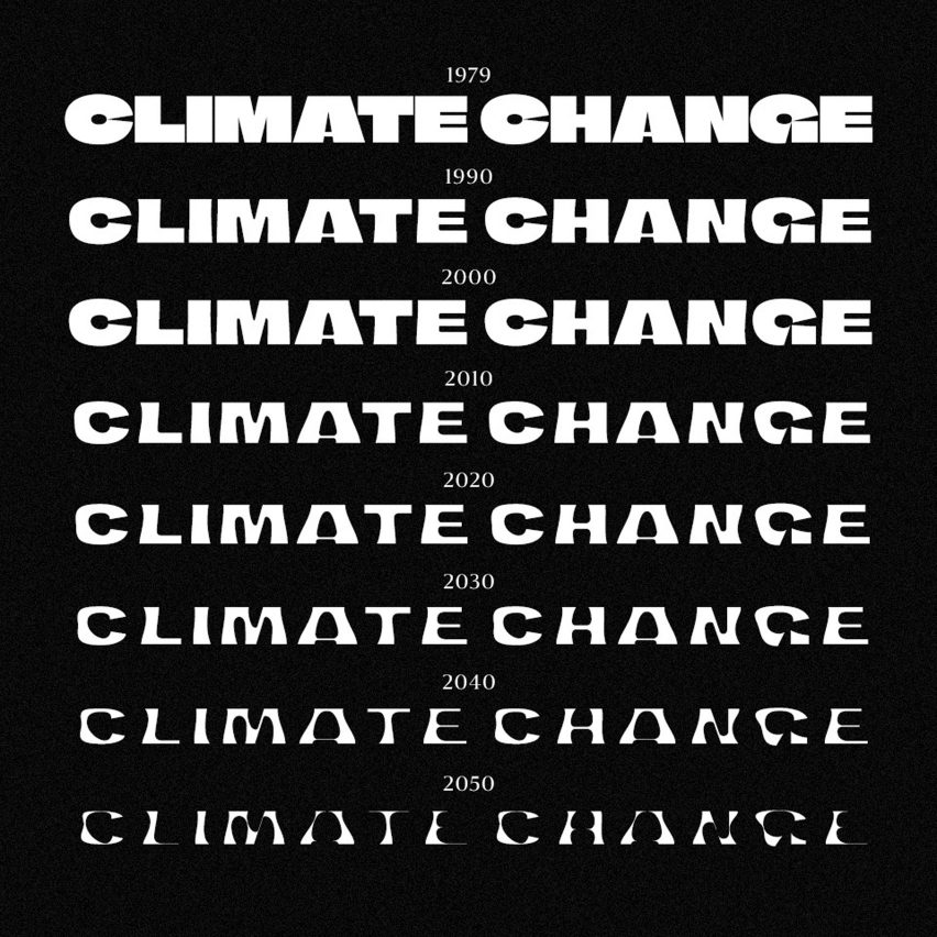
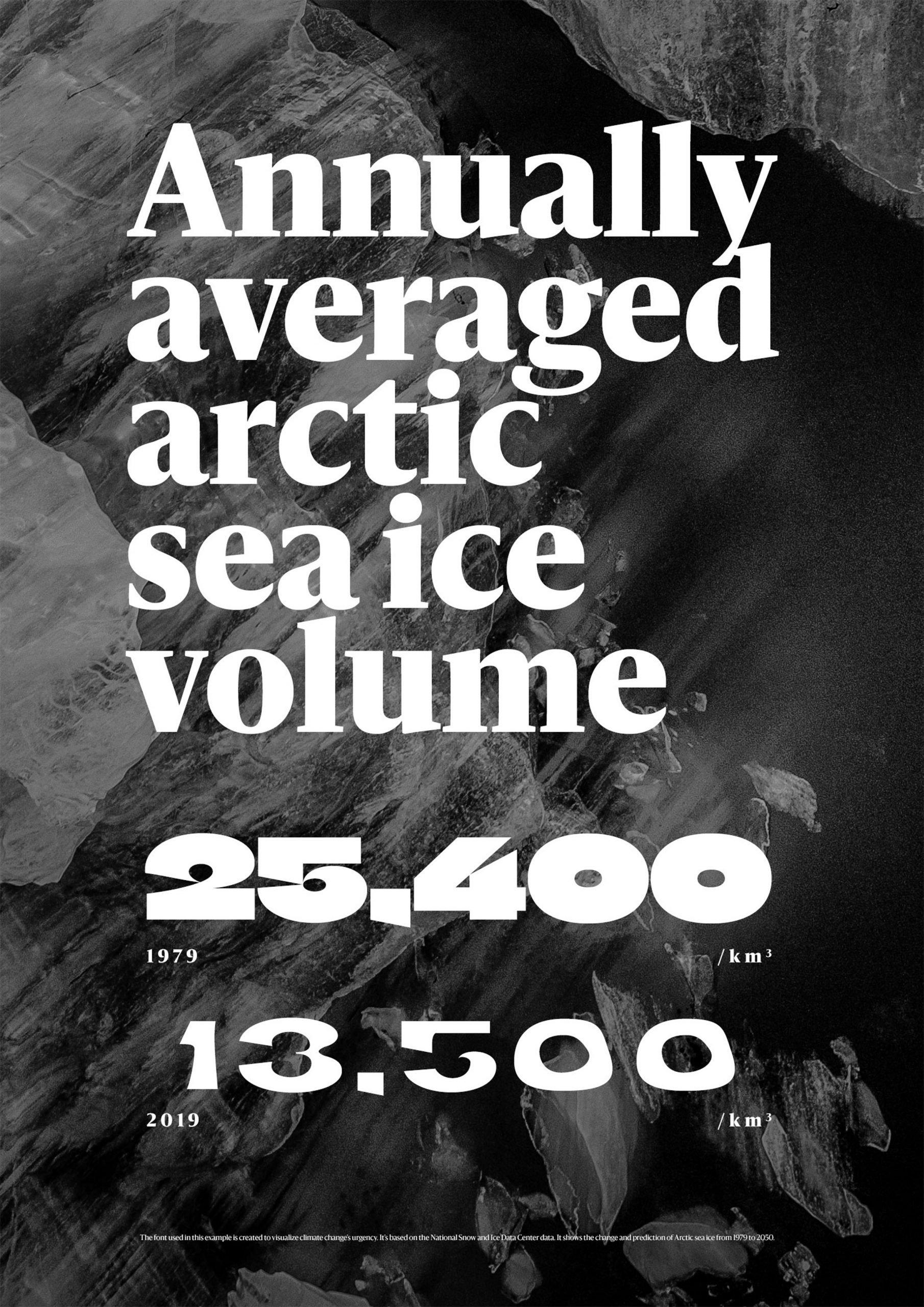
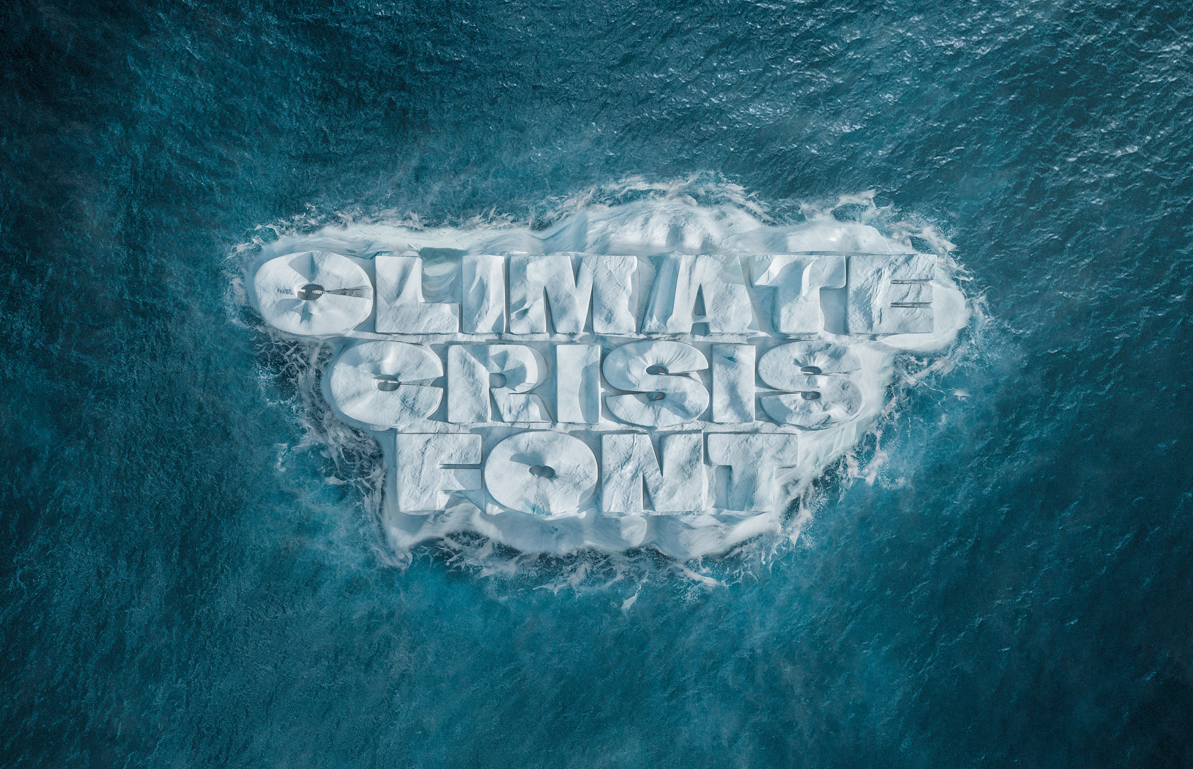
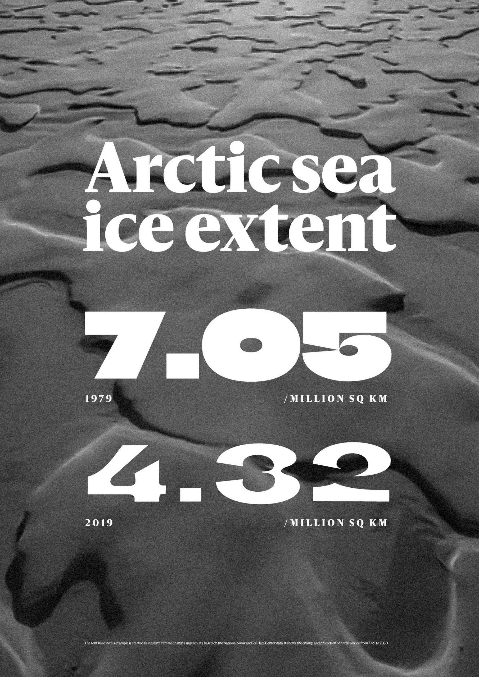
Finnish newspaper Helsingin Sanomat has developed a variable font that hopes to make the urgency of climate change tangible by mirroring the declining amount of Arctic sea ice in its disappearing letterforms.
While a regular typeface has certain pre-determined styles like bold or italic, the Climate Crisis Font allows users to adjust its font weight with the help of a sliding timescale.
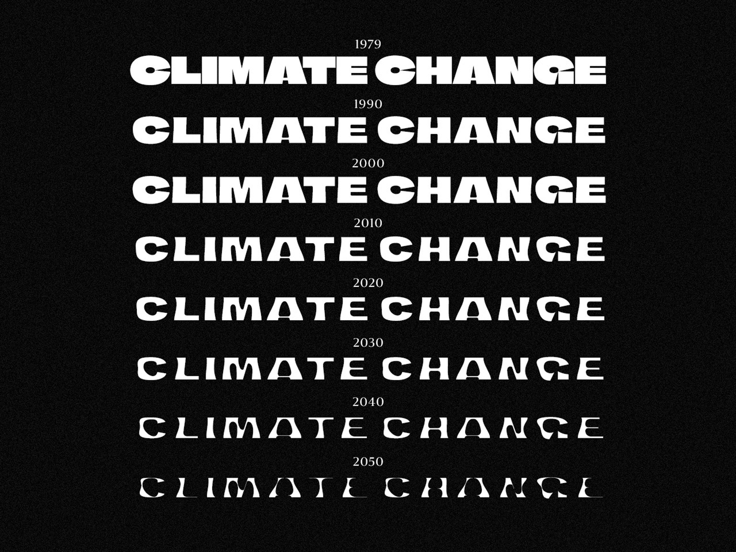
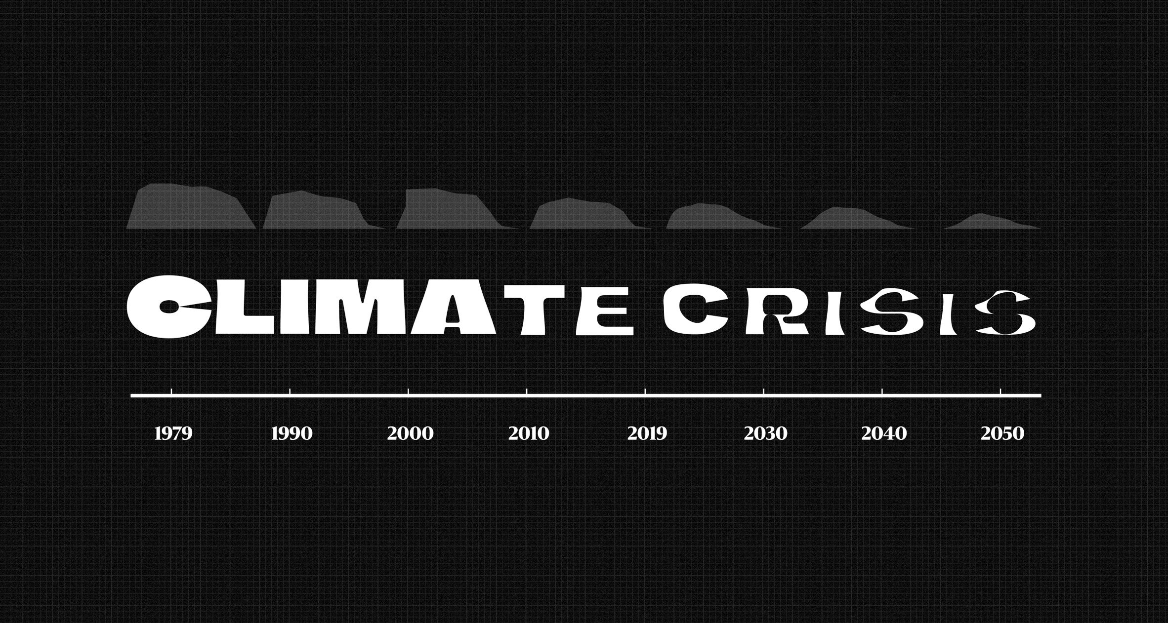
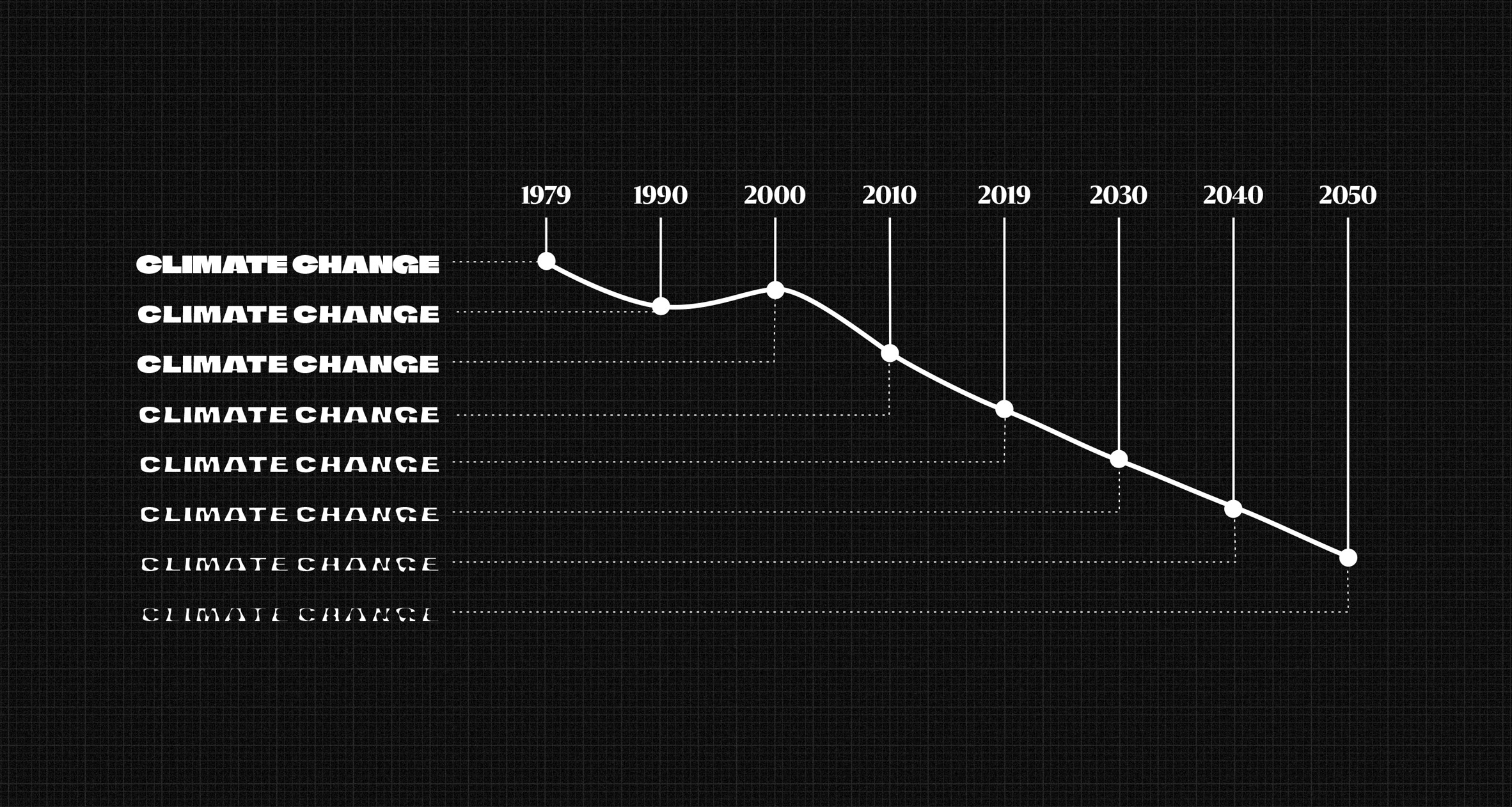
This allows them to select any year between 1979 when satellite measurements of Arctic ice first began and 2050, by which time it is expected to have shrunk by 30 per cent.
In 1979, the font, much like the ice, is at its thickest, with extra bold characters and what Helsingin Sanomat's art director Tuomas Jääskeläinen describes as "icy sharp edges".
But as the years go by, the silhouette of the letters becomes ever more curved and thin as if they were melting away or sinking into the ocean.
The exact weight of the font at any point is based on historical data from the US National Snow and Ice Data Center (NSIDC), as well as future projections released by the Intergovernmental Panel on Climate Change (IPCC).
"A lot of attention to detail went into following the data with the font's weights," Jääskeläinen told Dezeen.
"For example, there was a slight positive development in NSISC's arctic ice data around the year 2000 and that can also be identified in the typeface."
This is possible because the Climate Crisis Font is a variable font, meaning it stores all of the font family's possible style variations inside a single file.
Here, a regular, "default" version of the typeface is linked to two other styles in a continuous range, creating an axis with different extremes on either end – ultra-light and bold for example, or upright and slanted.
Designers can flexibly toggle between these extremes to create a font that is responsive to their needs.
Hungarian student Vatány Szabolcs recently made use of this functionality to create a typeface for people with ADHD that can be adapted by the user to help them better take in written information.
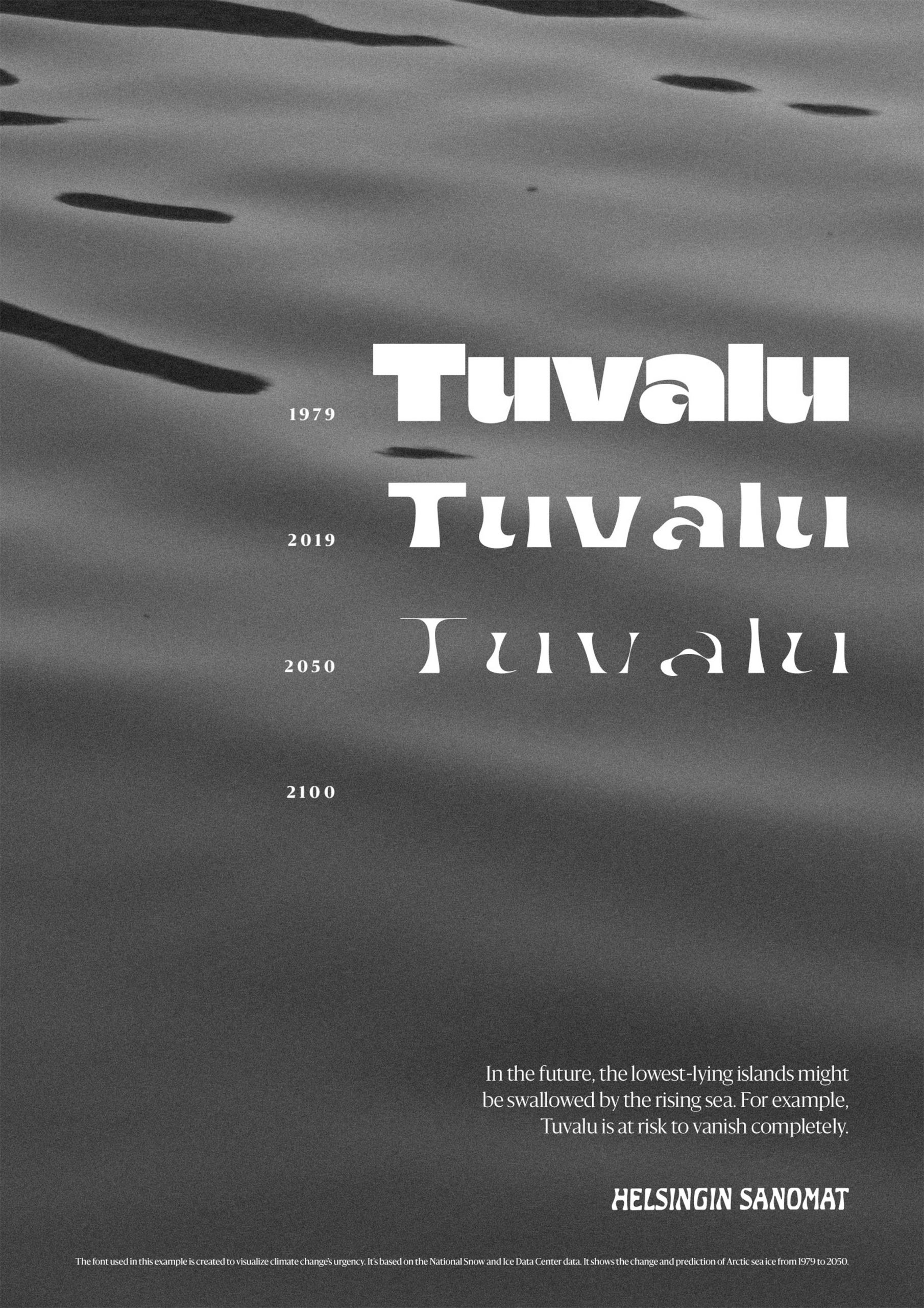
But in the case of the Climate Change Font, Jääskeläinen and his team instead "misused" the technology to respond to real-world environmental data.
"The transformation between the two extremes, known as interpolation, was mapped to respond to the Arctic ice pack's shrinkage," he explained.
"In the design process, we tried out countless letter shapes and styles, only to find that most of them visualised the disaster right in the earliest stages of the transformation. That's something we wanted to avoid because unlike a global pandemic, climate change is a crisis that sneaks up on us."
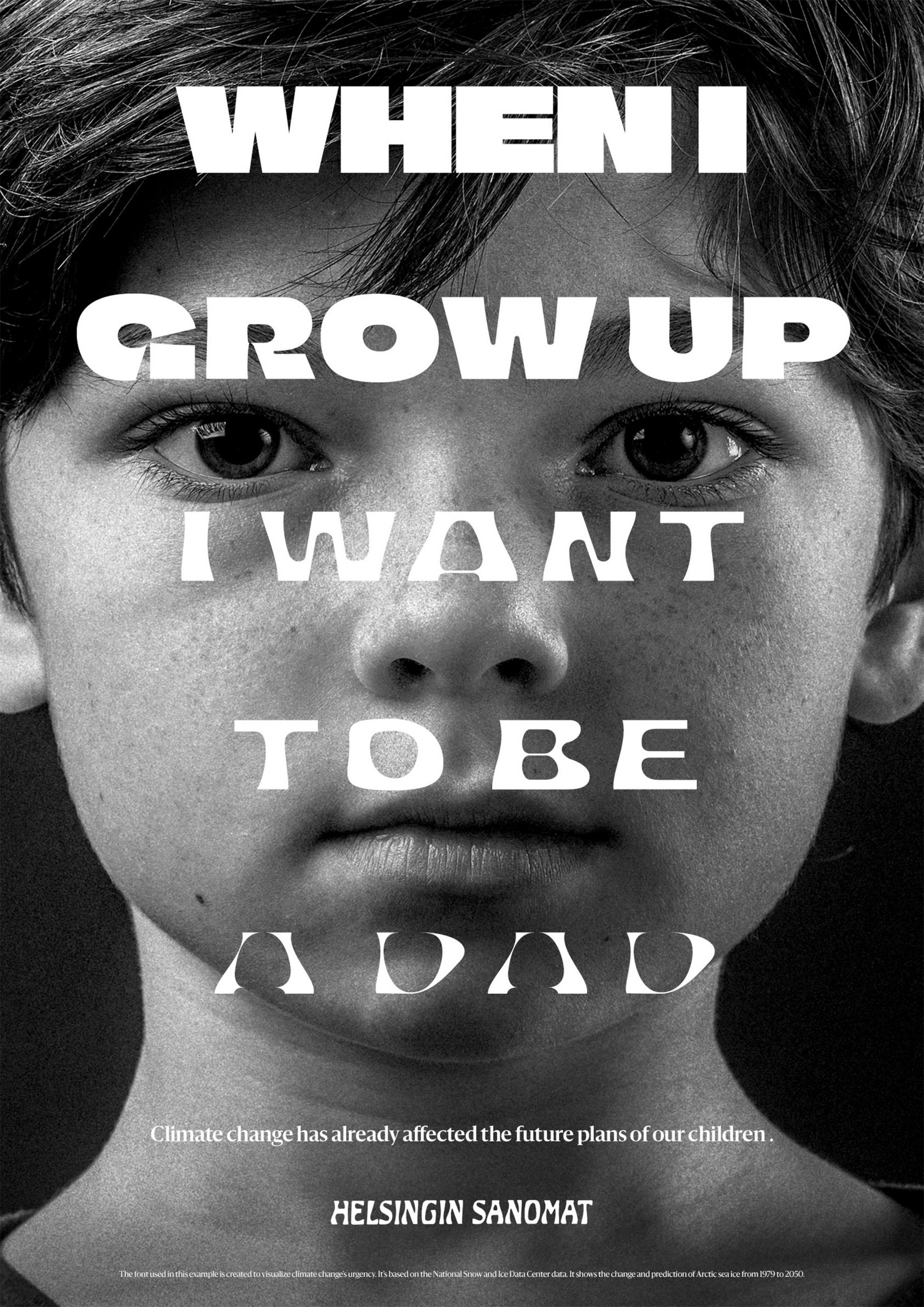
Helsingin Sanomat is making the font available to download for free, in the hopes that designers and other news organisations will use it to enhance their storytelling around global warming.
"Fact-based journalism is more essential than ever. Media organisations have a responsibility for their readers to make complex matters more comprehensible," Jääskeläinen added.
"We hope that using the font helps people see the urgency of climate change in a more tangible form – it is a call for action."
With a similar aim, Helsinki studio Berry Creative recently created a series of heat-reactive stamps for the Finnish Post that show the fatal consequences of rising temperatures.
Among the motifs featured in the project, which was named graphic design of the year at the 2020 Dezeen Awards, is a bird that transforms into a skeleton when warmed up through friction.
The post Climate Crisis Font visualises melting of polar ice based on real-world data appeared first on Dezeen.
from Dezeen https://ift.tt/3paQcmu
No comments:
Post a Comment