Italian design duo Formafantasma has unveiled a pared-back website designed to reduce carbon dioxide emissions.
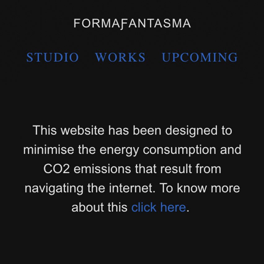
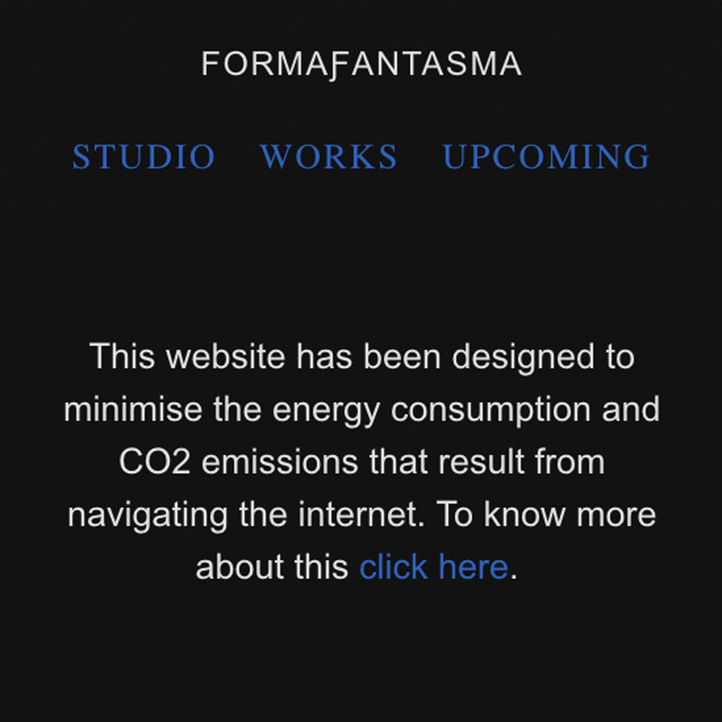
Designed in collaboration with Italian agency Studio Blanco, the website features small images, basic typefaces and a logo created from standard Unicode symbols.
Visitors can choose to switch to a dark mode with a black background instead of the default white while the home page features a simple table of contents without images.
All these features require less energy to load on computers and smartphones, reducing carbon emissions.
The site is hosted by GreenGeeks, a platform that uses renewable energy to power its servers.
"It started from a personal urgency and questions we had about pollution connected to the internet," said Formafantasma founders Andrea Trimarchi and Simone Farresin.

"We all know that when using digital tools we are consuming energy and emitting CO2 emissions," they continued.
"We felt it was an excellent design task to use new, more sustainable parameters as limitations for the website."
The website's spartan homepage is visually and functionally influenced by Wikipedia.
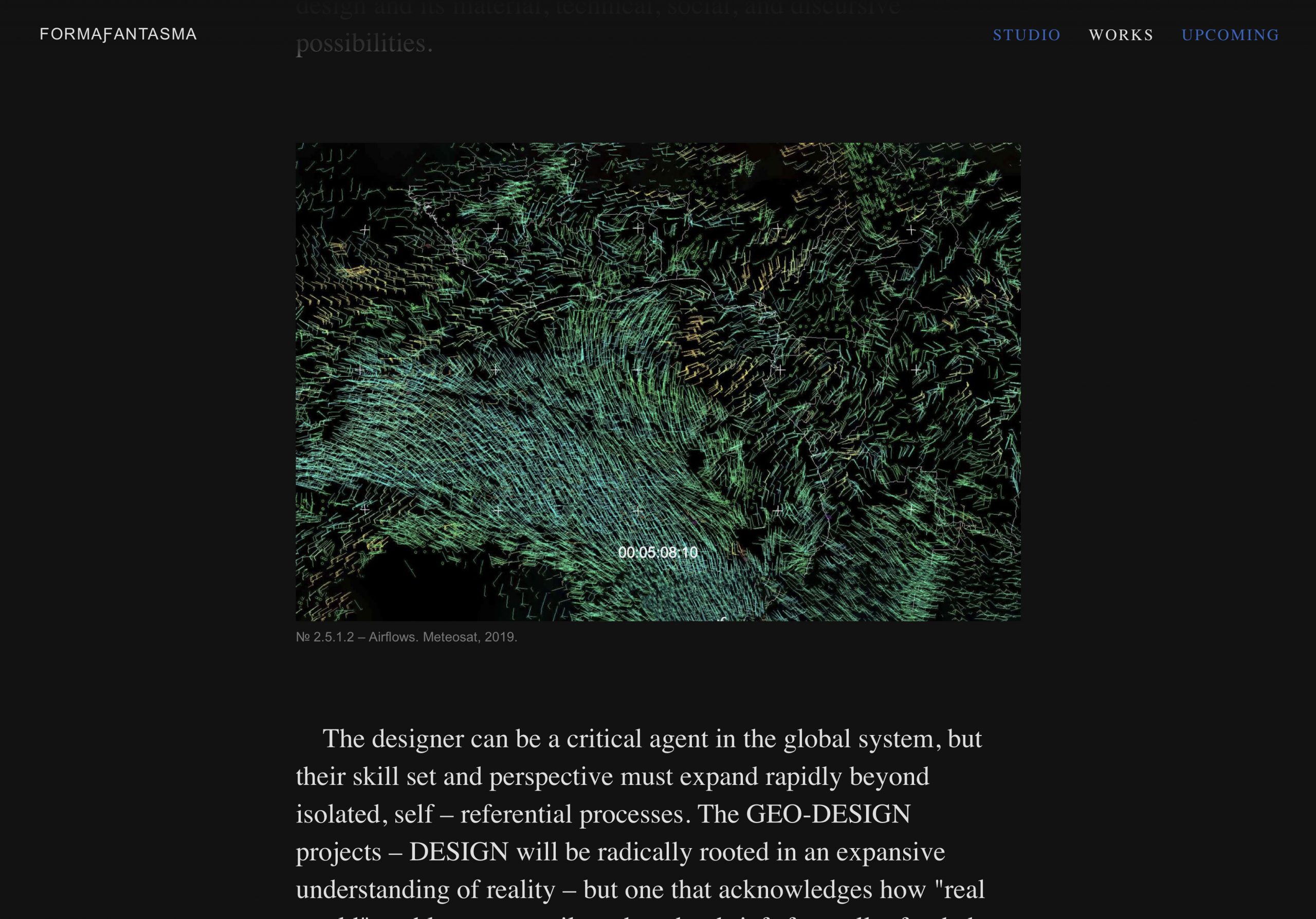
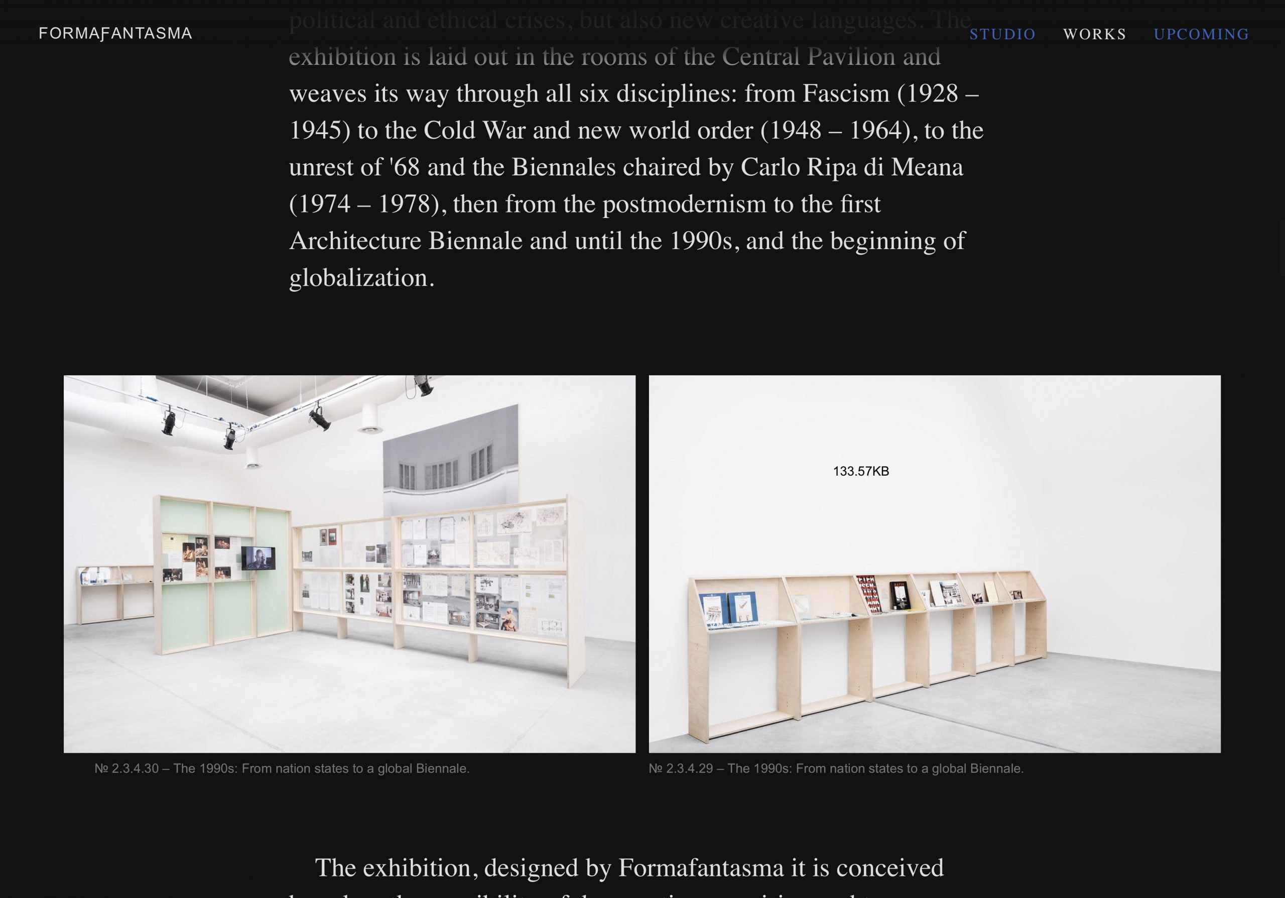
As larger images require more energy to download, the site initially loads small images that users then have the option to enlarge if they want.
The website's visual language was informed by pared-back early websites but was chosen to be energy efficiency as opposed to following graphic design trends.
"Our main goal wasn't necessarily to be innovative on a graphic level," said Trimarchi and Farresin.
"In fact, in recent years there has been a proliferation of works referencing basic early years internet templates," they continued. "Nevertheless, many of these works are based on style and are often not really energy efficient."

The launch of the site coincides with the introduction of a new logo for the Amsterdam-based studio.
This was created using a string of generic Unicode symbols spelling the studio's name that can be displayed on any device without having to download an image file.
"It is, by all means, a green logo. If it is used in an email signature, no JPEG file is necessary," said Studio Blanco. "It's nerdy but fun."

The site uses standard System typefaces Times New Roman and Arial. Using these fonts, which are preinstalled on most devices, reduces the number of HTTP requests that are required to load more unusual fonts.
The launch comes amid growing awareness of the internet's carbon footprint.
"The internet is the fastest-growing carbon polluting industry and it will eclipse all other industries in terms of worldwide pollution," according to GreenGeeks.

The growing number of data centres that host web servers today account for two per cent of the world’s carbon emissions, according to the hosting platform.
"Data center pollution is expected to grow to 14 per cent of the world’s carbon emissions, as much as the United States of America, by 2040," it adds.
Sustainability is at the heart of much of Formafantasma's work. In March last year, the design duo curated Cambio, a research-focused exhibition at the Serpentine Sackler Gallery in London which interrogated the environmental impact of the timber industry.
Its 2017 project Ore Streams investigated the waste generated by the electronics industry.
Formafantasma was co-founded by Trimarchi and Farresin in 2009. It was named studio of the year at the Dezeen Awards 2020.
Based in Reggio Emilia in Italy, Studio Blanco was co-founded by Sara and Valerio Tamagnini in 2005.
Images are courtesy of Formafantasma and Studio Blanco.
The post Formafantasma redesigns website to reduce "pollution connected to the internet" appeared first on Dezeen.
from Dezeen https://ift.tt/3u4Tv1Z
No comments:
Post a Comment