Thursday, 29 April 2021

Red concrete museum tells the story of Alpine ibexes in Pitztal valley

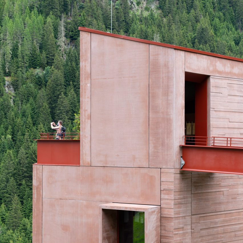
Red concrete exterior of Ibex Museum St Leonhard by Daniela Kröss and Rainer Köberl

Swiss architects Daniela Kröss and Rainer Köberl have completed a red building "like a small castle" to celebrate the history of wild ibex in the alpine region of Pitztal, Austria.

The Ibex Museum St Leonhard charts the history of a native ibex goat species that became extinct from the area but was successfully reintroduced in the 1950s.
Facade of Ibex Museum St Leonhard by Daniela Kröss and Rainer Köberl
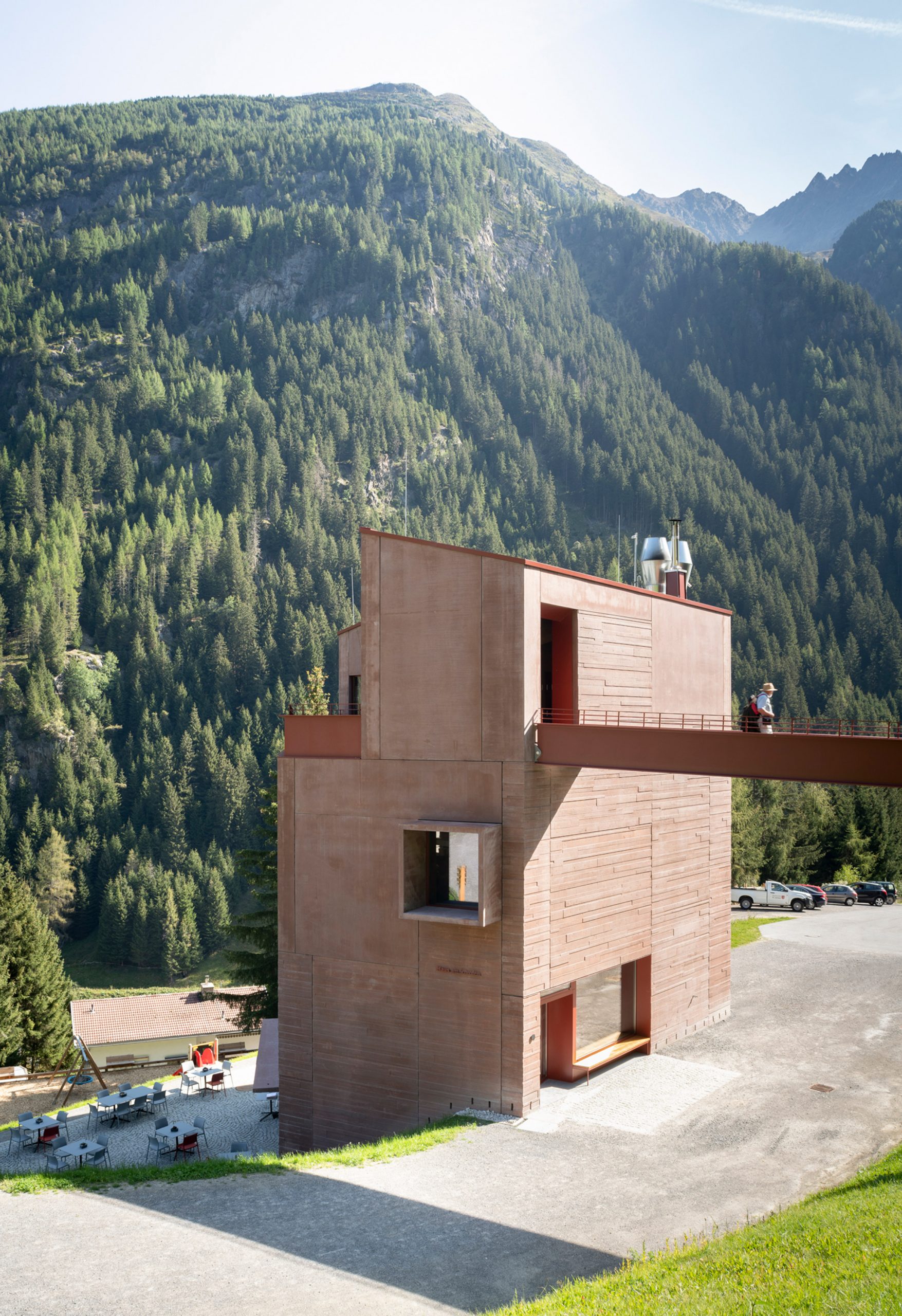
The museum was designed as a four-storey tower with a bridge

Kröss and Köberl wanted to make the building feel like a landmark, so they designed it as a four-storey tower, connected to the hillside by a monumental bridge.

They also chose a red-toned materials palette, comprising pigmented concrete and powder-coated steel, to allow the building to stand out against its green backdrop.
Red concrete exterior of Ibex Museum St Leonhard by Daniela Kröss and Rainer Köberl
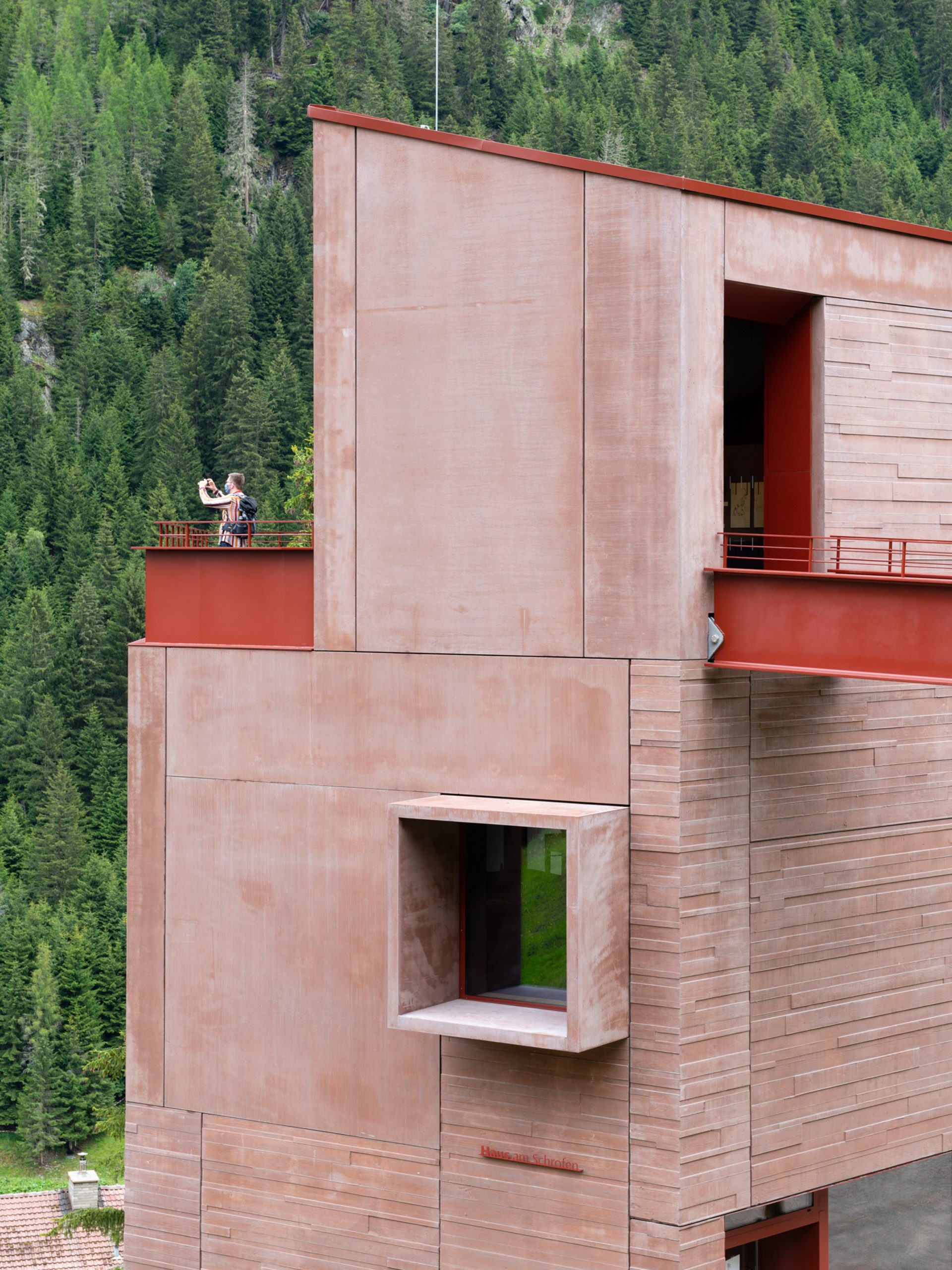
Precast panels of red concrete clad the exterior

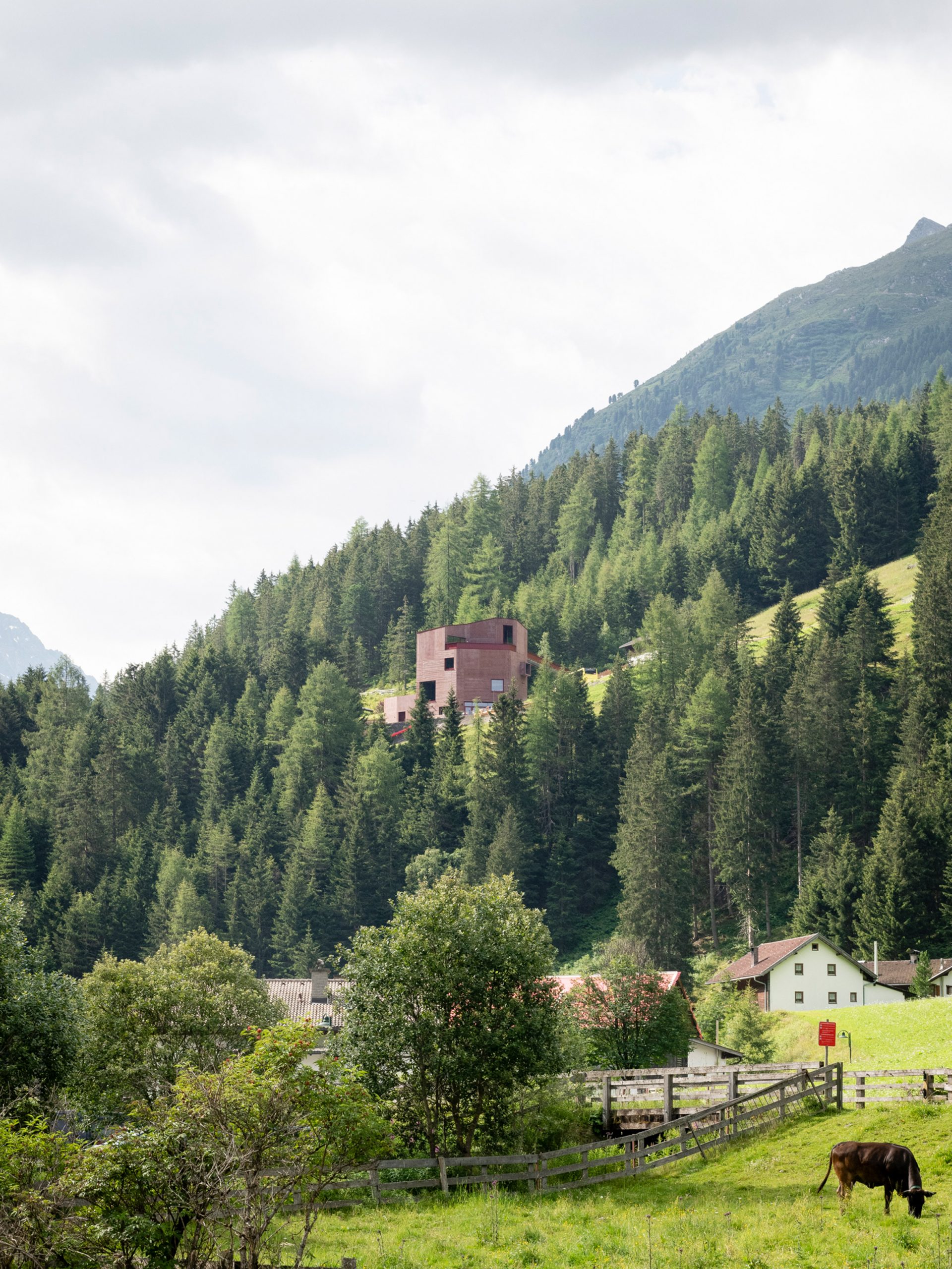
"Up on a wooded mountainside, you see a reddish building, somehow appearing like a small castle," said Kröss.

"The red/brownish colour puts the building in a harmonious coexistence with the nature surrounding it," she told Dezeen.
Distance view of Ibex Museum St Leonhard by Daniela Kröss and Rainer Köberl
The red colour helps the building stand out as a landmark

The Ibex Museum is located in the parish of St Leonhard, next to one of the oldest farmhouses in the valley. It sits on a site that previously housed a barn.

The new building is designed to reference both the wooden farmhouse and the original barn, with a precast concrete facade featuring a texture that resembles timber boards.
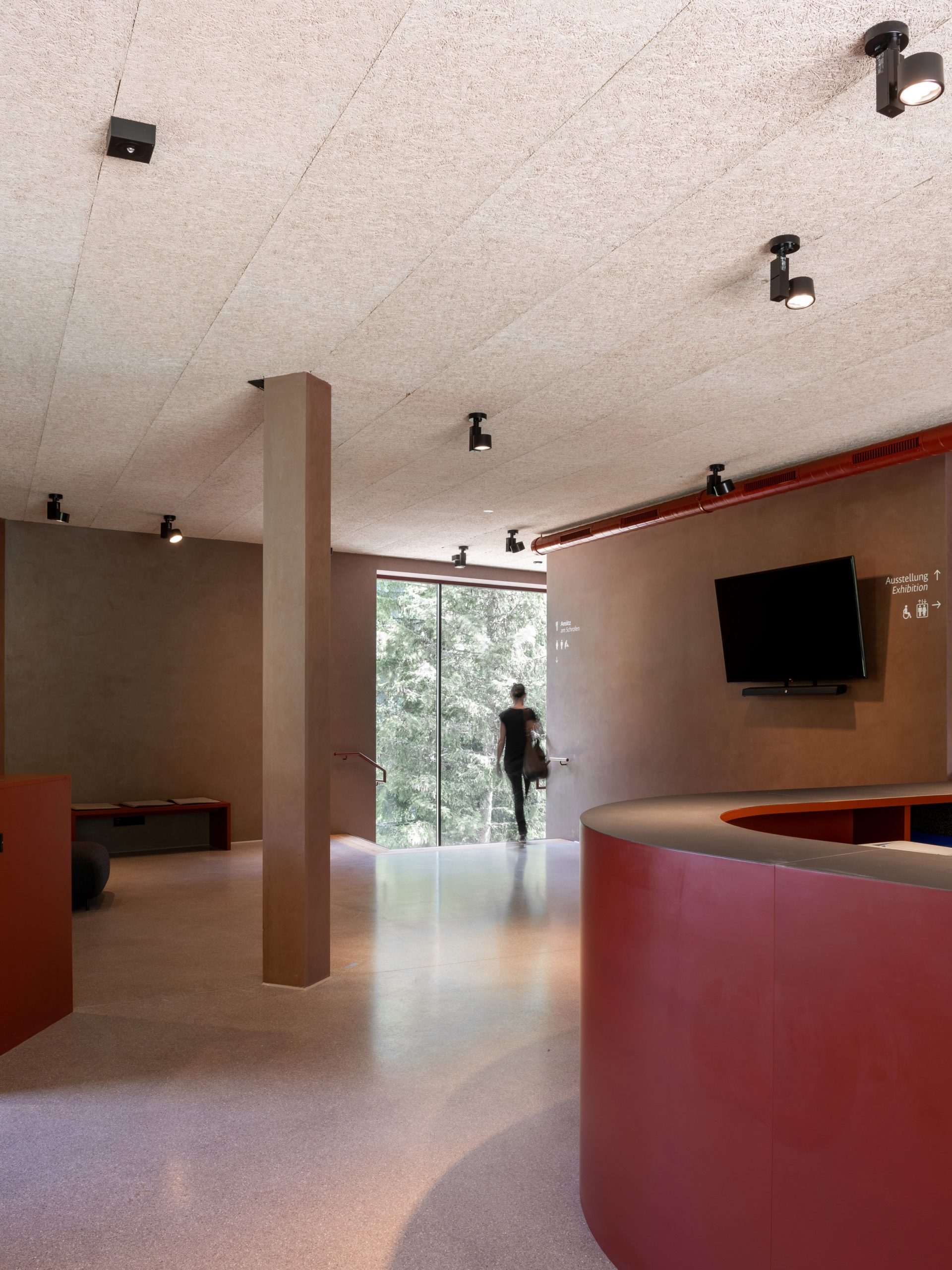
Reception of Ibex Museum St Leonhard by Daniela Kröss and Rainer Köberl
The reception is located on the upper ground floor

"When we first visited the site, we found a very harmonious ensemble between the historic building and an old barn," said Kröss. "We wanted to develop the new building in the same place and on the same footprint of the barn."

"The idea of maintaining the wooden structure of the barn led to the wooden cast in the prefabricated concrete elements of the facade."
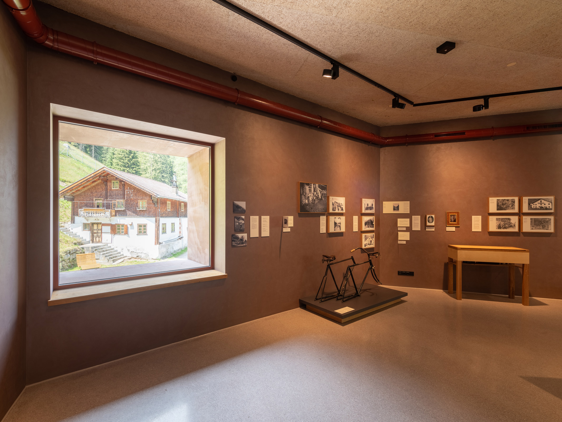
Exhibition gallery at Ibex Museum St Leonhard by Daniela Kröss and Rainer Köberl
Windows frame specific views of the surroundings

The two lower levels of the museum both have ground-level entrances, thanks to the way the building nestles into the slope.

A cafe and bar are located on the lower ground floor, while the upper ground floor contains the main reception.

Visitors move up through the building, finding the main exhibition spaces on the two upper levels.

The bridge extends out from the top-floor terrace, leading visitors to a hillside enclosure where they can encounter seven ibexes.
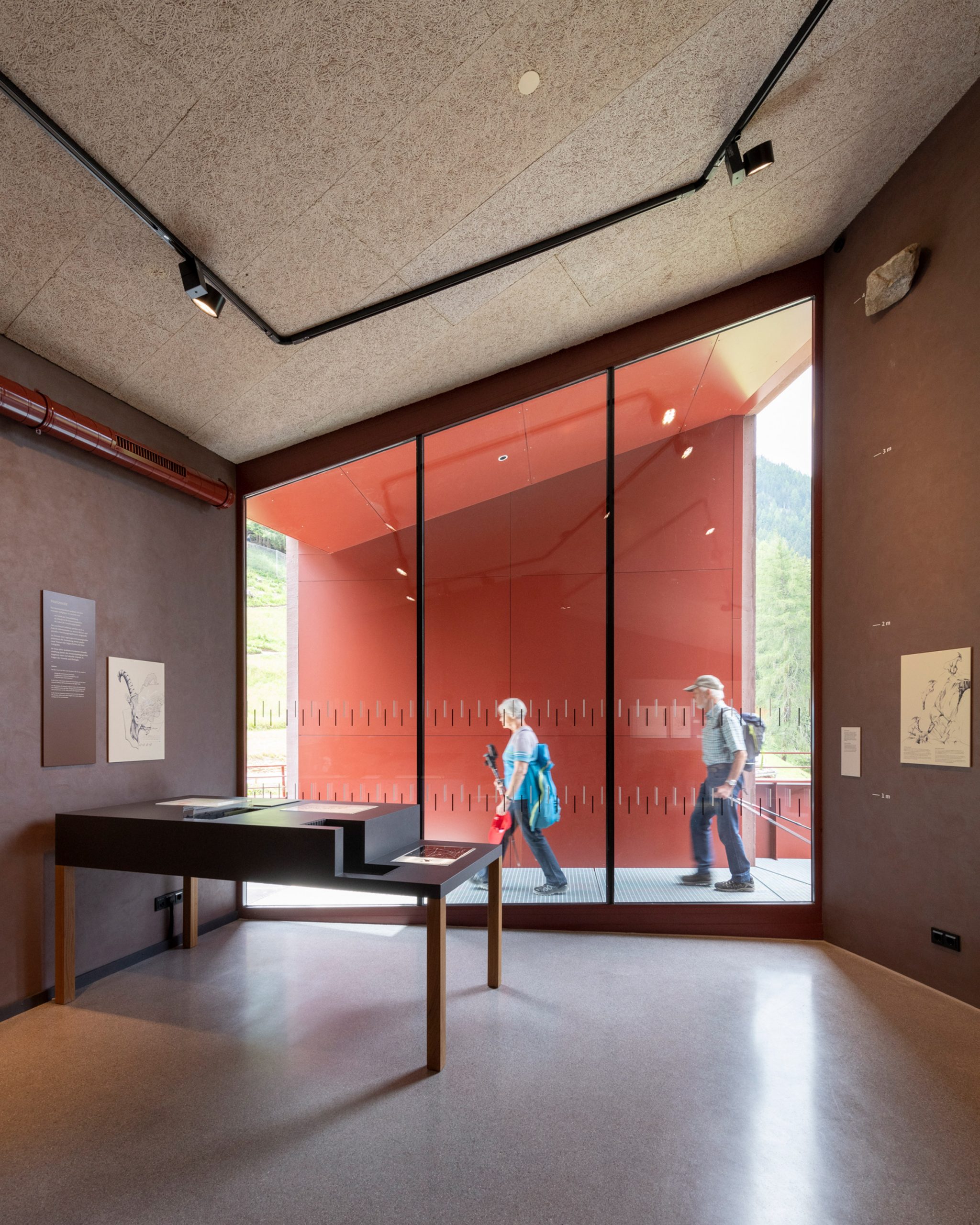
Top floor of Ibex Museum St Leonhard by Daniela Kröss and Rainer Köberl
The bridge connects the exhibition galleries with an ibex enclosure

The layout of the building was largely influenced by the desire to make the museum accessible to all. The idea was to help all visitors "climb the mountains and see the ibex face to face."

With this in mind, many of the windows are positioned to offer specific views of the landscape and surrounding buildings.
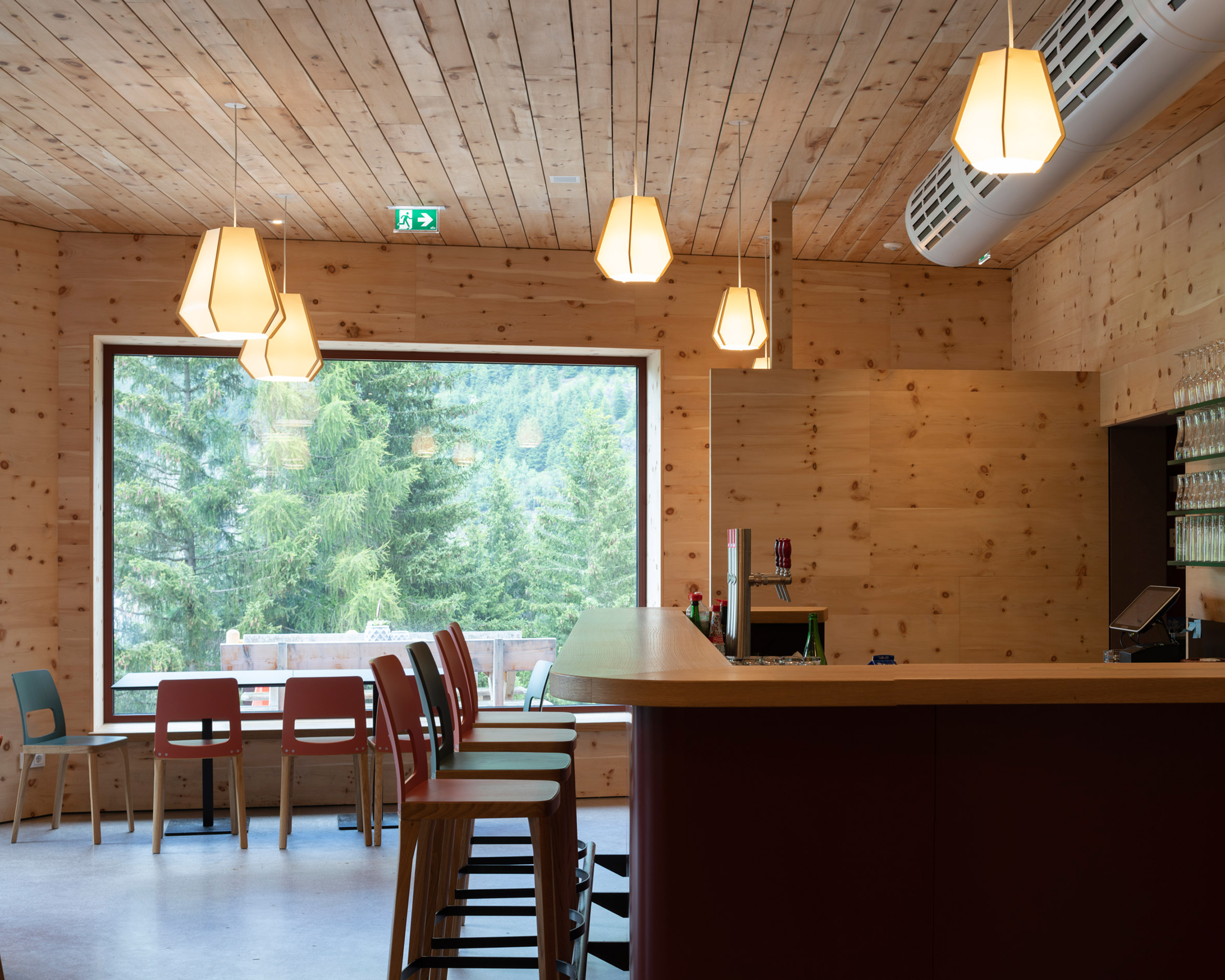
Cafe and bar in Ibex Museum St Leonhard by Daniela Kröss and Rainer Köberl
Pine wood lines the bar and cafe on the lower ground floor

Interior finishes follow the colour palette of the exterior, with red-speckled terrazzo floors, red-painted service ducts and soft-red-grey walls.

The bar has a more cabin-like aesthetic, with walls lined in locally sourced pine wood.

Other notable recent Austrian projects include a geometric timber house in a traditional Austrian village and a private spa made from stone blocks.

Photography is by Lukas Schaller.


Project credits

Client: Gemeinde St Leonhard im Pitztal
Architecture: Rainer Köberl, Daniela Kröss
Planning: ArGe Architekten, Rainer Köberl, Daniela Kröss
Project management: Julian Gatterer
Construction management: R&S Planbau
Structural consultant: Georg Pfenniger
Landscape design: ArGe Architekten, Rainer Köberl, Daniela Kröss
Exhibition planning: Rath & Winkler
Exhibition design: Himmel Studio für Design und Kommunikation
Electrics: Technisches Büro Schwienbacher
Building services: Technisches Büro Pregenzer

The post Red concrete museum tells the story of Alpine ibexes in Pitztal valley appeared first on Dezeen.


from Dezeen https://ift.tt/3vt7yyp
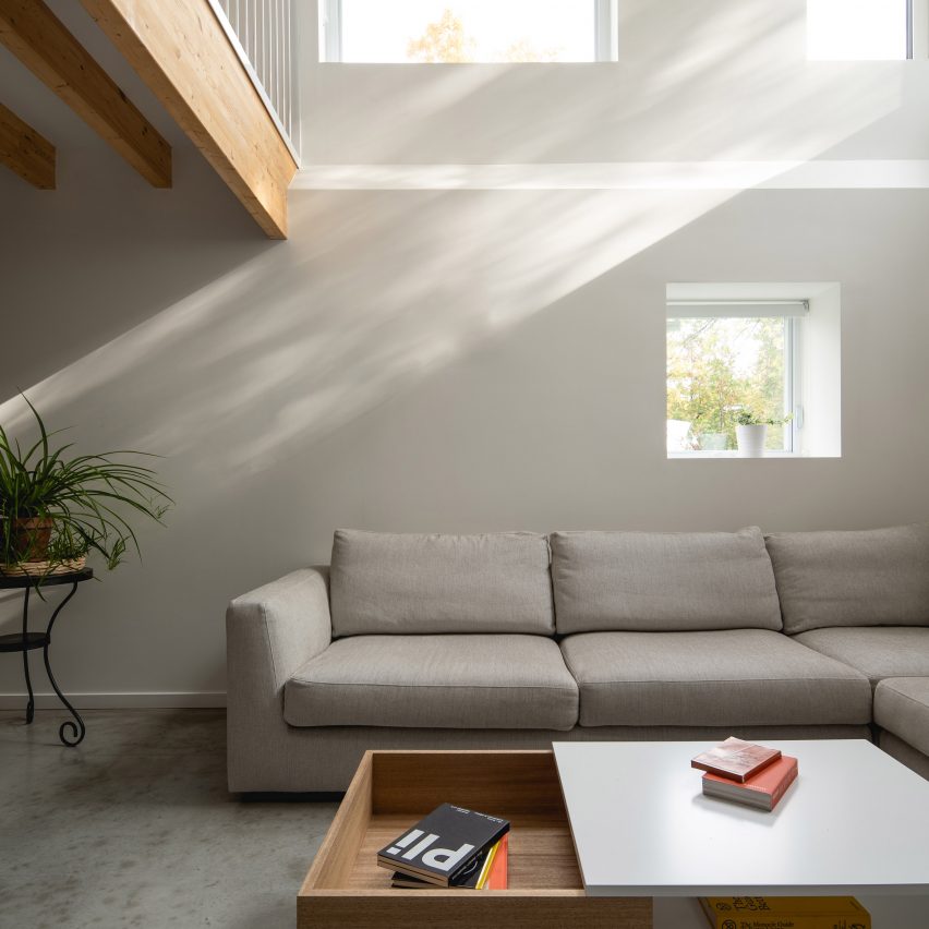
Park Ex House in Montreal has voids that flood its basement with light

Park Ex House by Nicholas Francoeur and Joel Fontaine Lortie

Architecture graduates Nicholas Francoeur and Joel Fontaine Lortie have renovated a steel-clad house in Montreal to include two cut-outs in its floors that fill the basement with sunlight.

Called Park Ex House, the dwelling is positioned on a corner in the Park Extension neighbourhood of Montreal, known by locals as Park Ex.

Park Ex House by Nicholas Francoeur and Joel Fontaine Lortie
Park Ex House is named after its neighbourhood

Current architecture interns and friends Francoeur and Fontaine Lortie added another floor and an angled roof to what was previously a one-storey house, in a gut renovation of the property that transformed both its exterior and interior.

The project was completed independently when the pair were finishing their Master's degrees.

Park Ex House is named after its neighbourhood
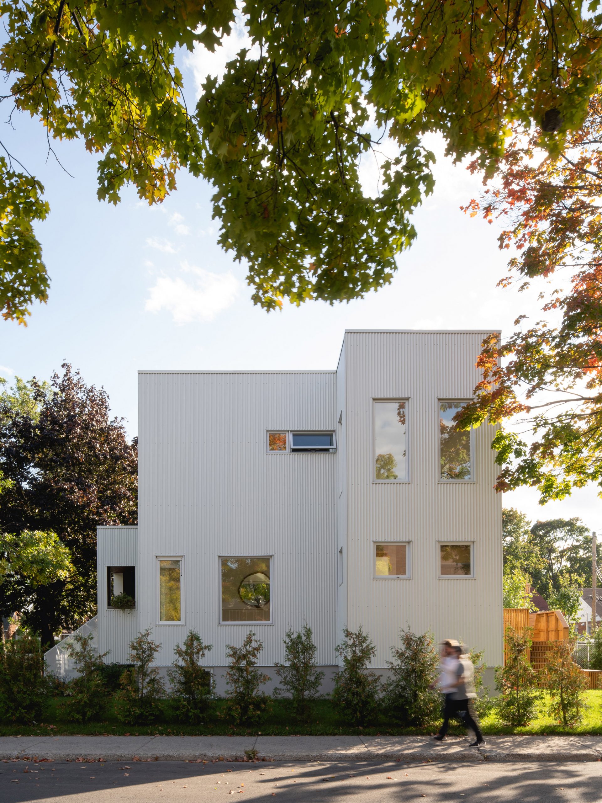
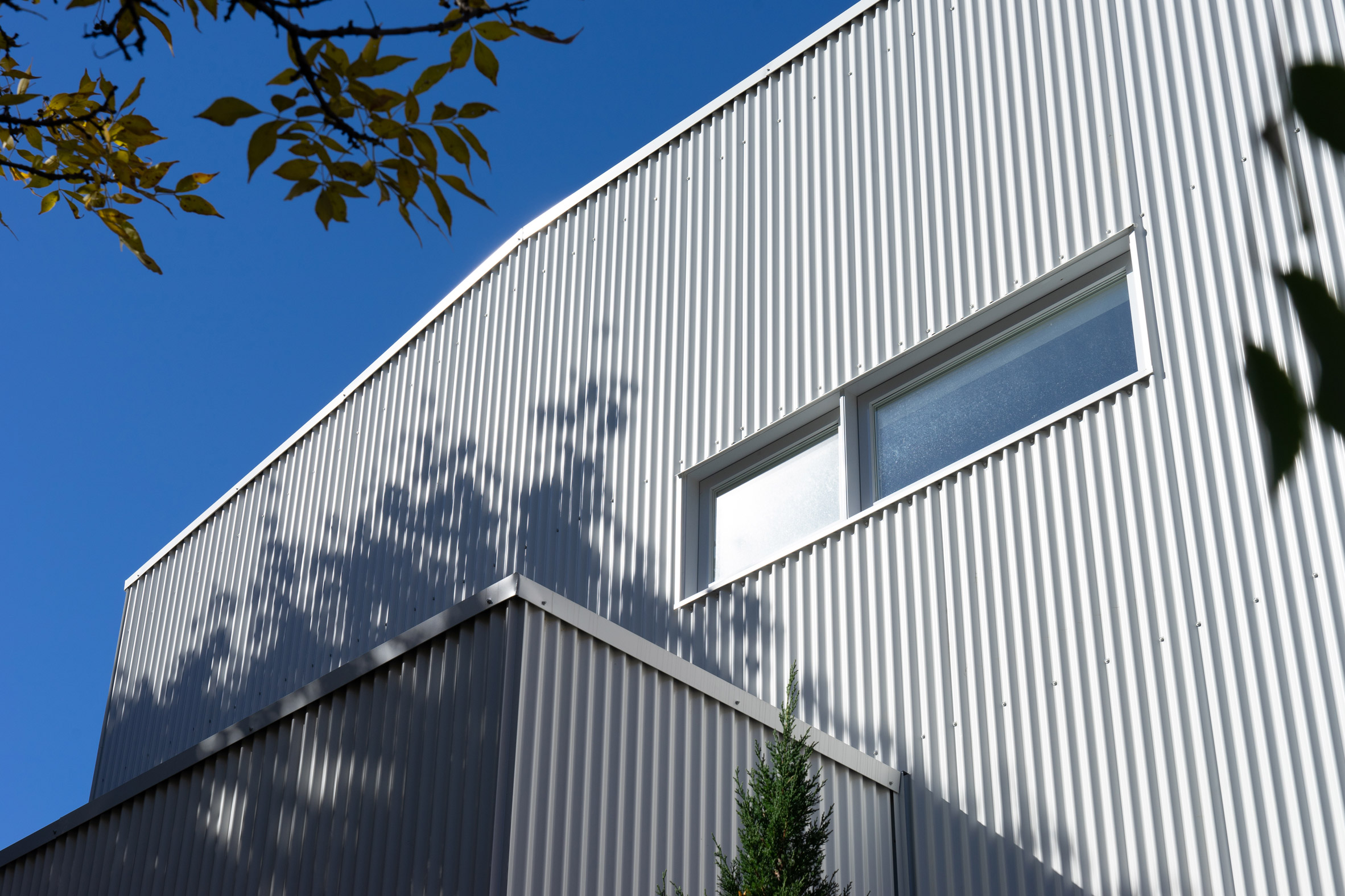
The renovated house is clad in vertical corrugated steel

Francoeur and Fontaine Lortie replaced Park Ex House's original white horizontal siding with vertical corrugated steel cladding in Cambridge White, which takes cues from Miesian architecture.

"We liked the idea of juxtaposing an industrial material with refined detailing," the graduates told Dezeen.

"The angled roof pays tribute to the original house, as does the fact that we maintained the general proportions of the existing facades."

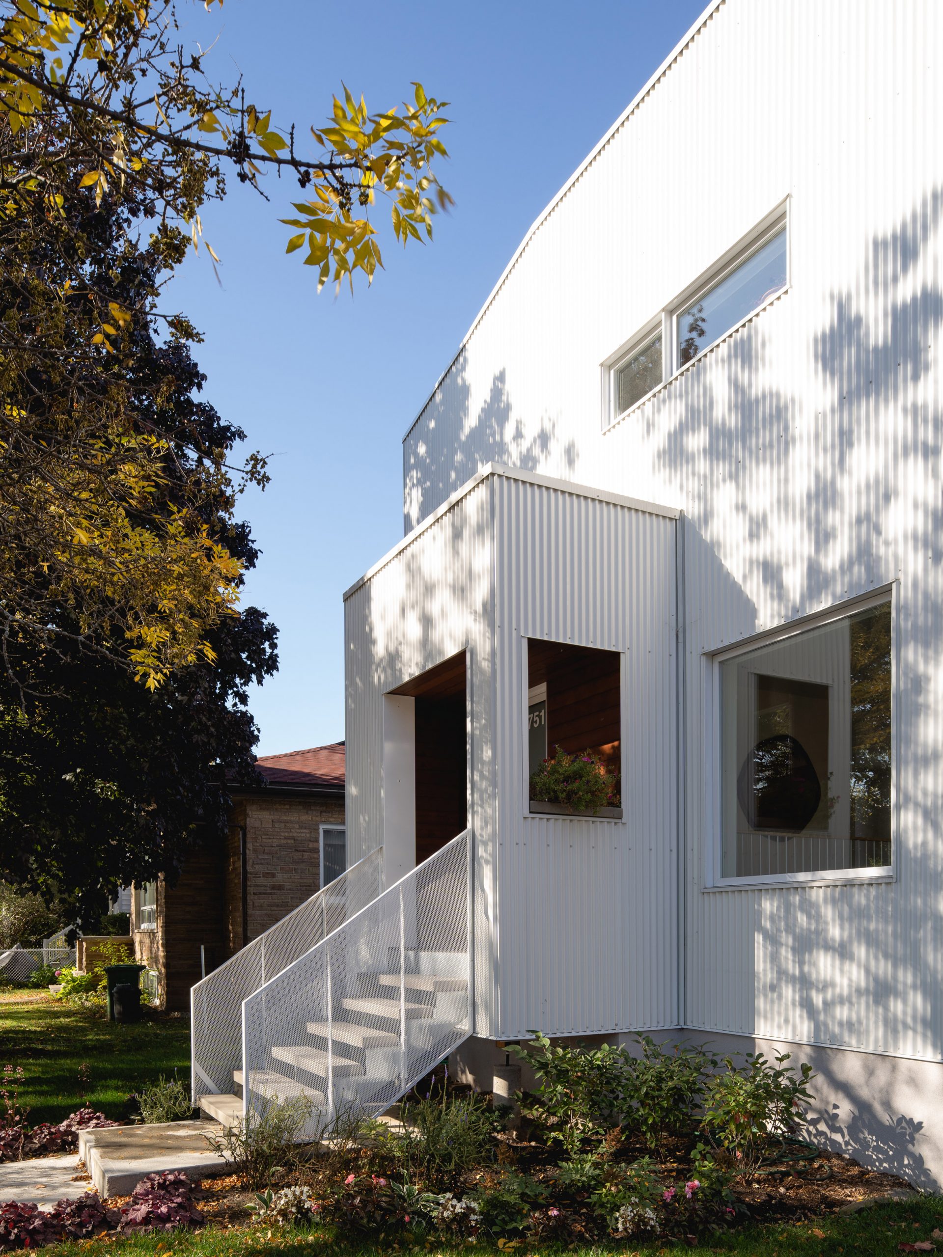
Nicholas Francoeur and Joel Fontaine Lortie renovated Park Ex House
A porch covers the house's front door

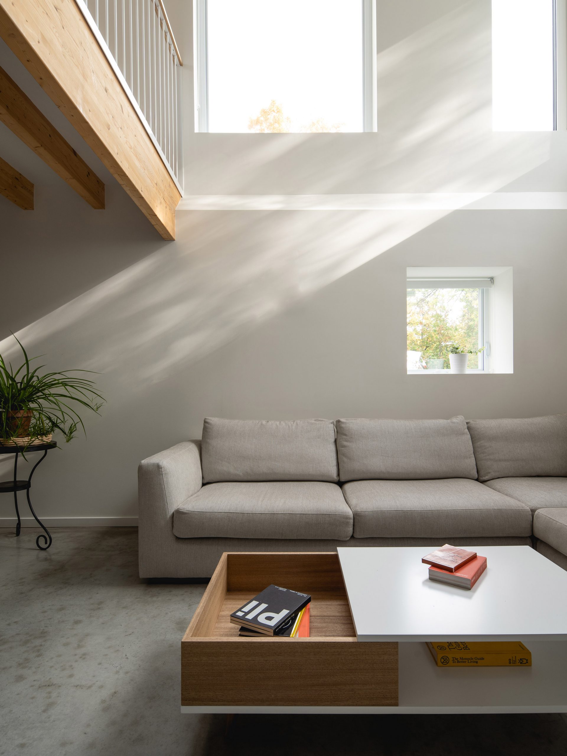
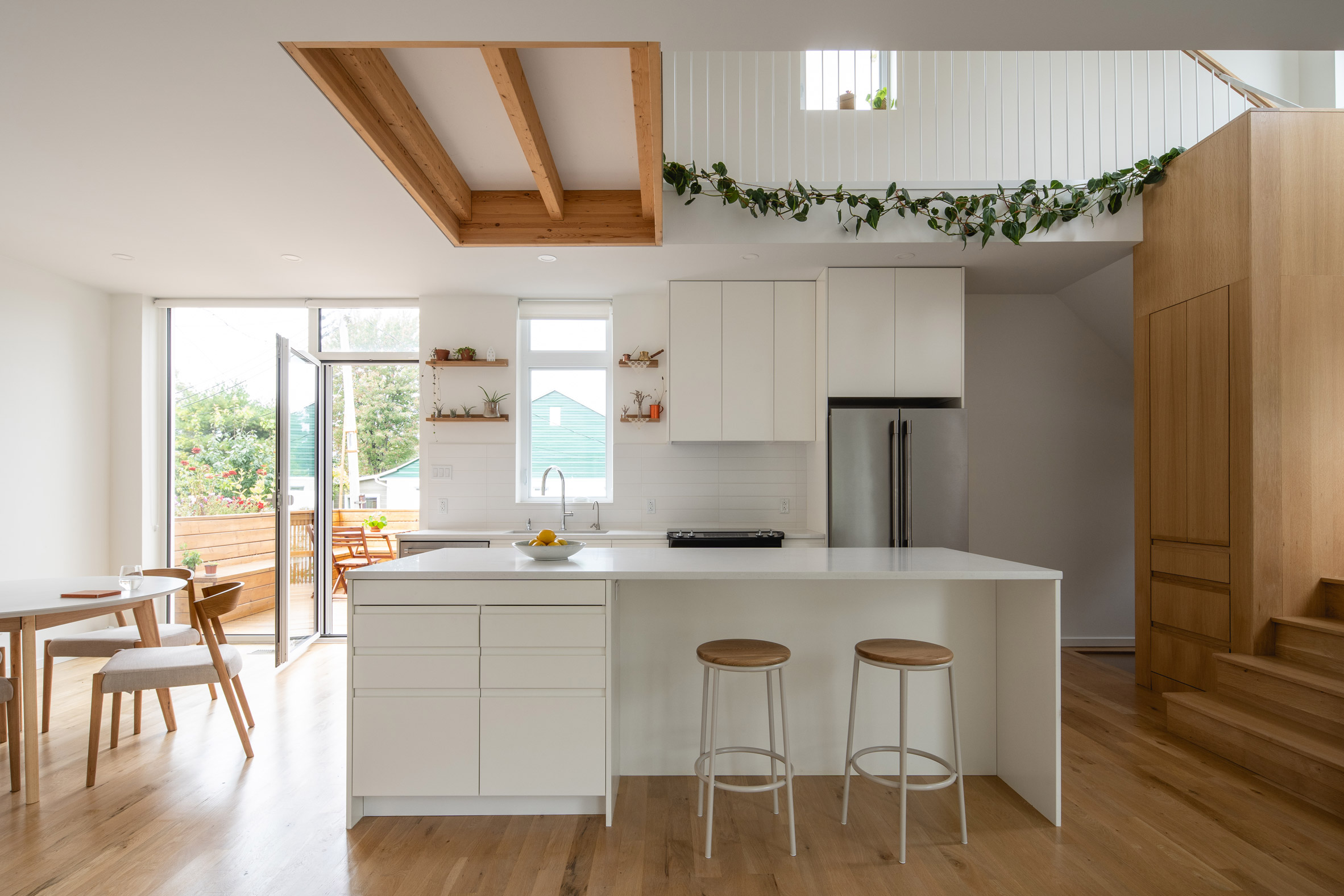
Inside, Francoeur and Fontaine Lortie wanted to introduce more light into the small building. The pair achieved this by adding a hole in the ground floor above the basement, as well as one between the kitchen and second storey.

The voids flood the basement with natural light, expanding an underground space that is commonly known for its low ceiling and poor lighting.

"The strategy really makes a small house feel much bigger. Ironically, this is carried out by sacrificing square feet," explained Francoeur and Fontaine Lortie.

Engineered wooden beams are also used in the basement in order to increase the ceiling's perceived height.

Park Ex House has a light-filled basement
The basement of Park Ex House is filled with light

With exposed concrete floors, the light-filled basement connects the rooms above it to each other in a way that the architecture graduates defined as "separate but together".

"We liked the idea of how the basement would be somewhat private in relation to the house's exterior, but extremely bright and connected to the interior," they explained.

The house is in Montreal
Voids make the space underground airy and bright

This bright atmosphere is reflected in the rest of the house's white oak floors, stairs and cabinets, which also complement the building's stained-white-cedar-lined porch.

Francoeur and Fontaine Lortie described how functionality is at the heart of the project, with many of its design features serving multiple purposes.

Nicholas Francoeur and Joel Fontaine Lortie used light colours for Park Ex House
Park Ex House's bright kitchen

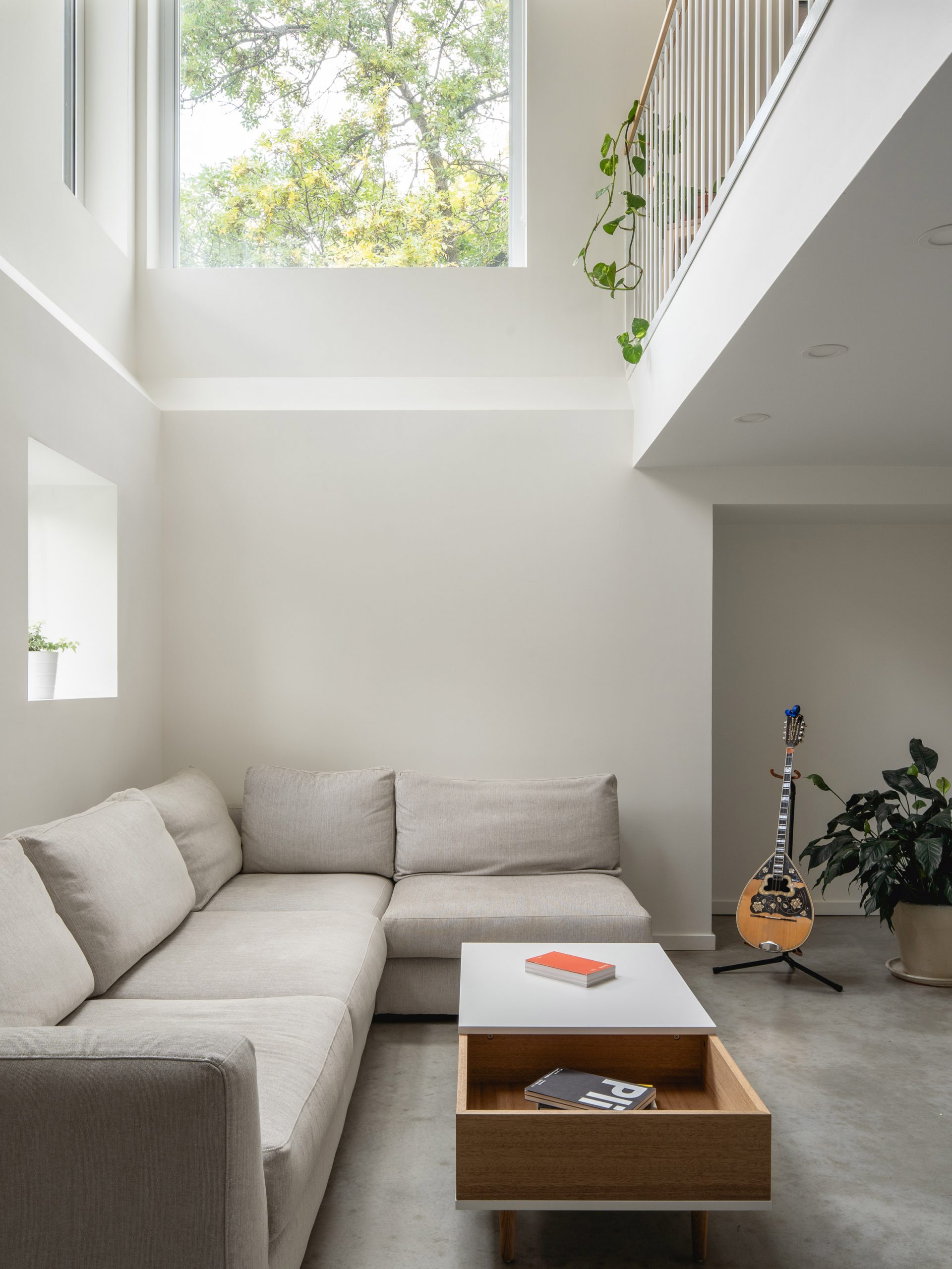
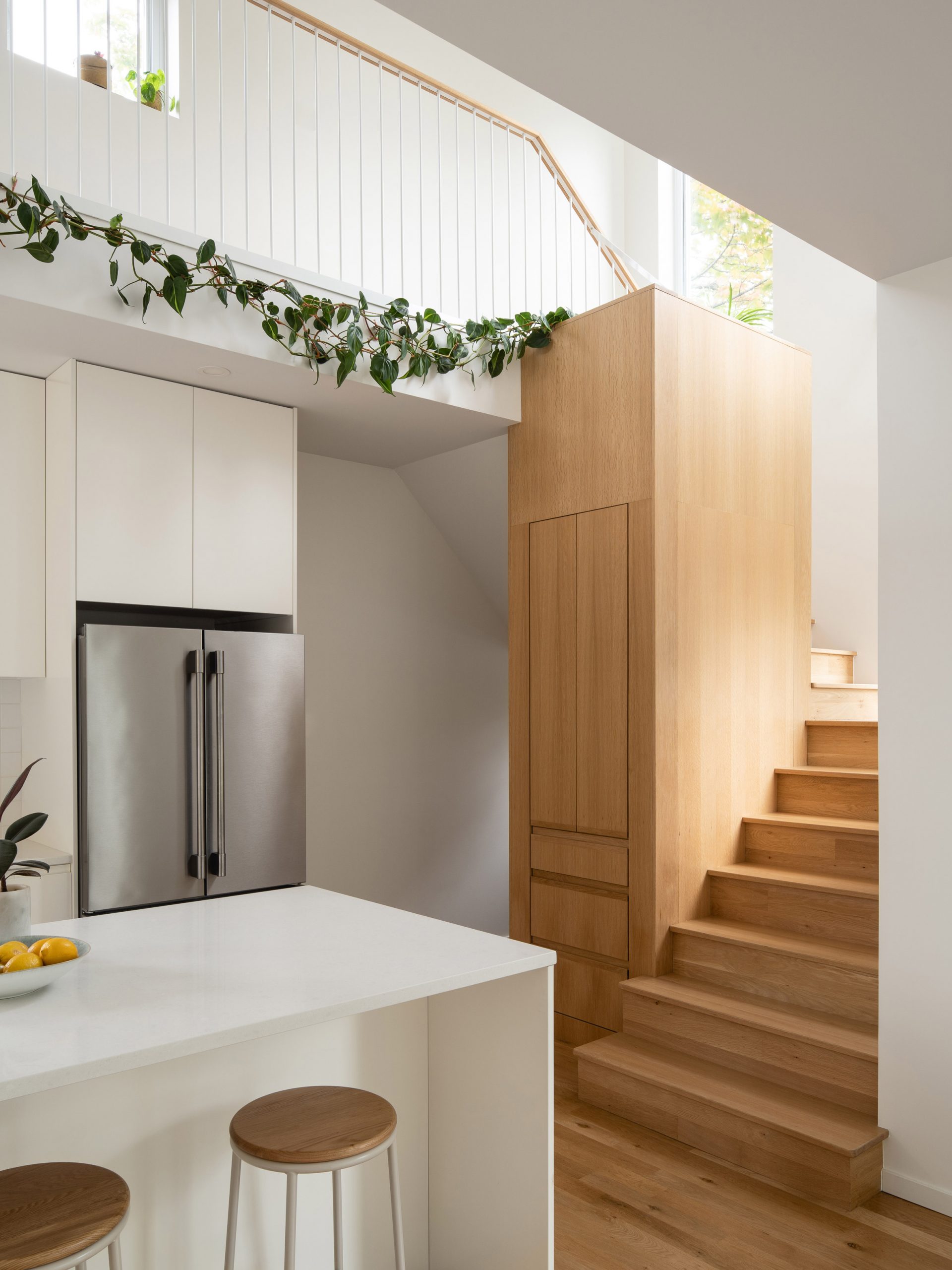
For example, Park Ex House's staircase has an integrated decorative planter and laundry chute which doubles as a support mechanism for the bridge above it.

"For us, Park Ex House makes the point that paying homage to an area's heritage does not always need to be nostalgic, and that history can be made by designing buildings which reflect the present moment while remaining in continuity with the past," the pair explained.

The house has functionality at its core
The staircase is both steps and a laundry chute

Nicholas Francoeur and Joel Fontaine Lortie are architects-in-training who are completing their education at Canadian firms DKA Architectes and Miloud Boukhira respectively.

Other recent projects that make use of underground spaces include a wine cellar embedded into a Texan hillside by Clayton Korte, and a cave-like house partially submerged in the earth on a Greek island by Mold Architects.

Photography is by Raphaël Thibodeau.

The post Park Ex House in Montreal has voids that flood its basement with light appeared first on Dezeen.


from Dezeen https://ift.tt/2R2xxxM

The Bryant concrete skyscraper by David Chipperfield completes in New York

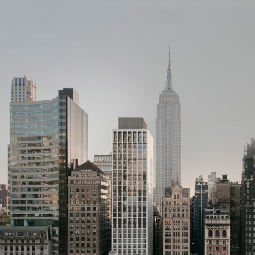
British architect David Chipperfield's latest New York project is The Bryant, a 32-storey mixed-use concrete skyscraper in Midtown Manhattan.

David Chipperfield Architects undertook the project for New York-based developers HFZ Capital Group.

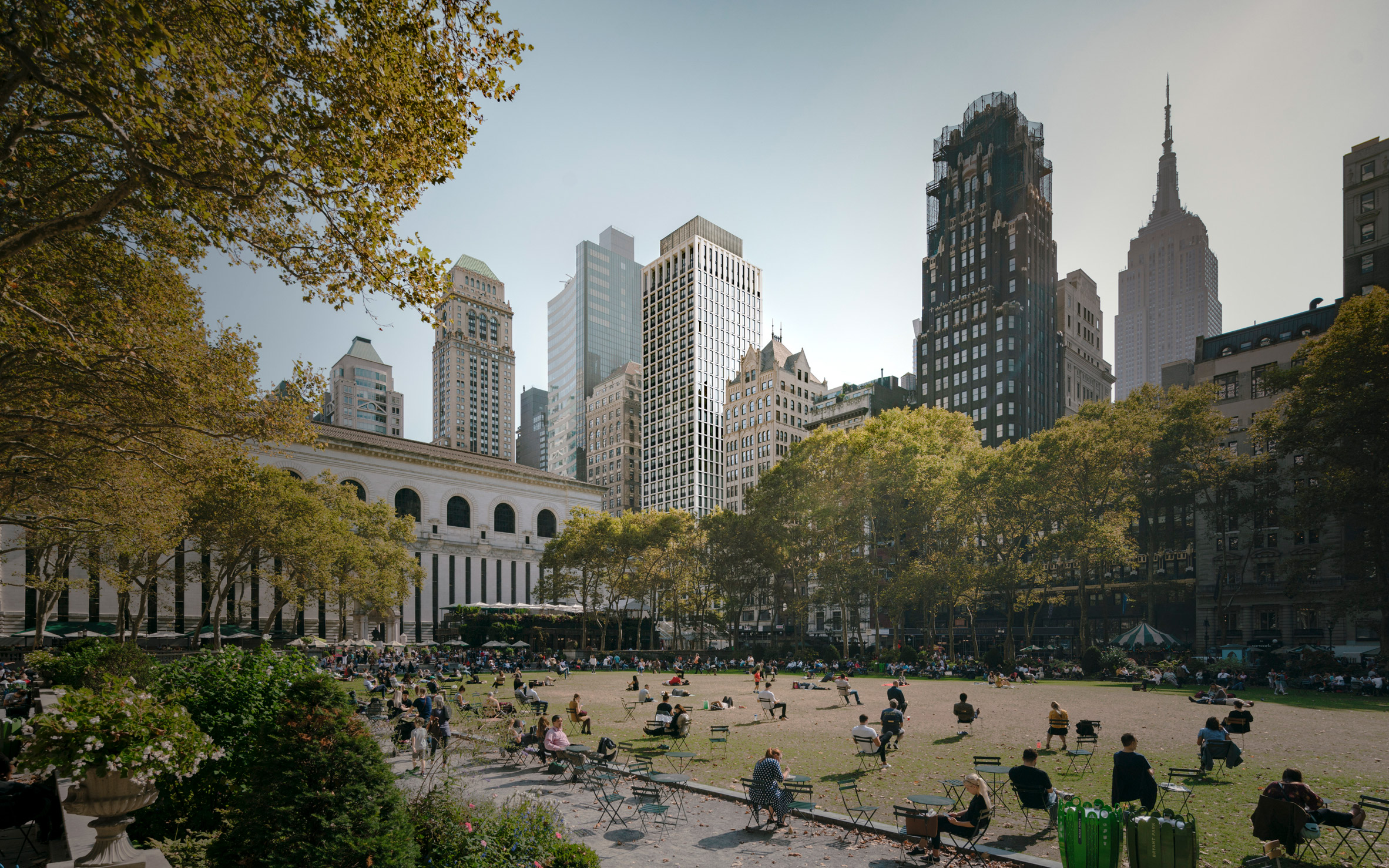
The skyscraper overlooking Bryant Park in Midtown Manhattan
The skyscraper overlooks Bryant Park

The 402-foot-high (123 metres) building overlooks Bryant Park and the New York Public Library. In 2001, the practice renovated the Bryant Park Hotel in the American Radiator Building next door.

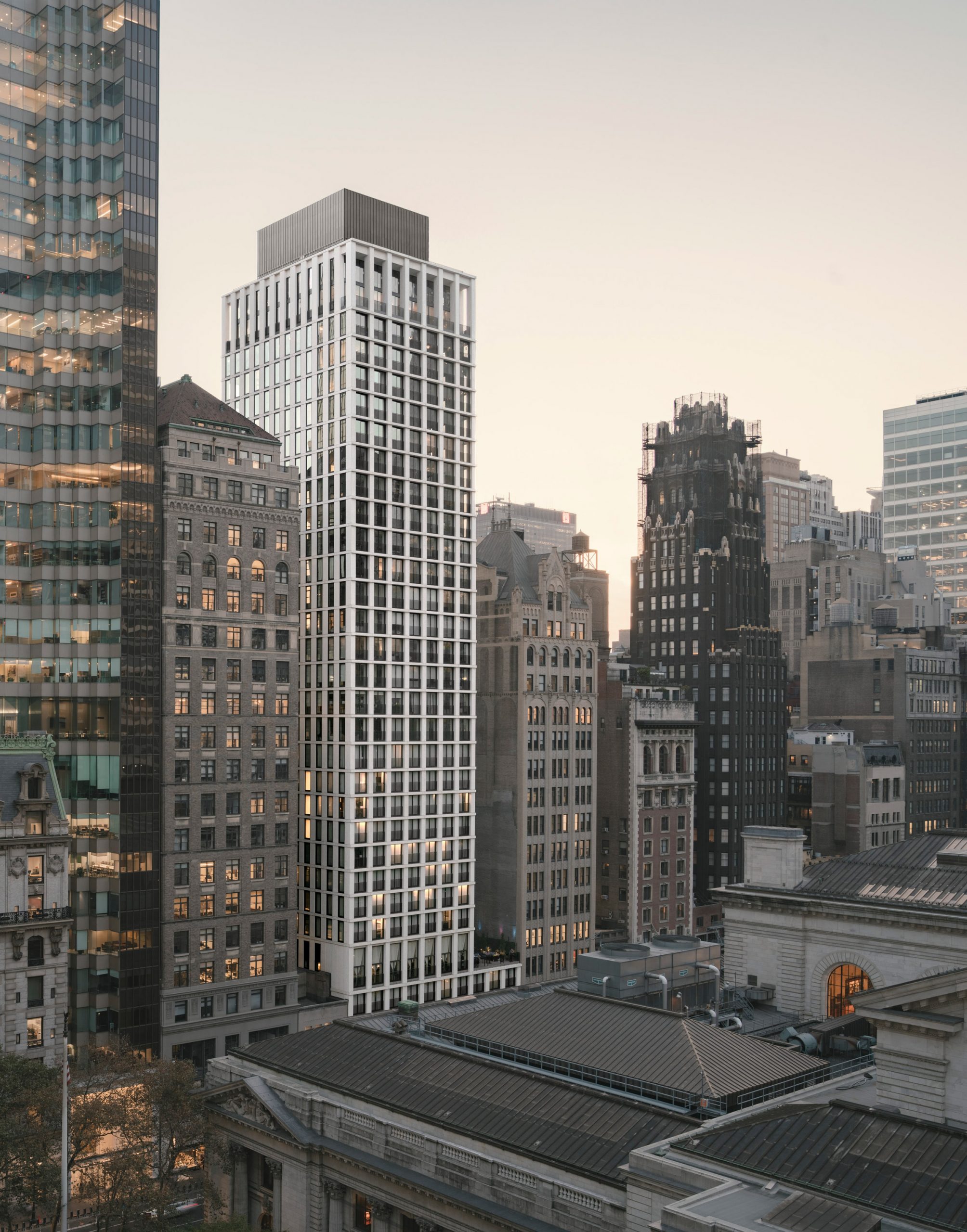
A hotel occupies the levels up to the 14th floor of The Bryant, with private apartments taking up the other 18 storeys.

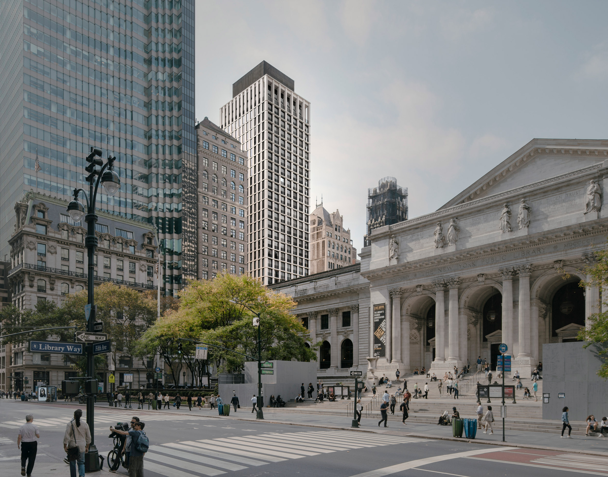
The Bryant visible behind the New York Public Library.
The New York Public Library is nearby

There are two separate lobbies for each use on the double-height ground floor, along with two retail units.

The Bryant has a base that fills the plot and steps back after a few levels, to create an outdoor rooftop terrace on one side of the building.

Facade of The Bryant by David Chipperfield
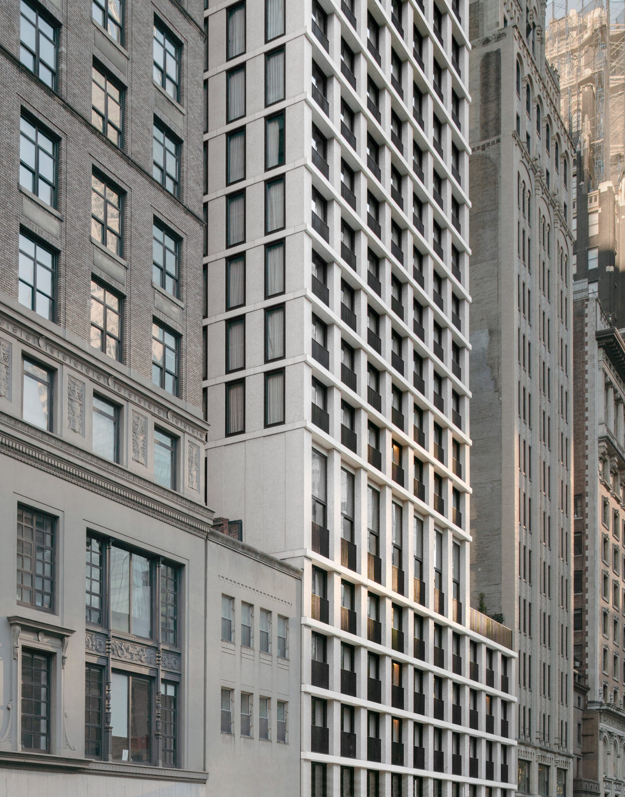
The concrete facade is a "contemporary interpretation" of the local landmarks

At the very top is a crown, stepped back even further and containing two penthouses with private terraces.

Due to its location near the library and the Beaux-Arts style Knox Building, David Chipperfield Architects had to make sure the concrete facade did not look out of place.

"The facade relates to the historic buildings nearby, offering a contemporary interpretation," said the practice.

"The concrete mix contains different aggregates identical to the stone varieties found in the neighbouring buildings' masonry facades."

Upper level of the skyscraper steps back
A rooftop terrace occupies the step back

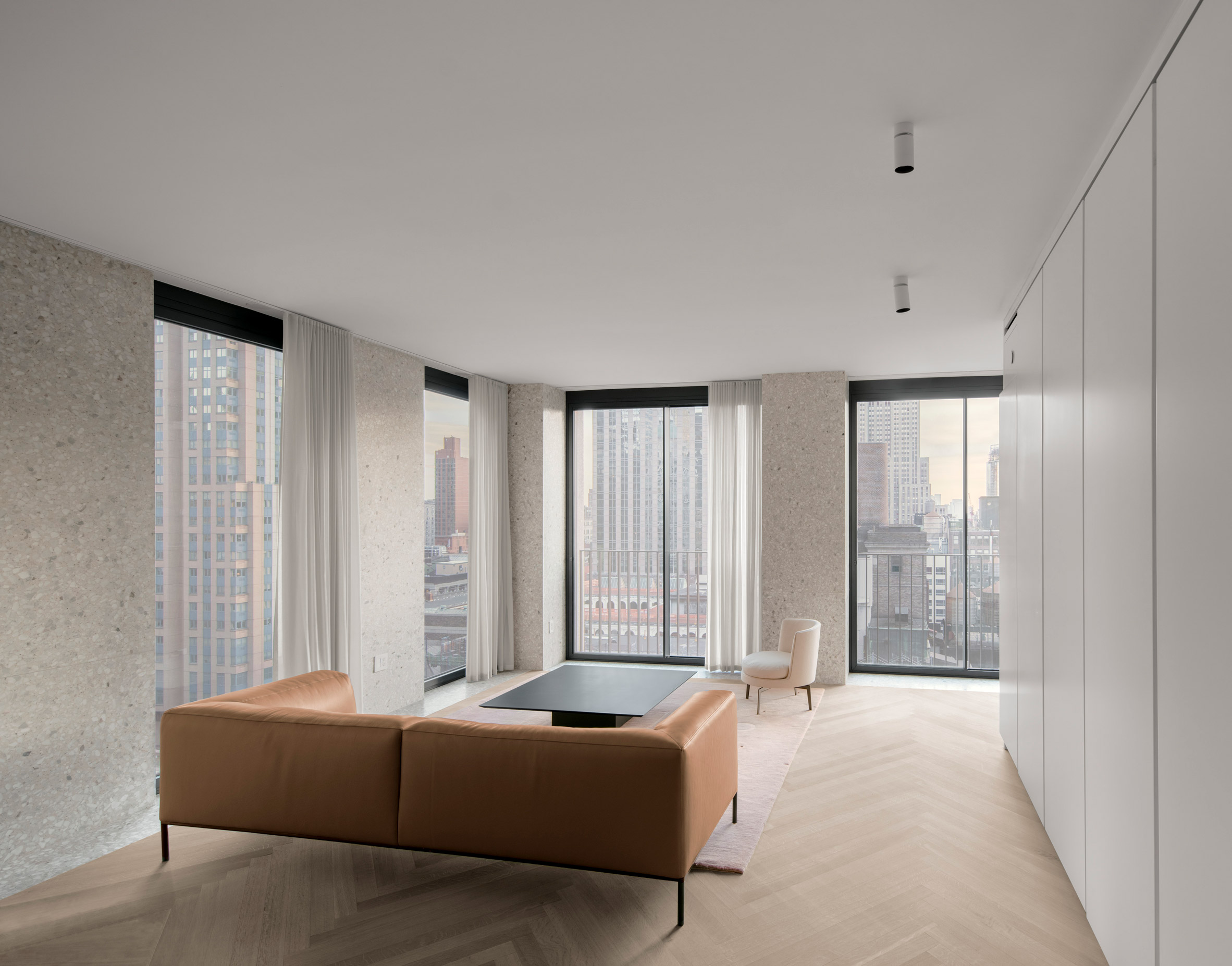
This concrete continues as terrazzo walls in the interiors of The Bryant, where the apartments feature floor-to-ceiling windows.

To keep the perimeter free and maximise the views, built-in furniture is designed to hide appliances and provide discreet storage.

Terrazzo interiors of The Bryant by David Chipperfield
Terrazzo and floor-to-ceiling windows in the apartment interiors

Selected apartments have already been dressed, including one on the 24th floor by curatorial firm Standard Arts and another by the online design retailer Radnor.

David Chipperfield, who founded his eponymous practice in the UK, is the recipient of both the RIBA Stirling Prize and the Mies van der Rohe Award.

The studio recently completed another residential project in New York – a red concrete and brick apartment block in Greenwich Village.

Photography is by Simon Menges.


Project credits:

Client: HFZ Capital Group
Architect: David Chipperfield Architects London
Project director: David Chipperfield, Billy Prendergast
Project architect: Mattias Kunz
Project team: Mira Abad, Pau Bajet, Gonçalo Baptista, Kleopatra Chelmi, Florian Dirschedl, Gabriel Fernandez-Abascal, Micha Gamper, Ines Gavelli, Maria Giramé, Christopher Harvey, Johannes Leskien, Nic Moore, Sergio Pereira
Contact architect: Stonehill & Taylor Architects
Lighting consultant: George Sexton Associates
Acoustic consultant: Shen Milsom & Wilke
Structural engineer: Severud Associates Consulting Engineers
Services engineer: Corcoran Sunshine
Real estate consultant: Vidaris
Facade consultant Contractor: T.G. Nickel & Associate

The post The Bryant concrete skyscraper by David Chipperfield completes in New York appeared first on Dezeen.


from Dezeen https://ift.tt/3u0vKI1

The Pulse episode six to explore "digital twins" phenomenon

Digital rendering by Buildmedia

Dezeen promotion: the sixth episode of Epic Games' discussion series The Pulse will delve into the fast-growing world of digital twins, and its impact on the future of architecture and construction.

The talk, organised by Epic Games' 3D creation tool Unreal Engine, is titled Digital Twins: Building Cities of the Future and will take place 5 May 2021 at 8PM UK time (12PM PDT).

Digital twins are virtual representations of physical objects or processes, like buildings, that serve as their real-time digital counterparts.

Digital rendering by Buildmedia
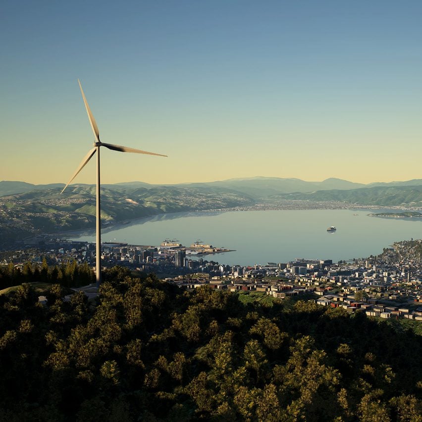
These images show a GIS accurate real-time digital twin model of Wellington City, New Zealand, running in Unreal Engine 4

Made possible through real-time rendering, they are increasingly being used across the architecture, engineering and construction (AEC) industries.

The panel discussion will cover in more detail what digital twins are – and are not – as well as how they can aid in large-scale decision making, prevent costly mistakes, and play a role in improving infrastructure.

For Digital Twins: Building Cities of the Future, AEC influencer Fred Mills will be joined by speakers Salla Pallos of Microsoft, Tim Johnson of Buildmedia, and David Weir-McCall of Epic Games.

Digital rendering by Buildmedia
Digital twins are increasingly being used in the architecture, engineering and construction industries

"The advent of real-time rendering has brought digital twins within reach for a variety of projects for the first time," said the organisers. "Join these industry experts as they explore the many ways that digital twins will help us build better cities for tomorrow, and make sure to stay for the live Q&A at the end."

The discussion will be the latest in a series titled The Pulse, which comprises video interviews and talks that explore the latest thinking on interactive 3D technology.

Previous episodes of The Pulse have encompassed virtual spaces, the next-gen gaming revolution and real-time filmmaking. Watch them on-demand here.

Digital rendering by Buildmedia
The Pulse episode six will discuss the benefits of digital twins, like this one, in more detail

To take part in Digital Twins: Building Cities of the Future, register here and submit any questions for the host and guests to answer during the live Q&A.

Images are courtesy of Buildmedia.


Partnership content

This article was written by Dezeen for Unreal Engine as part of a partnership. Find out more about Dezeen partnership content here.

The post The Pulse episode six to explore "digital twins" phenomenon appeared first on Dezeen.


from Dezeen https://ift.tt/3u0AmOD

Rogers Stirk Harbour + Partners designs Shenzhen airport terminal with "natural environment at its heart"

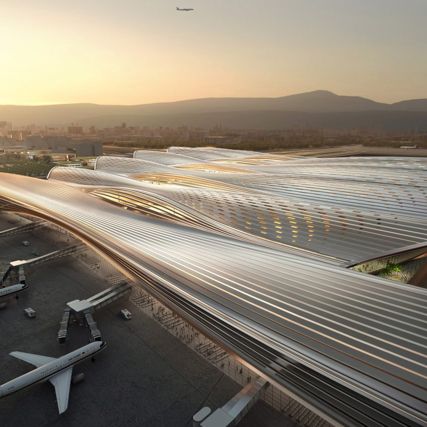
The terminal has a sweeping roof by Rogers Stirk Harbour + Partners

Architecture studio Rogers Stirk Harbour + Partners has designed a terminal for an airport in Shenzhen, China, that will be arranged around a large covered garden.

The 400,000 square-metre terminal will be an extension to Shenzhen Bao'an International Airport and is designed to handle 31 million visitors a year.

The building will have a streamlined form with an undulating, sweeping roof that emulates the pattern of airflow.

Airport will be built around central garden

Rogers Stirk Harbour + Partners' terminal will include a central 10,000-square-metre garden that was designed to act as a "front door" to the city of Shenzhen.

"The design concept has at its heart a 10,000 square-metre central garden space, the size of 40 tennis courts," said Rogers Stirk Harbour + Partners partner Andrew Tyley.

"The garden acts as the front door to Shenzhen connecting and integrating ground and air travel."

According to the studio, the terminal will include vast green spaces and landscaped walkways to promote wellbeing.

"It is a building where passengers' wellbeing and pleasure are at the heart of the design," said Rogers Stirk Harbour + Partners senior partner Ivan Harbour.

"This is an airport that celebrates the hellos and goodbyes in a natural environment at its heart," he continued.

"These are the emotional moments that, despite the ever-increasing speed of our daily lives, remain important to us as individuals."

The terminal hopes to become a landmark

The terminal was developed in collaboration with China Northeast Architectural Design & Research Institute as part of an international competition.

According to the Rogers Stirk Harbour + Partners, the building will attempt to meet sustainability goals through its compact form, control of solar gain, low water use, and the harvesting of rainwater.

Grimshaw Architects have also designed a transport hub for the Shenzhen Bao'an Airport that will accommodate highspeed rail and other transport systems.

Elsewhere in Shenzhen, a music conservatory enveloped in decorative louvres designed by EMBT  along with a 700 metre-long university building designed by Dominique Perrault Architects is being built as part of a city-wide development for 10 new cultural buildings that form part of the Shenzhen Ten Cultural Facilities of New Era masterplan.

The post Rogers Stirk Harbour + Partners designs Shenzhen airport terminal with "natural environment at its heart" appeared first on Dezeen.


from Dezeen https://ift.tt/3xxMGbe

New Modern table system by Tiptoe

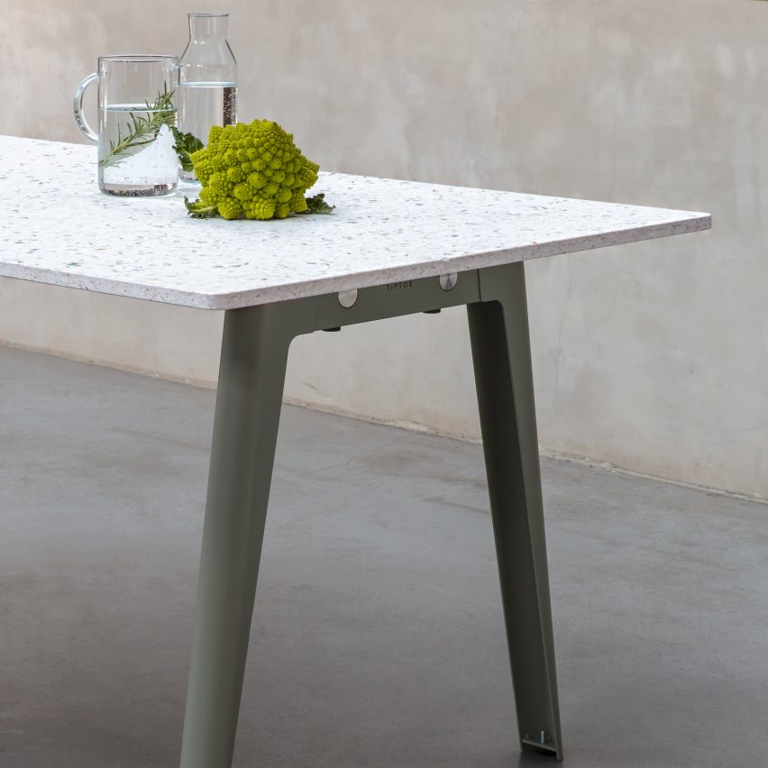
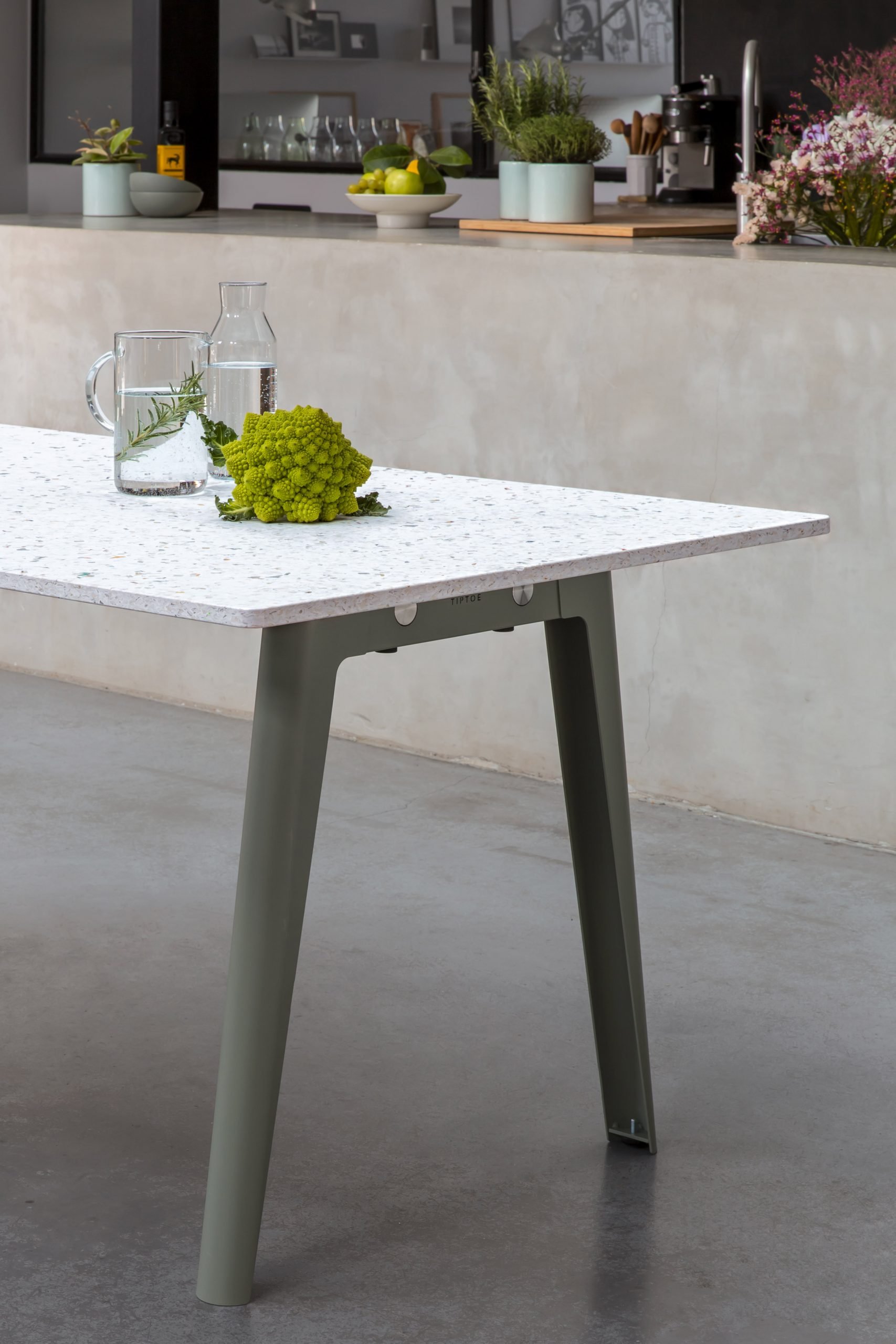
New Modern table with a recycled plastic top and eucalyptus green legs by Tiptoe

Dezeen Showroom: French furniture brand Tiptoe has released a modular table system called New Modern that allows the same trestle-style legs to be paired with a range of different worktops.

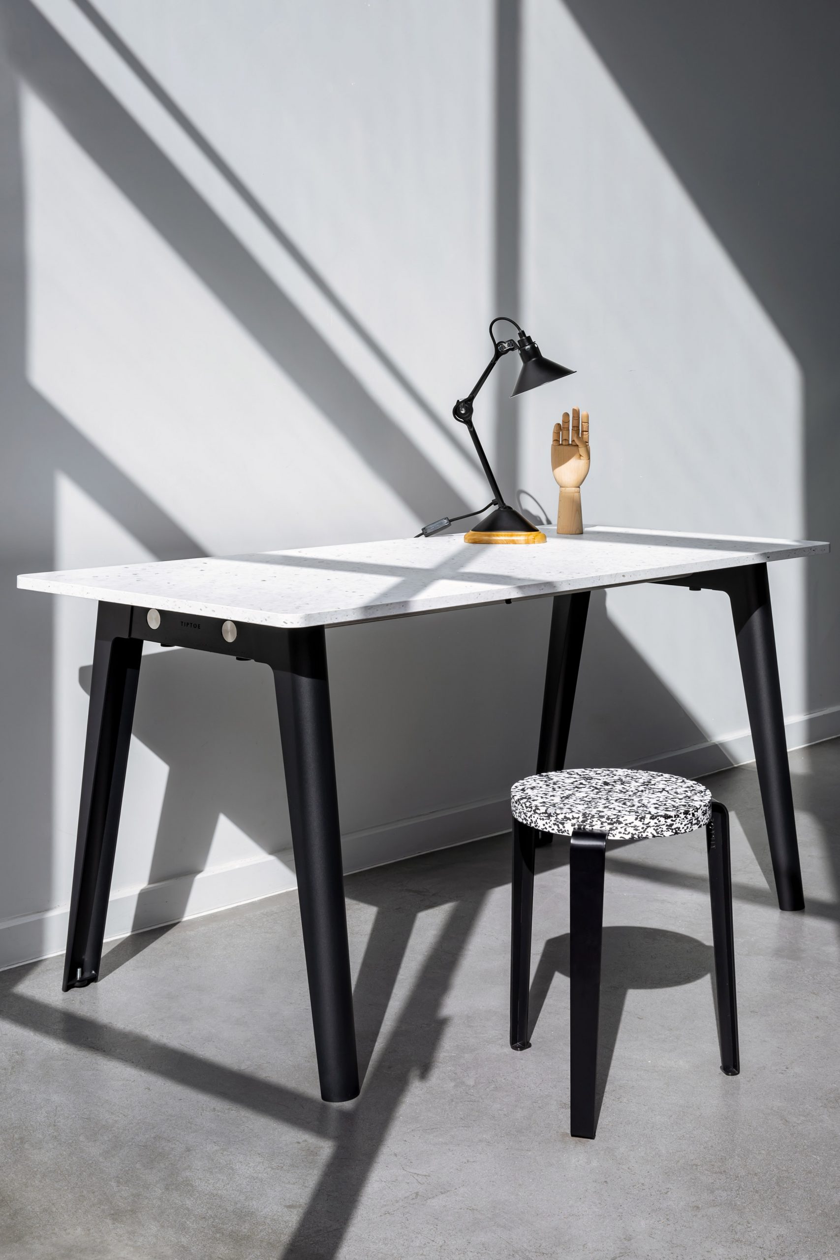
Each item in the New Modern range is composed of two colourful steel leg units that are connected via two stainless steel support bars.

These allow different tabletops to be screwed in from below to form everything from a round dining table to a desk and a 2.2-metre-long, 12-person banquet table, which is supported by an additional crossbar in the centre.

According to Tiptoe, the collection was designed as a contemporary take on modernism.

"The name New Modern is a tribute to the modernist movement that profoundly marked the history of architecture and furniture design from the 50s to the 80s, with the making of minimal, beautiful, highly functional and long-lasting furniture," said the brand.

The tops themselves are either rendered in FSC-certified pinewood with different-coloured oak veneer, or in a terrazzo-like recycled plastic made from hundreds of discarded yoghurt pots.

New Modern table with a recycled plastic top and eucalyptus green legs
The tables are also available with tops made from recycled plastic

The steel legs can be powder-coated in five different finishes – Cloudy White, Graphite Black, Rosemary Green, Eucalyptus Grey and Ash Pink – which are the brand's bestsellers.

Like all of Tiptoe's products, the New Modern range is manufactured entirely in Europe with a mind to keeping production as sustainable as possible.

Desk by Tiptoe with black trestle-style legs and a recycled plastic top
The New Modern range includes desks as well as a range of different dining tables

Beyond using responsibly sourced, recycled or recyclable materials, its simple construction allows parts to be easily repaired or replaced to extend the products' lifetime.

To reduce the plastic waste and carbon emissions associated with transport, the New Modern range is shipped flat-packed in at least 80 per cent recycled paper.

Product: New Modern table system
Brand: Tiptoe
Contact: hello@tiptoe.fr

About Dezeen Showroom: Dezeen Showroom offers an affordable space for brands to launch new products and showcase their designers and projects to Dezeen's huge global audience. For more details email showroom@dezeen.com.

Dezeen Showroom is an example of partnership content on Dezeen. Find out more about partnership content here.

The post New Modern table system by Tiptoe appeared first on Dezeen.


from Dezeen https://ift.tt/3gM6r98

Plaff-on! outdoor wall light by Joan Gaspar for Marset

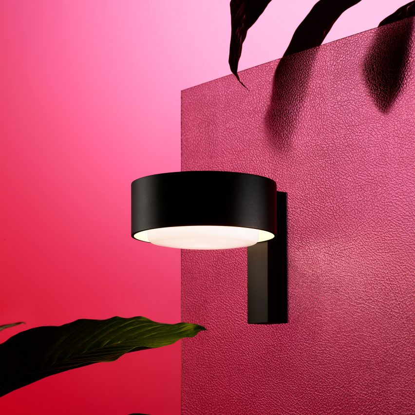
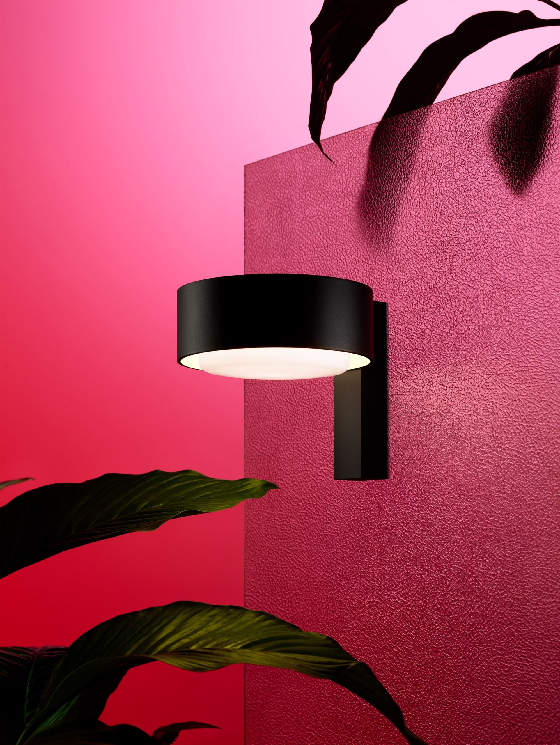
Plaff-on! outdoor wall light by Joan Gaspar for Marset

Dezeen Showroom: Marset has expanded its Plaff-on! collection, first created by industrial designer Joan Gaspar as a range of indoor lighting in 2010, with the addition of a minimal outdoor wall light.

Unlike the original, circular Plaff-on! light – which fixed flat to the wall – the new outdoor sconce features a mount that holds it perpendicular to the floor.

Plaff-on! outdoor wall light
The wall light has a perpendicular mount

This allows the light to project straight downwards, as well as allowing it to escape through the open top.

As all designs in the range, the Plaff-on! wall light has a blown-glass diffuser that seems to hover detached from its surrounding aluminium body.

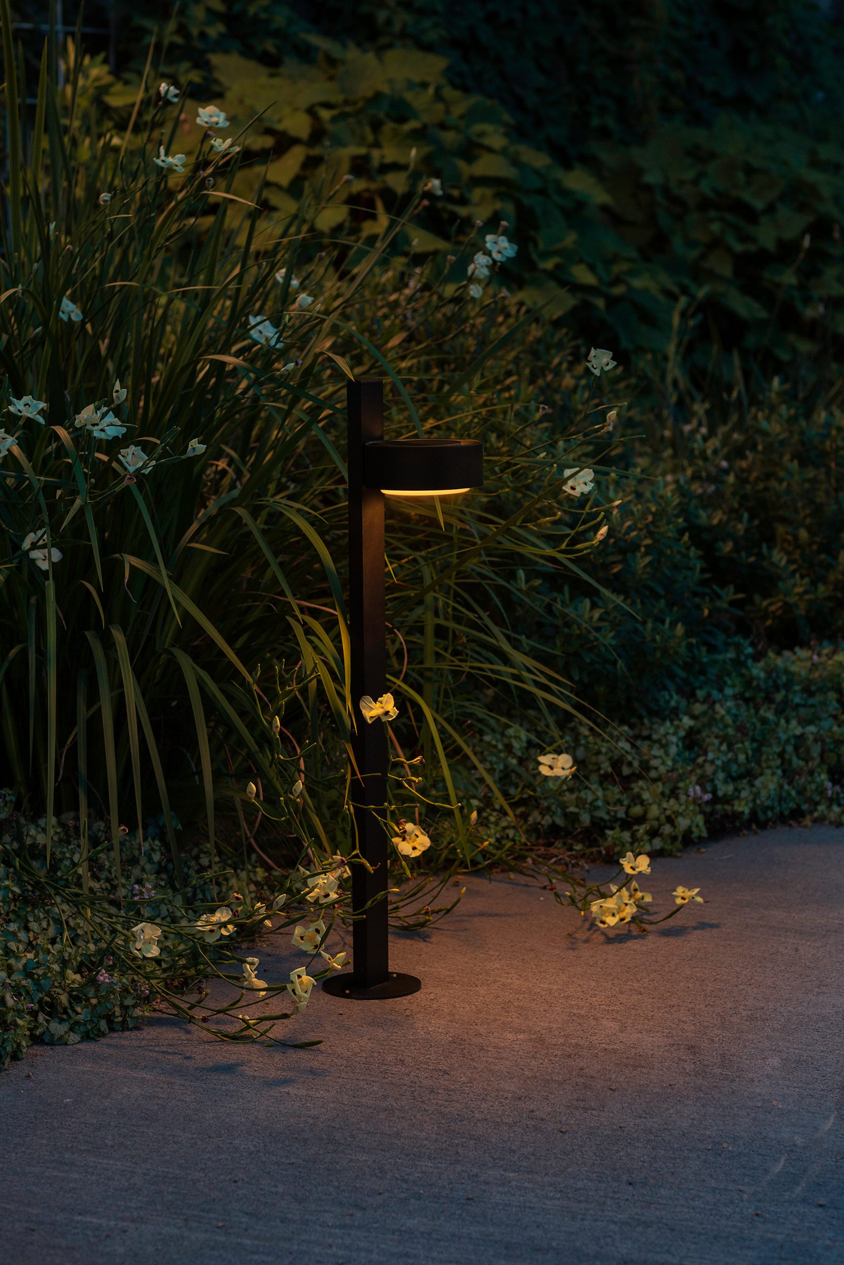
Outdoor bollard by Joan Gaspar for Marset
The Plaff-on! outdoor collection also includes a bollard

It joins an outdoor collection that also includes the Plaff-on! bollard, and the original ceiling and wall light that Gaspar designed more than a decade ago, and are now available in new 33- and a 50-centimetre versions.

Product: Plaff-on! outdoor wall light
Designer: Joan Gaspar
Brand: Marset
Contact: info@marset.com

About Dezeen Showroom: Dezeen Showroom offers an affordable space for brands to launch new products and showcase their designers and projects to Dezeen's huge global audience. For more details email showroom@dezeen.com.

Dezeen Showroom is an example of partnership content on Dezeen. Find out more about partnership content here.

The post Plaff-on! outdoor wall light by Joan Gaspar for Marset appeared first on Dezeen.


from Dezeen https://ift.tt/3dXbyBi

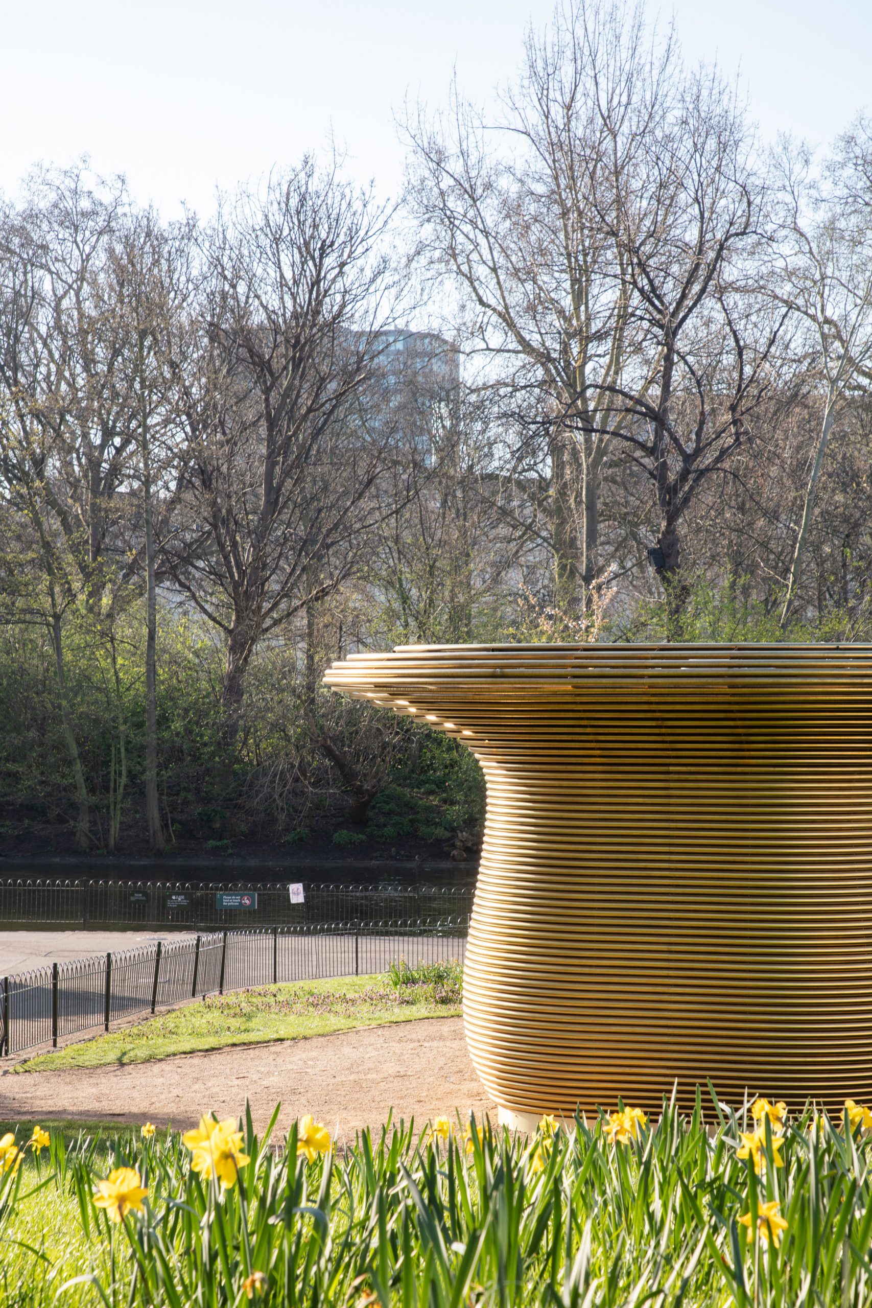
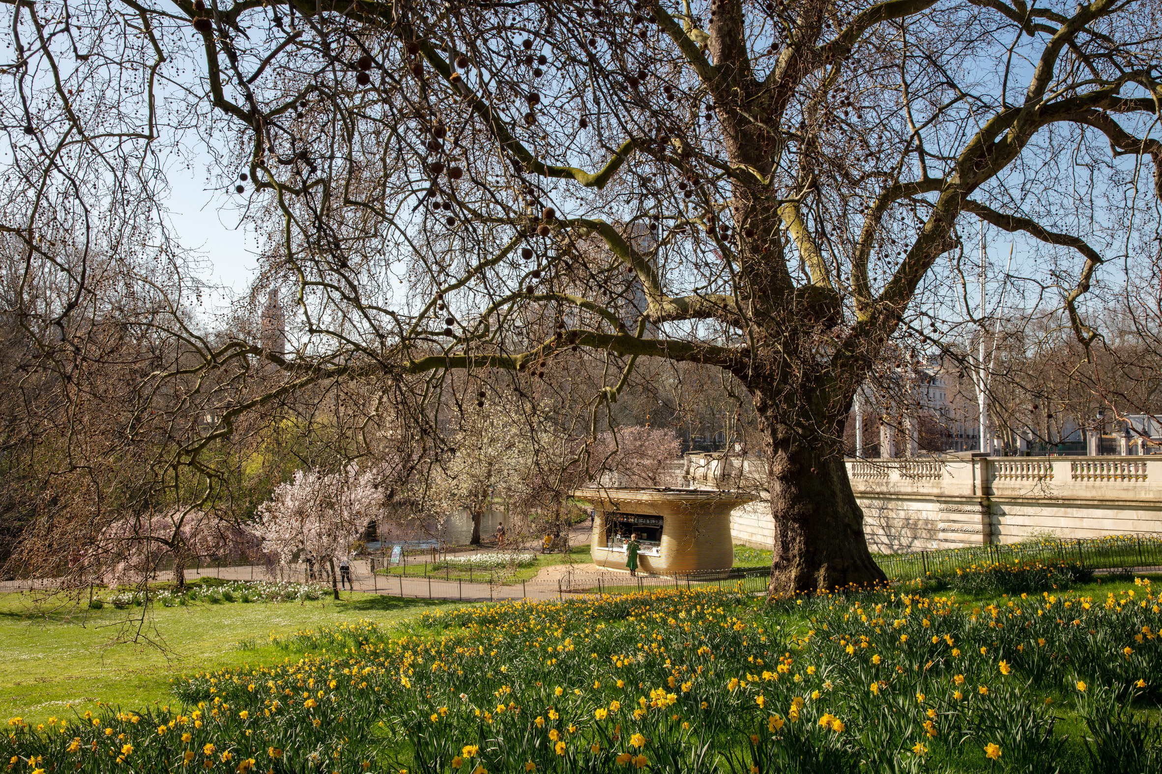
Mizzi Studio builds coffee kiosk with "a sense of nobility" alongside Buckingham Palace

Coffee stand near Buckingham Palace by Mizzi Studio

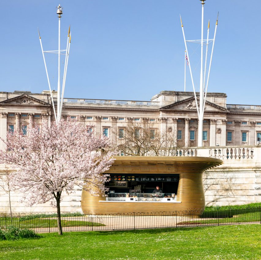
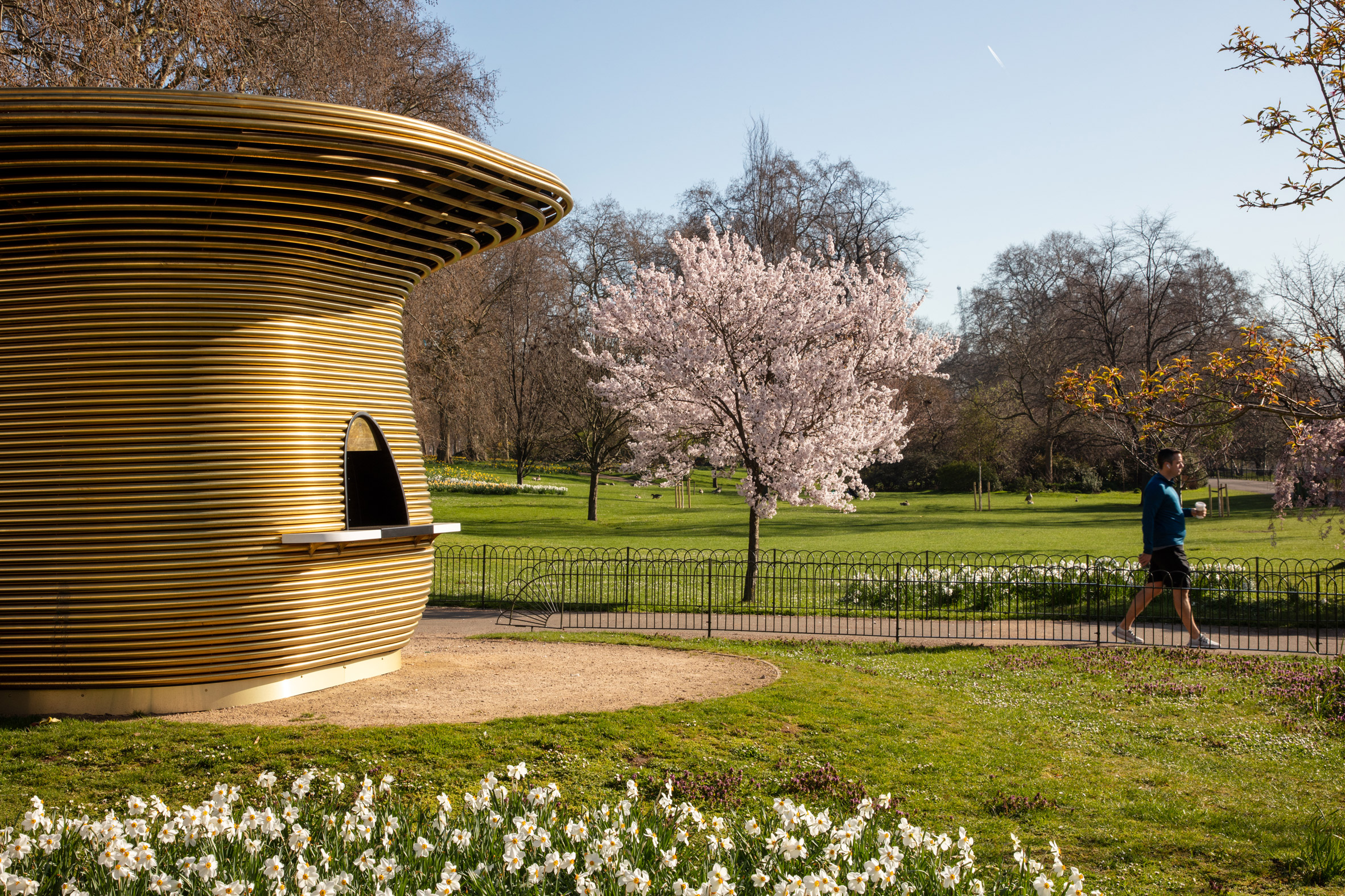
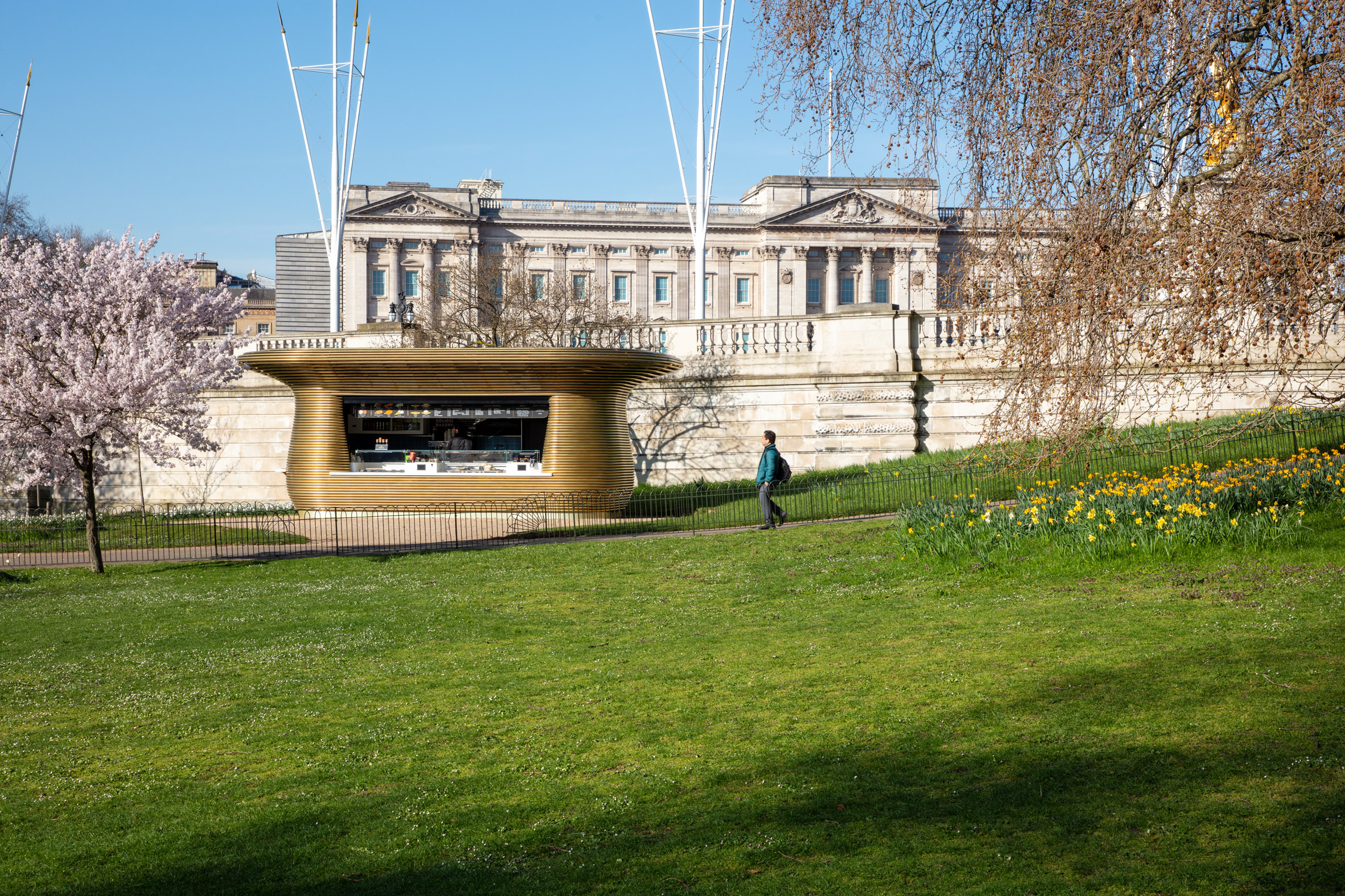
Design practice Mizzi Studio has designed a brass coffee kiosk next to Buckingham Palace as part of a series of drinks stands placed throughout London's Royal Parks.

Built in St James's Park close to the Buckingham Palace royal residence, the Horseshoe Bend Kiosk is one of nine pavilions designed by the studio to replace dated structures in central London.

To mark its prominent position alongside the royal palace, Mizzi Studio wrapped the kiosk in bands of brass to give it a golden appearance.

Coffee kiosk in St James's Park
Mizzi Studio designed a drinks stand next to Buckingham Palace

"The Horseshoe Bend Kiosk is the finale of the fleet's design – it takes the fundamental DNA of the rest of the kiosks and adds a sense of nobility," said Mizzi Studio founder Jonathan Mizzi.

"Its position beneath the palace allows for this amplification," he told Dezeen. "We wanted to create a lustrous, eye-catching footer to a building that is already so ingrained in people's minds."

Coffee stand near Buckingham Palace by Mizzi Studio
The stand is wrapped in tubular steel

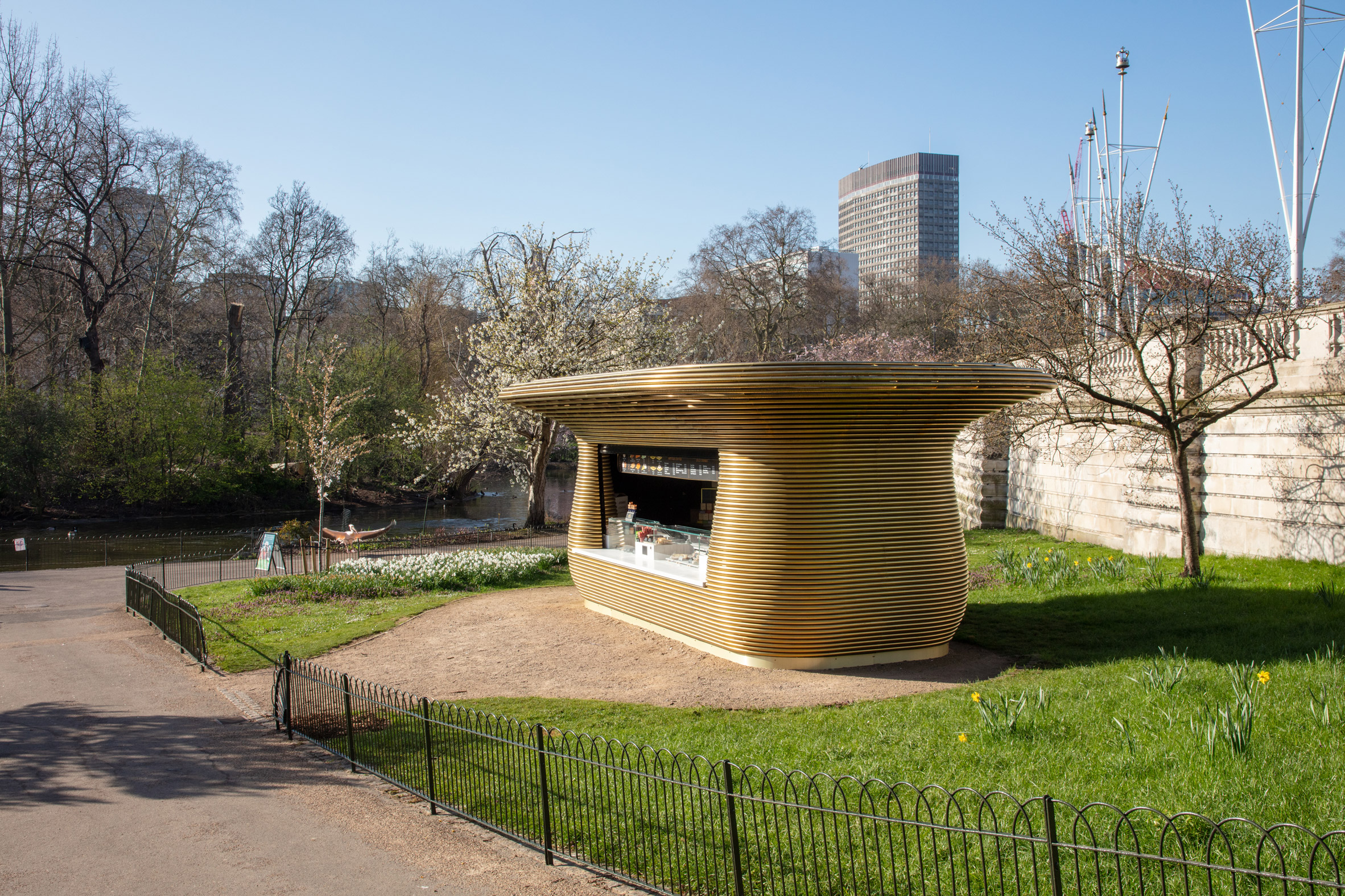
The kiosk has a curved form that matches the other eight pavilions that have been erected across Hyde Park, St James's Park and Green Park.

However, unlike the other kiosks, which were enclosed in steam-bent English oak designed in collaboration with British designer Tom Raffield, the Buckingham Palace kiosk is wrapped in tubular brass.

Golden drinks stand in St James's Park
The kiosk has a curved form

"The crucial difference is its material – the kiosk's cladding is formed out of brass as opposed to steam-bent timber like the rest of the units in the fleet," said Mizzi.

"We did this to echo context. The Horseshoe Bend Kiosk mirrors some of the opulence of the Palace, yet it does so in an approachable, inviting way."

Coffee stand in St James's Park
It is in St James's Park

Built to house a coffee, food and drink kiosk operated by cafe operator Colicci, the stand has a large serving opening at its front as well as a small hatch on the side.

The curved form, which was derived from the shape of the park's trees, forms a small canopy over the serving hatches.

"We wanted to create a series of kiosks that didn't only work as refreshment pit-stops, but as bold, wayfinding landmarks, so we created designs for a fleet of functional, tree-like sculptures," explained Mizzi.

"Their shape, materiality and texture needed to feel organic – an extension of the parks' own ecosystem. For this reason, they take on a natural, bulbous shape, with a canopy that curves up and outwards like a tree."

Side hatch
The kiosk has a small hatch on its side

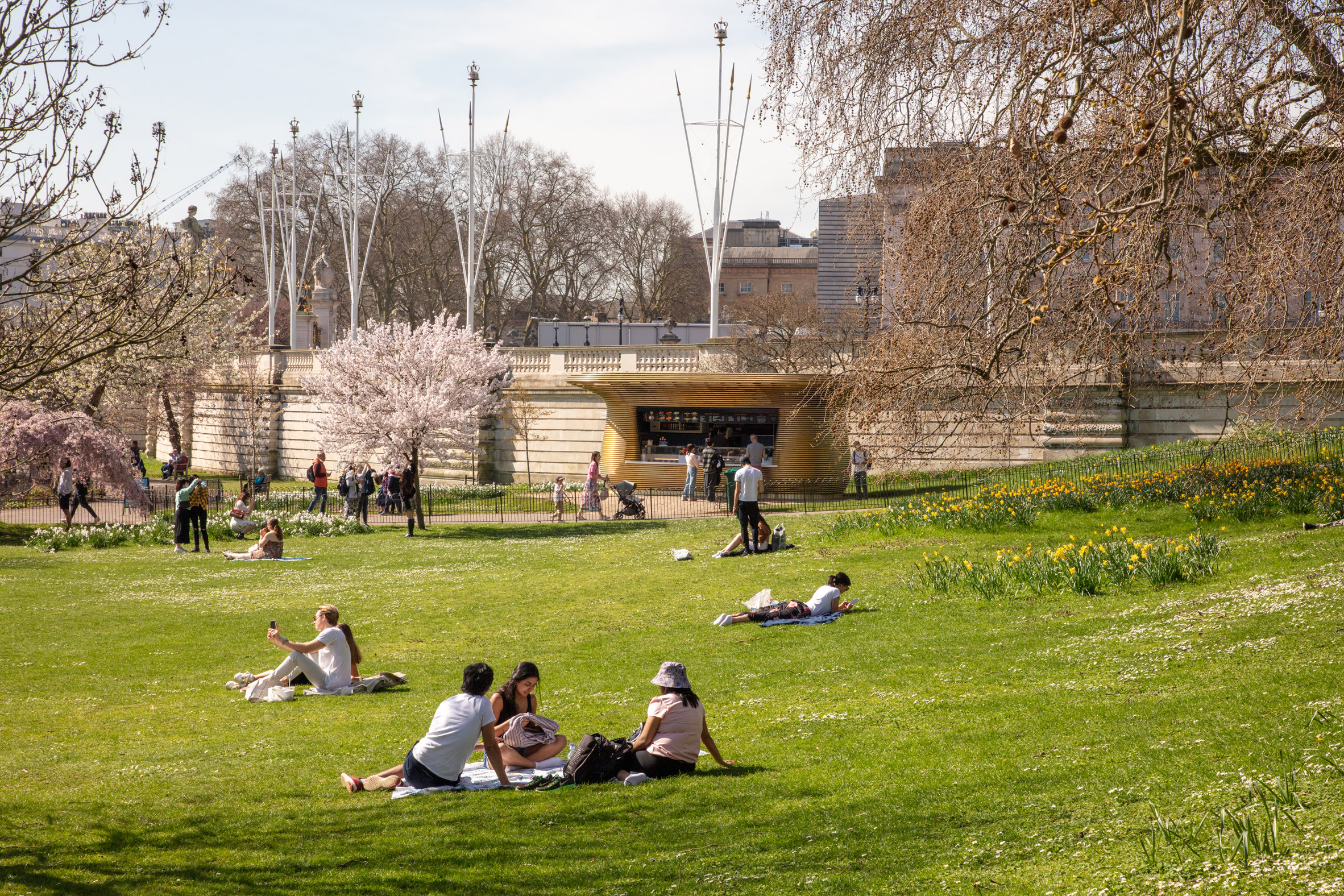
Mizzi hopes that the recently opened pavilion will be enjoyed by Londoners and visitors to the city using the parks, as coronavirus restrictions in the UK ease.

"Right now, we really believe Londoners need their spirit and confidence renewed," he said. "With the weather warming up and restrictions easing, we feel as though this final piece has a role to play in uniting people and building a new sense of joy."

Buckingham Palace coffee stand
It was one of nine stands designed by the studio

"We hope to have created an emblem of a bright, optimistic future," he continued.

"Its location right beside a building that symbolises history and tradition, and the contrast that that brings, adds to the positive impact we hope it will have."

Along with the nine coffee kiosks, Mizzi Studio also designed a cafe with a roof shaped like a stingray alongside the Serpentine lake in Hyde Park.

Photography by Luke Hayes.

The post Mizzi Studio builds coffee kiosk with "a sense of nobility" alongside Buckingham Palace appeared first on Dezeen.


from Dezeen https://ift.tt/3eBeq6a