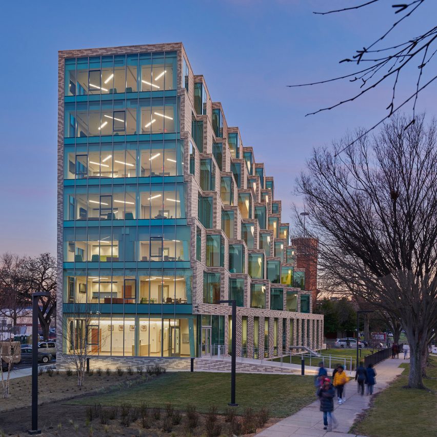
Staggered apartments and semi-enclosed play areas animate the exterior of The Aya, a short-term housing block in Washington DC by US firms Studio Twenty Seven Architecture and Leo A Daly.
The seven-storey building commissioned by the District of Columbia Department of General Services contains temporary homes for up to fifty families in need of emergency shelter in the US capital.
Designed by Studio Twenty Seven Architecture and Leo A Daly to provide "wrap-around services" for residents, the block contains apartments, a dining room and a public health centre.
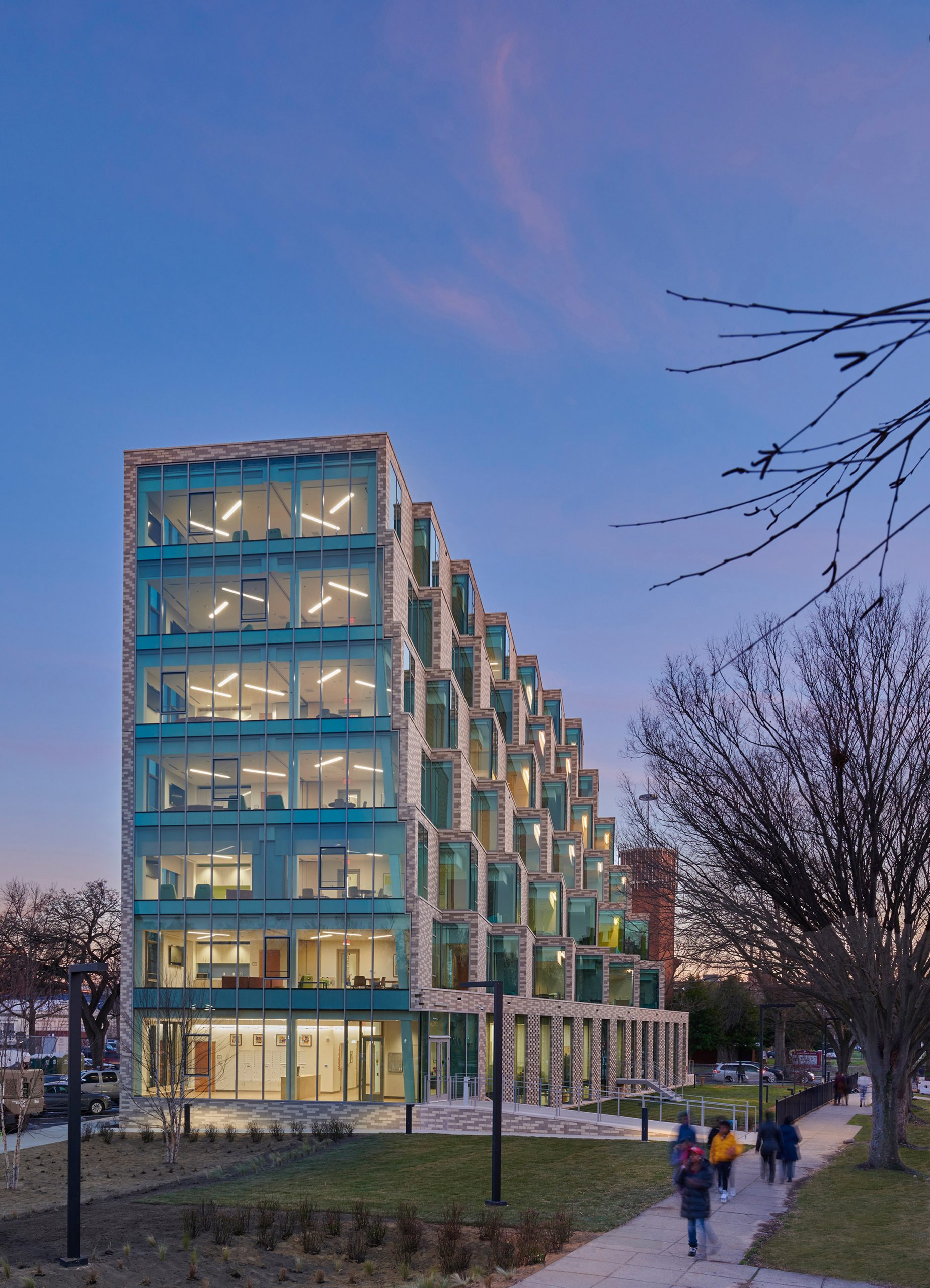
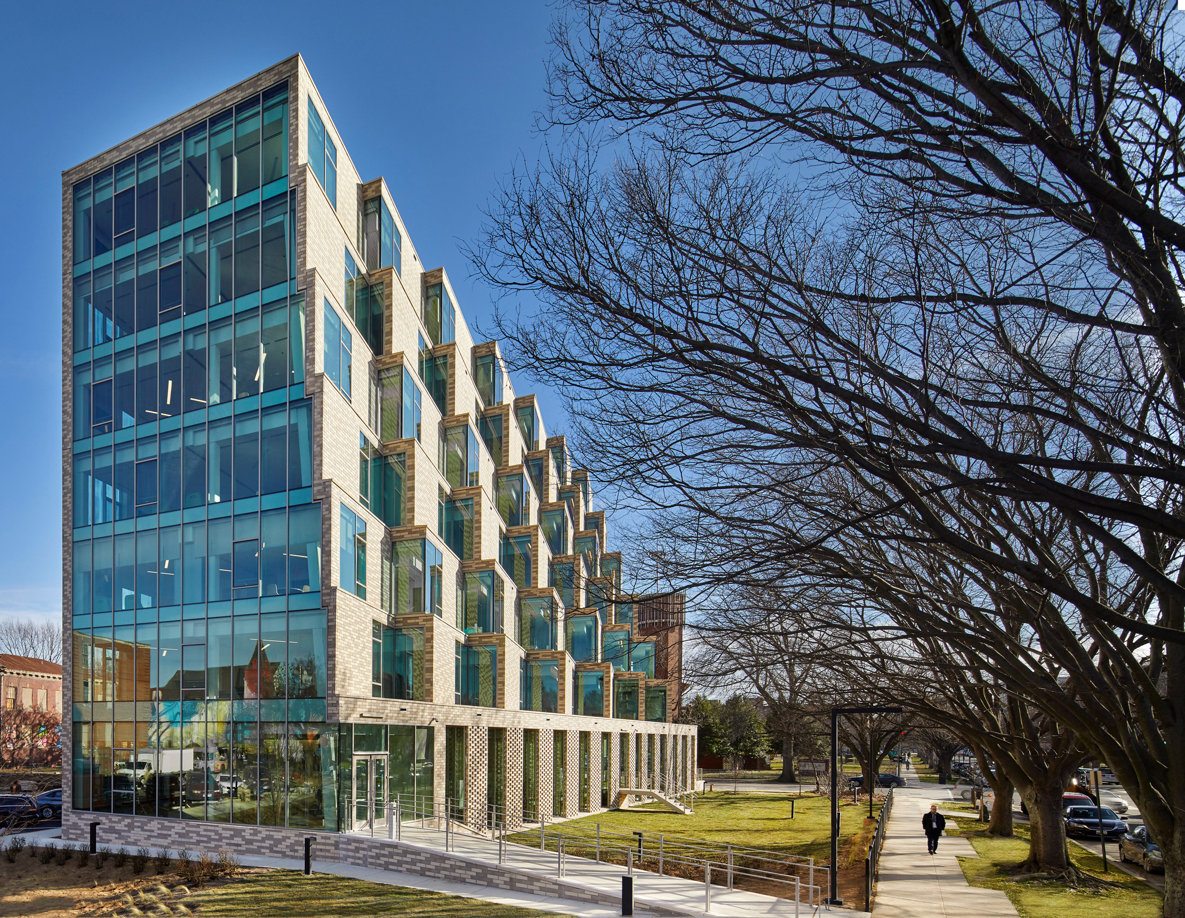
The Aya is characterised by its animated exterior where each facade is unique – meaning there is no front or back to the building.
The facades' designs respond to the internal layout but also help maximise natural light inside, prevent "dead zones" from forming outside and preserve sightlines, trees and green space.
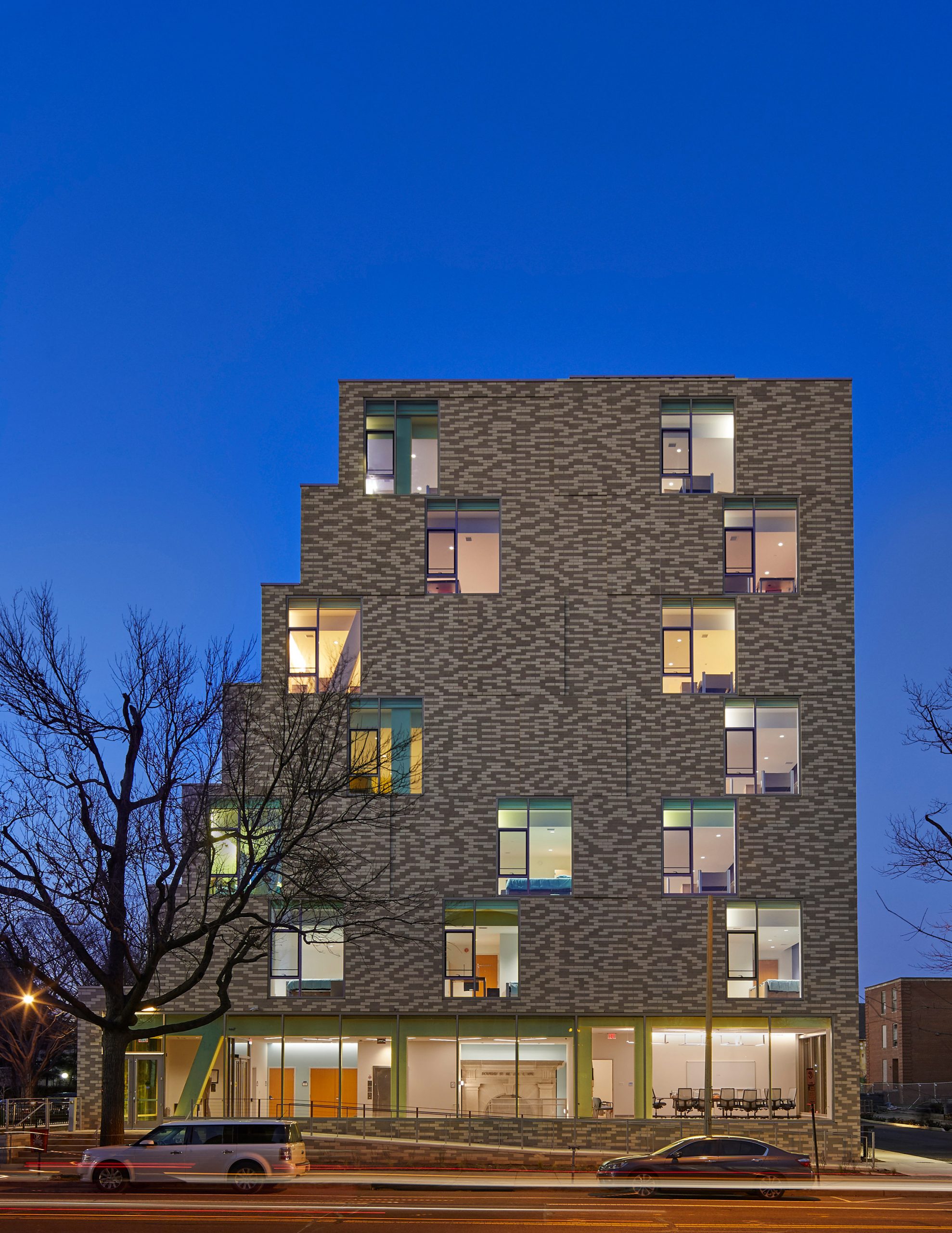
"Each elevation of the building is uniquely different," Studio Twenty Seven Architecture explained.
"The concept is a building that has no front or back and responds to the arterial street viewshed through a ziggurat form that preserves the existing tree canopies and allows for maximum daylighting views to each of the small dwelling units."
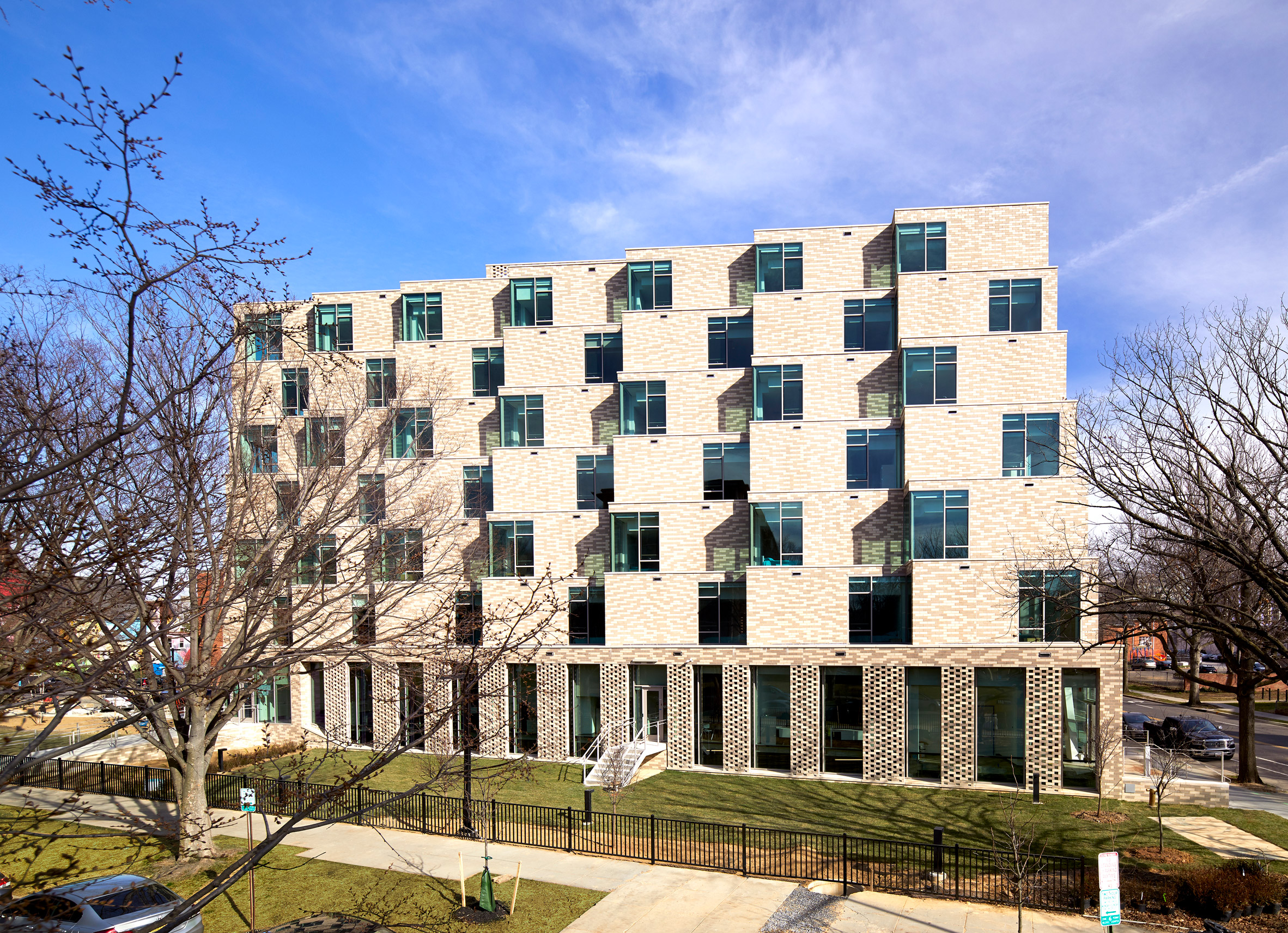
The Aya is one of eight short-term family housing blocks being constructed in each of Washington DC's neighbourhoods to help combat homelessness in the city.
Its footprint is modelled on a dilapidated 1940's health centre that previously occupied the site, while its height relates to the surrounding buildings.
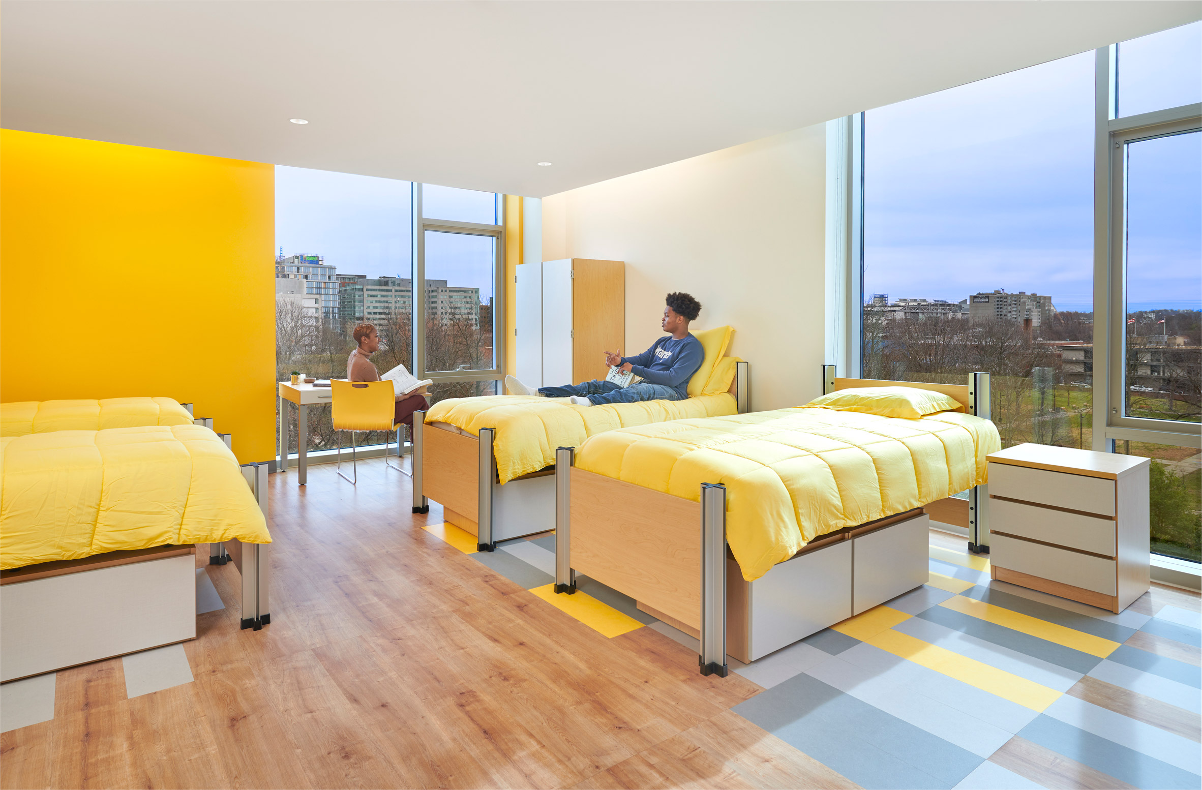
Inside there are between seven and ten apartments per level, alongside community spaces, laundry facilities and a mix of private and family bathrooms.
A dining area, computer room, exam room and administrative facilities occupy the ground floor, while a basement contains a public health centre to replace the original one on the site.
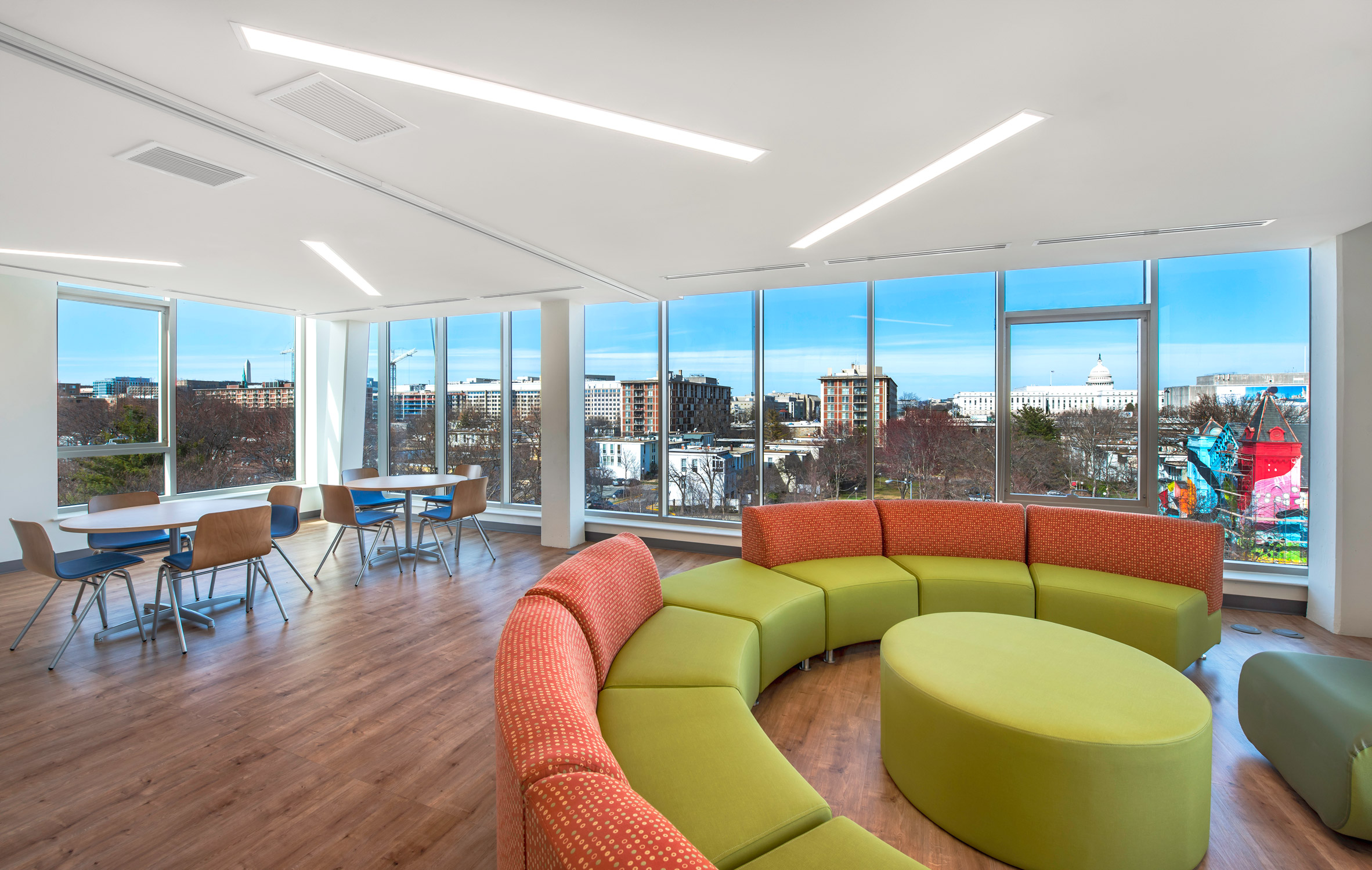
The community areas on each floor are positioned on the north side of the building, marked by an open, glazed facade that frames views towards the US Capitol building.
Residences are positioned behind the predominantly bricked east and west sides.
To the west, the apartments are staggered to give rise to a stepped facade – described by the studio as a "ziggurat" – which maximises natural light inside.
These stepped units also incorporate a small green roof, designed by the studio to "imply a front lawn" for the apartment that looks onto it.
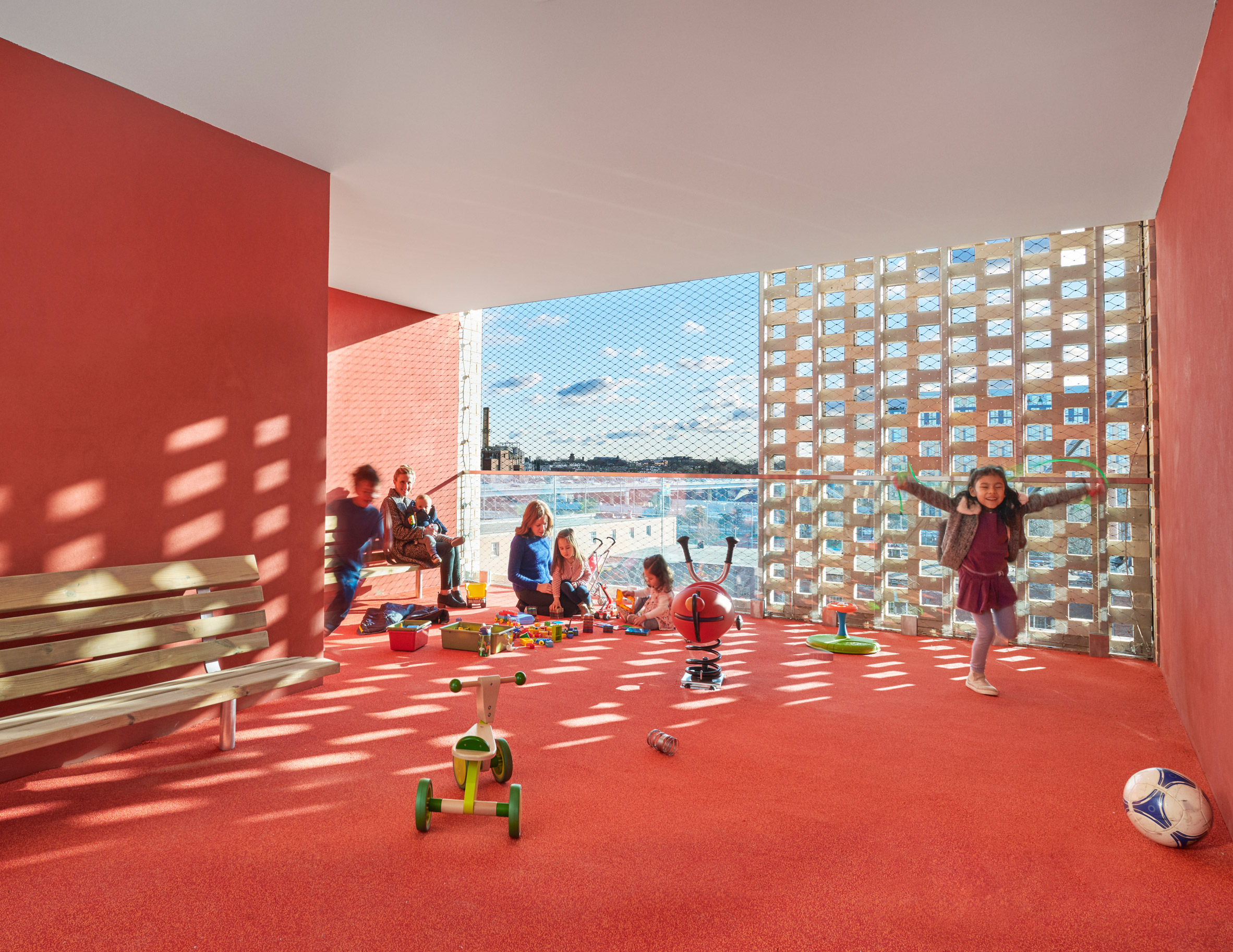
On the east, the brick facade is punctured by large windows and screened outdoor play spaces on each floor. These ensure children do not have to use the elevators to go outside.
A glass-lined entrance to the health clinic is the focal point of the south facade. This entrance is deliberately separate to the housing to create "daily activity all around the building".
Elsewhere in the US, Michael Maltzan Architecture designed a bright white housing block in the Los Angeles area, which contains over 60 studio apartments for its formerly homeless tenants.
In the UK, Holland Harvey Architects also recently completed a temporary housing block named Shelter from the Storm. It provides 42 beds for homeless people within a disused London supermarket.
Photography is courtesy of Studio Twenty Seven Architecture.
The post Emergency housing block in Washington DC has four "uniquely different" facades appeared first on Dezeen.
from Dezeen https://ift.tt/2Pvew6M
No comments:
Post a Comment