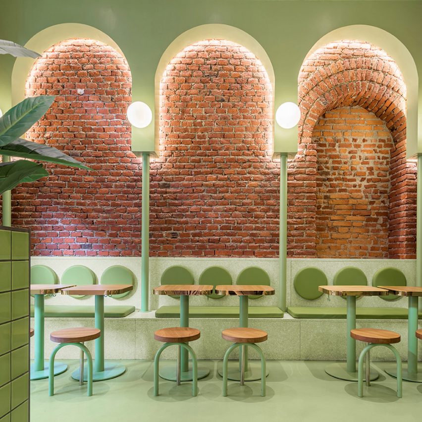
Valencian creative studio Masquespacio has used a lilac and avocado-green colour scheme to create a youthful yet "sophisticated" interior for the Milan outpost of Italian fast food chain Bun.
Located on the Viale Bligny boulevard, the restaurant occupies a space that was formerly home to a pizzeria and sits at the base of a residential building.
"With the design, we tried to get away from the usual aesthetics used for hamburger restaurants, with a much more sophisticated identity but at the same time a fresh and young approach," Masquespacio co-founder Christophe Penasse told Dezeen.
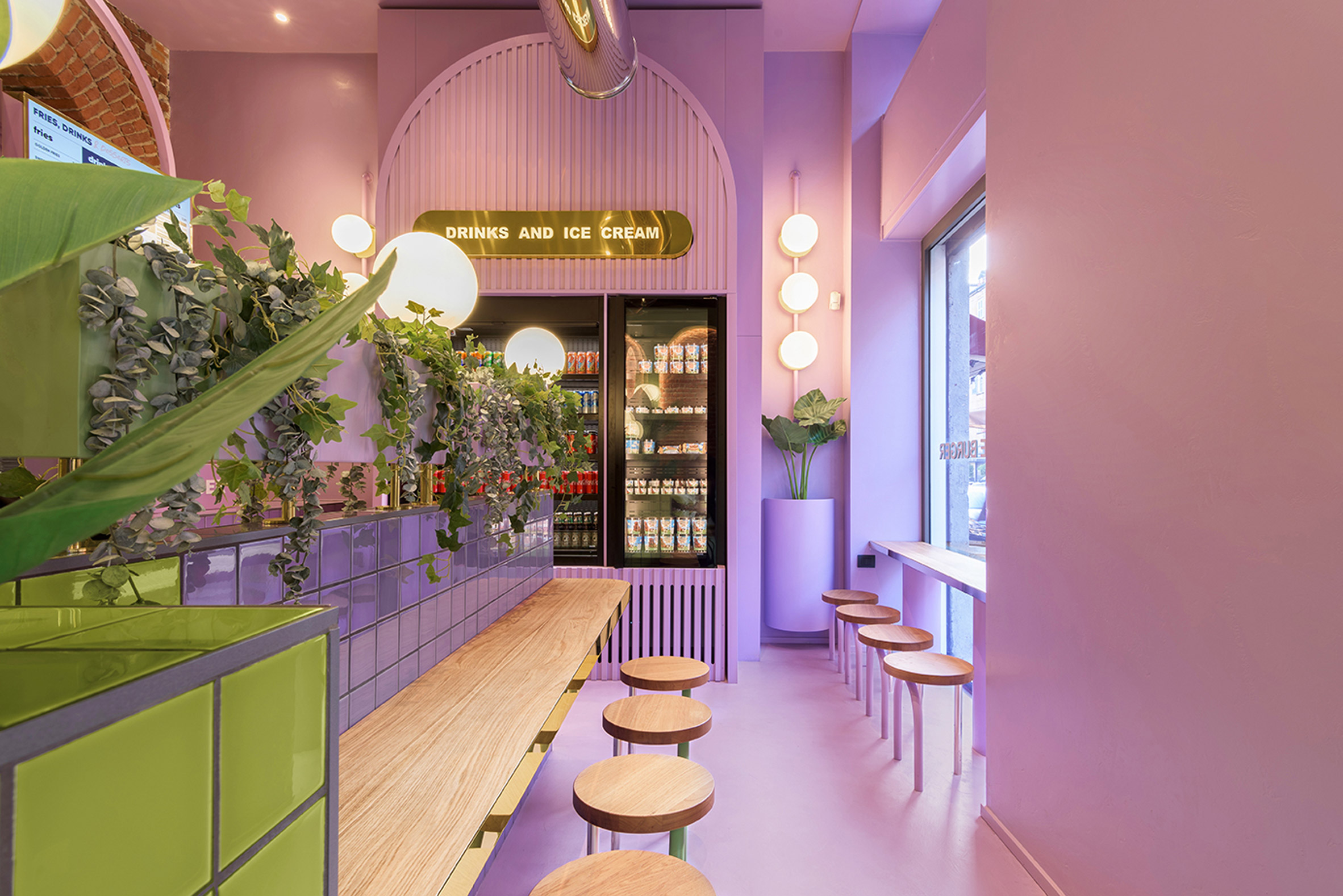
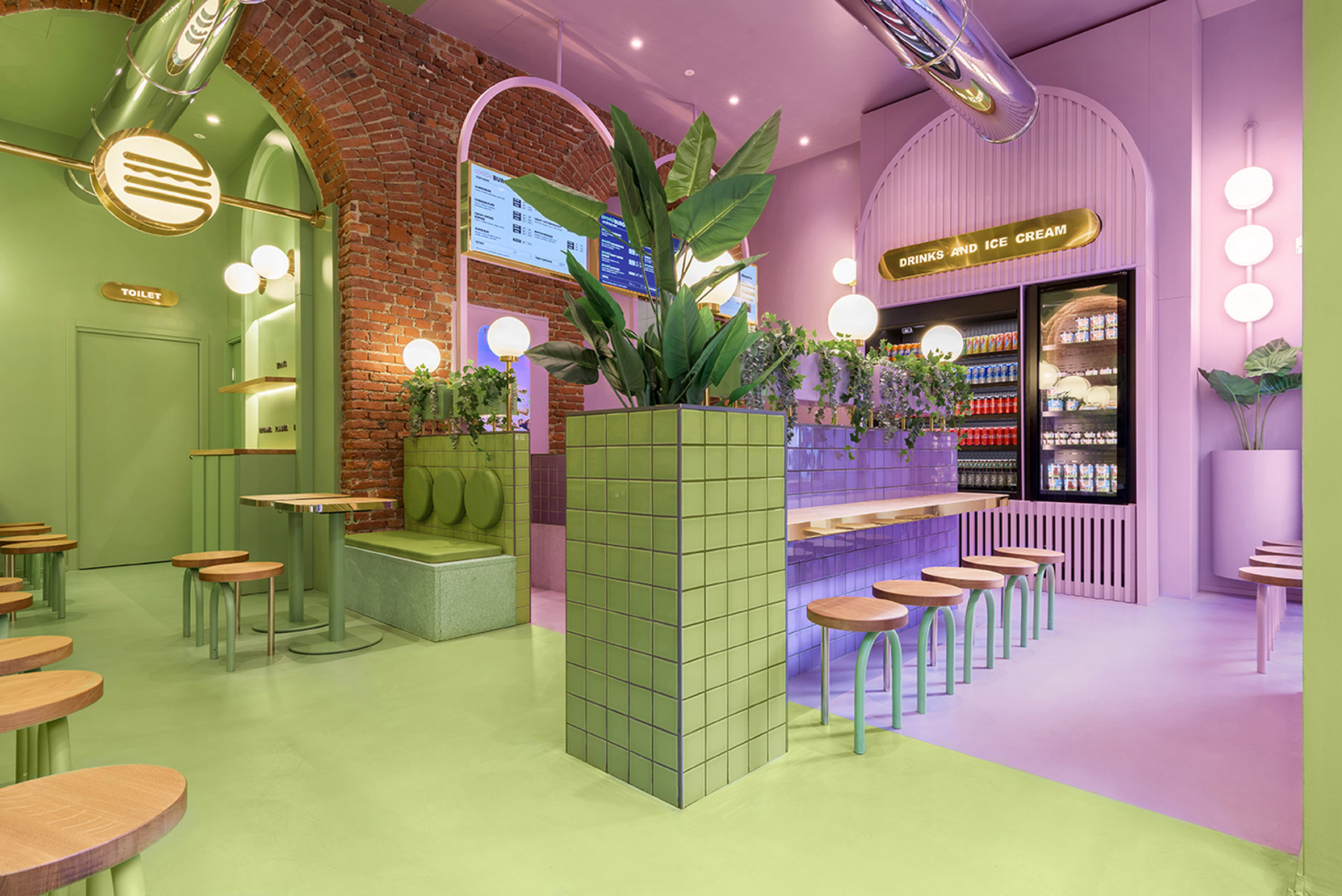
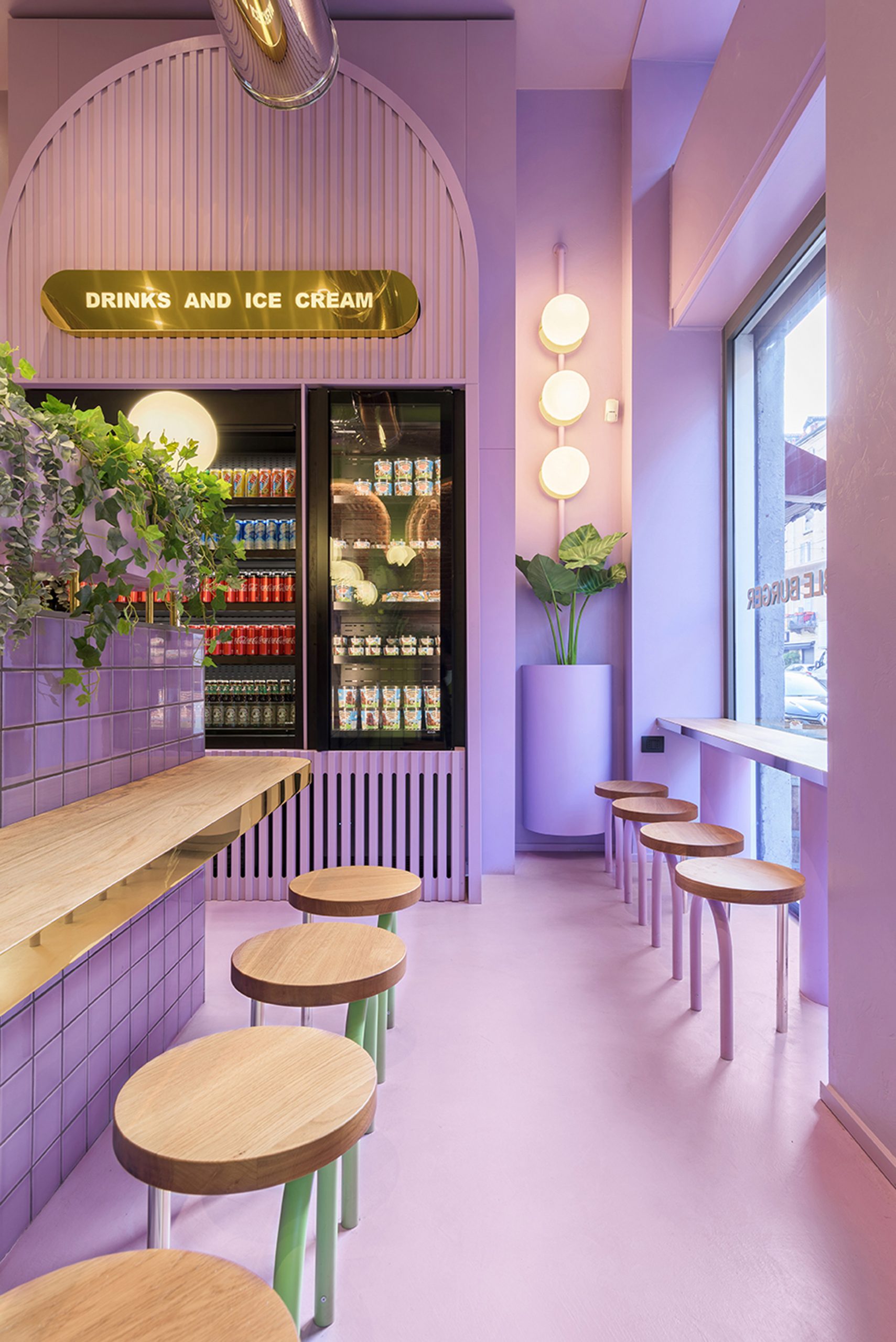
The studio used colour to clearly divide the L-shaped restaurant into a serving and seating area. In the serving area, a lilac hue is used across the floors, walls and ceiling to create an immersive environment.
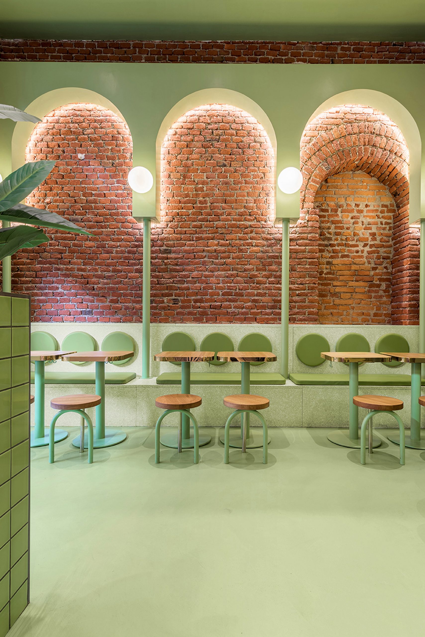
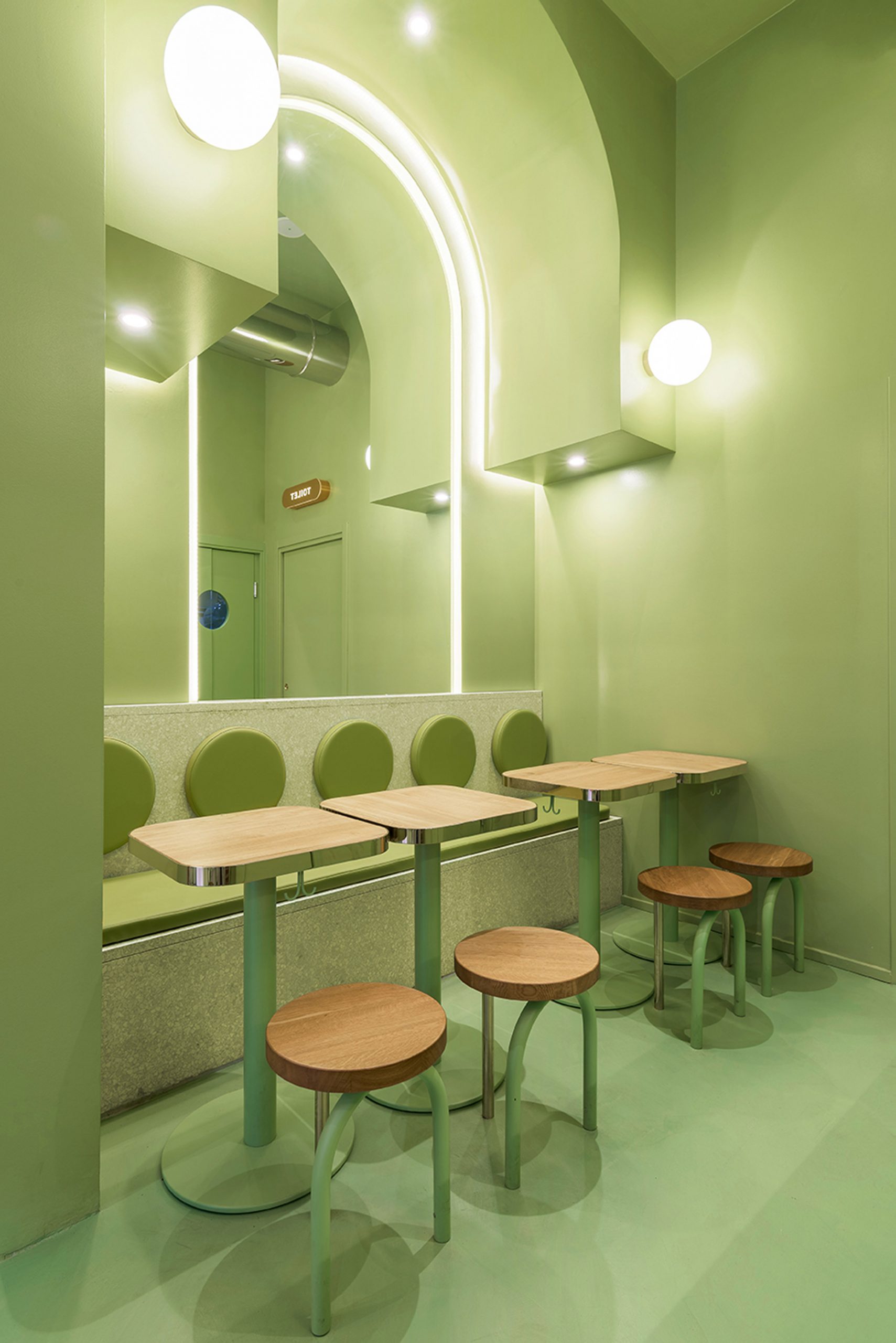
Meanwhile, customers in the dining area are completely surrounded by green, from the mint green terrazzo bench seating to the circular leather seat cushions.
The existing space featured tall, red brickwork arches, which the studio integrated into the restaurant's design.
"When we saw the beautiful bricks and arcs in the space, it was evident for us that we would use these two elements as the starting point of the design," said Masquespacio's creative director Ana Hernández.
To create a uniform aesthetic throughout the space, the studio also added further arches that bring in the green and purple colour scheme.
"Some are totally independent and others highlight the existing arcs of the interior architecture," Masquespacio said.
According to the studio, Bun's polished look was chosen as a conscious move away from the kind of vintage, industrial style that has proven popular in burger restaurants in recent years.
Instead, the bright colour scheme helps to maintain the restaurant's appeal for a younger clientele, alongside gold accents throughout the lighting, signage and tabletops.
Like many of Masquespacio's furniture and interiors projects, the restaurant also incorporates references to post-modernism and the Memphis Group – the Italian design collective founded by Ettore Sottsass in 1981.
In addition to meat burgers, Bun offers a menu of plant-based meat alternatives and all its burgers are wrapped in plastic-free, recyclable packaging.
To communicate this commitment to sustainability, Masquespacio didn't use plastic for the interior design and added plenty of potted plants.
The studio is currently working on several new restaurants with Bun, including its first outpost in Turin.
Founded in 2010 by Ana Milena Hernández Palacios and Christophe Penasse, Masquespacio's work is characterised by a bold use of colour and form.
Other recent projects include an open-plan, colour-block interior for a student house in Spain and an upholstered chair with an eye-shaped backrest and tassels for eyelashes.
Photography is by Gregory Abbate.
The post Masquespacio uses blocks of colour to break up interior of Milan burger joint appeared first on Dezeen.
from Dezeen https://ift.tt/3wkRQH4
No comments:
Post a Comment