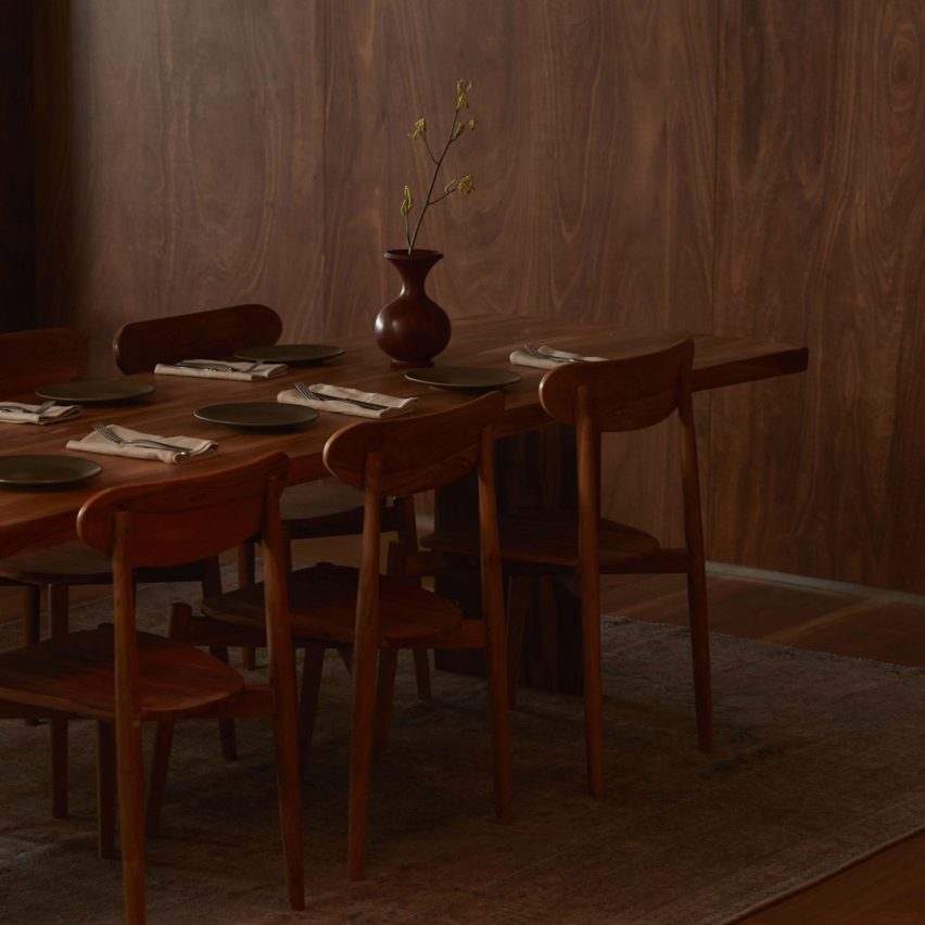
Australian studio Pattern has teamed industrial grey bricks, concrete and steel with warm-toned timber in the interior of this poolside restaurant on the outskirts of Melbourne.
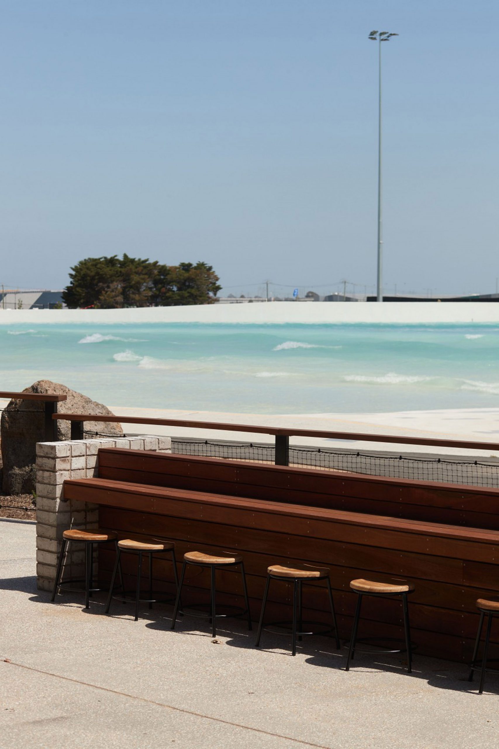
The eatery belongs to local restaurant chain Three Blue Ducks and is situated in the Urbnsurf park, with an outdoor dining area that has views across the artificial, two-hectare surf lagoon.
Pattern, which was also responsible for designing Urbnsurf's changing rooms and surf rental areas, was conscious to steer clear of the kind of "cliche aesthetics" commonly associated with surfing while making the restaurant memorable.
"We were very mindful that restaurants at recreation centres are not necessarily renowned for being the most memorable, nor memorable for good reasons," said Pattern co-founder Lily Goodwin.
"We wanted diners to feel surprised by the quality and considered character of this offering," she told Dezeen
"Our inspiration for this project drew influence from the spirit of surf culture. Critical to the design was ensuring vistas across the water be framed carefully and remain unobstructed. Our intention was to create an environment that felt casual and relaxed, but could also feel special."
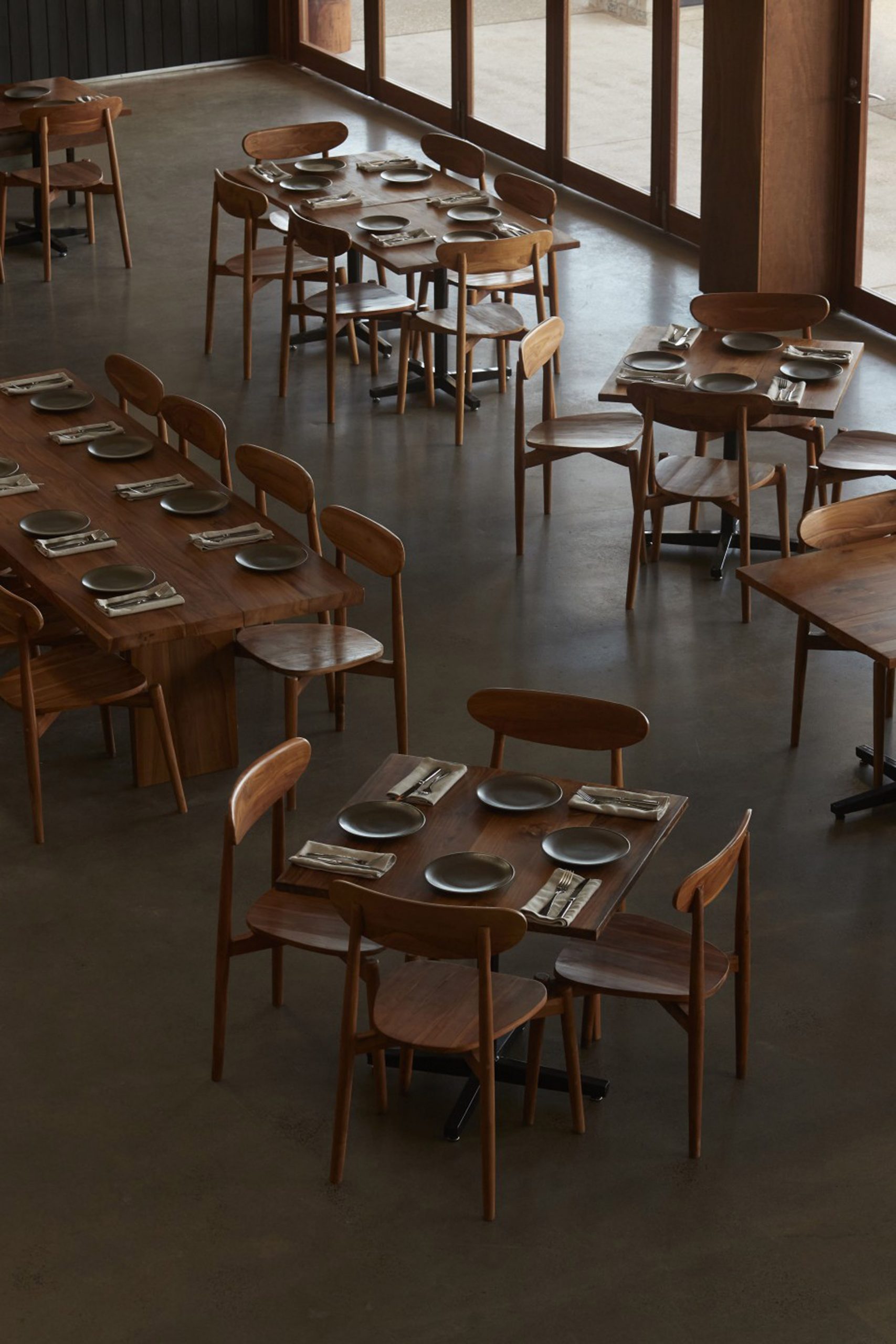
The 1,600-square-metre restaurant, which is housed in a new building with an industrial, corrugated steel shell, has 400 seats on the ground floor, the mezzanine and alfresco dining areas.
"One of the biggest challenges in the brief was to create interior spaces that would sensitively respond to this utilitarian language; rather than struggle against such a distinctive fabric," said Goodwin.
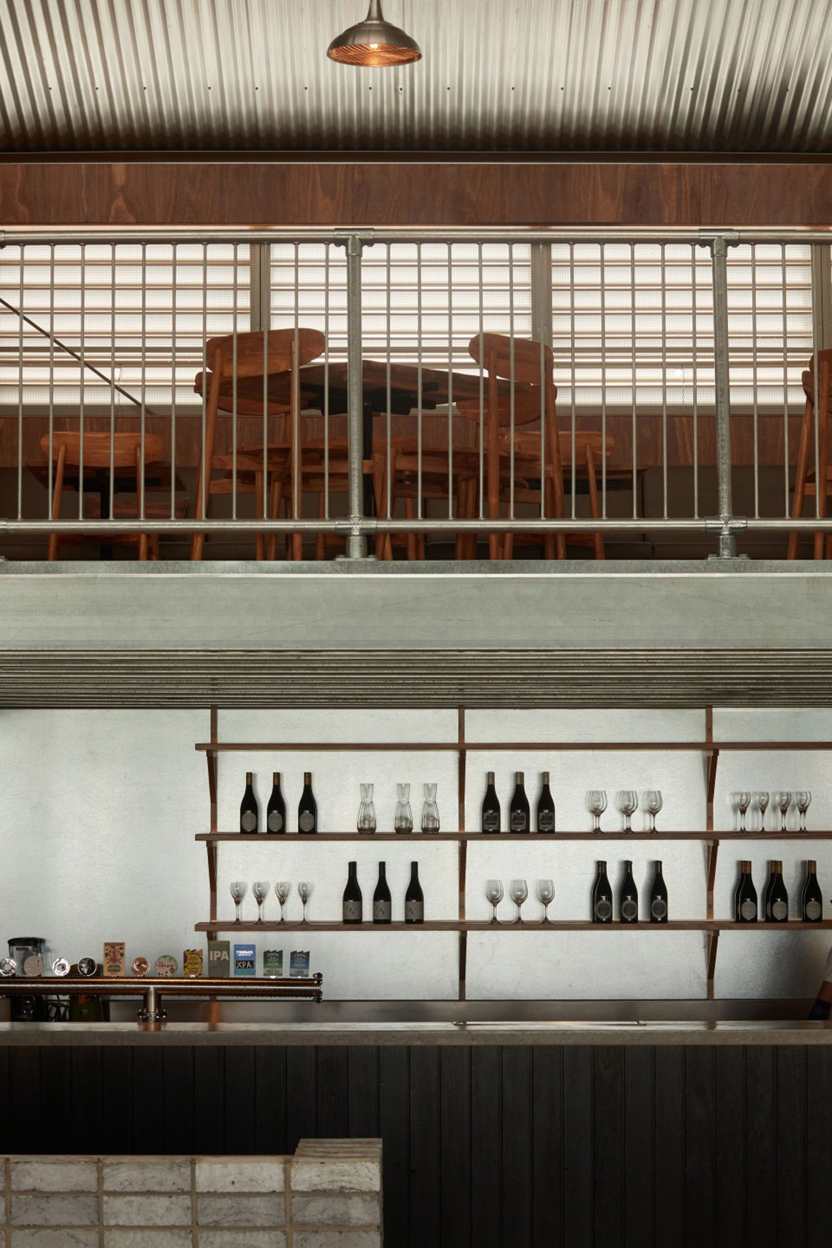
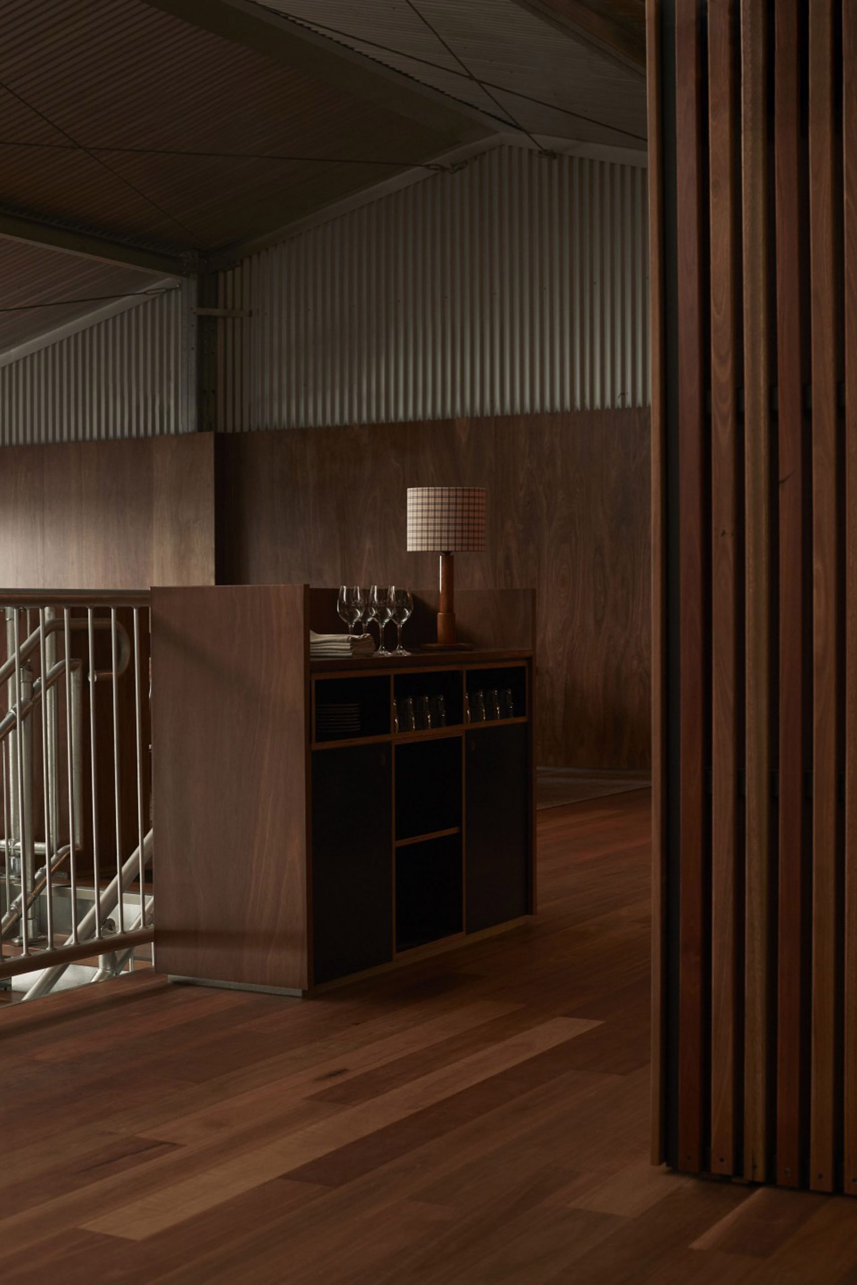
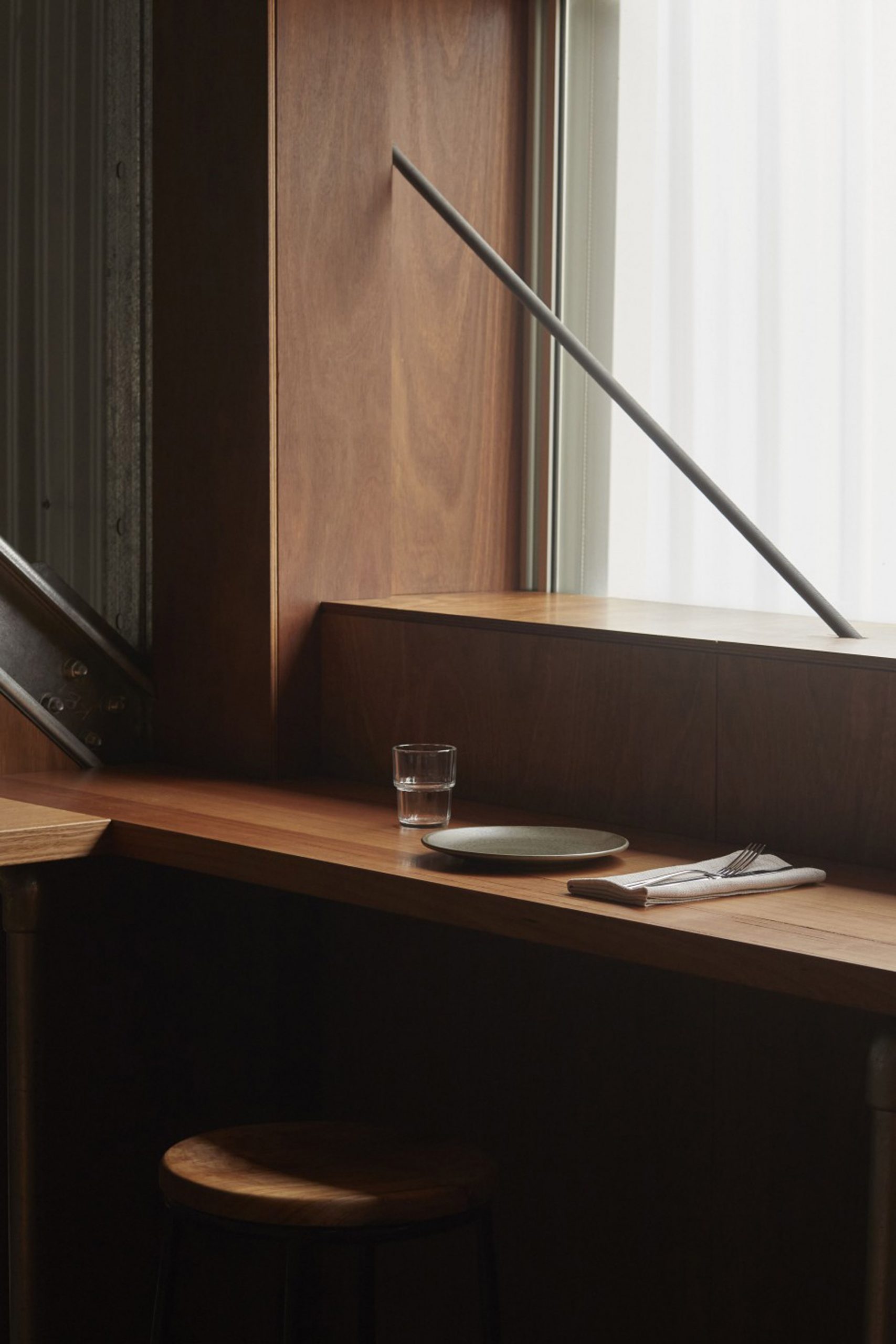
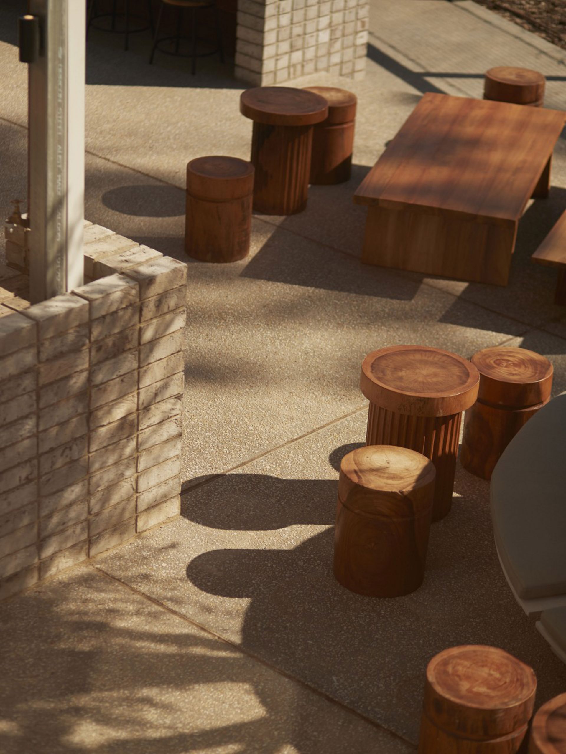
Throughout the restaurant's indoor and outdoor spaces, the studio used an industrial material palette that echoes the landscape of the nearby surf park, including grey bricks, concrete and steel.
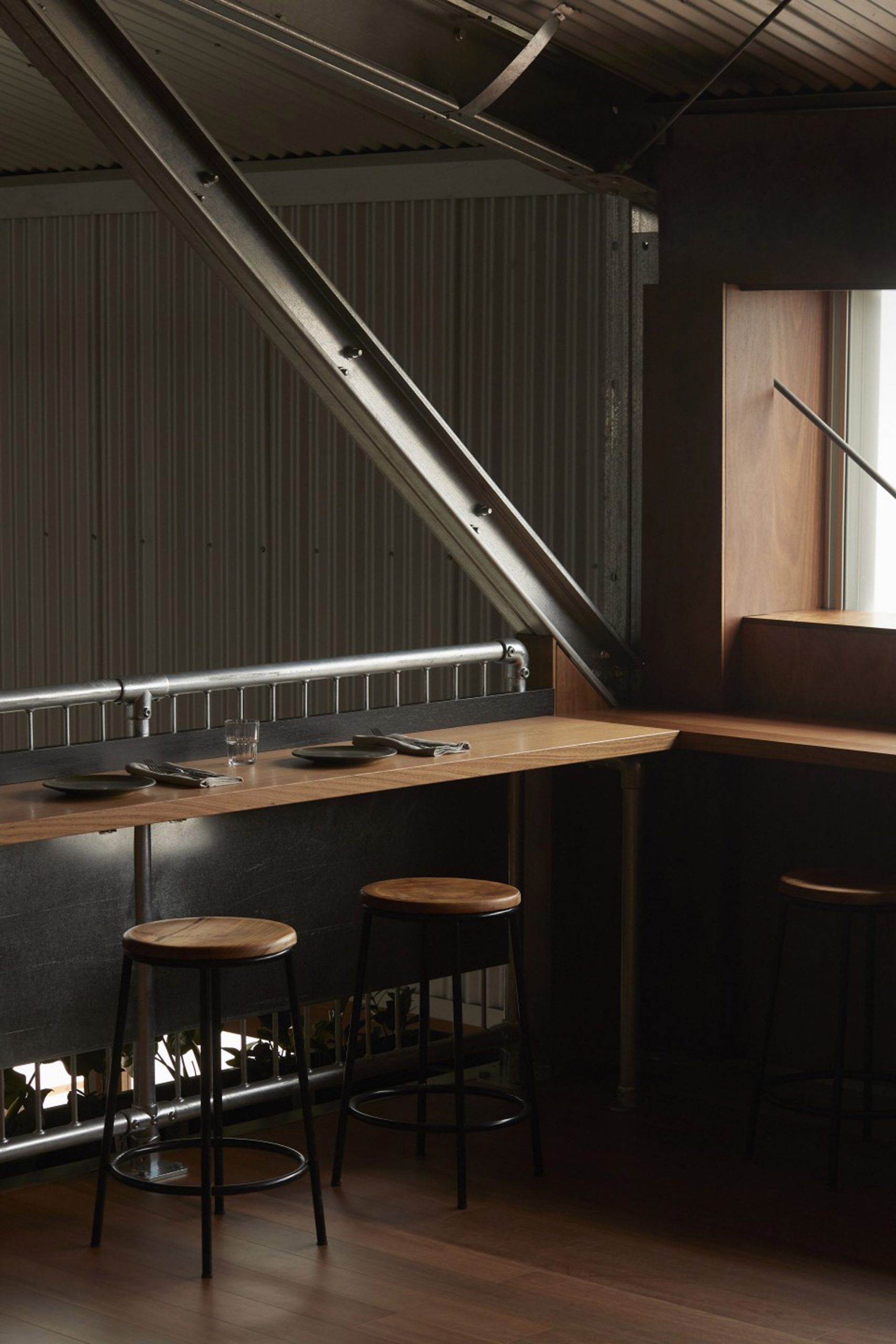
To add an element of warmth, these materials are paired with tactile woods such as teak and locally sourced blackbutt, which completely envelopes the upstairs dining area.
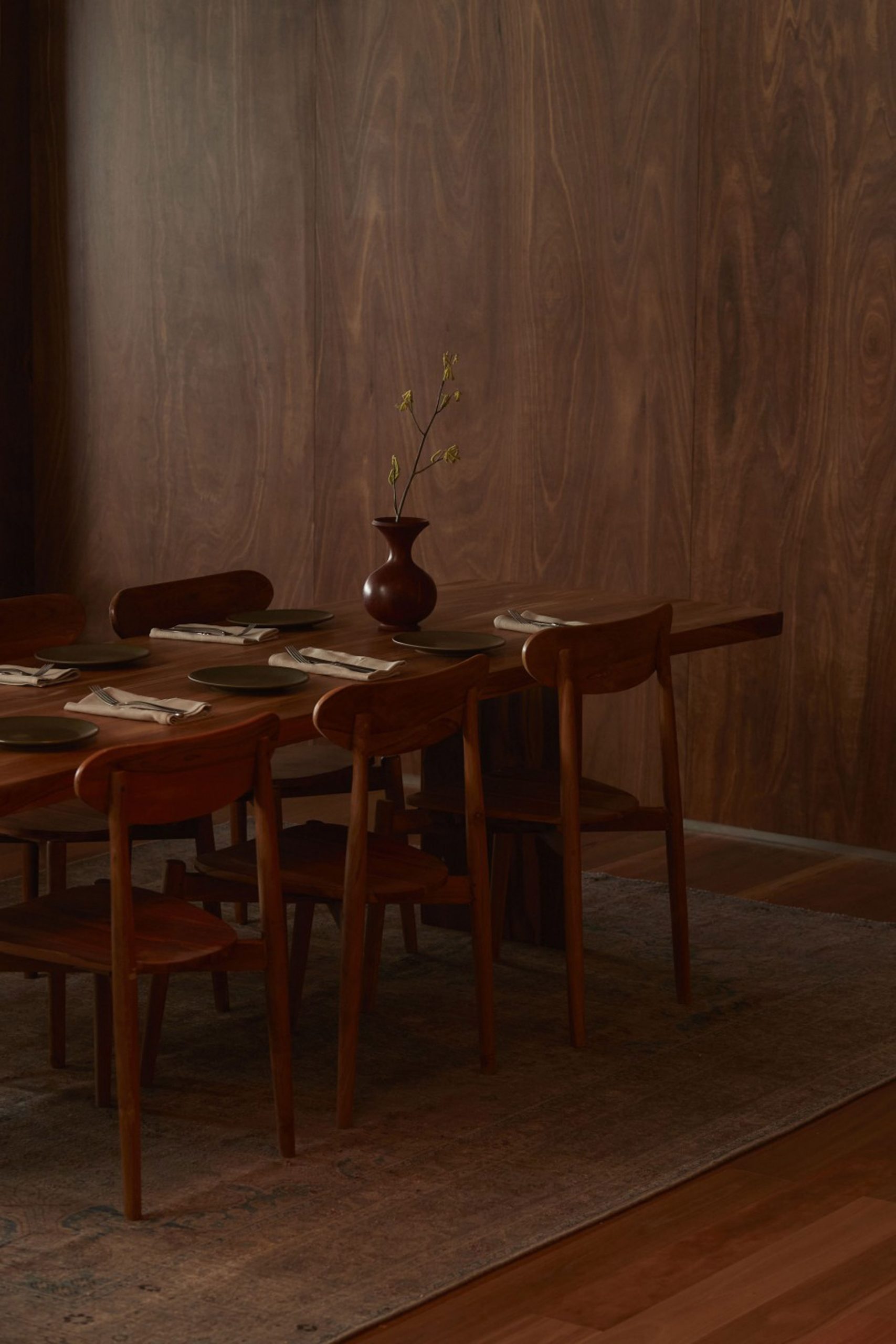
"Blackbutt has lovely and rich honey-hued tones, said Goodwin. "The building is industrial in its aesthetic language, so the addition of the timber brings natural colour and warmth to the space," she continued.
"Also, the climate of Melbourne can be cold during the winter months, so we were drawn to the robust feeling of this timber and felt it would deliver a sense of warmth that a blonde timber perhaps may not."
On the restaurant's ground floor, Shou Sugi Ban charred timber was used to panel the bar and walls while galvanised steel sheets serve as a backsplash, echoing the restaurant's steel staircase and railings. The countertops and floors are made from hardwearing polished concrete.
Kiln-fired Italian bricks are used both inside and out and were selected for their hand-made quality and tonal variation.
"The palette champions materials in which colour and texture are inherent rather than applied to the finish," Goodwin explained.
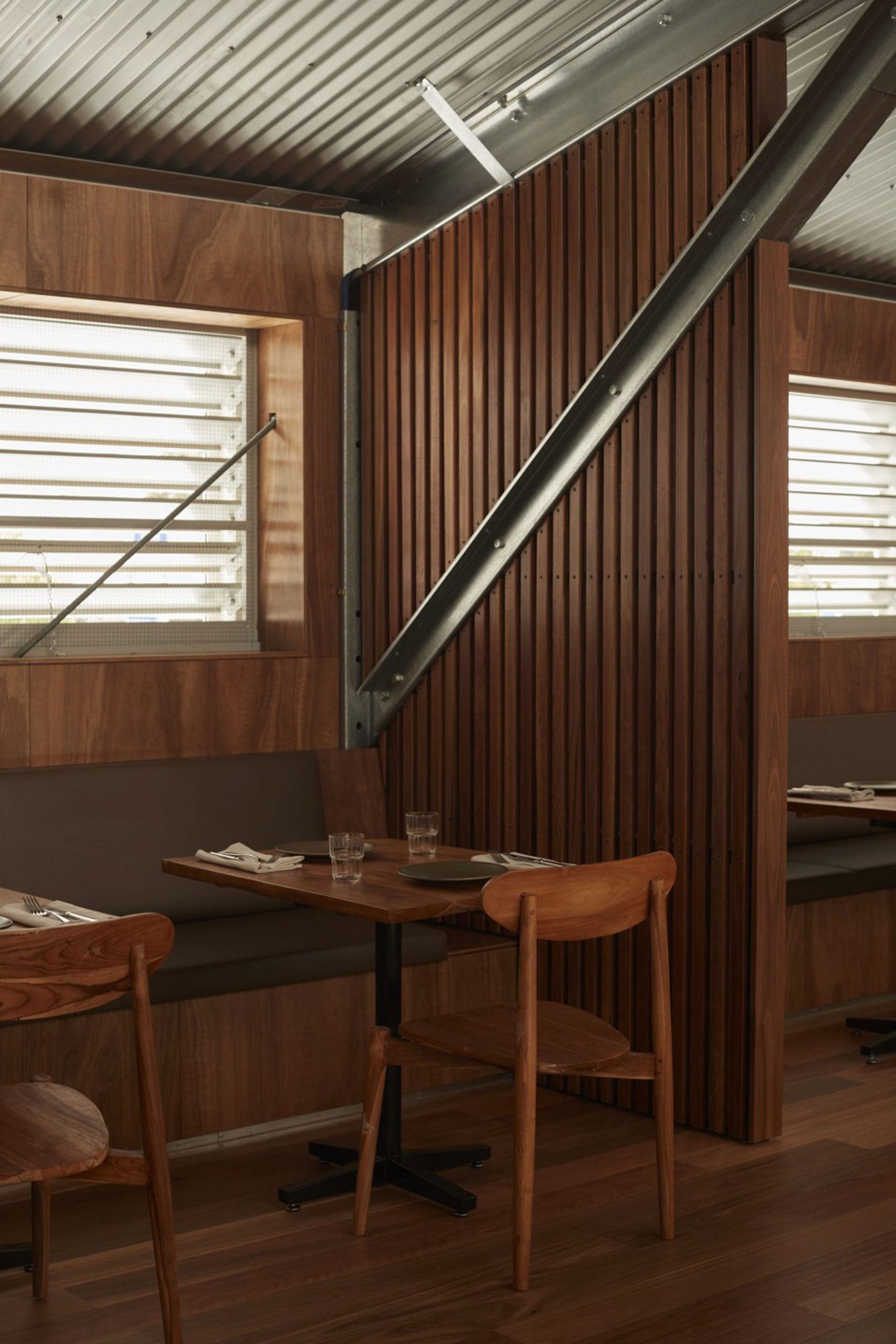
By extending the use of outdoor materials to the restaurant's interior, the studio aimed to create the feeling of one continuous space.
"We wanted very much to celebrate the restaurant's poolside location and to create a seamlessness between the interior and exterior spaces," Goodwin explained.
"Meanwhile upstairs on the mezzanine, there is a greater feeling of being cocooned in timber. This space is more of a departure from the rest of the dining spaces."
The outdoor dining area offers a mix of teak furnishings to accommodate a range of group sizes. Native trees in large planters provide shade, while herbs and edible plant varieties are cultivated to service the restaurant.
Pattern added layers of colour and texture through accessories and soft furnishings, such as the Moroccan rugs and throw cushions that nod to north Africa and its famous surfing spots.
"Rather than try to replicate cliche aesthetics associated with surfing, we wanted the spaces to have a sense of authenticity," said Goodwin.
"Our design principles took cues from the essence of surf culture – honesty in expression, love and respect of the natural world, a low-fi charm and character. The spaces are not overly styled or dressed, but through handmade and vintage furnishings and fittings offer a sense of surfing's history and global spirit."
Pattern, which is run by Goodwin alongside co-founder Josh Cain, has completed a variety of interior projects across Australia including a rose-tinted boutique in Melbourne and a bar in Byron Bay that was designed to reflect the "raw beauty" of late-night eateries.
Photography is by Traianos Pakioufakis.
The post Pattern avoids "cliche aesthetics" at Melbourne surf park restaurant appeared first on Dezeen.
from Dezeen https://ift.tt/3a7cJMr
No comments:
Post a Comment