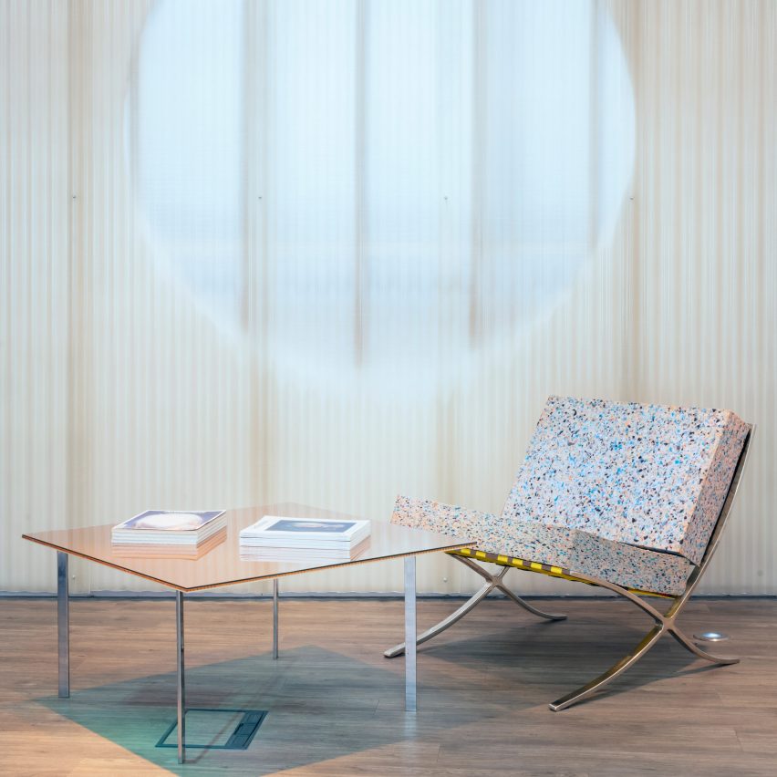
Architecture practice Sam Jacob Studio has built an office, bar and events space for the ArtReview magazine in London that includes a pair of revamped Mies van der Rohe armchairs.
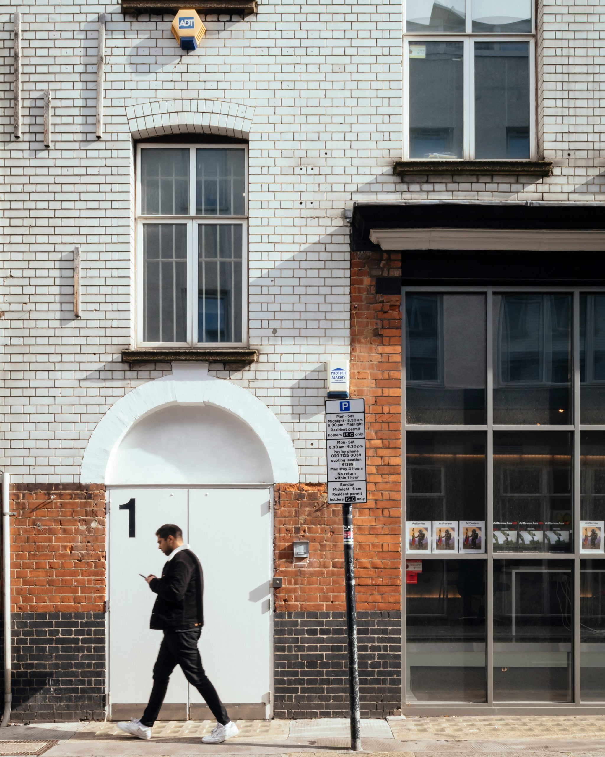
Designed for ArtReview to be used both as an office and for talks or screenings, the space occupies the ground floor and basement of a Victorian warehouse near Old Street.
Sam Jacob Studio stripped back previous fit-outs to create a bright space that incorporated elements of the building's previous uses.
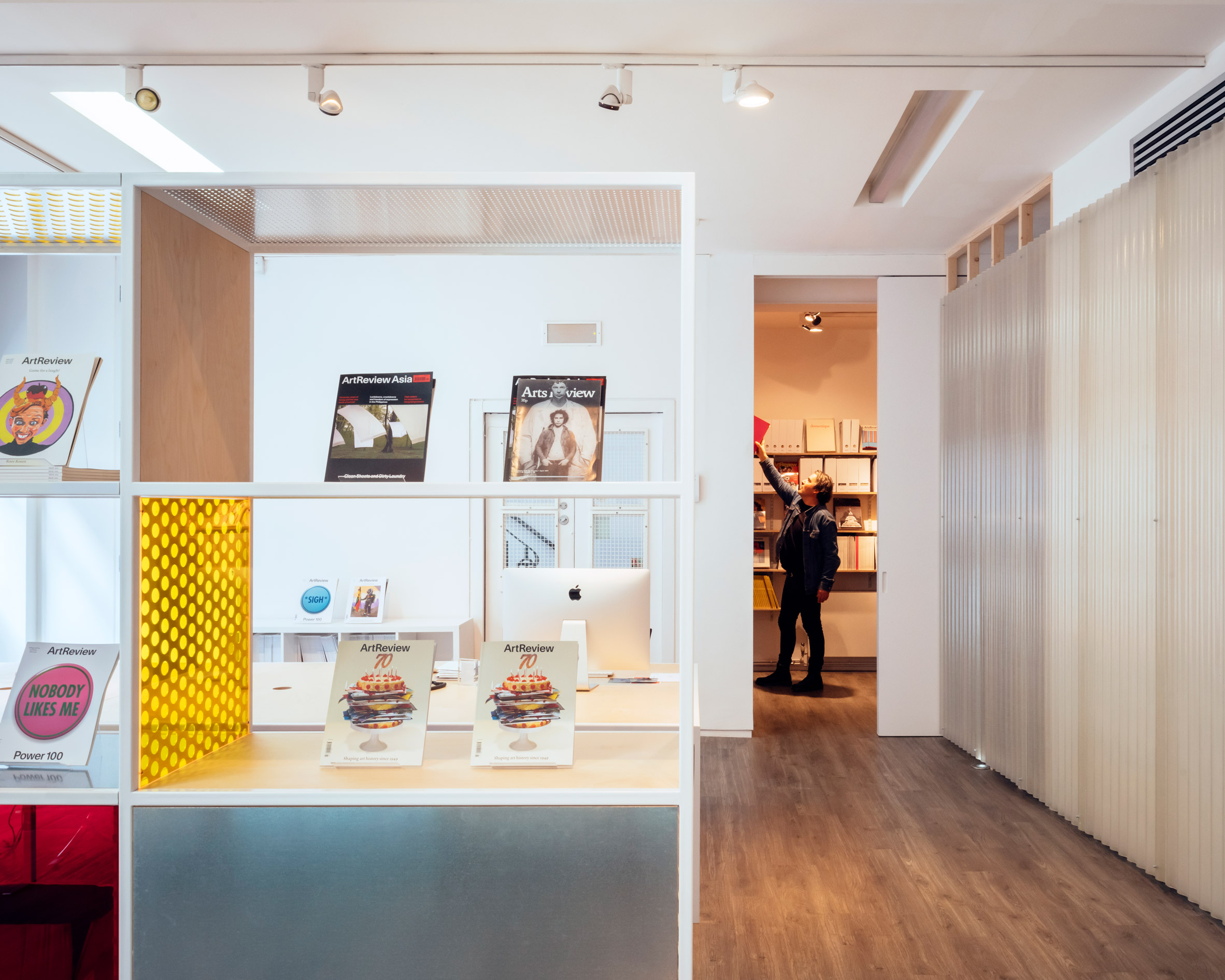
"We wanted the design to feel both strong and light at the same time," said Sam Jacob Studio founder Sam Jacob.
"We were interested in working in a way that revealed the assembly – and disassembly – involved in the construction of the space and furniture elements," he told Dezeen.
"The peeling back of layers of previous fit-outs was a way to simplify the space while also creating a kind of interior archaeology so that the history of the built fabric is exposed – not just the original building but its subsequent reuse – previously a gallery, before that designer Nigel Coates' office space and so on."
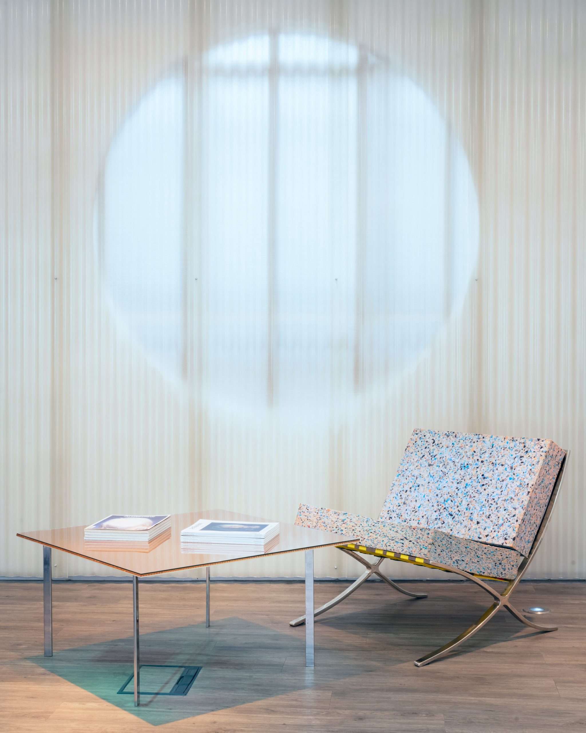
On the ground floor, which contains a reception area and a workspace divided by a bookcase, the studio uncovered a window to a lightwell that had been covered up.
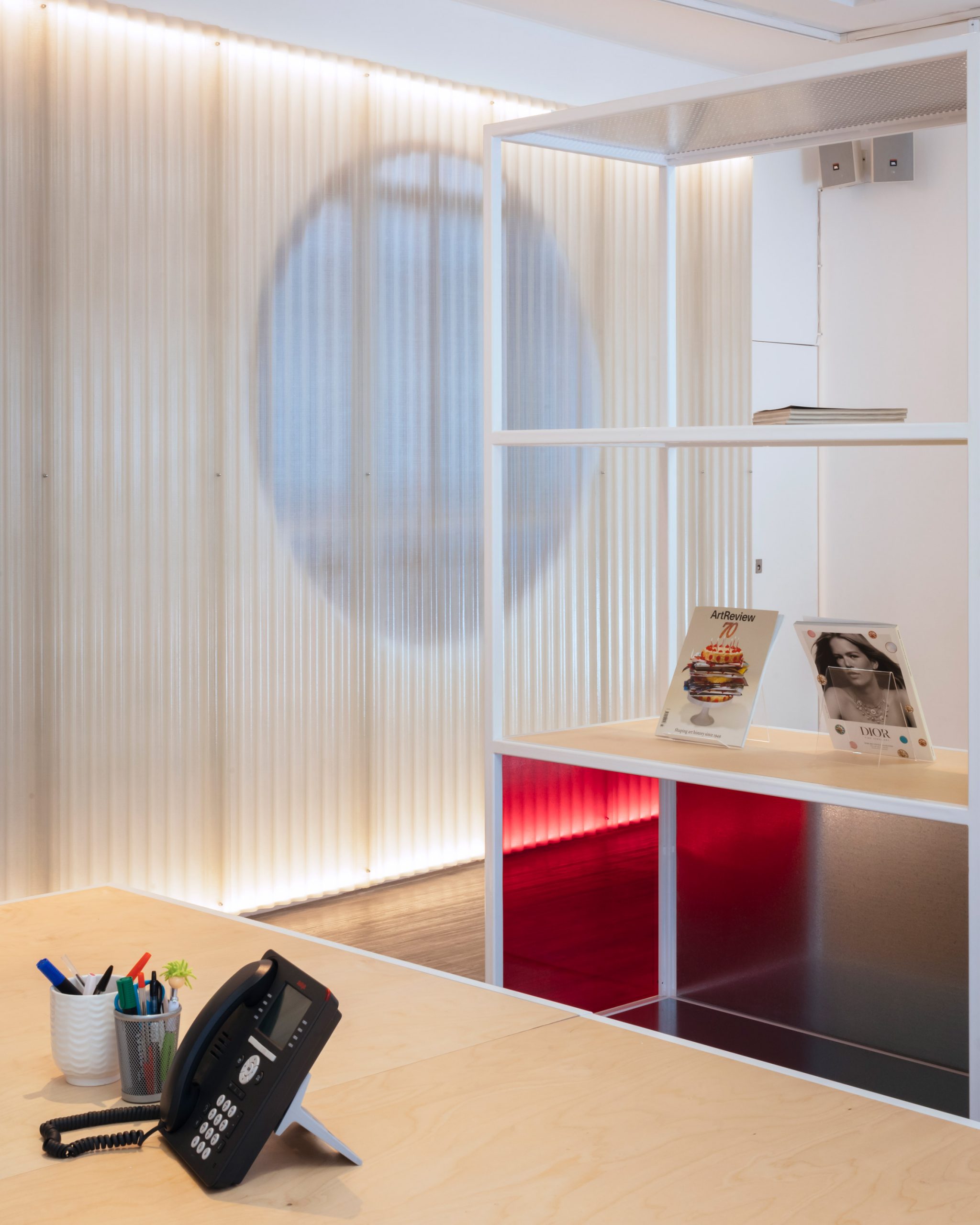
As the window looked directly onto a piece of mechanical ventilation equipment, the studio created an open circle within the plasterboard wall and covered this with corrugated fibreglass.
"When we were looking around the space we were poking around, investigating the space," explained Jacob.
"From a cleaners' cupboard, we realised what has looked like a solid wall was actually a false wall that concealed a window," he continued.
"Rather than simply exposing the window, we saw how a careful excavation of these layers could bring light into the space in a more interesting way, filtered through the archaeology of the architecture."

The translucent wall runs along the length of the ground floor space and encloses a small store and a library space.
A set of stairs leads down to the basement, which contains the events space with a bar and small recording studio.
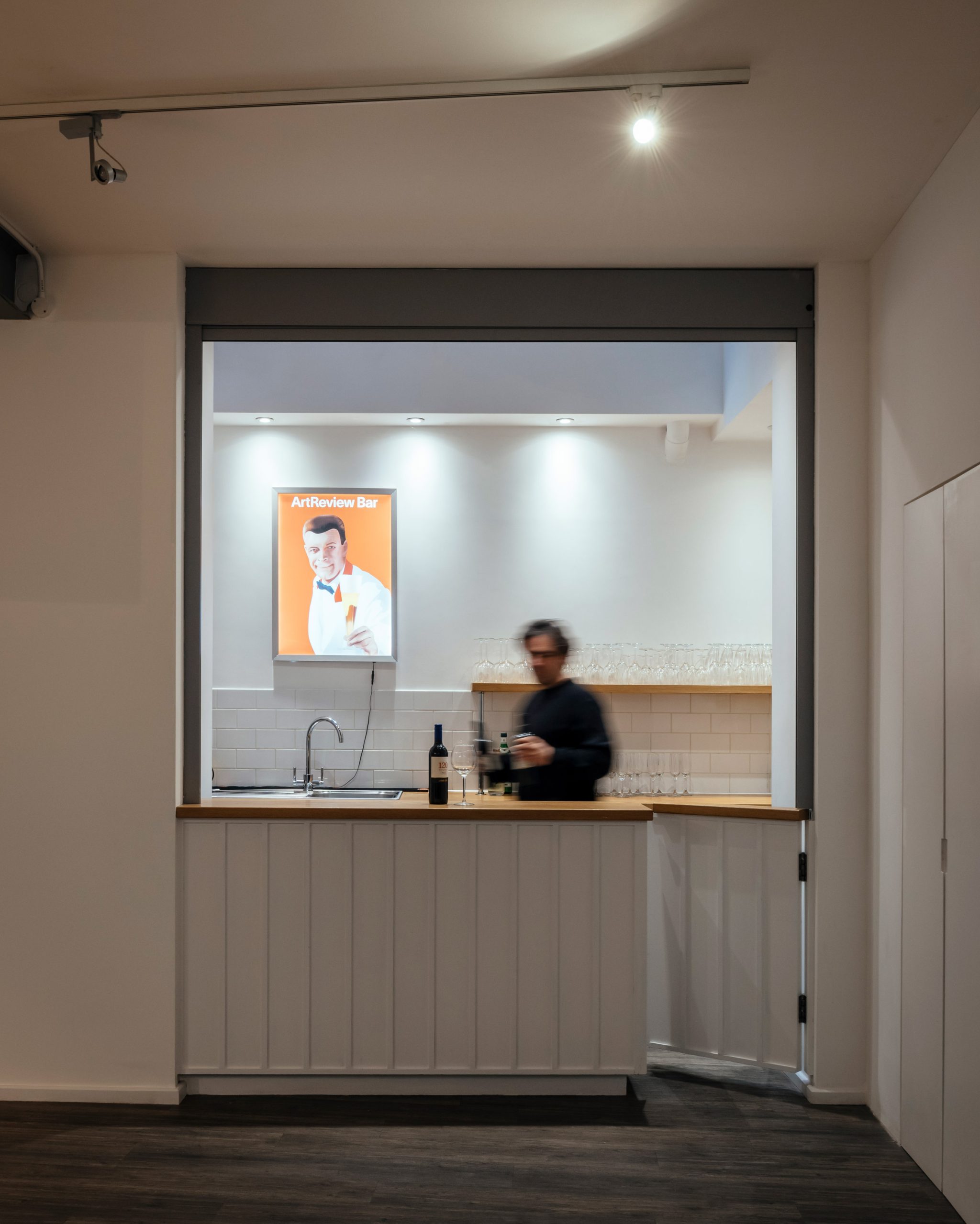
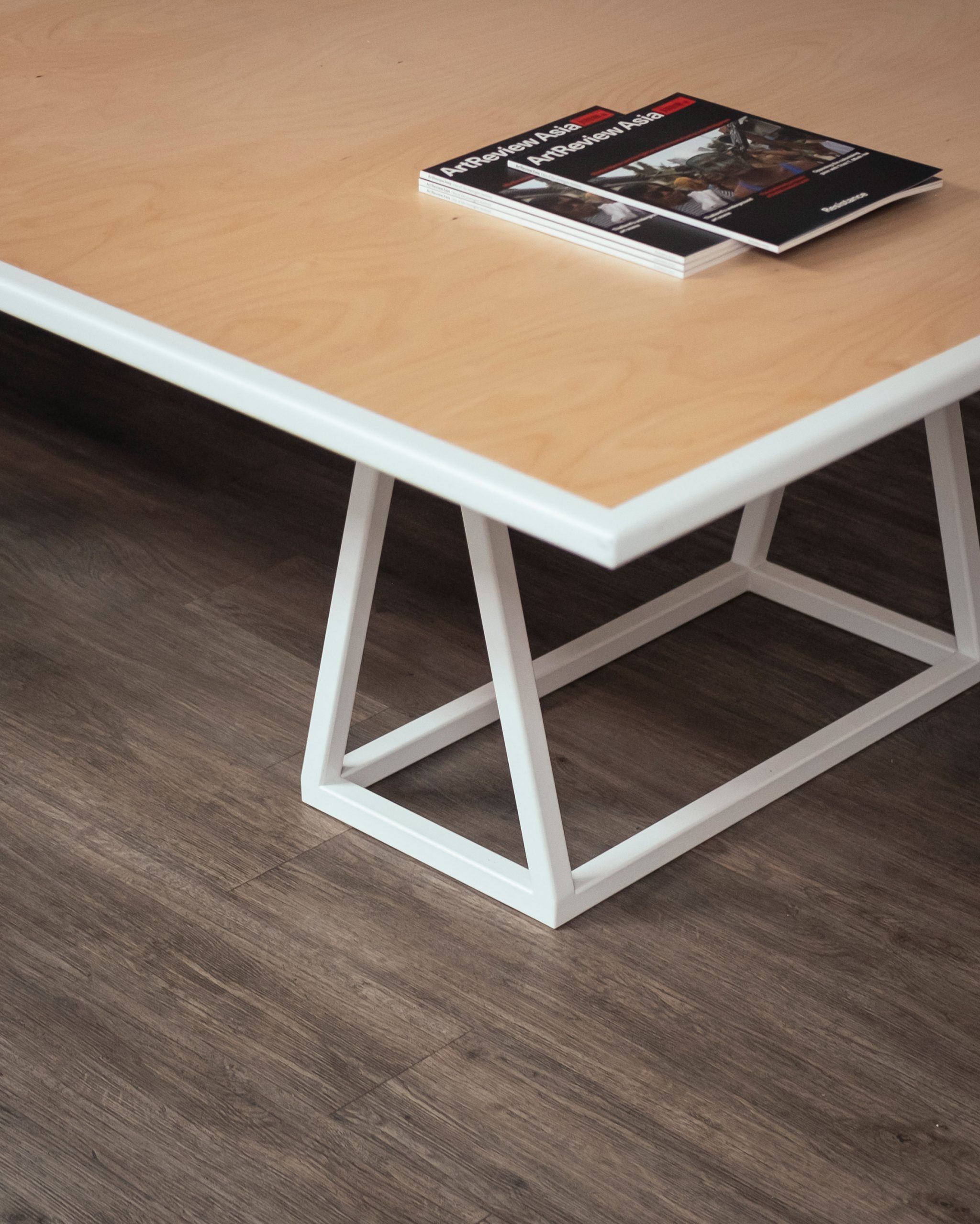
At the centre of the space is a trestle table designed by the studio that can be used as an additional workspace and dismantled for events.
Throughout the interior, the studio aimed to use furniture to add intrigue to the small space by combining powder-coated white steel frames with plywood, galvanised steel, perforated and coloured acrylic panels.
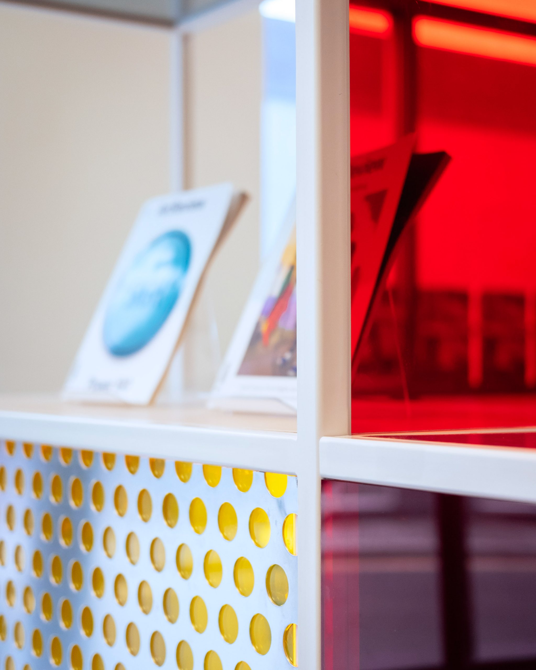
"These materials have different qualities of translucency, reflectivity and texture, and it was the overall build up that they create that was important – creating different kinds of depth of field, connections and spatial sensations," said Jacob.
"While the arrangement of the space is considered in a simple way, materials create layers of ambiguity and mystery."
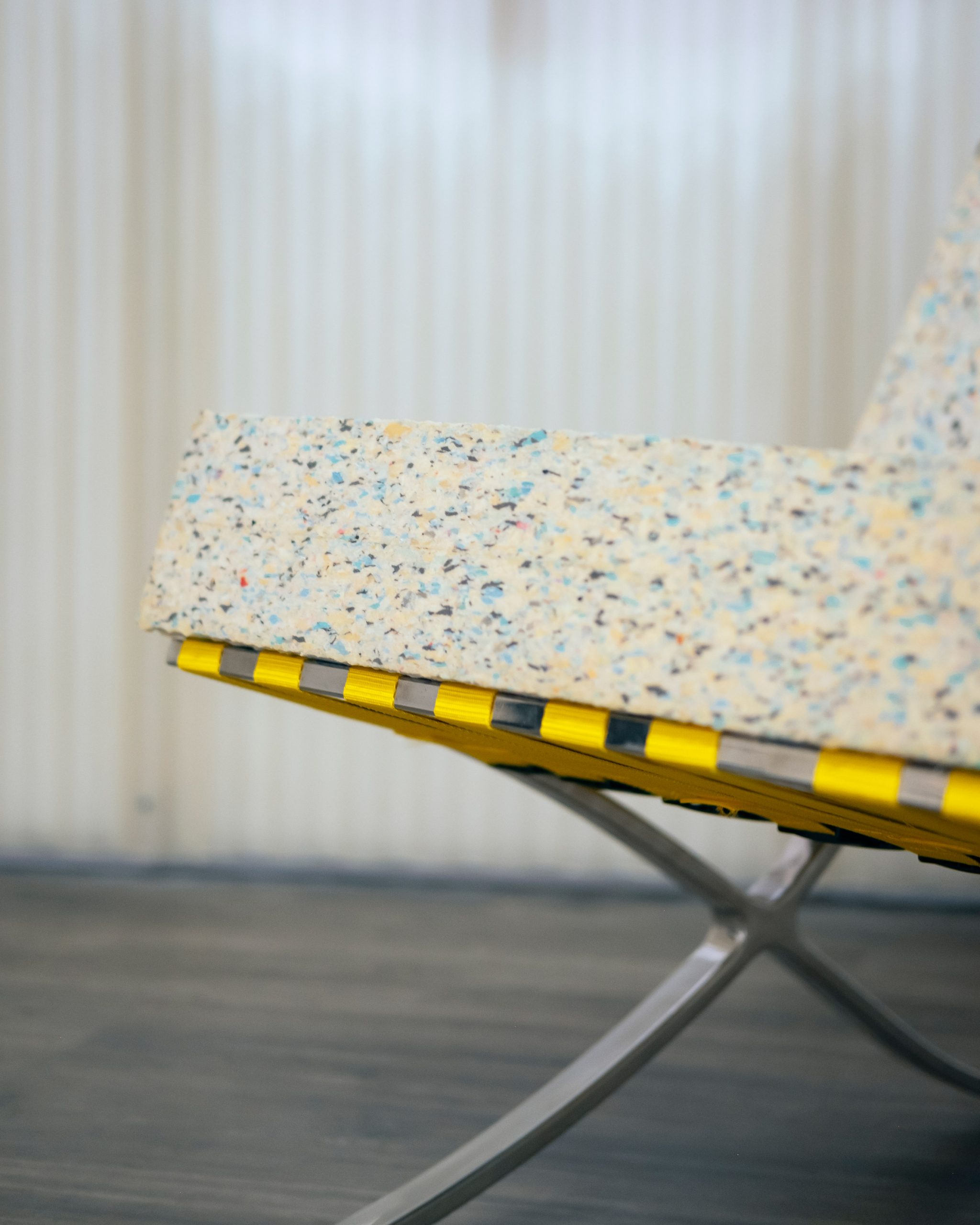
The studio completed the reception area with a pair of updated Barcelona chairs, which were originally designed by architect Ludwig Mies van der Rohe and designer Lilly Reich for the Barcelona Pavilion at the 1929 International Exposition.
"We thought bringing the attitude of assemblage to a modernist classic could extend the ideas used in the space," said Jacob. "The chairs feel more materially articulated with their coloured ratchet straps and recycled foam blocks arranged on the chairs' steel frame," he continued.
"There's also something of a reinvention of its early 20th-century idea of industry into something post-industrial, that speaks directly to how reuse and recycling can also reinvent."
As a writer for the ArtReview magazine Jacob, who is also a Dezeen columnist, found designing the space an interesting experience.
"I've had a long relationship with ArtReview as a contributor to the magazine so we know each other pretty well," he explained.
"It's interesting to turn from columnist to designer, from commentating on design to – hopefully design as a way of commenting. I like the back and forth between criticism and design, and it's great the project was a chance to carry on oscillating in that way."
Sam Jacob Studio was founded by Jacob, who was one of the founders of influential architecture studio FAT, in 2014 .
The studio has recently designed a shelter in the Yantian port district of Shenzhen and London's Cartoon Museum.
Photography is by Jim Stephenson.
The post Sam Jacob Studio adds "ambiguity and mystery" to ArtReview events space appeared first on Dezeen.
from Dezeen https://ift.tt/3dZSYap
No comments:
Post a Comment