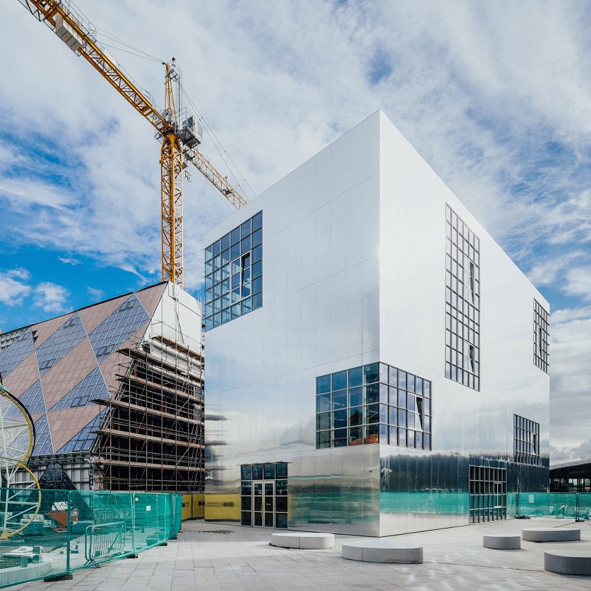
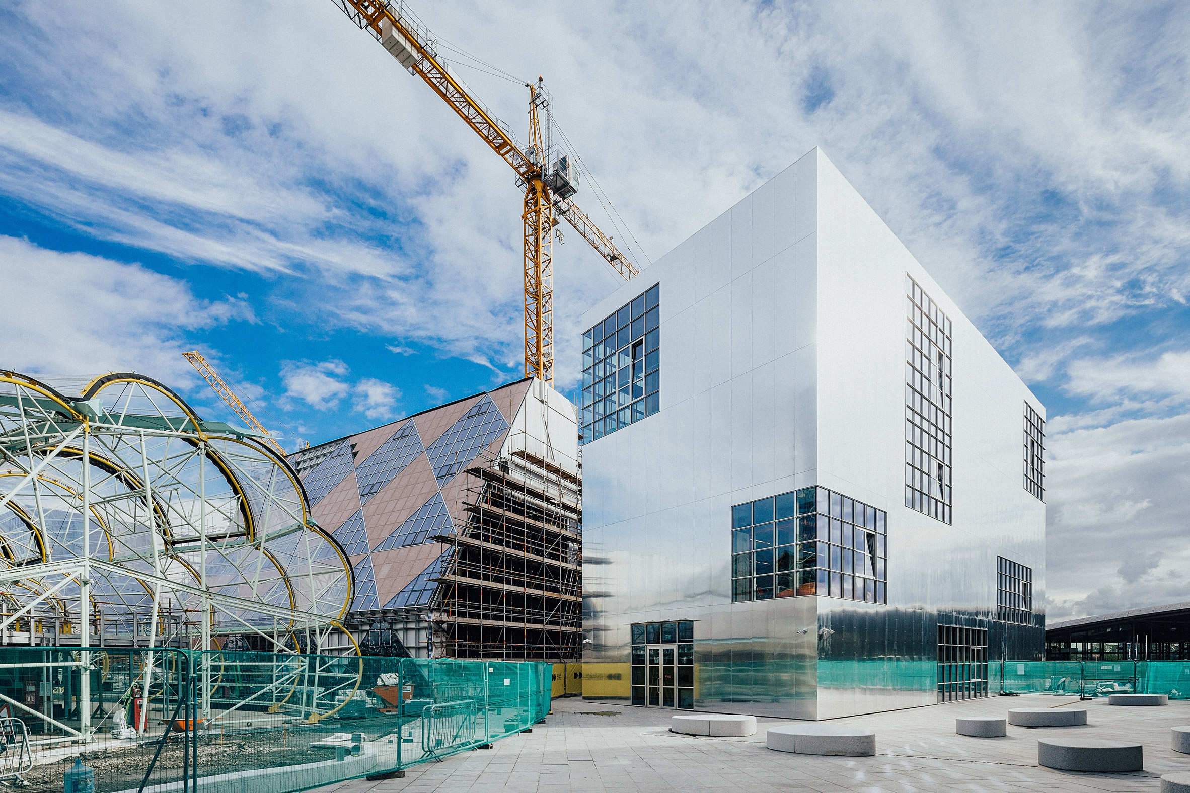
Spanish studio Barozzi Veiga has completed an aluminium-clad building for Ravensbourne University London at the Design District in Greenwich.
Barozzi Veiga's design for Ravensbourne University London's Institute for Creativity and Technology is the first building to open in the new Design District on the Greenwich Peninsula in south London.
The studio is one of eight different architecture firms that will design two buildings each for the Design District area, which is envisioned as a "permanent hub" for the creative industries and will have workspaces for up to 1,800 people when completed.
Other studios involved in the project include David Kohn Architects and SelgasCano.
Located near the university's main building, which was designed by
Foreign Office Architects, the block is Barcelona-based Barozzi Veiga's first project in the UK.
"The idea of working in London attracted us right from the start and our involvement in this project gave us the possibility to do it in one of the most interesting development areas of the city," Barozzi Veiga co-founder Alberto Veiga told Dezeen.
"We are particularly glad that our first built project in London is also the first building to open at the Design District. We think this is a very nice coincidence and we wish it could mark a great beginning both for our practice in the UK and for the new creative district."
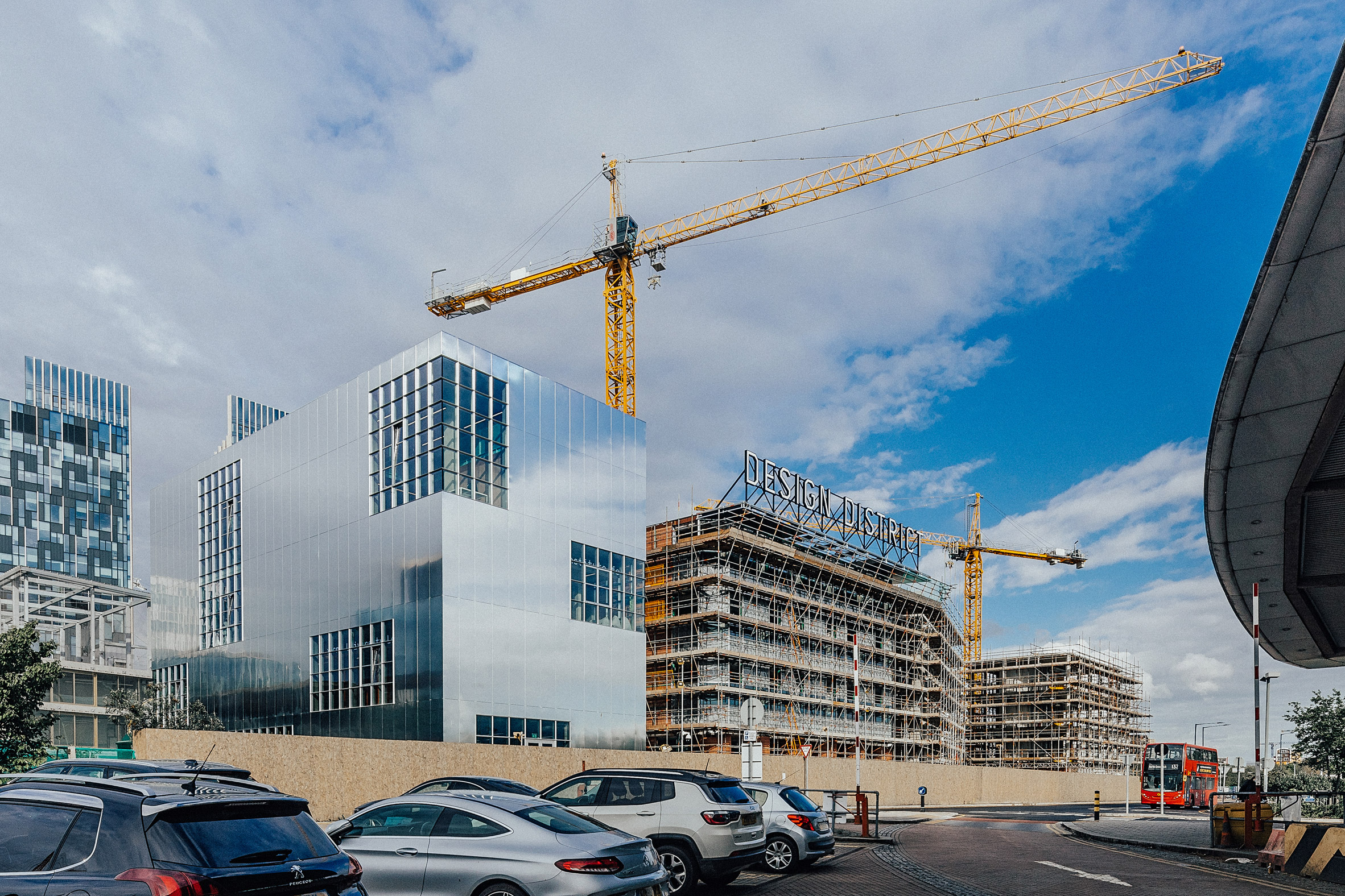
The four-storey building houses 200 students and staff on its upper floors with public spaces on the ground floor.
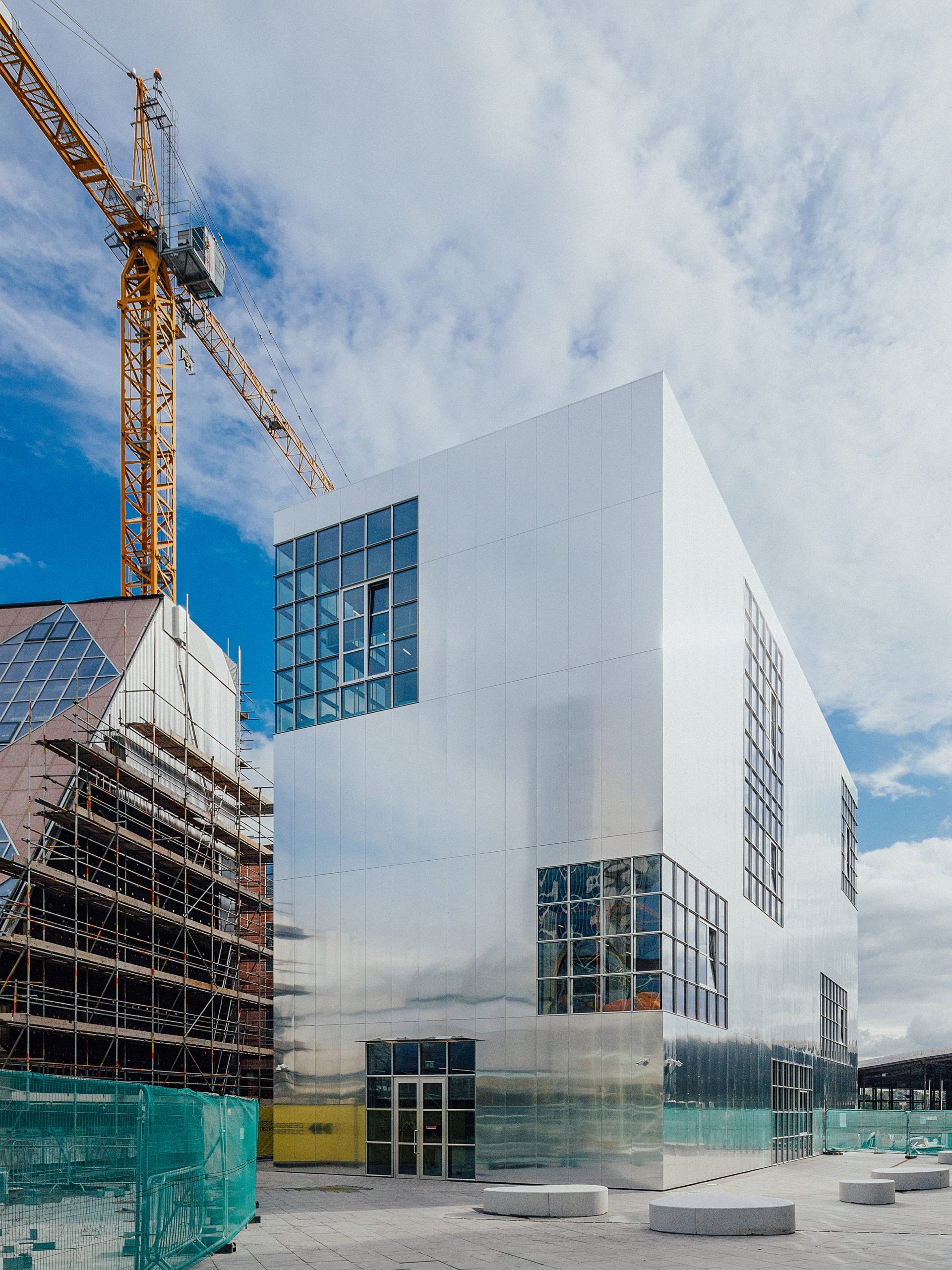
Its concrete structure has been clad in a polished aluminium finish that was chosen to reflect the institute's Design District neighbours and as a reference to the area's industrial past.
"The work draws inspiration upon the industrial past of the area and upon our researches about significant artist studios, which emphasize the use of the light in the art space and present workspaces characterized by raw materials and double-height rooms," Veiga said.
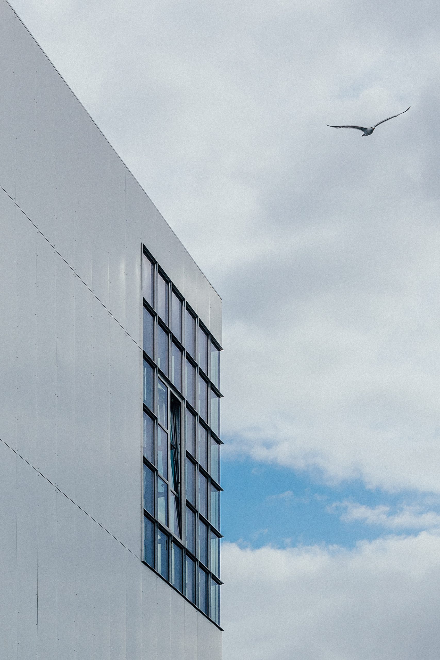
"The external appearance allows the facades to participate in the life of the neighbourhood, absorbing and reflecting the nuances and colours of the context," he added.
"The polished aluminium finish plays with the light and transforms depending on the day or the season of the year."
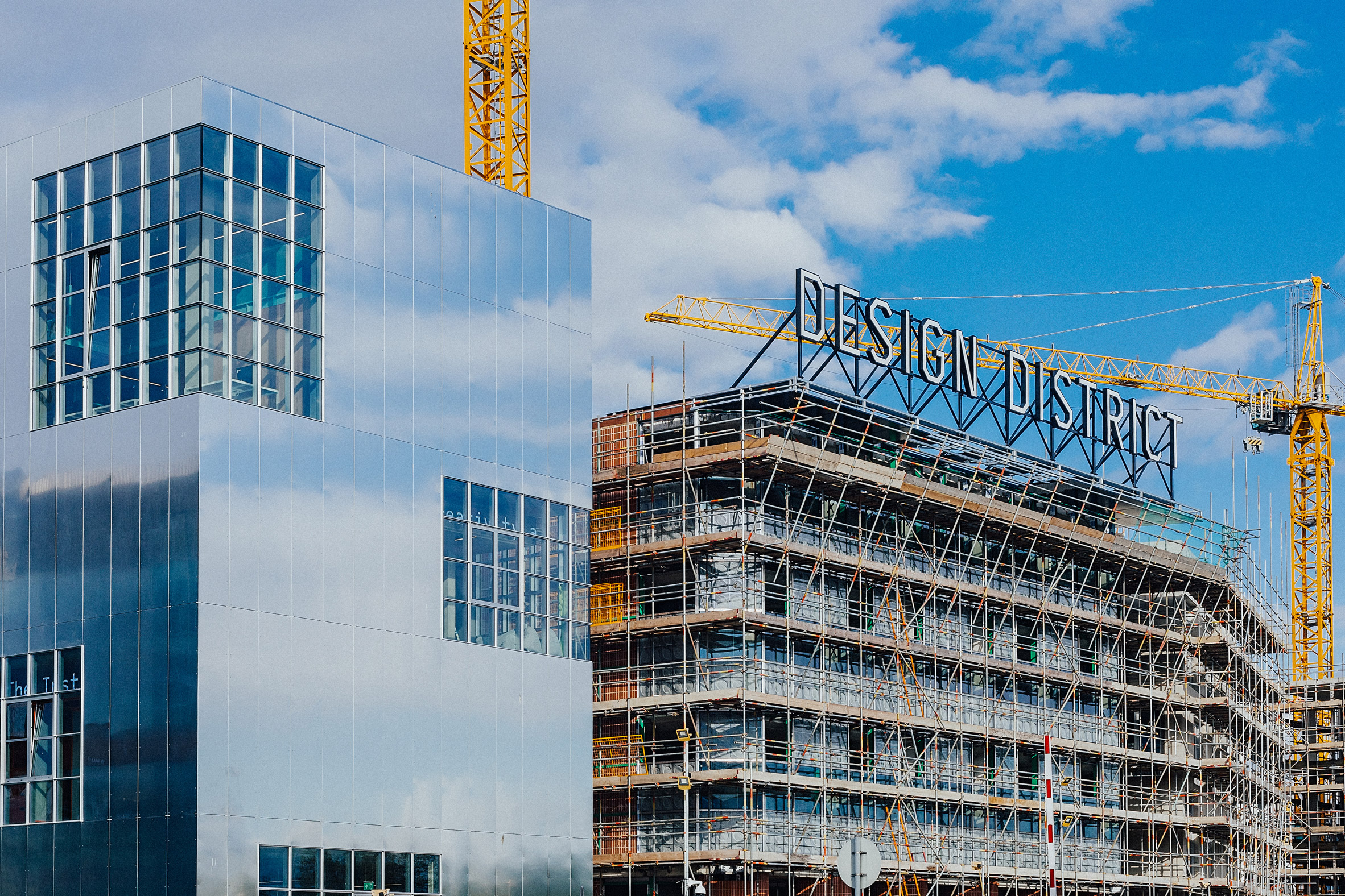
Large, asymmetrically placed openings in the facade hold windows in a grid pattern and aim to create a "certain ambiguity of scale," according to the architect, while also letting light into the art studios.
The compact building was stepped back from the site's perimeter to leave room for an exterior staircase. This connects the first-floor studio spaces directly to the ground, enabling students to avoid going through the public ground floor areas if they want.
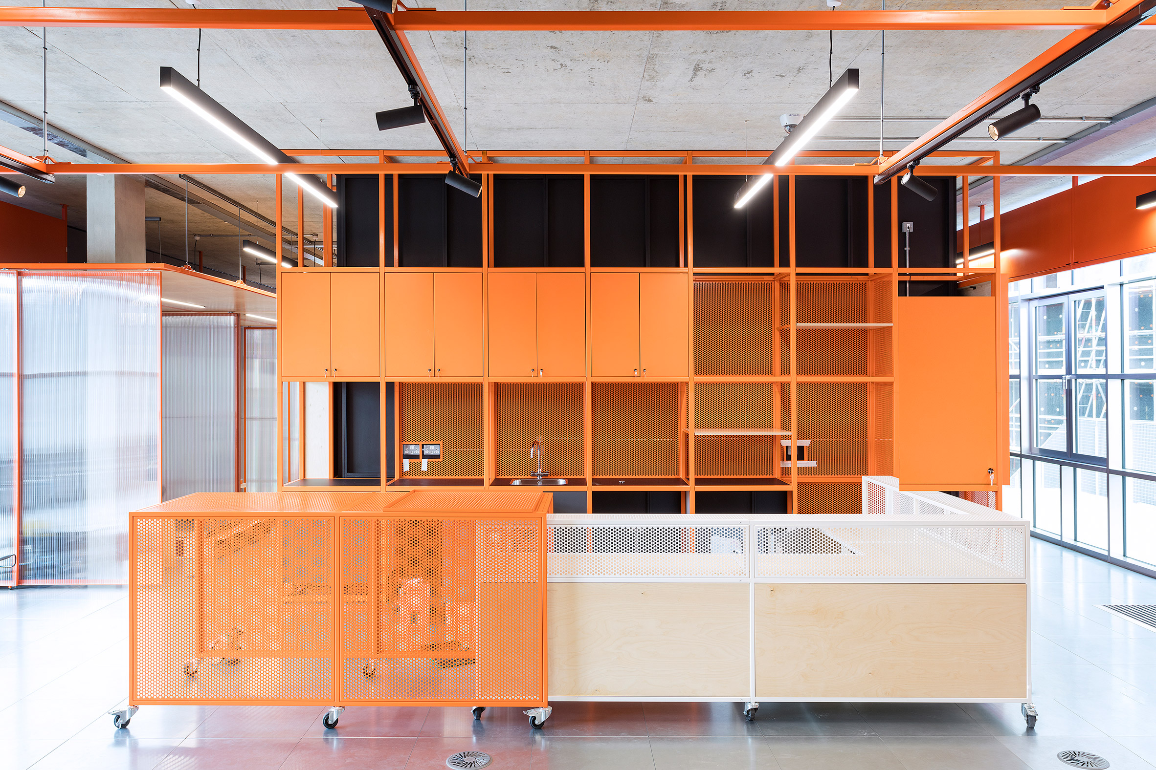
Inside, the layout of the 1,500 square-metre space was developed around a central core.
This core, which houses a distribution staircase, services and technical spaces, was designed to free up space among the perimeter to house functional workspaces for the students.
The ground floor, first and second floors have a ceiling height of 3.6 metres, which increases to 5.4 metres on the third floor.
"The configuration in plan repeats on each floor while, to guarantee the possibility of hosting different types of artistic activities, the section of the project presents interior rooms with variable heights," Veiga said.
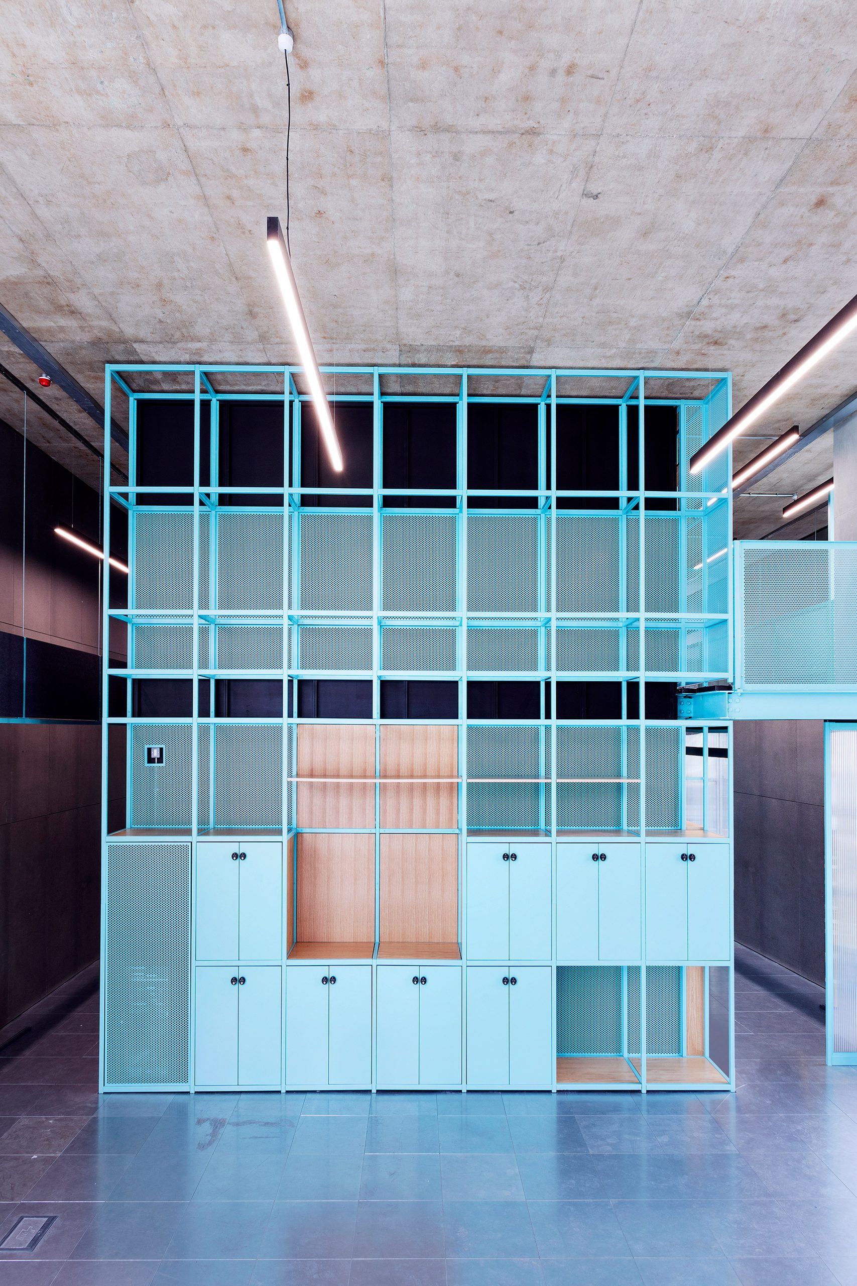
The institute will be used by postgraduate students as well as for research and industry partnerships.
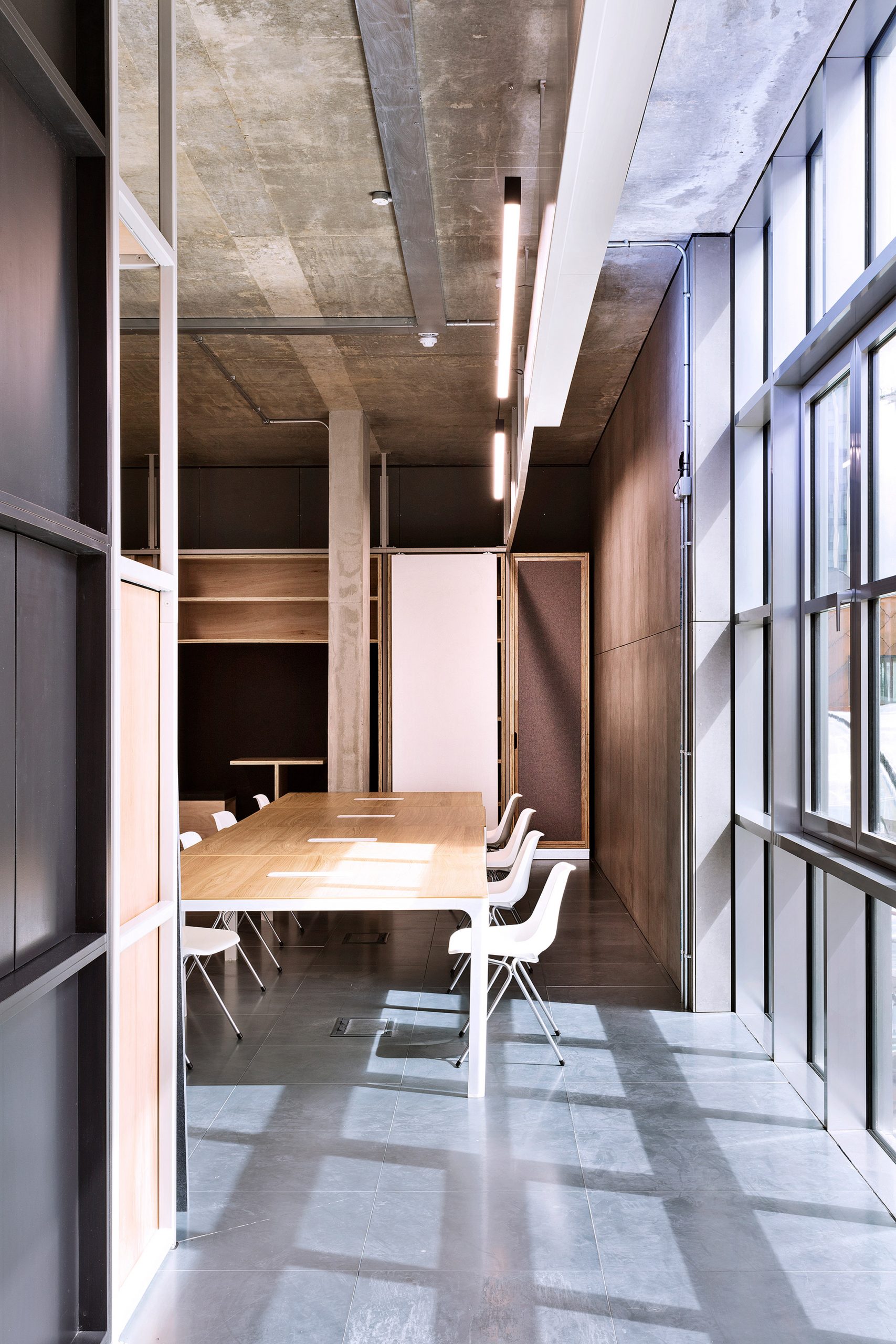
"In order to create rooms suitable for workshop and experimentation, the interiors feature raw materials such as exposed concrete, built on-site or prefabricated, pre-finished wood and metal panelling," Veiga said.
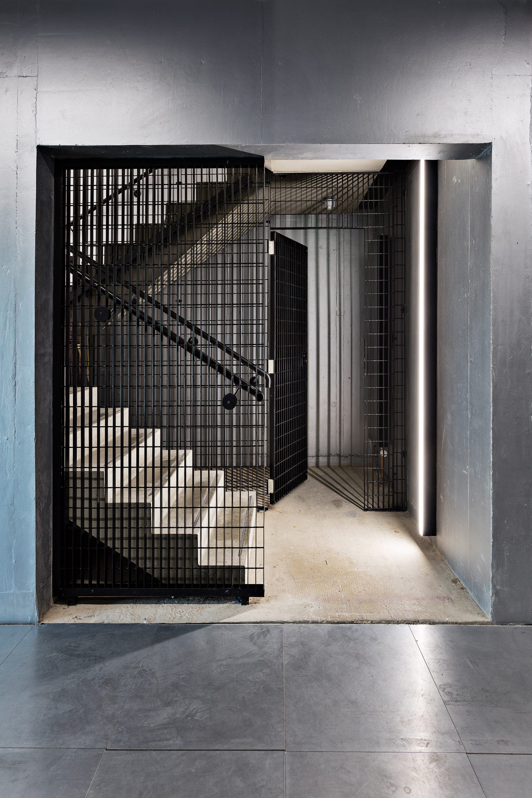
"The goal of the project consists of making spaces for creative activities of various kinds, including art, photography, technology, and communication," he added.
"The approach was, therefore, one of thinking about flexible areas, with the possibility of being transformed and adapted without losing the main character of the design."
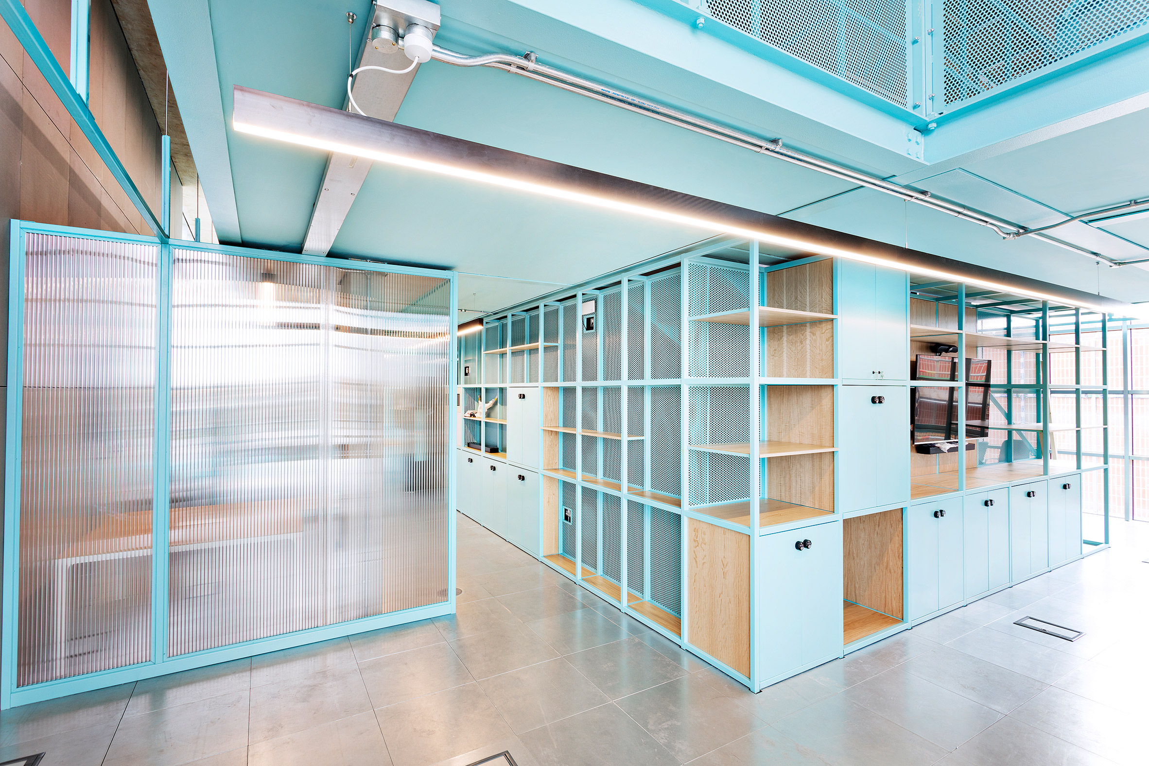
The interior design by Brinkworth features a material palette of birch plywood and linoleum, as well as colourful powder-coated steel structures that function as room dividers and storage spaces.
Throughout the building, a system of digital screens will be used for wayfinding.
As well as this building, Barozzi Veiga is also creating a sister building within the Design District with a "slim, black facade".
"The bi-chromatic appearance of the two volumes expresses the concept of creating a single project consisting of two separate figures," said Veiga.
"Hence the desire to establish a dialogue between the pair and the choice of creating two chromatically opposite volumes."
While this first building, A1, is located next to the entrance of the Design District, the studio's second building, D4, will overlook the central square.
Visuals for the designs by the eight architects creating the Design District were first unveiled in March 2020, three years after the project was announced in 2017.
Exterior photography is by Taran Wilkhu. Interior photography is courtesy of Brinkworths.
The post Barozzi Veiga designs reflective university building at London's Design District appeared first on Dezeen.
from Dezeen https://ift.tt/3uHroW1
No comments:
Post a Comment