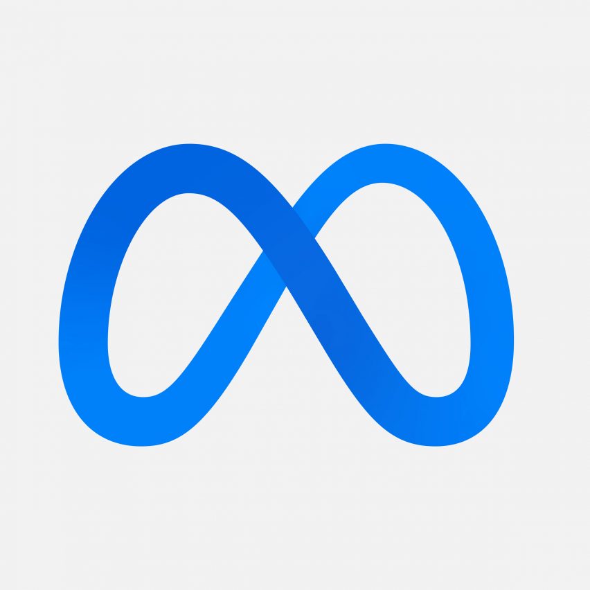
Social media brand Facebook's parent company has changed its name to Meta and updated its logo to an infinity loop that resembles the letter M.
At the latest annual Facebook connect event, co-founder Mark Zuckerberg announced that the social media company has changed its name to Meta. The CEO also shared how its logo has been updated to a looping letter M.
According to the brand the name represents the company's move further into the metaverse – a digital world where people can experience an alternate life to their real-world existence.
Both the name, which has been created in the company's familiar 2019 typeface, and logo will be used across all Facebook-owned apps such as Whatsapp, Instagram and Messenger. They will also be used for its virtual reality brand Oculus, which the company acquired in 2014.
"The defining quality of the metaverse will be a feeling of presence"
According to a letter Zuckerberg published on the brand's blog, the company chose Meta because of its connotations with possibility and a future where there is "more to build". The word translates to beyond in Greek.
"We chose 'Meta' because it can mean 'beyond'", read the statement. "The defining quality of the metaverse will be a feeling of presence – like you are right there with another person or in another place."
"The metaverse encompasses both the social experiences and future technology," it continued.
Rebrand marks company's shift away from social media platform
Under the Meta umbrella, the company is now attempting to create a platform where users will be able to "socialise, work, learn, play, shop and create" across various apps.
Meta users will be able to use products and connect with others virtually without a Facebook account. The name change also distances the company further from its association with the social media Facebook.
"Right now, our brand is so tightly linked to one product that it can't possibly represent everything that we're doing today, let alone in the future," explained Zuckerberg.
"Over time, I hope that we are seen as a metaverse company, and I want to anchor our work and identity on what we're building toward."
The new logo is designed to "live in motion and 3D"
The logo, which comes in 2D and 3D versions, is designed to be effective across all screens and apps of all sizes, from phone screens to virtual reality worlds.
Using a single line, the designers drew the logo as an infinite loop that can rotate and twist. Users in the metaverse will be able to move through it and around it.
Although the new design comes in a variety of colours, it also comes in the same blue colour associated with the Facebook brand identity.
The social media giant isn't the only technology company to rebrand recently. Last year Google's emailing app swapped its envelope logo for a simplified, multi-coloured letter M.
The post Facebook rebrands to Meta and adopts infinity loop logo appeared first on Dezeen.
from Dezeen https://ift.tt/3pZXu0f
No comments:
Post a Comment