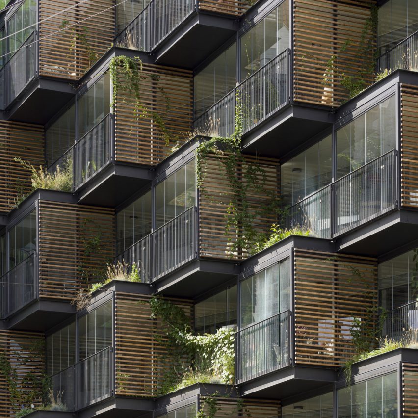
Danish studio Tegnestuen Lokal has transformed an apartment block in Copenhagen, by replacing its austere concrete exterior with angular, plant-filled blocks.
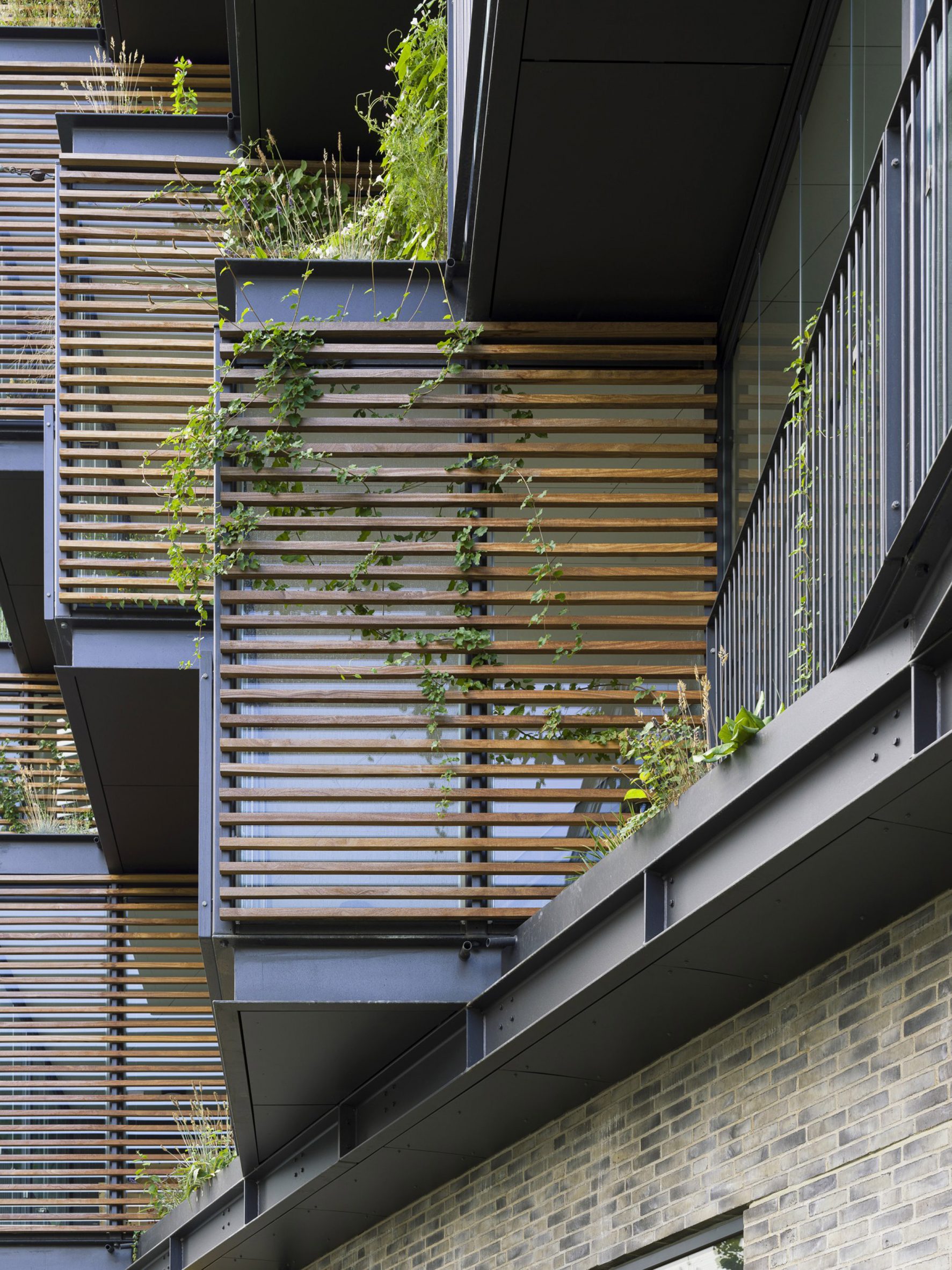
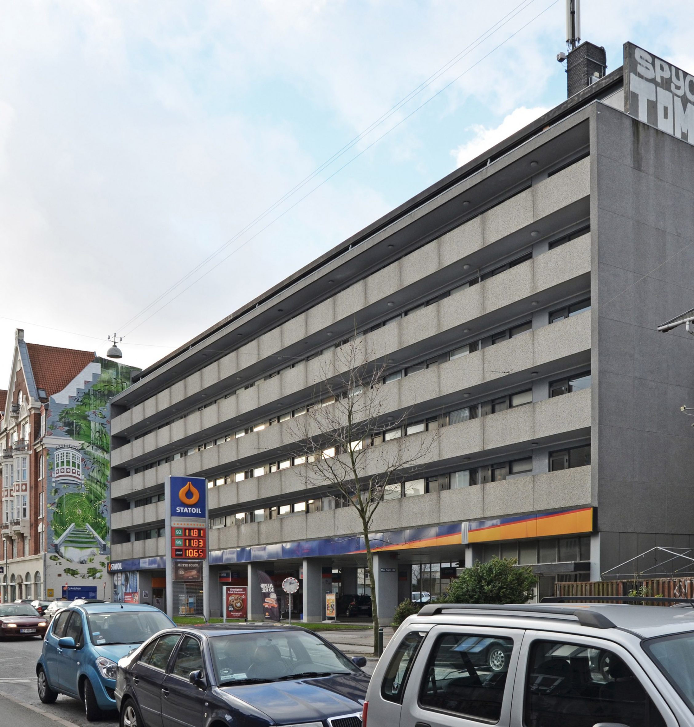
Built in the 1960s, the six-storey slab block in Frederiksberg featured a typically rationalist facade fronted by linear balcony walkways. Tegnestuen Lokal's revamp brings more three-dimensionality to the facade, by replacing the long lengths of concrete with a series of glazed blocks.
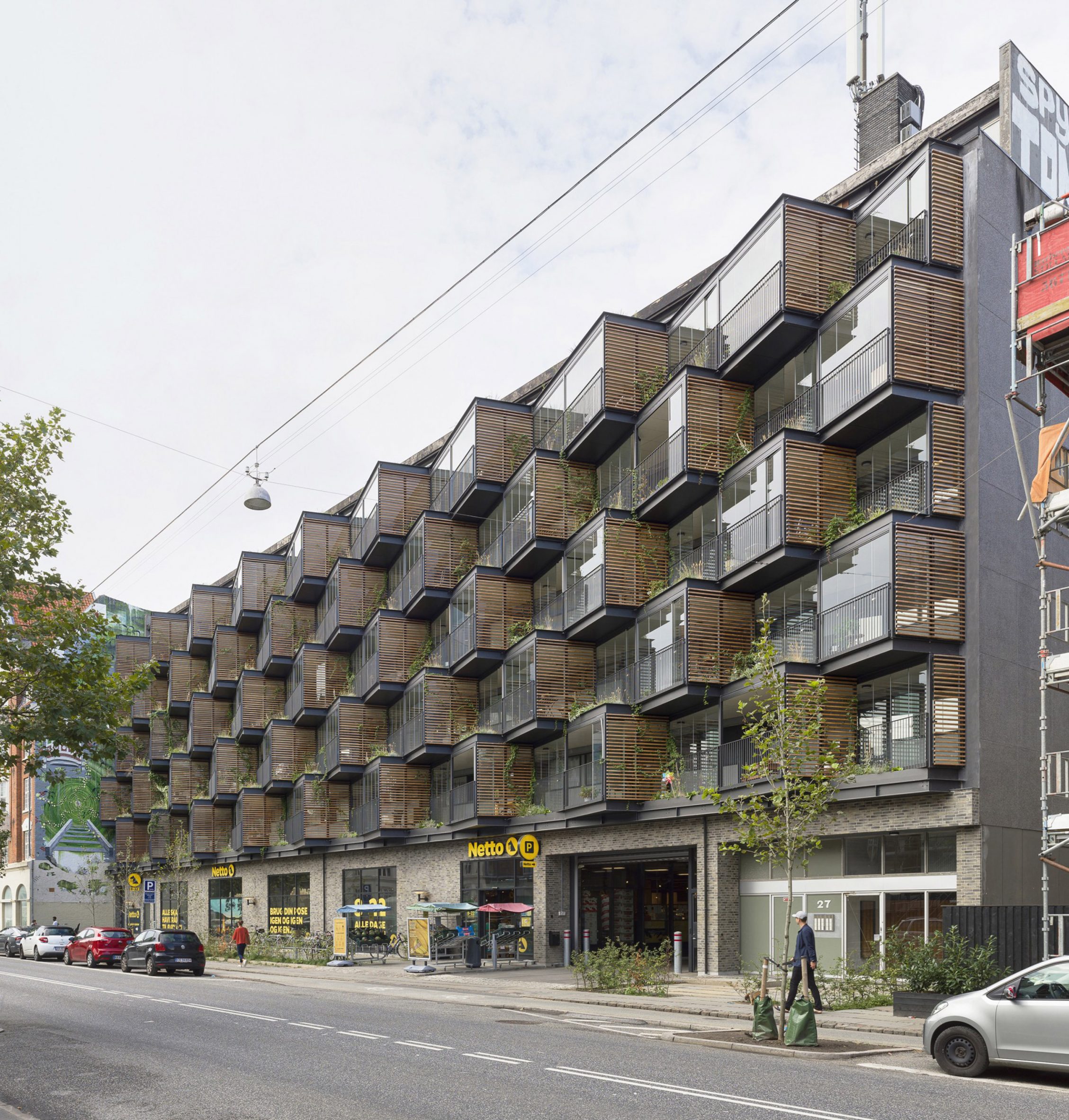
As well as making the building more attractive, these blocks give residents an outdoor space where they can sit and observe the street below, or converse with their neighbours.
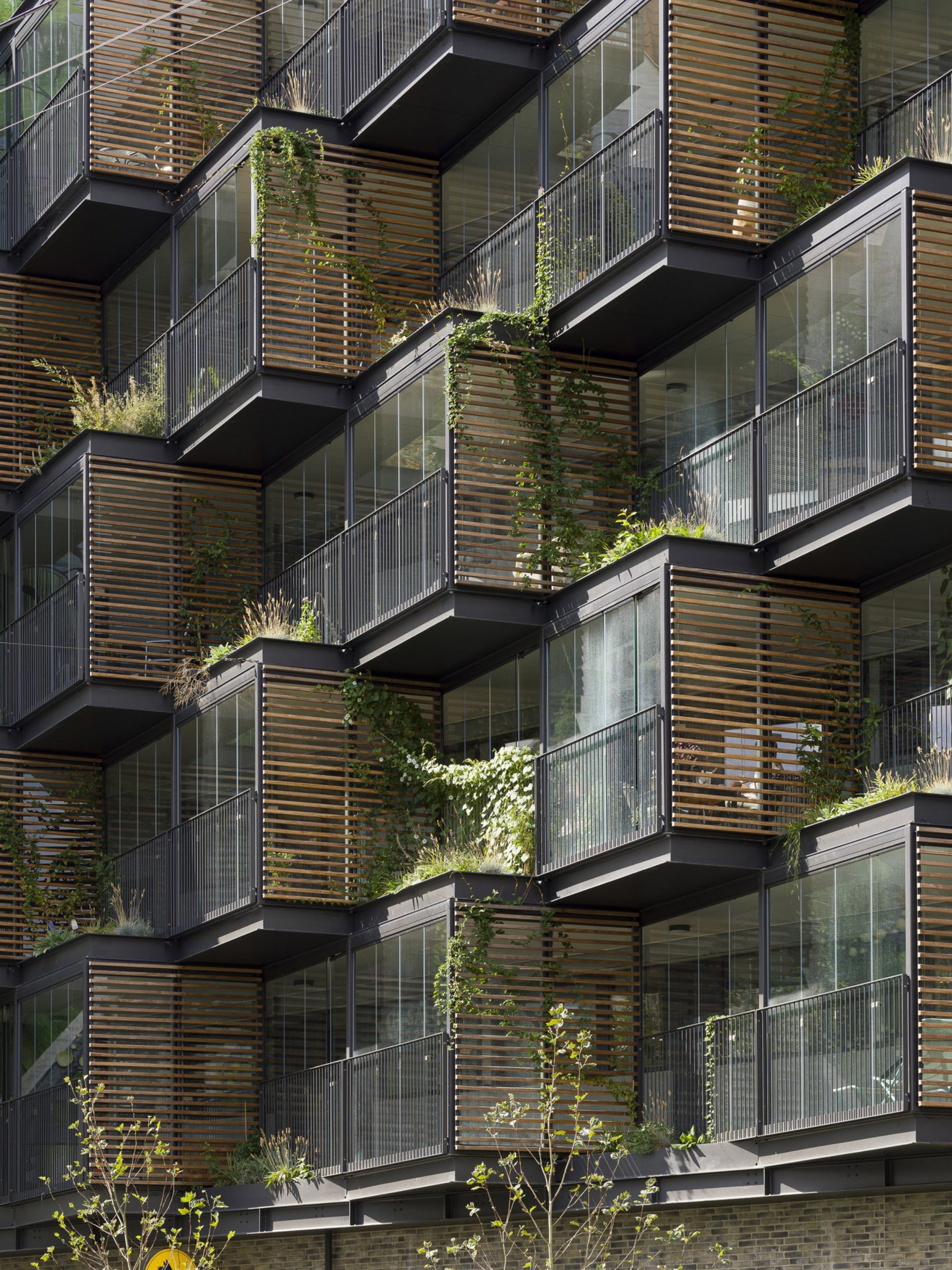
They also create space for growing plants, which is why the architects gave the project the name Ørsted Gardens.
"Ørsted Gardens transformed a dilapidated building that was often referred to as the ugliest in its neighbourhood," said Christopher Ketil Dehn Carlsen, co-founder of Tegnestuen Lokal.
"The building was sleek and unwelcoming, and didn't age with a modicum of grace," he explained. "Our aim was to create a new social space to bolster the social coherence in the building."
Ørsted Gardens is shortlisted for Dezeen Awards 2021, in the residential rebirth project category.
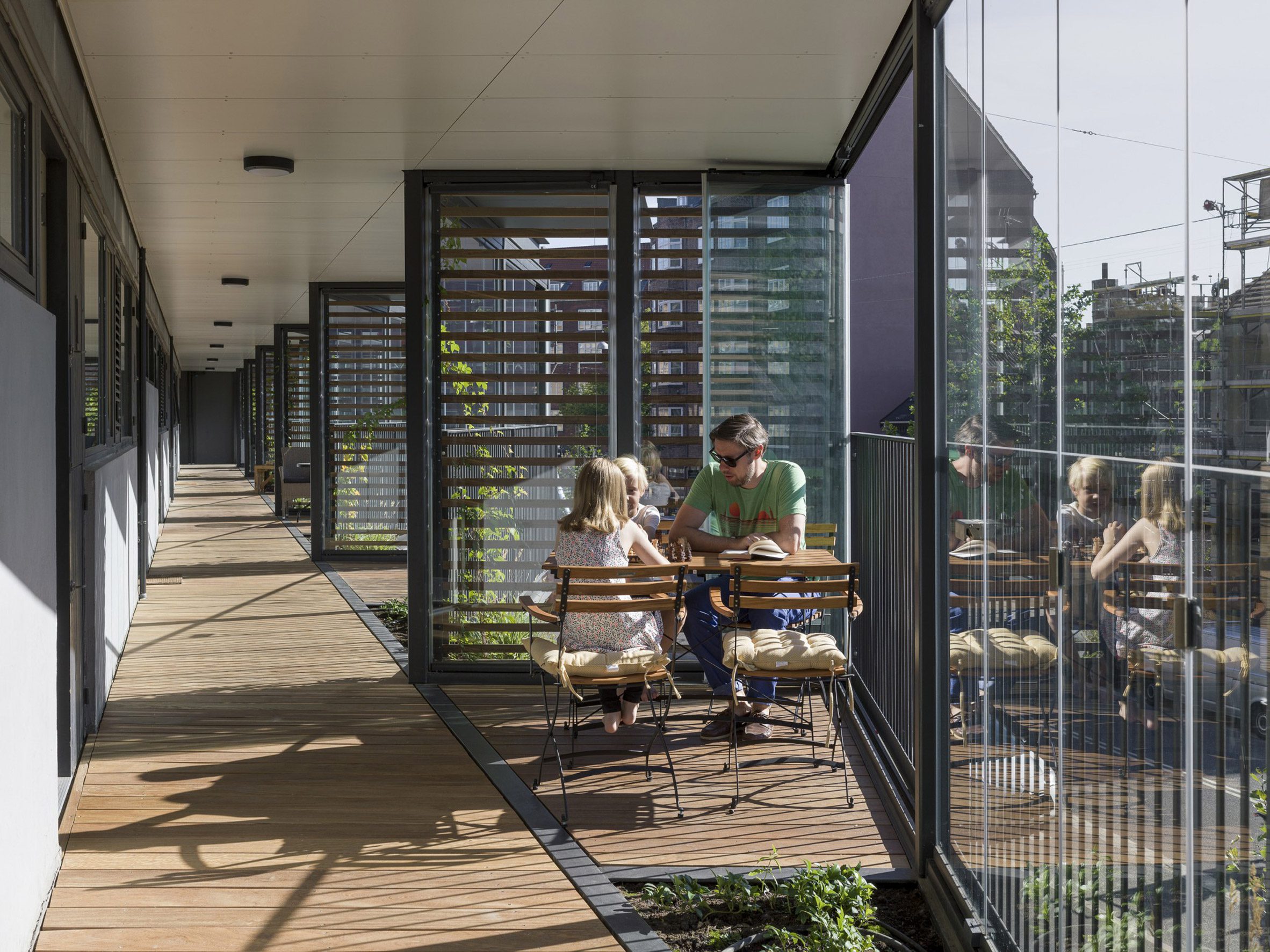
The design maintains the building's original access walkways; the glass blocks simply extend the space outwards.
These blocks make it clear which space belongs to which residence. At the same time, the spaces are open to encourage more neighbourly interactions.
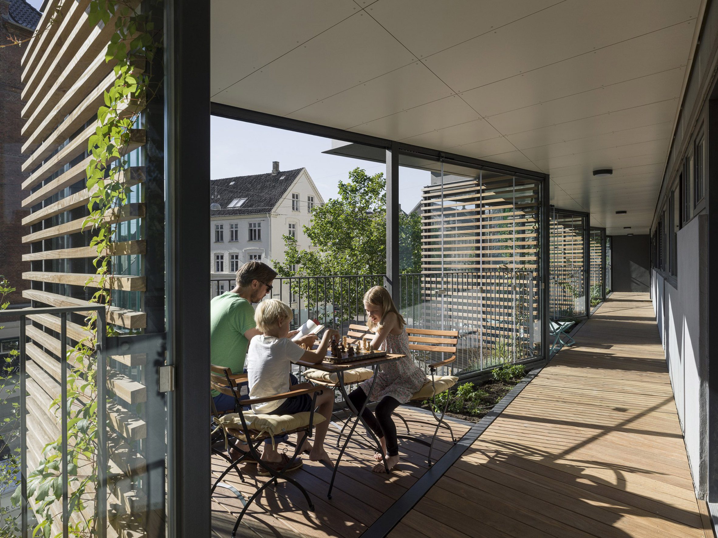
"The new facade shelters the apartments from the heavy traffic noise, and it has transformed the way residents live in the building," said Carlsen.
"Front doors are now open and kids roam the new space, creating a lively urban space on the side of the building rather than the bleak access way that was there before."
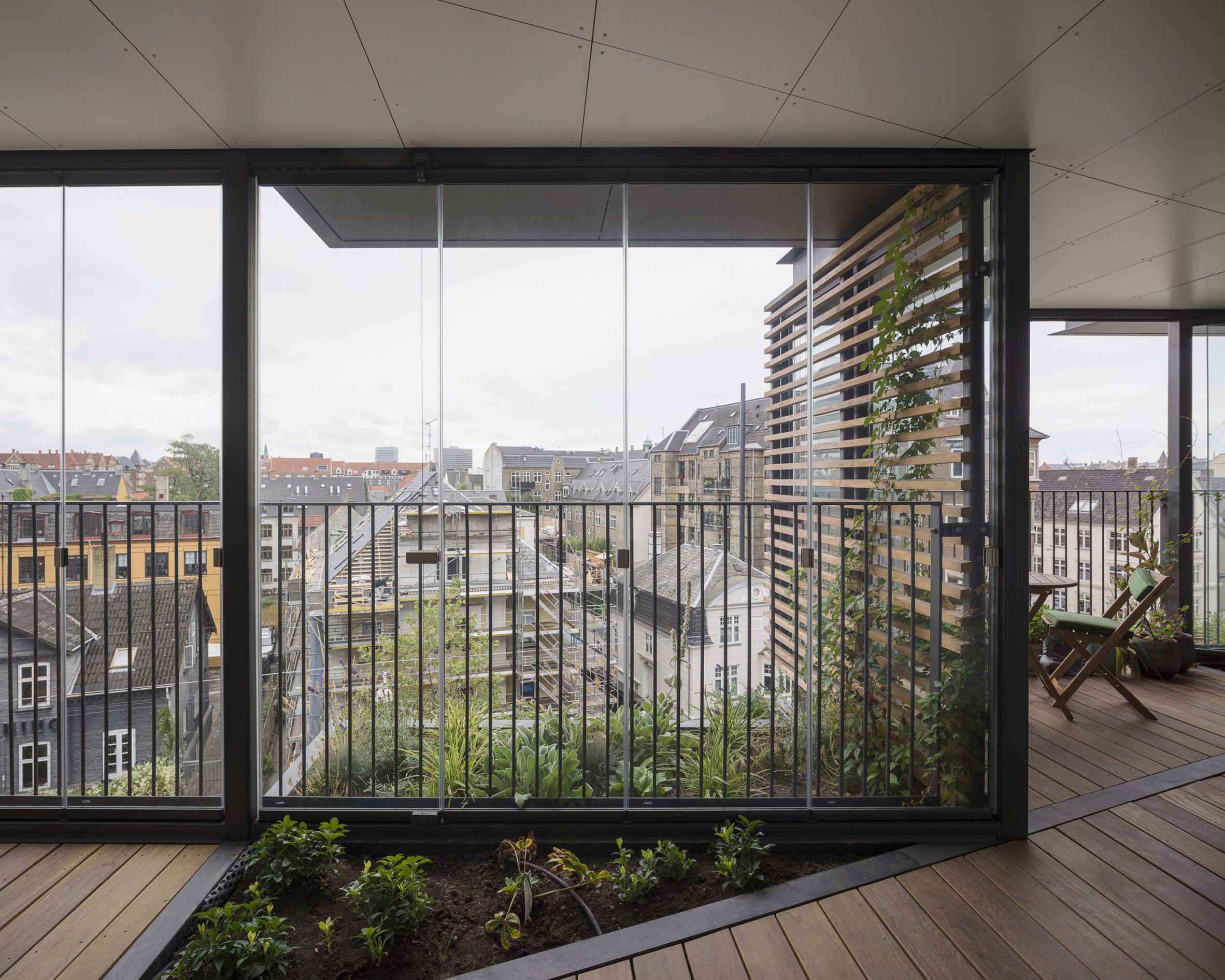
The structure is framed by steel and infilled with glass panels that can be opened or closed, making the space more usable at different times of the year.
Wooden louvres shade some of the glazing.
Residents are given the freedom to cultivate their own mini gardens. Some of the planting areas feature climbing plants that are spreading over the wooden louvres.
The renovation also included overhauling the commercial space on the building's ground floor, replacing the petrol station with a Netto supermarket.
Carlsen believes the approach could be replicated on many other 1960s housing blocks of the same style.
"There are many examples of buildings where open access ways are covered, but usually the renovations don’t take into account the antisocial nature of the original architecture," he said.
"With Ørsted Gardens we proposed a radical transformation that wouldn’t just prolong the challenges with the typology but would rather improve it," he continued.
"The end result demanded a high investment from residents and all implicated, but the increased value and the improved social life in the building has far surpassed it."
Photography is by Henneby Nielse.
Project credits
Architect: Tegnestuen Lokal
Design team: Christopher Carlsen, Morten Bang
Client: Salling Group
Engineering: Henneby Nielsen
Consultants: CEJ
Contractor: Amstrup & Baggesen
The post Tegnestuen Lokal adds plant-filled blocks to "ugliest building in the neighbourhood" appeared first on Dezeen.
from Dezeen https://ift.tt/3EE7EYI
No comments:
Post a Comment