Continuing our 2021 review, Dezeen looks back on a year of high-profile rebrands including Facebook changing its name to Meta and Volvo adopting a flat logo.
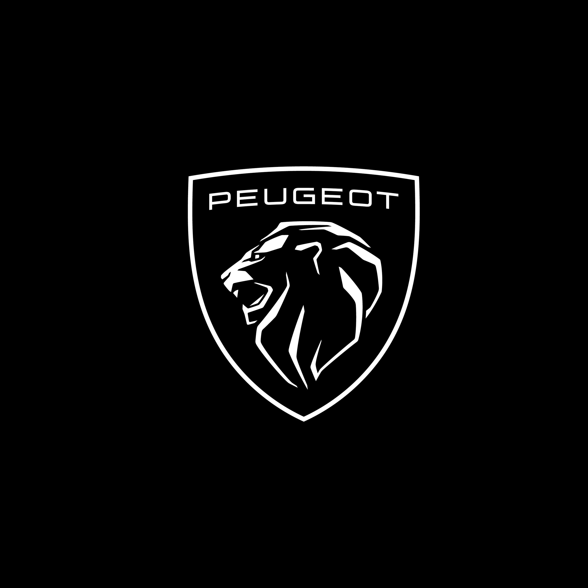
The first of three car manufacturers to feature in this list is French brand, Peugeot. This year, the company released a new version of its logo for the first time in a decade to mark a new era of building electric vehicles.
As with every version of Peugeot's logo since 1847, the lion is still central to the design: a stylised head with mane sits in the middle of a shield emblazoned with the brand's name. However, unlike the previous logo, the design no longer includes the lion's body.
Find out more about the Peugeot rebrand ›
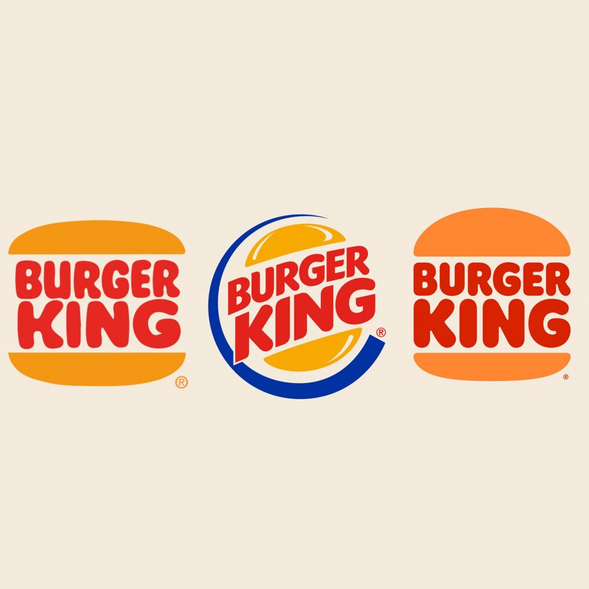
Burger King by Jones Knowles Ritchie
Twenty years on from the last Burger King logo revamp, the American fast-food restaurant rebranded this year with new packaging, uniforms and a logo.
Its new visual identity harks back to the flat logo used by the brand in the 1970s, 80s and 90s. The chain hopes that the restyle "pays homage to the brand's heritage with a refined design that's confident, simple and fun."
Find out more about Burger King's rebrand ›

The parent company of social media giant Facebook changed its name and logo to Meta in a move that propelled the brand further into the direction of the metaverse.
This new name, which translates to "beyond" in Greek, is often associated with possibility and the future. It appears along with the new infinity loop logo within all apps owned by the company including Whatsapp, Instagram and Messenger.
Find out more about Meta's rebrand ›
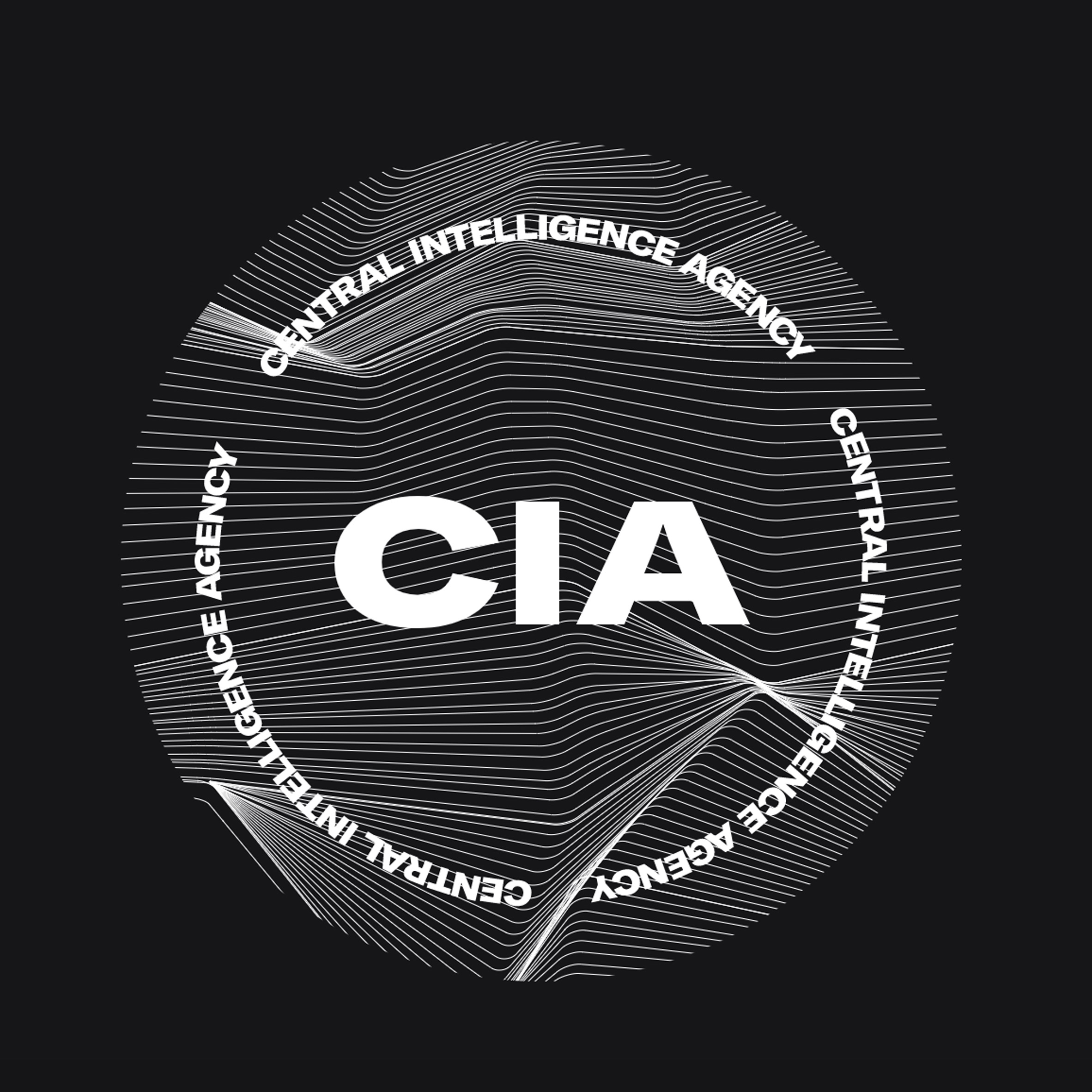
America's Central Intelligence Agency (CIA) unveiled a new brand identity in January with a new logo and an updated website designed to attract a more diverse employee base.
The CIA website now has a clean, sans-serif typeface as well as a new circular logo with a background of fractal lines. A border formed of the words Central Intelligence Agency frames the design. In true espionage fashion, the agency refused to disclose the designer behind its new look.
Find out more about the CIA rebrand ›
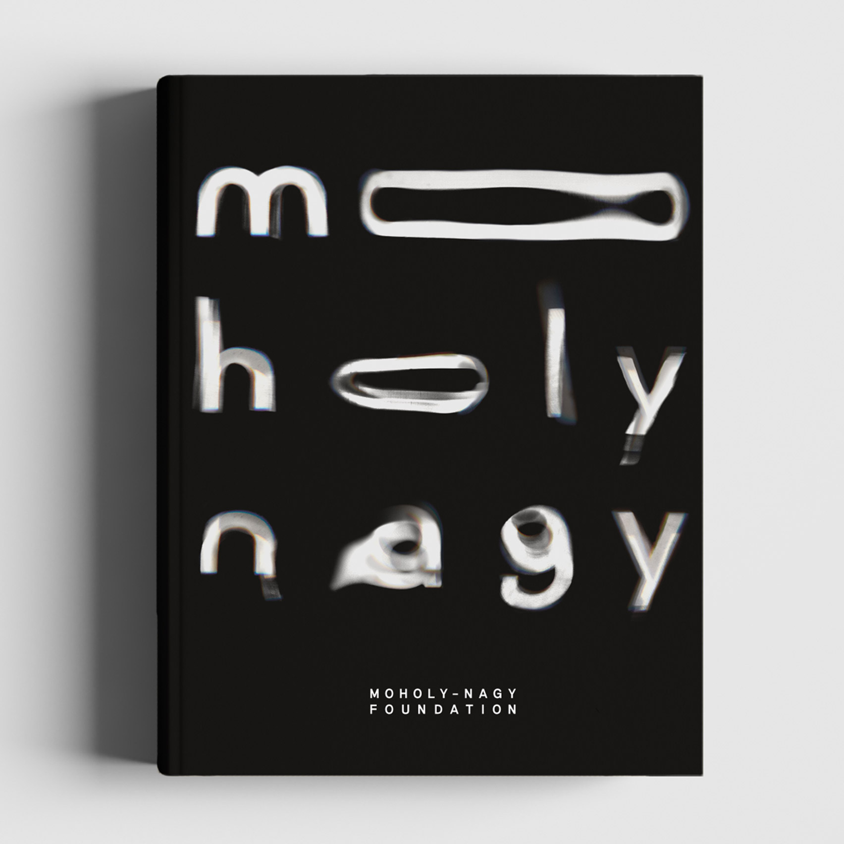
The Moholy-Nagy Foundation by Pentagram
Design consultancy Pentagram created new monochrome branding for The Moholy-Nagy Foundation, an organisation that aims to preserve the legacy of renowned artist László Moholy-Nagy.
Pentagram partner Marina Willer and her team were asked to design an "expressive" visual identity that embodies the style and methods used by the artist such as his photograms – images made by laying objects onto photographic paper and exposing it to light.
Find out more about The Moholy-Nagy Foundation rebrand ›
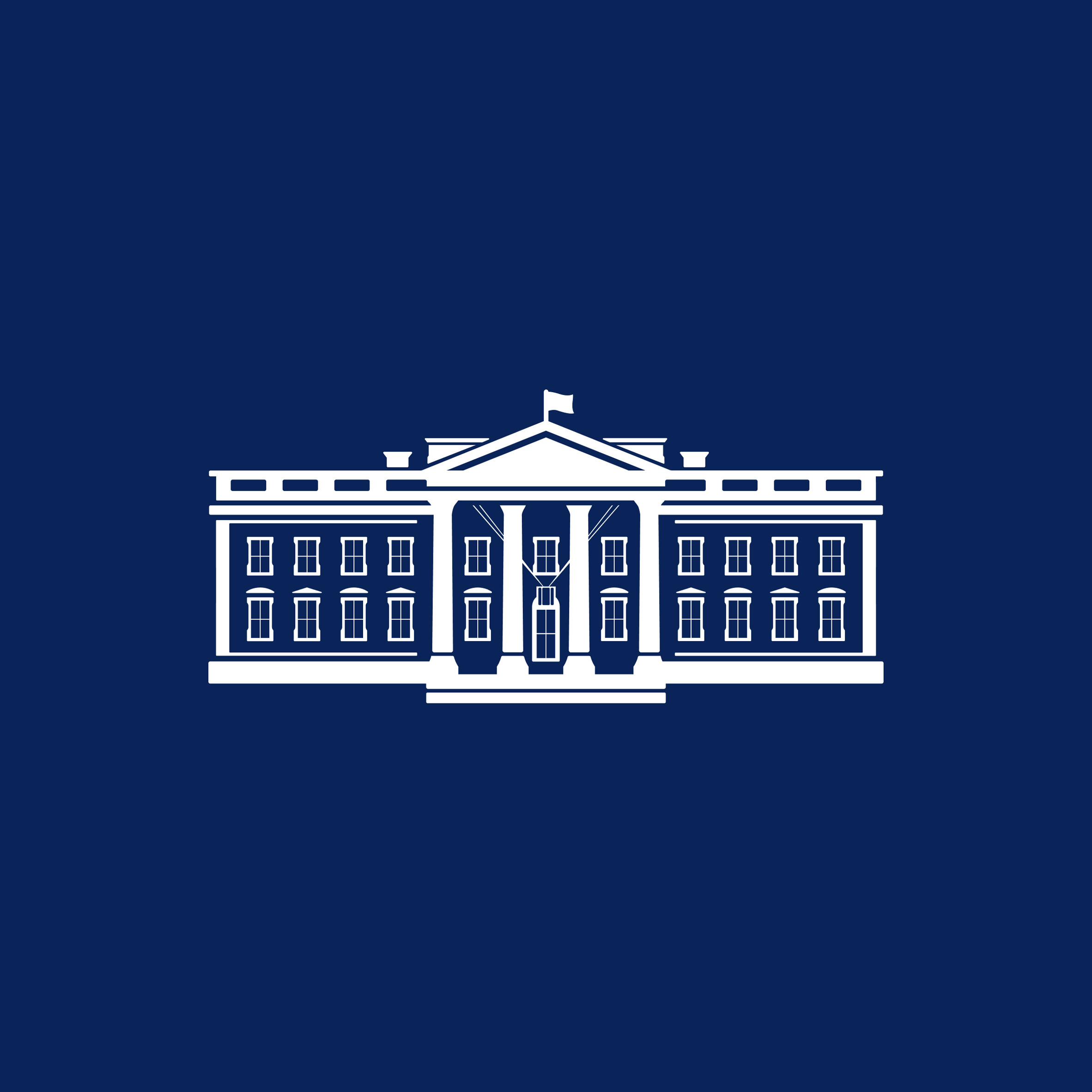
Creative agency Wide Eye updated the White House logo after Republican president Donald Trump left office. The updated design, which is a slightly more detailed and architectural depiction of the White House, was intended to convey Joe Biden's "desire to bring the country together" following a tumultuous few years.
"This is symbolic of the president's desire to bring the country together: conveying a sense of openness, warmth, inclusion, and humanity," explained the agency.
Find out more about The White House rebrand ›
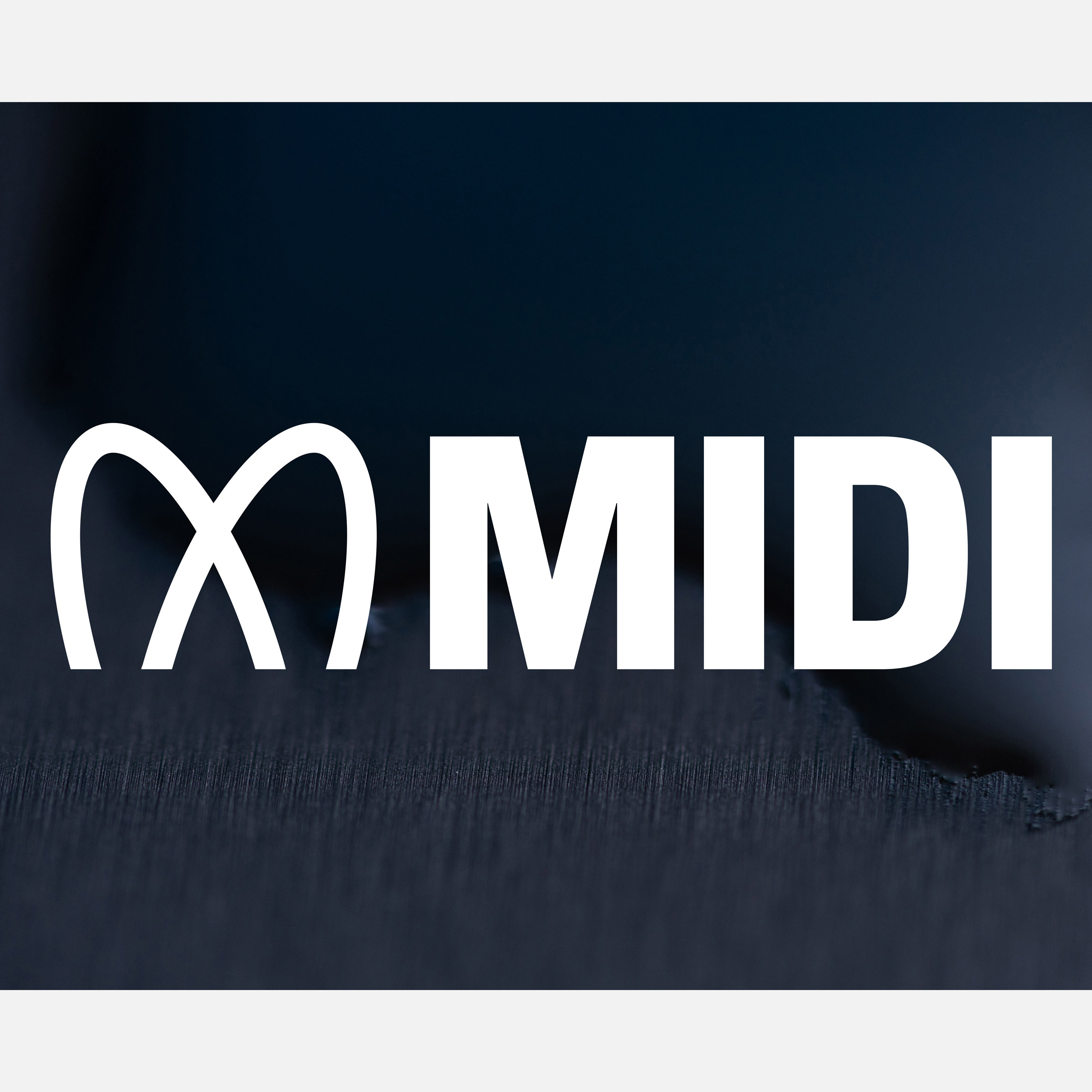
Pentagram makes this list again with its brand identity for Musical Instrument Digital Interface (MIDI), the global standard that allows digital musical instruments to talk to each other.
Yuri Suzuki, a musician and Pentagram partner, worked with the graphic designer and partner Sascha Lobe on the update. The logo, which looks like an abstract letter M, replaces its previous wordmark and follows the 2020 release of MIDI 2.0, the first major update of the standard in over 35 years.
Find out more about MIDI's rebrand ›
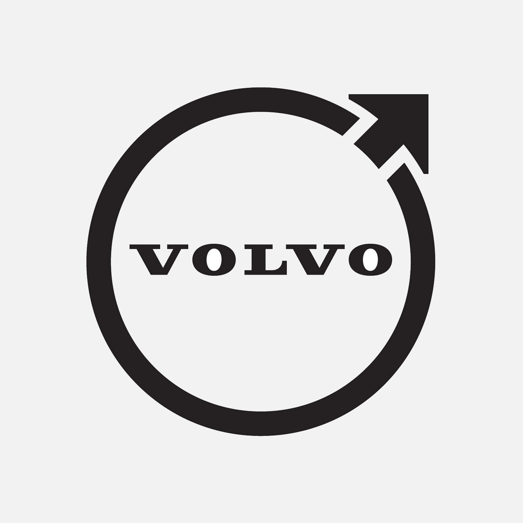
Swedish carmaker Volvo joined BMW, MINI and Volkswagen in officially replacing its three-dimensional emblem with a flat, two-dimensional version. It bears a resemblance to other two-dimensional logos created by automotive brands looking to adapt their visual identity to an increasingly digital world.
The company believes that the flat, less colourful logo is a more "modern" reinterpretation of its longstanding Iron Mark logo. It still retains the same circular shape and upward-pointing arrow first used by the brand in 1927.
Find out more about Volvo's rebrand ›
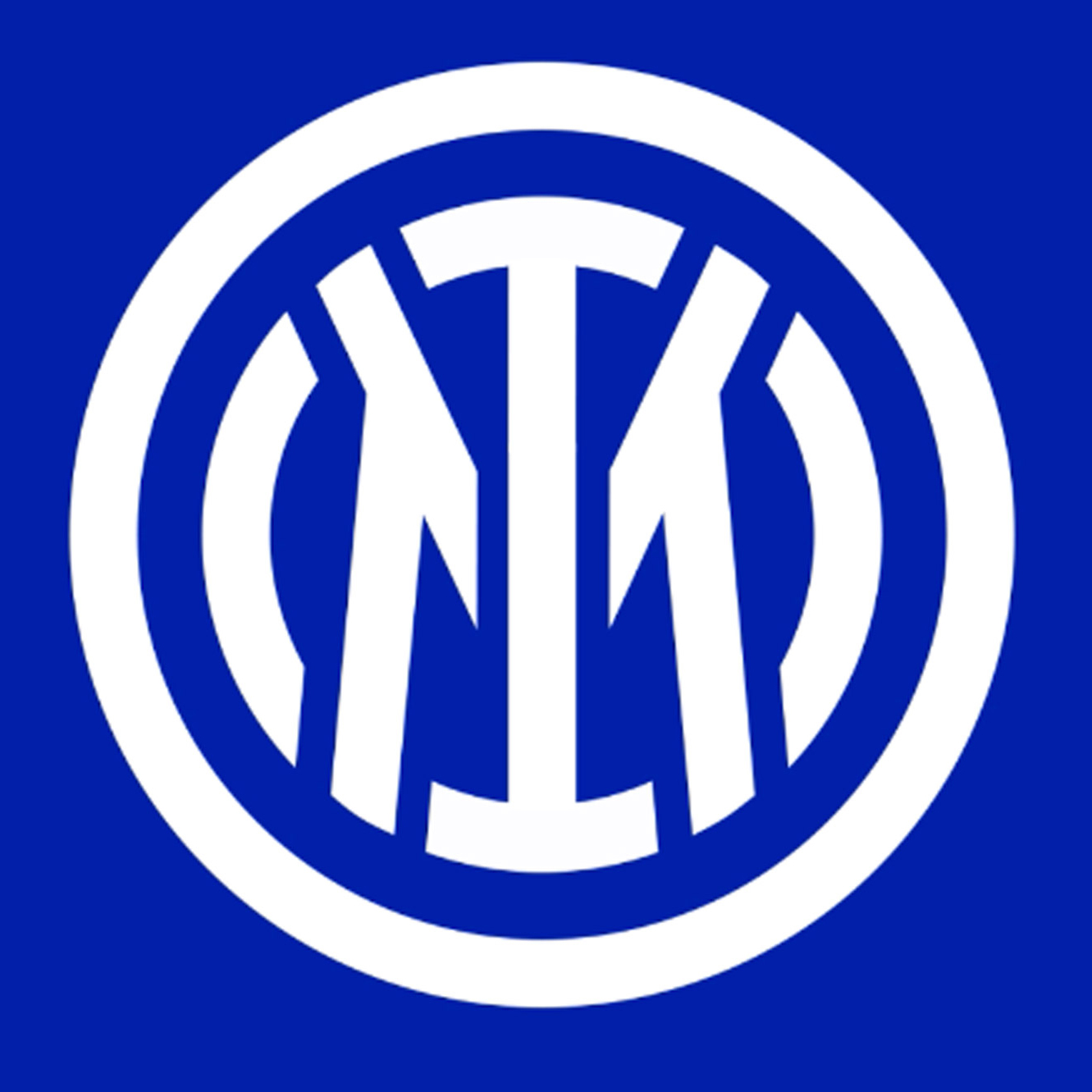
Graphic design studio Bureau Borsche redesigned the logo for Italian football club Inter Milan as part of an effort to promote the club beyond sport.
The studio updated the original logo designed by painter Giorgio Muggiani in 1908 by producing a simplified crest and removing the letters FC, which stand for football club.
Find out more about the Inter Milan rebrand ›
General Motors by General Motors
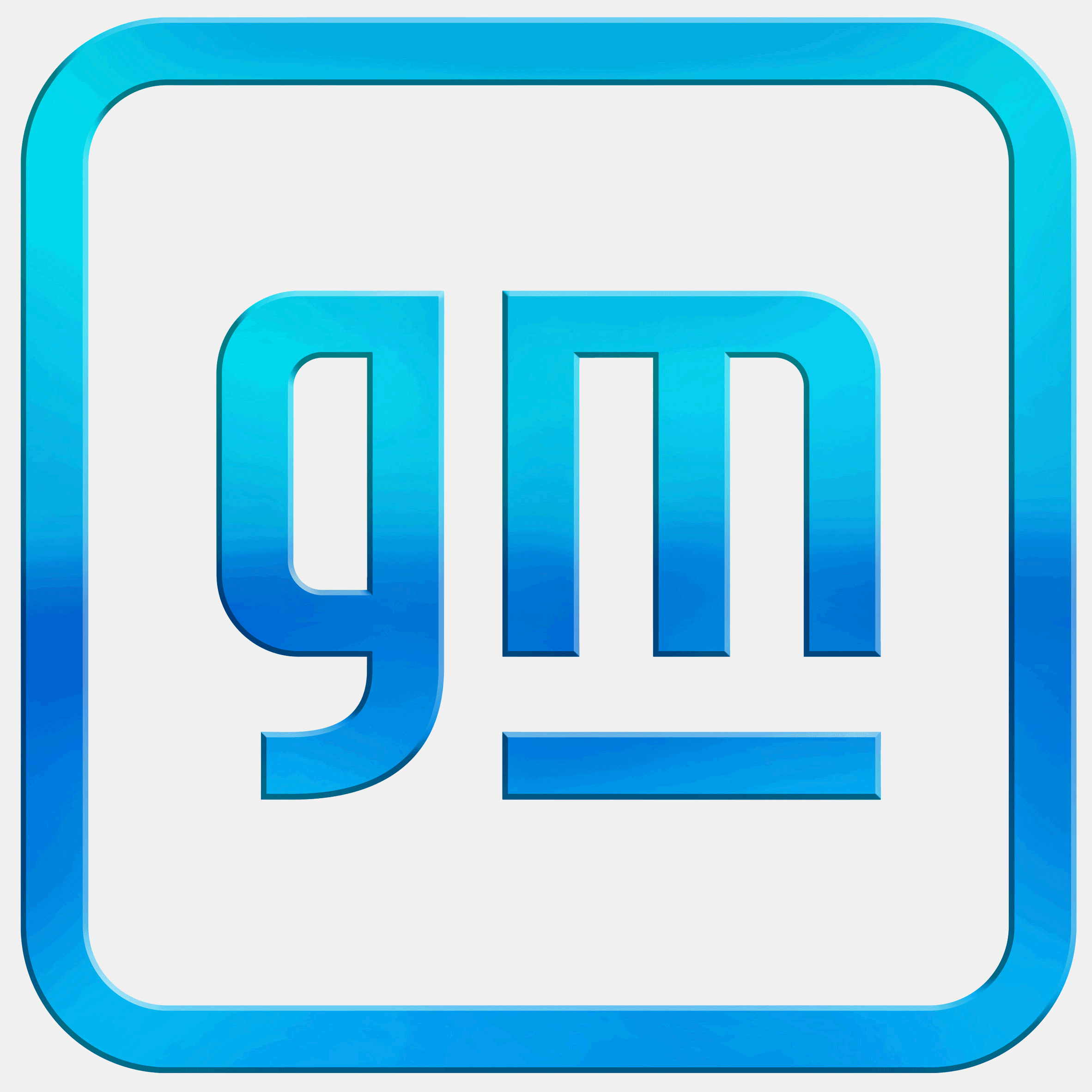
An eye-catching bright blue and a softer border was used to modernise the logo of American automotive company General Motors. The firm's old logo, which had thick white letters superimposed onto a navy background, had remained largely the same since 1964.
The redesign is part of the company's pivot towards electric vehicles and "a zero-emissions future".
Find out more about the General Motors rebrand ›
The post Dezeen's top 10 rebrands of 2021 appeared first on Dezeen.
from Dezeen https://ift.tt/3Jhb32z
No comments:
Post a Comment