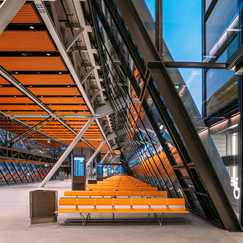
British architecture studio Rogers Stirk Harbour + Partners has completed the polychromatic and modular Aile Est airport terminal in Geneva, Switzerland, as part of a consortium called RBI-T.
The 520-metre-long glass and steel building was created by RBI-T, a team composed of Rogers Stirk Harbour + Partners (RSHP), architecture studio Jacques Bugna and engineering firms Ingérop and T-Ingénierie for the La Genève Internationale airport.
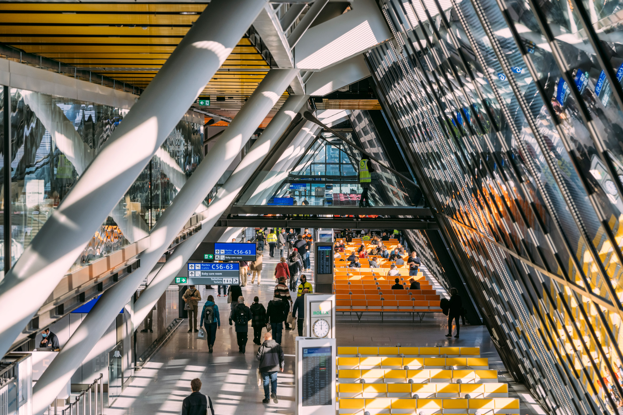
Composed of two floors, Aile Est serves six existing aircraft stands at the international airport and comprises departures, arrivals and transfer facilities, alongside border controls and passenger lounges.
It accommodates approximately 2,800 passengers per hour on departure and 3,000 on arrival.
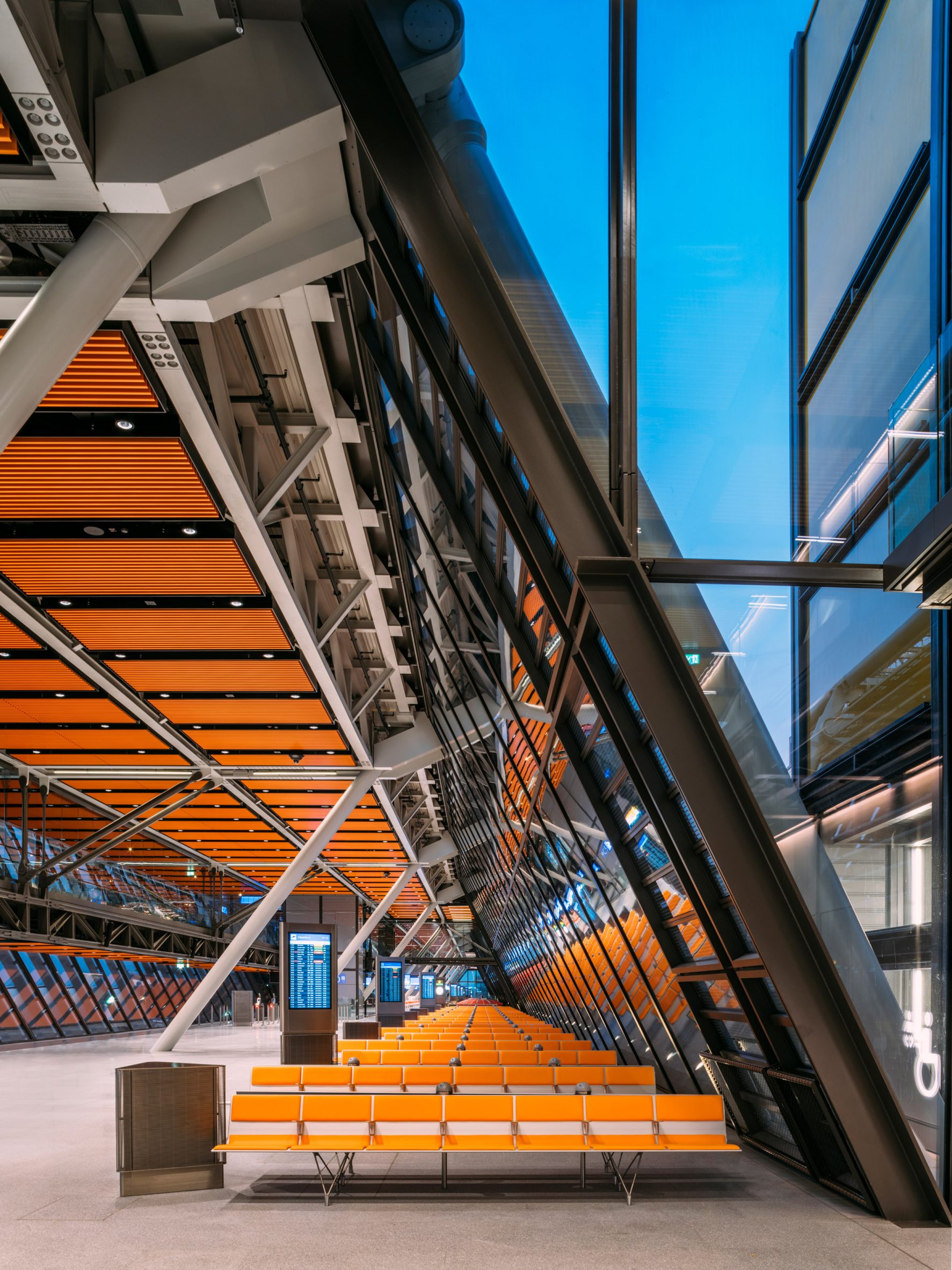
The terminal is distinguished by its narrow, elongated form, described by RSHP as an "extruded parallelogram". It measures less than 20 metres in width.
This was designed in response to tight site constraints but it also helps to maximise daylight inside, reducing demand for artificial lighting.
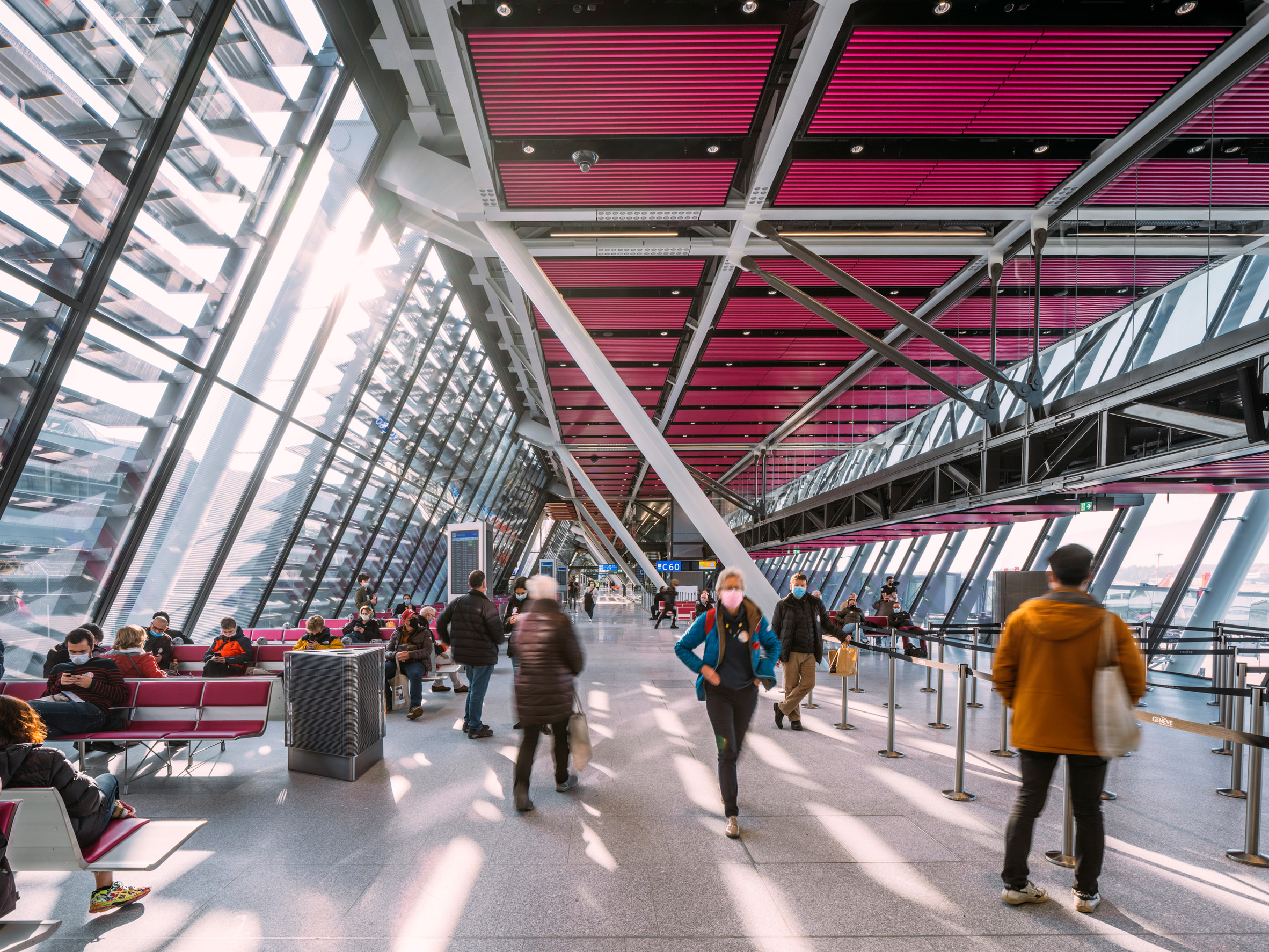
Aile Est has a repetitive modular structure, with its six gates built from four 20-metre-long modules. Their structure is exposed externally and internally.
Designed as a kit of parts, this structure allows the building to be easily disassembled, recycled or extended in the future. It also helped to reduce waste during construction.
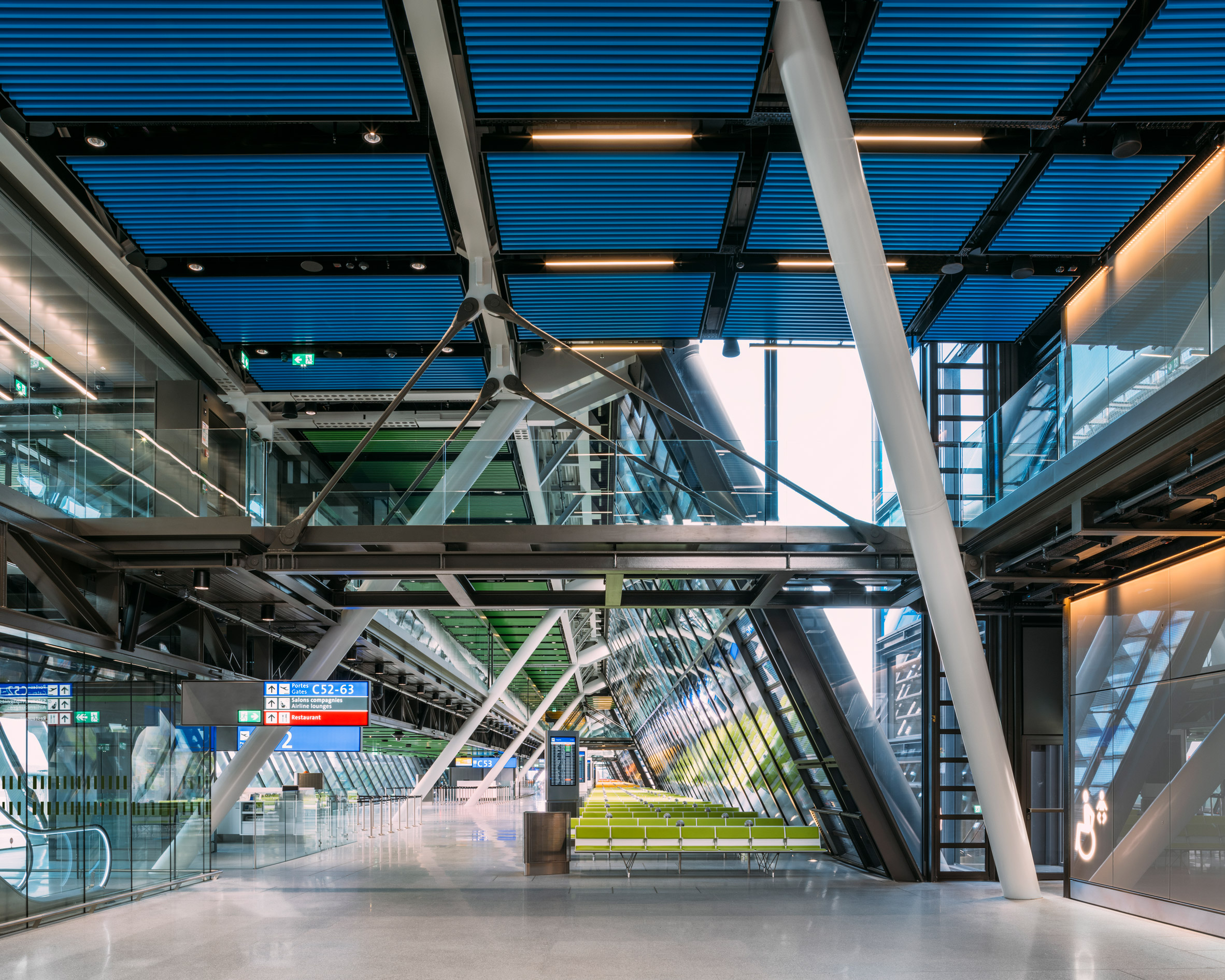
Expressing structural elements is a trademark style of RSHP, as seen in other buildings such as the Leadenhall Building and the Macallan Distillery and, more famously, the Lloyd's building.
"There has been a long-standing approach at RSHP to articulate clearly and truthfully the elements that make up the building," explained the studio's associate partner Douglas Paul.
"The material and structural systems differ greatly on each project, but all have a structure that is carefully detailed and expressed," Paul told Dezeen.
"This is reflected in the expression of all building components but particularly structure and services."
Aile Est's design was led by the studio's senior design partner Graham Stirk after RBI-T won a competition to create it in 2010.
It was commissioned to replace a technically and environmentally outdated facility at the airport that was built for temporary use in the mid-1970s.
According to associate partner Paul, a key element of the design that led it to win the competition was its layout that maximises outward views.
Passengers are welcomed by large expanses of glass that look out at pilots preparing for departure and further over to the Jura mountains.
"One of the key strategies that led to the RSHP design consortium RBI-T being chosen was the decision to move the arrivals passenger flow from the basement and place it on the airfield side of the building above the departing passengers," Paul said.
"The client had anticipated that passengers on arrival would descend underground to pass along a subterranean tunnel to the baggage hall," he continued. "By contrast, arriving passengers using the Aile Est today enjoy fantastic views across the airfield to the Jura mountains to the north."
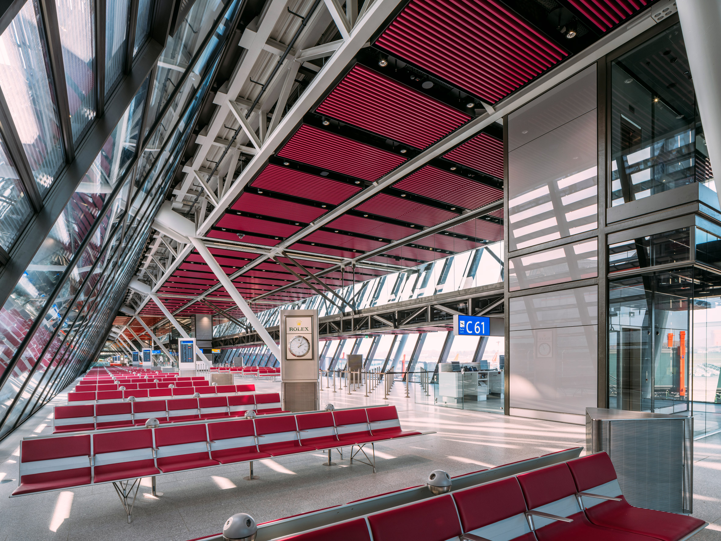
The large windows that frame these views are also designed to maximise daylight, improve passenger and staff wellbeing and help occupants orient themselves.
Therefore, each of the modules is engineered to minimise the quantity of internal structural elements to ensure views are unobstructed.
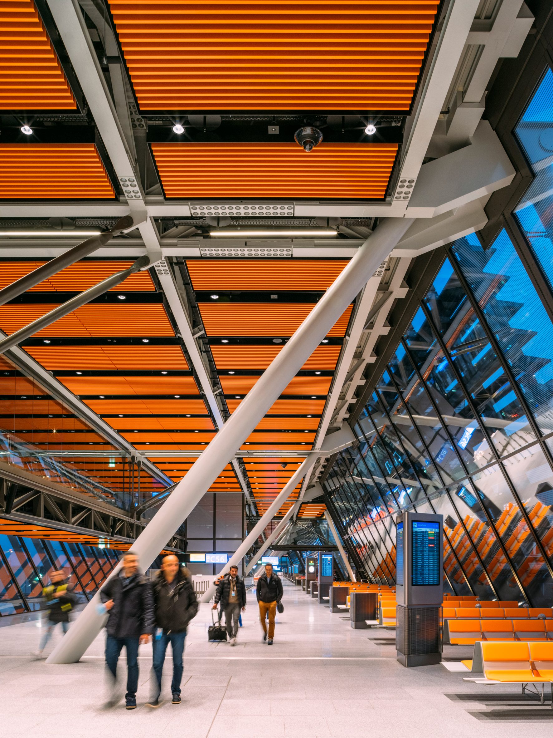
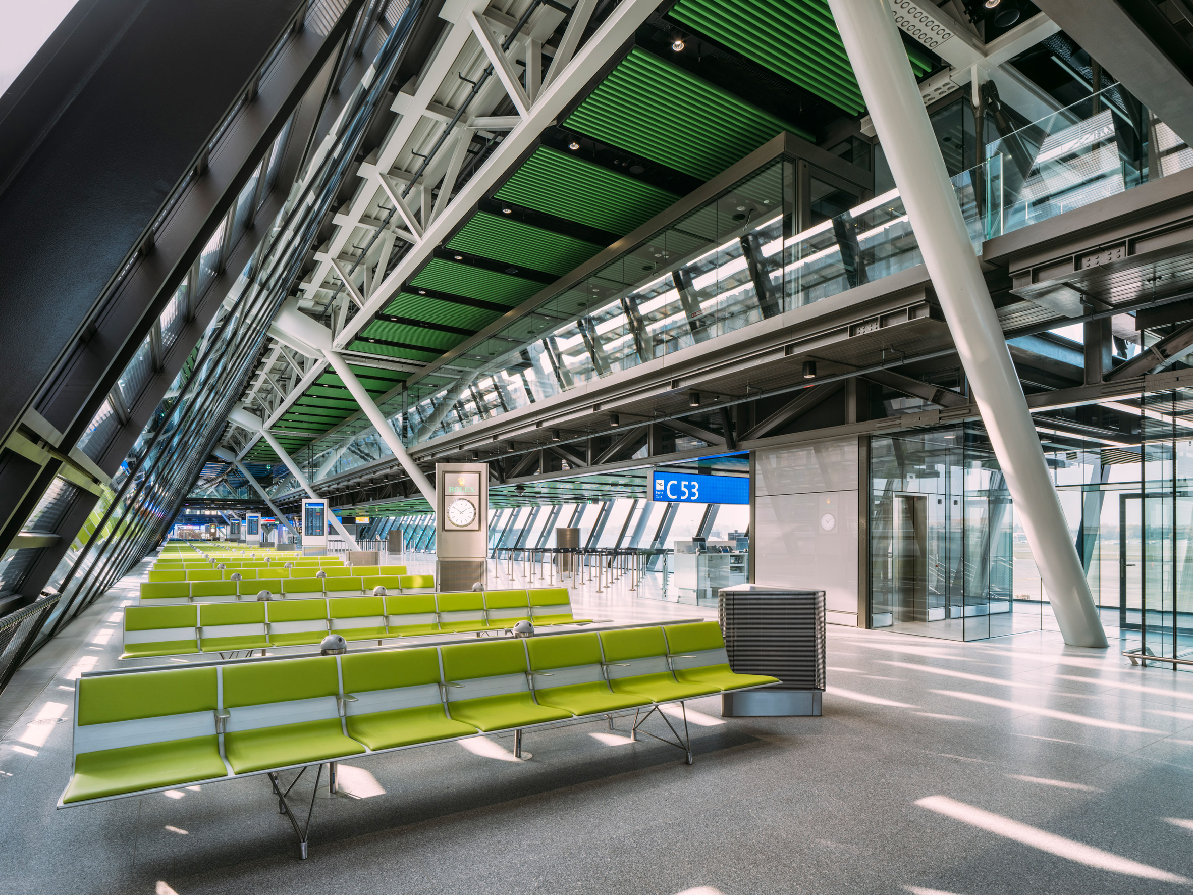
Occupant orientation is also helped by the colourful baffle ceilings and seating, which break up the structural repetition of the structure and distinguish one gate from another.
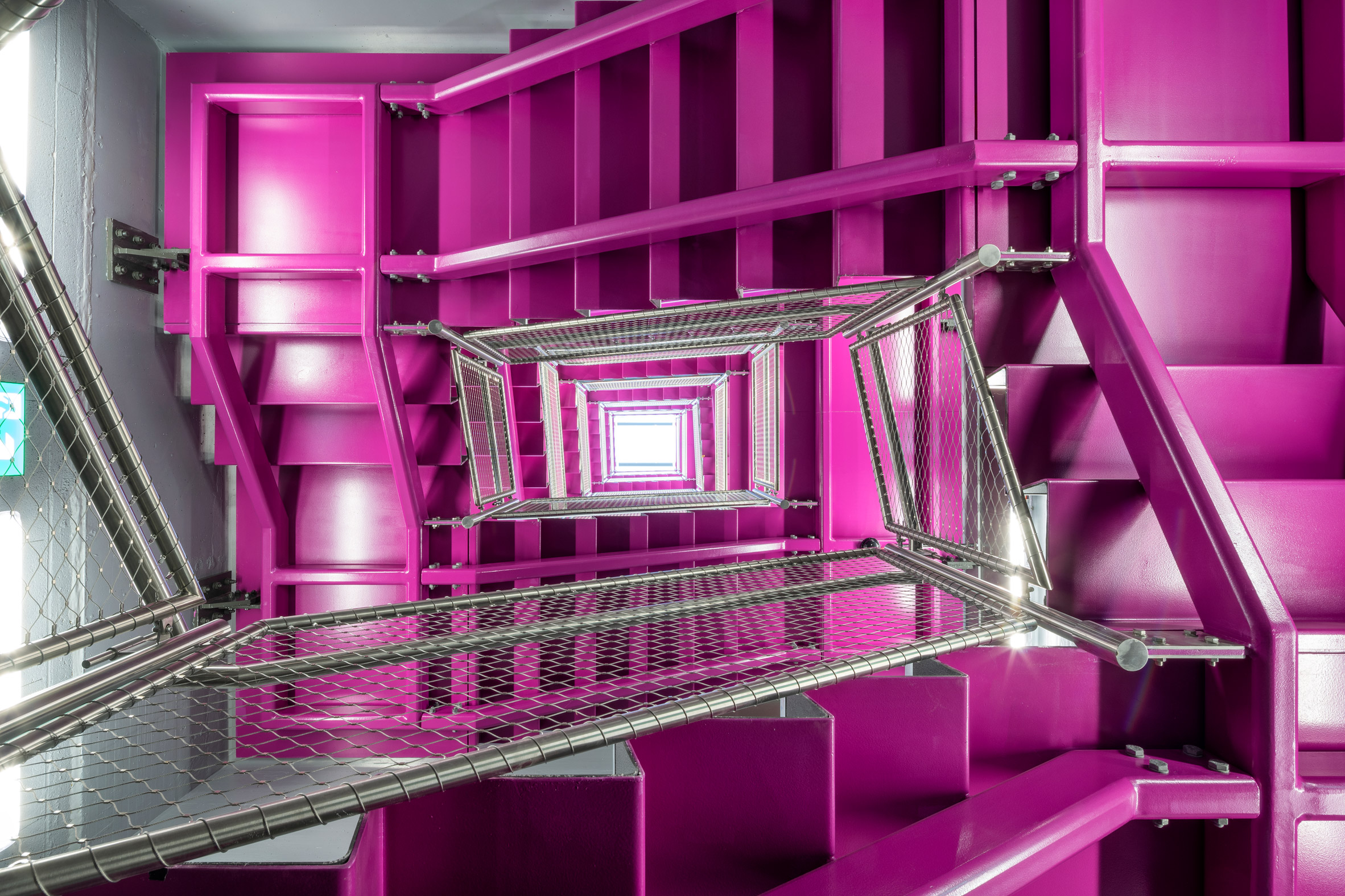
This also brightens the building's natural stone flooring and exposed structure, of which the primary components are painted light grey and secondary structural elements dark grey.
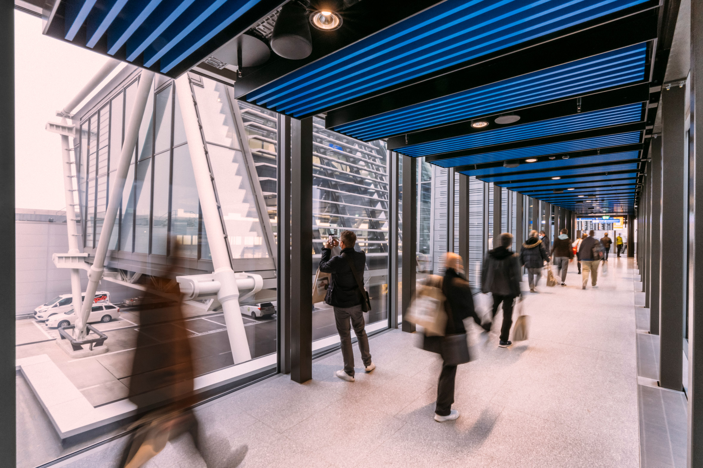
"An airport can be a stressful environment, particularly if one is unsure where the departure gate is or how long it will take to get there," said Paul.
"The Aile Est endeavours to make wayfinding as simple as possible."
To prevent overheating and solar glare from the large expanses of glass, the services and stair cores are designed to self-shade the building in tandem with fixed louvres.
The windows are also triple-glazed and have colourless coatings that help to maximise daylight while reducing solar gain.
According to RSHP, the terminal is designed to produce more energy than it consumes using on-site renewable energy sources such as photovoltaic panels and geothermal piles. From 2024, Aile Est will also link up to GeniLac – a network that uses water from Lake Geneva to reduce the cooling loads for buildings.
There will also be facilities to support the recovery and use of rainwater throughout the building.
RSHP was founded by the late architect and high-tech architecture pioneer Richard Rogers in 1977 who passed away in December aged 88. The studio was known as Richard Rogers Partnership until 2007 but was renamed to reflect the contributions of the studio's partners Stirk and Ivan Harbour.
Elsewhere, RSHP is also currently designing an airport terminal in Shenzhen, China, which will be arranged around a large covered garden.
The photography is by Joas Souza.
The post Rogers Stirk Harbour + Partners completes modular airport terminal in Geneva appeared first on Dezeen.
from Dezeen https://ift.tt/wMio45yU8
No comments:
Post a Comment