Sunday, 2 February 2020

Mark Odom Studio restores mid-century building for Austin insurance company BKCW

US firm Mark Odom Studio has opened up the floor plan of a mid-century office building in Austin for insurance company BKCW.
BKCW Offices by Mark Odom Studio

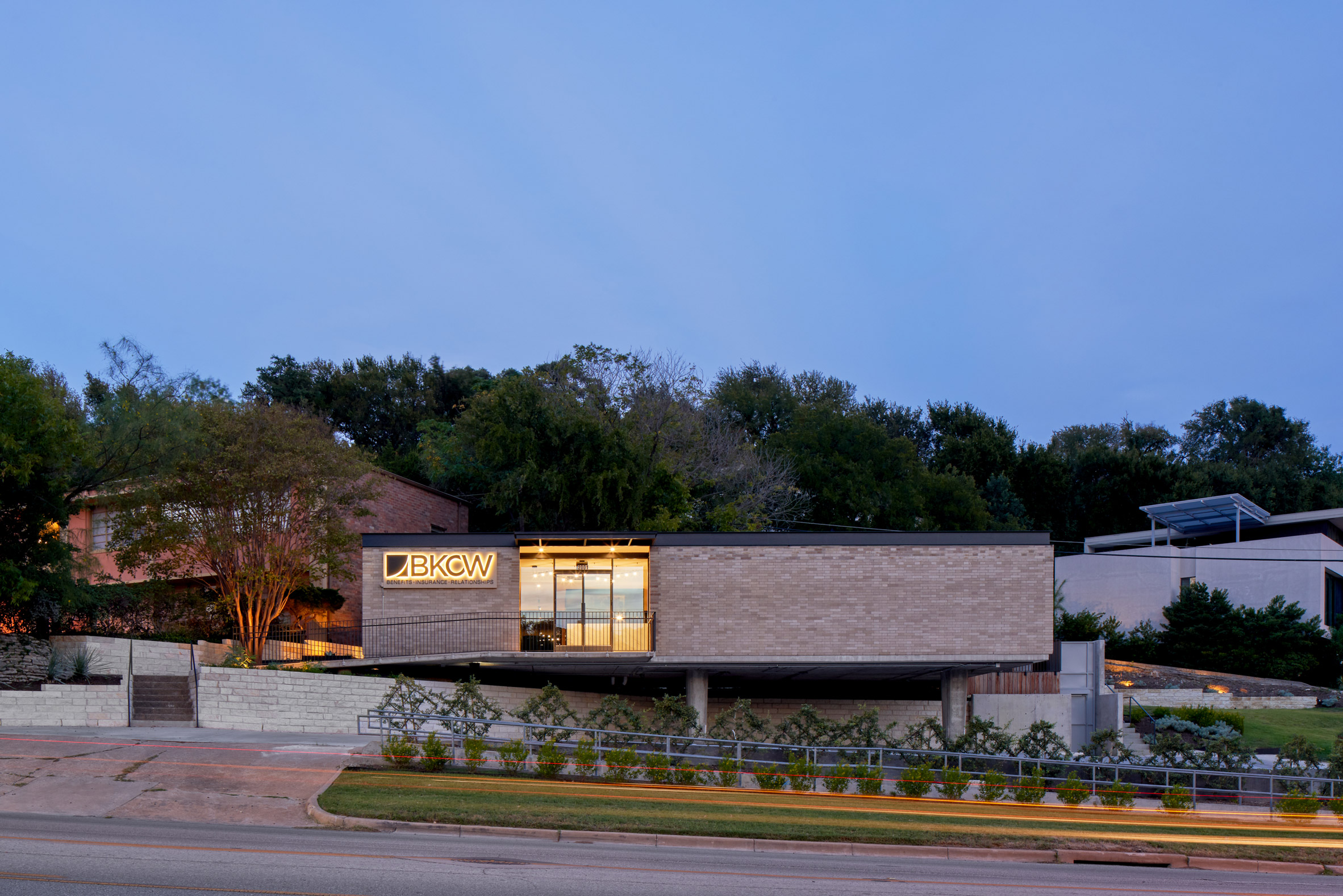
The original structure by architects Pendley & Day was built in 1960 on North Lamar Boulevard, in an area just north of downtown Austin. It's low-slung form juts out on stilts to overlook Shoal Creek, a popular park that runs through the centre of the city.

Local insurance company BKCW recently purchased the property to restore the 3,000 square-foot (278 square metres) structure for use as their offices.
BKCW Offices by Mark Odom Studio

"Meredith and Tyler Spears, owners of the heritage and family operated insurance company BKCW, bought the building for its iconic mid-century architecture which they felt reflected their company culture, attitude, and goals," said Mark Odom Studio.

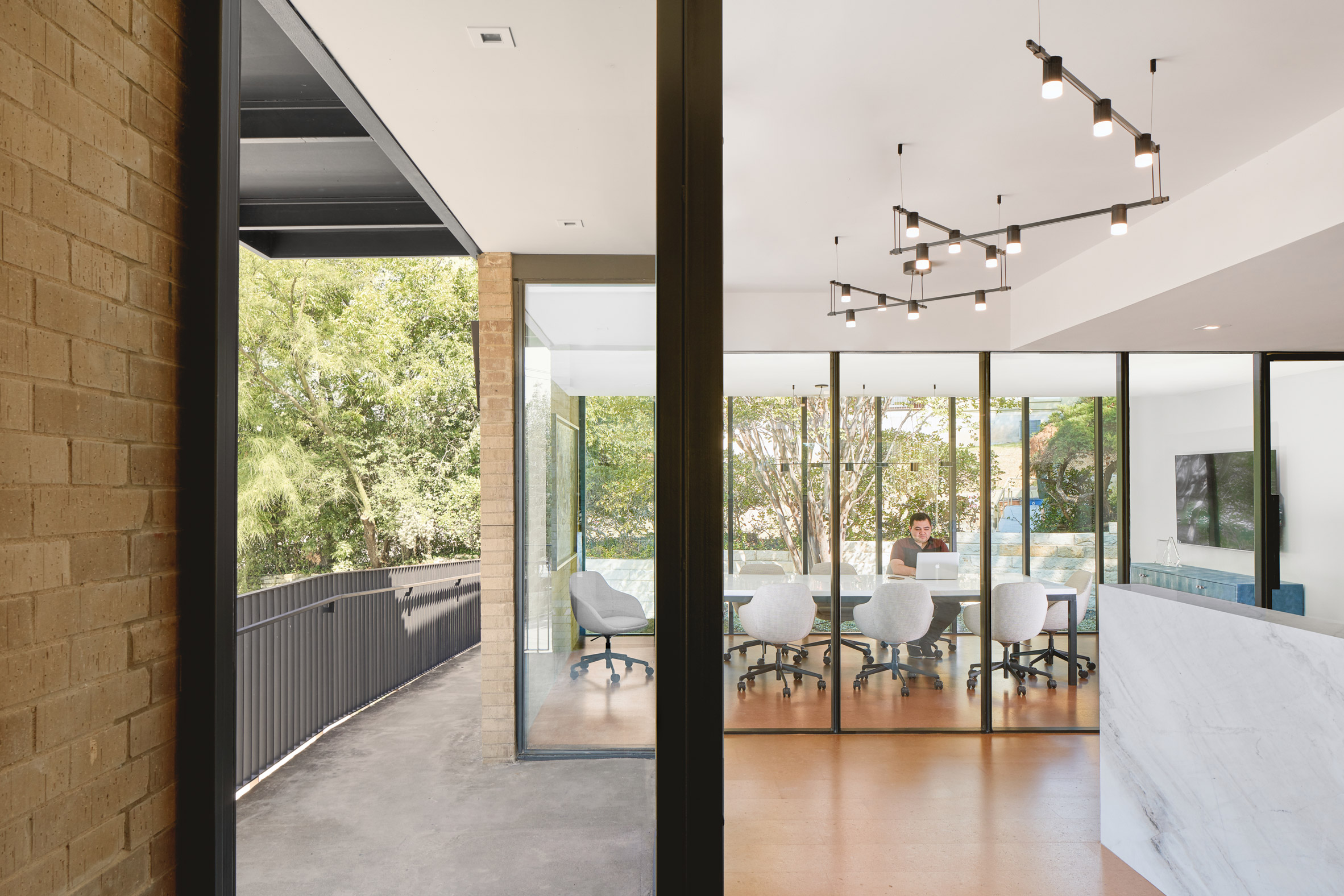
The office building had been subdivided multiple times over the years, creating cramped interiors with poor natural lighting. In an effort to return the structure to its original state, the architects started by removing these walls.
BKCW Offices by Mark Odom Studio

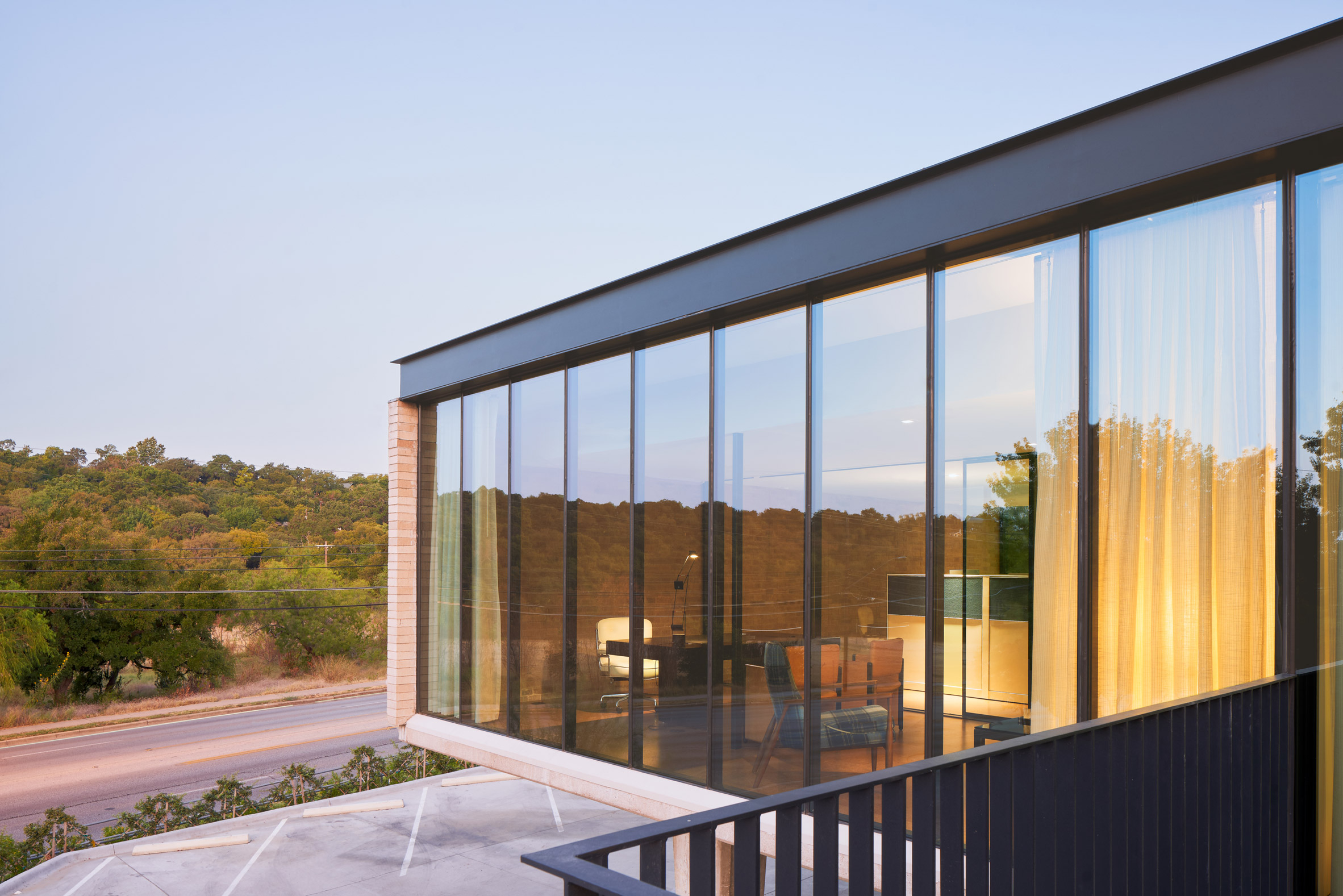
"This approach fully expressed the entire building volume by not only opening up the interior, but by allowing the prominent glass facades to flood the space with natural light," said the studio, which is based in Austin, and San Antonio Texas.

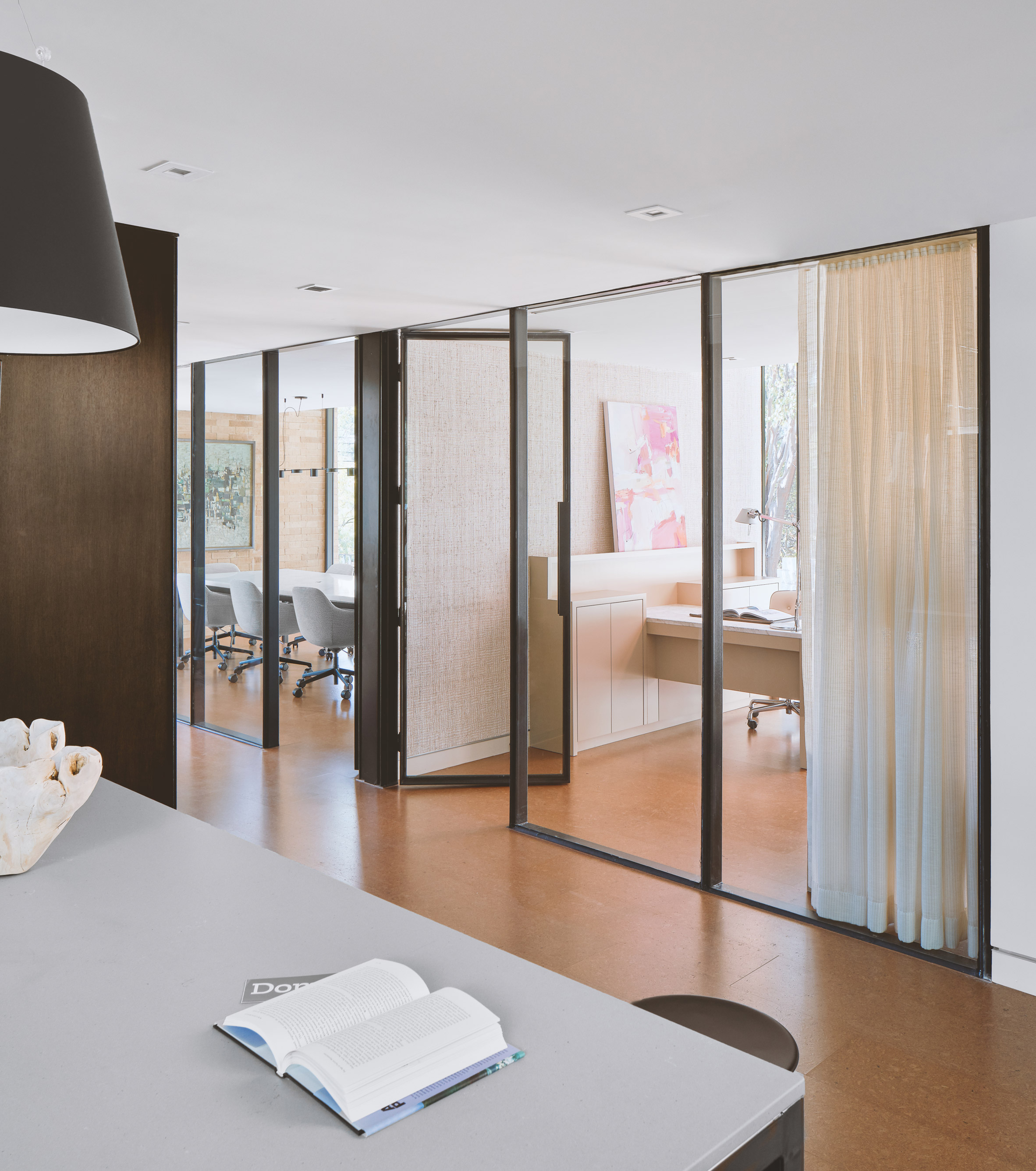
Visitors enter via a ramp that fronts North Lamar Boulevard and leads into the open-plan offices. A single opening in the brick volume provides access to an open-plan work area, flanked on two sides by private offices and a conference room.
BKCW Offices by Mark Odom Studio

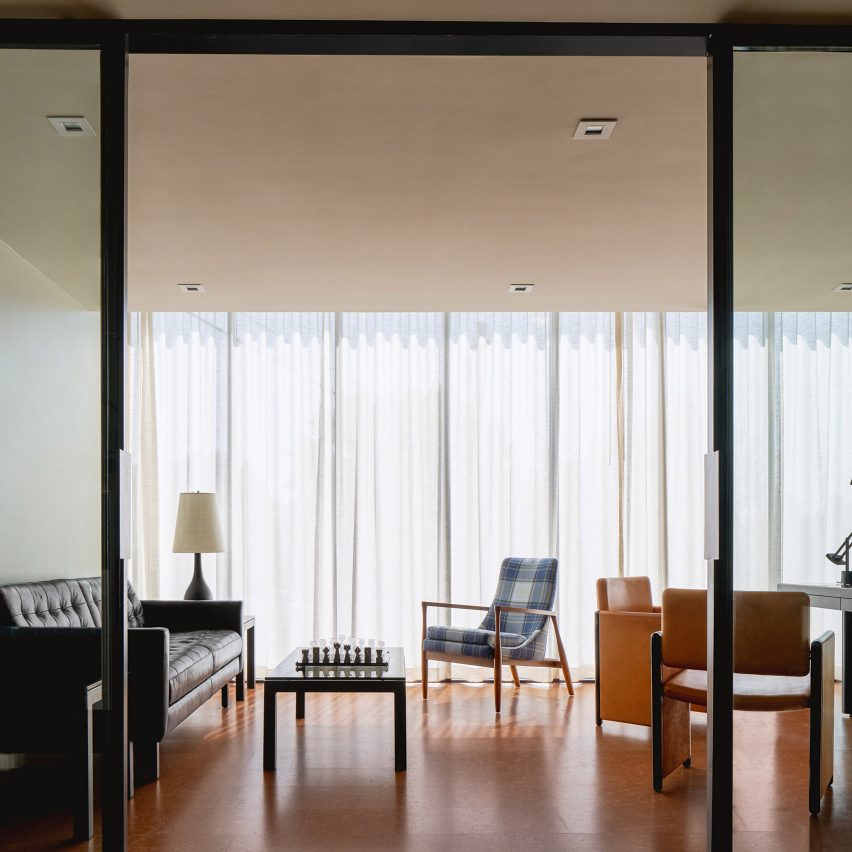
Floor-to-ceiling windows, composed of more energy-efficient glazing and steel mullions, bring plenty of natural light into the workplace.

At the back, there is a secondary volume for the company's employees, including a break room and an exterior terrace behind the building.
BKCW Offices by Mark Odom Studio

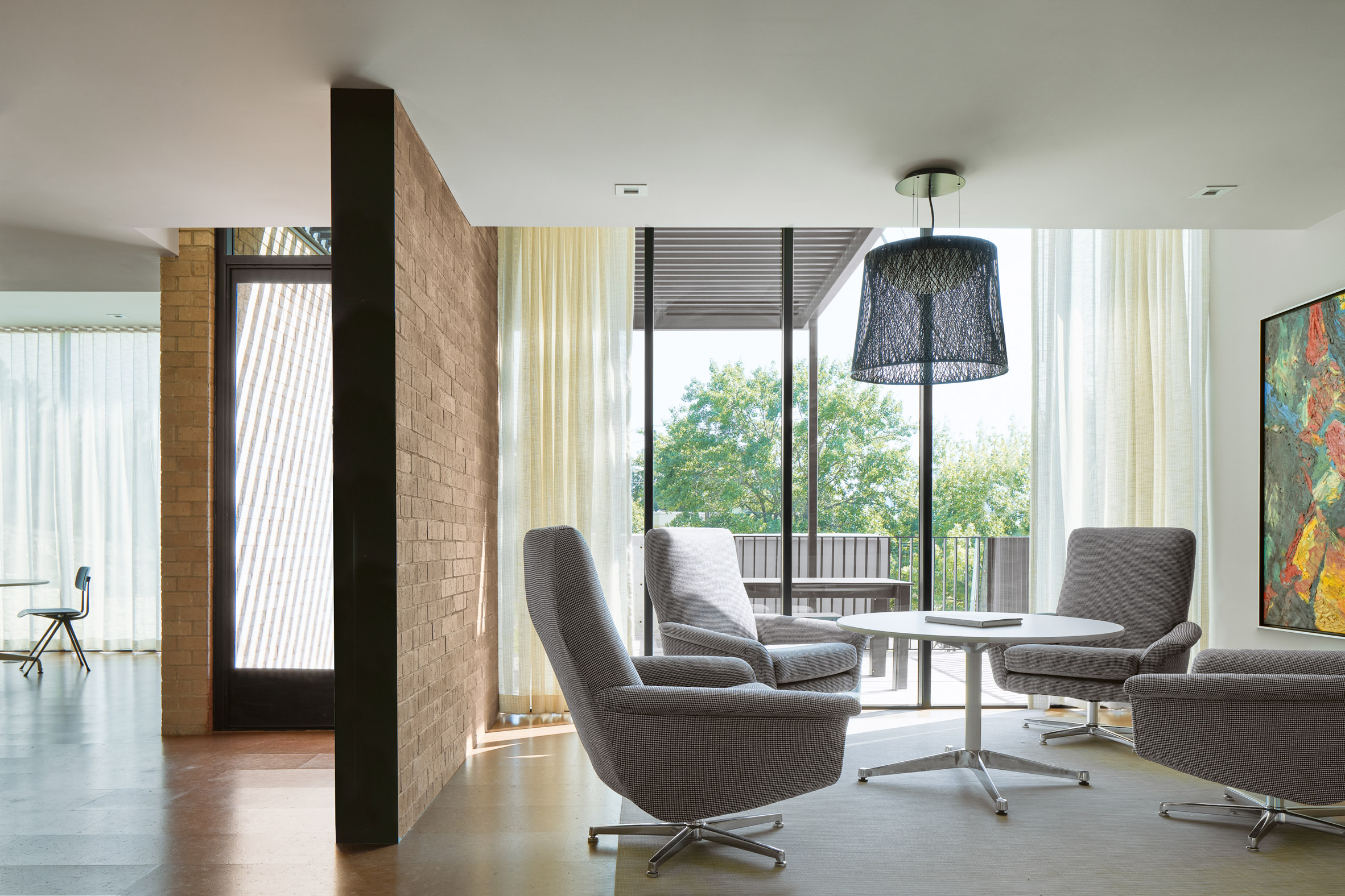
"Complimenting the very public southern and western views, the eastern windows now face a revitalised subterranean back courtyard, which acts as a respite from the North Lamar traffic," said Mark Odom Studio.

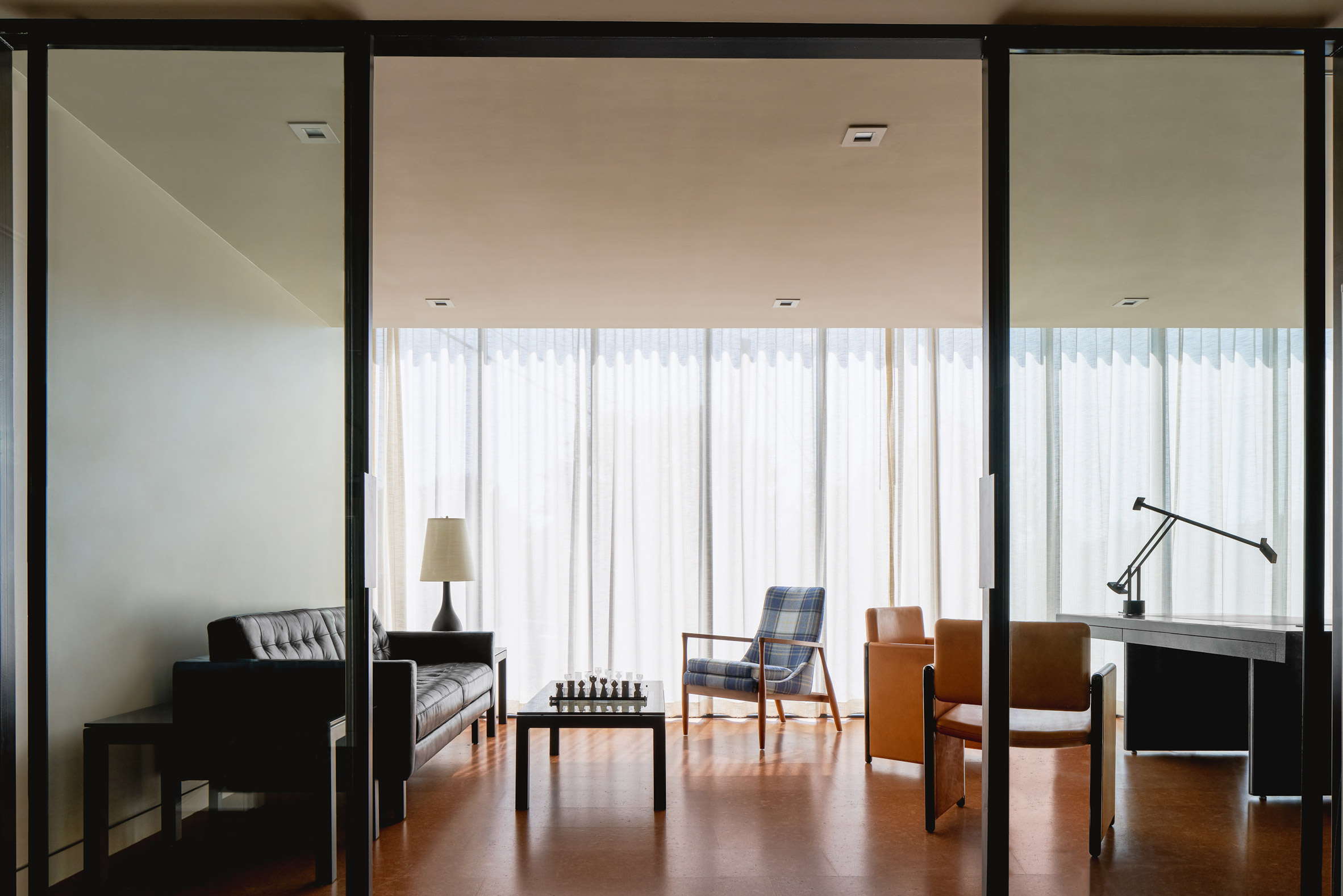
In addition to salvaging beige brick from the original building, the firm developed a palette that references materials popular in the 1960s, such as cork flooring and stained wood paneling. Vintage furniture matches these material choices, completing the retro look of the revitalisation project.
BKCW Offices by Mark Odom Studio

Other projects in Austin include an eclectic restaurant with features salvaged from a New York City bar, and a carefully rehabilitated mid-century residence by architecture studio Clayton & Little.

Last summer, OMA was selected to complete the renovation of Houston's Barbara Jordan Post Office into a mixed-use venue for arts called POST.

Photography is by Leonid Furmansky.

The post Mark Odom Studio restores mid-century building for Austin insurance company BKCW appeared first on Dezeen.


from Dezeen https://ift.tt/2tnKAyr

Seagulls and Pigeons Photobomb Shots of Rome by Photographer Skander Khlif 

All images © Skander Khlif, used with permission

Munich-based photographer Skander Khlif documents public spaces with the Shakespearian mentality that life is theater and we are all actors. The play becomes both comedy and drama in his recent From Rome, With Birds… series. Seagulls and pigeons take center stage as they fly between the camera and scenes of Italian street life.

Either well-timed shots or a curated collection of happy accidents, Khlif’s humorous series presents an alternate view of a city typically visited and photographed for its architecture. Like people passing in front of buildings, the birds are almost oblivious to the beauty they are obstructing. In the artist bio on his site, Khlif shares that his interest in photography began with a school project back in his home city of Tunis. The experience “made him aware of the power that photography has to reveal the beauty in each object,” even Roman birds.

To see more of Khlif’s photography from his travels around the world, check out his Behance portfolio and follow him on Instagram.


Do stories and artists like this matter to you? Become a Colossal Member and support independent arts publishing. Join a community of like-minded readers who are passionate about contemporary art, apply for our annual grant, and get exclusive access to interviews, partner discounts, and event tickets.


from Colossal https://ift.tt/2ucDQDU

Studio Amit designs elderly housing with "sense of vitality" in Israel

Bayit Balev by Studio Amit

Tel Aviv's Studio Amit has opted for colourful details to add flair to this retirement housing development in Israel.

Bayit Balev by Studio Amit

Studio Amit designed the project for Maccabi Healthcare Services' chain of private, upscale retirement complexes around the country, called Bayit Balev.

Israel has national health insurance but requires membership to one of four organisations, either Maccabi, Clalit, Meuhedet and Leumit.

Bayit Balev by Studio Amit

The local studio was tasked to design the public interior spaces of Bayit Balev's latest outpost in the city of Petah Tikva, also known as Em HaMoshavot, which is about a 30-minute drive east of Tel Aviv.

Bayit Balev by Studio Amit

The five-storey complex was built by Tel Aviv practice Canaan Shenhav Architects and includes 211 units.

Studio Amit designed a host of areas like the lobby, dining room, swimming pool, gym and a synagogue.

Bayit Balev by Studio Amit

"The challenge was to design a retirement home that does not look 'elderly' but rather create spaces with a contemporary modern feel, yet at the same time are warm and indulging," studio co-founder Gali Amit told Dezeen.

"Our design approach was to give the retiree population a homey feeling, as well as an exclusively modern, updated environment."

Bayit Balev by Studio Amit

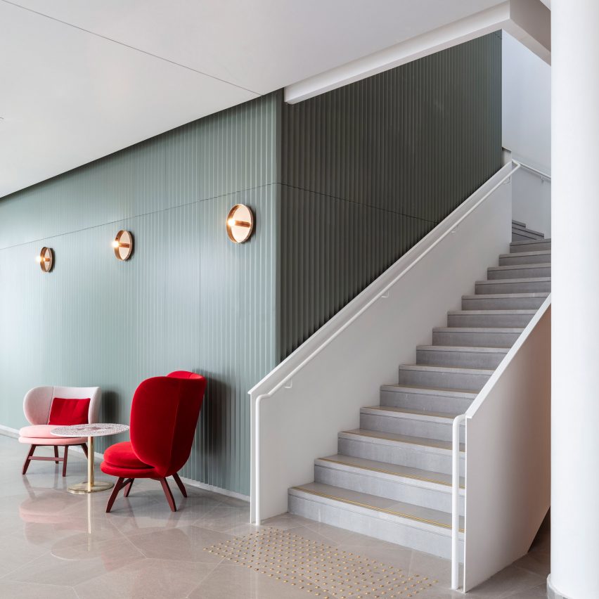
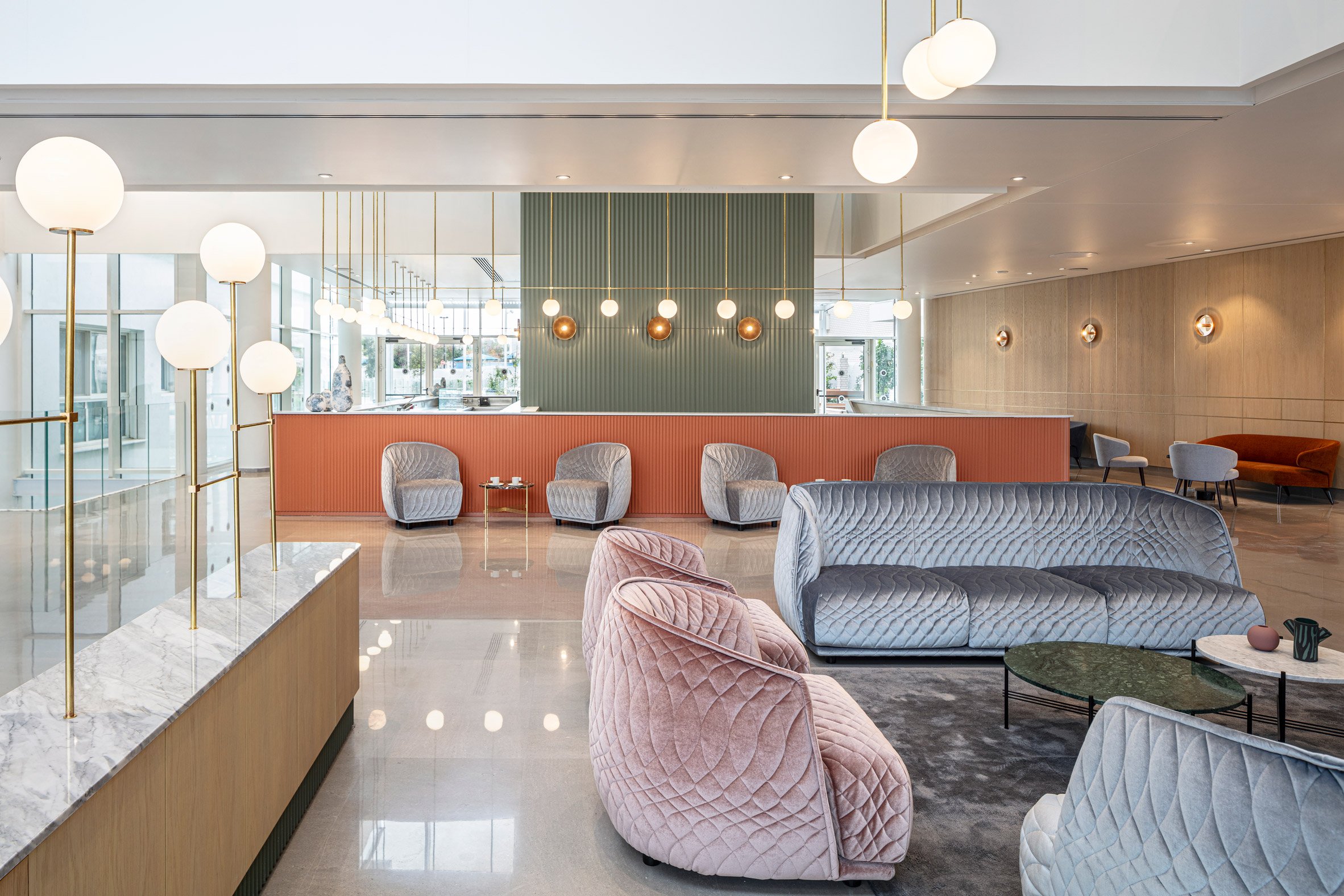
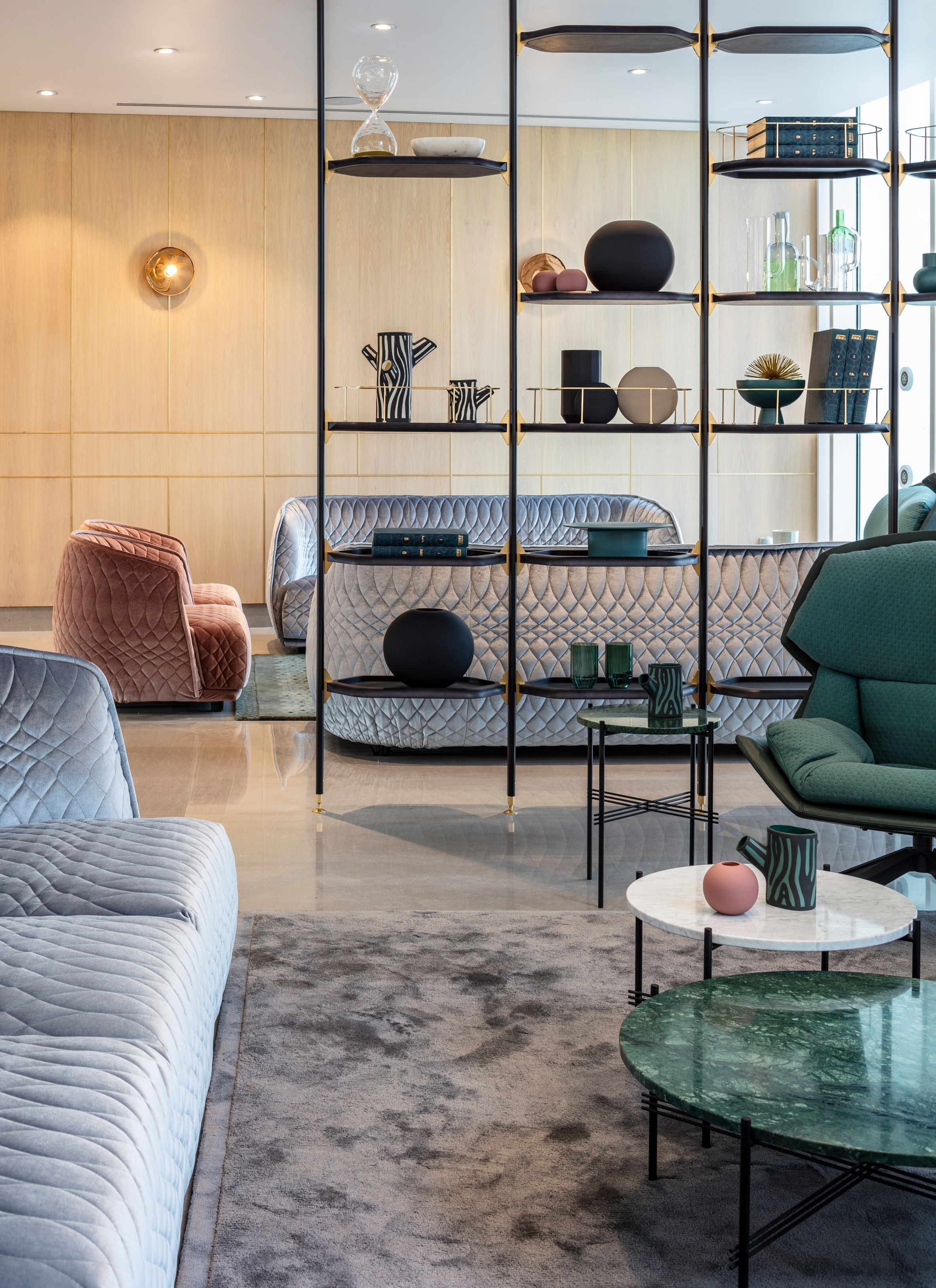
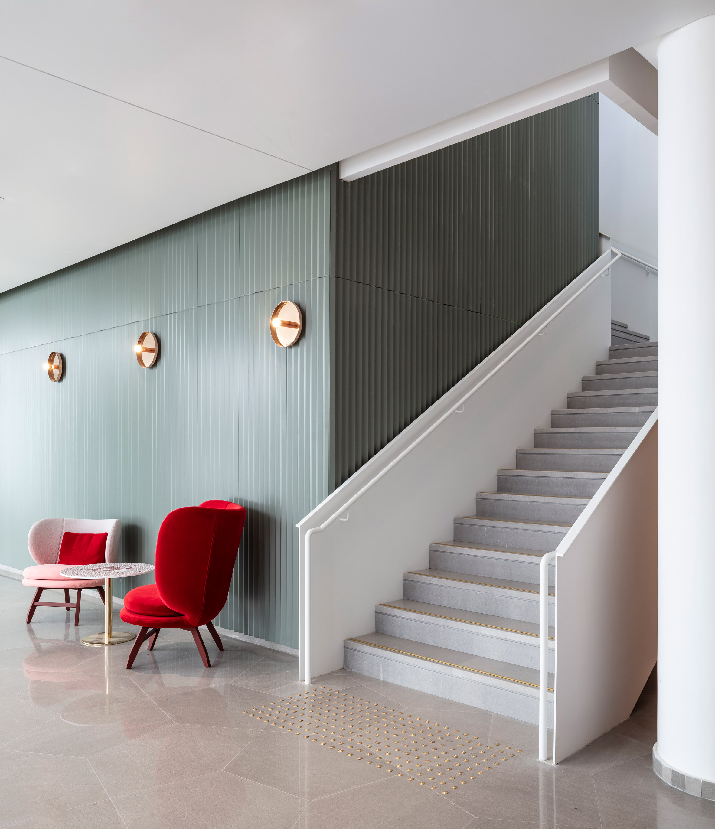
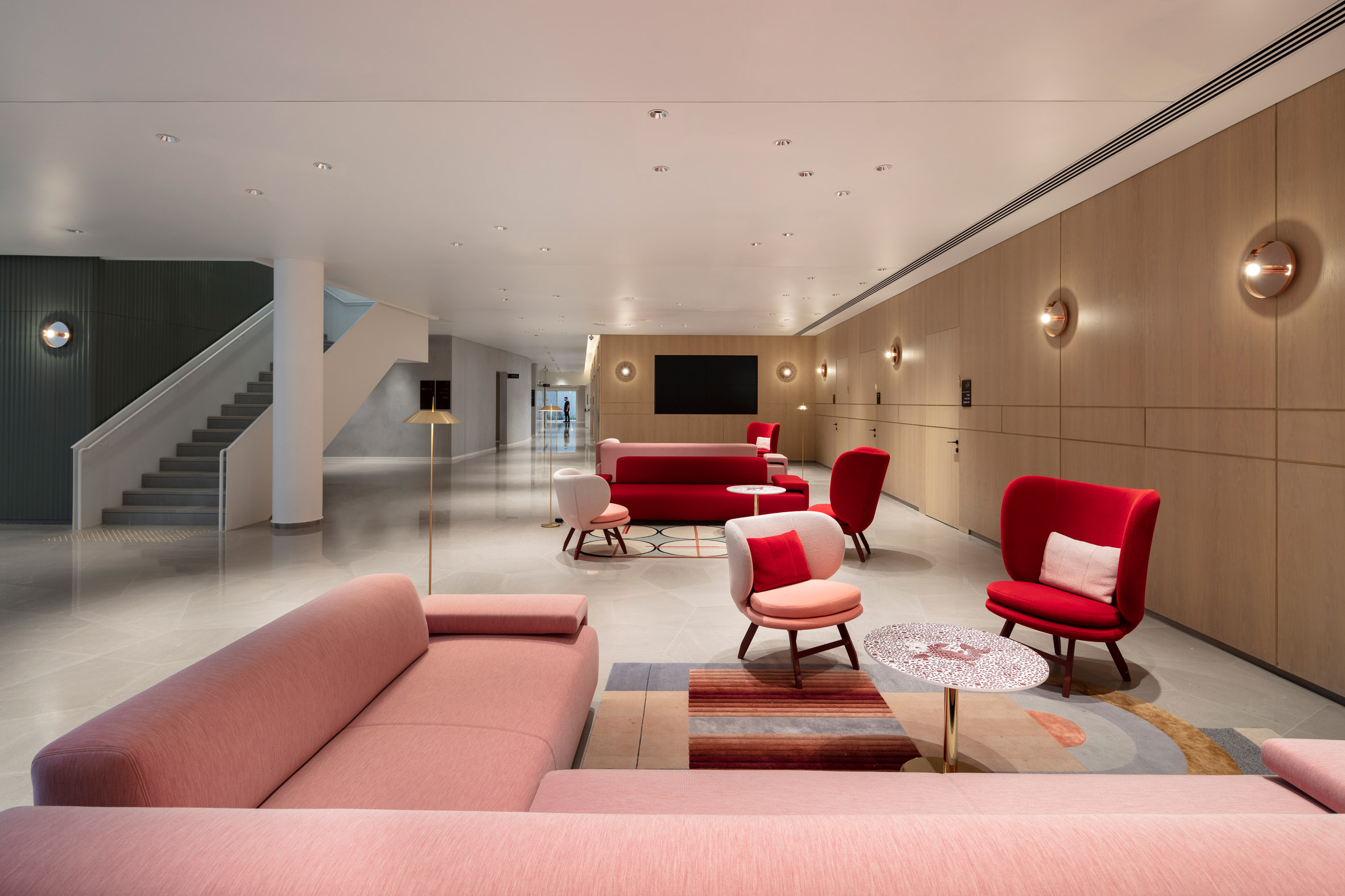
To soften Bayit Balev's stark grey marble floors and bare white walls, the studio added wood-clad feature walls and oak counters and cabinets.

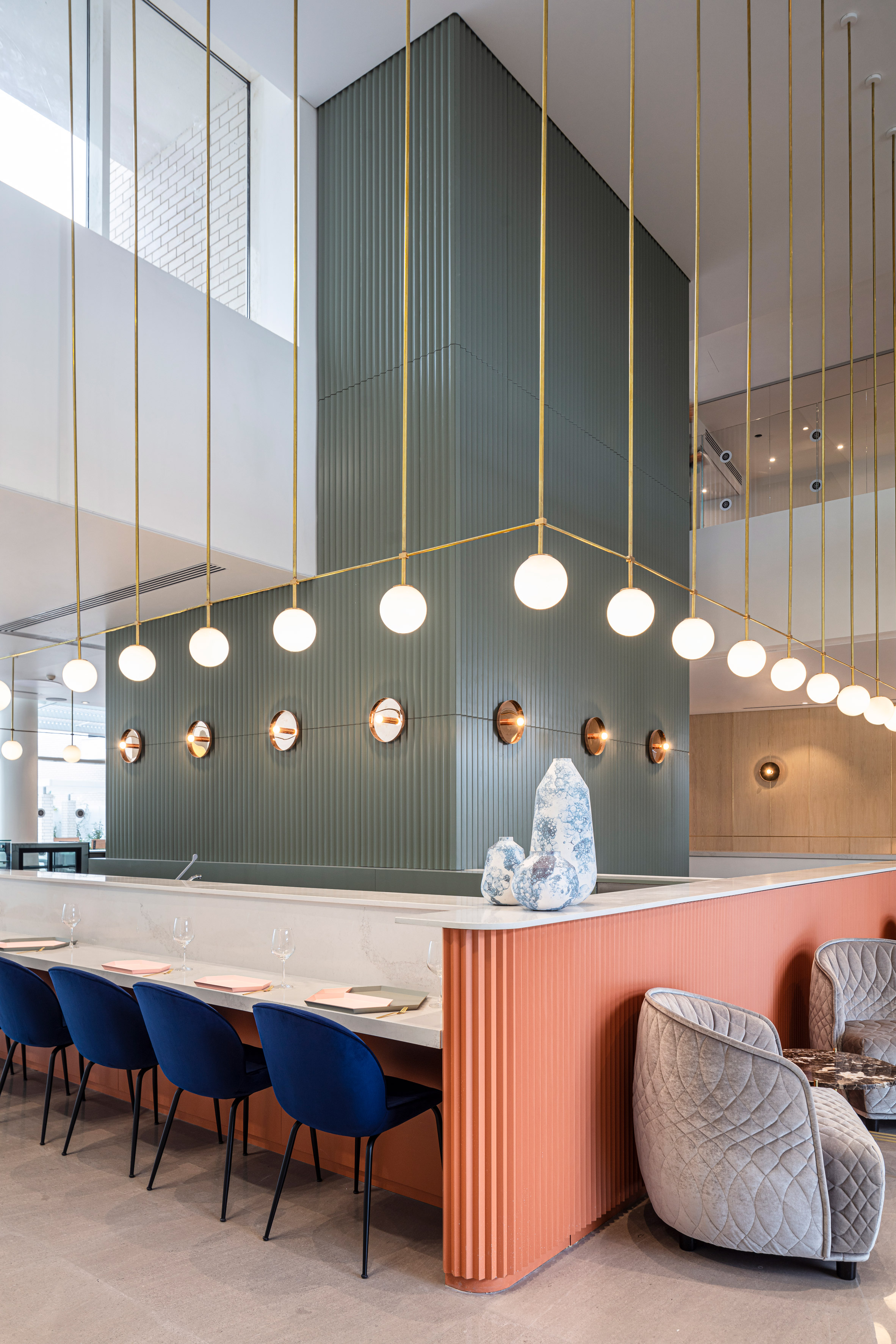
Almost all of the furniture is by Moroso. On the ground floor is the Italian brand's Redondo chairs and sofas in metallic salmon, sage and grey fabrics, while a basement has pink and red seating.

"The challenge was to create a sense of brilliance and newness in an elegant way," Amit added. "Thus the choice of fabrics for the Moroso sofas was high-quality velvet with special stitching that sparkle as the lighting change."

Bayit Balev by Studio Amit

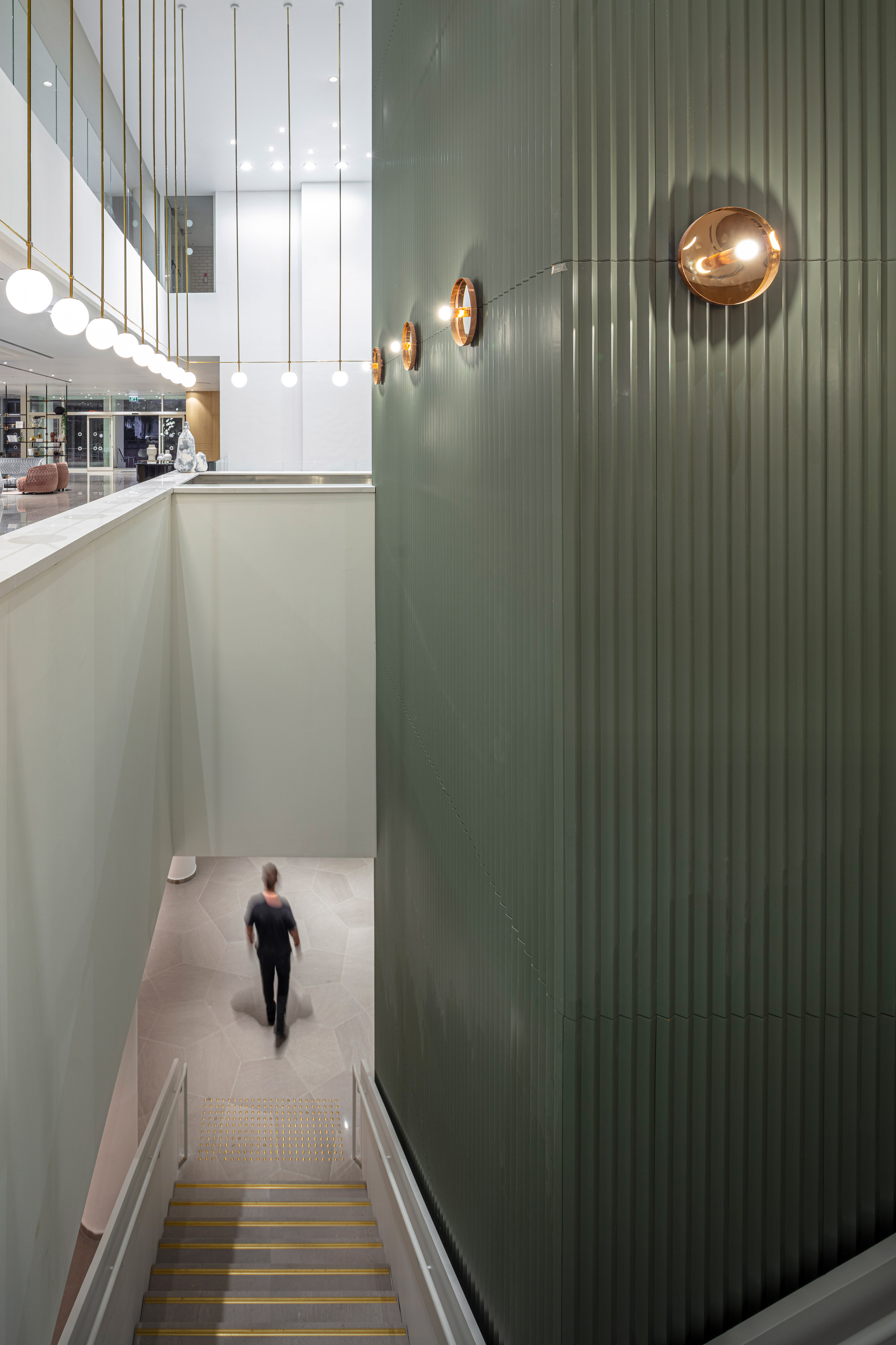
A central column in the lobby is painted pink and green and conceals stairs that connect the communal areas on the three levels.

Studio Amit, which Amit runs with her partner Yoav, also used a similar pink-and-green palette in Tel Aviv's Bana cafe.

Bayit Balev by Studio Amit

"It was essential to convey a sense of vitality, 'alive and kicking', hence the bold choice of colour," Amit added.

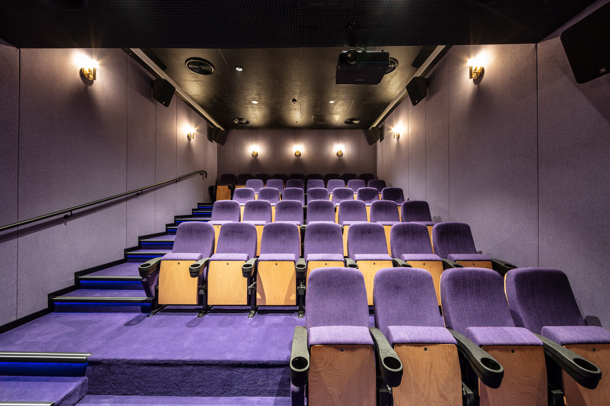
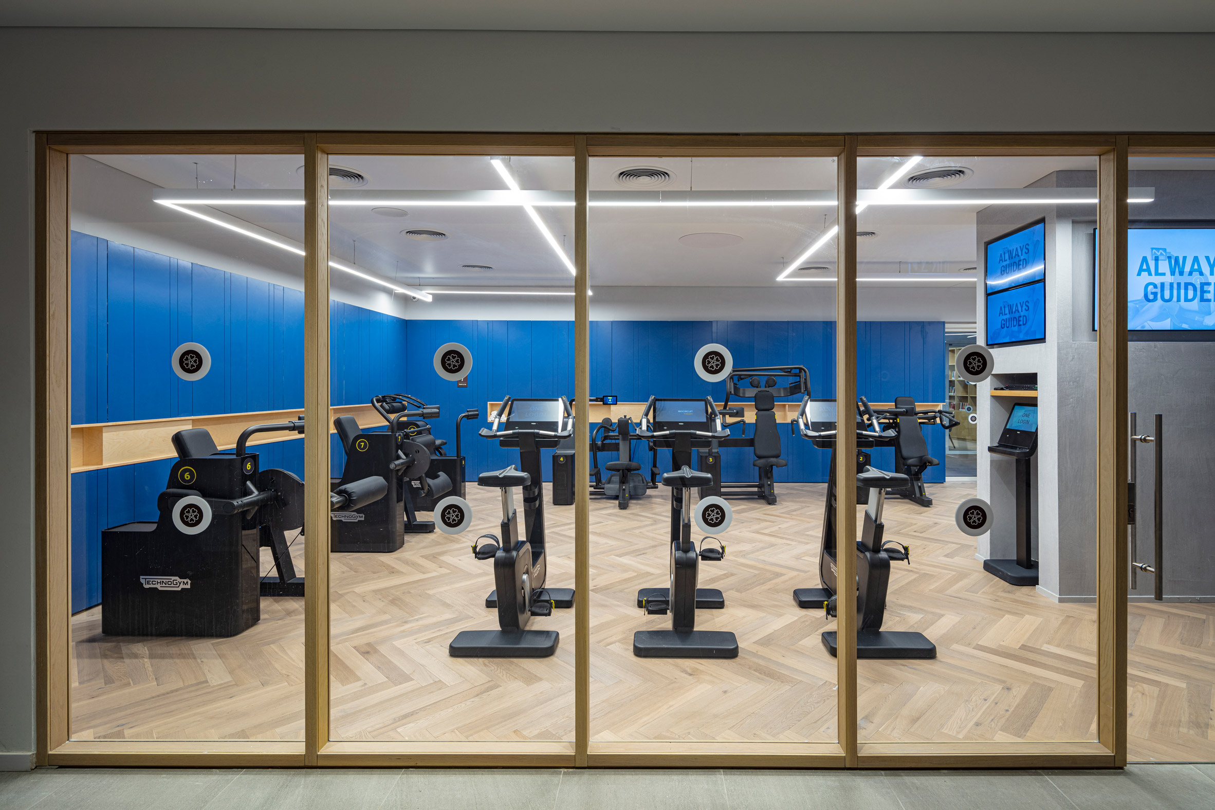
Other colourful details are cobalt blue walls in the gym, and bright purple carpet and seats in the movie theatre.

Bayit Balev by Studio Amit

Decor includes a geometric Visioni rug by Spanish designer by Patricia Urquiola, globe light fixtures by local company Kamchi and floor lamps by Barcelona lighting brand Vibia.

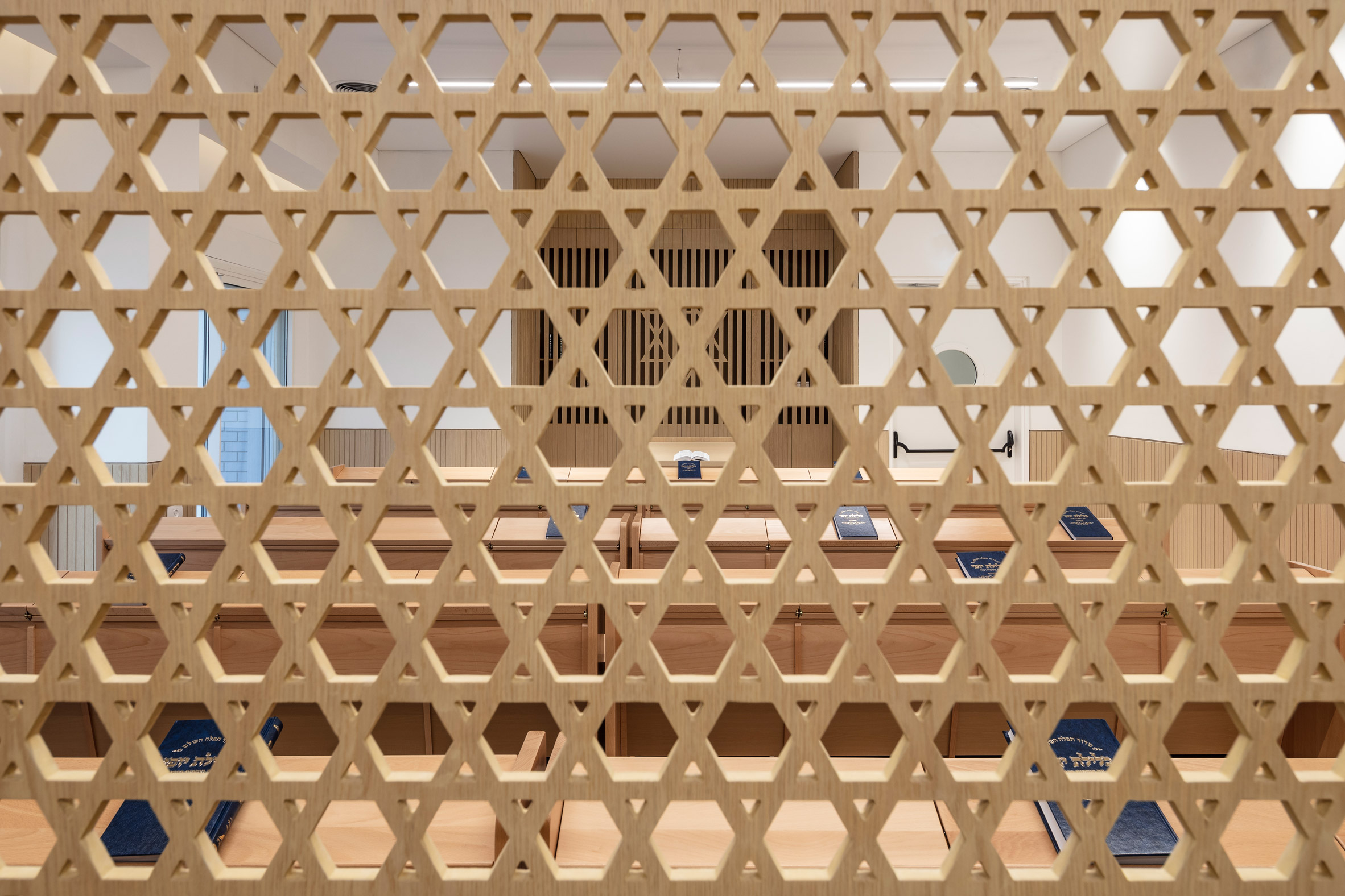
A dining room with floor-to-ceiling windows has grey Gubi chairs, and a synagogue has a cut-out wall design with a geometric motif of the Star of David.

Bayit Balev by Studio Amit

Rounding out Studio Amit's Bayit Balev are treatment rooms, classrooms, and all-day health care and security.

Staff rooms and offices are located in the mezzanine above the ground floor.

Bayit Balev by Studio Amit

Other retirement houses around the world are a Montreal high-rise by ACDF, a brick building with pink concrete interiors by Dominique Coulon, and a low-slung concrete construction by Guillem Carrera in Spain.

Photography is by Amit Geron.

The post Studio Amit designs elderly housing with "sense of vitality" in Israel appeared first on Dezeen.


from Dezeen https://ift.tt/3b3RTfE

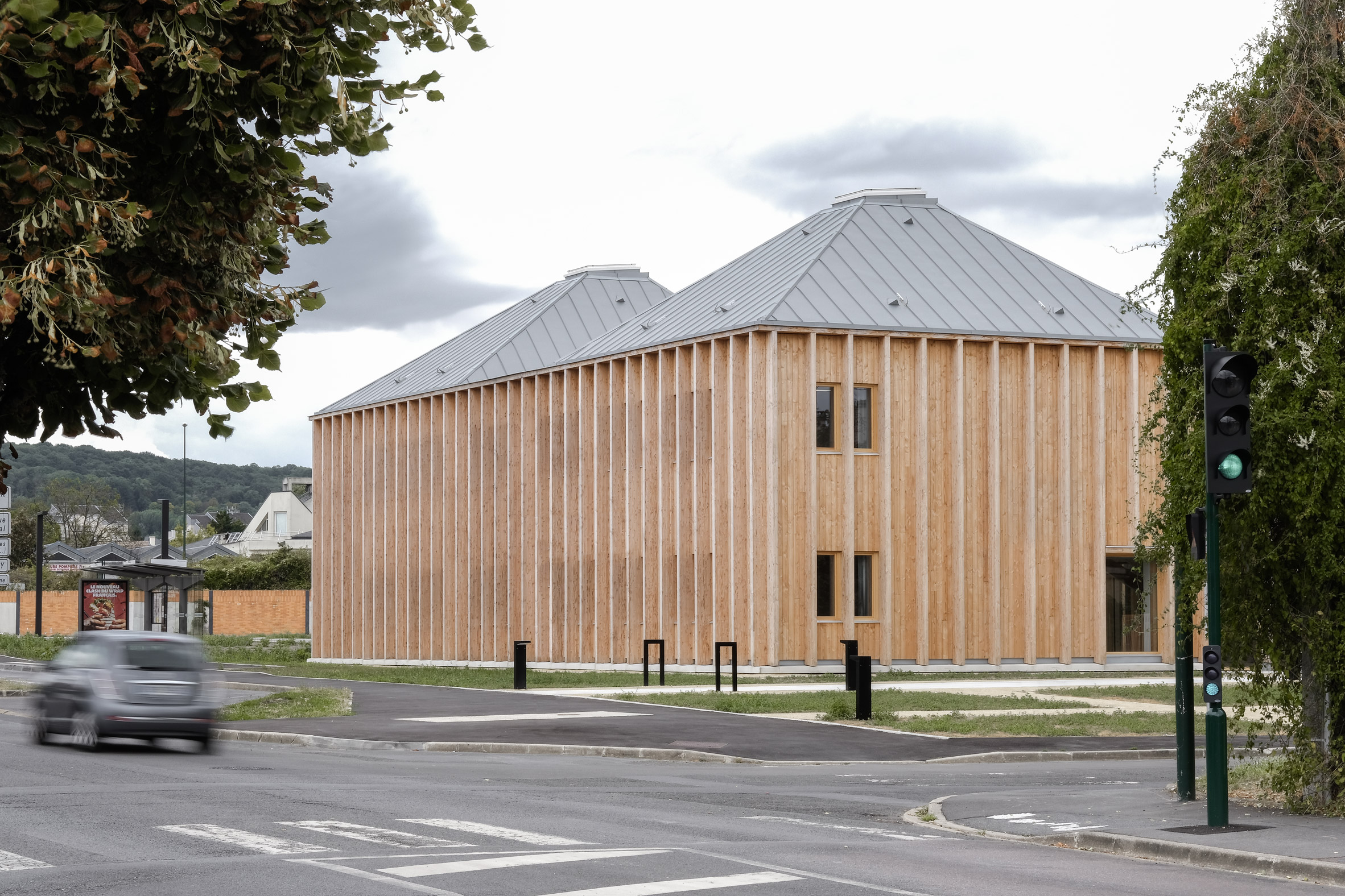
Timber health centre surrounds courtyard of medicinal plants

Taverny Medical Centre by MAAJ Architectes

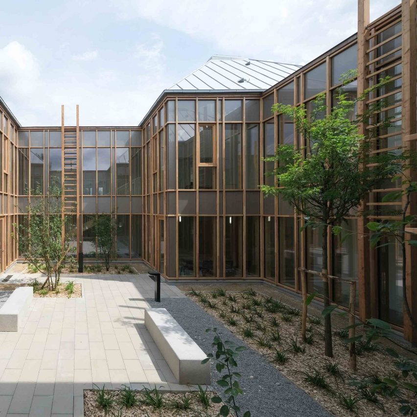
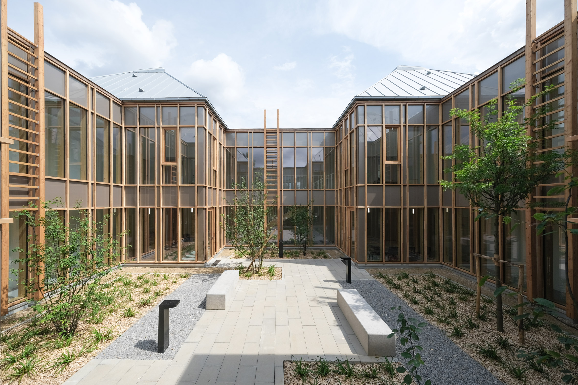
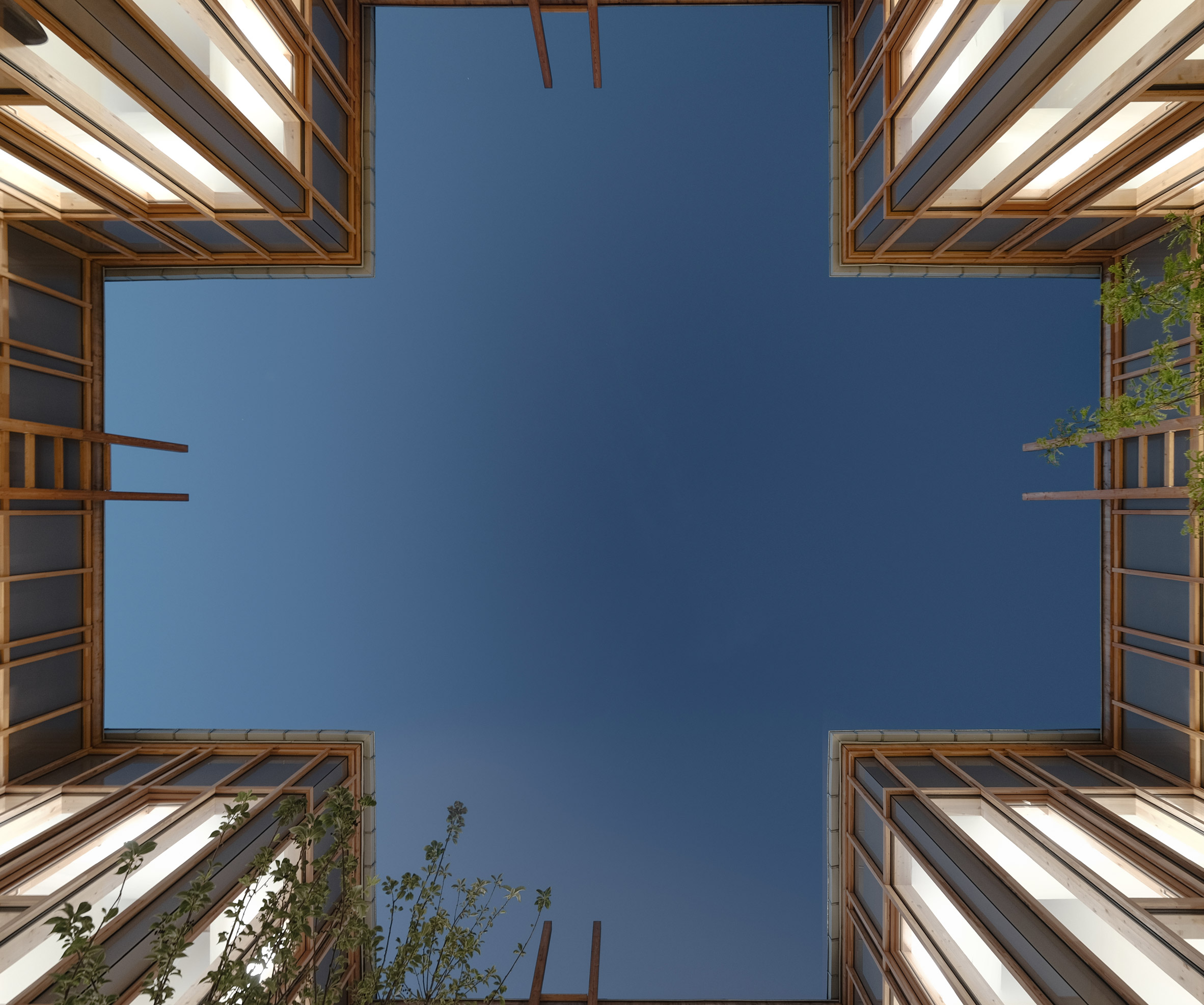
MAAJ Architectes placed a cross-shaped courtyard for growing medicinal plants at the heart of a timber-framed health centre in the French town of Taverne.

The Taverny Medical Centre brings together several previously disparate healthcare facilities under one roof.

Taverny Medical Centre by MAAJ Architectes

Because of the busy road next door MAAJ Architectes, decided to turn the building inwards.

The plan of the Taverny Medical Centre draws on the ancient cloister typology common in monasteries.

Taverny Medical Centre by MAAJ Architectes

"In this peri-urban landscape, the aim was to set up an anchorage to the new building," MAAJ Architectes co-founder Marc-Antonie Richard-Kowienski told Dezeen.

"Thus the large plot was reshaped into a domestic landscape around the health centre."

Taverny Medical Centre by MAAJ Architectes

Four individual metal pitched roofs with skylights sit at each corner of the centre's square plan

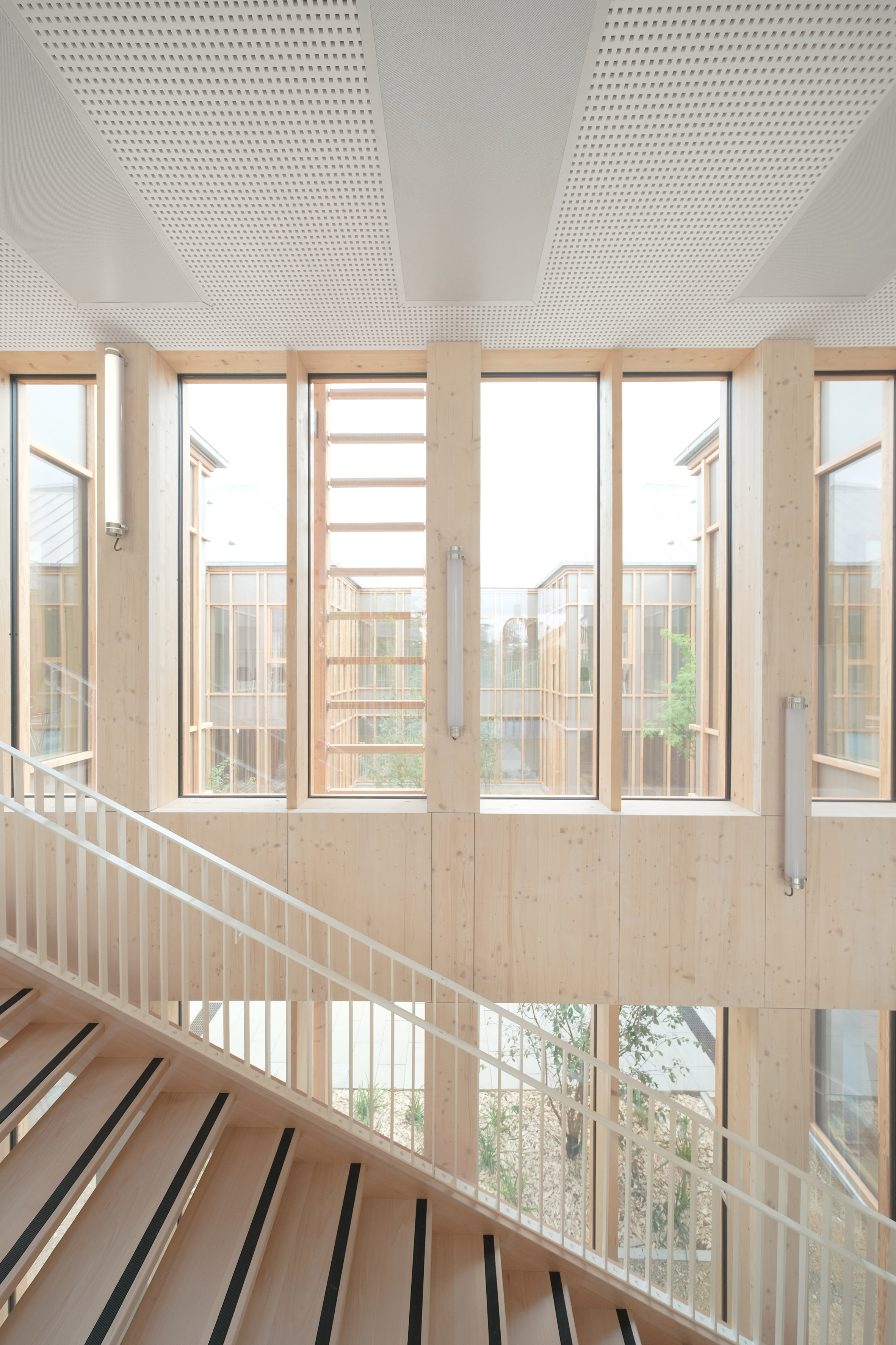
The cross-shaped central courtyard is wrapped by the centre's main circulation area.

Taverny Medical Centre by MAAJ Architectes

"The central patio offers several advantages such as natural lighting for the whole building," said the practice.

"It also serves as an open extension of the waiting rooms and acts as an intimate and sensory place where medicinal plants are grown, a reminder of the health and curative purpose of the centre."

Taverny Medical Centre by MAAJ Architectes

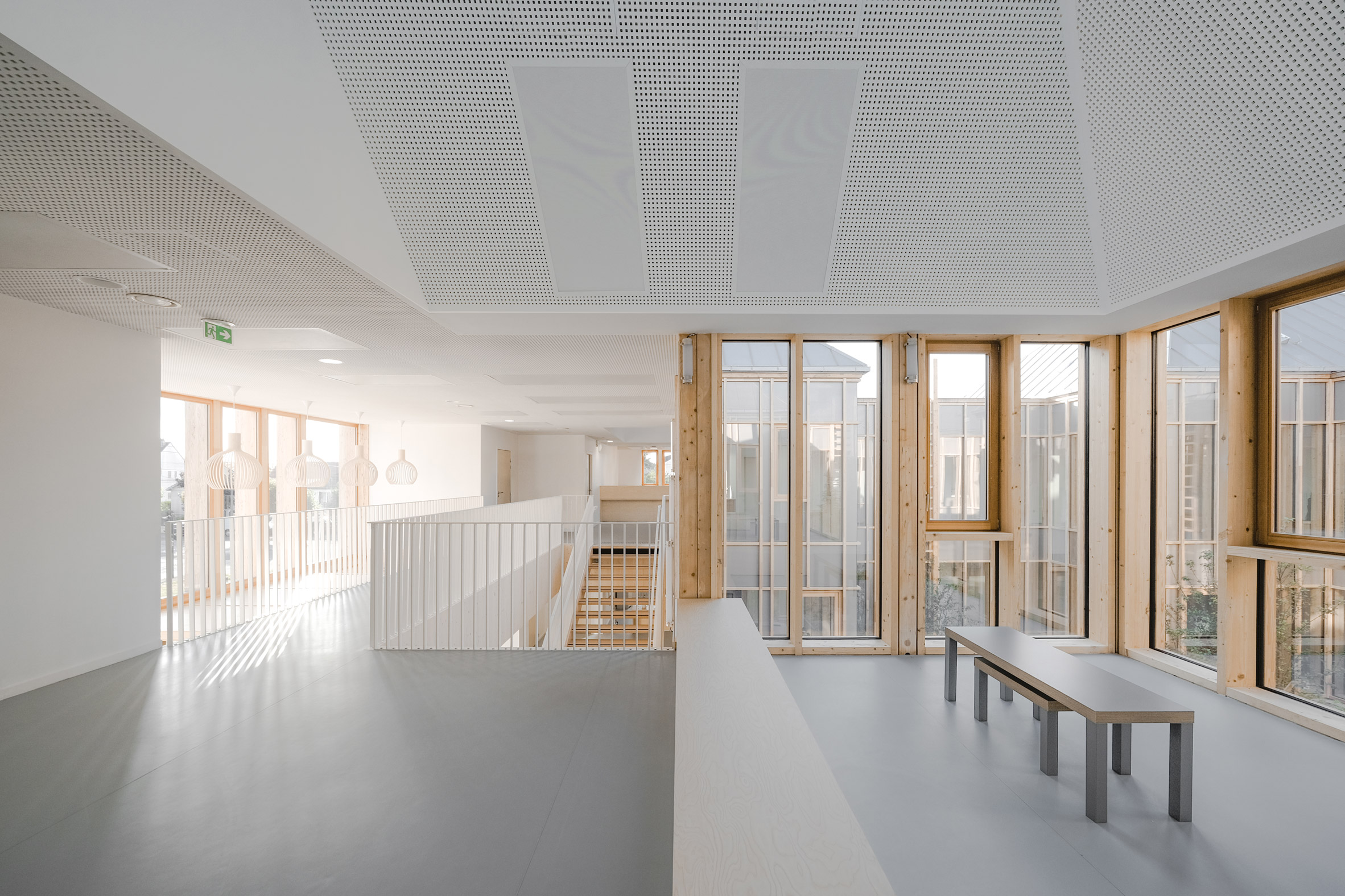
Waiting areas are nestled into each corner protruding into the courtyard, and staircases positioned along its north and south edges.

Treatment rooms are placed around the perimeter.

Taverny Medical Centre by MAAJ Architectes

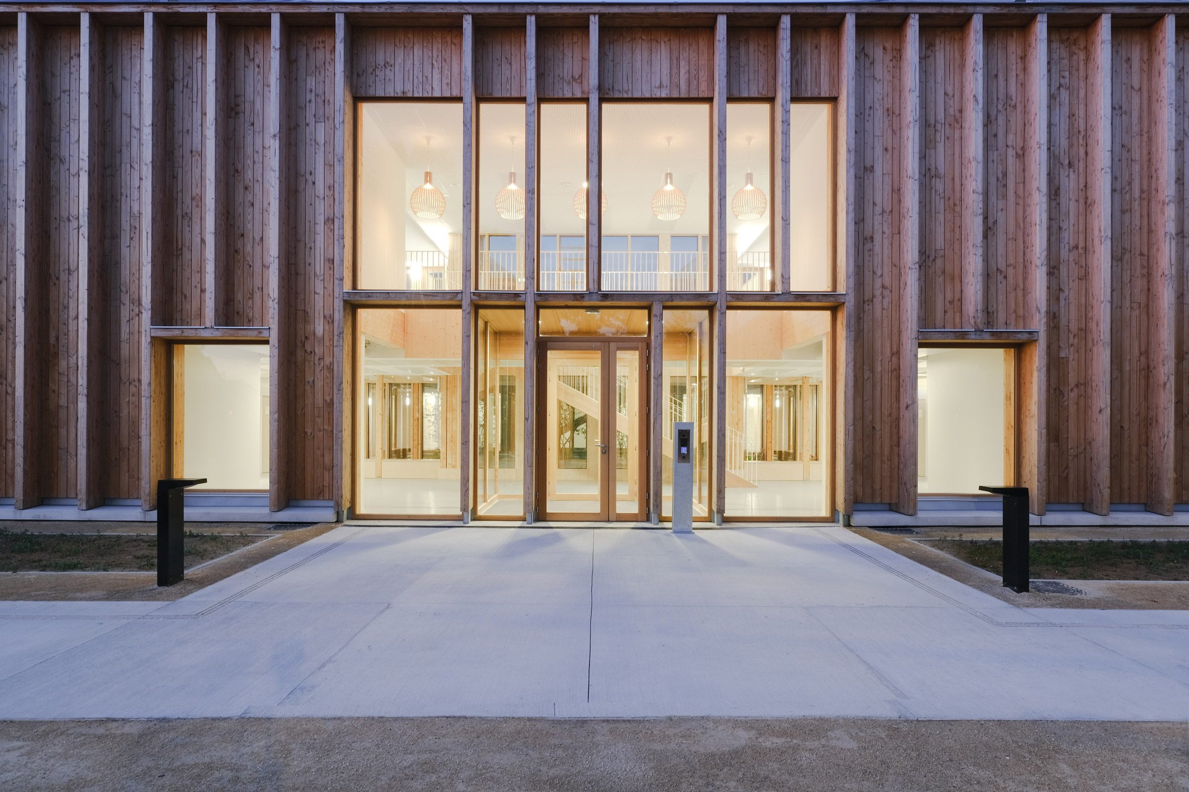
Its exterior walls are infilled with wooden sheets, with only small windows to shut out noise and views from the road.

A glazed section of the exterior envelope marks the centre's entrance, which is approached via a small landscaped garden that helps to create a buffer between it and the road.

Taverny Medical Centre by MAAJ Architectes

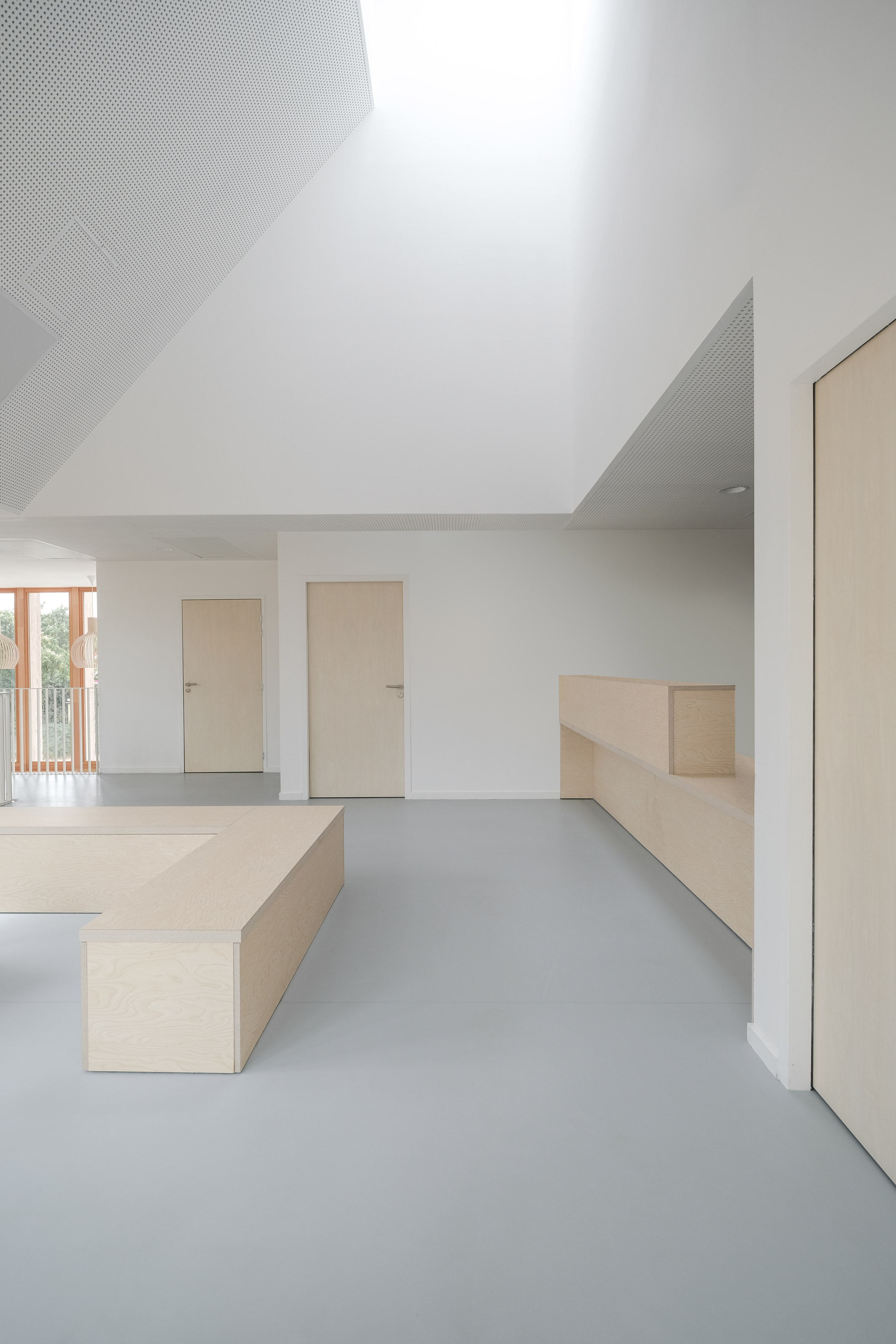
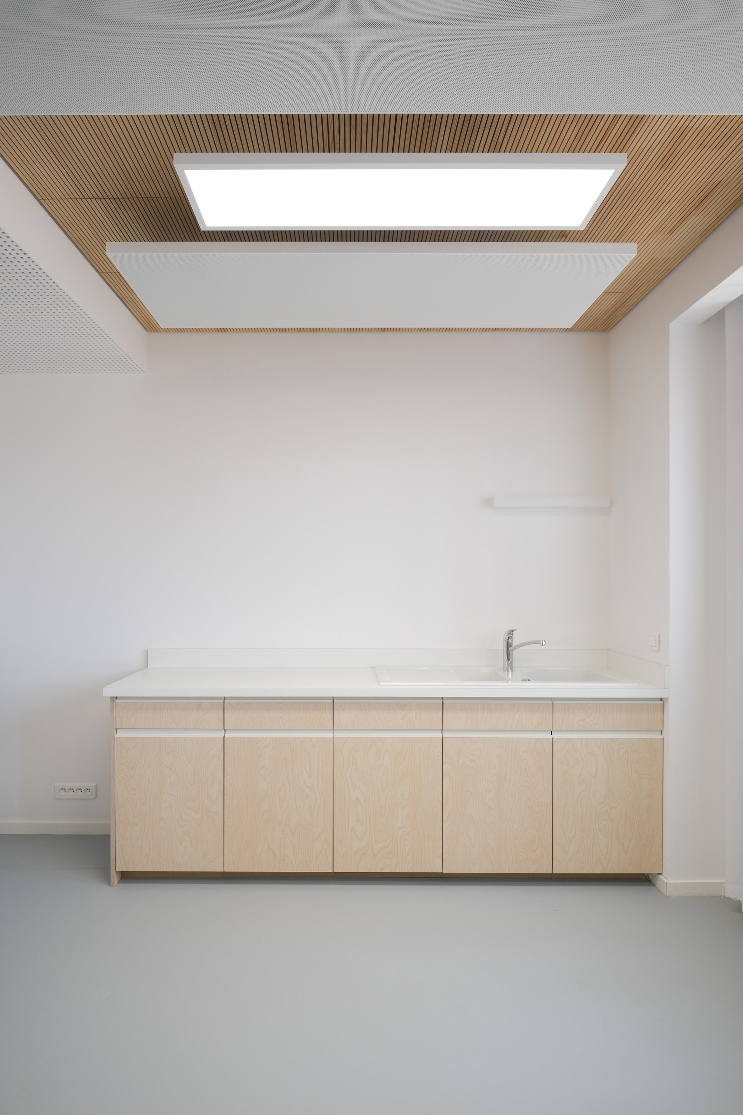
Interiors are pale and calm, with exposed timber between the glazing, white ceilings and white balustrades of thin steel.

MAAJ Architectes was founded in 2004 by Richard-Kowienski and Anne-Julie Martinon.

Taverny Medical Centre by MAAJ Architectes

Norweigian practice Hille Melbye recently made similar use of the courtyard typology for a psychiatric centre in Oslo, with garden spaces that are intended to act as an extension of the therapy taking place inside.

Photography is by François-Xavier Da Cunha Leal.

The post Timber health centre surrounds courtyard of medicinal plants appeared first on Dezeen.


from Dezeen https://ift.tt/2tlnWGO

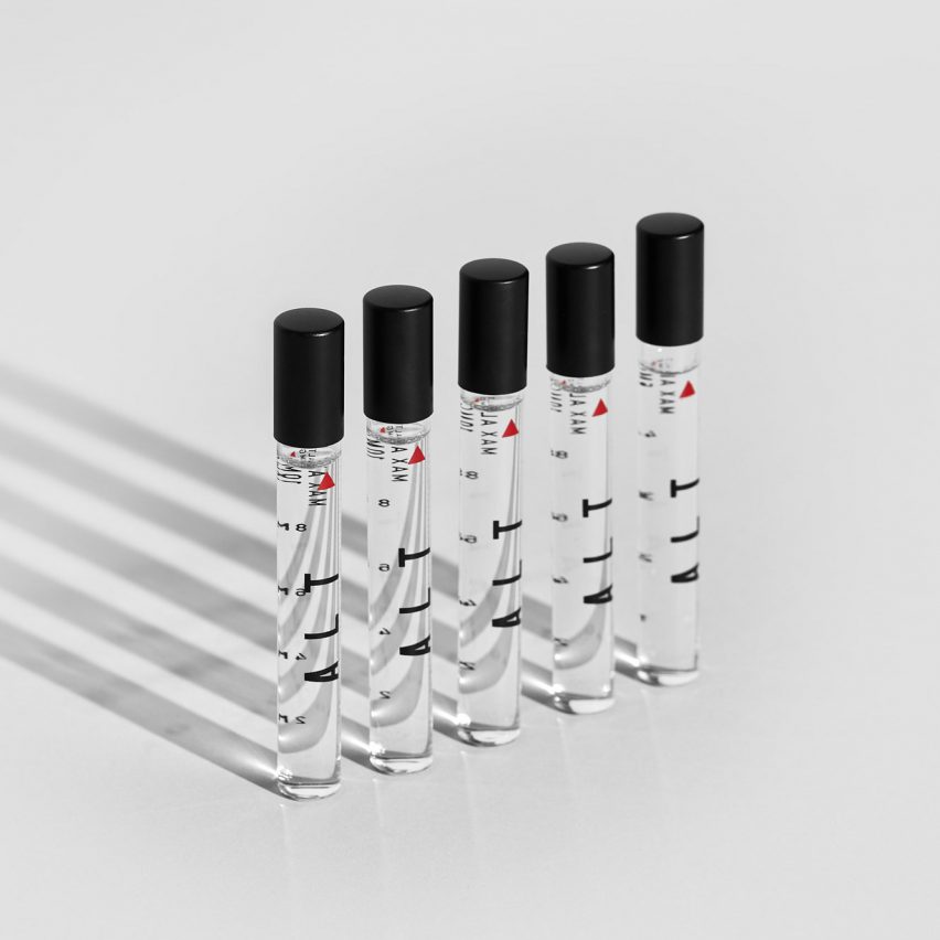
ALT uses aerospace-inspired packaging for its "mind-expanding" liquid cannabis

ALT cannabis packaging

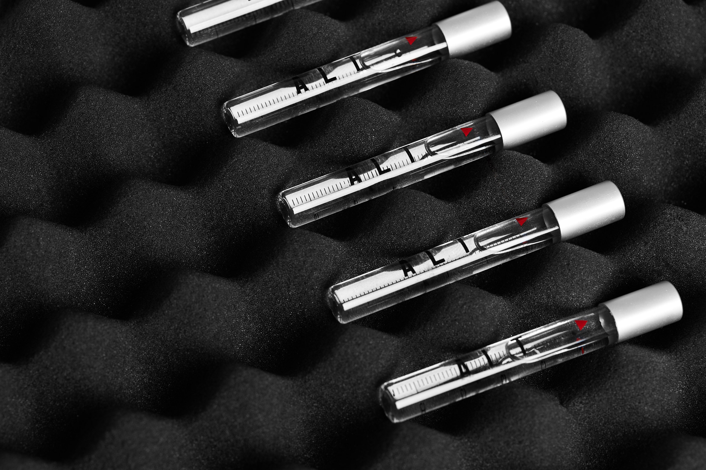
Science, aeronautics and NASA inspired the Very Polite Agency's packaging design for ALT, a liquid cannabis product for people who want a mind-expanding rather than purely medicinal high.

The Canadian creative agency worked on every aspect of the brand identity with the ALT founders, including the name.

"ALT" is a play on the words "altitude" and "altered state" that eventually evolved into an acronym — Advanced Liquid Technologies.

ALT cannabis packaging

The product has a couple of unique selling points: it is liquid in form, and it promises a controlled but deep high that, according to the brand, opens up neural pathways and gives users a chance to see things differently.

Very Polite saw a potential market among people interested in self-improvement based on scientific approaches, and they designed the packaging accordingly.

ALT cannabis packaging

"ALT was rooted in scientific development, which we found interesting in a space where cannabis often has an 'organic' or 'granola' association, both in aesthetic and overall tone," Very Polite partner and head of creative Dylan Rekert told Dezeen.

"We wanted to pull from the science element without it feeling pharmaceutical. We had to find a way to make it work, and to us that came in the idea of performance."

ALT cannabis packaging

This brought Very Polite to the aeronautical and moon-landing theme — not only was it scientific, it conjured associations with human aspiration and achievement that seemed right for ALT.

At the same time, the overall effect had to suit the demographic by being discrete and refined — "something they would have no issue displaying on their coffee table", according to Rekert.

ALT cannabis packaging

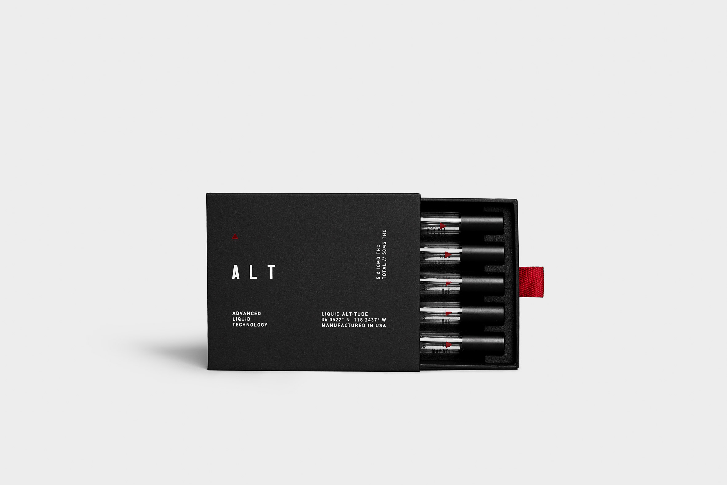
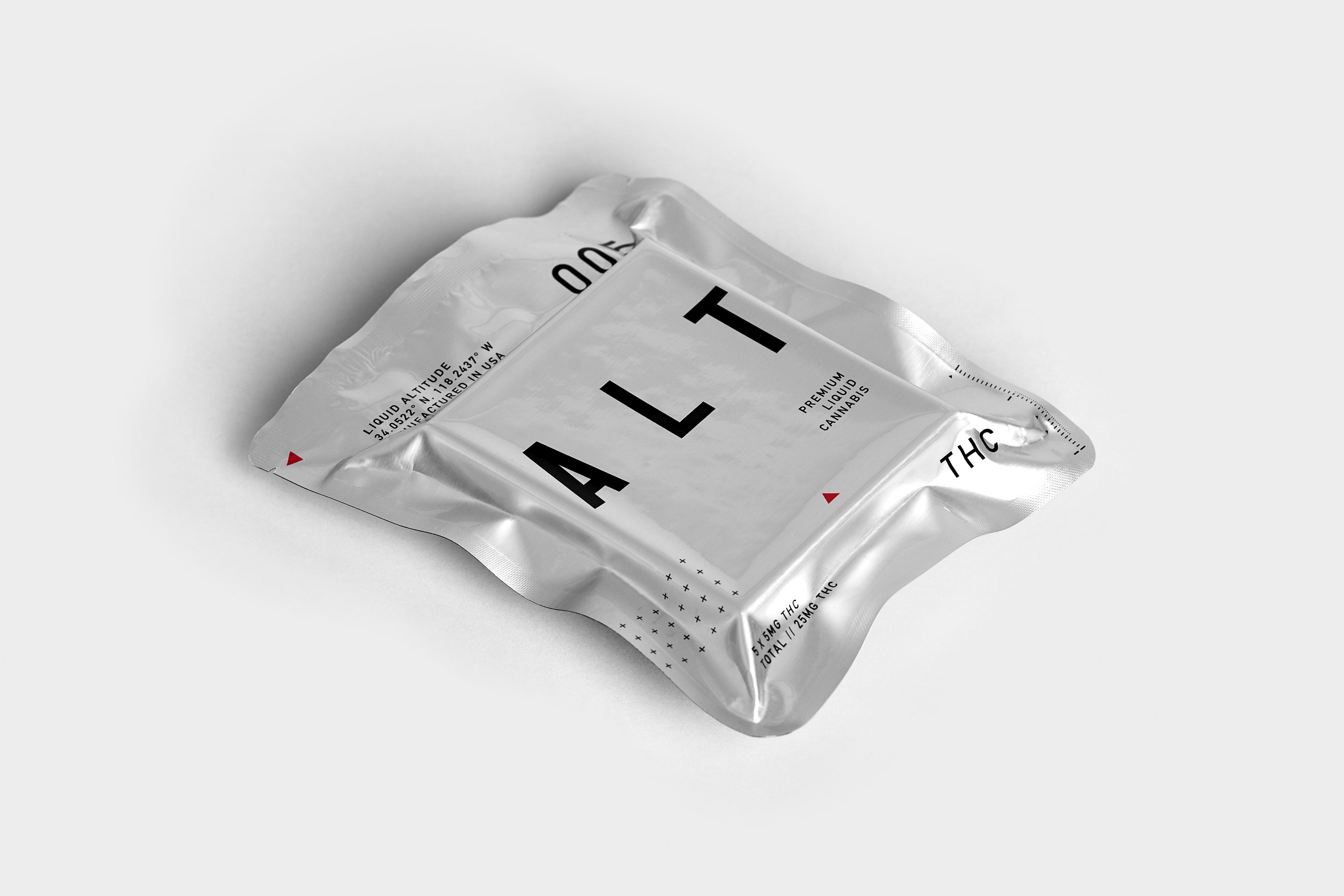
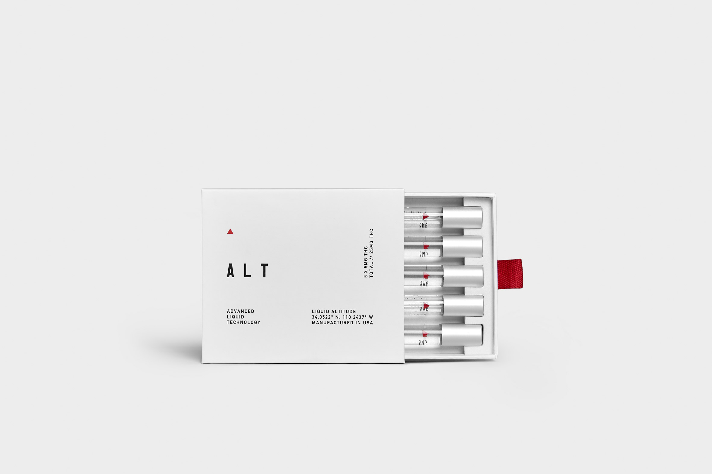
They took their visual cues from NASA, incorporating a minimal black, white and silver colour palette with dashes of red.

The visual identity pairs navigational elements such as crosshairs and GPS coordinates with lean, sans serif typography.

ALT cannabis packaging

When it came to the packaging design, space food was a major reference; ALT comes vacuum-sealed in silver foil, looking like a luxury version of the meals astronauts get on voyages.

The box within contains five resealable vials of ALT, with dosage levels clearly labelled.

The product comes in either a "functional micro-dose" version with five milligrams of THC per vial or a "deeper expression" with 10 milligrams of THC per vial.

ALT cannabis packaging

ALT's approach is in contrast to other new premium cannabis companies such as Dosist and Standard Dose, which have tried to associate themselves with wellness.

It is also a departure from the jokey or kitschy branding that still dominates in the sector.

ALT cannabis packaging

"Ultimately, the cannabis industry is a pun-filled market we didn't want to fall into," said Rekert.

"What we created was a strong, aspirational concept that approached 'getting high' from a different perspective, and the idea of doing something to expand potential for yourself," he continued.

ALT cannabis packaging

"The same way meditation has gone from a 'hippy' thing to a widely socially accepted and integrated practice, using ALT is a form of modern connectivity, evolved from the perception of simply 'getting high'," he said.

"It can be a cerebral drug, with the right dosage, expanding the mind intentionally."

ALT will be available to buy in North America, which has seen an explosion in cannabis-related products and technologies since US states began legalising recreational marijuana use in 2012.

The post ALT uses aerospace-inspired packaging for its "mind-expanding" liquid cannabis appeared first on Dezeen.


from Dezeen https://ift.tt/2OlMUgr