
From the impressive to the downright ridiculous, there’s seemingly nothing that’s safe from being turned into a camera by Brendan.

from It's Nice That https://ift.tt/2wjmeqR
From the impressive to the downright ridiculous, there’s seemingly nothing that’s safe from being turned into a camera by Brendan.
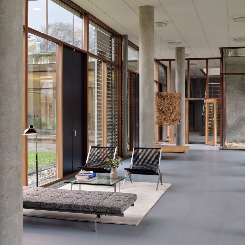
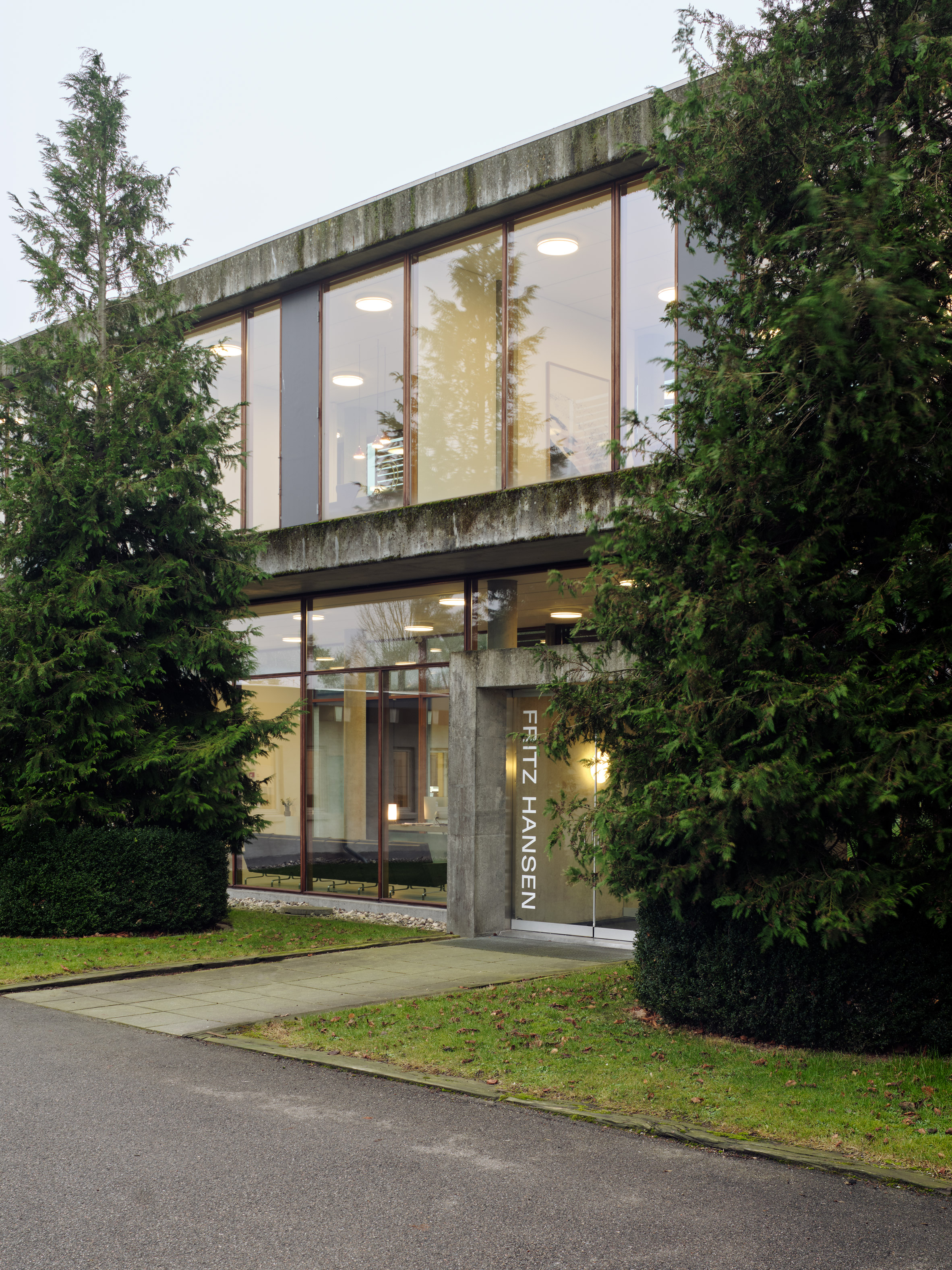
Furniture brand Fritz Hansen has revamped its headquarters in eastern Denmark, creating a sequence of homely spaces that cater to the diverse work methods of its employees.
The HQ is located on the edge of a forest in the municipality of Allerød, next to the site of Fritz Hansen's now-defunct sawmill.
Workspaces are spread across the remains of the brand's former factory and an administrative building from the 1960s. These two buildings are connected by a reception and meeting room that were constructed in 2003.
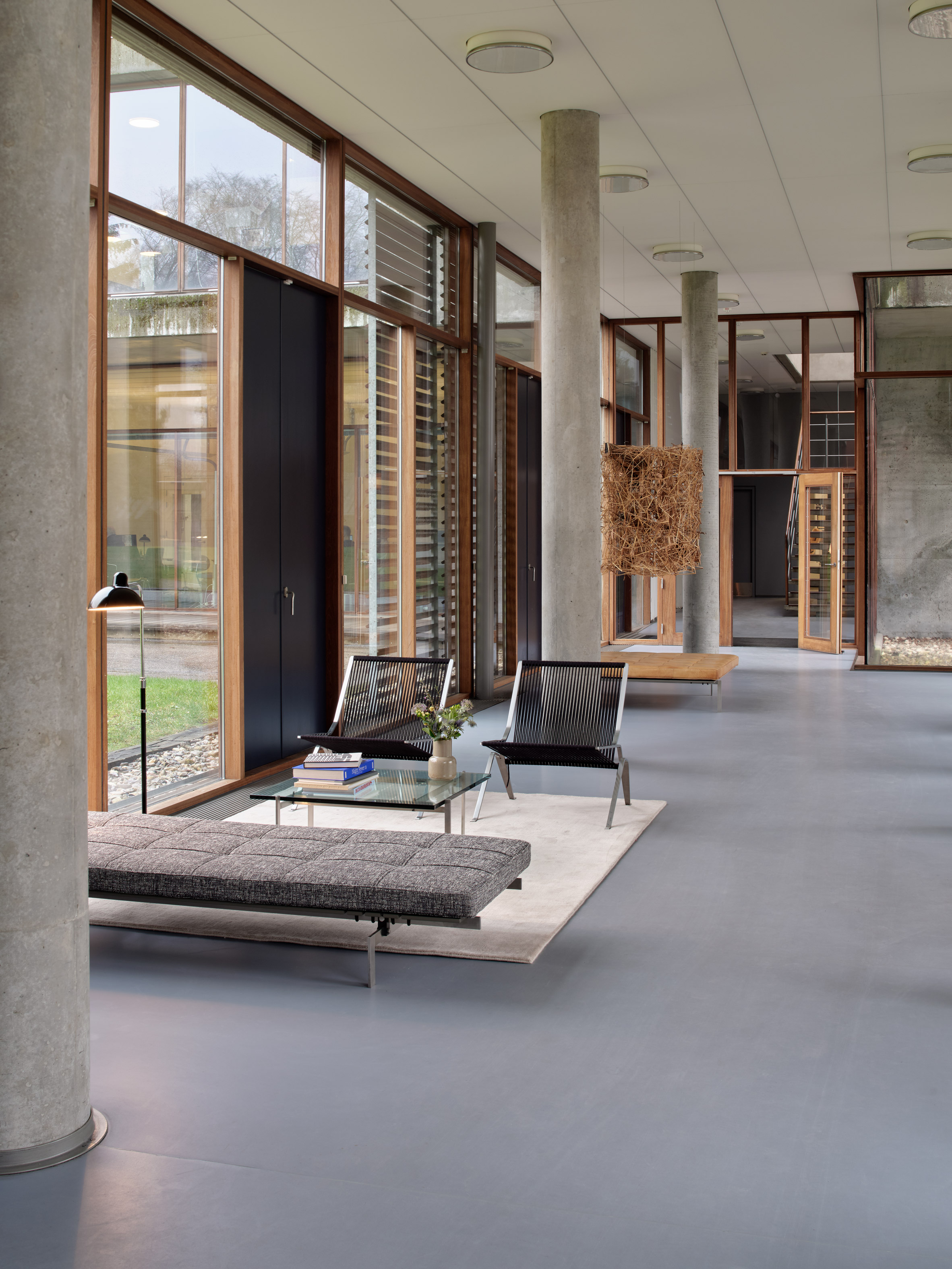
The revamped interior has been developed by Fritz Hansen's in-house design team using an activity-based space planning method.
It's meant to create more flexible working environments by allocating particular activities to different areas. Workspaces are split into a series of zones, each one dedicated to social, collaborative or individual activities.
Together, these zones are designed to promote better concentration, productivity, knowledge sharing and stronger collaborations.
"We've looked at how we work at Fritz Hansen to define an environment that supports the people who work here, with both functionality and aesthetics in mind," said Christian Andresen, head of design at Fritz Hansen.
"During any given workday we undertake a series of different tasks – from solo projects to conference calls to group activities," he continued. "Rather than limiting colleagues to a single, allocated desk, our new design concept encourages them to recognise that different work activities can be better supported by spaces and features designed specifically for that task."
The theory chimes with the results of a recent study by furniture brand Haworth, which revealed that offices can only facilitate creative thinking if they offer spaces for both focused work and restorative activities.
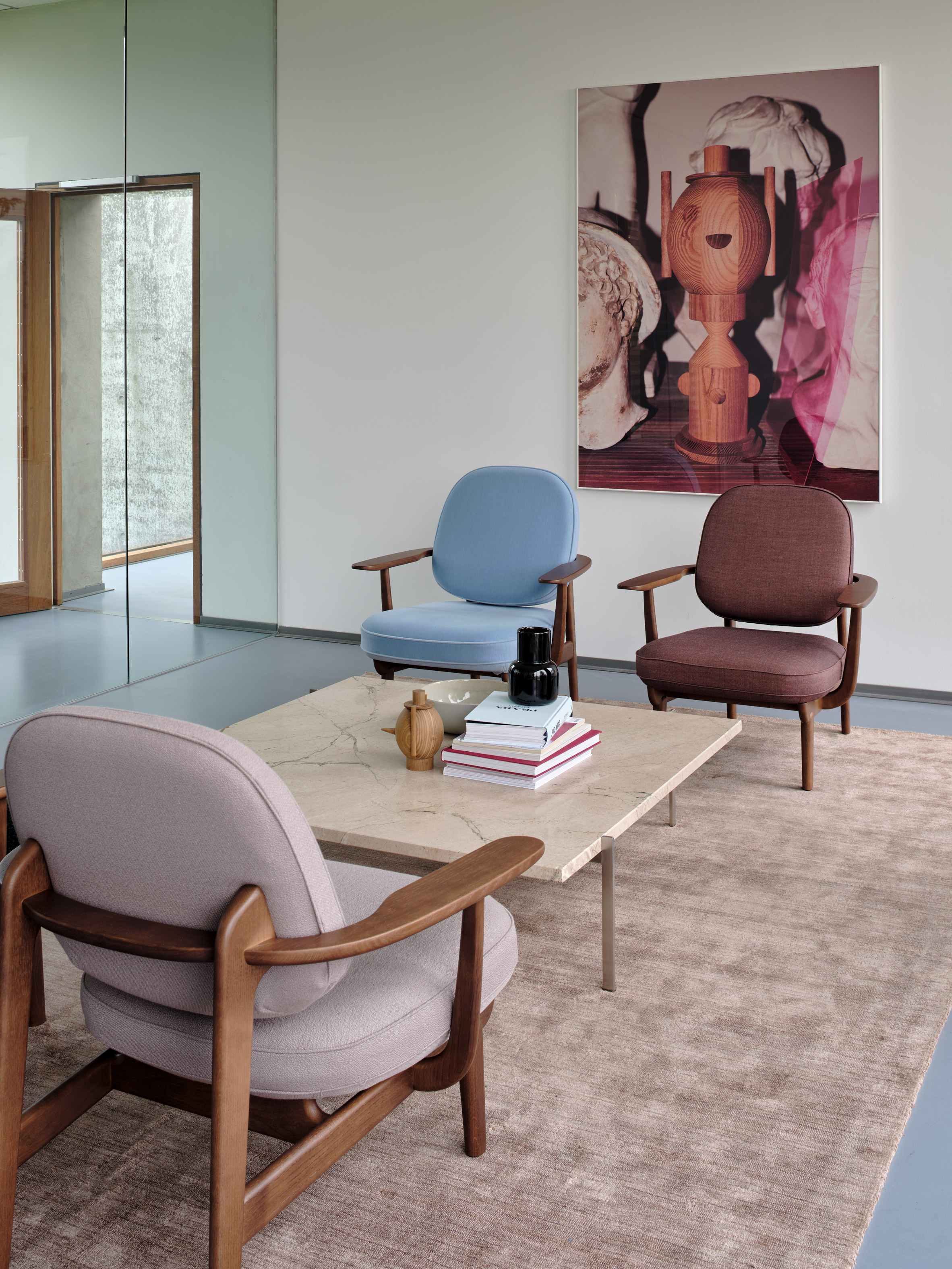
The interior of the building has been brightened up with white walls and pale-grey floors. Natural wood, leather and fabric upholstery are used to create a homely aesthetic that the brand said facilitates "closeness and creativity".
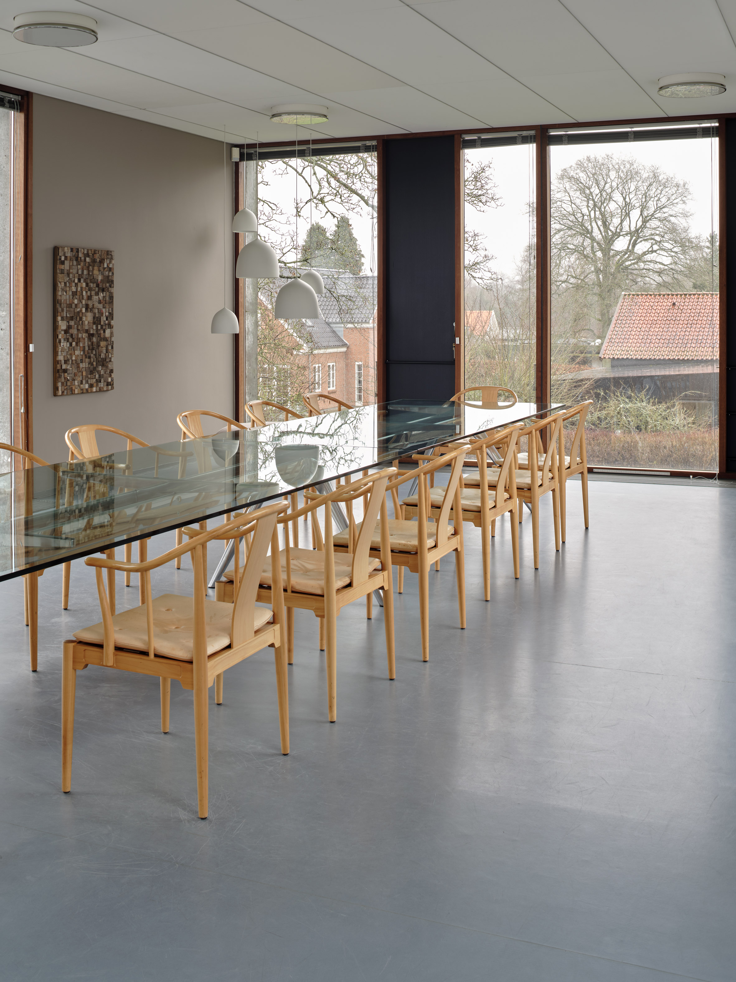
Floor-to-ceiling windows line the HQ's facade. An abundance of glass partitions has also been incorporated inside the office, particularly in the meeting rooms that run around the building's perimeter.
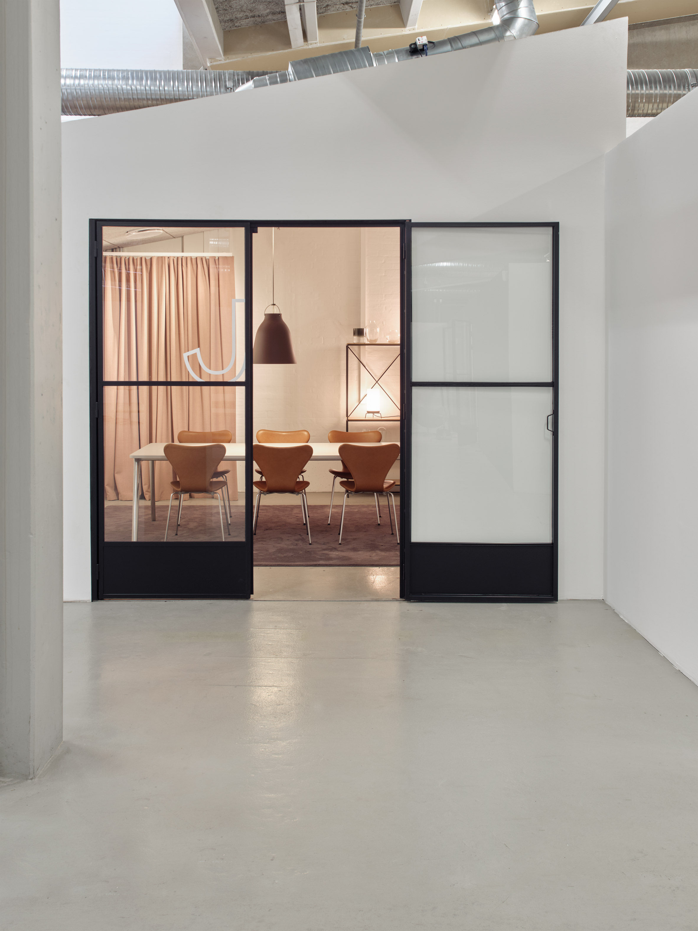
"The idea [to place meeting rooms around the perimeter] came from classic furniture display shelving where you put a chair in its own little room or box," the brand told Dezeen.
"When you see the meeting rooms from outside, especially lit in the dark, each room looks like one of these display rooms. These spaces are not a daily workspace but meeting rooms and the way that we have styled and decorated them is with four different themes and offering a format and informal style in a large and small setting."
"Daylight is always a blessing in our Nordic area and it definitely promotes a better meeting," it continued.
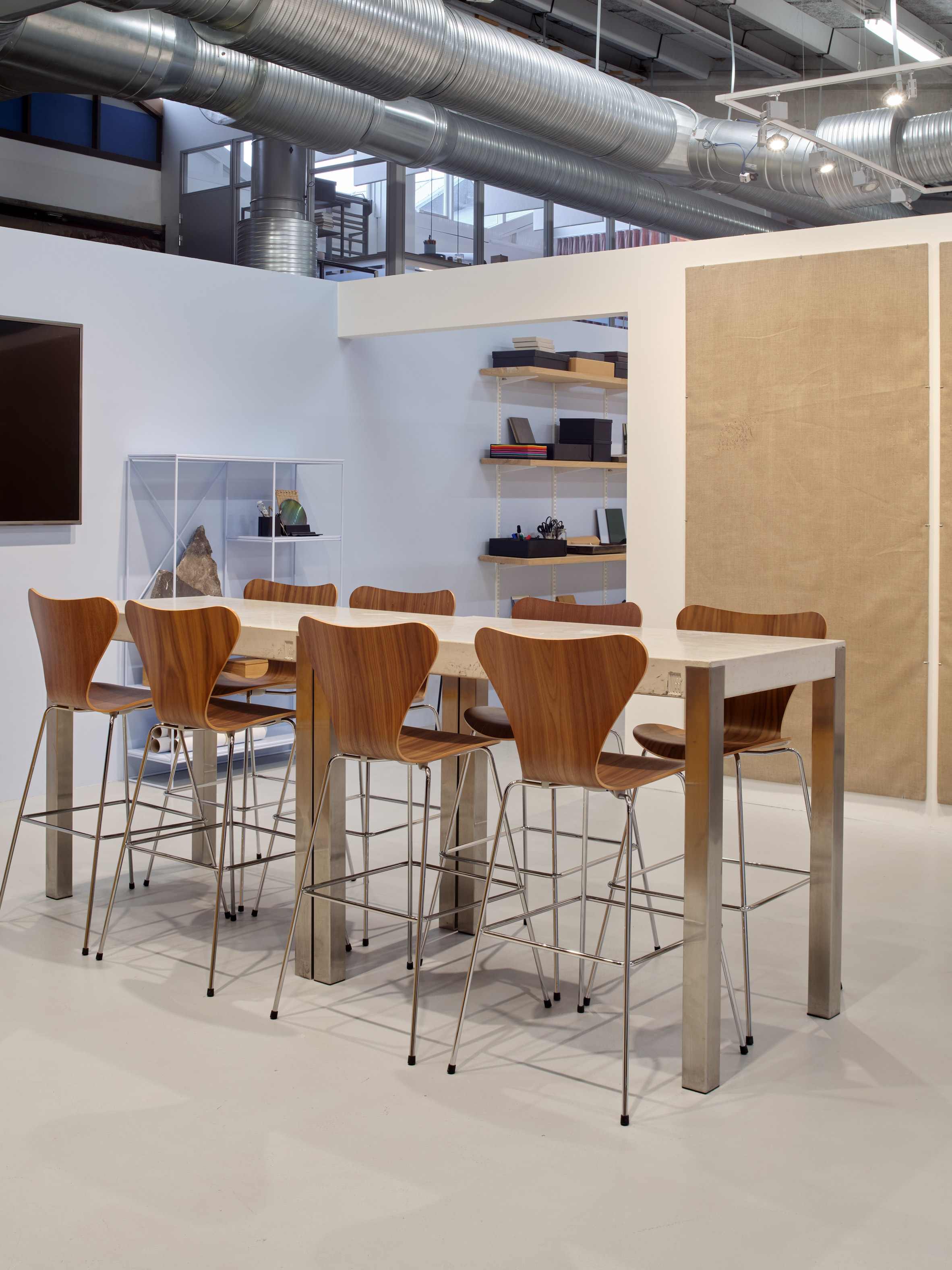
In the former factory, a series of white shed-like volumes with sloping roofs and Crittall-style glazing accommodate meeting rooms and break out areas.
"The idea with the revitalisation is to offer a much more flexible work environment where one, two or 30 colleagues can gather," explained the brand.
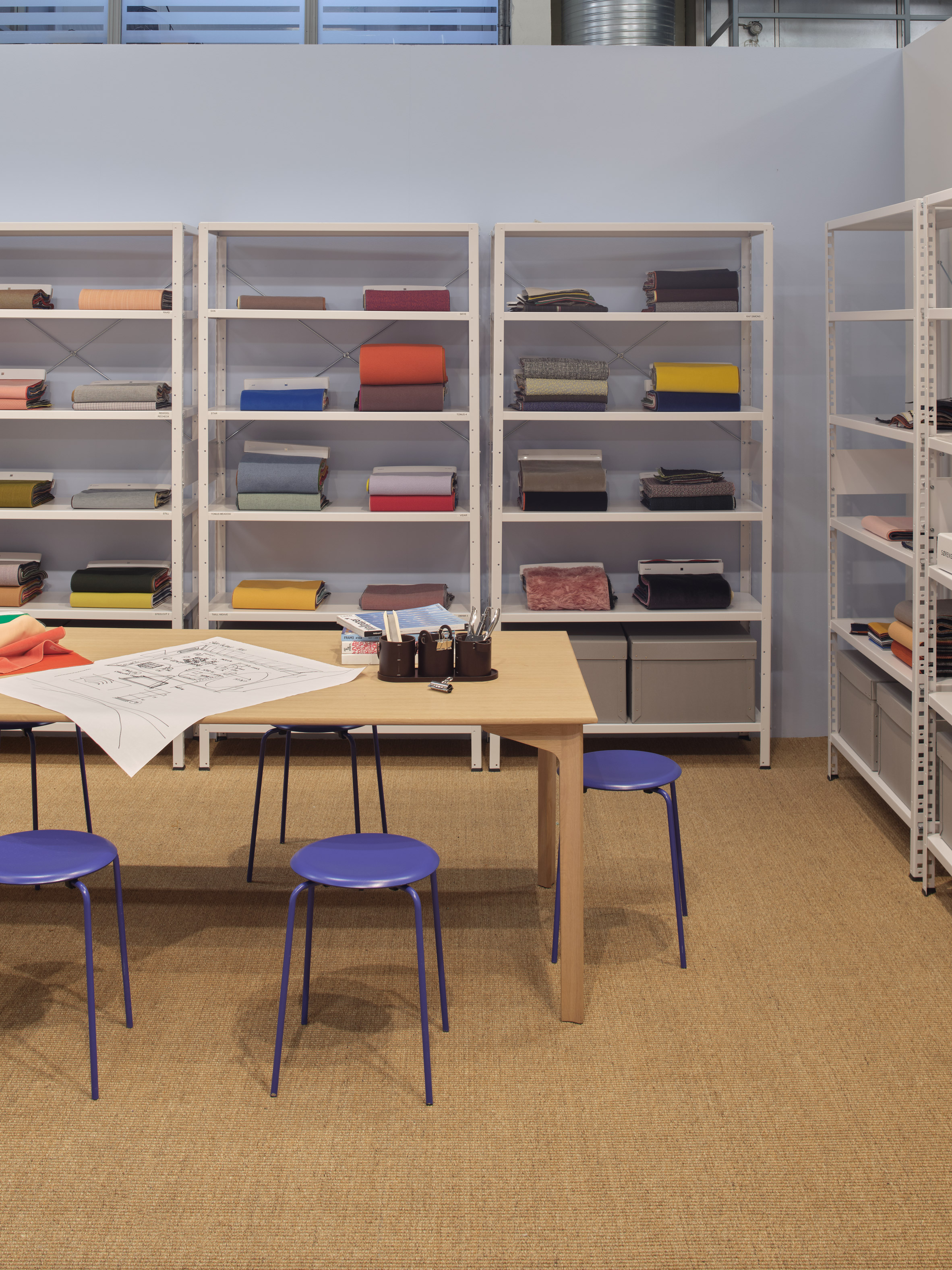
"All rooms have whiteboards and screens. We also created a new textile room where all swatches are available, and a sample room, where all materials such as wood types, veneer and recycled plastic, are close at hand," it said.
"These new spaces are all placed within one big open factory hall, meaning that the footfall has increased," it continued. "We meet each other much more often across departments, creating a much more human and lively space."
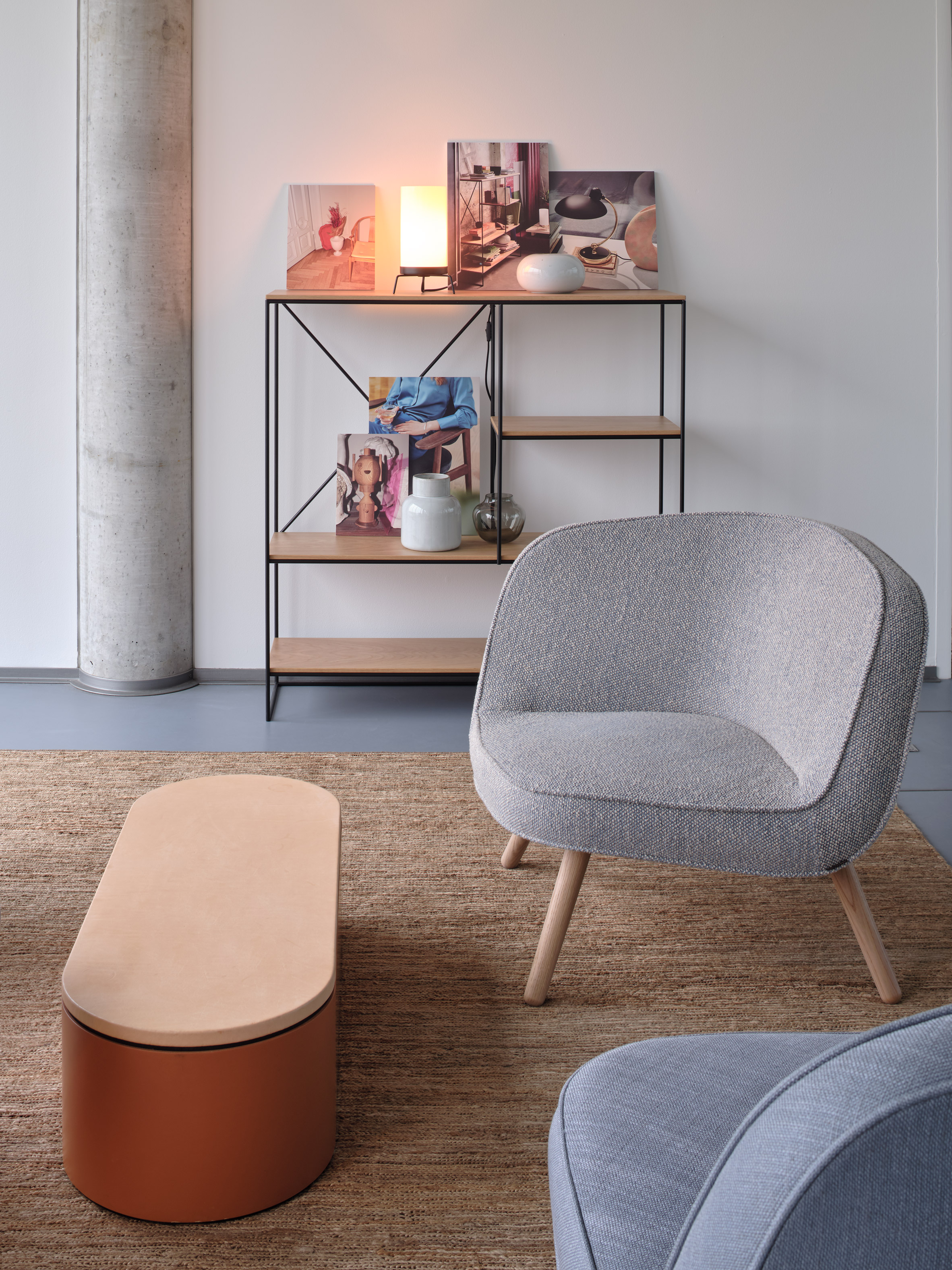
In the open spaces, the design team has created sheltered areas that provide privacy for individual tasks, or for taking a break from the busier zones of the office.
The brand's showroom now doubles as a flexible exhibition space, which can be changed around according to the products on show.
"By modernising our working space to reflect the versatility of our products and the changing needs of our 250 employees, we have created a home that is not only beautiful, but also conducive to productivity, underpinning our brand values, reflecting the Fritz Hansen retail experience and inspiring our visitors," added the brand.
"A physical manifestation of our new brand identity and positioning, the new interior design is led not by trends, but by the changing ways we work."
Photography is by Brian Buchard.
The post Fritz Hansen completes revamp of Danish HQ appeared first on Dezeen.
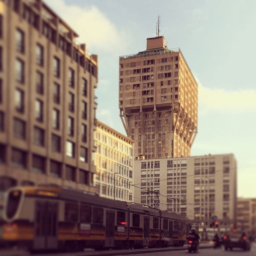
Last week, we announced plans for an online design week called Virtual Milan. Dezeen's founder and editor-in-chief Marcus Fairs explains why this was the wrong thing to do, and what we intend to do about it.
I want to apologise to our Italian friends. On Thursday last week, we announced an idea for a digital design week. We chose to call it Virtual Milan.
We never for one minute intended it to be disrespectful to the city of Milan, its community and its current suffering amid the coronavirus pandemic. We didn't think of it as a competitive move against Salone del Mobile or any of the other Milanese design platforms, but rather as something to support the global design community at this difficult time.
But while the vast majority of the responses we got were positive and supportive, many people in Milan were deeply offended. It quickly became clear that we had got it wrong. We're genuinely sorry about that.
It quickly became clear that we had got it wrong
We are learning the hard way as coronavirus rips its way around the world. London right now is where Italy was a couple of weeks ago and where China was in the weeks before that: poised on the edge of darkness.
Having closed the Dezeen offices in both London and New York for the immediate future, and with both cities on the brink of lockdown, we now have a terrible inkling of how Milan has been suffering in recent weeks.
We also feel an even keener responsibility to be an honest and trusted voice for our international audience while helping design businesses everywhere amid this global crisis. The virus has no mercy and no favourites. It cares not for Wuhan, Milan, London or anywhere else.
Having made a mistake, we want to put it right. We think that some kind of Virtual Design Festival (as we hastily renamed the project on Friday, before putting it on hold) could offer a new way of bringing people together and provide a new platform for businesses. It could be something positive to come out of this crisis.
We'd like to extend a hand of friendship to Italy
We're still formulating ideas for how such an online design festival could work. We had imagined something like the online equivalent of a music festival, offering a mixture of videos, talks, live streams, video conferences and more about the culture and commerce of design.
Whatever we do, we want it to be inclusive. We'd like first and foremost to extend a hand of friendship and an offer of help to designers, brands and organisations in Italy. Please let us know how we can help you.
But we also want this to be something for the entire global design community. If you have any suggestions, please let us know via the comments section below, or by emailing me at marcus@dezeen.com.
Meanwhile, our thoughts are with everyone during this terrible time. Please stay safe and let's all stay connected.
The post "I want to apologise to our Italian friends" appeared first on Dezeen.
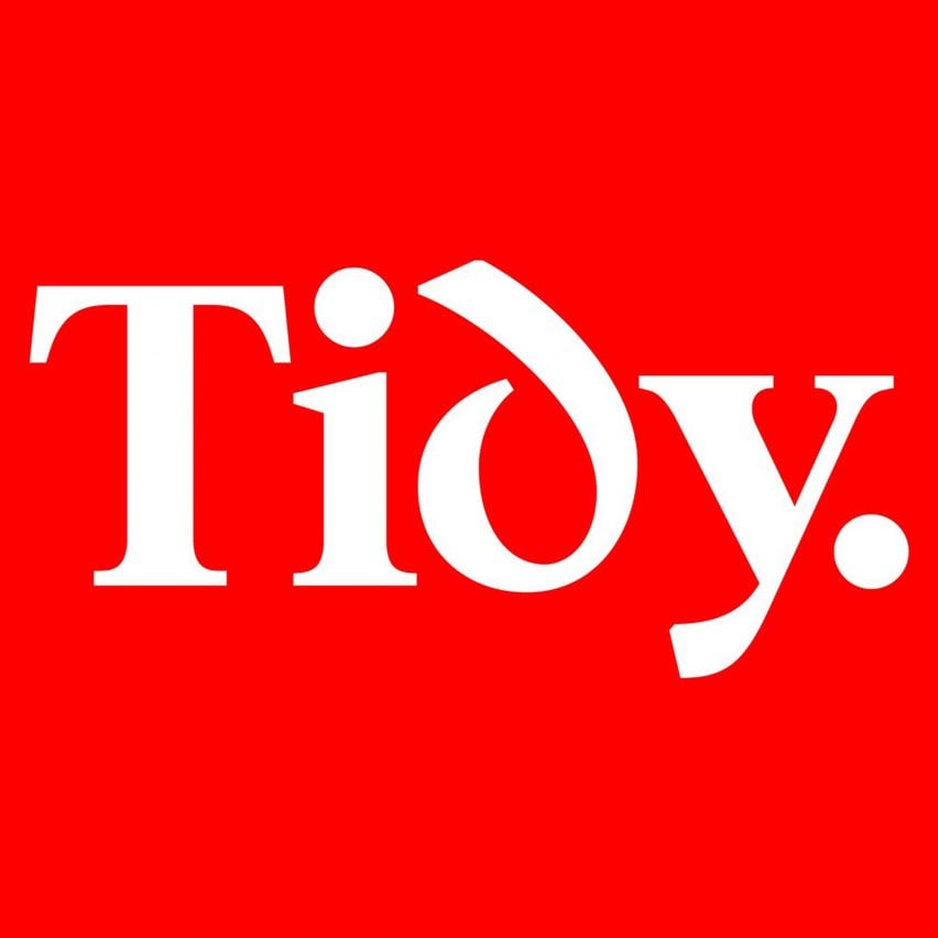
Cardiff and Amsterdam-based design studio Smörgåsbord has developed Cymru Wales, a "nation-defining" font family that gives an accurate, digital expression to the Cymraeg language for the first time.
The project was commissioned by the Welsh government as part of a wider rebrand of the country's visual identity, and features the no-frills Cymru Wales Sans which Smörgåsbord originally designed in 2017, alongside a serif font for longer reads and a designated font for the local transport system.

To imbue the typography with a unique sense of identity and place, the studio went back to some of the oldest surviving Welsh manuscripts, including The Black Book of Carmarthen and The Red Book of Hergest, which date back to the 13th and 14th century respectively.
In collaboration with the Colophon Type Foundry, they set about adopting some of the language's unique stylistic traits into a modern font.
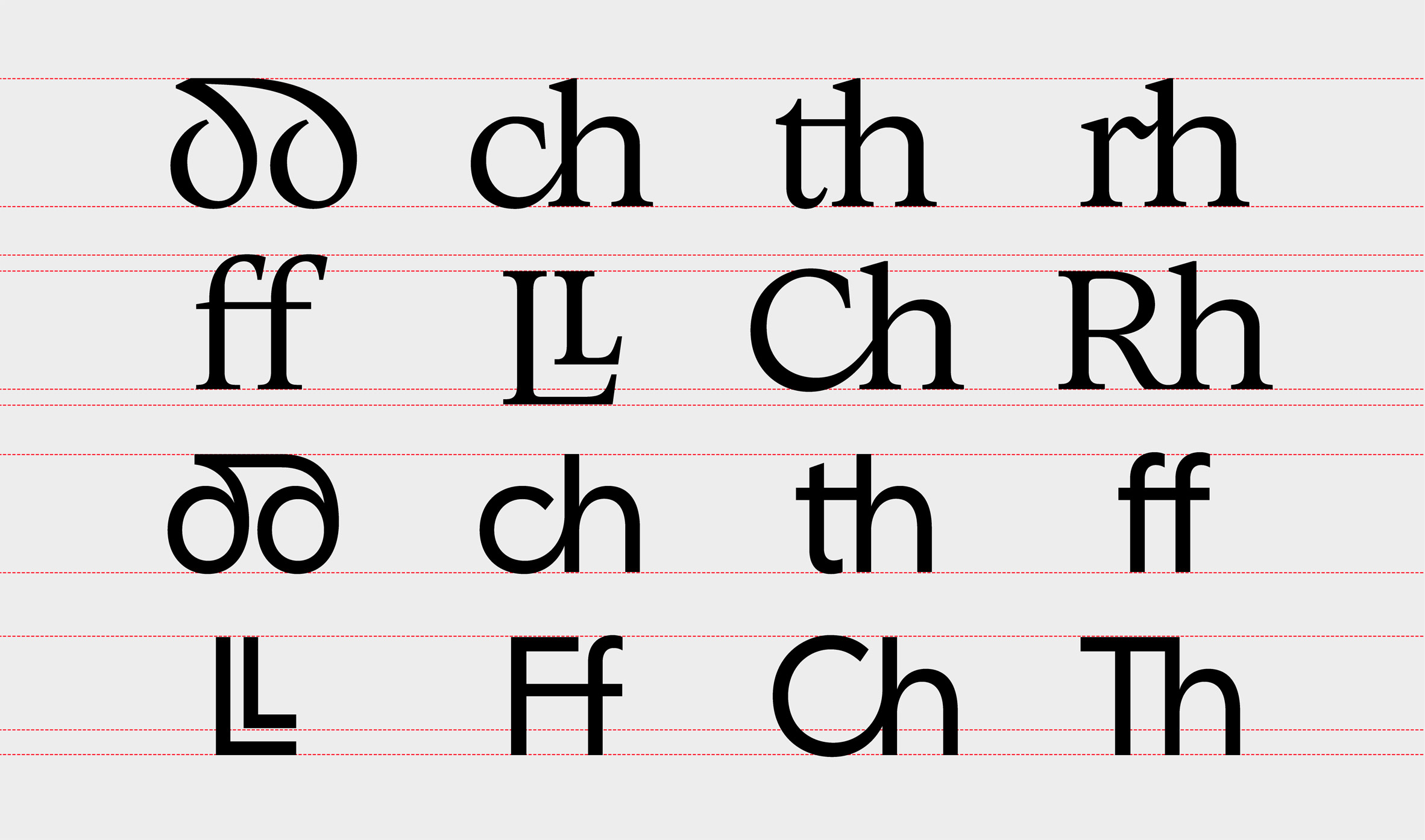
Most notably, the it gives an expression to the digraphs that distinguish the Welsh alphabet from the English one. These feature a combination of two letters such as ph or ll to represent a single sound.
Due to the lack of dedicated digital characters, these are generally spelled using two individual letters, but they actually represent a single letter – much like a German umlaut – and take up a single box in a crossword.
"The Welsh alphabet has a total of 28 letters and is blessed with eight digraphs," said Smörgåsbord's creative director and co-founder Dylan Griffith. "Good enough reason to set about creating a nation-defining bespoke font family."
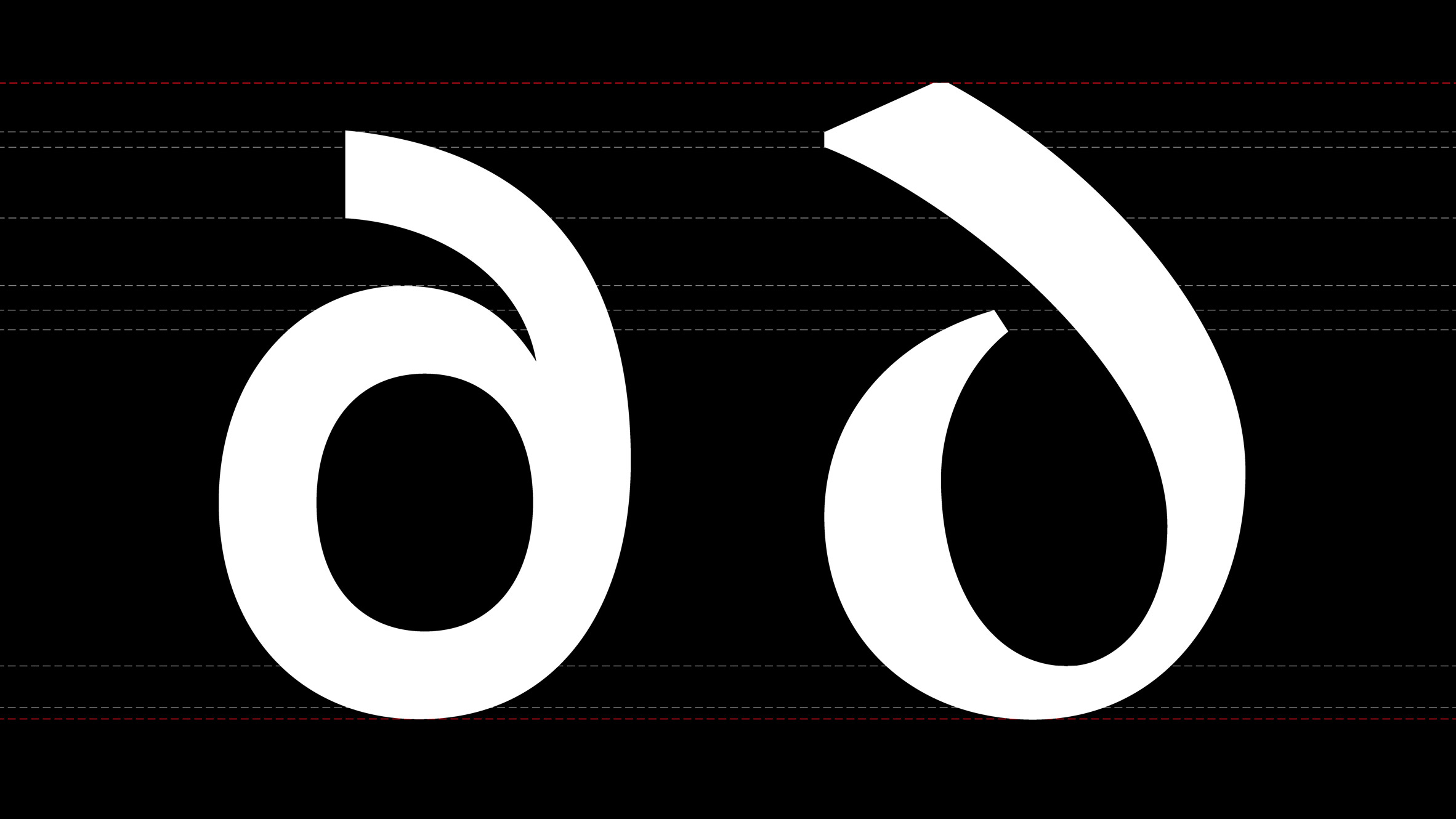
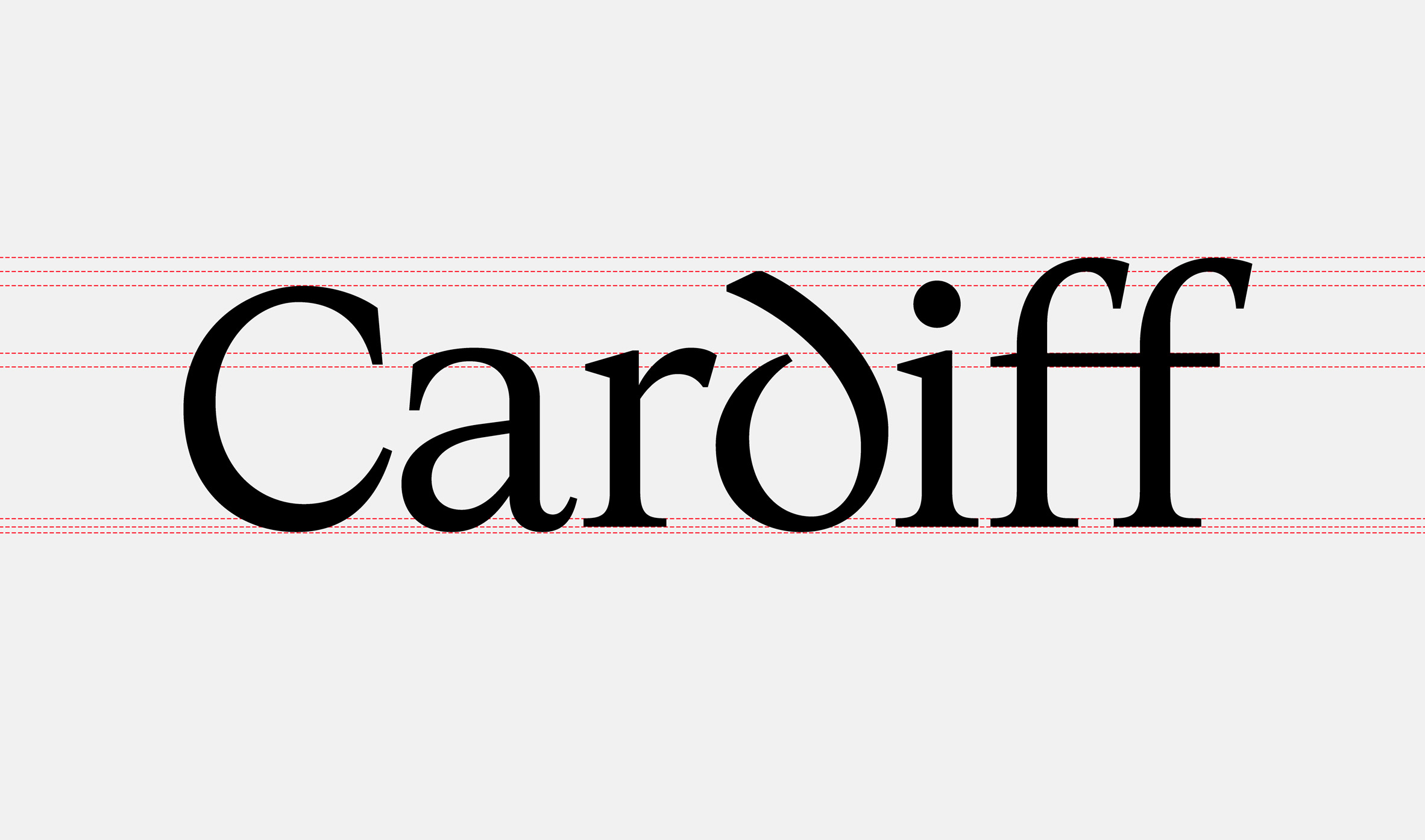
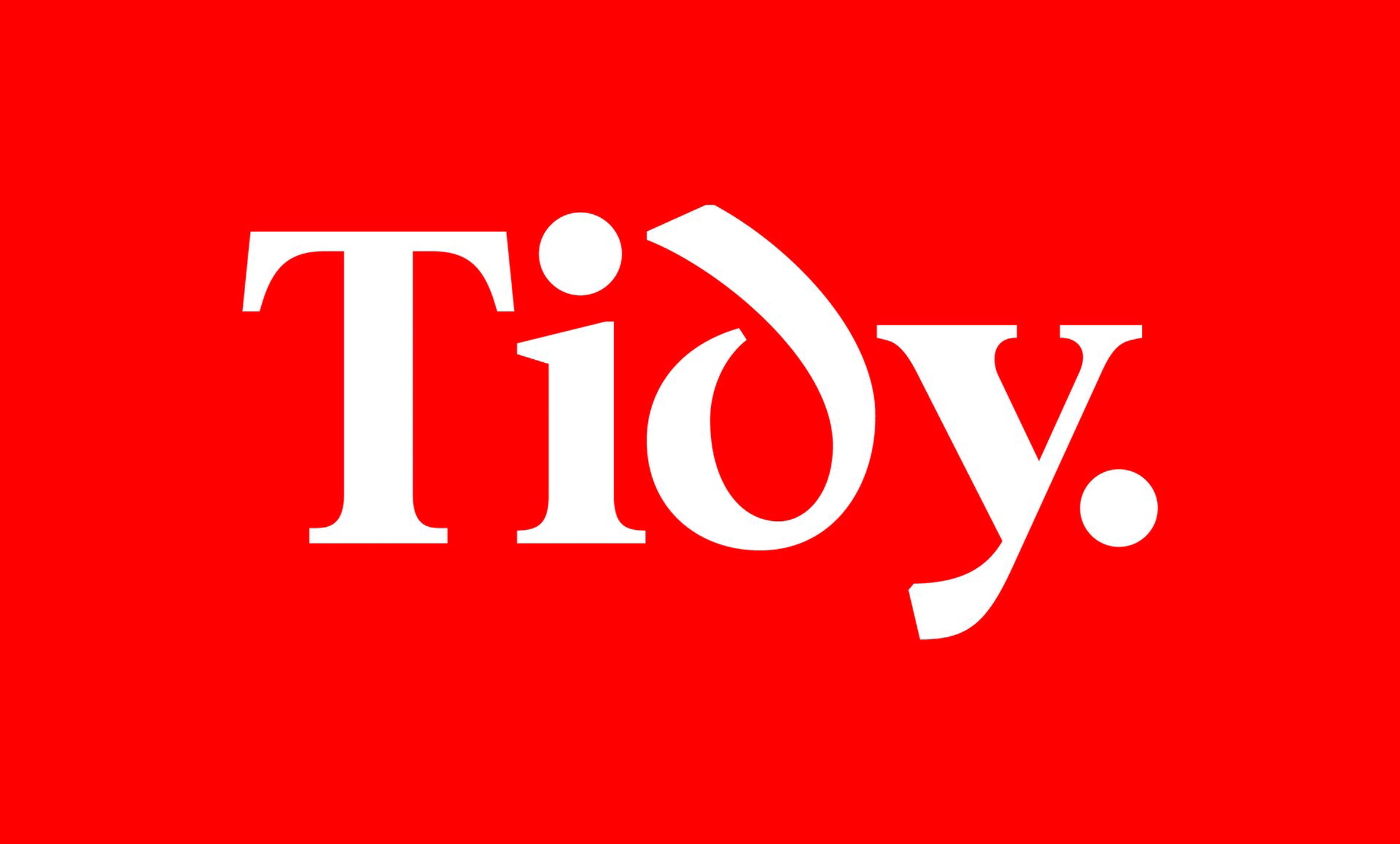
Beyond the digraphs, the most distinctive character is the d, which has an ascender that curves forwards.
"The curved d featured widely across our two Welsh reference texts, alongside open bowled characters, in which the rounded part of letters such as B, g or R isn't fully closed," Griffith told Dezeen.
"We also felt that the introduction of the open bowls added a contemporary and stylistic element that would further enhance the uniqueness of the font without wandering into the territory of pastiche or parody."
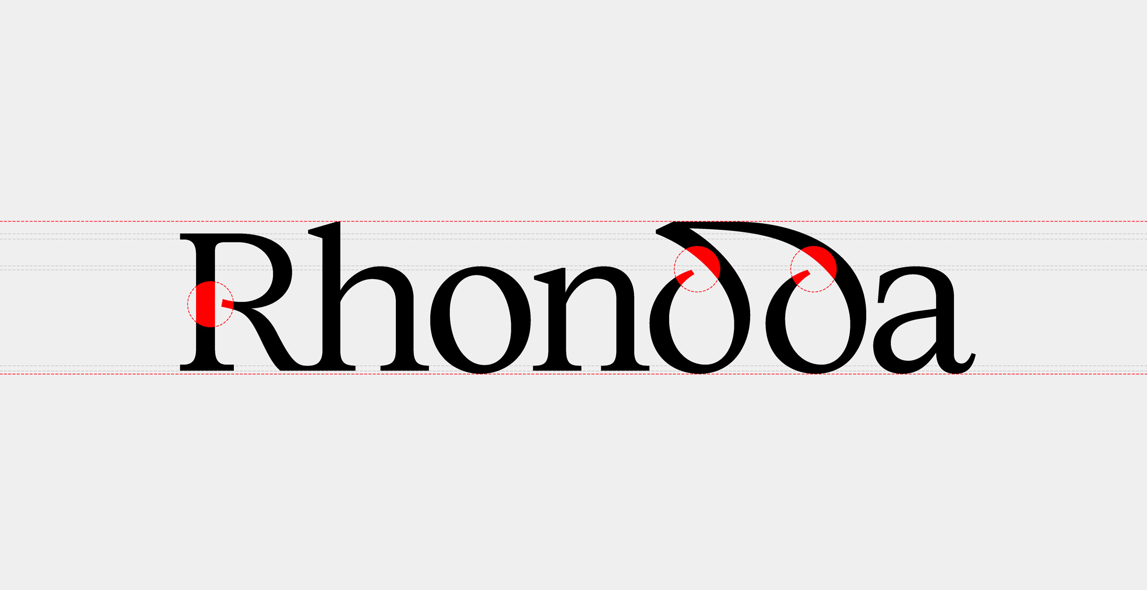
Nods to Welsh cultural heritage be found in subtle details like the chamfered edges of the Cymru Wales Serif font, which invoke the region's traditional craft of stone letter carving.
The studio also looked to the digital expression of other minority languages such as Icelandic, as well as the cursive characters of Arabic for cues on how to infuse a typography with a distinctive personality.
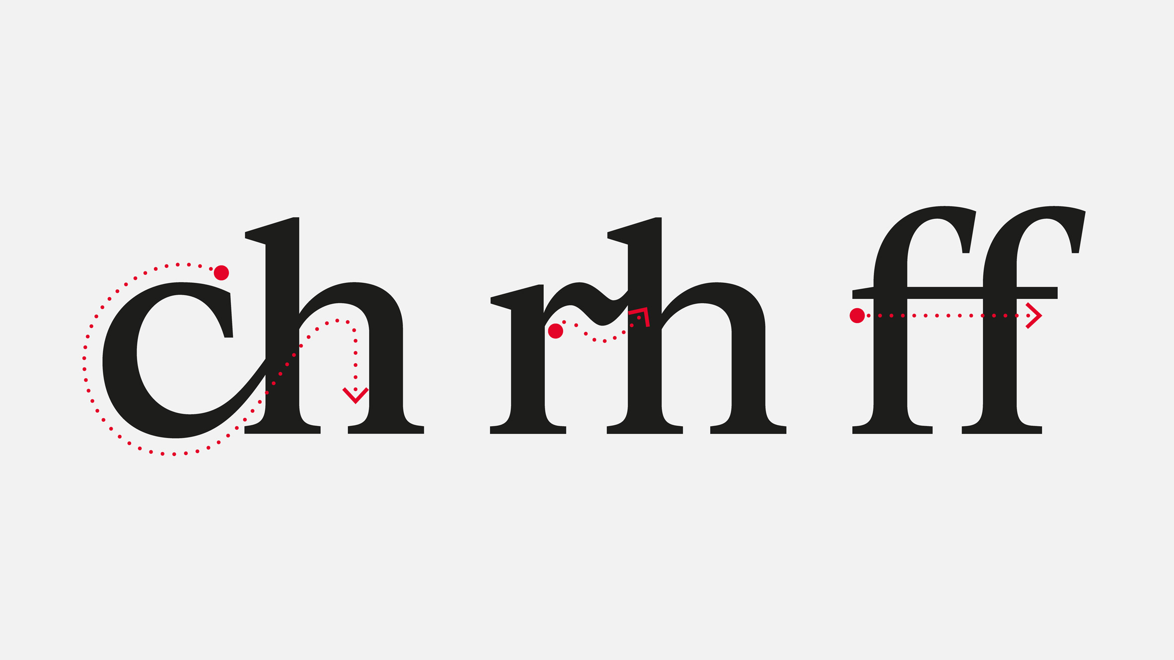
"The Icelandic ð character provided us with some clues as to how to best tackle our curved d," explained Griffith.
"And Arabic typefaces led us to create the folded ribbon-like gestures that feature in Cymru Wales Serif, namely the d, dd, ch, rh, & – plus the stacked element of the l."
Another key concern for the studio was maintaining the accessibility of the language despite the inclusion of little known linguistic elements like the digraphs.
"We could foresee that introducing what could be deemed as 'alien' letterforms into the alphabet could challenge some users, so we worked alongside teams from Burdus Access and Applied Wayfinding from the outset to ensure that the digraphs were deemed valuable legibility tools as opposed to linguistic obstacles," said Griffith.
"All characters share generous, open counters. Descenders were made longer than usual and the dots on the i and j are oversized. We also introduced flicks at the ends of the vertical stems in Cymru Wales Sans to ensures differentiation, for example, between a capital I and lowercase l's."
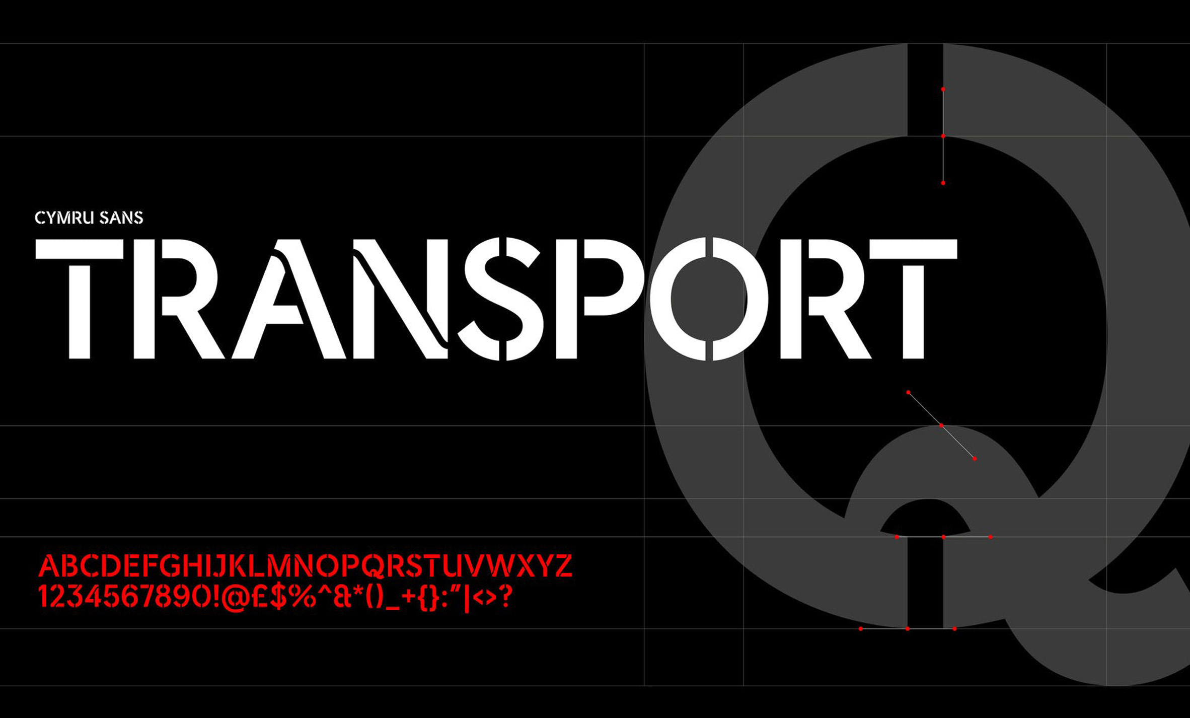
The official Transport for Wales font sees Cymru Wales Sans rendered in all caps, with stencilled utilitarian letters that will be adapted across all the whole transport network.
For now, the new font family is exclusive to government communications, marketing and campaigns associated with promoting Wales. But Griffith hopes that its influence will stretch beyond that.
"Looking ahead we'd like to think the fonts might act as a catalyst for other digital typefaces and could even see people integrate the digraphs into their handwriting," he said.
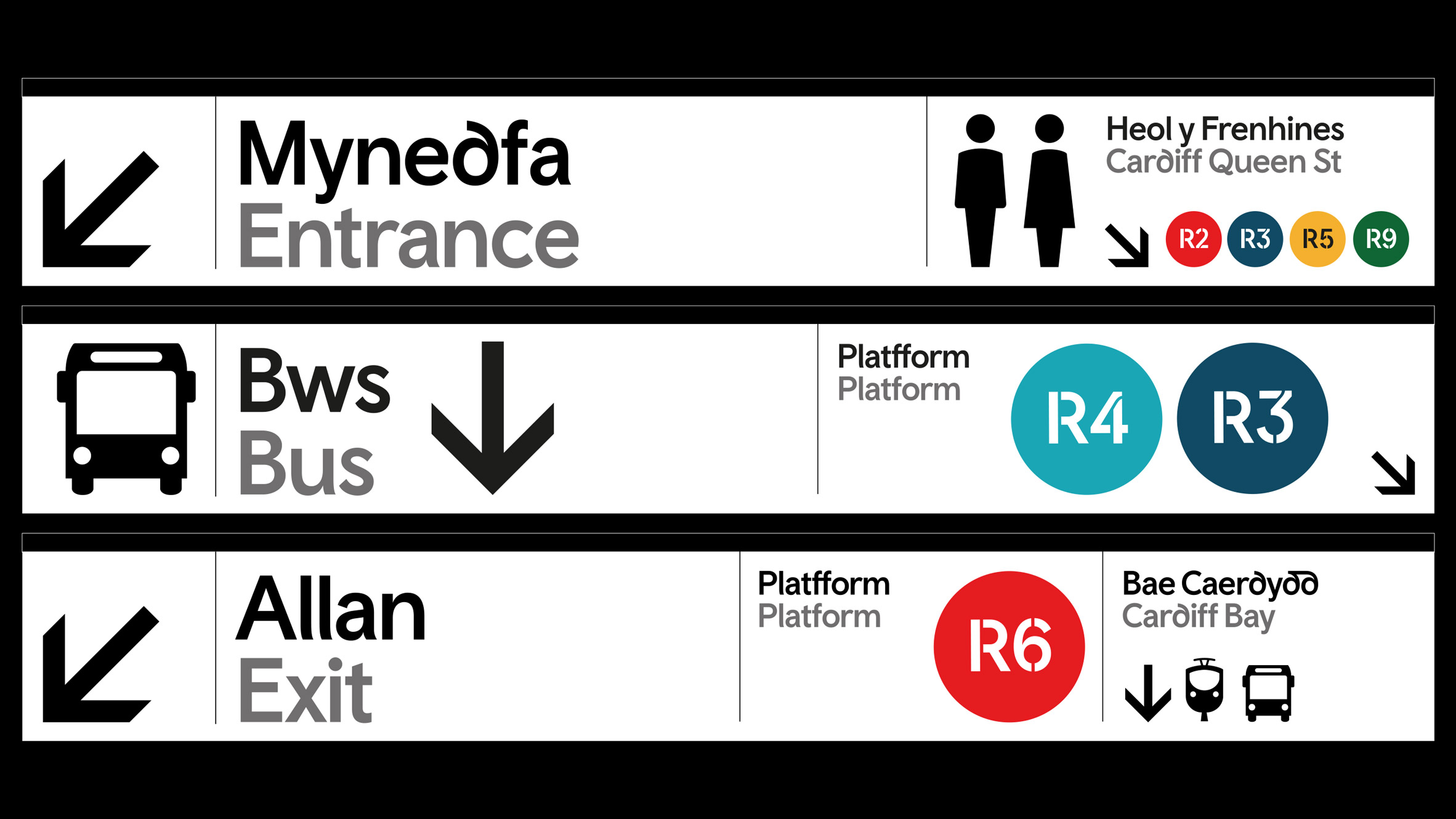
Although Welsh is one of the oldest living languages in Europe, and was once spoken by around 90 per cent of the population, a 2019 survey found, that this is now only true for around 29 per cent of Welsh people.
Under English sovereignty, Welsh had its official status as a language removed by Henry the VIII in 1567. Later, after a parliamentary review in 1847, it was banned from being taught or even spoken in schools because it was seen by the English to perpetuate the perceived "immortality" of the Welsh people.
However, the language has experienced a renaissance in recent years after it was reinstated as a compulsory subject in schools in 1999, and moved from designated Welsh language radio stations and newspaper into mainstream TV shows such as Hinterland, which was picked up by Netflix.
"The creation of the Cymru Wales font family chimes with the Welsh Government’s vision to have one million Welsh speakers by 2050," explained Griffith. "To quote Irish teacher and poet Pádraig Pearse: 'A country without a language is a country without a soul'."
The importance of language and typography to a sense of national identity has also manifested itself in a series of other recent projects, such as the Oli Grotesk typeface which is capable of expressing nine traditional Indian scripts, and Signato, which was created to celebrate 100 years of Lithuanian independence.
The post Smörgåsbord designs first digital typeface family for the Welsh language appeared first on Dezeen.
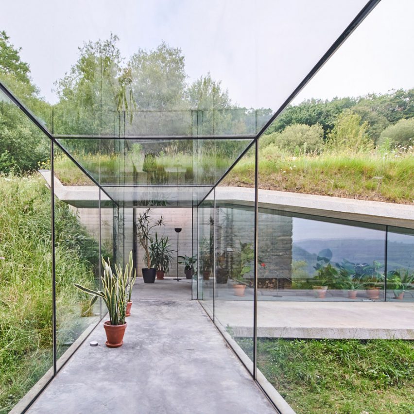
Architecture studio Jordi Hidalgo Tané has extended a small stone building in rural Navarra, Spain, with a subterranean concrete annex accessed via a glass corridor.
The original building, called Landaburu Borda, sits close to the town of Bera and overlooks the surrounding landscape of the Navarra mountains.

In order to not disrupt this dramatic setting, the extension has been hidden under the adjacent hillside.
It houses a large living, dining and kitchen area and sits across from the original building.
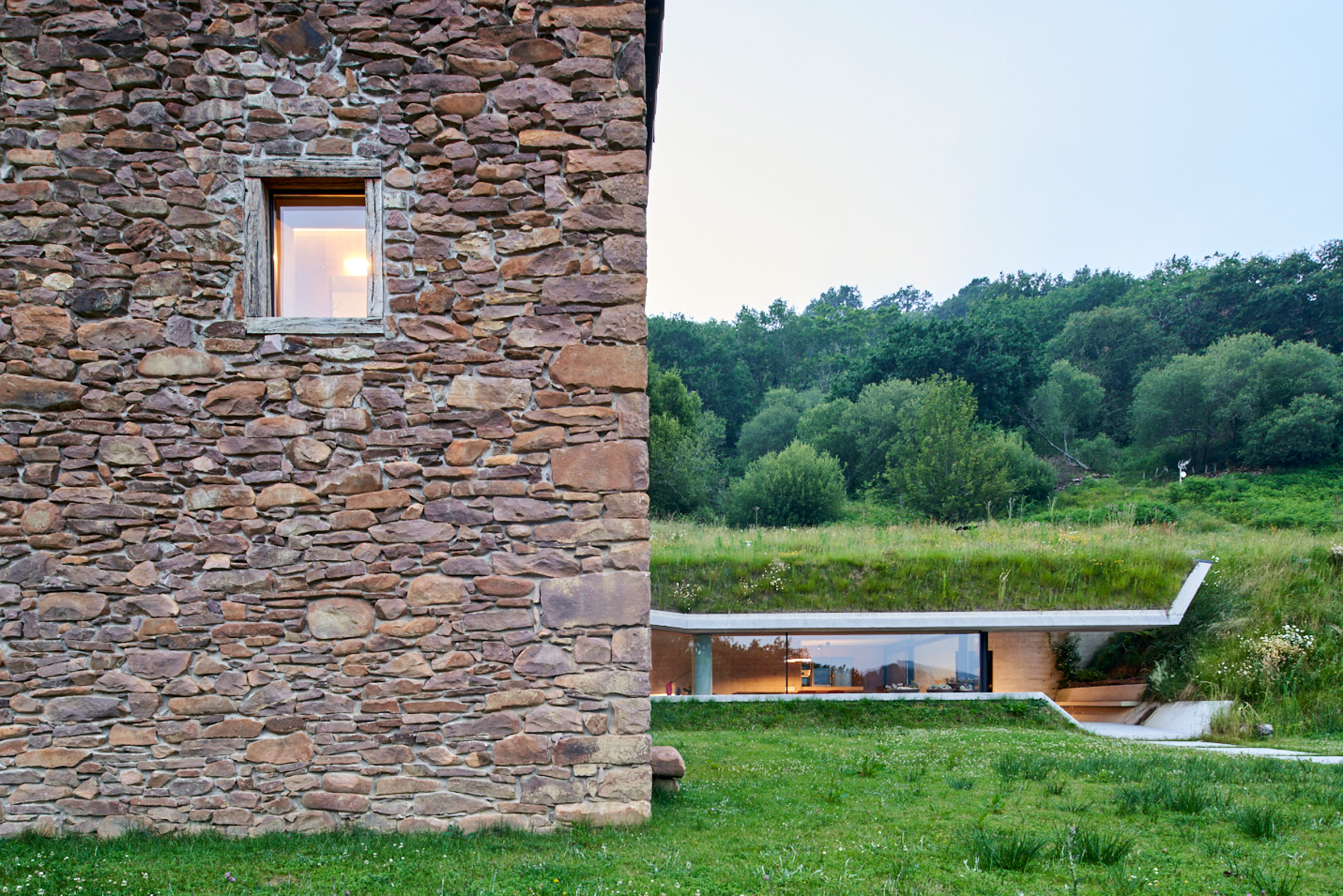
"To work in this exceptional location is an exercise of respect to the fragile building and especially to the mystical power of the Navarra mountains, rich in history and legends," said Jordi Hidalgo Tané.
"A spacious annex living area with a kitchen [is] built inside the mountain, becoming part of it, as if the annex had been there before the old construction was built."
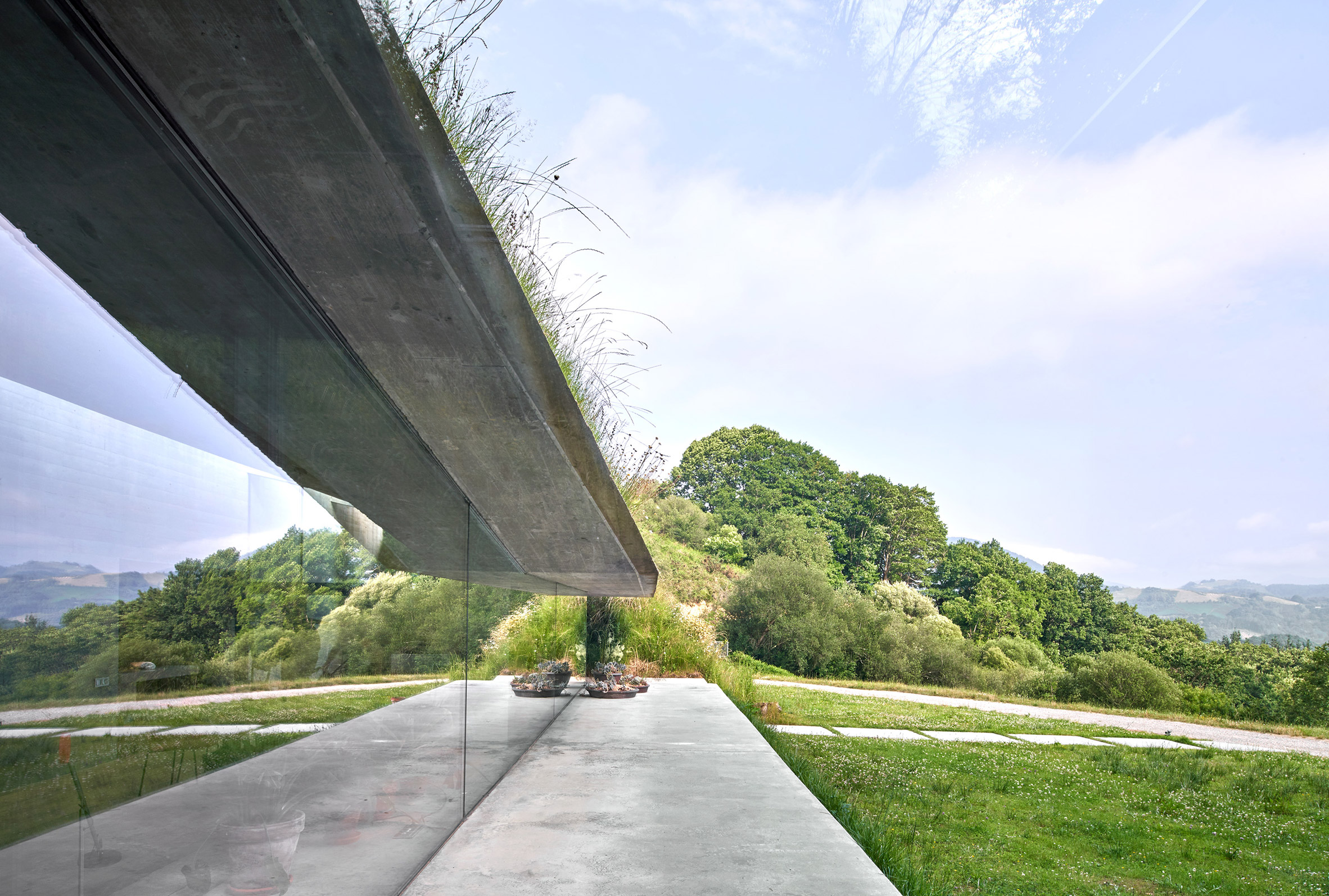
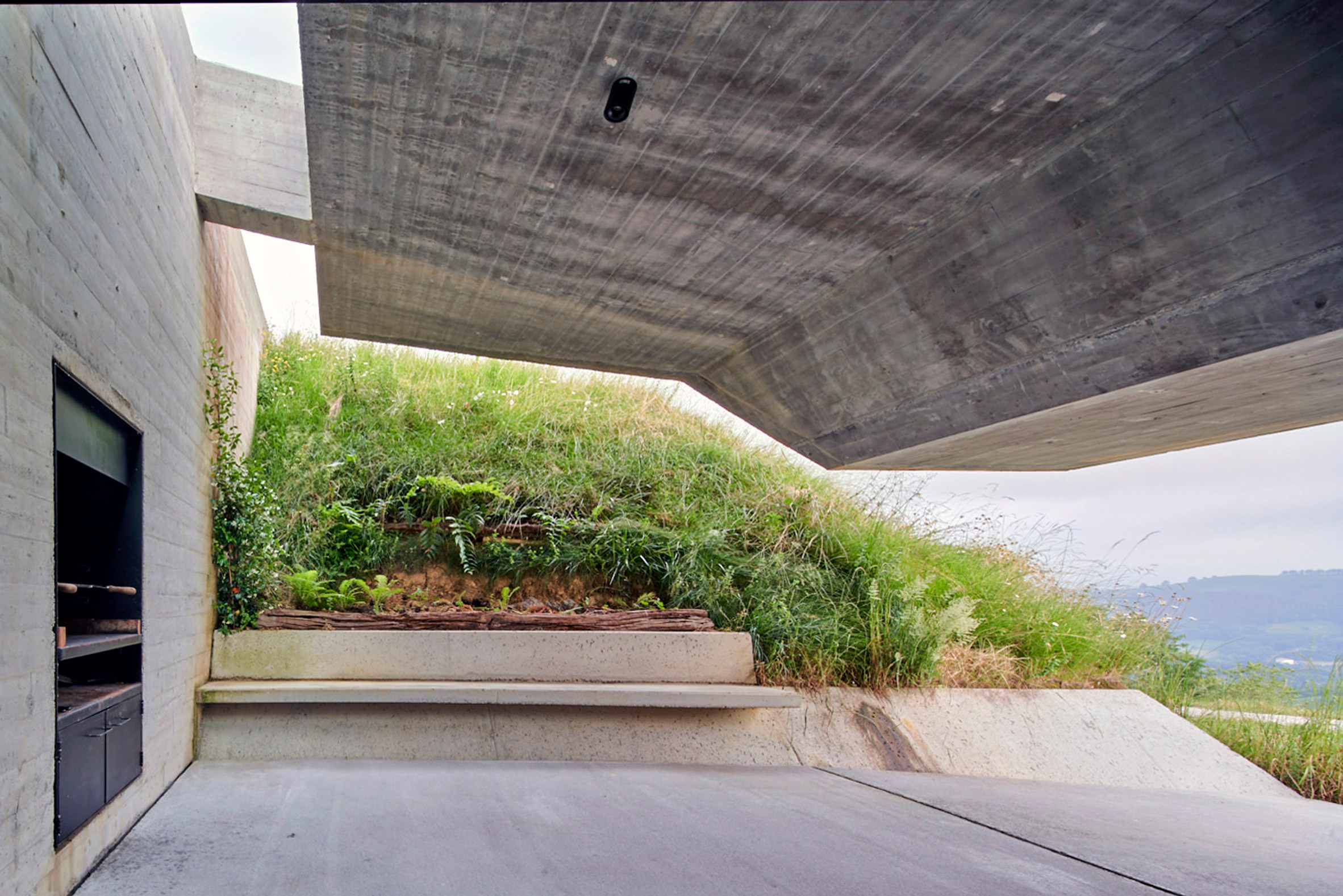
The form of the annex follows the contours of the hill, with the extension sitting atop a high concrete base.
Its green roof extends to shelter an external terrace with an outdoor oven.
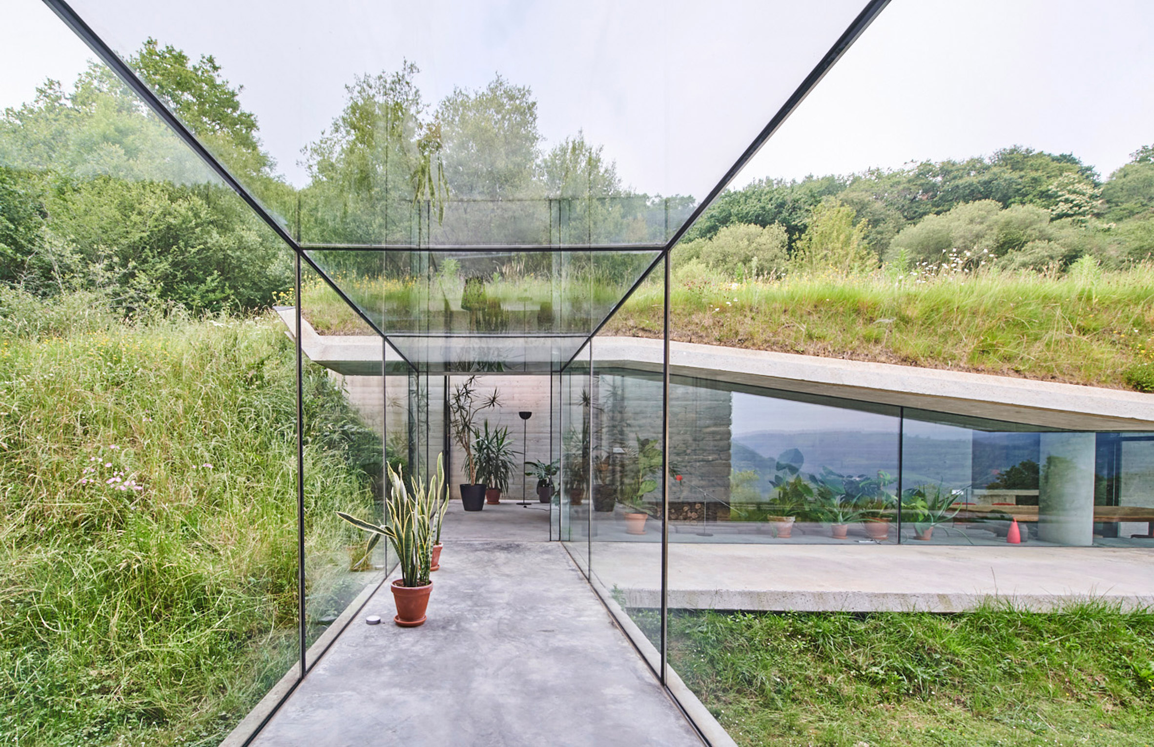
Accessed via a sliding door, the new living space in the annex is lined by a curtain wall of glazing that runs along its length.
A deep concrete sill, covered with potted plants, doubles as a seating area for admiring the panoramic views.
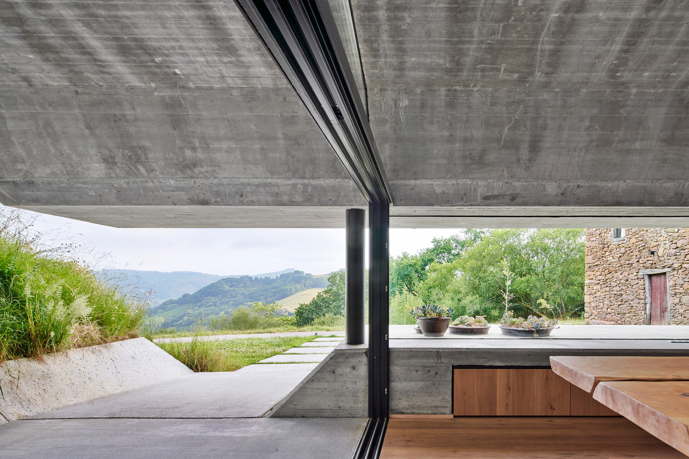
"Sheltered inside the 'cave', we observe the magnificent landscape that is in front of us," the studio said.
A chunky concrete column in the centre of the hillside is flanked by two steel columns.
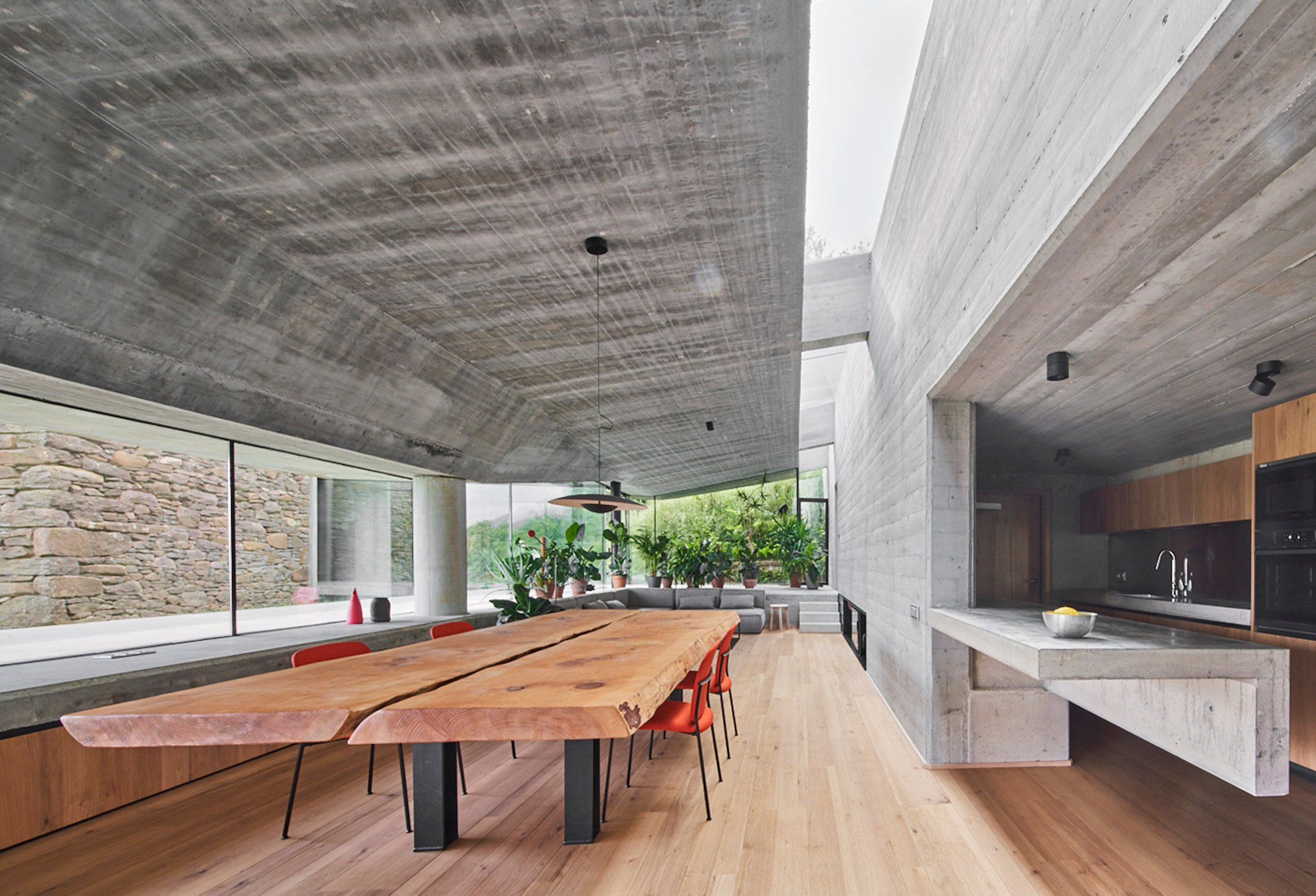
The architects inserted a thin strip of skylights where the ceiling meets the back of the annex, making the roof appear to cantilever as it slopes down above the living area.
At the back of the space, the kitchen and storage areas are dug further into the hillside, with wooden cabinets and a thick concrete counter that juts out to create a breakfast bar.
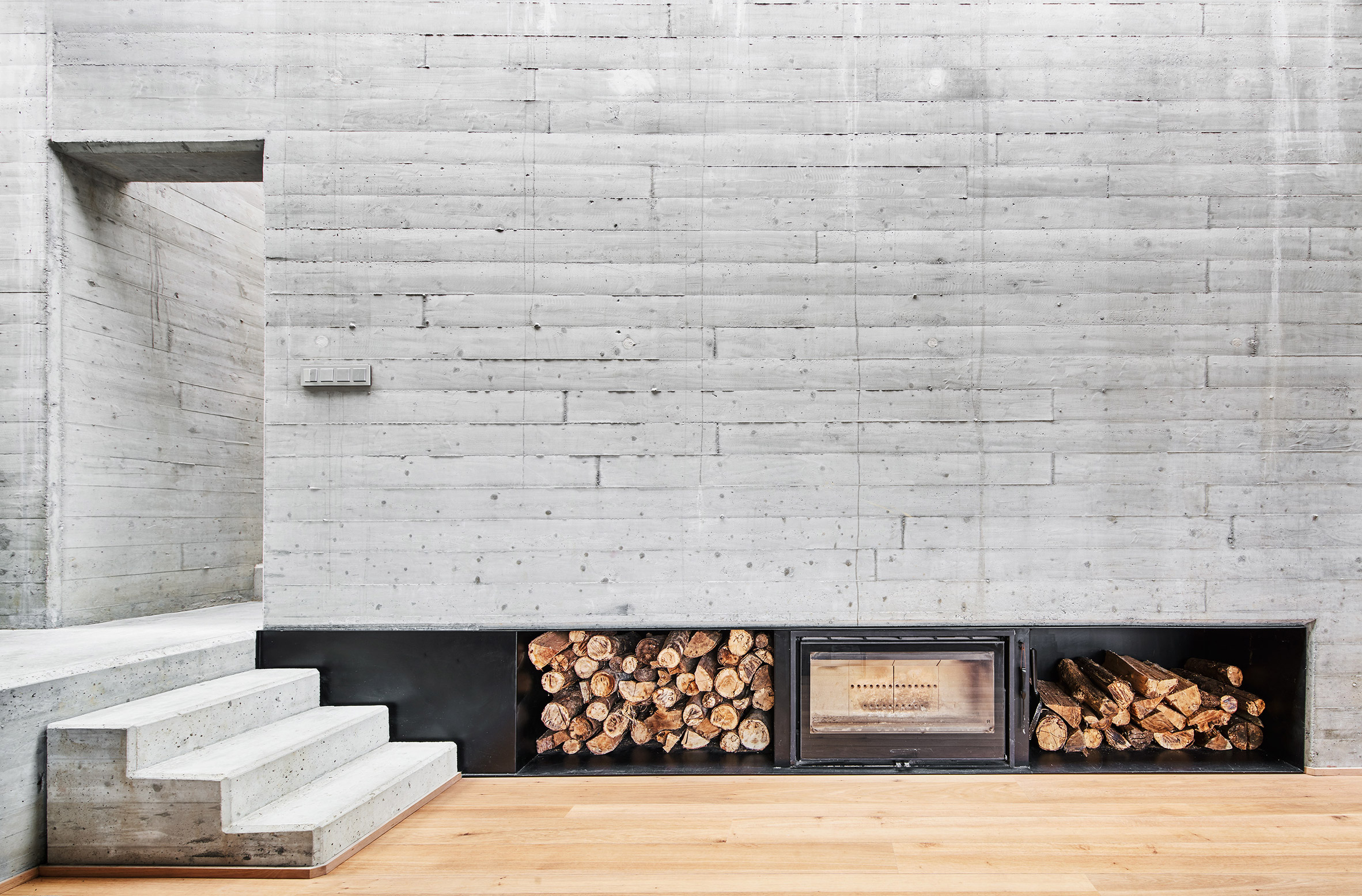
The floor level steps up at the end of the living area to match that of the stone building.
A short glass corridor provides a scenic route through to the new bedroom block.
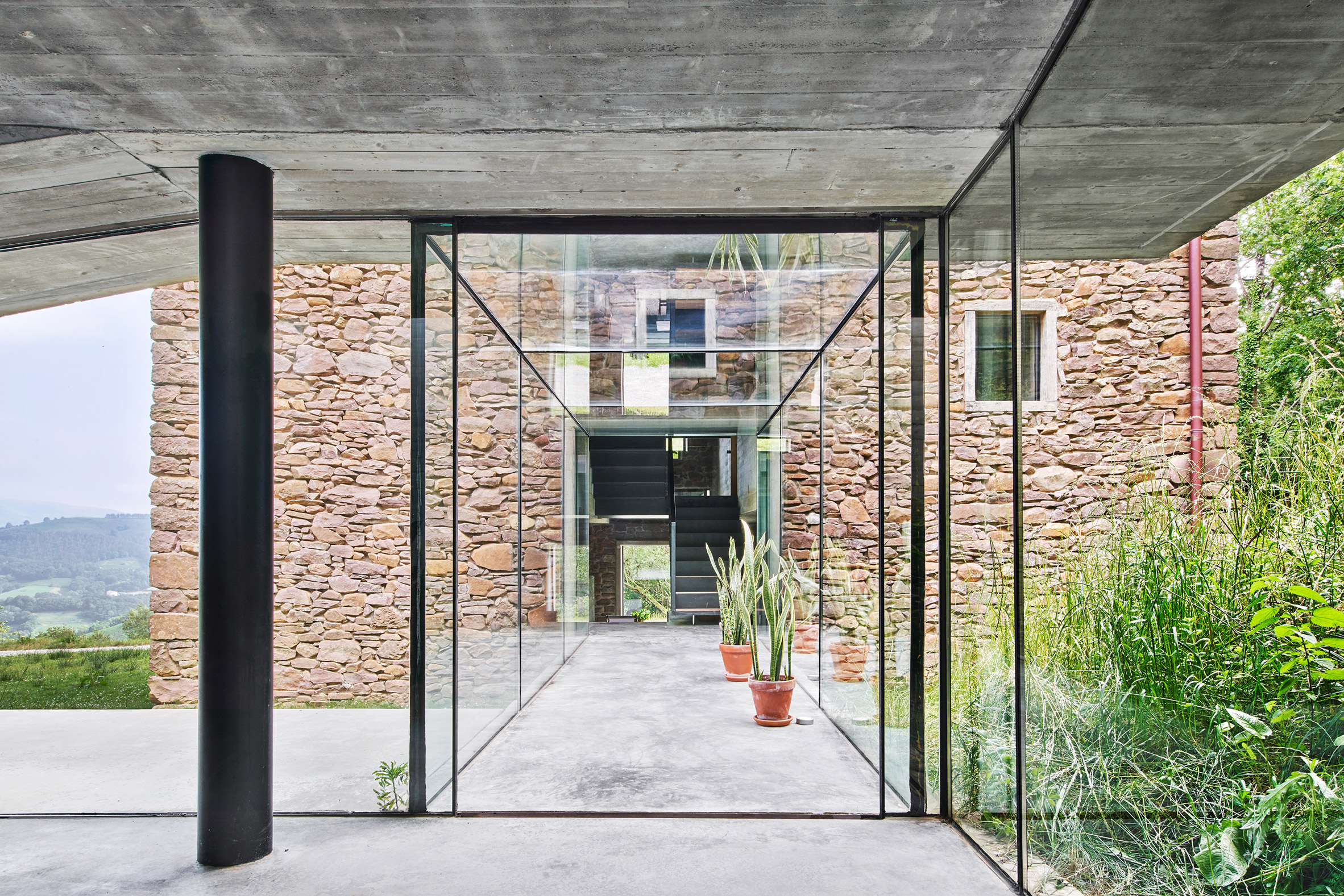
Concrete walls that echo the materiality of the annex have been used to subdivide the stone shell of the old house, supported by new columns on the ground floor.
The open storage and seating area downstairs feature exposed stone walls.
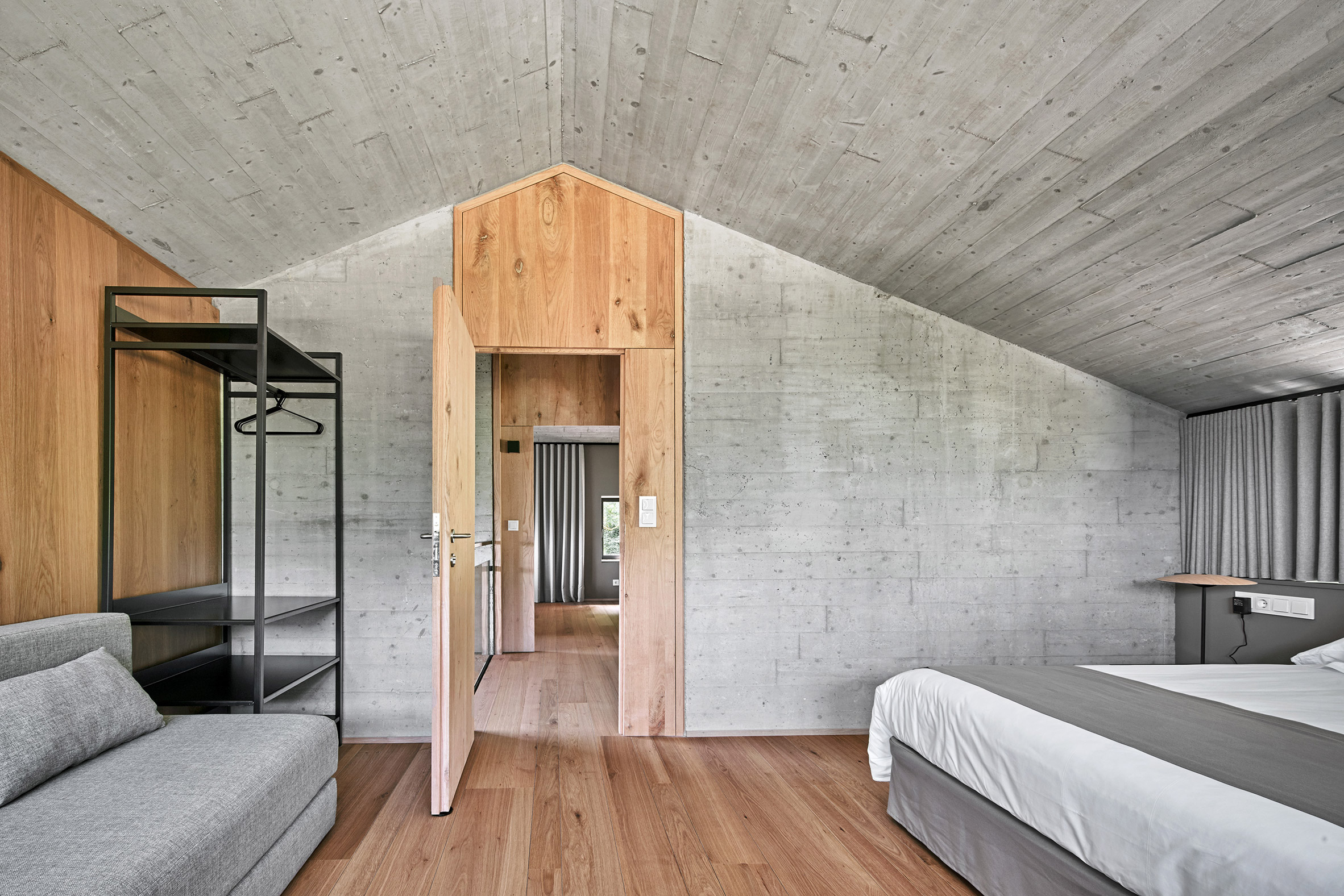
A staircase of black steel and wood leads up to four en-suite bedrooms in the two upper storeys.
The stone building's outward appearance hides the contrasting interior, with its concrete ceilings and wooden floors and wall linings.
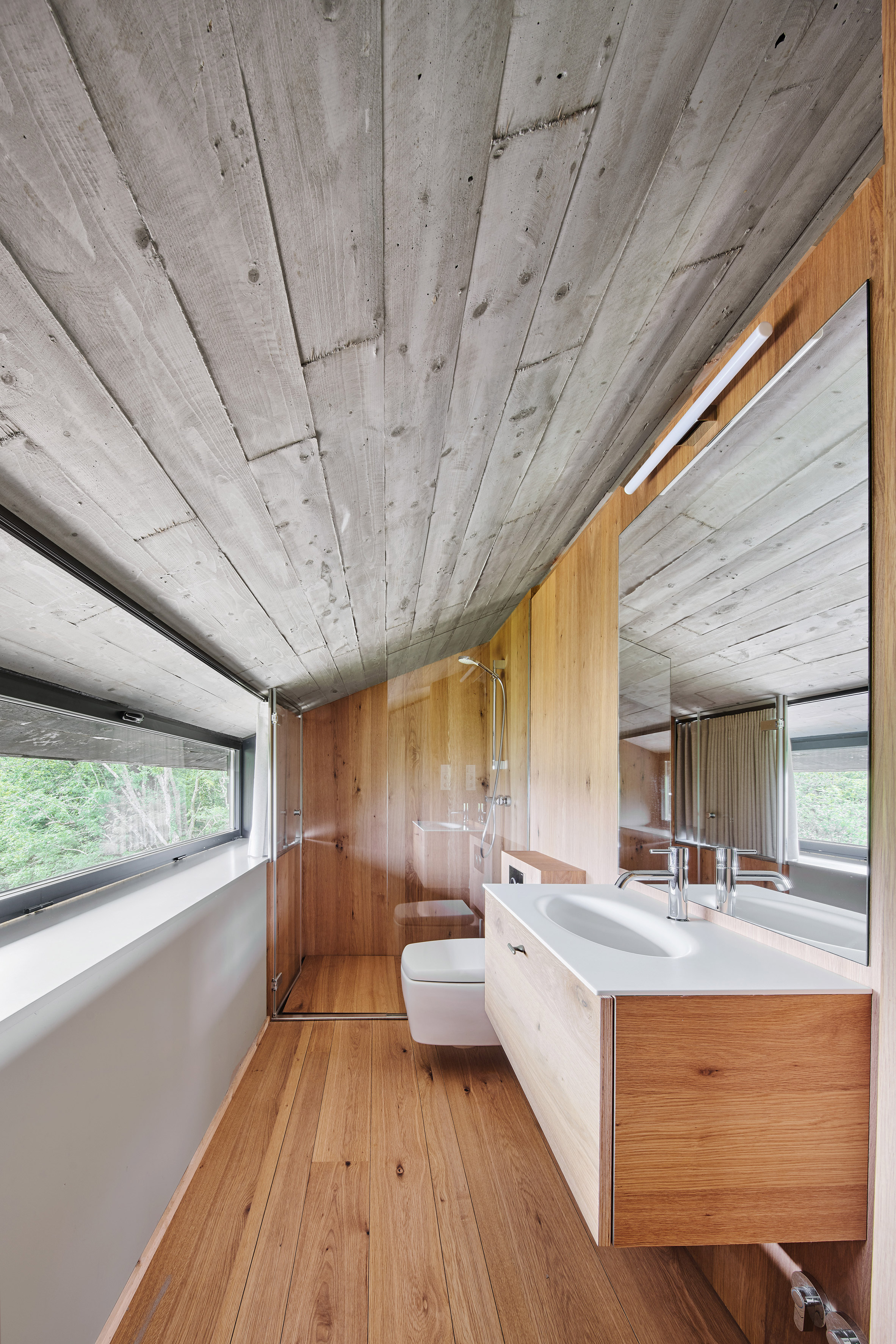
Large grey curtains can be drawn to cover the small, deep window reveals.
Previously, as a partner at Hidalgo Hartmann Arquitectura, Hidalgo Tané designed a triangular concrete house that appears to grow out of the ground in Girona.
Other recent residential projects that have decided to build downwards rather than up include a concrete home dug into a hillside in Portugal by Aires Mateus and a brick home in Belgium by Studio Okami that emerges from a grassy slope.
Photography is by Jose Hevia.
Project credits:
Architect: Jordi Hidalgo Tané
Technical architect: Julen Lekuona
Collaborating architect: Guillaume Larraufie
Promoters: Gorka Ibargoyen Prieto.
General construction: Company Dorrenea, Joseba Genua Santamaria
Carpenter: Burne Zurgindegia
Wood interior: Parklex
Aluminium joinery: Gurrutxaga Leihoak
Plumbing: 3Kide
Electrics: José Canabal
The post Glass corridor connects underground concrete extension to house in Spain appeared first on Dezeen.


