Sunday, 5 July 2020

Mountain Refuge is a concept for a tiny modular cabin

Mountain Refuge by Massimo Gnocchi and Paolo Danesi

Italian architects Massimo Gnocchi and Paolo Danesi designed Mountain Refuge as a prefabricated cabin-style micro-home built from plywood.

The duo has founded a startup company to find a partner to make their prefabricated concept a reality.

Mountain Refuge by Massimo Gnocchi and Paolo Danesi

Gnocchi and Danesi designed Mountain Refuge as a contemporary twist on typical cabin typology that would help the occupants find a "connection with nature".

"The cabin's concept is inspired by traditional archetypes, evoked through contemporary principles," they said.

Mountain Refuge by Massimo Gnocchi and Paolo Danesi

A steeply sloping roof sits at an exaggerated angle above an exterior wall that is glazed from floor to ceiling, to maximise views over the landscape.

Mountain Refuge is modular, so the design could stand alone as one 24-metre-square space, or include an optional second module to add 12 square metres of floor space.

Mountain Refuge by Massimo Gnocchi and Paolo Danesi

This second module's sloping roof would be set in the opposite direction (as pictured in the top image), creating a raised sleeping nook accessible by a built-in staircase.

Gnocchi and Danesi would paint the cabin's plywood exterior with pine tar to weatherproof it.

Mountain Refuge by Massimo Gnocchi and Paolo Danesi

Inside the cabin, the pale wood could be left bare to create a minimal yet cosy backdrop.

In their renders, the pair imagine Mountain Refuge kitted out with a stylish hanging fireplace, paired with rustic wooden stools made from tree stumps or more comfortable armchairs.

Mountain Refuge by Massimo Gnocchi and Paolo Danesi

The cabin has space for a kitchenette with a sink and stove, and could also feature a small but comfortable bathroom with a shower tucked away in one corner.

A deck could run around the external perimeter of the cabin to give its occupants a place to enjoy the weather.

Mountain Refuge by Massimo Gnocchi and Paolo Danesi

Gnocchi and Danesi designed Mountain Refuge to not require foundations, but if the site required, a thin concrete slab could be used for some locations.

Other conceptual cabin designs include a modular tube-shaped treehouse designed by Precht for tiny homes startup Baumbau, and cabin on stilts with a dark felt-lined sleeping nook.

The post Mountain Refuge is a concept for a tiny modular cabin appeared first on Dezeen.


from Dezeen https://ift.tt/3f3Cr4K

Five Casa Wabi pavilions include Álvaro Siza ceramics studio and Kengo Kuma chicken coop

Atlantes by Bosco Sodi

The Casa Wabi artist retreat in Puerto Escondido, Mexico is filled with pavilions designed by architects such as Kengo Kuma, Álvaro Siza and Alberto Kalach. We've roundup up five from a chicken coop to an open-air structure for composting.

The pavilions were built to assist with the everyday functions of Casa Wabi, which is led by contemporary Mexican artist Bosco Sodi.

Japanese architect Tadao Ando first completed the art centre for the project in 2016, and the campus has since expanded to include structures that supplement its artist residency programme and education classes.

Read on for more about the five pavilions at Casa Wabi:


Atlantes by Bosco Sodi

Atlantes by Bosco Sodi

Sodi created this cube-like installation with 64 volumes spaced evenly apart in eight rows of eight.

Each contains 1,600 bricks that were handmade and fired in a nearby traditional Oaxacan kiln, which consists of local wood, coconut shells and jacaranda seeds.

Find out more about Atlantes ›


Casa Wabi Coop by Kengo Kuma

Casa Wabi Coop by Kengo Kuma and Associates

Kengo Kuma's Japanese firm designed a coop for the chickens that provide eggs to feed Casa Wabi staff members, resident artists and visitors.

The structure comprises a grid of charred wood boards, with elevated nooks for the birds to rest while laying eggs.

Find out more about Casa Wabi Coop ›


Casa Wabi ceramics pavilion by Alvaro Siza

Casa Wabi ceramics pavilion by Álvaro Siza

A curved brick wall encloses this ceramics pavilion by Portuguese architect Álvaro Siza, which is covered in a thatched roof.

The centre is a space for Casa Wabi to teach clay techniques traditional to the region, and has a large table and sinks made of concrete.

Find out more about the ceramics pavilion ›


Chimney Casa Wabi by Alberto Kalach

Casa Wabi chimney by Alberto Kalach

Siza's pavilion is accompanied by a chimney designed by Mexico architect Alberto Kalach, who is the co-founder of TAX Architects in Mexico City.

It is 22 metres tall and constructed with local bricks to complement the materiality of Siza's project as well as the pottery it supports.

Find out more about the chimney ›


Descended from another sun pavilion at Casa Wabi by Gabinete de Arquitectura

Descended from Another Sun by Gabinete de Arquitectura

This open-air pavilion by Paraguayan studio Gabinete de Arquitectura is for Casa Wabi to compost its organic materials.

The project comprises a diagonal pathway that divides a series of zones for composting. Perimeter walls are formed by metal cables that suspend chunks of recycled brick.

Find out more about Descended from Another Sun ›

The post Five Casa Wabi pavilions include Álvaro Siza ceramics studio and Kengo Kuma chicken coop appeared first on Dezeen.


from Dezeen https://ift.tt/2ZDkyTZ

Huge window opens to patios in matching Mexico City houses by PPAA

Pachua by PPAA

Architecture firm PPAA has created a pair of slender houses in Mexico City that have rear patios accessed by glass doors to flood natural light inside.

The local practice designed the Pachuca project for a plot in the Mexican capital measuring eight metres wide and 16 metres long.

Pachua by PPAA

The site was originally intended for an apartment block but PPAA decided to split it into two matching homes.

One of the main challenges was to ensure that each of the slender homes received plenty of natural light and ventilation.

Pachua by PPAA

In response, the team designed the levels to gradually reduce in size towards the top of the property in order for natural light to enter. The garage is located on the street level, the living areas on the first floor, and bedrooms on the top two.

Glazing with black gridded frames fronts the first and second floor of each house facing the street, matching a glass door that opens onto a patio at the rear of the first floor.

Pachua by PPAA

"Taking advantage of the east-west orientation of the plot, we opted for a series of stackable spaces, that will get light and ventilation from the street at the front, and from a private and contained patio on the back," said PPAA.

Pachua by PPAA

"This resulted in two houses with independence and privacy in all their spaces," it added.

The glass door to the patio opens so it sits flush with the concrete wall between the two home's patios. The idea is that when it is open it creates a continuation between the living and dining room and the outdoor area.

Pachua by PPAA

An outdoor concrete bench, which has a window underneath offering light down to service rooms on the floor below, runs along the opposing wall, while the rear wall is fitted with a planter.

Exposed concrete walls and flooring of the patio continue inside the house, where the aesthetic is similarly minimal.

Pachua by PPAA

Concrete is contrasted by a series of American white oak details designed by Mexico City studio PUR, which PPAA founder Pablo Pérez Palacios recently established with Katerina Alatzia.

Designs include a long dining table, described as an "essential element in the space", as well as kitchen cabinetry and a staircase. These elements are all placed on one wall so as to keep the main area open, but are designed differently in each house.

Pachua by PPAA

For example, one staircase has treads that slot into a huge bookshelf, while the other stairs are fronted by wood panels to keep a boxy shape.

In both homes, the staircases lead up to the second floor, which includes a studio that opens onto a terrace at the front and a bedroom at the rear. Another bedroom with an en-suite bathroom is located on the top floor.

Pachua by PPAA

PPAA, which stands for Pérez Palacios Arquitectos Asociados, has completed a number of residences in Mexico City.

Others include Lluvia house, which contrasts black facades and pale interiors, Tlalpuente house, designed to merge with a wooded landscape, and Casa Sierra Fría, which is built with board-marked concrete walls.


Project credits:

Team: Miguel Vargas, Andrés Domínguez, Sergio Delgado, Nancy Estévez, Jonathan Calderón and Antonio Contreras.

The post Huge window opens to patios in matching Mexico City houses by PPAA appeared first on Dezeen.


from Dezeen https://ift.tt/3e2Nmds

Contini Architettura arranges church and community centre around public square in Castel di Lama

Church and community centre in Castel di Lama by Studio Contini

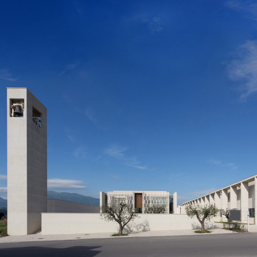
Parma-based Contini Architettura has built a church, parish hall, sports' clubhouse and changing rooms around a new public square in the village of Castel di Lama, Italy.

Contini Architettura drew upon the arrangements of traditional Italian town centres to design the complex, which contains both religious and community buildings.

"The client wanted the parish centre to reflect the idea of ​​an open and supportive community in which many activities, including sports, harmoniously coexisted," said Contini Architettura founder Marco Contini.

"We can find this concept in the small historical centres of Italy, where the urban space is lived collectively, with different activities overlooking this space that belongs to the community," he told Dezeen.

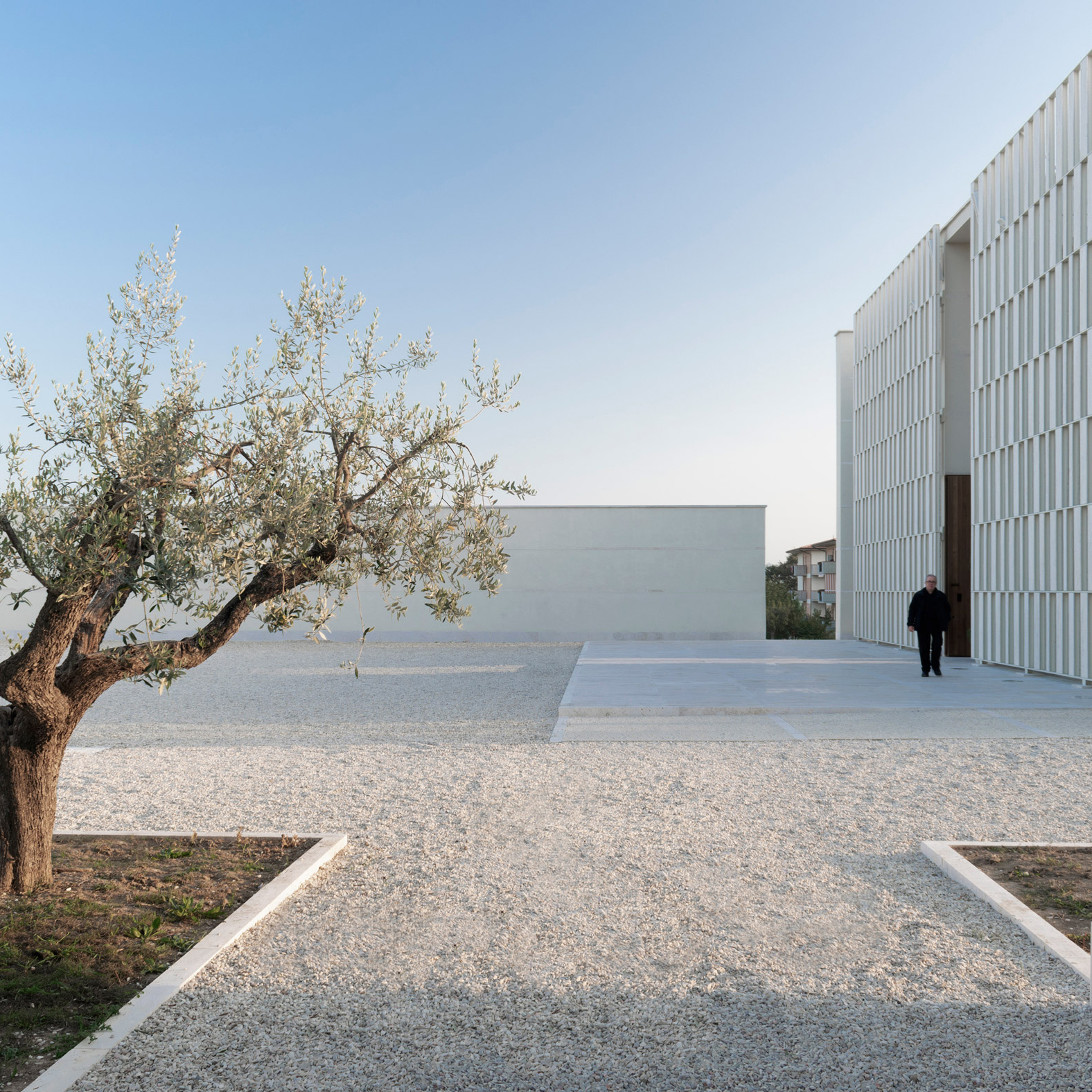
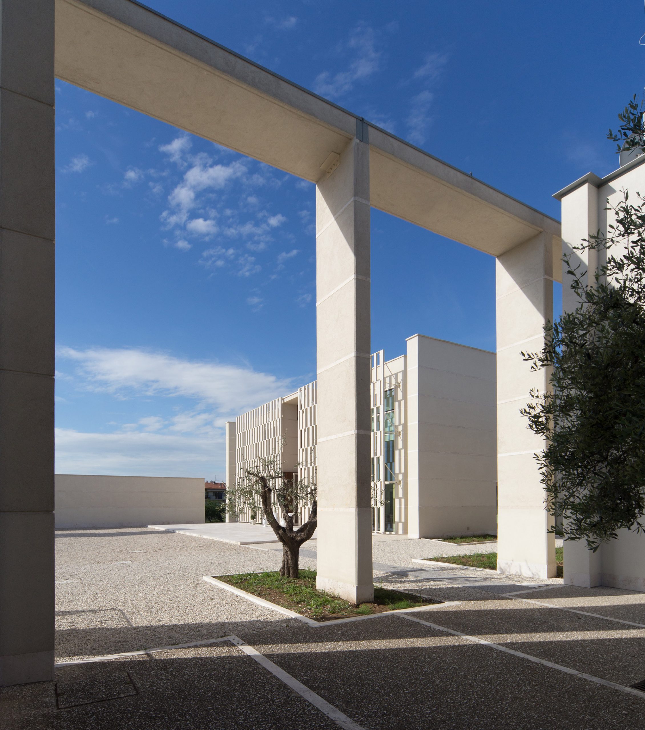
The church occupies one side of the gravel-filled square, with the series of community buildings running along another side behind a free-standing stone colonnade. The two remaining sides are enclosed by low walls.

"The large churchyard-square in front of the church has become the town square of Castel di Lama," explained Contini. "It works very well because it can be used in many different ways, like the squares of the historic centres, and also belongs to the whole community because it is always open and usable."

Church and community centre in Castel di Lama by Studio Contini

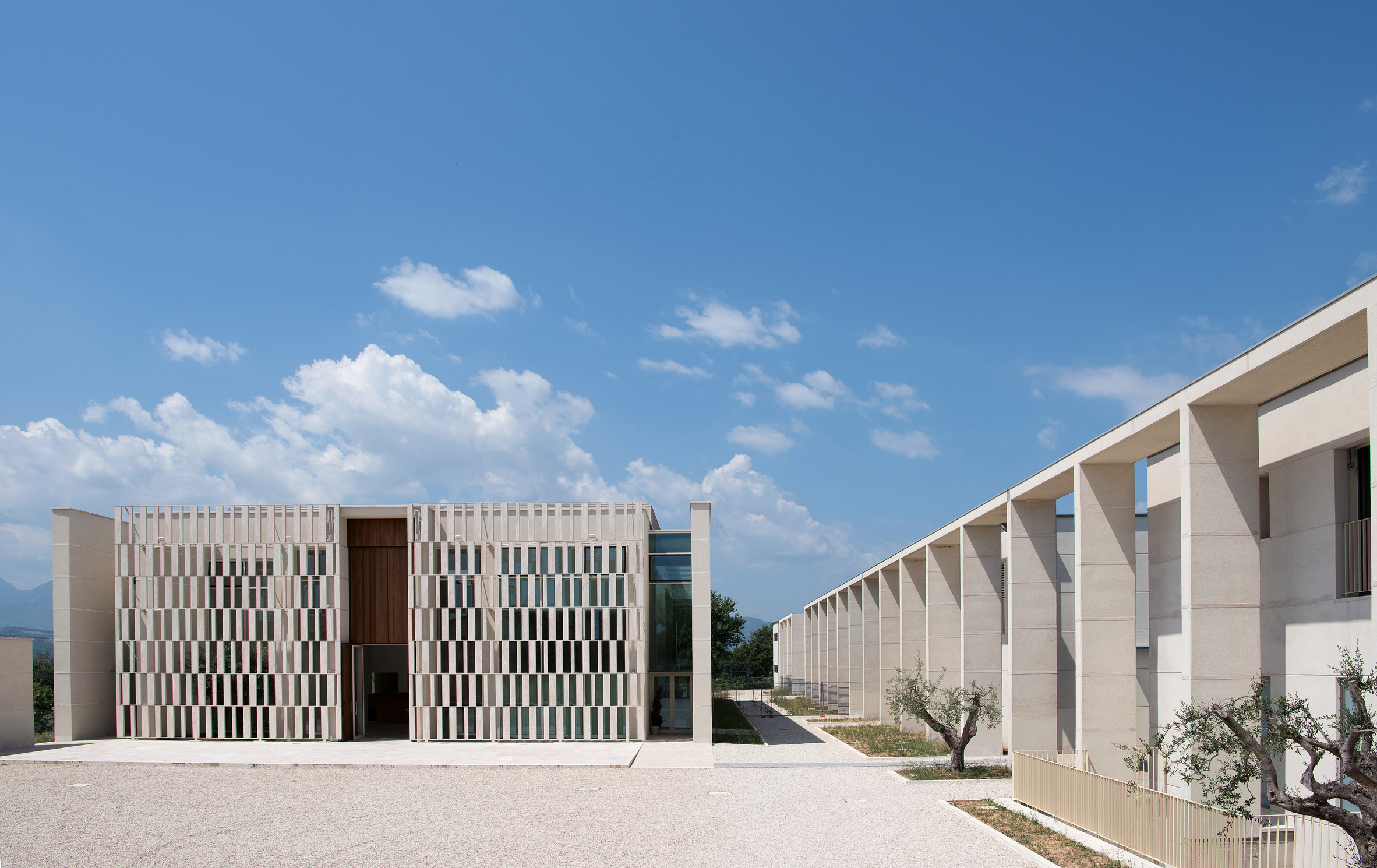
The first of the four aligned community buildings contains a 130-seat parish hall. Next is a block containing the rectory offices, then a clubhouse for the adjoining sports pitch that also houses a bar, and finally a changing room block.

Contini Architettura aimed to unite all the building through their scale and by using a similar palette of materials throughout.

Church and community centre in Castel di Lama by Studio Contini

"We used the plaster to obtain a visual homogeneity and 'softness' with respect to the neighbouring interventions which, unfortunately, as often happens, have little attention to the local landscape," explained Contini.

"Plaster is a simple, almost poor material. In Italy we have a tradition of plasters with different characteristics: in this case, we have used one with a coarse grain aggregate," he continued.

"We also used travertine for the floors and the facade of the building for worship. Travertine is a stone typical of this zone, making it possible to use it with low costs due to the presence of quarries nearby."

Church and community centre in Castel di Lama by Studio Contini

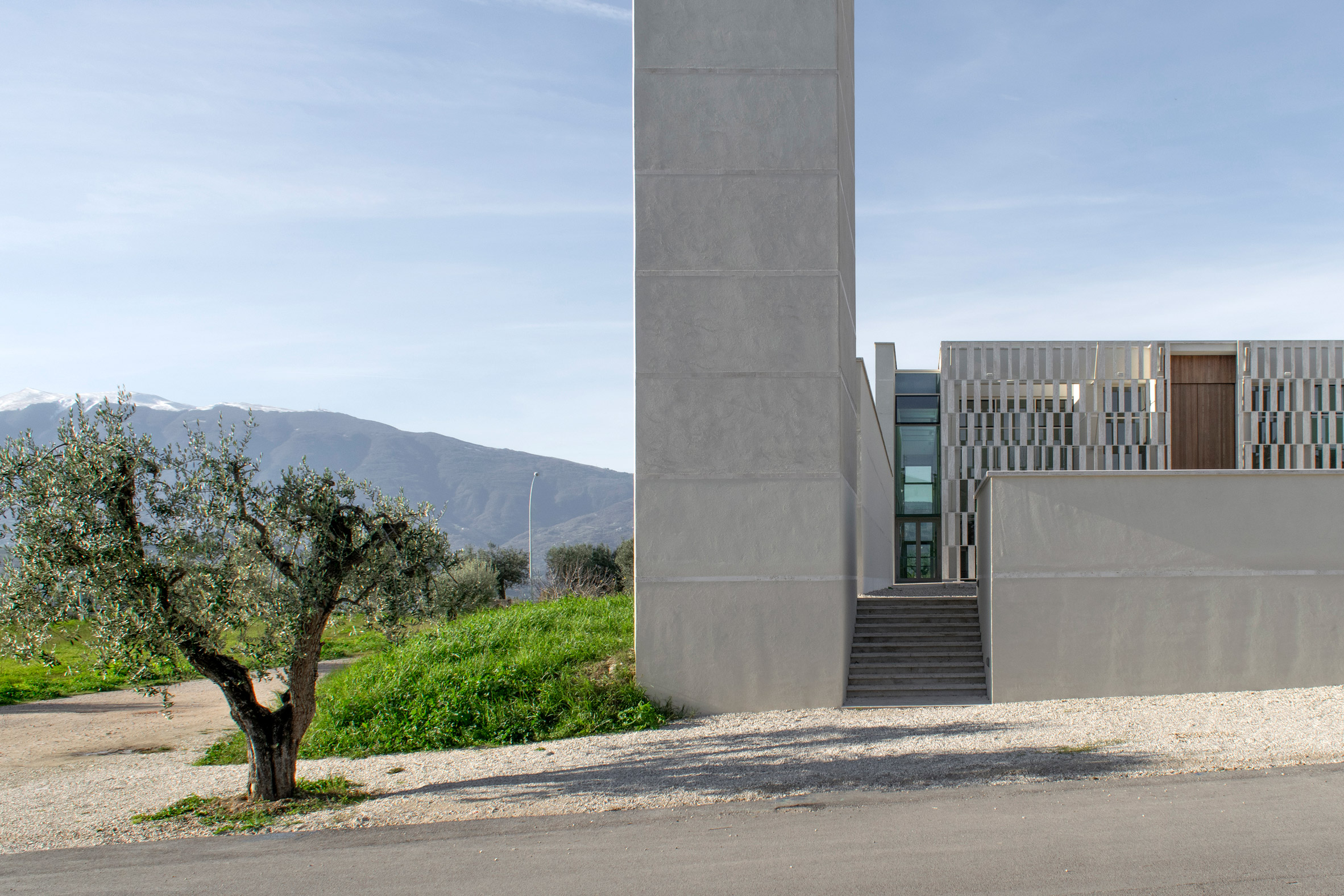
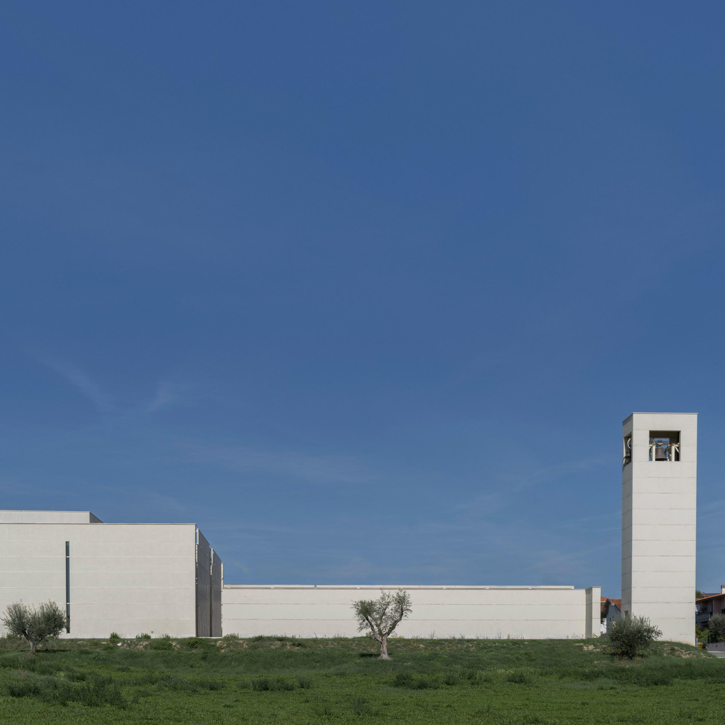
The studio designed the church, which is marked on the street by a free-standing bell tower, to be recognisable as a religious building, but not to dominate the complex.

"The interpretation that we have given to the building for worship is that of a Domus ecclesia – a house in the middle of other houses," said Contini.

Church and community centre in Castel di Lama by Studio Contini

"Together with a good liturgist, we reflected on the origin of the church and considered that the first Christian communities did not have a temple but gathered in homes," continued Contini.

"There is no need for a temple, but for a place that makes the gathering of the faithful and the correct conduct of the liturgy possible," he continued.

"This interpretation led to making the building as part of a system with the other buildings, recognisable in size but without too much emphasis: it is only by crossing its threshold that we fully understand its function."

Church and community centre in Castel di Lama by Studio Contini

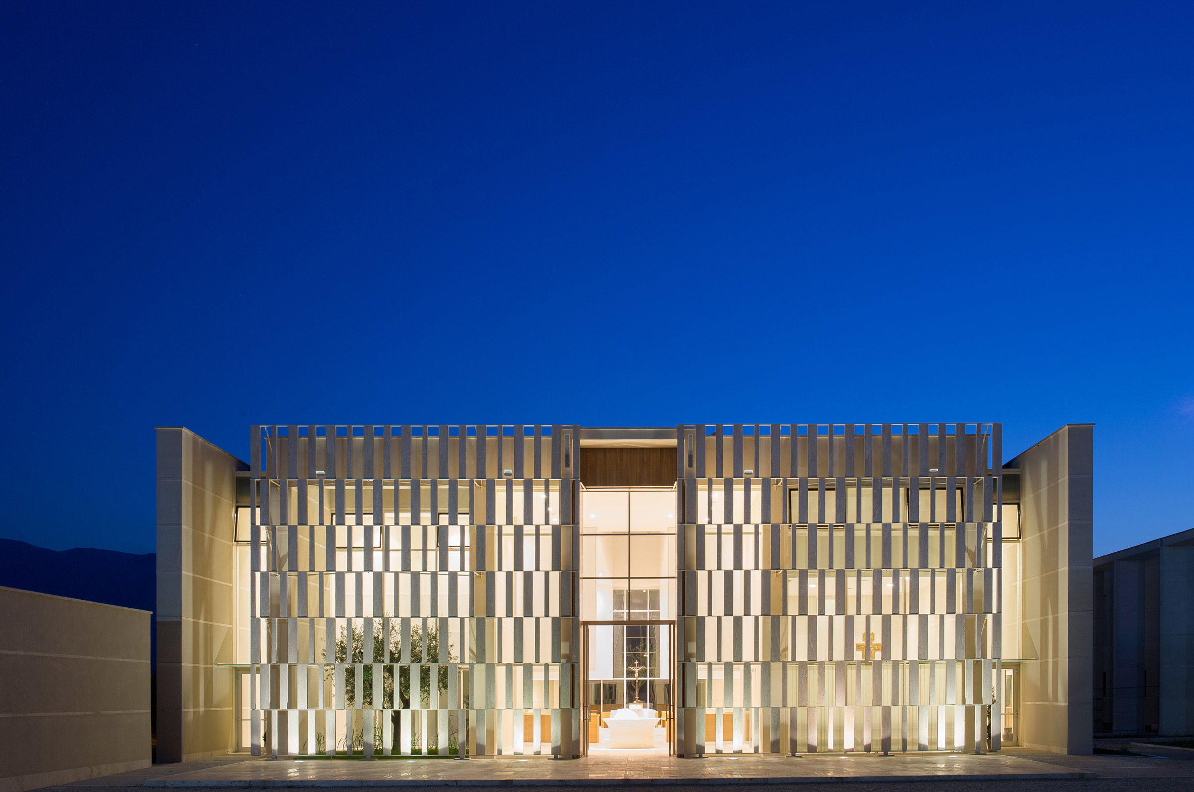
The church stands behind a screen made of large travertine blocks, with a glass wall offering partial views into its main hall.

"I wanted to obtain visual transparency, an open building that can be crossed by the eye but at the same time, I liked the idea that the internal space was fully understood only once the entrance threshold was crossed," said Contini.

"For this reason, I deepened the idea of ​​a filter wall using travertine stone slabs assembled with a steel structure. The structure is hidden by the stone slabs and does not seem to rest on the ground, but it is nine meters high and we are in a seismic area!"

Church and community centre in Castel di Lama by Studio Contini

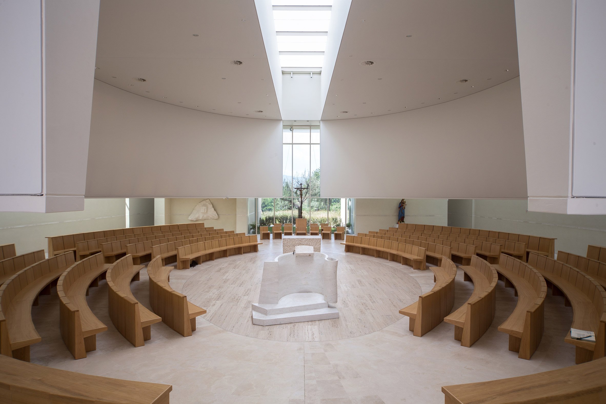
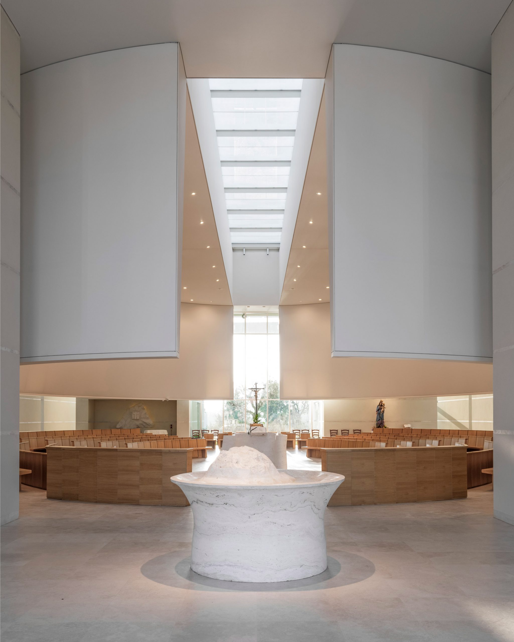
Within the church's main hall, an elliptical structure that projects from the ceiling defines the central seating area. This form is broken at the building's two ends and at the ceiling to let light into the hall.

Four rooms in the building's corners contain the church's confessional, chapel, sacristy and toilets.

Church and community centre in Castel di Lama by Studio Contini

Other recently completed churches include a porcelain-covered church in the city of Porsgrunn, Norway, designed by Espen Surnevik and Trodahl Architects, and a church built by Prison inmates in Bologna, Italy.

The post Contini Architettura arranges church and community centre around public square in Castel di Lama appeared first on Dezeen.


from Dezeen https://ift.tt/38w72VW

Gabriel Chipperfield gives London newsagents plush revamp

Shreeji News by Gabriel Chipperfield

Gabriel Chipperfield has created an "Alice in Wonderland"-style warren of luxurious rooms behind Shreeji newsagents in central London.

Shreeji newsagent and tobacconist is located on Chiltern Street in London's affluent Marylebone neighbourhood, just a stone's throw from the notable hotel Chiltern Firehouse.

The shop was set up by Sandeep Garg in 1982, and has since become a go-to spot for locals to pick up sweets, snacks and find an international roster of magazines.

Shreeji News by Gabriel Chipperfield

However, over the years, Shreeji had grown tired in appearance so architect Gabriel Chipperfield – son of David Chipperfield –was tasked with refreshing the shop.

He set about fashioning a multifunctional space that better utilised the dormant rooms that lay towards the rear of the floor plan.

Shreeji News by Gabriel Chipperfield

"The shops on Chiltern Street were originally built in the early Victorian era to accommodate the family of the shopkeeper, so there is an enormous amount of space behind the front shop," Gabriel Chipperfield told Dezeen.

"We wanted to put it to good use and recreate part of the atmosphere of the original apartment in order to offer different experiences for our customers," he continued.

"What has come from it is an Alice in Wonderland experience where you pass through from one world into another, and even down into another."

Shreeji News by Gabriel Chipperfield

During six months of renovation works, a salon, reading room and coffee and pastry bar were created at the back of Shreeji News. Gabriel Chipperfield's wife, curator Laura de Gunzburg, was then brought in to develop the interiors.

In the salon, surfaces have been painted a muted shade of grey-green. A pair of armchairs with woven cane backrests and a table with a graphic black-and-white surface top have been arranged in front of the room's fireplace.

A scallop-edged pendant lamp has been suspended from the ceiling directly overhead.

Shreeji News by Gabriel Chipperfield

Along the rear of the room runs a stained-plywood cabinet displaying different coffees that customers order. Extra seating is offered by a handful of plump, stripey Pillow Chairs by Will Cooper – design director of studio ASH NYC.

Rows of glassware are presented against a mustard-yellow wall.

Shreeji News by Gabriel Chipperfield

A short corridor leads through to the front of Shreeji News, which has been refitted with floor-to-ceiling shelves also crafted from stained plywood.

Magazines are displayed here or presented in stacks on the central service counter that's topped with honey-hued onyx.

Shreeji News by Gabriel Chipperfield

De Gunzburg has additionally curated a range of new and vintage homeware items that will be available to purchase in the newsagents, including designs from figures such as Gio Ponti and brand Lobmeyr.

"We hope to have this be a melting pot of our many interests— a space where we can promote dialogue on design, art, culture, travel and so on," added de Gunzburg.

Digital magazine Air Mail has also partnered with Shreeji for its reopening. The magazine will be available to read on iPads in the shop's reading room, and its red-and-blue branding will also feature on the facade and to-go coffee cups.

Marylebone is home to a host of other shops and boutiques. Others include The Drug Store, a gallery-style retail space that sells a range of products infused with CBD.

The post Gabriel Chipperfield gives London newsagents plush revamp appeared first on Dezeen.


from Dezeen https://ift.tt/2BuZG9u