Monday, 12 July 2021

Creatives share what they're grateful for during the pandemic in 100 Days of Gratitude

A coloured illustration of people dancing at a wedding

Designers and architects including Arthur Mamou-Mani and Adam Nathaniel Furman have shared what they're grateful for as part of 100 Days of Gratitude, an ongoing portrait series illustrator Justyna Green started in response to the Covid-19 pandemic.

The London-based illustrator began drawings for the series 100 Days of Gratitude as Covid-19 restrictions began loosening around the world.

An illustration of a person spreading jam onto toast
Top: Adam Nathanial-Furman is grateful for spending time with his grandmother. Above: Marcus Fairs is grateful for toast with apricot jam

Green collects stories from across the world that embody the theme of gratitude through an open call on her Instagram and website.

Over the course of three months, the illustrator will draw one portrait a day, creating a compilation of colourful portraits around the theme.

"100 Days of Gratitude is born from the idea that even in the toughest life situations, there's always something to be grateful for," Green told Dezeen.

"Covid has surprised all of us and presented many challenges, so I wanted something that would bring the creative community together around a positive and universal idea."

An illustration of someone writing a postcard
Illustrator Justyna Green used bright colours and bold lines to highlight her positive message

"We're starting to see the light at the end of the tunnel in terms of the pandemic and I wanted to support creatives who, like everyone else, have been under pressure and subjected to prolonged periods of uncertainty," she added.

"With lockdown easing, it felt like the right time to amplify now that the worst seems to be behind us."

Her use of vibrant block colours and softly rounded lines emphasise the "feelings of hope and positivity" associated with the return to normal life.

An illustration of people dancing at a wedding
Arthur Mamou-Mani shared his happy memories of his festival wedding

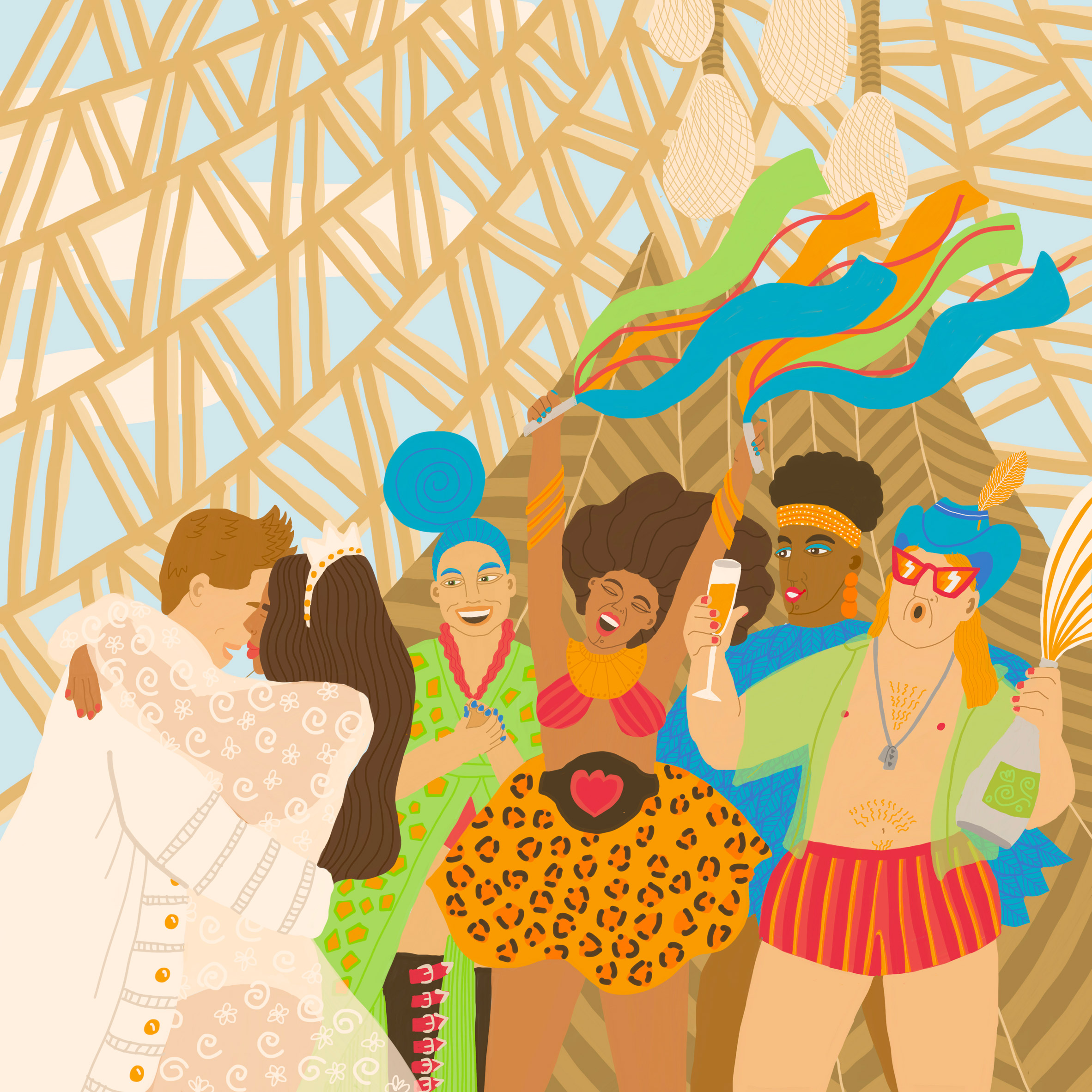
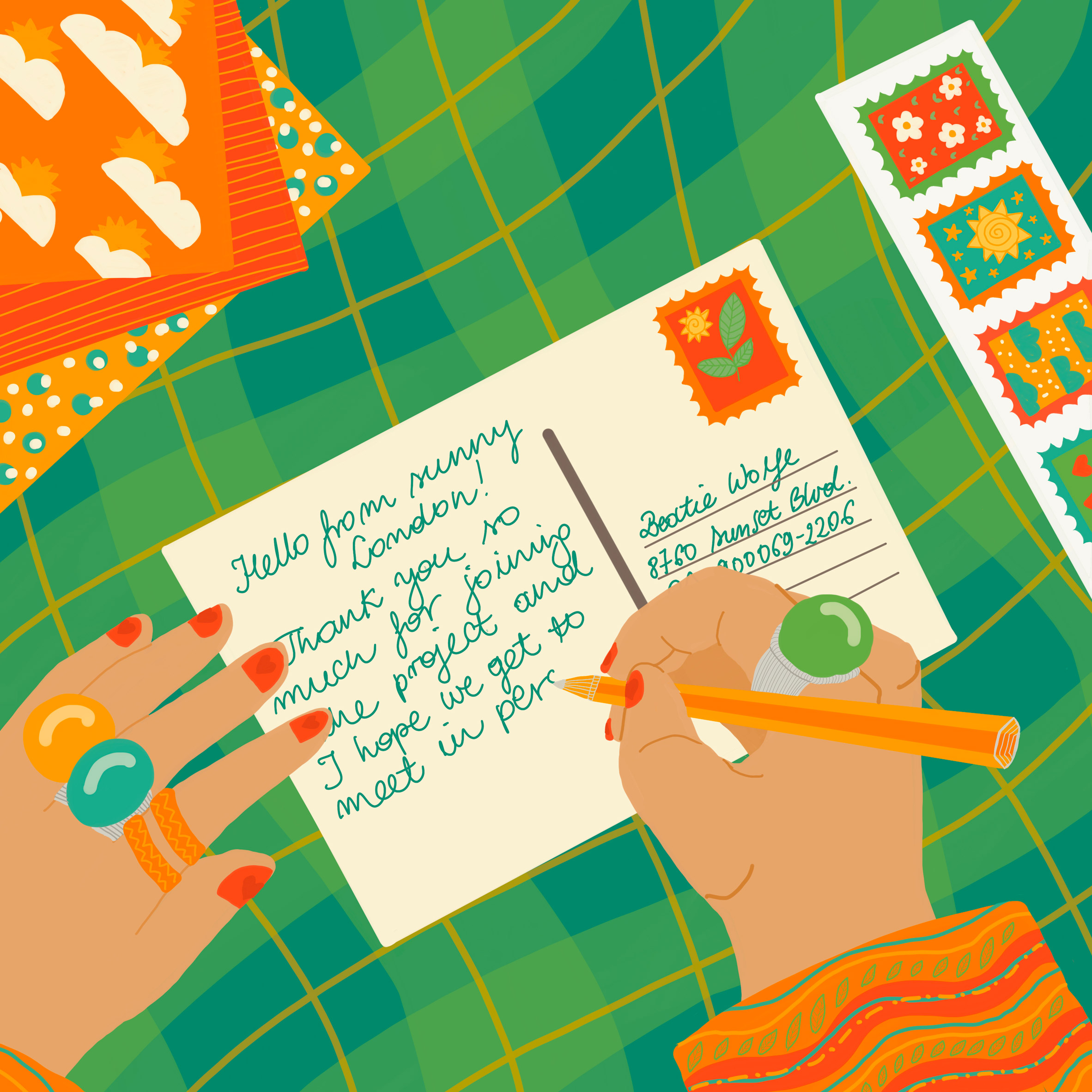
Among the illustrator's favourite submissions is French architect Arthur Mamou-Mani's wedding at Burning Man. The award-winning architect wanted the illustration to include his Galaxia Temple and the bustling crowds found at the festival.

Green also enjoyed working on the designer Adam Nathaniel Furman's portrait of his grandmother holding him in an embrace. In this image, Furman wanted to capture how his grandmother inspired his aesthetic over the years.

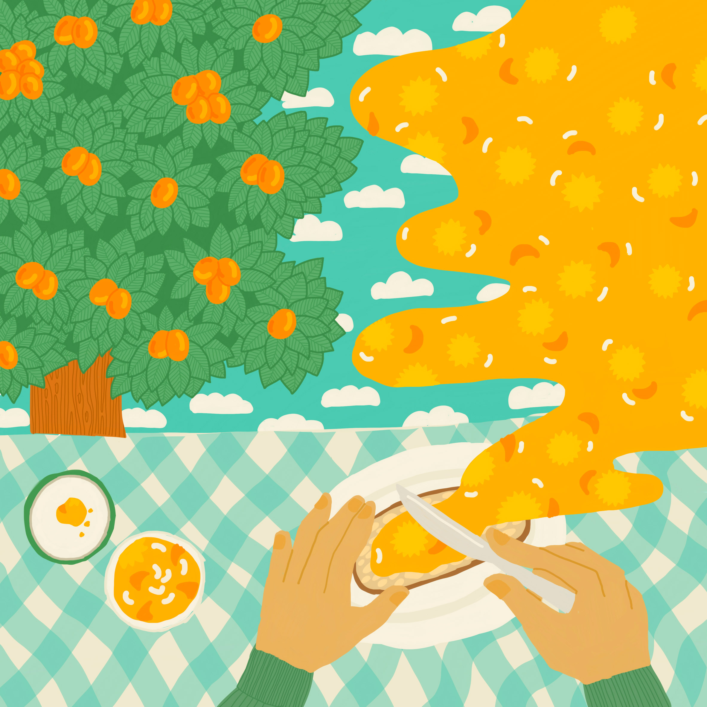
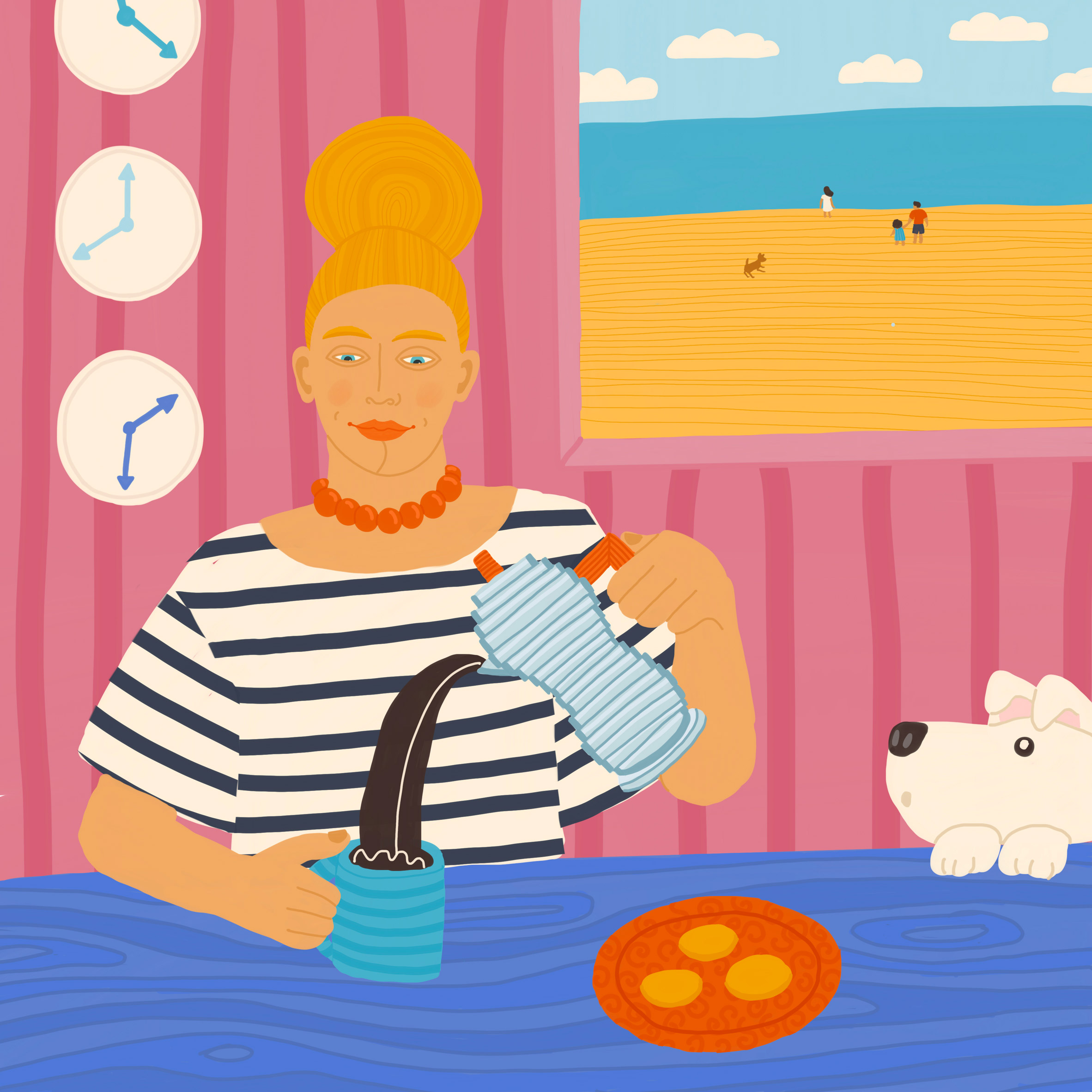
Dezeen's founder and editor-in-chief Marcus Fairs shared his new pandemic ritual of eating toast with apricot jam each morning before starting work.

An illustration of someone making ceramics
Creative activities such as pottery are common themes in 100 Days of Gratitude

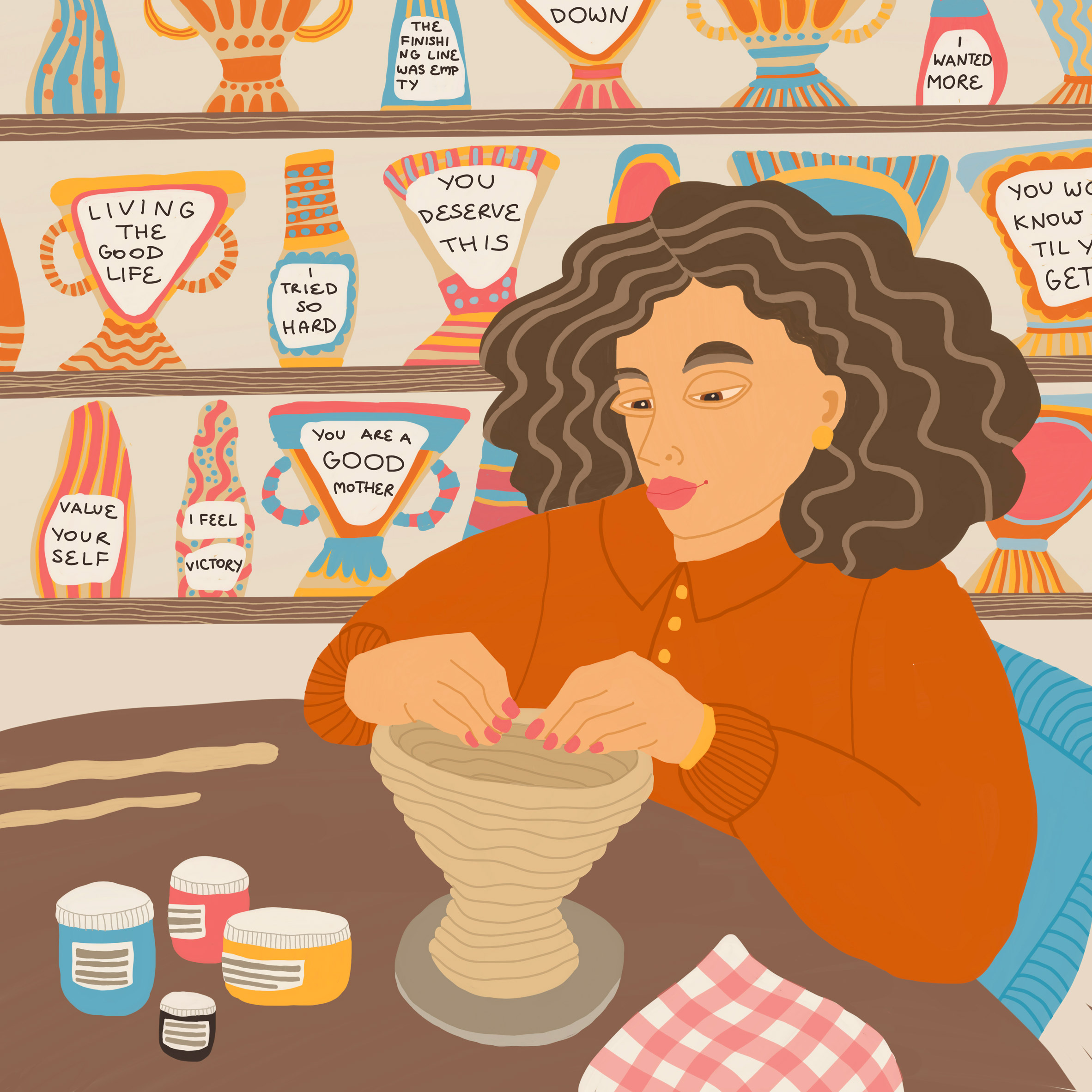
Green realised quickly after launching the project that many of the submissions featured recurring motifs of small rituals such as making coffee and creative activities including pottery.

"Sometimes it takes challenging situations to see the wonderful things right in front of us that we previously might have taken for granted," she explained.

For lots of creatives who have submitted their stories to the project so far, simple activities provided a "comforting focus", and something familiar to continue practising at a time when much else was uncertain.

"These activities have been a life-saver for many of us, and a great way of focusing our attention on something positive. Lockdown gave many of us more time at home, which people took advantage of to work on their creativity and passion projects," she continued.

An illustration of a woman pouring coffee
The series is an ongoing project which will span three months

Nature and pets have also come up time and time again. According to the illustrator, this is because the pandemic prompted people to re-evaluate their relationships with their surroundings.

"Lockdown has reminded us about the importance of nature and has given us opportunities to reconnect, because when everything else shut down, we could still get outside and find some peace in the great outdoors."

"These relationships seemed to take on a new poignancy during lockdown, with many of the participants expressing a deep gratitude for their beloved cats and dogs."

An illustration of people eating Tacos
Small rituals like eating dinner with friends and drinking coffee are common themes

Green hopes that 100 Days of Gratitude will be an "antidote" to the mainstream Covid-19 pandemic news coverage.

"Having awareness of and celebrating the things in our daily lives that we are grateful for serves as a welcome antidote to the mainstream news agenda," said Green

"As the project submissions came in from across the world, it quickly being apparent that we have a lot in common and that we might not be as divided and fearful as the news would have us believe," she added.

"I wanted this project to put a smile on people's faces, to ease their sorrows and create moments of grateful reflection."

Elsewhere, Italian designers Francesca Perani and Claudia Manenti illustrated 488 scale figures for use in architectural renderings, while Agustín Ferrer Casas created a graphic novel with illustrations of the 20th-century modernist Ludwig Mies van der Rohe.

The post Creatives share what they're grateful for during the pandemic in 100 Days of Gratitude appeared first on Dezeen.


from Dezeen https://ift.tt/3AWAYsk

Sarah Coleman puts a psychedelic twist on the brand's logo at the Fendi Caffe

The Fendi Caffe

Artist Sarah Coleman has added a psychedelic twist to Fendi's distinctive double-F logo for a pop-up cafe she designed for the brand in the Miami Design District.

Stylised as the Fendi Caffe, the cafe designed for the Italian fashion house was located on the outdoor corridor of OTL restaurant in the heart of Miami's Design District from May to early July.

Sarah Coleman designed the project
Coleman manipulated the traditional Fendi logo

The cafe was informed by the brand's Summer Vertigo capsule collection, which New York artist Sarah Coleman designed in collaboration with Fendi's creative director Silvia Venturini Fendi.

Defined by yellow and blue tones, the ready-to-wear collection features 90s streetwear references as well as shapes borrowed from 70s psychedelia.

The Fendi Caffe was in Miami
The entrance to the cafe was on an outdoor corridor

Central to the cafe's bold design was FF Vertigo, Fendi's iconic FF logo that Coleman and Venturini Fendi warped for the capsule collection and repeated throughout the cafe in a series of bold colours.

The artist explained the influences that prompted her to explore the 70s in her design process.

"When I first began brainstorming, I went straight to my bookshelf and dove into everything I have about the 1970s, a period of spontaneity and extreme self-expression," Coleman told Dezeen.

"I think the 70s are the greatest fashion era of the 20th century. The spirit of disco, the flowing post-psychedelic art," she added. "There were so many inspiring aesthetic references to draw upon."

FF Vertigo defined the pop-up
FF Vertigo was repeated throughout the space

Visitors to the cafe were greeted with an expanse of bright yellow canopy that contrasted with green potted plants lining the permanent Fendi boutique that is located opposite the pop-up's site.

FF Vertigo featured as a bold motif throughout, topping the space's various tables and barstools while more abstract swirly shapes tumbled over the cafe's yellow walls.

Potted plants faced the pop-up cafe
A permanent Fendi boutique is opposite where the pop-up was

Orb-style pendant lights and menus also included FF Vertigo in their design, while a more traditional version of the Fendi logo featured on the cafe's edible items such as cappuccinos and toast.

Fendi is a luxury fashion house founded in 1925 by Adele and Edoardo Fendi.

Other previous projects by the brand that are informed by the past include a travelling installation for an edition of Design Miami featuring pastel 50s furniture.

The images are courtesy of Fendi.

The post Sarah Coleman puts a psychedelic twist on the brand's logo at the Fendi Caffe appeared first on Dezeen.


from Dezeen https://ift.tt/3hzsm39

Ten of the best homes in the Hamptons

Aerial view of Hamptons house

The Hamptons is an exclusive enclave of private holiday homes and sandy beaches at the eastern end of Long Island in New York. We've rounded up ten houses that make the most of the ocean views.


Atelier 216 in Amagansett, the Hamptons, by Studio Zung

Atelier 216 in Amagansett, the Hamptons, by Studio Zung

New York-based architecture firm Studio Zung looked to the traditional barns of the area for inspiration when designing this house in the seaside town of Amagansett.

Three cedar-clad volumes are arranged around a deck with an outdoor swimming pool, and an indoor dining room features huge windows and a 16-foot-high (five metres) ceiling supported by reclaimed pine beams.

Find out more about Atelier 216 ›


Atlantic in Amagansett, the Hamptons, by Bates Masi + Architects

Local practice Bates Masi + Architects referenced a nearby historic lifeguard station when designing this house. Called Atlantic, the residence is clad in slats of weathered cedar.

The upper level is reminiscent of a lookout tower and cantilevers over the pool deck, with a hanging chair suspended underneath.

Find out more about Atlantic ›


Old Sag Harbor Road in Southampton, the Hamptons, by Blaze Makoid Architecture

Old Sag Harbor Road in Southampton, the Hamptons, by Blaze Makoid Architecture

Blaze Makoid Architecture, which has offices in the Hamptons and Miami, designed this house for a couple who wanted a hideaway amongst the trees.

The three-storey house is clad in cedar and has interiors that include a long fireplace made of blackened steel and a climate-controlled wine cellar.

Find out more about Old Sag Harbor Road ›


Red Creek Road Retreat in Peconic Bay, the Hamptons, by Marvel Architects

This three-bedroom weekend home overlooks Peconic Bay, with floor-to-ceiling windows that frame views of the ocean and an infinity pool on the back terrace.

The exterior is clad in horizontal planks of cedar and the interior features a monumental fireplace made of board-marked concrete that separates the kitchen and dining rooms.

Find out more about Red Creek Road Retreat ›


Island Creek in Southampton, the Hamptons, by Cary Tamarkin

Island Creek in Southampton, the Hamptons, by Cary Tamarkin

New York City architect-developer Cary Tamarkin looked to Long Island's history of mid-century modern architecture – particularly the houses built on Fire Island in the 1950s and 1960s – when designing this three-storey house.

Set on a base of stone, the boxy house is clad in locally sourced old-growth cypress wood and features a terrace that cantilevers from the second floor.

Find out more about Island Creek ›


Pierson's Way in East Hampton, the Hamptons, by Bates Masi Architects

Long Island's 18th-century potato barns were a reference for Bates Masi Architects when the studio designed Pierson's Way.

The house, which was created for a young couple, has a gabled form and is clad in cedar shingles. The residence is composed of four volumes connected by walkways lined with weathering steel.

Find out more about Pierson's Way ›


Watermill House in Water Mill, the Hamptons, by Office of Architecture

Watermill House in Water Mill, the Hamptons, by Office of Architecture

New York-based Office of Architecture responded to the challenge of building on wetlands by creating three raised volumes that effectively straddle the floodplains of the site in the hamlet of Water Mill.

The zinc-clad house features a first floor that projects out and rests on a concrete pillar above an infinity pool.

Find out more about Watermill House ›


Cube House in Westhampton Beach, the Hamptons, by Leroy Street Studio

New York architecture firm Leroy Street Studio designed this house for multiple generations of a family who wanted a relaxing holiday home.

Due to flood risk, the house has a compact footprint and is raised 11 feet (3.4 metres) above the wetlands on wooden stilts. An outdoor terrace is also raised up on piles and the exterior is clad in slim horizontal cedar slats.

Find out more about Cube House ›


Peconic House in Peconic Bay, the Hamptons, by Mapos

A green roof planted with grasses tops this house set into a hill on a five-acre plot of land overlooking Peconic Bay. New York architecture studio Mapos used reclaimed ipe wood and cedar to help blend the building with the landscape.

A staggered wooden deck runs down the length of the house, with steps connecting various outdoor seating areas and a long, slim swimming pool.

Find out more about Peconic House ›


Grove House in Bridgehampton, the Hamptons, by Roger Ferris + Partners

A trio of gabled volumes clad forms this house designed by Connecticut architecture firm Roger Ferris + Partners for a family relocating from a Tribeca apartment.

Each volume is clad in garapa, a type of Brazilian hardwood. The two main structures are connected by a glass walkway, while a separate structure contains a garage and an artist's studio.

Find out more about Grove House ›

The post Ten of the best homes in the Hamptons appeared first on Dezeen.


from Dezeen https://ift.tt/3AVQeFF

From Green to Red installation by Beatie Wolfe makes atmospheric carbon "something that people can relate to"

Gif of the installation

Musician and artist Beatie Wolfe has created an interactive video installation depicting rising carbon levels in the atmosphere.

Called From Green to Red, the video acts as a soundtrack to a Beatie Wolfe song of the same name that is about climate change. The project aims to "take intangible data and make it something that people can relate to," Wolfe told Dezeen.

From Green To Red by Beatie Wolfe
Top: From Green to Red is an interactive installation by Beatie Wolfe. Above: a still from the video

Viewers of the installation can interact with data tracking atmospheric carbon levels over the last 800,000 years. The data is displayed in a video projection showing a stream of digital threads representing a"woven timeline of our planet," according to Wolfe.

The threads gradually turn from green to red before suddenly unravelling, symbolising the way recent greenhouse-gas emissions are driving climate change.

The video was previewed exclusively on Dezeen last year as part of Virtual Design Festival. The interactive version allows visitors to reveal climate data along the timelines by moving their hands in front of the projection.

Wolfe wrote the song From Green To Red in 2006 immediately after watching An Inconvenient Truth, a documentary directed by Davis Guggenheim about former United States vice president Al Gore's climate-change campaign.

Beatie Wolfe wrote From Green to Red
Beatie Wolf is a musician and artist

"I was just so horrified," said Wolfe, who was 17 at the time. "I just couldn't believe it. And so I went straight home and wrote the song From Green to Red. I just pressed record and the whole thing came out."

The song is about climate-change denial and the chorus ends: "As we sit at the crossroads the green turns to red. We don't want to know, don't want to know, don't want to know."

The song later appeared on Wolfe's 2015 album Montagu Square. A few years later, she met a NASA scientist who showed her data that showed rising levels of atmospheric CO2.

From Green to Red was previewed on Dezeen in 2020

The visualisation for From Green to Red was created in collaboration with production studio The Mill while the interactive installation was premiered at the London Design Biennale at Somerset House in London last month.

"One of the chief engineers for NASA was showing me these climate graphs, which were just so shocking in the same way as seeing An Inconvenient Truth," she said. "I was sort of shaken awake."

But she added: "I also realised how, for so many people, data is cold and impenetrable and sort of intangible." This gave her the idea to combine her song with an easy-to-understand visualisation of the data.

The From Green to Red installation is a way to "take that same data and essentially make it something that people can relate to and could absorb, and could really get a sense of where we are on the planet right now," she explained.

The amount of carbon in the atmosphere has risen 50 per cent due to the activities of mankind. Today there are around 420 carbon parts per million whereas in pre-industrial times there were around 280.

Beatie Wolfe was a guest artist at Dezeen's Virtual Design Festival last year. She provided the soundtrack to the festival's opening movie and recorded an exclusive performance.

The concentration of atmospheric carbon dioxide has been rising steadily since the industrial revolution and has accelerated over recent decades. Half of all emissions over the last 300 years have happened since 1980. A quarter has happened since 2000.

The Intergovernmental Panel on Climate Change (IPPC) estimates that between 100 and 1,000 gigatonnes of emissions will need to be removed from the atmosphere by the end of the century in order to keep global warming below the 1.5 degrees set out in the 2015 Paris Agreement.

UK studio Real World Visuals has also used visualisations to explain the impact of greenhouse-gas emissions. A short movie depicting New York's emissions as a mountain of blue balls went viral in 2012.

"Carbon emissions are invisible and that's a core part of the problem," Real World Visuals co-founder Antony Turner told Dezeen. "If carbon dioxide was purple, we would start taking notice."


Carbon revolution logo

Carbon revolution

This article is part of Dezeen's carbon revolution series, which explores how this miracle material could be removed from the atmosphere and put to use on earth. Read all the content at: www.dezeen.com/carbon.

The sky photograph used in the carbon revolution graphic is by Taylor van Riper via Unsplash.

The post From Green to Red installation by Beatie Wolfe makes atmospheric carbon "something that people can relate to" appeared first on Dezeen.


from Dezeen https://ift.tt/3e9ZzjC

Technical University of Munich spotlights eight student architecture projects

Technical University of Munich

A project that reimagines obsolete urban infrastructures and another that envisions a river bath as a place for the community are included in Dezeen's latest school show by students at the Technical University of Munich.

Also featured are projects that reinvent Munich's urban wastelands, usually used for Oktoberfest. These projects explore redesigning spaces to ensure that they don't become redundant once the festival has passed.


Technical University of Munich

School: Technical University of Munich, Department of Architecture
Courses: MA Architecture

School statement:

"With more than 1,500 students, 200 scientists and 30 professors, the Department of Architecture at the Technical University of Munich (TUM) is pursuing a research-oriented teaching approach in cooperation with public organisations and companies.

"Our study and research programme offers an extensive range of subjects across the three competence fields of urban and landscape transformation, integrated building technologies and cultural heritage, history and criticism.

"Our central task is to develop strategies for the transformation of our built environment. Starting from the core activity of designing, we synthesise and contextualise complex spatial solutions. This integrated approach is what TUM Architecture offers at many levels."


Technical University of Munich

Tutti: a river bath on the Isar by Friederike Schneider

"In steadily growing cities such as Munich, public space is becoming increasingly scarce. Due to the current land policy and the associated lucrative rise in the capital and the advancing commercialisation of our inner cities, consumption-free exterior space, in particular, is continuously gaining in importance.

"During my master's thesis, I created a place for the community – Tutti – a river bath on the Isar that offers the possibility to use the river as part of everyday life in diverse ways, including allowing people to swim alone as well as collectively."

Student: Friederike Schneider
Course: 
Architecture MA
Tutor:
Professor Uta Graff, Chair of Architectural Design and Conception
Email:
schneider.frdrk@gmail.com


Technical University of Munich

Eurotopia – reconfiguring European representation by Maximilian Steverding

"The EU is in despair – and with it its architecture. Transformative pressure of raising individualism and globalisation is calling for Eurotopia – a research project and reconfiguration of European representation.

"It challenges the current status, driven by tales of old nation-states, with a network representation that exceeds national boundaries in creating connected identities by enabling political participation through build architecture – reflecting on the role of architecture as political expression and political actor.

"Eurotopia is reconfiguring architecture from the representation of political might to the empowerment of the people through infrastructures of self-representation."

Student: Maximilian Steverding
Course:
Architecture MA
Tutor:
Professor Benedikt Boucsein, Chair of Urban Design
Email:
hi@maximilian-steverding.eu


Technical University of Munich

Limitrophe spaces, potentials of open spaces in apartment buildings by Jens Roll

"The thesis is based on a historical and typological study of open spaces in apartment buildings. From this, it is clear that a change in society results in a change of living.

"Current developments that demand a rethinking of housing are set out in the manifesto 'wohnHaft'. The project has developed from the housing idea to the floor plan and finally produces the entire building. Limitrophic space situations form an interface between public and private, and from inside to outside are the main focus of this project."

Student: Jens Roll
Course:
Architecture MA
Tutor:
Professor Dietrich Fink, Chair of Urban Architecture
Email:
jens_roll@yahoo.de


Technical University of Munich

Wiesn Ex Machina by Luis Huber

"The year is 2021, and a pandemic paralyses large parts of public life, including almost all events on the Theresienwiese – a unique urban wasteland typically the venue for Oktoberfest.

"What is the identity of the Theresienwiese and how can it be further thought about, questioned and reshaped?  Here, moving elements can be used for a variety of purposes. Event venues can be moved from A to B like containers. Tents can be erected. Water, electricity and light can be provided."

Student: Luis Huber
Course:
Architecture MA
Tutor:
Professor Benedikt Boucsein, Chair of Urban Design


Technical University of Munich

Plant House – Imagining a Circular Future for a Heating Plant by Carsten Becker

"Investigating the arising needs of further densification, this thesis focuses on the reimagination of increasingly obsolete urban infrastructure. As a key to a sustainable future society, special attention must be paid to circular social concepts.

"The transformation allows the former Maxvorstadt Power Plant a second life as a sustainable urban condenser. The underlying cycle refers both to traditional technical aspects and sustainable ideas, using energy from food waste to operate a 24/7 greenhouse. The market distributes the freshly grown vegetables, and alongside the restaurant, the Plant House becomes a social hub that reveals a long-lost potential to the city."

Student: Carsten Becker
Course:
Architecture MA
Tutor:
Professor Stephen Bates and Professor Bruno Krucker, Chair of Urban Design and Housing
Email: 
carsten.becker@tum.de


Technical University of Munich

Big Space Small Units by Laura Widmann

"With regard to the housing shortage, our resource-consuming lifestyle and the advancing gentrification, this master thesis examines the Theresienwiese in Munich: its function as a temporary residential and living space.

"The 43 hectars are divided into a permanent recreational space and a flexible area by restructuring and topographical intervention. An extensive infrastructure and neighbourhood centres activate the Theresienwiese year-round and enable temporary and minimalist living in the form of tiny houses between and during events such as the Oktoberfest.

"The potential space of the 'Wiesn' is expanded by these measures, and creates a sustainable living space, a social neighbourhood, a place for communication and participation, and still embodies individuality in the centre of Munich."

Student: Laura Widmann
Course: Architecture MA
Tutor: Professor Benedikt Boucsein, Chair of Urban Design
Email: laura.widmann1@web.de


Technical University of Munich

Occhio! by Lisa Henicz

"The Italian word occhio (eye) as an exclamation translates to caution. This caution was implemented in the theoretical and practical investigation of the term intimacy. Generally understood as a synonym for privacy, the word intimacy has a negative connotation. Instead of focusing on the isolating aspects of intimacy, this thesis' definition derives from the correlation of spatial, sensual and emotional intimacy.

"The second part of the thesis introduces four ideal situations that show intimacy in everyday life. Each chapter consists of a theoretical part and an architectural draft. By choosing mundane settings, this thesis emphasises the intimacy of common situations."

Student: Lisa Henicz
Course:
Architecture MA
Tutor:
Professor Uta Graff, Chair of Architectural Design and Conception, and Dr Dietrich Erben, Chair of Theory and History of Architecture, Art and Design
Email: 
lisanicz@icloud.com


Technical University of Munich

Theresienwiese/Hybridwiese (Future Theresienwiese) by Pablo Bretschneider Chillón

"Outside its main attractions, for example, the Oktoberfest, this open space offers no stimulation and remains most of the time as a fallow. This design aims to show potential uses beyond certain events, which last only a few weeks. Building forms (for example, a summer theatre and a viewing platform) mediate between the potential of the plot as a catalyst for urban space and the current use as an event location.

"The architecture thereby complement existing programs or stimulate an appropriation of the urban wasteland. The formal language of the buildings should also affirm the constantly changing composition of this city space. The investigation and transformation of architectures are in this respect, an important mean to ensure that visitors of the space also associate the occupied state of the place."

Student: Pablo Bretschneider Chillón
Course:
Architecture MA
Tutor:
 Professor Benedikt Boucsein, Chair of Urban Design
Email: 
pablo_bret@icloud.com


Partnership content

This school show is a partnership between Dezeen and the Technical University of Munich. Find out more about Dezeen partnership content here.

The post Technical University of Munich spotlights eight student architecture projects appeared first on Dezeen.


from Dezeen https://ift.tt/3kaDbuk