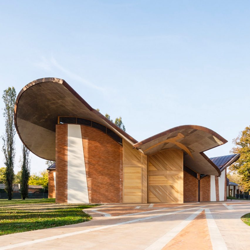
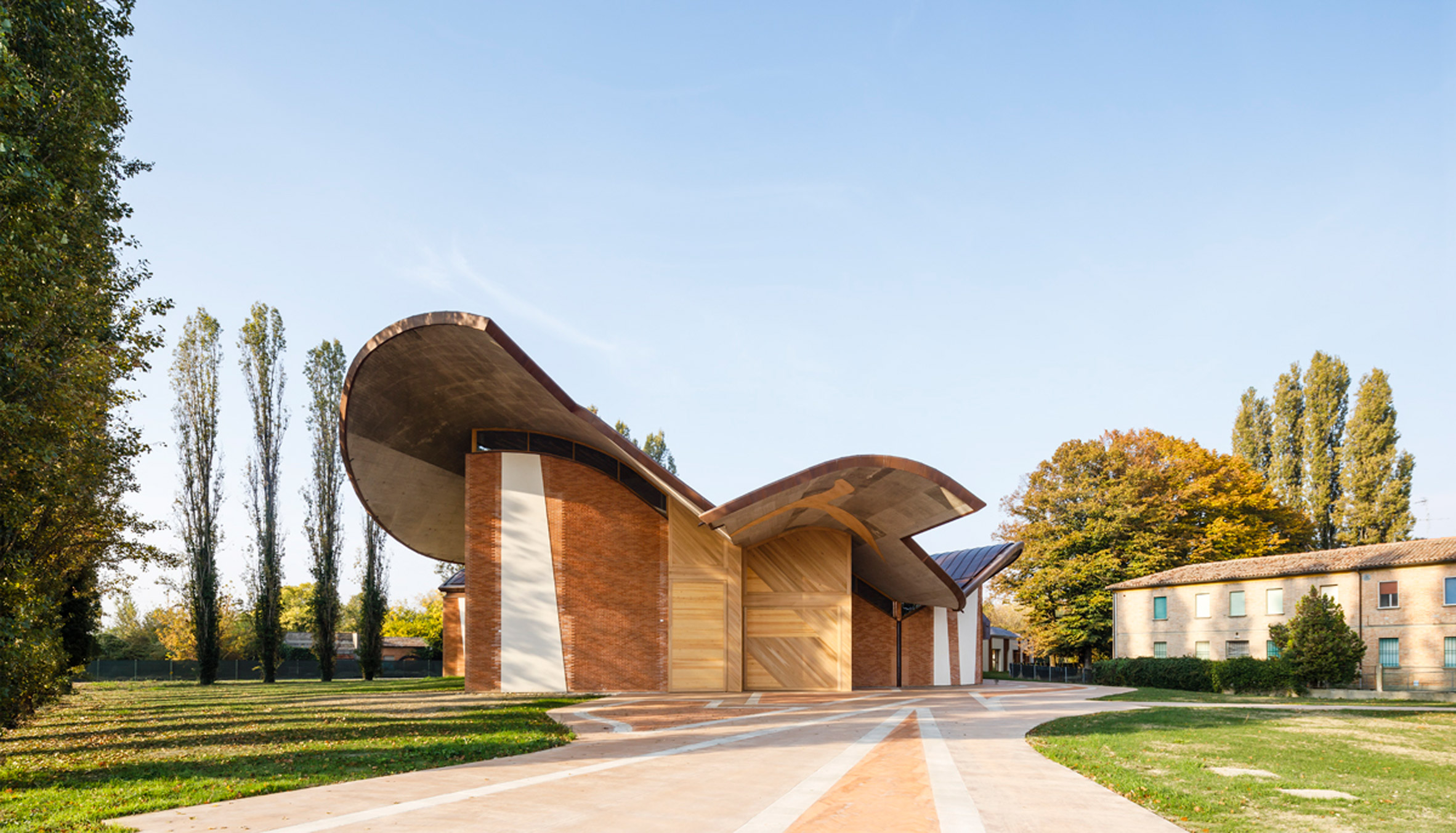
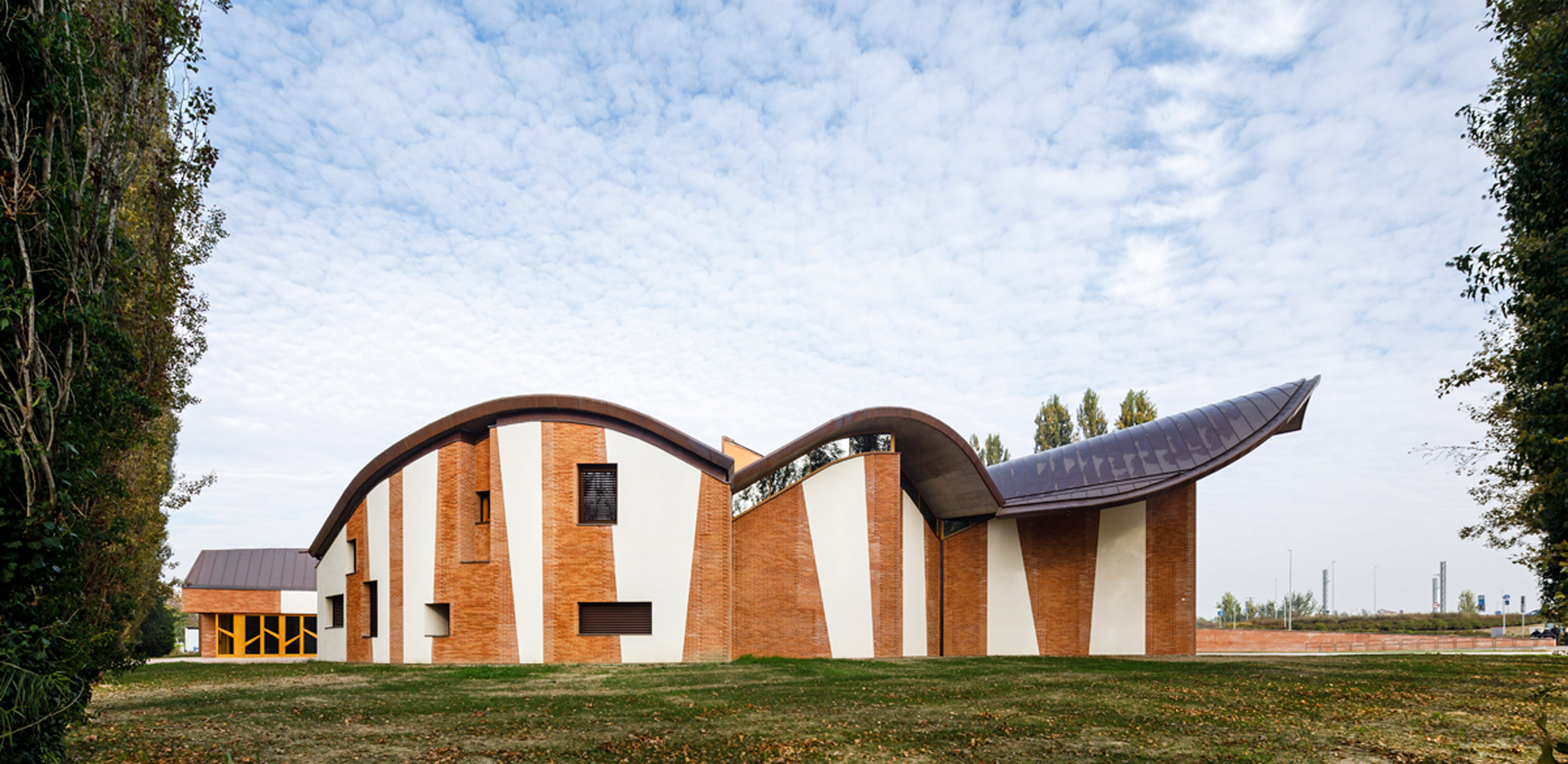
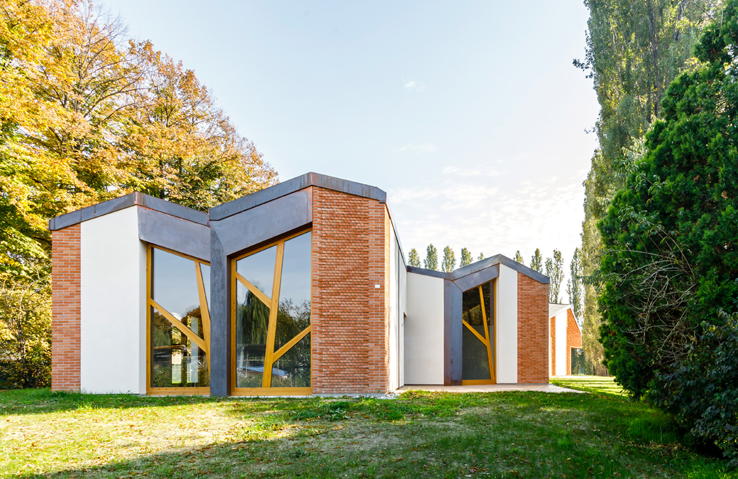
Spanish studio EMBT has designed a brick-and-plaster-clad church in Ferrara, Italy, which has a copper roof informed by hot air balloons and an interior that aims to be a modern take on primitive churches.
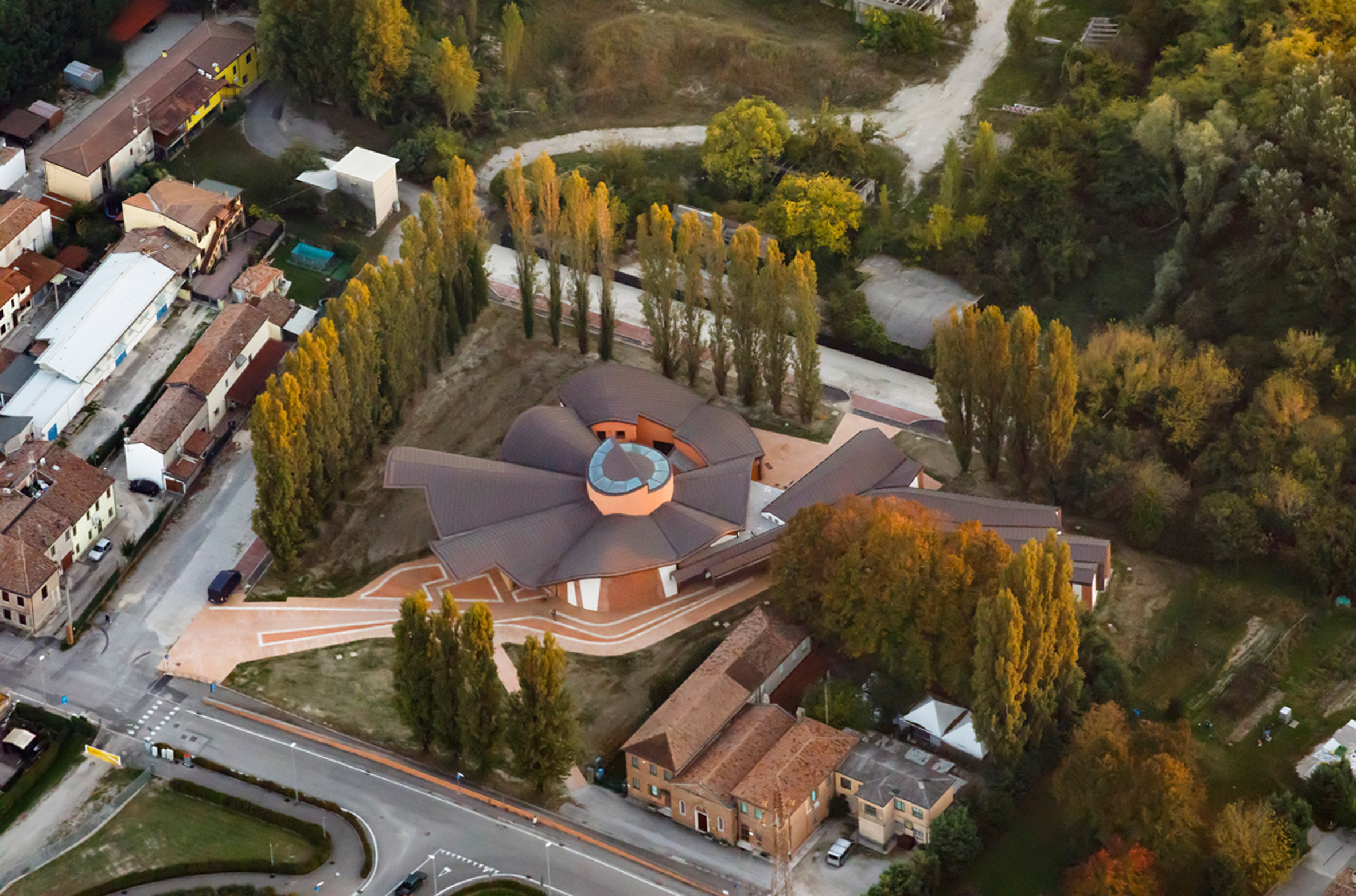
The church was developed over 10 years and completed in 2021. It sits in the parish of San Giacomo Apostolo in the Arginone neighbourhood of Ferrara and has an uneven, organic shape.
The shape of the church roof nods to hot air balloons
The sculptural design and wavy copper-clad roof reference the hot air balloons that fill the sky above Ferrara each year.
"The inspiration came one day when we were analysing the territory and the environment, when we saw the sky of Ferrara full of hot air balloons for the international festival that is held every year in September," said Benedetta Tagliabue, director and co-founder of EMBT.
The church is located in Ferrara, Italy
"Thus, we imagine a light and friendly church, which comes from heaven and is located in the place where the Christian community needs it most, a contemporary church, rich in strength and symbolism, surprising and familiar at the same time, inspired by the early days of the church," she added.
The exterior of the 710-square-metre church has a facade made from alternating brick and plaster that creates a striped effect.
In some sections, the bricks have been placed in a three-pointed protruding design in reference to the Renaissance-era Palazzo dei Diamanti in Ferrara.
Brick and plaster create a striped facade
The church was designed on a "visual and spiritual axis" to a new bridge and the city of Ferrara across the river. It has a spacious plaza in front that functions as a meeting place as well as an extension of the church courtyard.
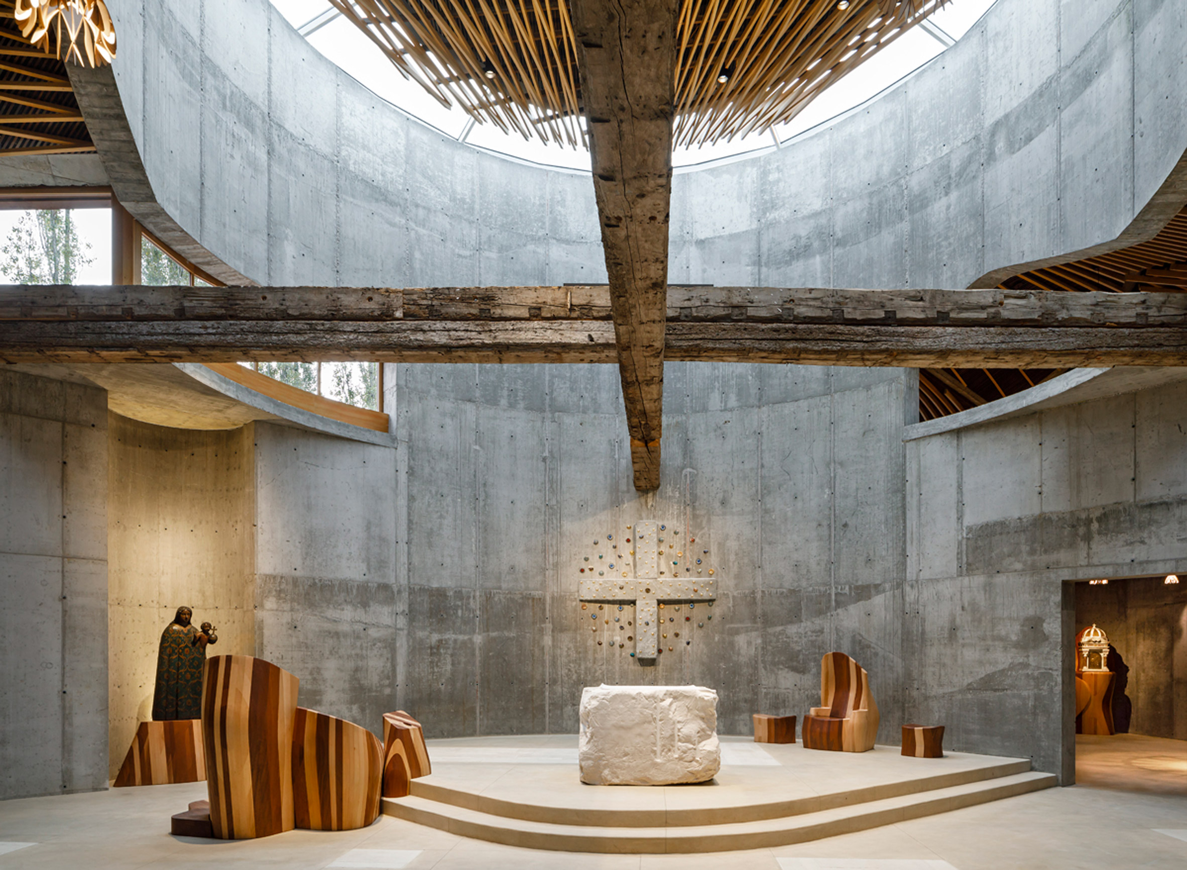
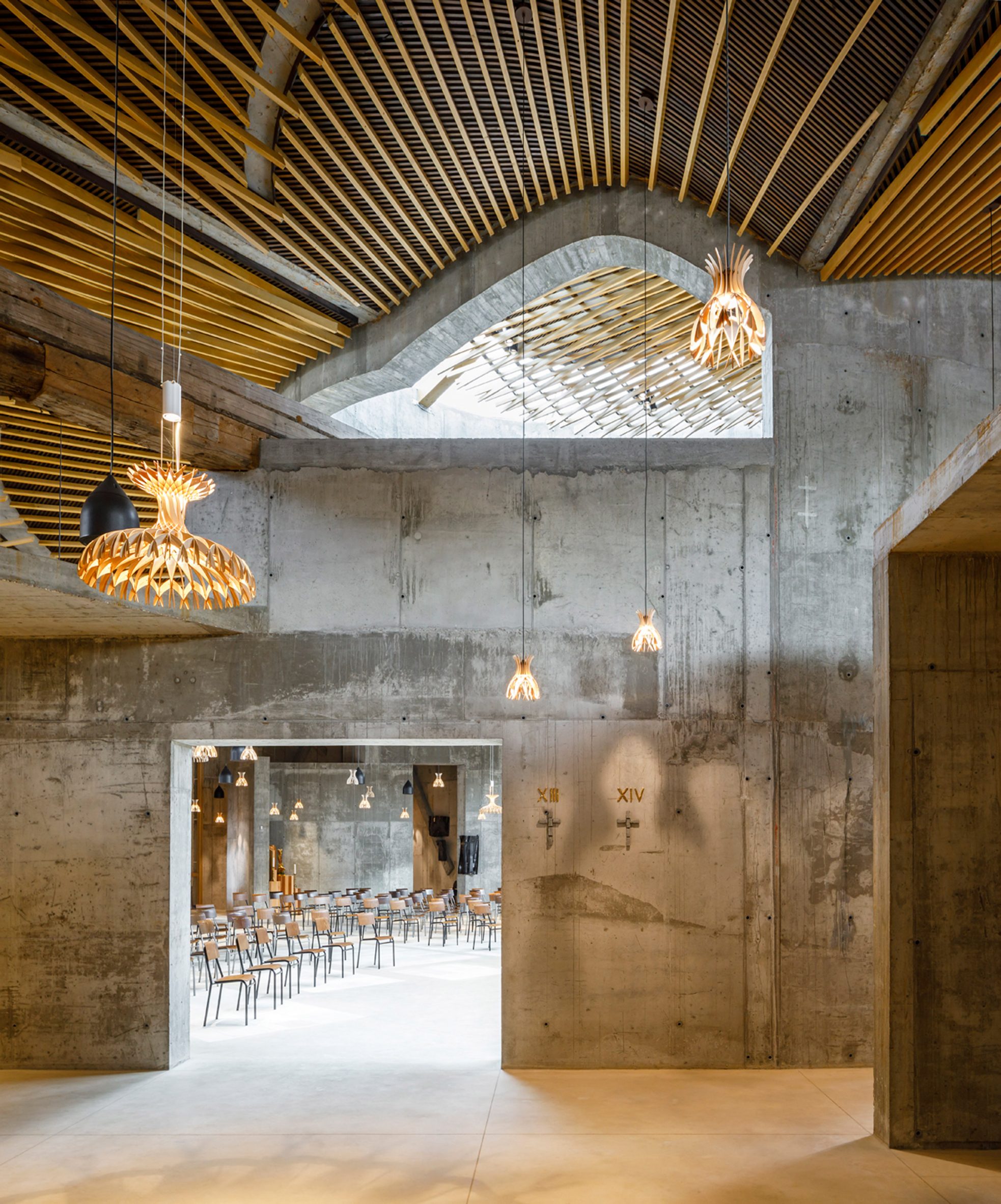
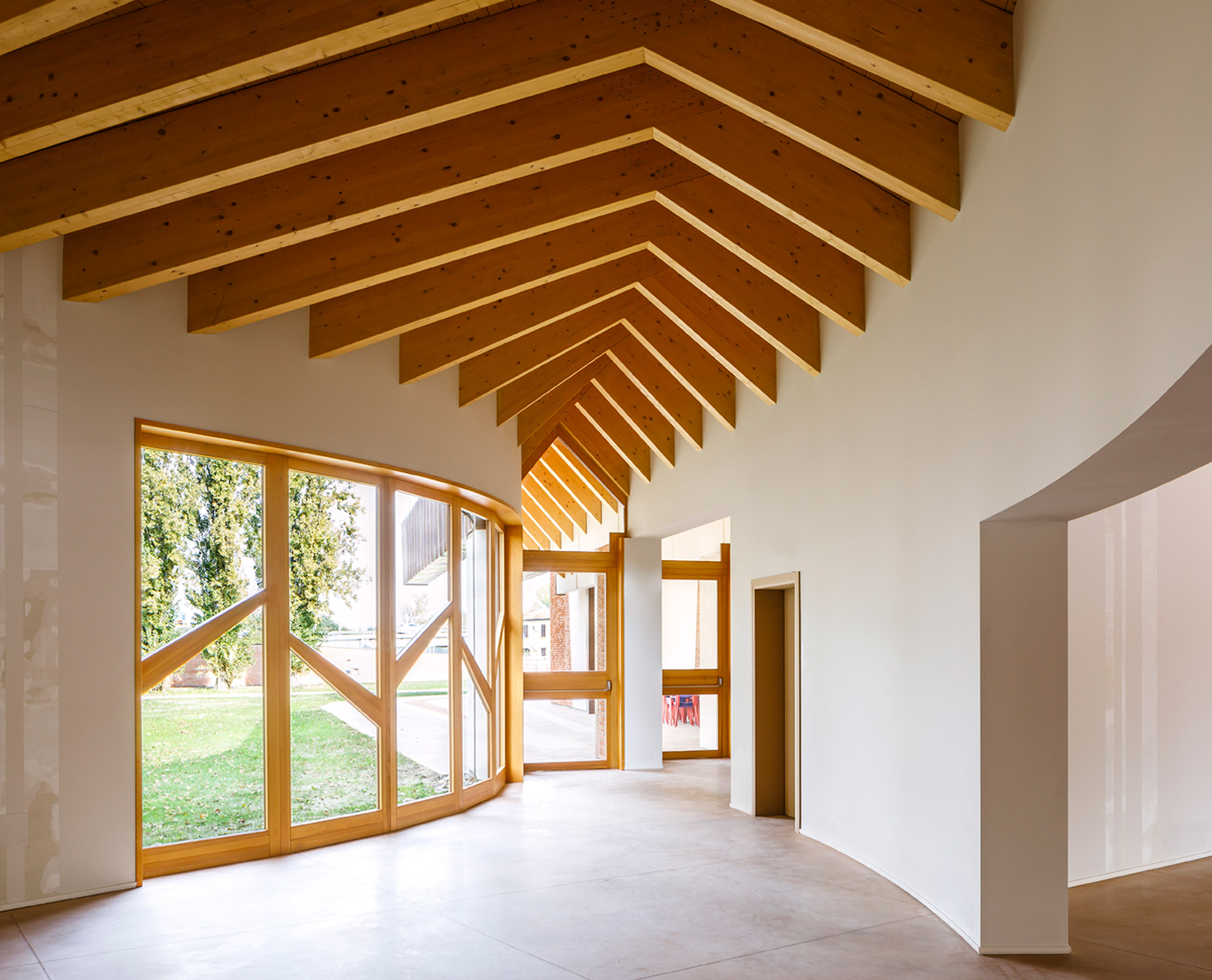
A large wooden gate leads inside, where the altar sits at the centre underneath a large skylight. A classroom, side chapel, baptistery and annexes are organised radially around it.
The exterior features angled bricks that reference a local Renaissance building
The central space, which is dedicated to the apostle St James, has raw concrete walls and a stone floor. Its altar was made from a block of white Travi stone that was left almost totally untreated, adding to the rough-hewn feel of the interior.
It has four small crosses, one in each corner, and also features a secret drawer that holds a relic.
Concrete walls clad the interior of the church
The raw, unadorned design of the altar was chosen to "recall the most primitive moments of the church when a mass was celebrated with found objects and where the symbol acquired an even greater importance", the studio said.
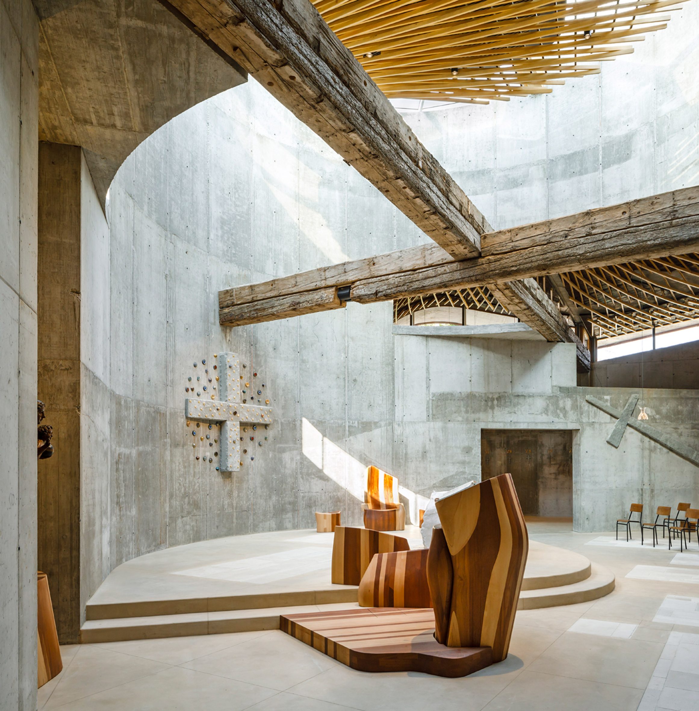
Above the nave sits a large cross made from wooden beams that were salvaged from Ferrara's old town hall.
A wood baldachin is suspended under the skylight and was designed to evoke the shape of the shell of St James, a traditional symbol connected to the apostle.
Artist Enzo Cucchi created the artworks for the interior, including large grey stone crosses that protrude from the church walls and colourful ceramic pieces.
Two wooden beams form a cross above the altar
The organic feel of the interior is underlined by furniture made from different types of laminated wood, resulting in a striped look that resembles the exterior.
Tagliabue also designed the suspension lamps for the church, which are made from thin wooden slats that create small domes.
The undulating shape of the roof can be seen inside the church
A weekday chapel is attached to the main church but has a separate entrance and leads on to a sacristry, penitentiary, parish house and more classrooms. The parish hall, classrooms and rectory measure 873 square metres in total.
EMBT has worked on the church since 2011, when the studio won a competition to design the project for the Arcidiocesi di Ferrara-Comacchi.
Client: CEI Conferenza Episcopale Italiana, Parrocchia di San Giacomo Apostolo, Ferrara Architect: Benedetta Tagliabue – Miralles Tagliabue EMBT Artist: Enzo Cucchi Liturgist: Don Roberto Tagliaferri Structural design: Studio Iorio, Francesco Iorio Miralles Tagliabue EMBT Team Project directors EMBT: Benedetta Tagliabue, Joan Callis Design coordinator EMBT: Valentina Nicol Noris Wooden ceiling and sacred furniture EMBT: Nazaret Busto Rodríguez, Julia de Ory Mallavia, Daniel Hernán García Management coordinator EMBT: Camilla Persi Collaborators EMBT: Paola Amato, Letizia Artioli, Guido Aybar Maino, Sofia Barberena Cantero, Christopher Bierach, Irene Botas Cal, Maria Cano Gómez, Helena Carì, Vincenzo Cicero Santalena, Luis Angello Coarite Asencio, Maria Antonia Franco, Juan David Fawcett Vargas, Paula Georghe, Leonardo Gerli, Francesca Guarnieri, Evelina Ilina, Michael Kowalsky, Philip Lemanski, Erez Levinberg, Lauren Lochry, Ernesto Lopez, Oscar Lopez, Pablo López Prol, Annarita Luvero, Andrea Marchesin, Laura Martín, Beatriz Martínez Rico, Agustina Mascetti, Lucero Mattioda, Grant Mc Cormick, Marianna Mincarelli, Andrea Morandi, Enrico Narcisi, Marco Nucifora, Marco Orecchia, Jiyoun Park, Mikaela Patrick, Gonzalo Peña, Juan Manuel Peña Sanz, Marina Pérez Primo, Eleonora Righetto, Roberto Rocchi, Cj Rogers, Francesca Romano, Gabriele Rotelli, Javier Ruiz Safont, Bárbara Ruschel Lorenzoni,Antonio Rusconi, Raya Shaban, Georgiana Spiridon, Guillermo Sotelo, Astrid Steegmans, Angelos Siampakoulis, Andrea Stevanato, Stefano Spotti, Raphael Teixeria Libonati, Lorenzo Trucato, Katrina Varian, Giovanni Vergantini, Beatrice Viotti, Federico Volpi, Ling Yang, Lisa Zanin. Communication team EMBT: Arturo Mc Clean, Ana Gallego, Lluc Miralles. Project management: Concordia SAS – Diego Malosso, Maria Elena Antonucci Local engineer: Beatrice Malucelli Acoustic consultant: Higini Arau Lighting consultant: Maurici Ginés – Artec3 Studio Scientific support: Matteo Ruta – Politecnico di Milano Installations: Studio Simax Director of works: Domenico Mancini Static Tester: Simone Carraro Catastral practices: Sotterri Giulio
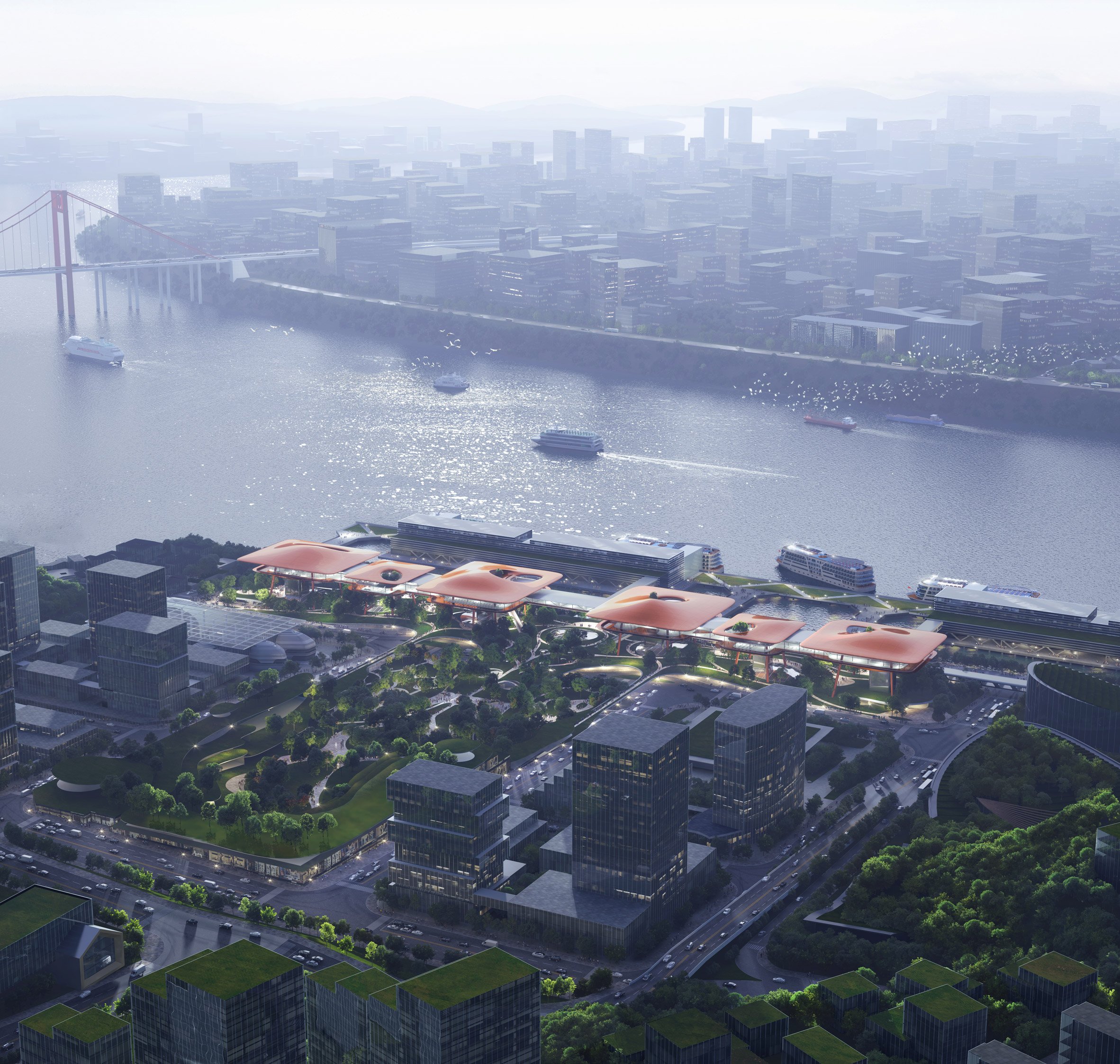
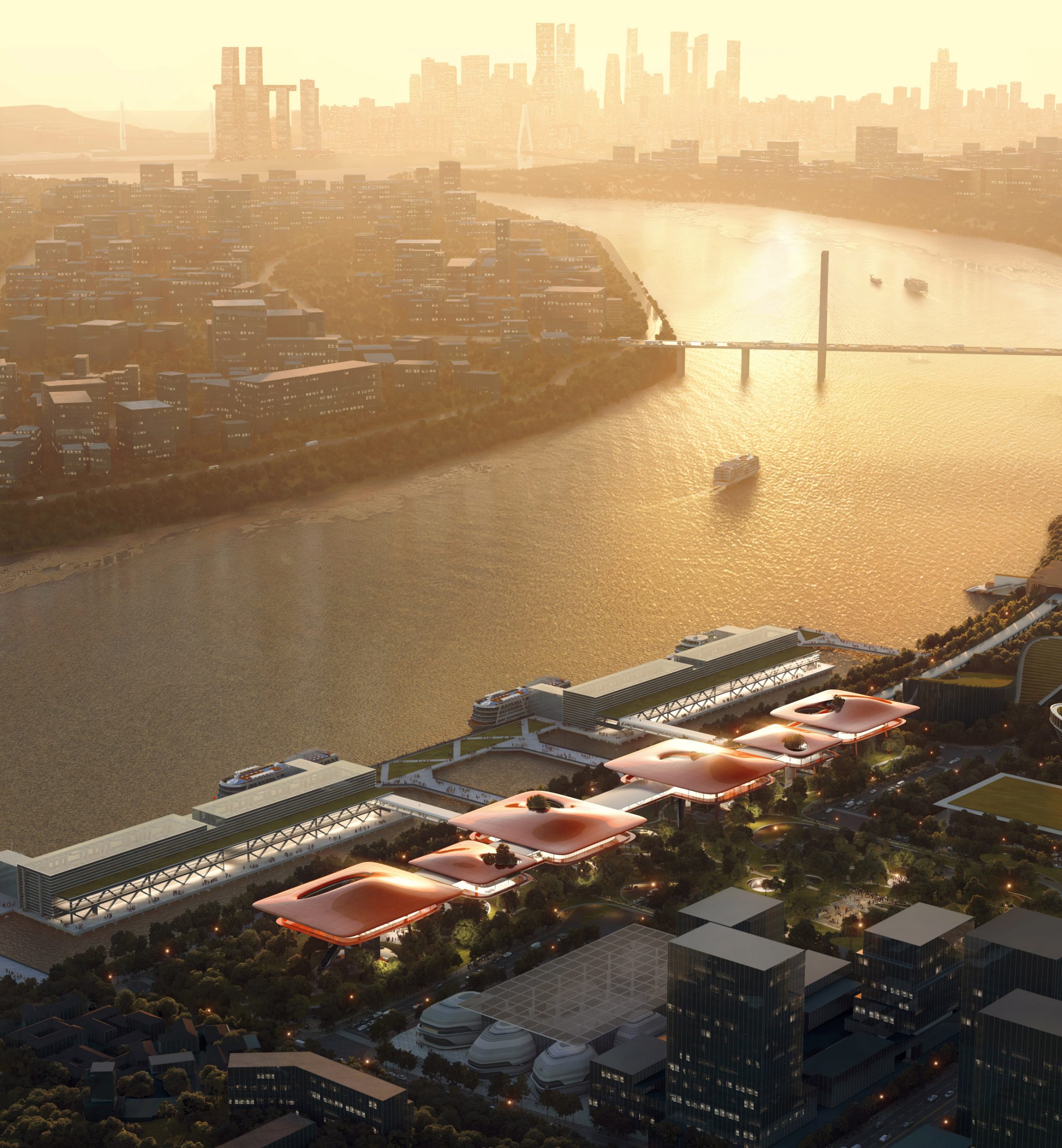
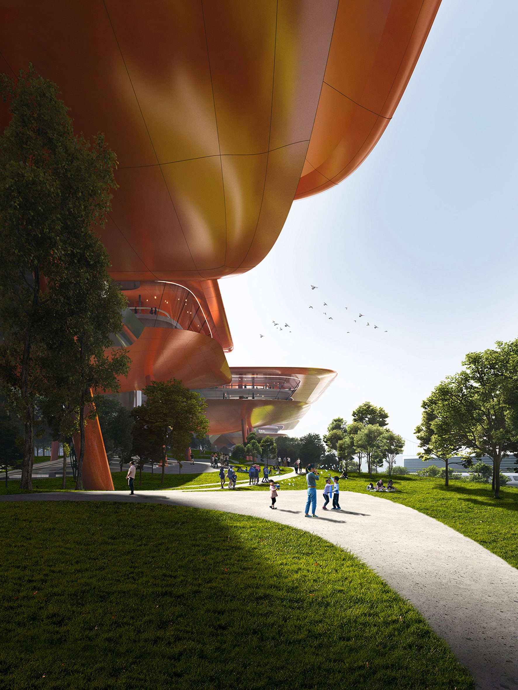
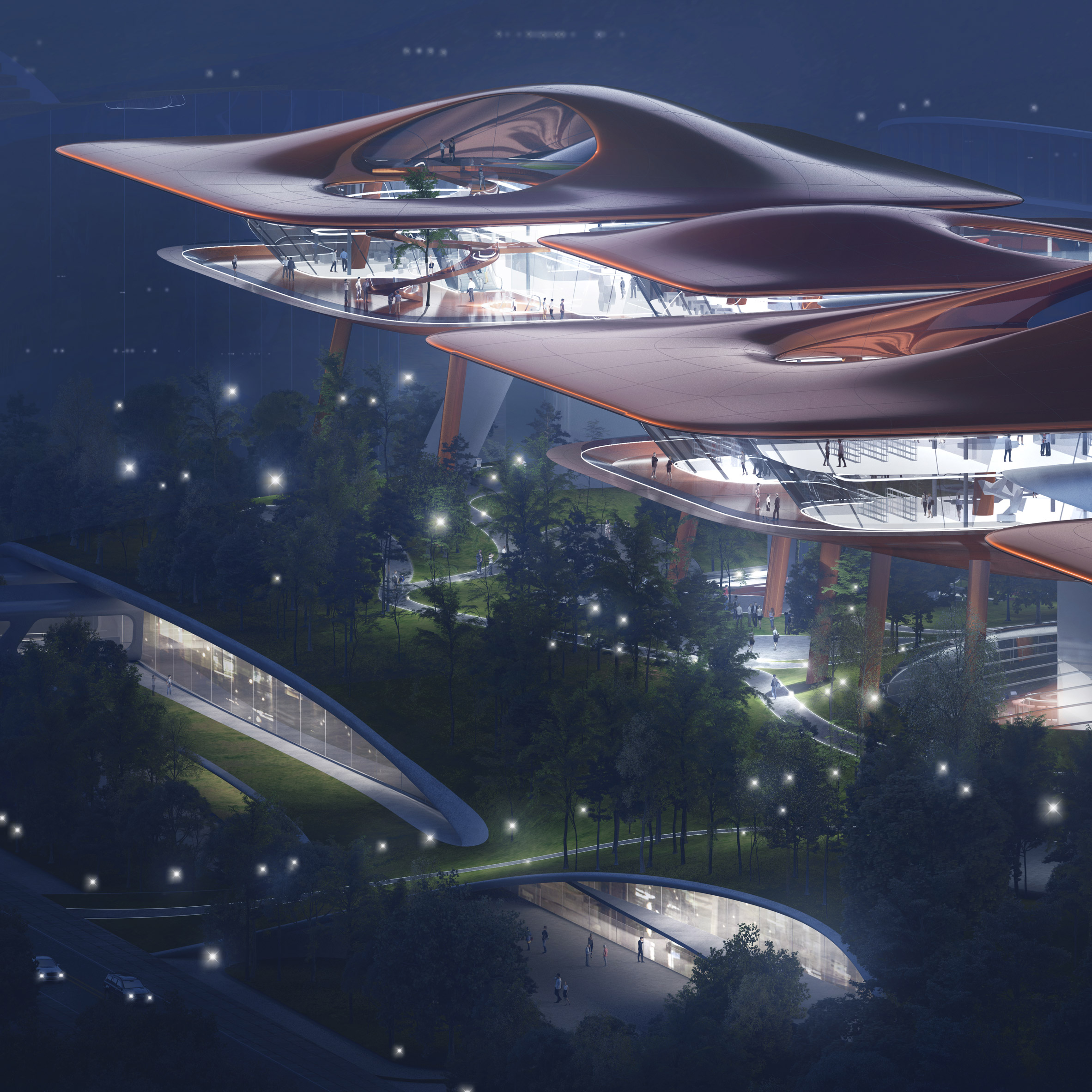
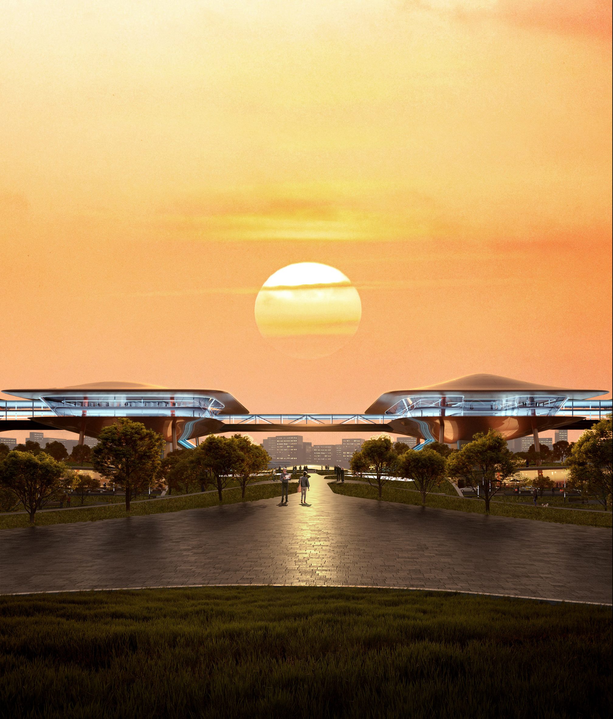
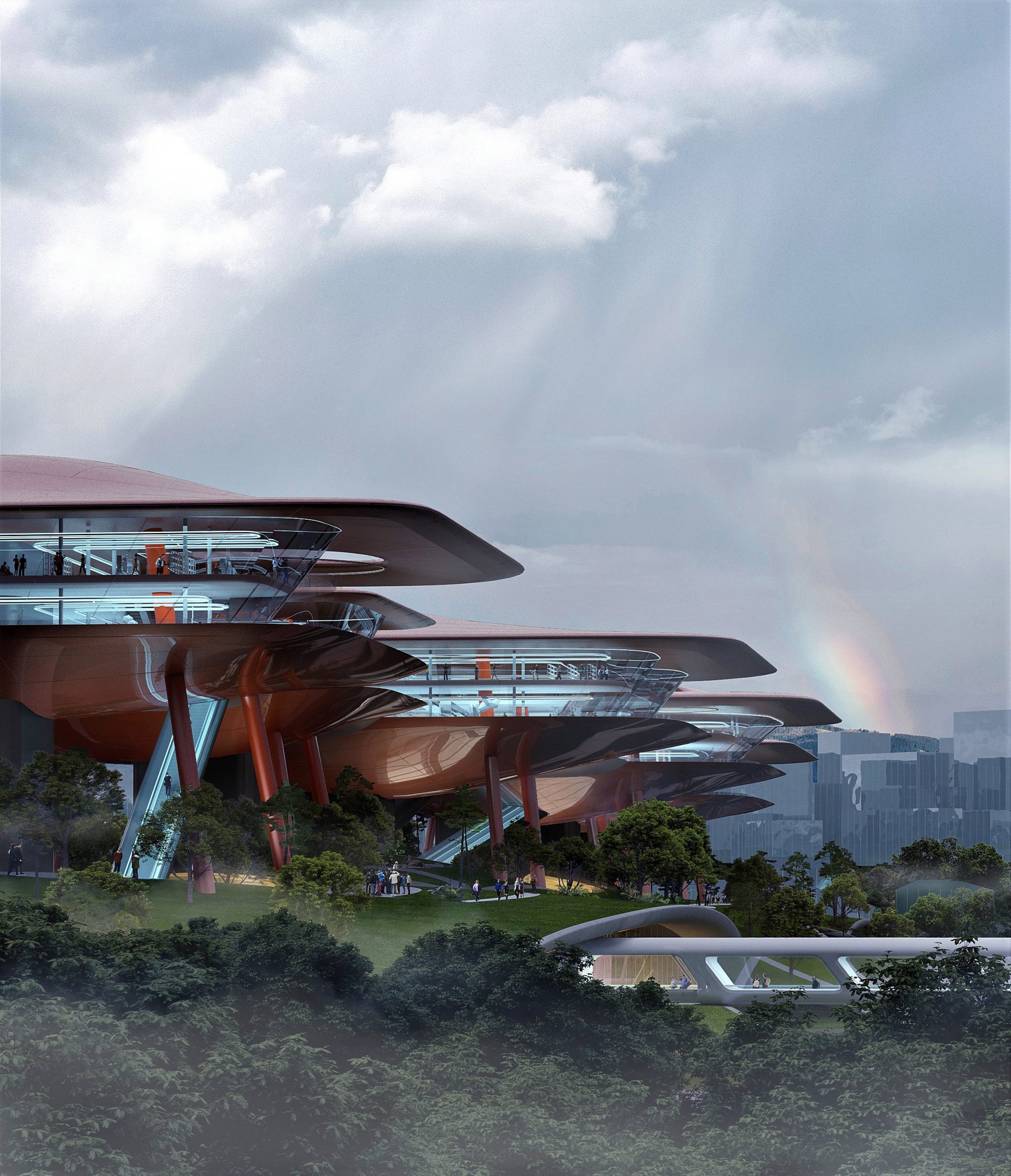
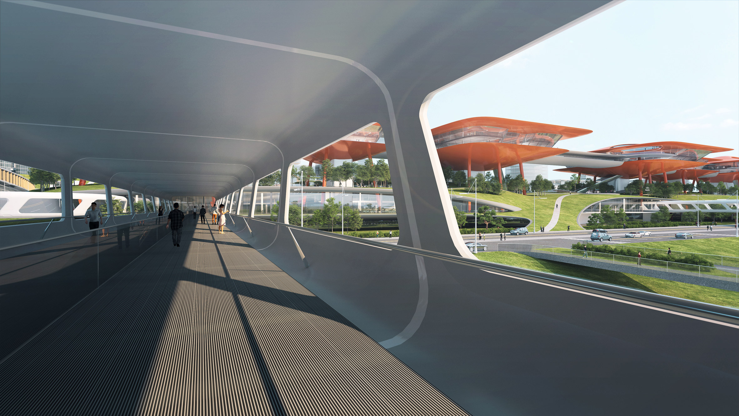
A string of orange buildings elevated above ground will mark the Cuntan International Cruise Centre, which Chinese studio MAD has designed for a port in Chongqing, China.
Developed by MAD with the China Academy of Building Research (CASR) for Cuntan Port on the Yangtze River, the scheme marries an international cruise terminal with commercial spaces.
MAD has unveiled the Cuntan International Cruise Centre
The 65,000-square-metre complex, which was the winning entry of an international competition for the scheme, is hoped to transform the industrial site into usable public space.
It will begin construction in November 2022, replacing an existing cargo terminal on the same spot, for completion in 2027.
The international cruise terminal will be positioned on the Yangtze River
"The Yangtze River is more than just a natural landscape in Chongqing," explained MAD founder Ma Yansong.
"Because of human activities such as shipping traffic and industrial transport, this mountain city is also full of energy and movement," he continued.
It will be distinguished by a string of elevated buildings
"We want to transform this energy in Chongqing from traces of industry into an energy that stimulates the imagination," added Ma.
"People can feel the kinetic energy of the city here, but also imagine the public spaces of the future."
The buildings will be clad in orange aluminium for a futuristic look
According to MAD, the Cuntan International Cruise Centre forms part of a wider masterplan that is being led by Chongqing's municipal government to transform the area.
The goal is to create "the world's preeminent river cruise port" and a district that supports tourism, shopping and entertainment.
All of the elevated buildings will be interconnected
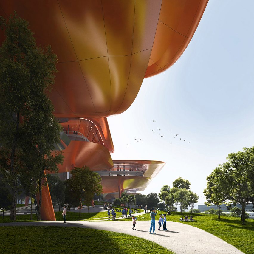
MAD's cruise terminal will be distinguished by six buildings spanning 430-metres, which will be raised on tall leaning columns and clad with orange-hued aluminium.
Dubbed Yangtze River Skywalk, these structures will be linked by skybridges and contain 50,000 square metres of commercial space such as shops and restaurants.
A park will sit below the elevated structures
According to MAD, the Yangtze River Skywalk takes cues from large orange gantry cranes, or portal cranes, which are used to lift large objects in the existing cargo terminal.
While taking on the industrial colours of the site, their design also aims to create a "futuristic" and "alien" aesthetic, according to the studio's founder.
"These gantry cranes became living alien creatures that gave a sense of surrealism," Ma said. "The new scheme is therefore not only about reflecting the industrial colours of the past, but also about respecting this original surrealism."
"We have designed the elevated buildings as if they were a futuristic, free-walking city, seemingly arriving here from elsewhere, and perhaps travelling elsewhere once again someday," he added.
The terminals will extend below ground
The string of orange buildings will have different heights and sizes, which is intended to recreate "the rhythm of the industrial freight terminal cranes" when viewed from a distance.
By elevating the buildings, they are also granted unobstructed views of the Yangtze River.
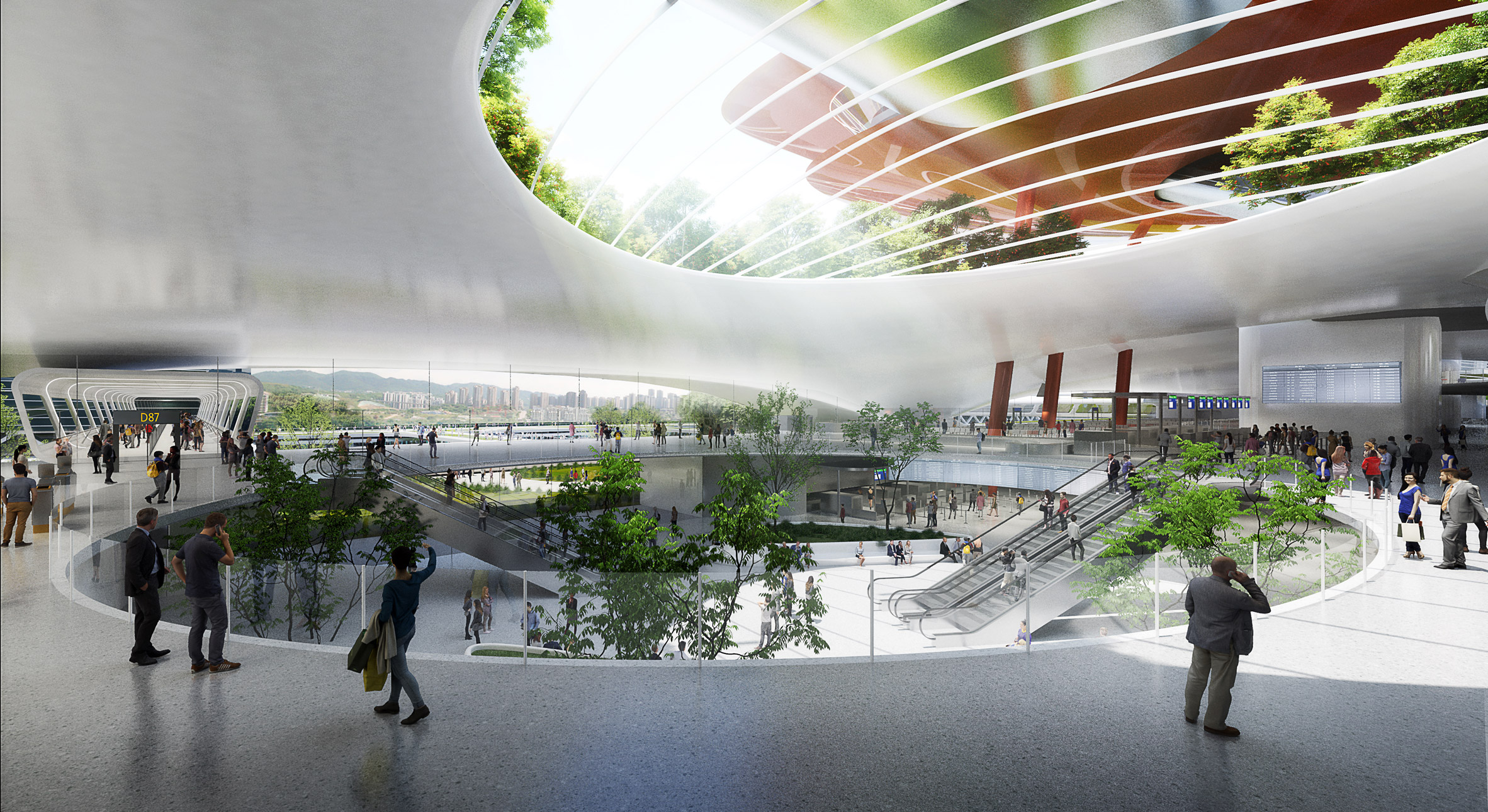
Positioned underneath the elevated commercial buildings will be the Cruise Ship Landscape Park and, below that, the Cruise Centre Hub.
The Cruise Ship Landscape Park will sit at ground level and link two existing parks adjacent to the site, creating 100,000 square metres of urban green space.
The underground spaces will be skylit
Meanwhile, embedded within the ground will be the Cruise Centre Hub, the 15,000-square cruise terminal, which will be lit by skylights in the park above. It will have access to both the ground-level park and commercial spaces above.
Architect: MAD Principal partners in charge: Ma Yansong, Dang Qun, Yosuke Hayano Associate in charge: Liu Huiying Design team: Yang Xuebing, Lei Kaiyun, Wang Ruipeng, Chen Wei, Ning Tong, Wang Yiding Client: Chongqing Cuntan International Cruise Home Port Development Co. Consortium: China Academy of Building Research Ltd
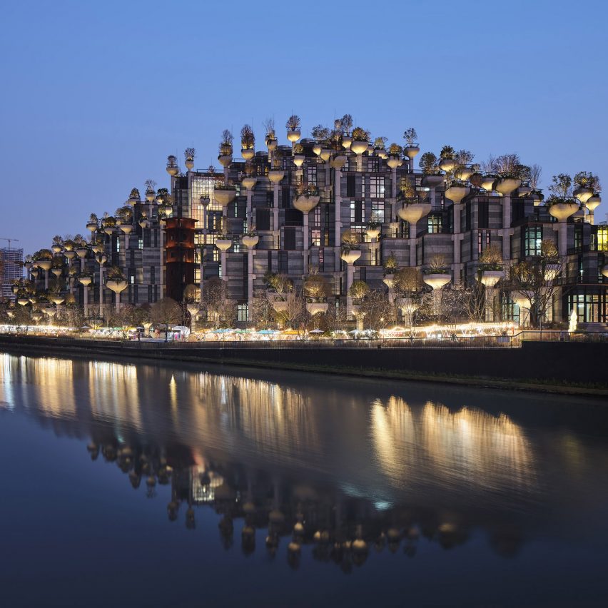
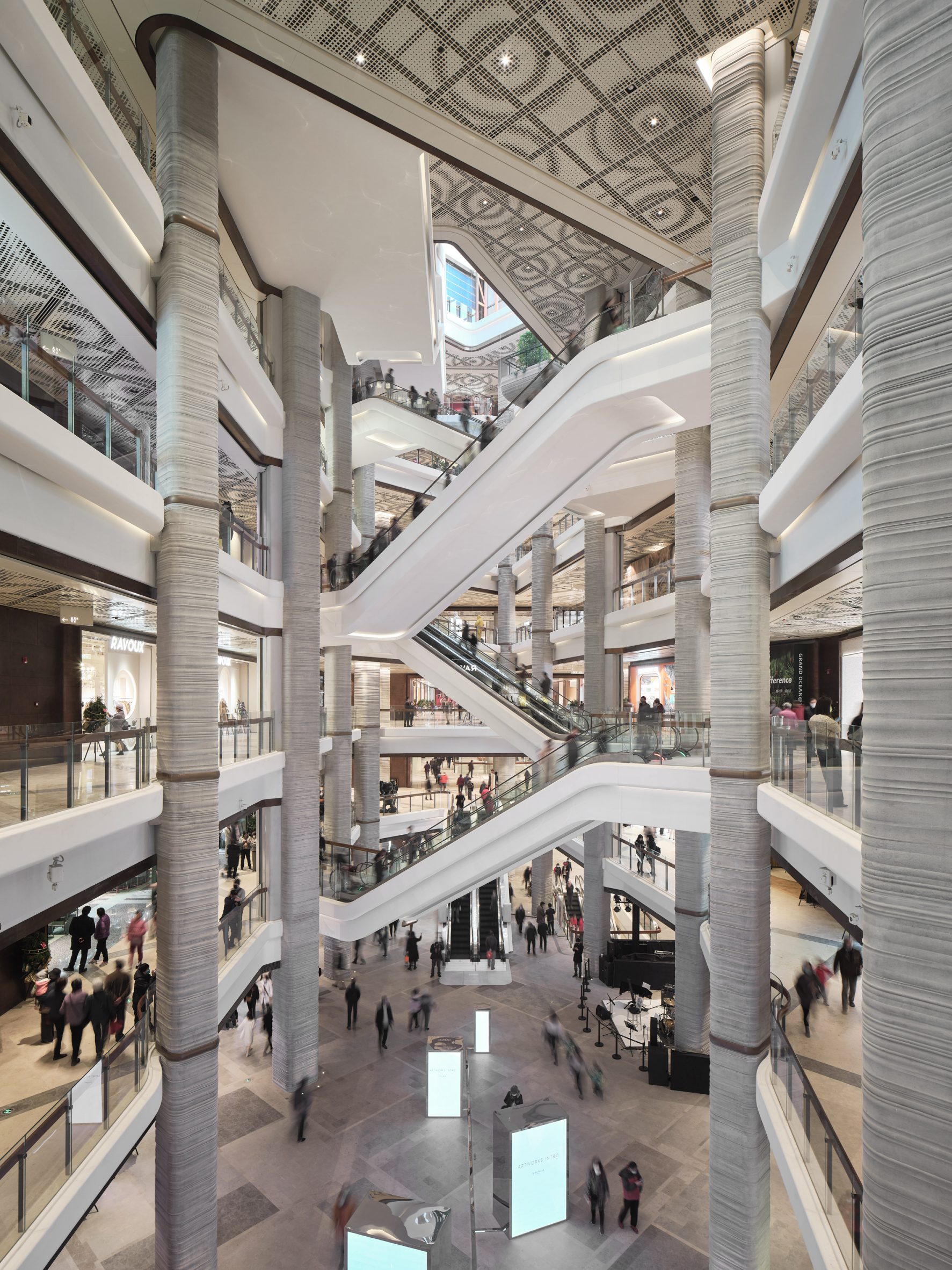
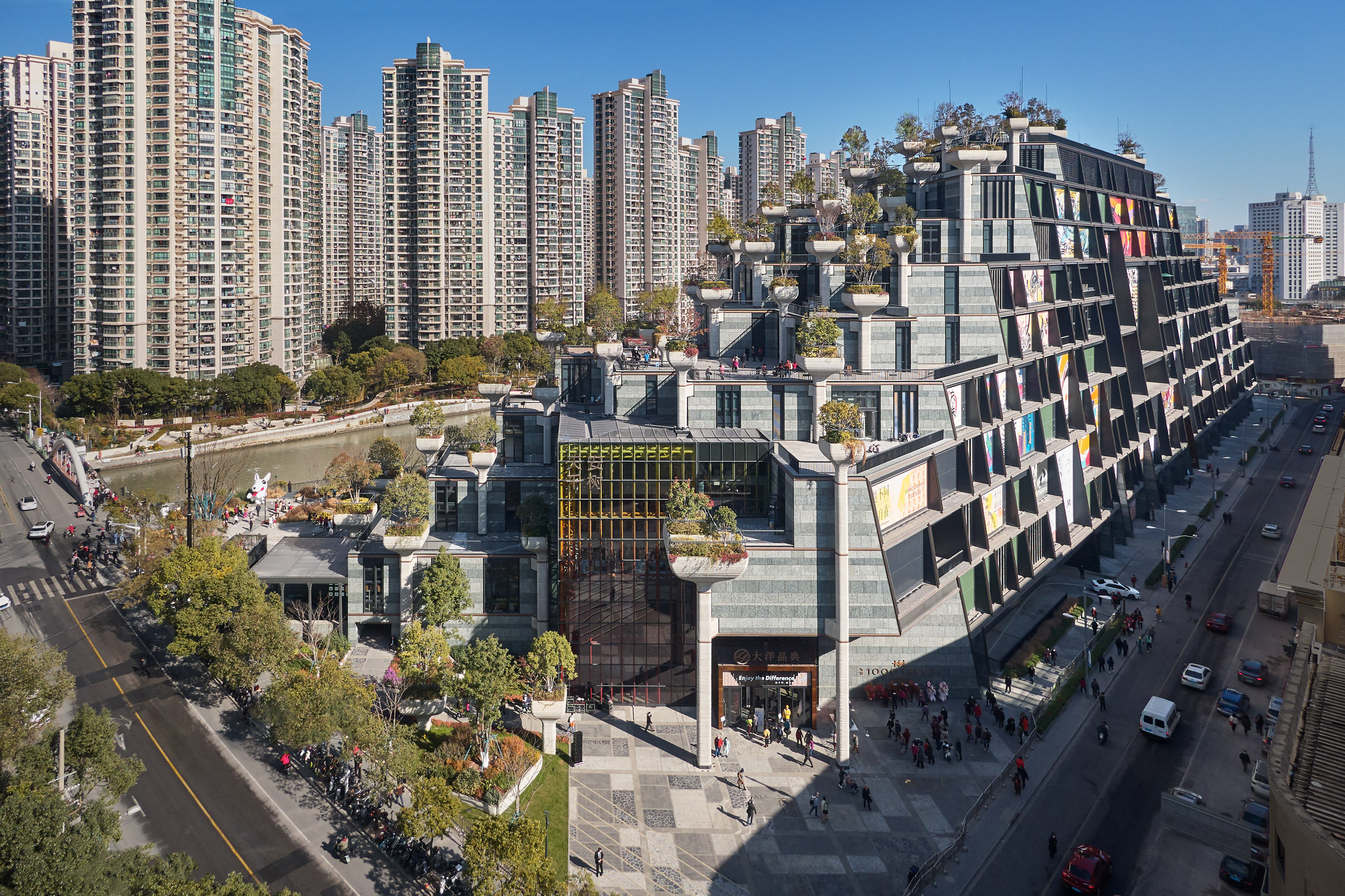
With Thomas Heatherwick's controversial 1,000 Trees project recently opening in Shanghai, the British designer told Dezeen why he believes the top of structural columns is "the best possible place" to plant trees in this exclusive interview.
Heatherwick designed the project to be a distinctive shopping centre that he hopes will become the "heart of a district that had no heart before."
"Typically, big building projects like these are big, sterile blocks," Heatherwick told Dezeen.
"Mixed developments with shopping and restaurants can weirdly sterilise places in spirit. We didn't want to be the people that built a big cheesy wall next to the main art district."
By covering the building in trees, Heatherwick aimed to both "humanise" the project and add environmental benefits in a way that the designer claims is preferable to "heavy" green roofs.
Nature "affordable way" to make complex facades
As the name suggests, the shopping centre is covered in 1,000 trees and 250,000 plants supported in large planters that sit at the top of the building's structural columns.
According to Heatherwick, this planting has many environmental benefits, but also contributes to breaking down the scale of the large building.
Top: 1,000 Trees recently opened in Shanghai. Above: it was designed by Thomas Heatherwick
"The integration of plants was in response to the scale," said Heatherwick.
"How can you affordably build in the complexity that your eye needs to have variety and human scale rather than monolithic imposition in every way," he continued.
"So every part of the project, we've looked at how we can break that down. To me, integrating nature is a very affordable way to get complexity and movement into the facade."
Green roofs have "little actual contribution" to architecture
Although a simple green roof may give similar environmental benefits, Heatherwick argues that the trees on this project add to the overall architectural impact.
"There's a tendency to think greenery is only for environmental reasons in terms of greenhouse gas emissions – and those are benefits – but a big part of the reason in this project is the emotional engagement, to humanise it," said Heatherwick.
"A sedum roof, or something like that, has little actual contribution to the larger architecture that we all experience."
The column supporting the plants form the building's structure
Heathterwick also argues that placing the trees at the top of the columns is a logical structural decision due to their weight and the weight of the soil required for planting.
"If you look at buildings with wholehearted green roofs, the challenge is that that green is very heavy," said Heatherwick.
"The best possible place if you want something heavy on top [of a building], is to put it on top of the column, don't put it on the beam, then that load goes straight to the foundation. So there was an efficiency to that," he continued.
"The load is transferred straight onto the columns, the irrigation and illumination, and they're all accessible."
"Typically, the architect's role is decorating the box"
The nine-storey shopping centre, which contains 166 stores and restaurants, was designed to look like a greenery-covered mountain.
Along with the numerous trees and plants, the exterior of the centre is covered in balconies, meaning that there was no need to wrap the building in cladding.
The shopping centre is topped with trees
"Typically, the architect's role is decorating the box," said Heatherwick.
"So it's playing out how are we going to do louvres, are we going to do frit on the glass. What if we could, instead of playing the game of spending the money on this box – we hate cladding, everything's covered in cladding these days – what if the hero isn't cladding and we just let the structure be that hero."
The shopping centre officially opened in December and according to Heatherwich it is being visited by 100,000 people a day. Overall, he sees this traffic as vindication that the project has engaged the local people.
"This was driven by making something that we hope is engaging people," he said.
"I think the 100,000 people a day are proof that we all need places that trigger a response. "
Read on for an edited transcript of the interview with Heatherwick:
Tom Ravenscroft: What was the overall idea for the project?
Thomas Heatherwick: What was exciting for me about the project was that it wasn't in the conventional, high-powered centre of the city. There was a district with a lot of tombstones of grey, faceless towers around with a lot of people, but no real urban heart. There was a river that had been heavily polluted and had just been turned around into something where fish are actually alive again.
Then in the middle of it, there was the main art district of Shanghai with this derelict site next door. There was no real heart to the neighbourhood. The whole point was that it was something that was for everybody. And so how do you make somewhere that will connect with people, that is a gathering spot and that reconnects people with the river.
Typically big building projects like these are big, sterile blocks. Particularly mixed developments with shopping and restaurants, can weirdly sterilise places in spirit. We didn't want to be the people that built a big cheesy wall next to the main art district. How could we allow the spirit of the art district to grow, rather than consolidate its edge.
The second phase is right next to the district. The form comes down to meet the same height as the edges. So it's coming down to the river, coming down to the park, it's coming down to the art district. And on the eastern side, it's coming down. And then on the south-facing side, it's sliced open. So that's where we worked with the 16 different artists, on the aspects of the skin of the building, but then we also work with a number of them inside.
Tom Ravenscroft: So it was important to make a form that would become the heart of the area, and not be a standard shopping centre. Was it important to make a building that grabbed people's attention?
Thomas Heatherwick: When I was originally studying it was like real architecture only happened if something was a museum. I felt that that shouldn't be how we think about the world around us and that the same love could be applied to something that was for a different kind of aspect of our life. Culture isn't just the arts, every aspect of our lives is culture.
And so a place that has restaurants and shops and kindergarten and workspaces and all the different varieties of aspects of life, that's as cultural as you get.
Tom Ravenscroft: How did you decide on the form?
Thomas Heatherwick: Those kinds of mixed-use developments that include shops and things like that, the outside is regarded as not necessary to be meaningful to an area and you get no sign of life.
You know, unless someone puts an advert on the outside, you just get these impersonal sterilisers, unless someone is engaging internally in the commercial activity, and we wanted to make something that contributes in multiple ways.
Pre-Covid, I've found it fascinating that we said yes to working in spaces where we were hermetically sealed in. It seemed bizarre that the place you spend more time in your life used to be your workspace and you spend less time in your home, yet your home was the place with the garden, your home was the place with the balcony.
So why can't workspaces have outdoor space. And so this is why we developed of the design so that we could have hundreds of outdoor spaces, and even a shop space had an outdoor space as well as a workspace.
Tom Ravenscroft: So by creating the hilly form you have lots of outdoor space?
Thomas Heatherwick: What it is making as many terraces, which means you've got activation, external. Instead of looking at a building, which is just a facade decision that a little gang of people has made, you're looking at something that has people using it.
It feels to me that people are one of the best forms of inlivener and you can have, rather than some decision about cladding that I make.
The integration of plants was in response to the scale. How can you affordably build in the complexity that your eye needs to have variety and human scale rather than monolithic kind of imposition in every way.
So every part of the project, we've looked at how we can break that down. To me, integrating nature is a very affordable way to get complexity and movement into the facade. We've got 28 different tree species. We've got hundreds and hundreds of different shrubs and creepers. And those things move.
You know, facades never move. Simultaneously it has a bunch of other benefits. There are more studies than ever or showing the mental health dimension. We're more interested in the mental health impact of place now. So gradually, there are studies that are showing and giving really good evidence that things like street trees, really reduce crime statistics and the mental health aspects, but also reduce noise, take out dust and particles out of the air.
The mental health side and the emotional side was what drove the decisions that led to this. But it happens that there are also other things that we know about. But I am not going to say that those were the starting point. But they are, there's just a whole lot of things in and around that help feel at this scale, a project like this needs, integrating many things into it.
Tom Ravenscroft: So my understanding is that the starting point was a grid of columns and you tried to work out how to take a grid of monotonous grid of columns and make it more intriguing?
Thomas Heatherwick: One thing was this relatively small, but precious art district, then you've got the park next door on the corner of this peninsula, then you've got these two government land plots that we had with a split in the middle. In a way, we were trying to integrate an art district, a piece of scraggy park that hasn't really found its feet. It seems the thing that could stitch them together was that the park could be the key that the nature.
If you look at buildings with wholehearted green roofs, the challenge is that that green is very heavy.
When you start having 800 to 900 millimetres of wet soil, organic roots and tree trunks and plant material, that's a very heavy thing to put on the roofs. So if you put them on a flat roof the beams would have to increase probably by 40 centimetres or something like that.
So the ceilings will get lower as there's a heavy sink, and that's to transfer all that weight sideways till it finds a column that can get down to the foundations.
So there was this parently with these parallel thoughts of how do we get really meaningful nature into this, but then also not have all these forced down ceilings, because we've got big, chunky heavy beams.
Separately, it's sort of fascinating, I think when you get big projects, you go into the car park and there are these columns. You know, when you see speeded up, David Attenborough nature programmes and there's a seed stem growing in the dark as it's coming up from the seed.
It's going there through four storeys of car parking, it's then going to go some past someone in a kindergarten, then it's going to go past someone drinking, someone eating, it's then going to go past someone sitting at a desk working someone else having a meeting further up.
It felt like the story. To make a flexible frame that can be reused over the future that is of a human scale that can really last this nine metre by nine metre grid emerged.
Then it felt like there was something romantic about that column that is the core to holding everything together. Yet that's also the best possible place if you want something heavy on top [of a building], put it on top of the column, don't put it on the beam, then that load goes straight to the foundation. So there was an efficiency to that.
Tom Ravenscroft: So even though it appears to be an elaborate form, you're saying it's based on structural logic?
Thomas Heatherwick: It's great, it's an absolute grid. There are no curves in the building itself at all. Typically, the architect's role is decorating the box. So it's playing out how are we going to do louvres, are we going to do frit on the glass. What if we could, instead of playing the game of spending the money on this box – we hate cladding, everything's covered in cladding these days – what if the hero isn't cladding and we just let the structure be that hero.
That means we can spend less money on the actual thing we would normally call the facades of the project. And that could be more straightforward, most just more normal.
I found that buildings became flatter and flatter. That to me is the big downside of the amazingness of modernism has been the flatness, that's just such a shame to have no shadows, bright spots and curiosity.
You can read buildings too quickly, you can look at them in about 20 seconds, you never need to look at it again. Whereas the best projects, your eye wants to keep looking because you keep seeing more into them. Nature does that just automatically by itself.
Tom Ravenscroft: I think you may have seen some people's criticism of the building – saying that the trees are a gimmick. So how would you respond to people who say that there are more sensible ways of greening a building?
Thomas Heatherwick: This is a three-and-a-half-million-square-foot project. The load is transferred straight onto the columns, the irrigation and illumination, and they're all accessible. Nature has been pushed out of the hearts of our cities. A sedum roof or something like that has little actual contribution to the larger architecture that we all experience. And at this scale, trees, major creepers and shrubs are something that can really impact. This has been driven by human experience and, trying to really make somewhere that people can love.
I think that the world of architecture has been led very much so from a theoretical side, I think for a long time, and not enough from an emotional experience side. And so what's thrilling for me is seeing 100,000 people going every day and engaging with something that is the heart of a district that had no heart before.
We were often not confident enough in the West. We don't actually have the confidence to make places that are so engaging for people In China they have more openness about what's possible,
Tom Ravenscroft: So this is more engaging than a standard green roof?
Thomas Heatherwick: There's a tendency to think greenery is only for environmental reasons in terms of greenhouse gas emissions – and those are benefits – but a big part of the reason in this project is the emotional engagement, to humanise it.
The focus of my studio's work is largely driven by the urge to humanise a world of buildings that I found, astonishingly, unhuman, as I grew up, and looked at new things that were built. You couldn't believe why something got built, and how we allowed it to happen. To be so sort of deaf to how the emotional response would really be, and how people would feel.
So this is driven by making something that we hope is engaging people and I think the 100,000 people a day are proof that we all need places that trigger a response. And you don't have a single response. Everything's got multiple responses and questions and provocations in that. And I think we've spent too much time making places that aren't, don't have enough layers of diversity within them to respond to.
Tom Ravenscroft: So to make it more intriguing?
Thomas Heatherwick: That's what the old buildings that we like have, they have many layers. You don't just look at them and 30 seconds later think I never need to look at this building ever again.
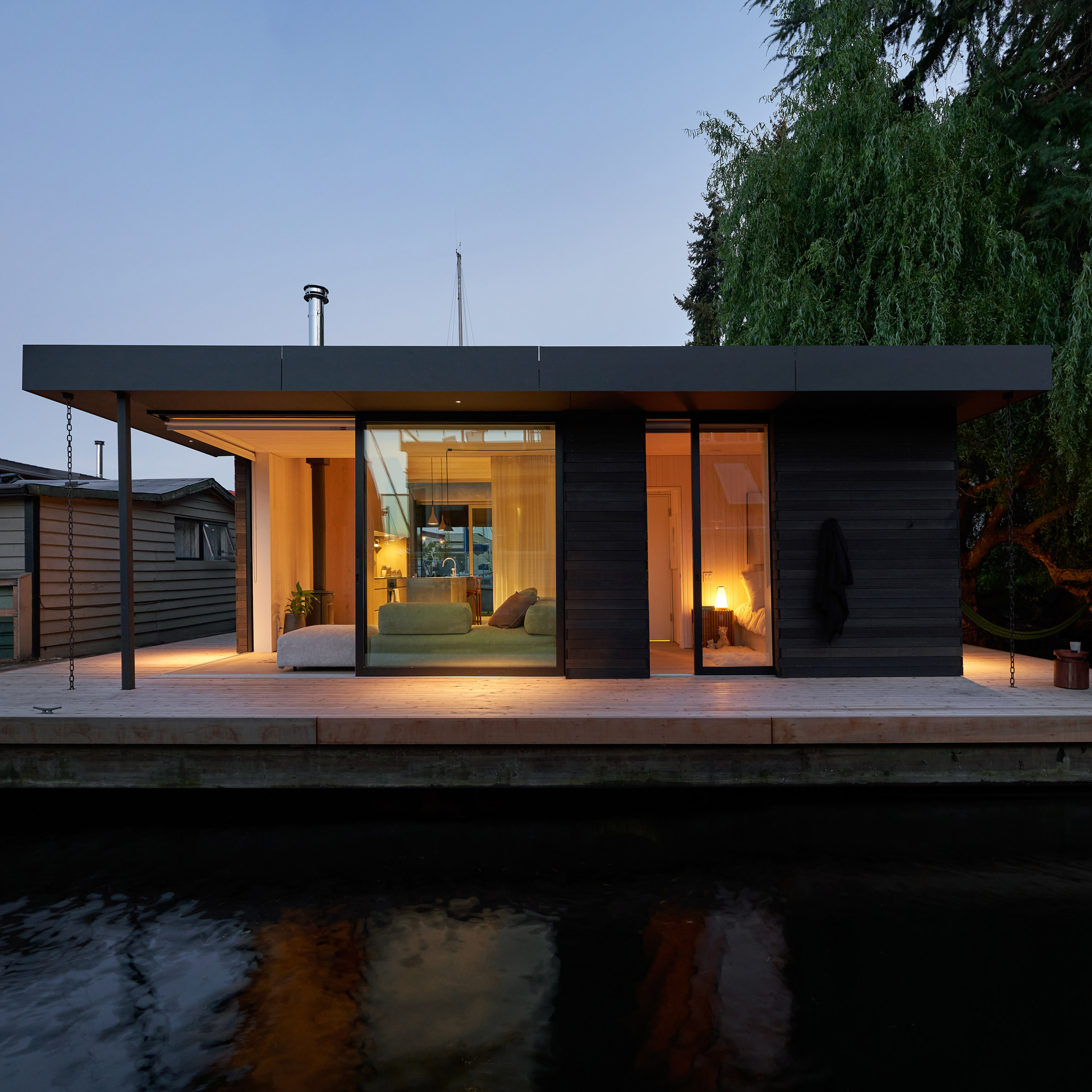
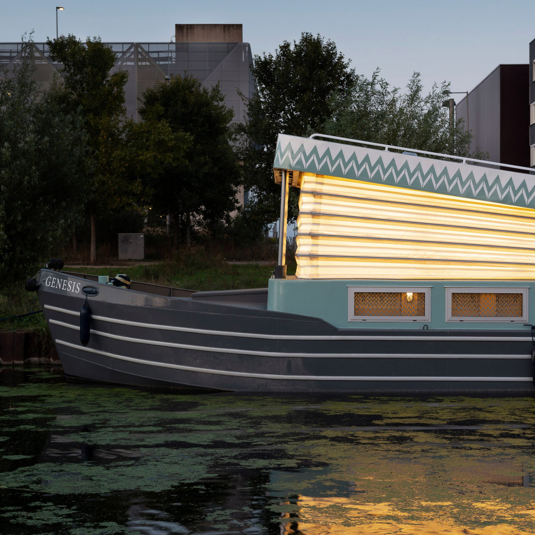
Last week Dezeen featured Bruges Diptych, a floating events pavilion in Belgium that references 15th-century canal homes. Here, we have rounded up 10 other floating architecture projects spanning housing, farms and event spaces.
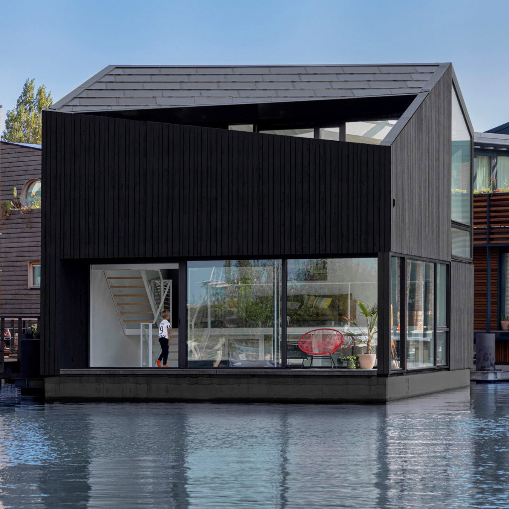
Located in Seattle on the northern end of Lake Union, this house by Studio DIAA looked to traditional floating homes of the area.
The home is square in plan and comprises a single level. It was built on top of a log-float foundation dating from the early 1900s and features a pitched roof and exterior walls clad in cedar and Richlite.
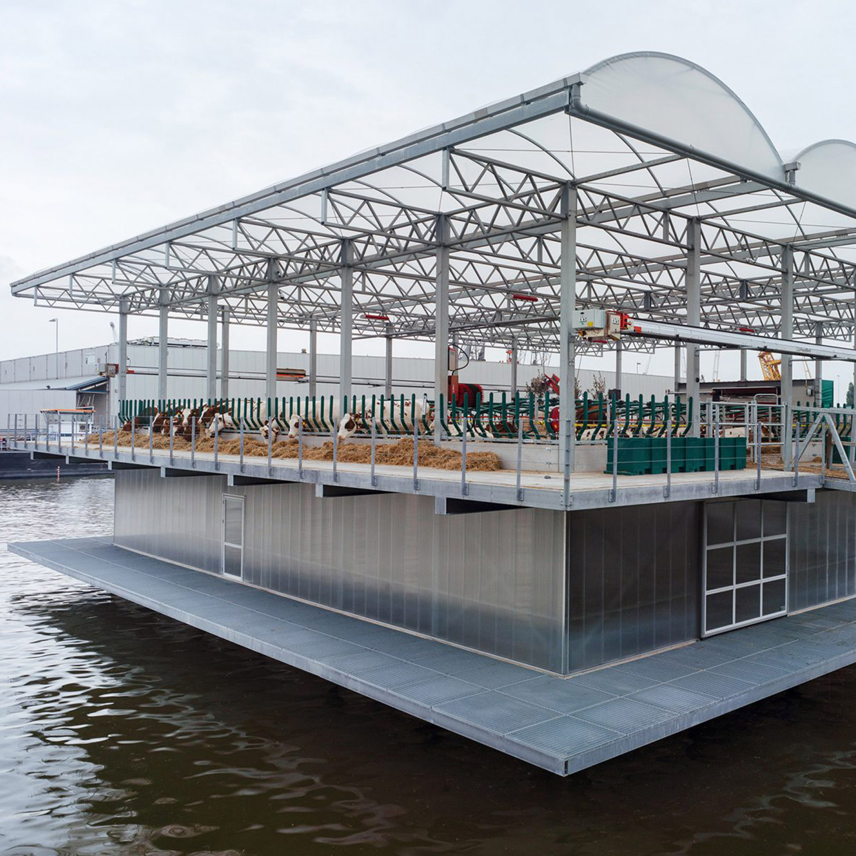
Envisioned and initiated by Peter and Minke van Wingerden of waterborne architecture company Beladon, and built by architecture studio Goldsmith, Floating Farm is a dairy farm in Rotterdam.
It was designed preemptively for a future where climate change and rising sea levels mean that farmland will become devastated by flooding. The structure generates its own electricity from floating solar panels and collects its own water from rainwater irrigation systems.
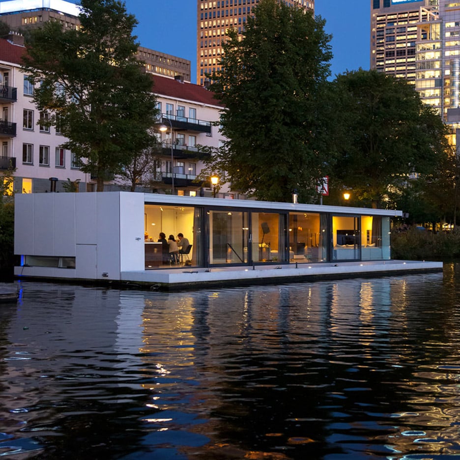
London-based architecture practice Baca Architects designed a boxy wood-clad floating home on Chichester Canal in the south of England.
Developed as a prototype with British company Floating Homes, the structure references the design of typical canal boats, but with an increased scale to create a spacious and luxurious home on the water.
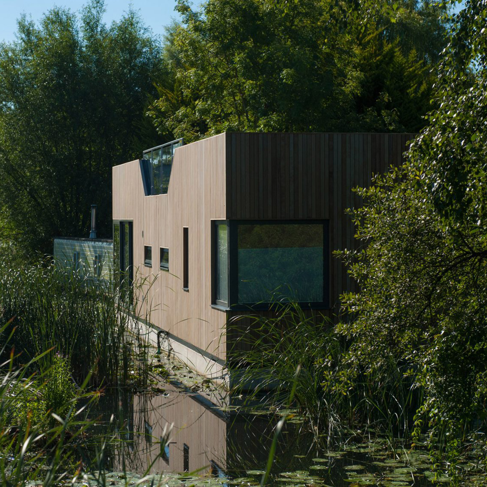
Partly underwater, this floating house by +31 Architects is located along Amsterdam's Amstel River.
The structure forms part of the growing number of Amsterdam's houseboats lining the banks of the city's canals and waterways. It consists of a lower level that is submerged in the river, while an upper storey is located level with the water's surface.
Veetee is a timber shelter floating on metal barrels designed to provide a haven for visitors to the Soomma National Park forest during annual flooding in the springtime.
It was created by interior architecture students at the Estonian Academy of Arts in collaboration with Tallinn-based architecture firm b210 during a 10-day workshop.
Forming part of a floating village, Schoonschip Amsterdam is a floating home that was designed by Dutch architecture practice i29.
The village has been in development since 2010 and intends to be a model for sustainable planning. The two-storey home features angled openings and cutaway corners to provide views across the watery neighbourhood.
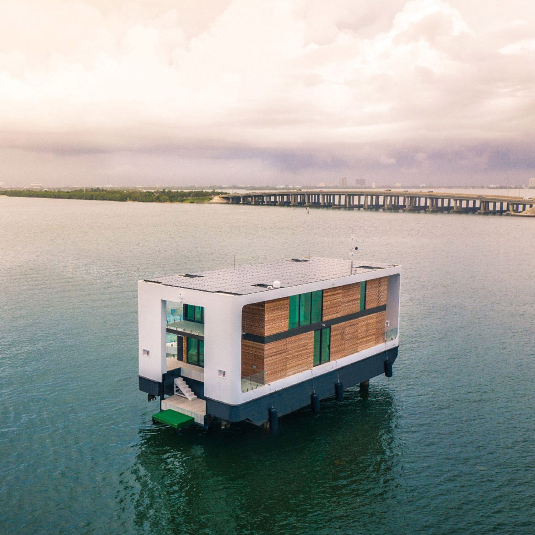
Dutch architecture studio Waterstudio.NL designed a solar-powered electric yacht-cum-villa with extendable stilts that can raise the structure out of the water to become an off-grid home.
"The design was inspired by the way flamingos stand in the water," Waterstudio.NL founder Koen Olthuis told Dezeen. "Only a leg in the water and the body untouchable above the surface."
It was developed by Denizen Works with Turks Shipyard and naval architect Tony Tucker and is characterised by an expandable roof that took design cues from the bellows of a church organ and Volkswagen camper vans.
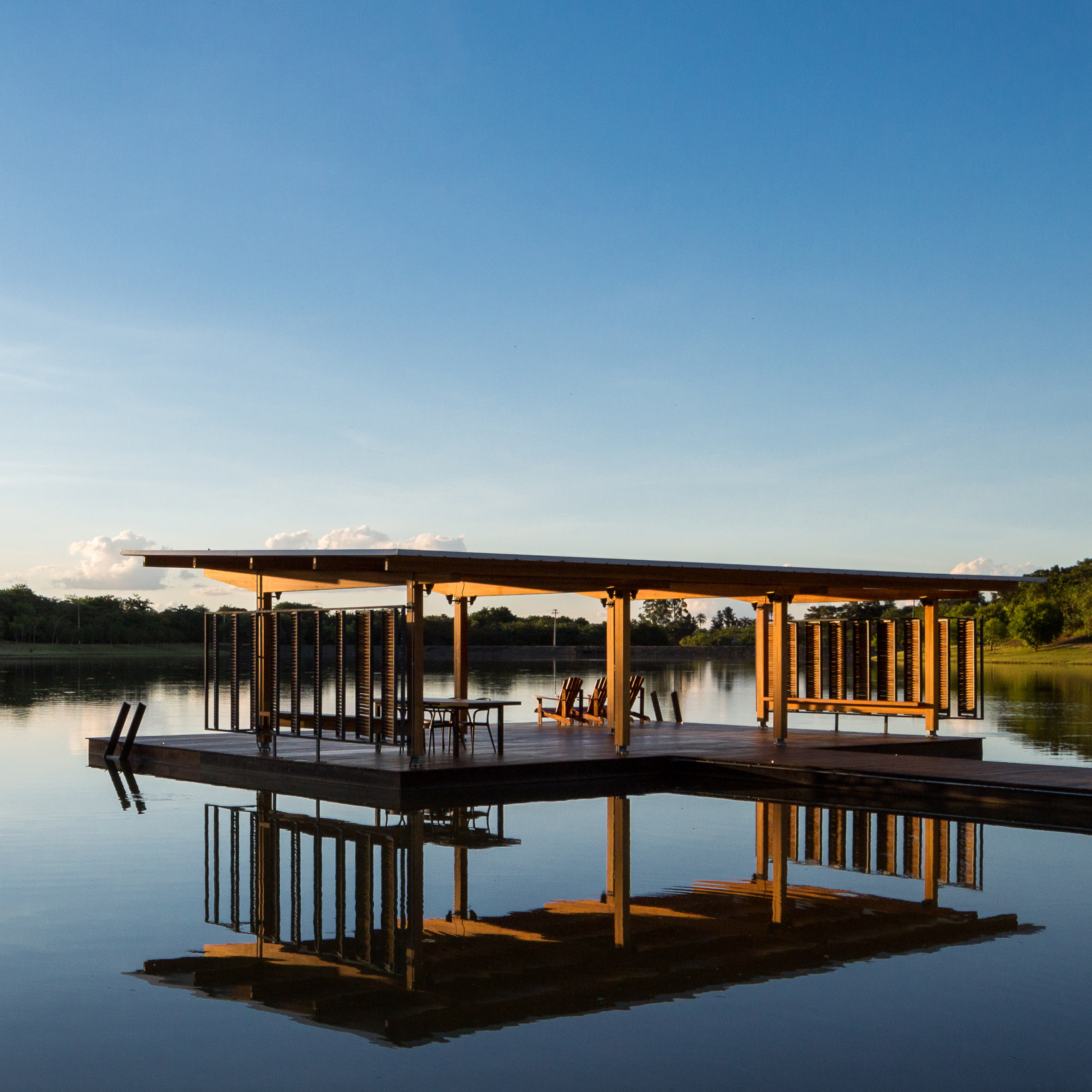
Designed by Brazilian studio Bruno Rossi, this 80-square-metre pavilion was built on a deck that extends across a dam in Brazil's Santo Antonio de Posse.
It was constructed to provide shade and add additional space to the existing jetty, which is used for leisure and nautical activities.
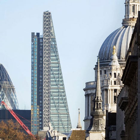
In the fourth exclusive interview that we filmed with Richard Rogers in 2013, the late architect explains the shape of the Leadenhall building and how it was designed to complement London's diverse skyline.
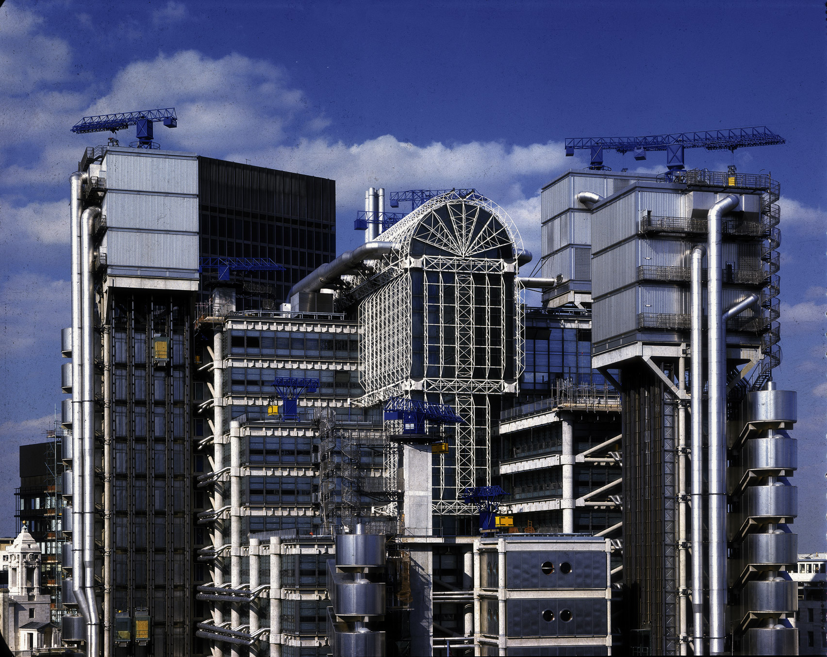
Among his most notable work is the Leadenhall building, an east London office skyscraper completed in 2013 that is known as "the Cheesegrater" due to its slanting, wedge-shaped structure.
It stands opposite the high-tech Lloyd's building, which was completed by the architect in 1986.
During this interview, filmed at the Rogers Stirk Harbour + Partners studio in Hammersmith, Rogers explained the reasons for designing the Leadenhall building so that it is integrated with its surrounding architecture and the challenges involved in attempting to create an interesting-looking office building.
"I think it's really exciting to see the dialogue between Lloyd's of London, Leadenhall and of course, the dome of St Paul's in the background of a totally different period," recalled Rogers.
Read on for a transcript of the interview below:
"Leadenhall office building, which is the tallest building in the city of London, is again a different animal. First of all, it's an office building.
"And that says, as I mentioned, it tends to be very boring. One of the arts of architecture is not only to humanise it, as I mentioned, but also how to use the constraints.
"And in a way, turn them upside down and see whether that can help you to design the building. The main constraints on Leadenhall were the views to St Paul's.
"London is unique in being partly controlled by views. So you have these big cuts, and you have to leave certain views open to St Paul's, and we were on one of those views.
The Leadenhall building has been dubbed "the Cheesegrater"
"Then the only way to build a tall building was to slope out of that. Now you could step out of it, you could cut it shorter, and so on. So we made use of this, and we cut it back – the Cheesegrater as it's now called – at an angle.
"And that gives it that very prominent section, and profile for all over London. We also had a client again, which we got on with very well with, British Land, who are willing to have a seven storey atrium, it's not enclosed. So probably you could call it a seven-storey public space below the building.
"The building itself expresses its system of construction because again, we celebrate construction because it's one of the things in which we get scale. And scale is a critical part.
"I mean, architecture is about scale, it is about rhythm, it's about geometry. It's obviously about beauty. These are all these elements and scale, which is really the size of the hand on whatever you do, is how you recognise size as well as light and shadow.
"It's got 50 storeys. So how you break it down into the scale is critical.
"What's interesting for me in Leadenhall is that whereas we thought Lloyd's was the absolute ultimate and the art of technology, when I look at it now it's handmade practically.
"Now we had pieces taken by truck off-site and so on. Leadenhall was all built off-site, I mean it arrived completely. The structure is less visible because in a sense, it's less important, we're more used to it, the shape is very important, the public space is very important. You can see the wonderful banks of elevators on the backside.
"So the elements which we have got to know well we are using. They're losing a lot of, obviously, flexibility. So we're using that but in a way, which more or less 40 years later than then probably which is very much machine-made.
Lloyd's building is an example of high-tech architecture
"So what the next one will probably be even more, well it will be even more. And it's very exciting to see that dialogue between these two. And actually, I think it's really exciting to see the dialogue between Lloyd's of London, Leadenhall and of course, the dome of St Paul's in the background of a totally different period.
"To me, that's what architecture is about. It's not about fitting it in, as the last building. It's setting up these dialogues. You know, the enjoyment of St Paul's was that it was seen against a very low and rather poor mediaeval background. That was for flourish.
"That's the same as any form of architecture. So it's a dialogue. It's a beauty that comes through contrast."