In this week's comments update, readers are discussing the shape of Amazon's new NBBJ headquarters and sharing their views on other top stories.
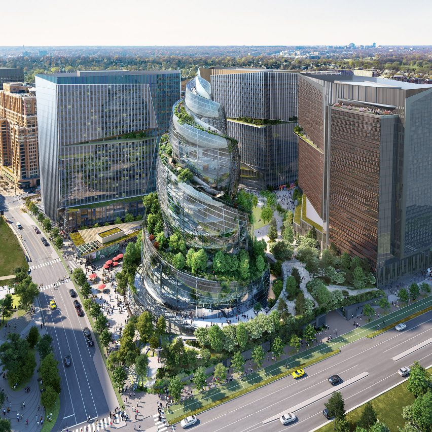
NBBJ has designed a spiral-shaped glass tower for Amazon's new headquarters in Arlington, Virginia.
Named The Helix, the glass tower will be part of a complex of three office buildings, each covered in outdoor pathways for employees to enjoy walking up and down.
"Looks more like the Tastee-Freez HQ"
Readers are amused. "Oh look... it's  ," said Karel.
Only The Lonely agreed: "We have the Gherkin, the Cheese-grater, Can of Ham etc. It was only a matter of time before the poop emoji was designed."
"Looks more like the Tastee-Freez HQ," continued Jim Angrabright.
"Splendid concept overall," concluded Sacrecouer. "Especially the synergy between the indoor and outdoor spaces, as well as sustainability. Now, if people would only concentrate on design, and dismiss infantile associations."
Are readers being immature? Join the discussion ›

"Looks like four cruise ships colliding" says reader
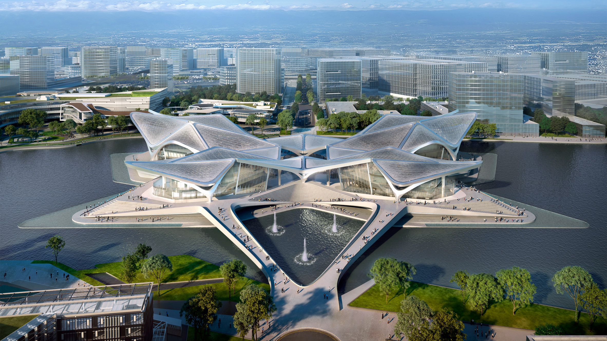
Commenters are critiquing Zaha Hadid Architects' design for the Zhuhai Jinwan Civic Art Centre in southern China. Its roofscape has been modelled on patterns of migratory birds.
"Looks like four cruise ships colliding," said Steve Leo on one hand.
"It's a bit Calatravesque, isn't it?" continued Donacio Cejas.
"I like this," said Heywood Floyd, conversely. "There's a mature tectonic clarity here that makes it believable, along the lines of Leeza Soho. Eye level renderings, considered spatial interplay of the roofs, not enslaved to some abstract parametric agenda. Well done."
What do you think of the Zhuhai Jinwan Civic Art Centre? Join the discussion ›

"Vanity, vanity, all is vanity" says commenter
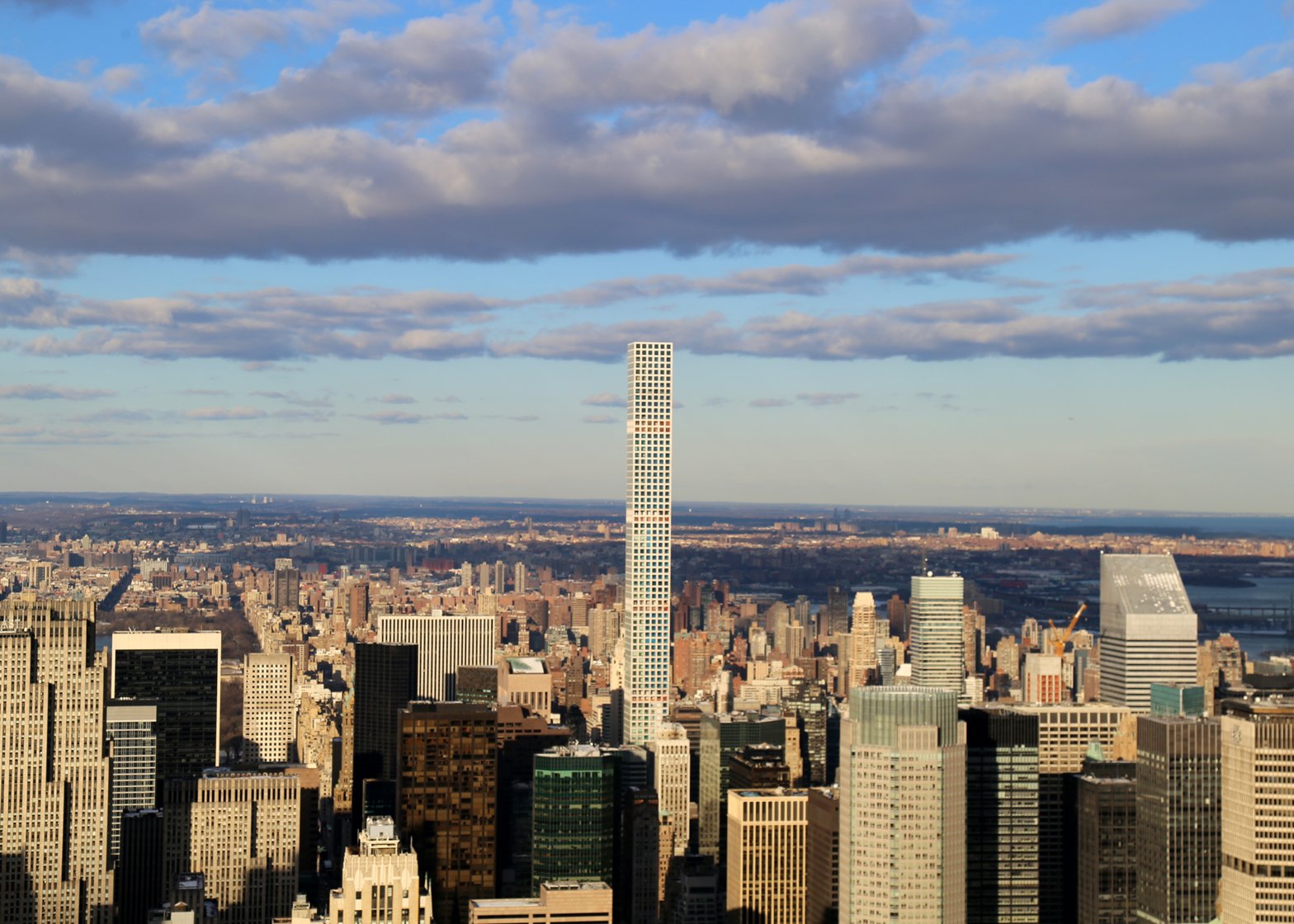
Readers aren't surprised to hear that residents of the Rafael Viñoly-designed supertall skyscraper at 432 Park Avenue in New York have reported "catastrophic" floods and getting trapped in the lifts during windy weather.
"Somewhere, I don't remember where," said Bubba10, "I remember reading about people that tried to build a building too high... a lot of babble ensued."
Chris Becket agreed, quoting: "Vanity, vanity, all is vanity – Ecclesiastes 1-3"
"Time to come down to earth, people," concluded Aigoual48.
Are commenters being harsh? Join the discussion ›

"Looks like a typical masterplan to me" says reader
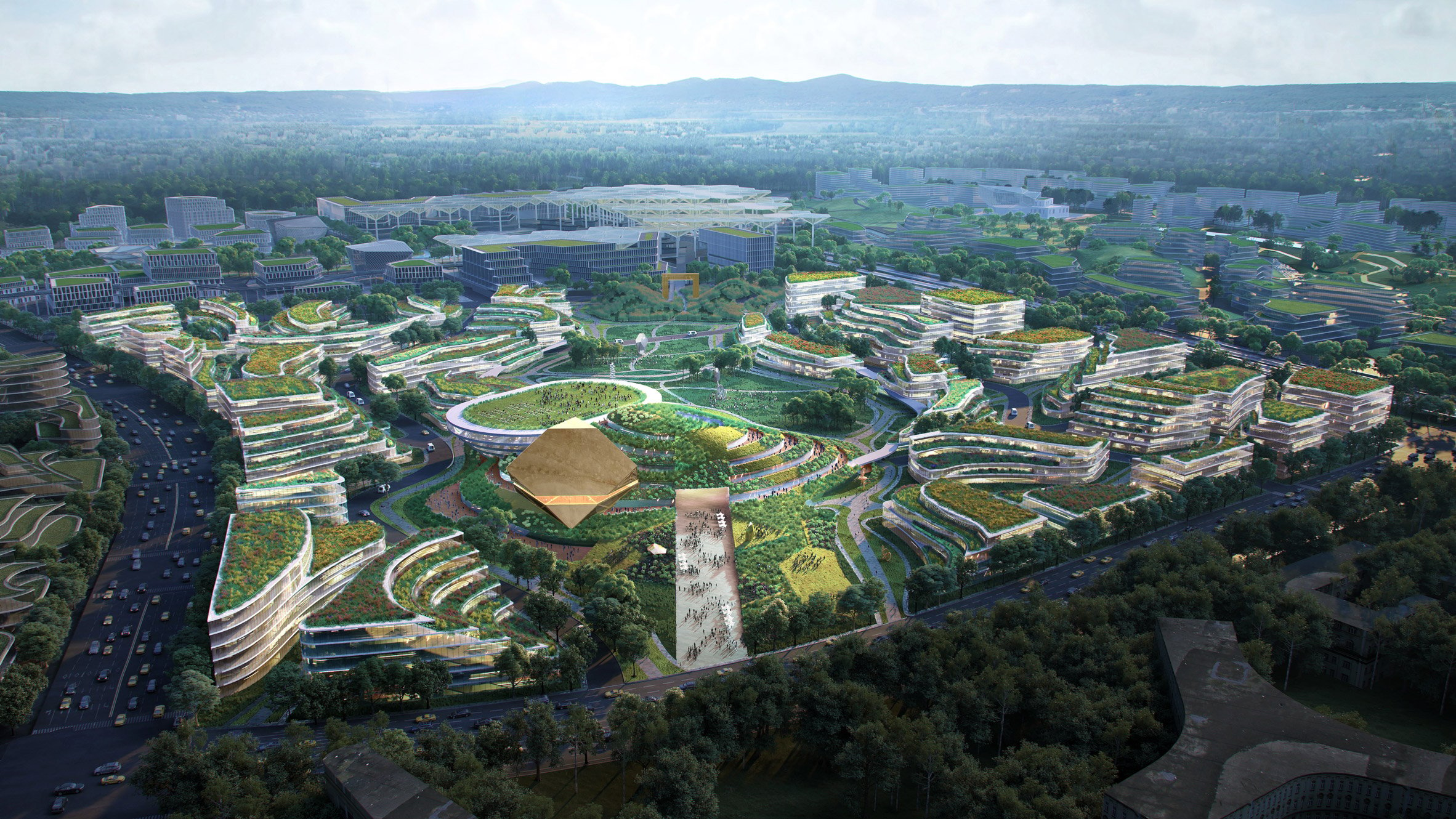
Commenters are debating Chengdu Future City – a car-free masterplan for the capital of China's Sichuan province. It was designed by OMA to focus on the site's existing geography and topography.
"Looks like a typical masterplan to me," said Alfred Hitchcock. "Pretty pictures with no substance."
Dan shared the sentiment: "I love the obligatory 'men in canoes, out having a paddle during their lunch break' nonsense, or the see-through glass everywhere, in an attempt to add life to the lifeless. :("
"Gigantic single-use precincts that will become dead zones outside of operating hours, grand aesthetic gestures to make the image look pretty... How is this different from any other ill-considered architect-driven master plan with zero strategy behind it?" asked Riley Flanigan.
What do you think of Chengdu Future City? Join the discussion ›
Read more Dezeen comments
Dezeen is the world's most commented architecture and design magazine, receiving thousands of comments each month from readers. Keep up to date on the latest discussions on our comments page.
The post "It was only a matter of time before the poop emoji was designed" says commenter appeared first on Dezeen.
from Dezeen https://ift.tt/3jx4z3j
No comments:
Post a Comment