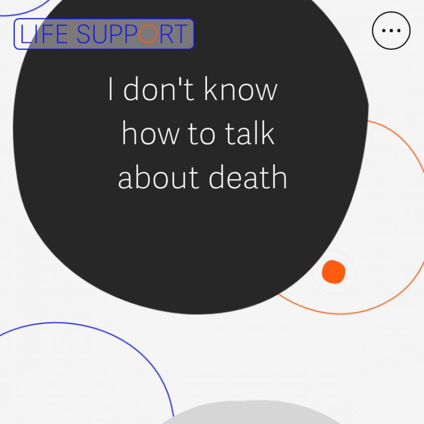
Creative consultancy The Liminal Space has designed Life Support, a mobile-first website designed to help people deal with death using their smartphones.
The Liminal Space designed the website in collaboration with The Academy of Medical Sciences.
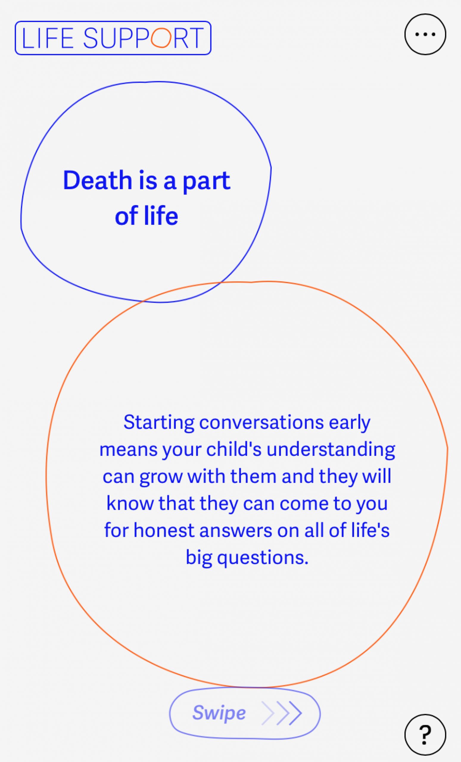
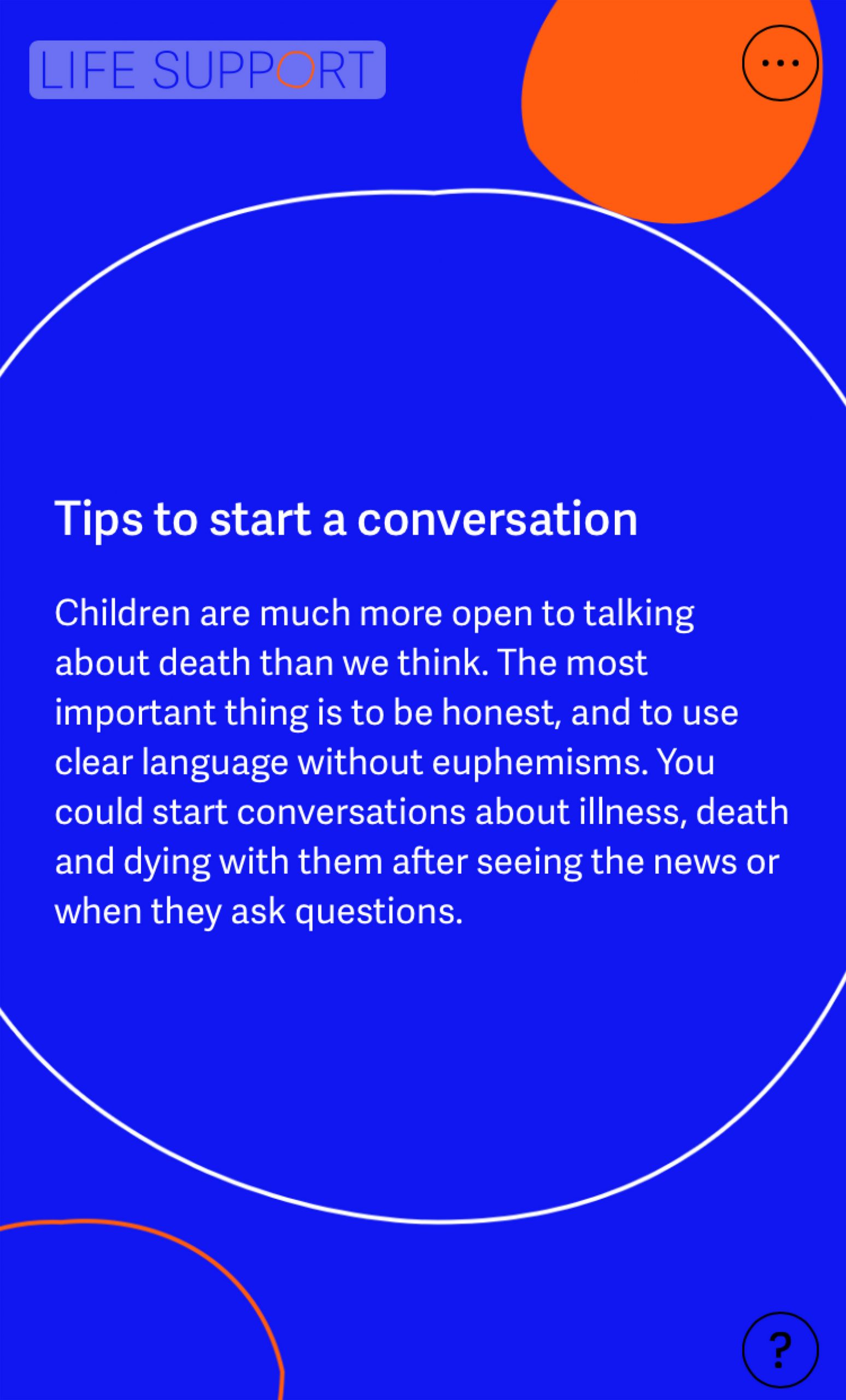
Life Support takes users on a visual journey from greyed-out visuals to multi-coloured information, featuring such as tips on how to talk to children about death and audio clips from experts in palliative care.
The tool was deliberately made as a website and not an app to make it more accessible.
"We developed Life Support as a mobile-first website designed for use on smartphones," The Liminal Space director Amanda Gore told Dezeen.
"This reflects the role they play in helping us start conversations and sharing information with friends and family in our day-to-day lives, and removes the barriers to usage that an app could create," continued Gore.
"The user experience is, therefore, richer on the smaller screen," she said.

The digital tool intends to help the public deal with questions about the taboo subject of end of life, especially during a period where anxiety surrounding death is on the rise due to coronavirus.
Life Support features black, white, blue and orange bubbles that float around the screen on a neutral grey background. The bubbles have statements on them like "I don't know how to talk about death" and "I'm scared to upset my family."
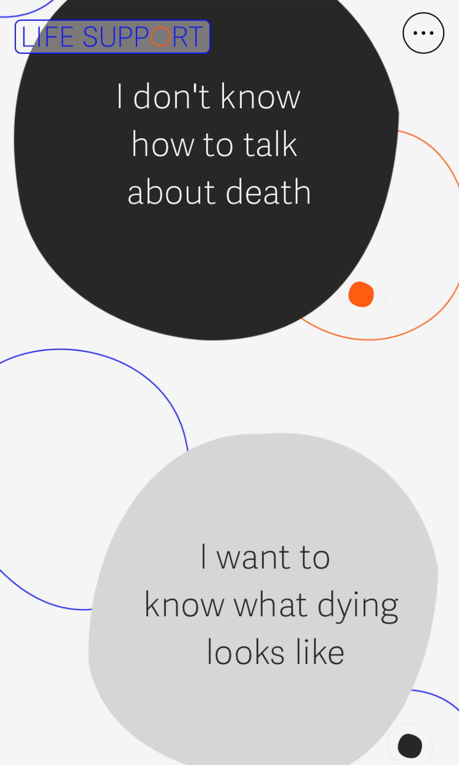
Website users can click on a bubble that is relevant to them, and explore further information on the topic such as people's personal stories, and short audio clips from experts in death such as consultant nurses and spiritual care leaders.
"The intention behind using bubble shapes was to create the feeling of drifting through the site, encouraging personal exploration with a sense of movement," said Gore.
"We also wanted to build a sense of calm and clarity, and so elements such as the subtle animation to the bubbles were used as a method of subconsciously encouraging more relaxed breathing and inviting the user to slow down and pause while they read, listen and reflect," she continued.

The website's tone is intended to balance sensitivity and practicality, ensuring that users are provided with clear information but presented in a way that isn't overwhelming. This is achieved through bold colours and typography, clean lines and simple shapes.
"Blue and orange appealed to us as a gender-neutral palette that would feel accessible for a range of ages, and one that could confidently build throughout the experience to give a sense of progression through the content," explained Gore.
"We liked the idea that things start in black and white but get filled in with colour as your understanding and confidence grows," she continued.
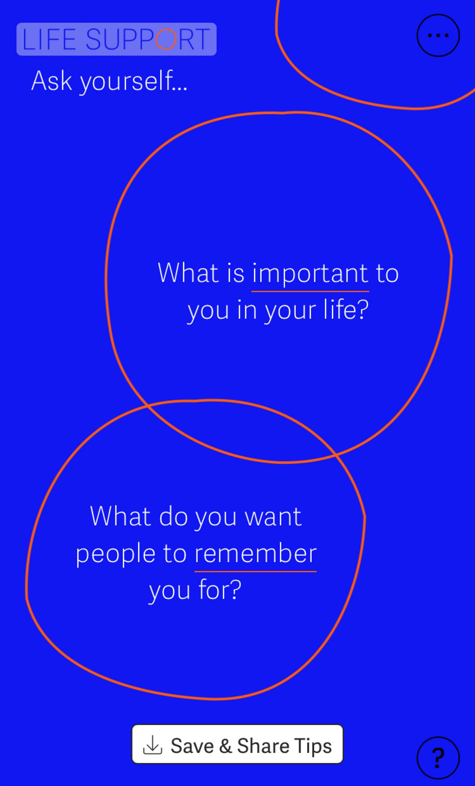
While Life Support is an online tool that people can use alone, it aims to help its users continue conversations about death offline as well.
The idea for Life Support came from an installation called The Departure Lounge, designed by The Liminal Space and showcased in 2019 at Lewisham Shopping Centre in London.
The Departure Lounge is a flat-pack installation set up like a real airport departure lounge, where the public was invited to come and discuss their thoughts about death with a range of hosts and experts.

The installation featured recognisable airport tropes such as suitcases and luggage tags, but with a focus on end-of-life. For example, the suitcases were filled with information about people's experiences of death.
"With death the final destination for us all, we conceived and developed an installation inspired by the idea of travel and journeys – highlighting the fact that like all journeys, the experience can be better or worse depending on how informed and prepared we are," explained Gore.
The Departure Lounge was visited by over 2,500 people in Lewisham, and versions of the flat-pack installation were distributed to a range of places around the UK such as hospitals and local bank branches.
The Liminal Space is a multidisciplinary creative consultancy that was longlisted for Dezeen Awards emerging designer of the year 2020.
More design for death includes Mourning Jewellery, a jewellery collection of pieces made specifically for people to wear throughout their lives so that their loved ones are left with a sentimental heirloom once they have died. Exit Here is a funeral parlour in Chiswick designed to make its clients feel at home.
Images are courtesy of The Liminal Space.
The post Life Support is a digital tool to help users cope with death appeared first on Dezeen.
from Dezeen https://ift.tt/3pwS0pV
No comments:
Post a Comment