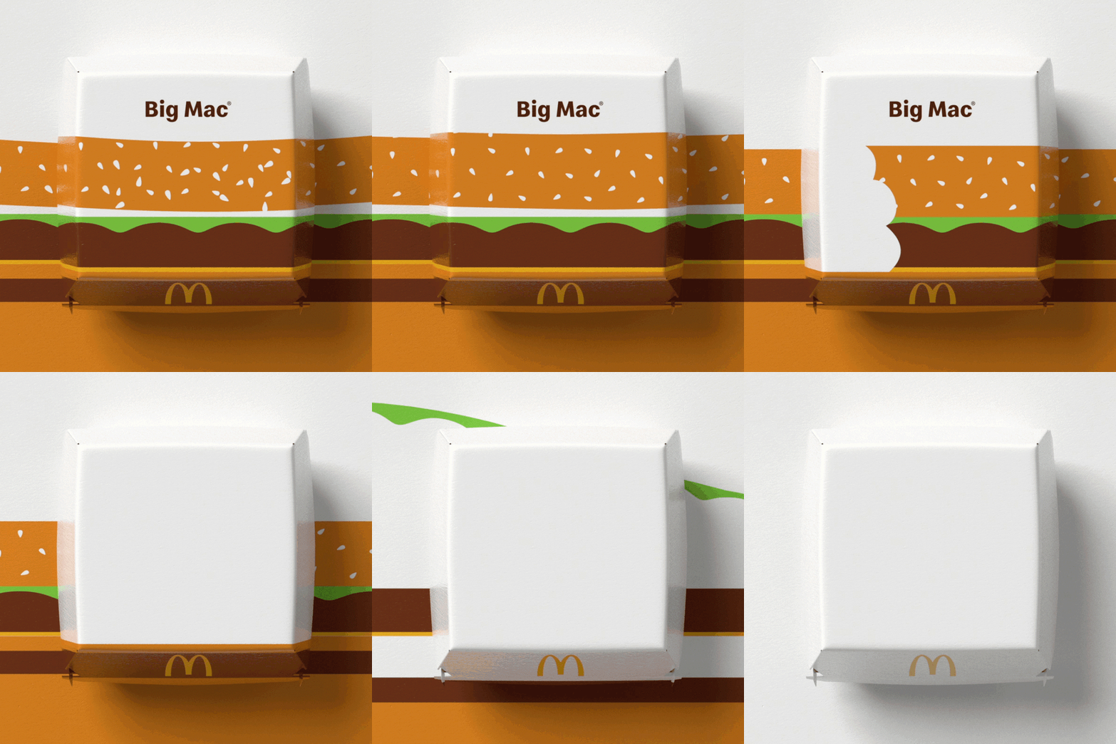
Branding agency Pearlfisher has redesigned the packaging at fast-food chain McDonald's to incorporate illustrations of the restaurant's classic menu items.
Set to be introduced across all of its global restaurants, the revamped packaging was designed to reflect the "innate joy of the McDonald's".
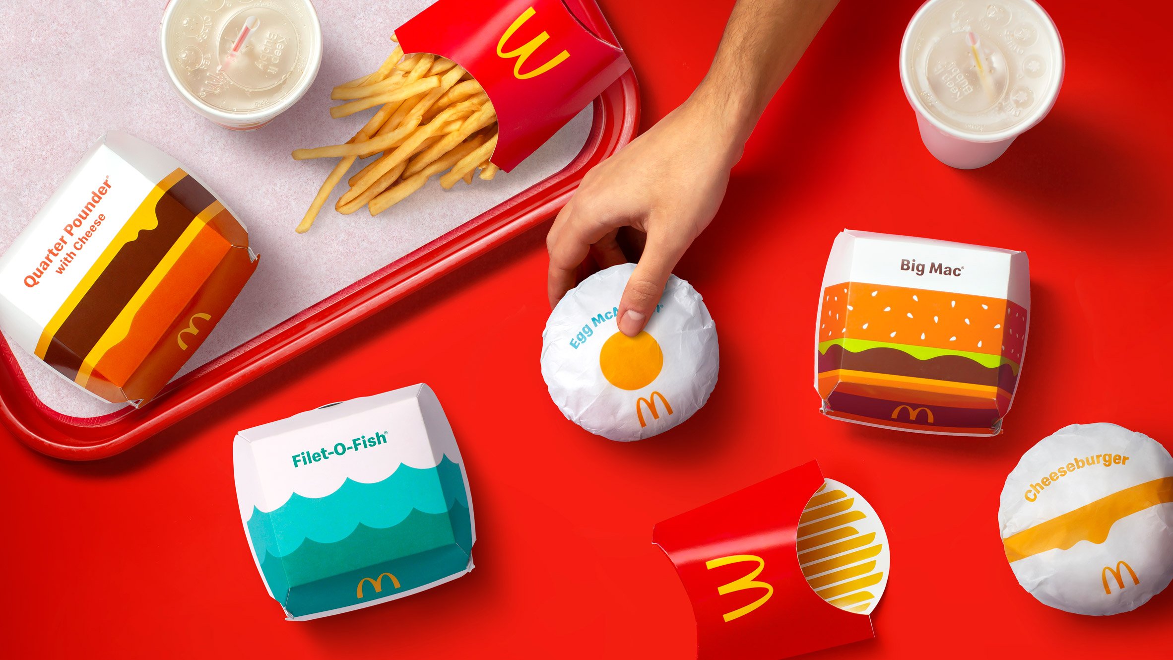
Each item will now be served in packaging that contains a bright and simple graphic design representing the food inside.
"We were very excited to have the opportunity to bring the innate joy of the McDonald's brand back into the packaging by allowing each unique menu item to speak for itself," said Hamish Campbell, executive creative director at Pearlfisher.
"The bold graphic representations of menu items help make each piece of packaging more connected and evocative of McDonald's' playful point-of-view while bringing delight and ease to the brand," he told Dezeen.
Pearlfisher worked with McDonald's to develop recognisable graphics that easily communicate what menu item the packaging contains.
"We strategically looked for the most direct way to communicate a playful and immediate expression of the product," explained Campbell.
"Anchored and inspired by the Golden Arches, each and every menu item is given the opportunity to appear as its best self: telegraphic, bold, and simple," he continued.
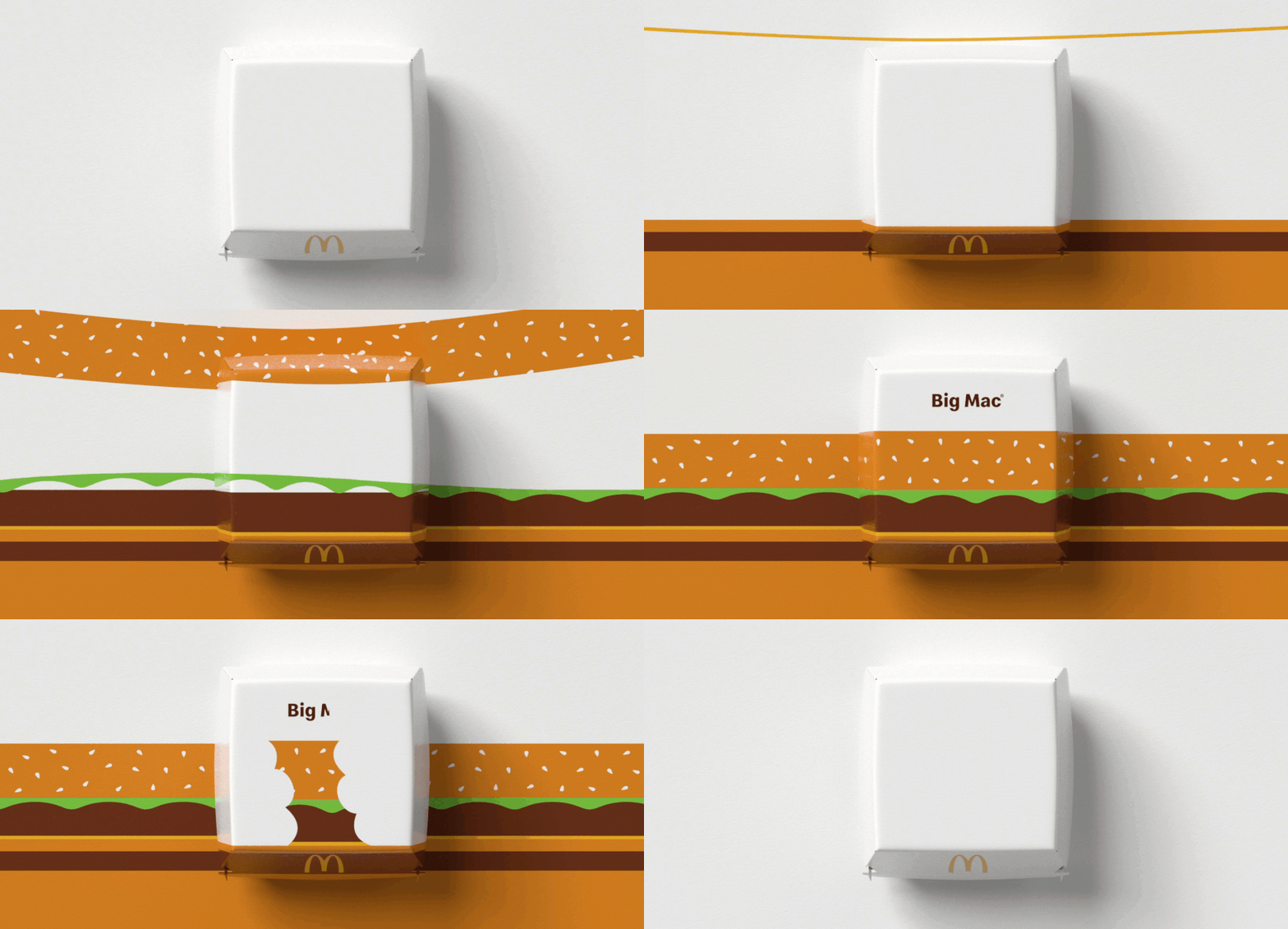
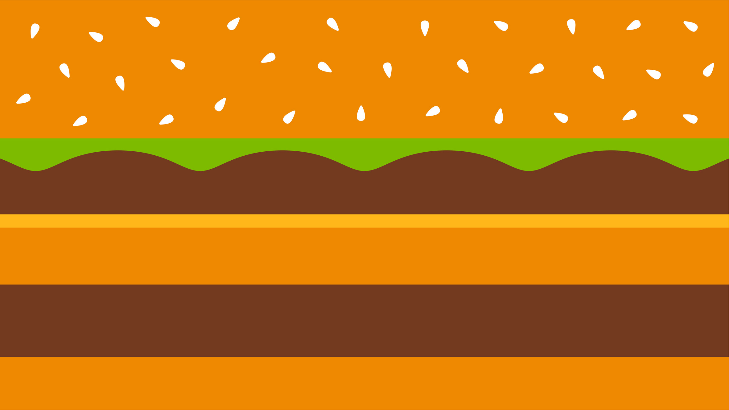
For some products, like the Big Mac, Pearlfisher created an illustration that is a direct interpretation of the food, while other graphics were informed by the item's most significant ingredients.
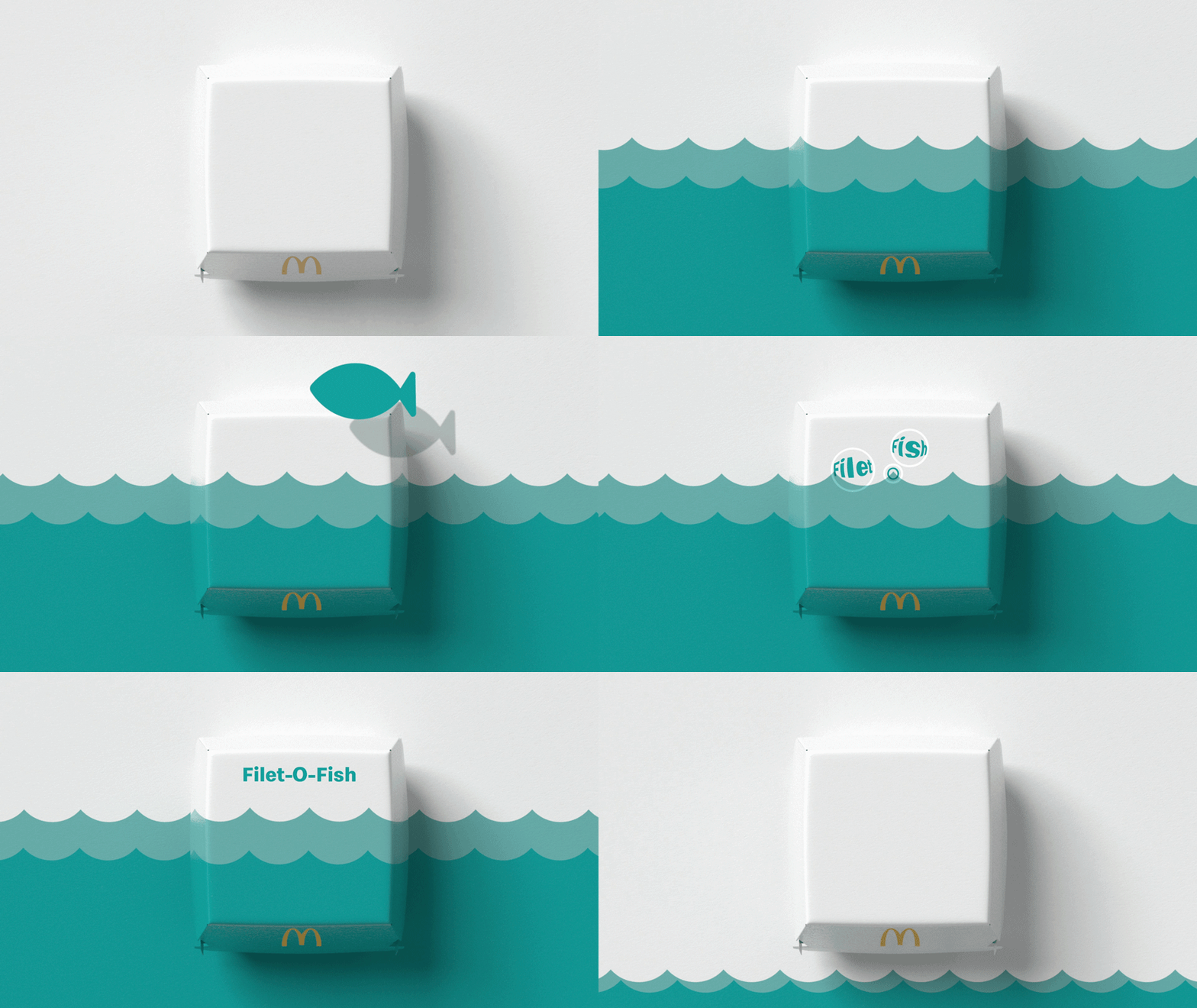
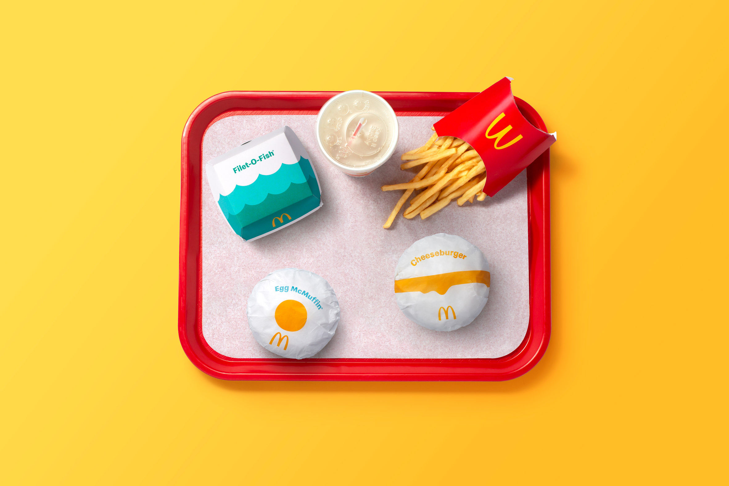
The Cheeseburger wrapper now has a single, dripping yellow line across it to represent cheese, the Egg McMuffin a single yellow circle to indicate a yolk, while the Fillet-O-Fish is covered with turquoise waves.
"Crucially, these aren't literal interpretations of the menu across the entire system," said Campbell.
"For some items, the most fun aspects are the ingredients that make them – and for other items, it's the way they make us feel."
"For the Filet-O-Fish, there's an obvious illustration choice to use a fish, waves were actually the most playful way to bring the sandwich to mind," he continued.
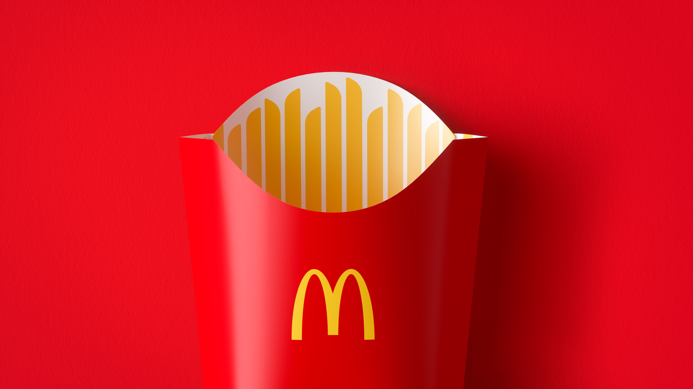
Pearlfisher designed the illustrations so that the items can quickly and easily be recognised by customers and those packaging the food, wherever they are in the world.
Alongside the graphics, the simplified packaging will only contain the item's name and the McDonald's M logo.
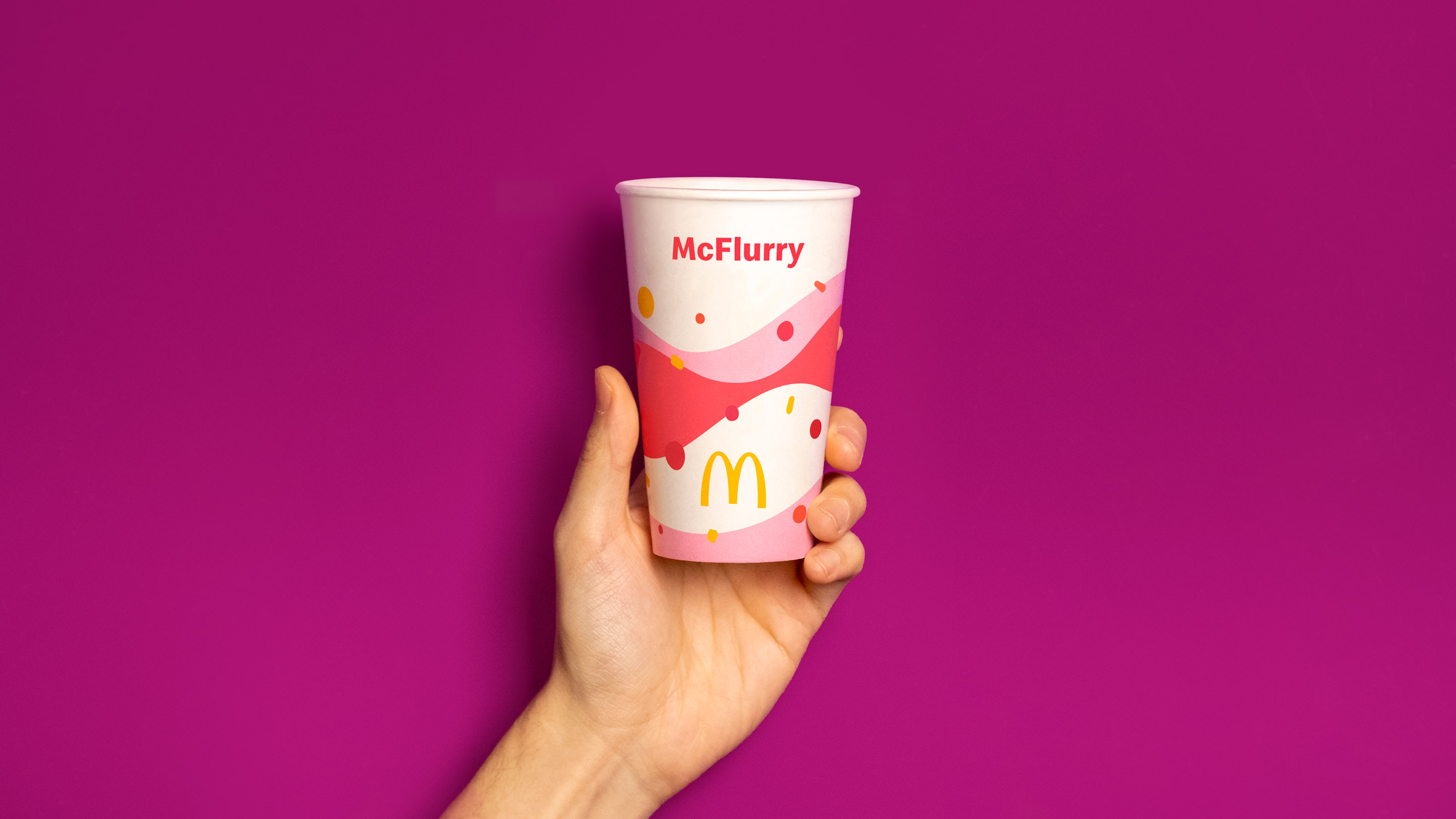
"Simplicity was such an important motivator for us because of the need to work in different markets and resonate universally," Campbell said.
"The beauty of the system is that it draws on the recognition of iconic equities from McDonald's and their menu through the combination of playful illustrations, modern colours and the product name – nothing more than there needs to be."
"This is a prime example of less is more. Not for the sake of ease, but to best serve customers across 60 million touchpoints every day," he continued.
The redesigned packaging will replace the "striking and in-your-face" packaging designed by branding agency Boxer to function as a "mobile billboard" for the fast-food chain, which was introduced in 2016.
Pearlfisher's packaging forms part of an overhaul of the McDonald's brand that has seen it redesign several of its restaurants following the pared-back Ray Concept, developed by Landini Associates.
Recently redesigned restaurants include the "the ultimate McDonald's" on Times Square and the Chicago flagship restaurant, which drew comparisons to Apple Stores when it opened.
"The development of the new packaging design took place in parallel with the brand refresh," said Campbell.
"From new product innovations to the way we order, the experience of enjoying meals at McDonald's is evolving," he continued.
"We wanted the brand personality to also be driven through the packaging – the smile brought on by sharing, enjoying a McDonald's meal. Now, the redesigned packaging and identity carry the same iconic, joyful energy as the brand itself as McDonald's looks to the future."
Rival fast-food chain Burger King also recently updated its packaging as part of its first rebrand in 20 years. As part of its retro overhaul, the food items' names are written in a new custom typeface called Flame Sans across their packaging.
The post McDonald's unveils graphic packaging to reflect brand's "playful point-of-view" appeared first on Dezeen.
from Dezeen https://ift.tt/3pFdgKt
No comments:
Post a Comment