Our latest lookbook features retro-flavoured interiors with whimsical pastel colours and symmetrical designs that would be at home in American filmmaker Wes Anderson's films.
As Anderson's latest film, The French Dispatch, hits the cinemas, we take a look at how his distinctive aesthetic has influenced interior projects from Stockholm to Melbourne.
These include a pale pastel-yellow cafe, a swimming pool-like jewellery store and a colourful restaurant, as well as a bar at Milan's Fondazione Prada designed by Anderson himself.
This is the latest roundup in our Dezeen Lookbooks series that provides visual inspiration for designers and design enthusiasts. Previous lookbooks include homes with playful slides, smart storage solutions, stylish plywood interiors and interiors with window seats.
WeWork Weihai, China, by Linehouse
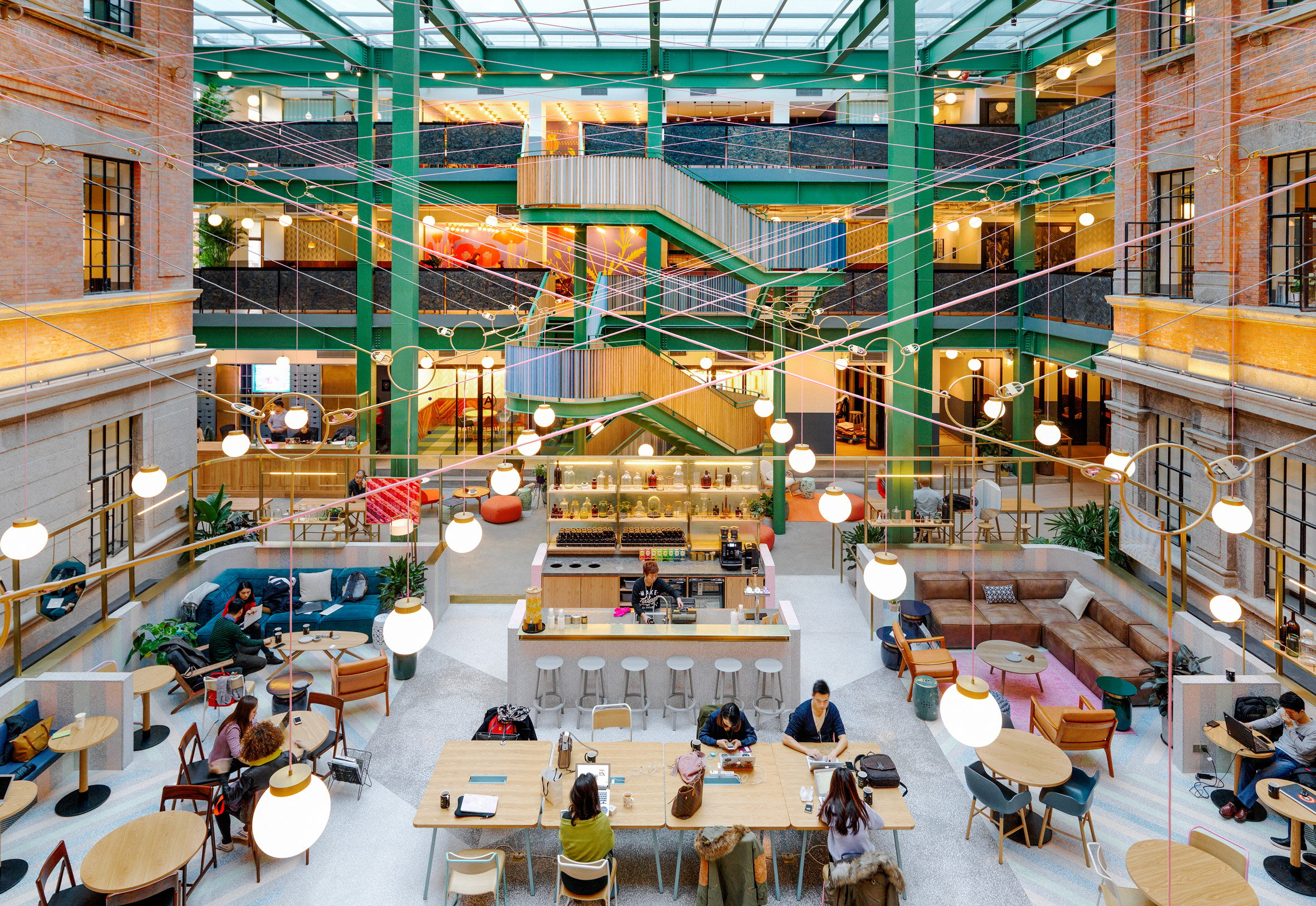
A former opium factory was turned into a 5,500-square-metre WeWork space in Weihai, designed by local studio Linehouse. The studio's design "celebrated the grandeur of the building, encapsulating the feeling of a grand hotel," it said.
The bright colours used for the staircase contrast the formerly derelict turn-of-the-century brick walls, creating a mix between the past and present that Anderson film fans will be familiar with.
Find out more about WeWork Weihai ›
Cafe Banacado, Sweden, by ASKA
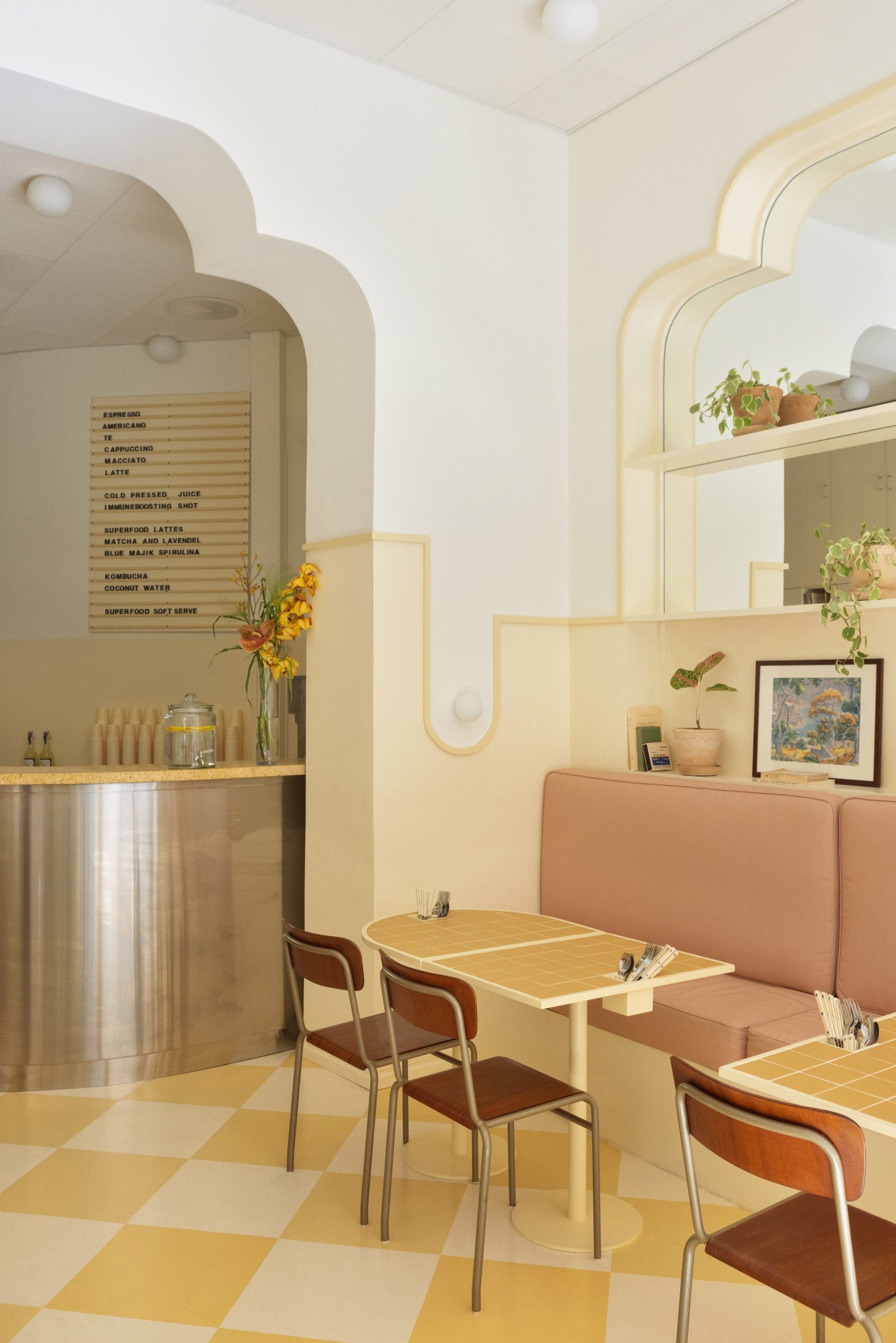
A pale banana-yellow decorates this Stockholm breakfast cafe that was designed to evoke the sun-drenched bars and cafes in more southern climates.
Nostalgic touches such as a vinyl record player and a pink wall covered in Polaroid photos add the perfect retro touch, while decorative arches nod to the late 19th-century design of The Grand Budapest Hotel in Anderson's eponymous film.
Find out more about Cafe Banacado ›
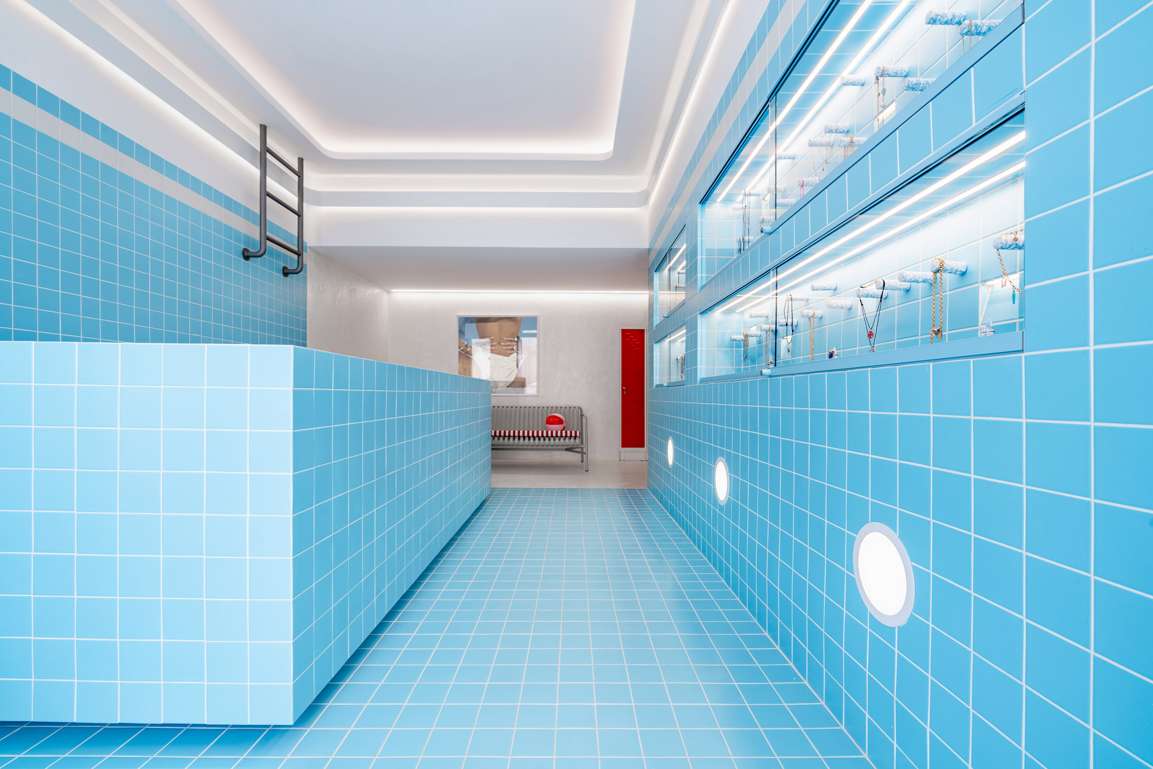
Gavello store, Greece, by Saint of Athens
This jewellery boutique on the Greek island of Mykonos features light blue tiles, lockers and a pool ladder. Its colourful design was created by Saint of Athens and Dive Architects to resemble a "luxury 1960s swimming pool".
"Soft blue, a colour reminiscent of urban pool luxury of the 1960s, furniture made from metal, vintage elements and custom blue terrazzo displays constitute a retro yet modern, Wes Anderson kind of universe," Saint of Athens founder Nikos Paleologos told Dezeen.
Find out more about Gavello store ›
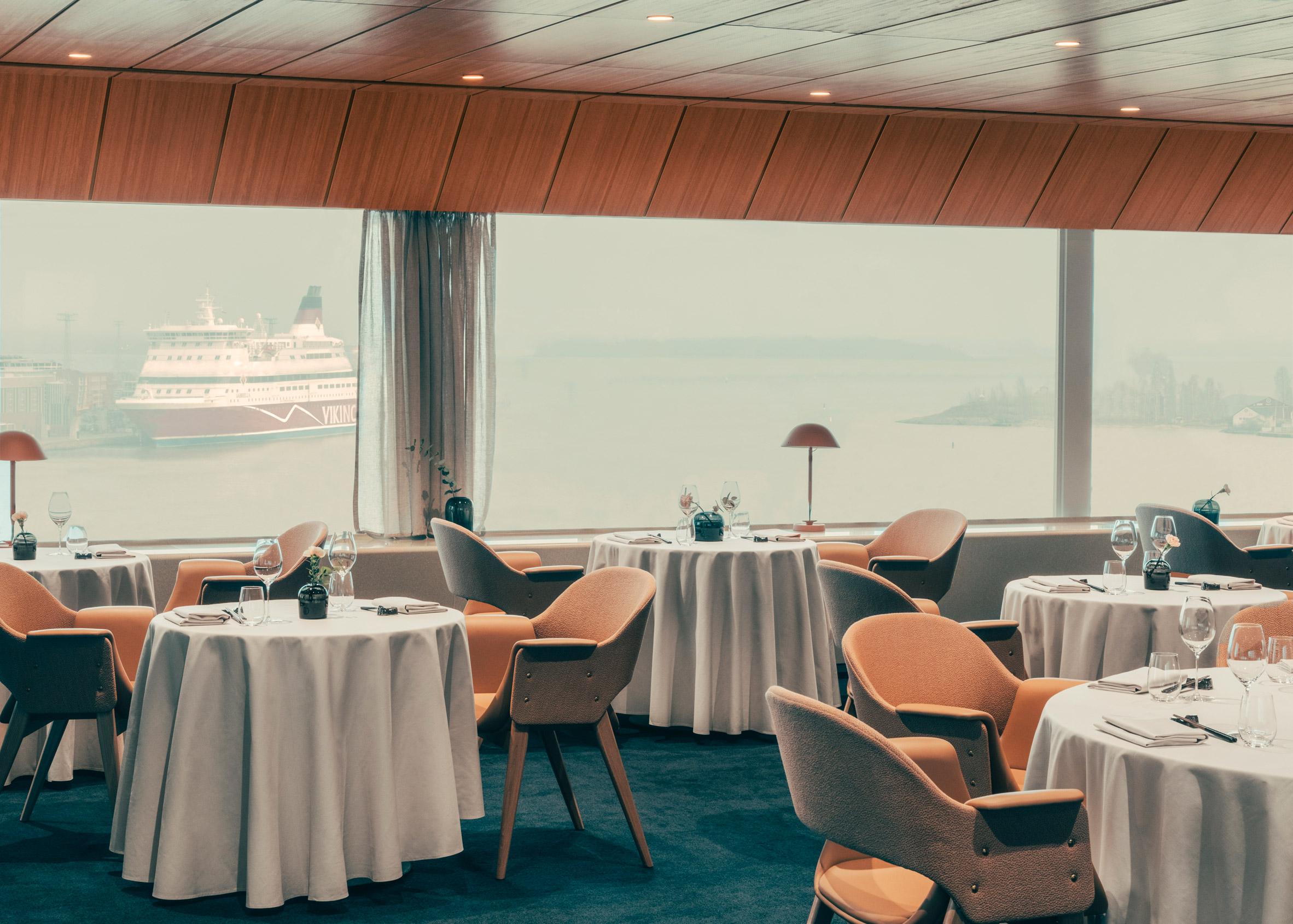
Hotel Palace restaurant, Finland, by Note Design Studio
There's something very cinematic about the dreamy retro interior of the restaurant at the Hotel Palace in Helsinki's harbour.
Renovated by Swedish design studio Note Design Studio, it features a teak-lined scheme and soft pink tones that honour its modernist 1950s design.
Opening in time for the Helsinki Summer Olympics in 1952, the hotel itself resembles an ocean liner and has distinctive yellow neon signage.
Find out more about Hotel Palace restaurant ›
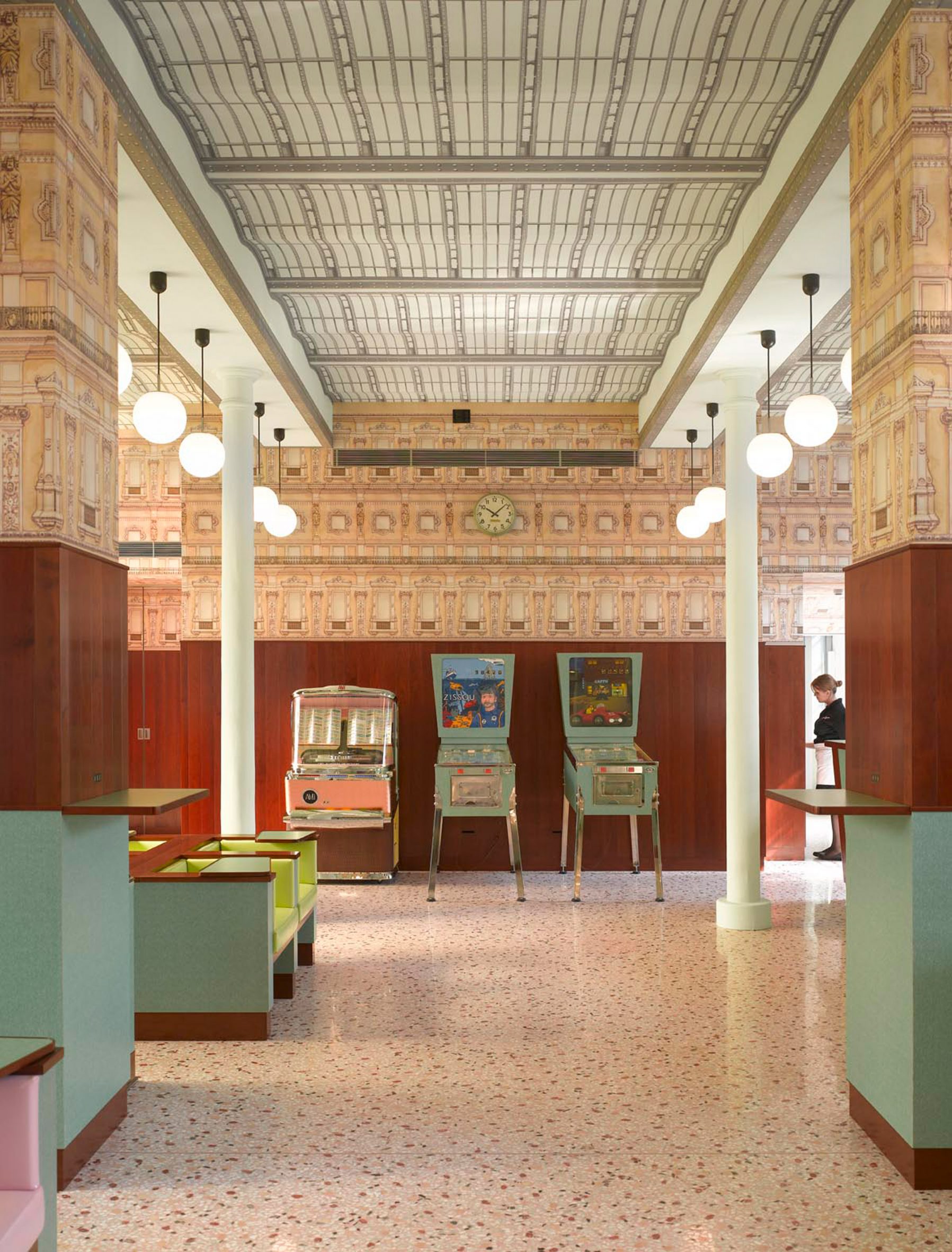
Bar Luce, Italy, by Wes Anderson
When Anderson himself got to design the Bar Luce at the OMA-designed Fondazione Prada in Milan, he drew on the atmosphere of Milanese cafes from the 1950s and 1960s.
The resulting space has colourfully-upholstered Formica furniture, a pink terrazzo floor and a vaulted ceiling covered in patterned wallpaper.
Two pinball machines feature characters from Anderson's The Life Aquatic and Castello Cavalcanti, a short film that he directed for Prada.
Find out more about Bar Luce ›
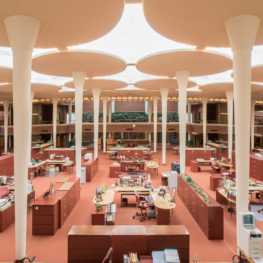
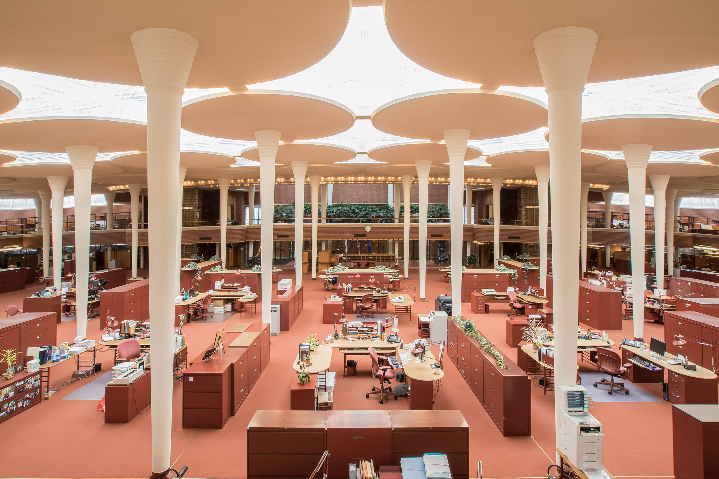
Johnson Wax Headquarters, US, by Frank Lloyd Wright
Iconic architect Frank Lloyd Wright's 1930s design for the Johnson Wax Headquarters in Racine, Wisconsin, looks straight out of one of Anderson's films.
The symmetrically placed filing cabinets and rows of workspaces are offset by quirky, mushroom-shaped columns. Even the name of the main office space – The Great Room – has a cinematic ring to it.
Find out more about Johnson Wax Headquarters ›
The Budapest Cafe, Australia, by Biasol
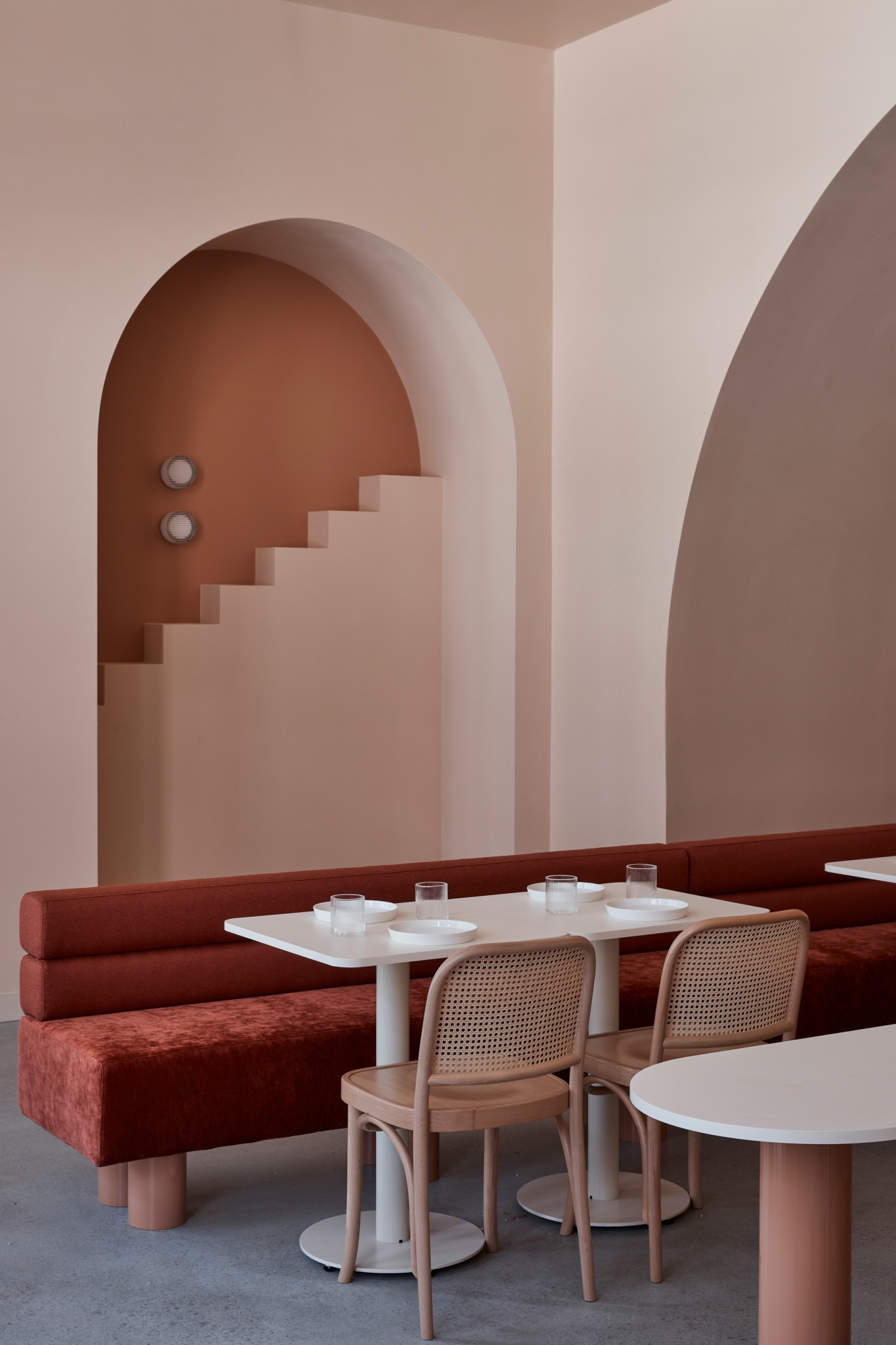
Not The Grand Budapest Hotel but The Budapest Cafe, this Melbourne eatery designed by Biasol has architectural motifs such as stylised decorative steps on the wall and arched alcoves.
Dark terracotta and orange hues contrast against sand and beige colours, while classic bentwood chairs evoke the European cafe culture in the interwar period.
Find out more about The Budapest Cafe ›
Kvadrat textile factory, England, photographed by Alastair Philip Wiper
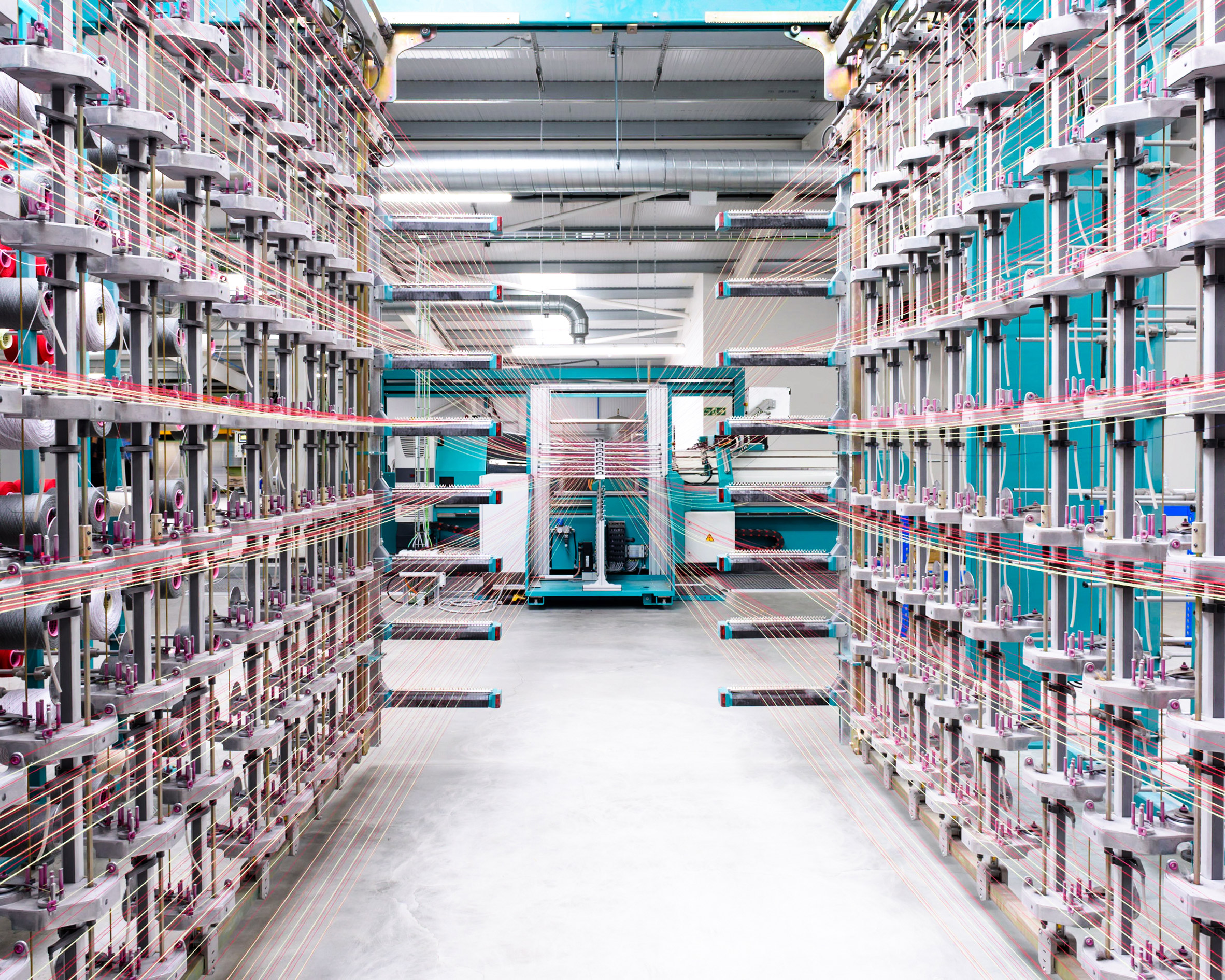
The beauty of the mundane is revealed in British photographer Alastair Philip Wiper's photographs of the Wooltex factory in Yorkshire, which is part-owned by Danish textile manufacturer Kvadrat.
The pink and yellow colours of the thread being fed into a bright turquoise loom, and the repetitive structure of the setup, inadvertently make the factory look very Andersonian.
Find out more about Kvadrat textile factory ›
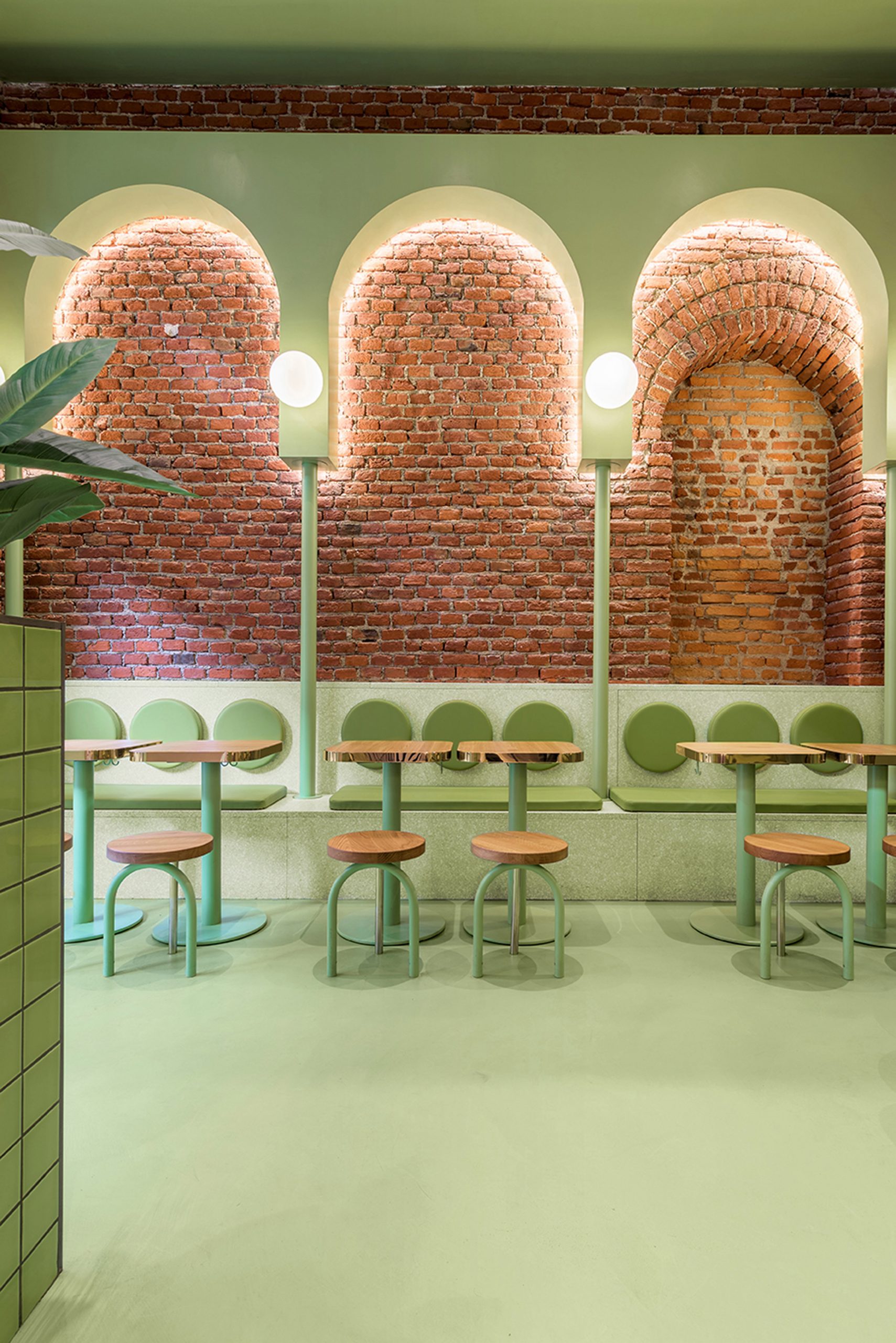
The interiors of Milanese burger joint Bun were designed by Spanish studio Masquespacio to be drenched in colour, with a pear-green area contrasted against a lilac hue used in half the restaurant.
The dining area is completely green and features decorative arches and classic white orb lamps, matching the round stools and backrests on the restaurant seating.
Calistoga Motor Lodge, US, by AvroKO
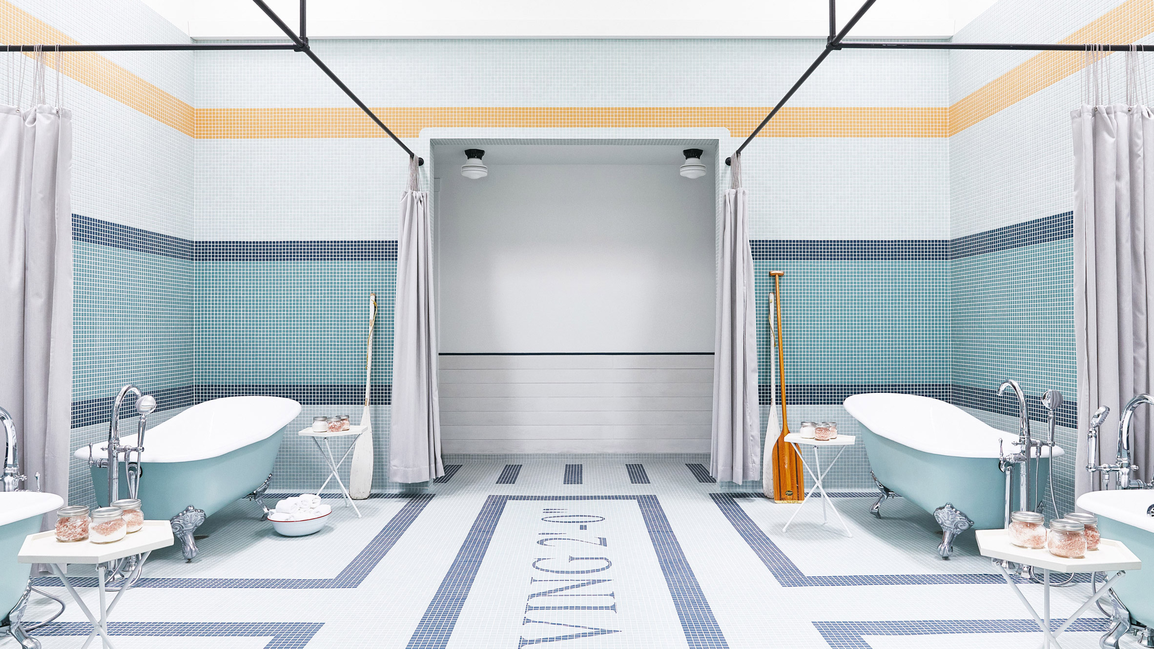
It's not just the name of the mid-century modern Calistoga Motor Lodge in California's Napa Valley that sounds like a place in one of Anderson's films; the interior more than lives up to it.
The bathroom features multiple claw-footed tubs placed in an orderly formation on a tiled floor. Pale-blue tiles cover the walls, and two oars leaning against the wall evoke the New England-aesthetic of the filmmaker's 2012 movie Moonrise Kingdom.
Find out more about Calistoga Motor Lodge ›
This is the latest in our series of lookbooks providing curated visual inspiration from Dezeen's image archive. For more inspiration see previous lookbooks showcasing window seats, plywood interiors and smart storage solutions.
The post Ten cinematic interiors that could be in a Wes Anderson film appeared first on Dezeen.
from Dezeen https://ift.tt/3jMCDcP
No comments:
Post a Comment