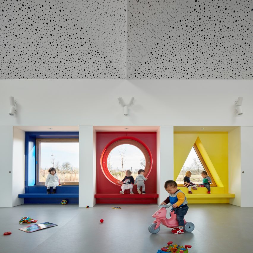
For our latest lookbook, we've collected 10 inspiring and colourful kids' rooms in kindergartens, including a pastel-hued children's centre and a nursery that pops with pink.
Designing kindergartens is often an opportunity for interior designers to release their inner child and experiment with bright colours in unexpected ways.
In these ten projects, designers used colour to encourage kids to crawl, jump and learn.
This is the latest roundup in our Dezeen Lookbooks series that provides visual inspiration for designers and design enthusiasts. Previous lookbooks include homely offices, interiors with cross-laminated timber and green bathrooms.
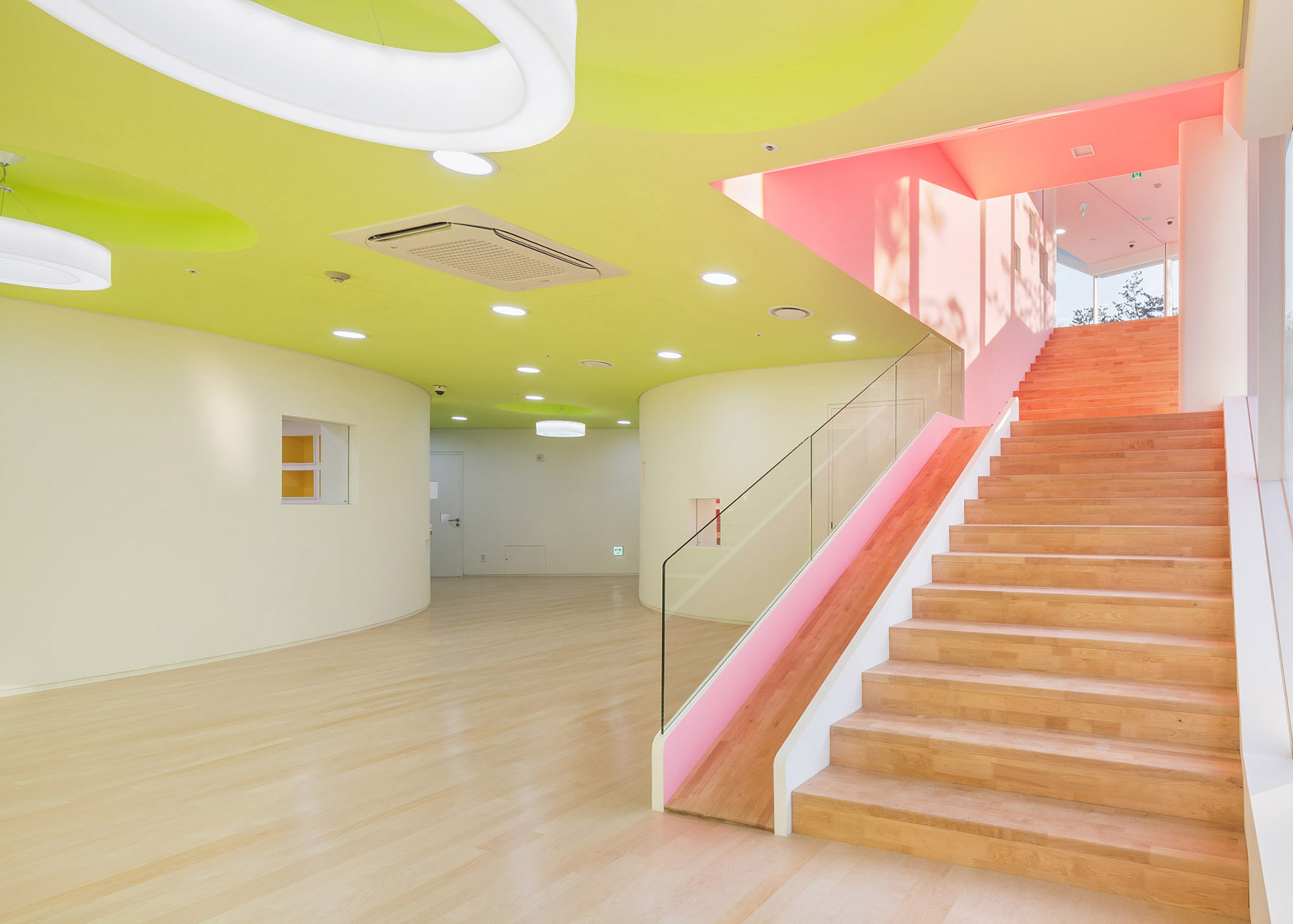
Flower Kindergarten, South Korea, by Jungmin Nam
Acidic yellows and pinks aren't the only playful features in this Seoul kindergarten interior. It also features walls with built-in flowerpots and a slide alongside a set of stairs.
Situated in the middle of a high-rise housing development in the South Korean capital's Seocho District, the five-storey Flower Kindergarten was designed to starkly contrast the neighbouring monotone buildings.
Find out more about Flower Kindergarten ›
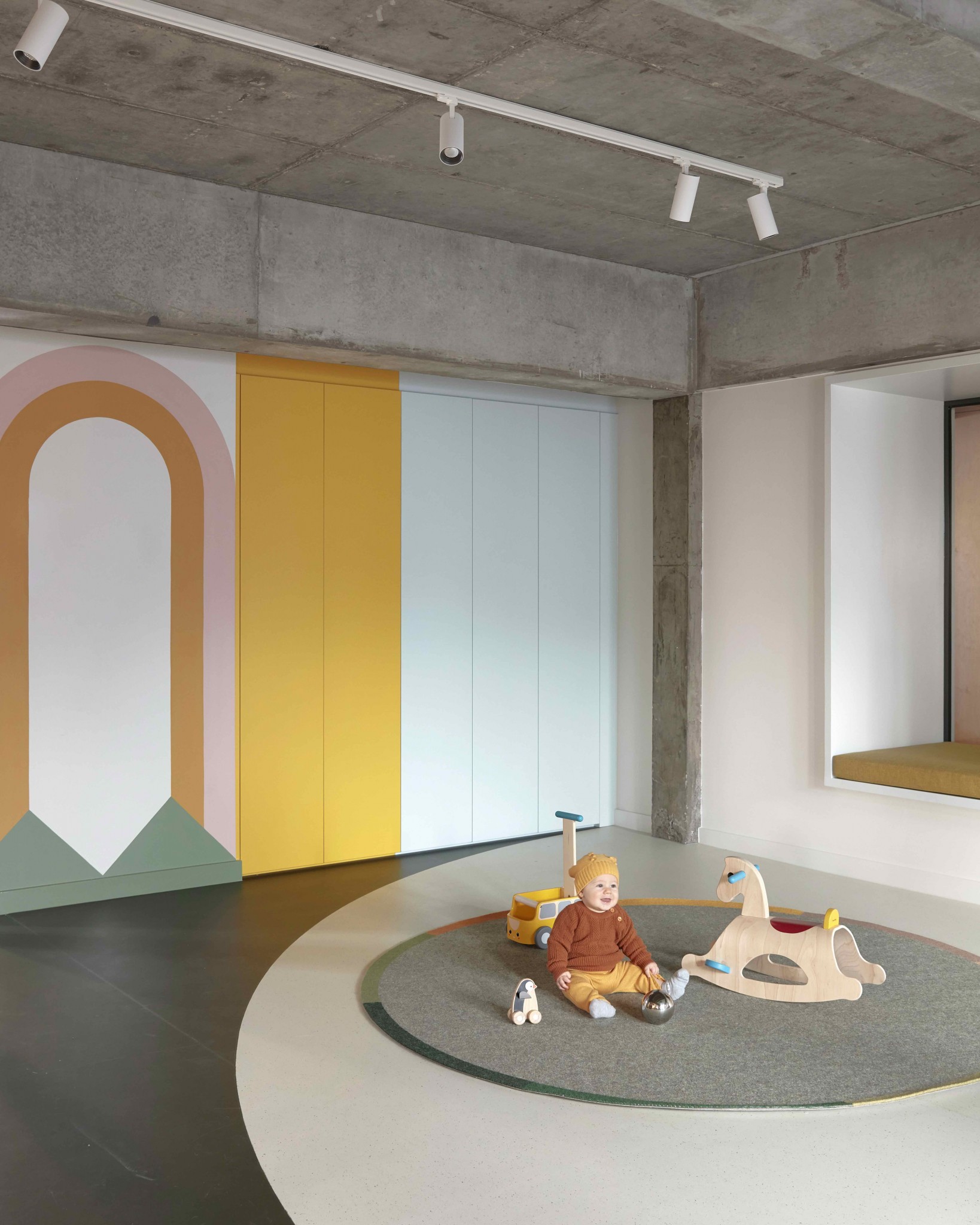
Brighton Street Early Learning Centre, Australia, by Danielle Brustman
Designer Danielle Brustman shows how kindergarten interiors needn't always be bright and gaudy in Brighton Street Early Learning Centre.
Located in a brutalist building in Melbourne, this learning centre has pastel colours, marmoleum flooring and theatrical hand-painted murals throughout the playrooms.
Find out more about Brighton Street Early Learning Centre ›
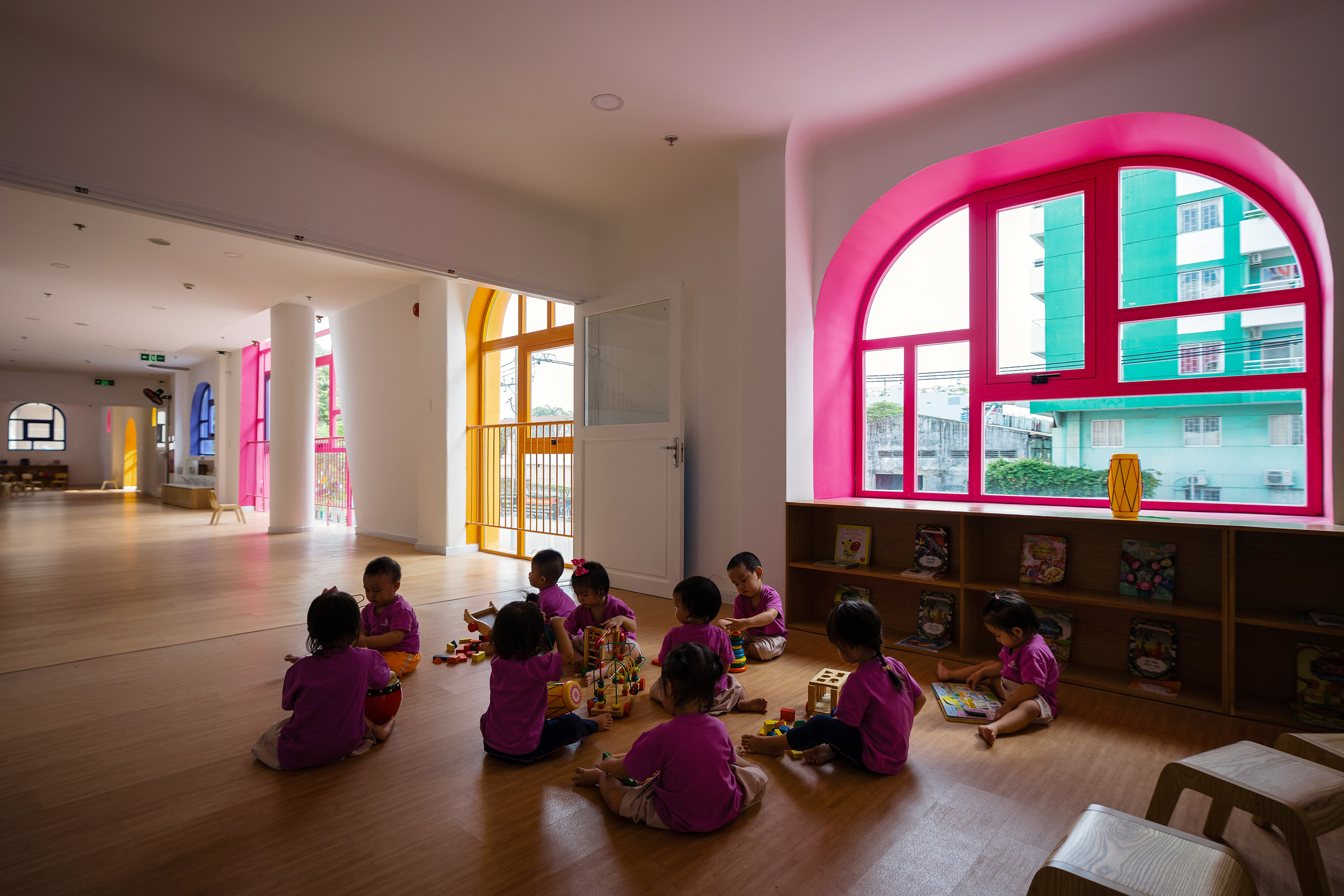
TTC Elite Saigon Kindergarten, Vietnam, by Kientruc O
The TTC Elite Saigon Kindergarten in Ho Chi Minh City features vibrant colours that frame its irregularly-shaped windows, allowing light to filter through in tinted hues.
Vietnamese architecture studio Kientruc O designed the kindergarten to be a giant playhouse for young children, with a colourful exterior facade and unusual openings.
Find out more about TTC Elite Saigon Kindergarten ›
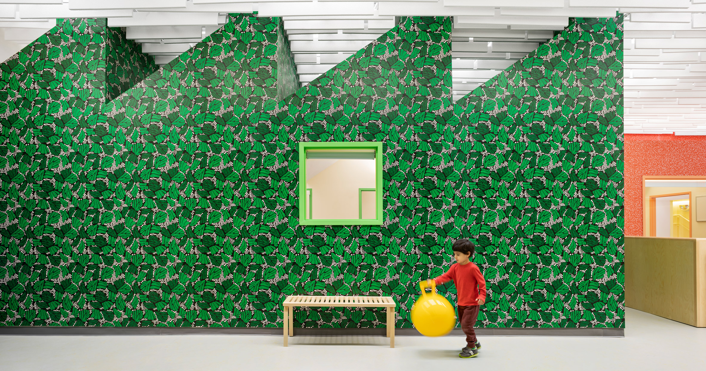
SolBe Learning Center, US, by Supernormal
The children who attend this nursery and preschool in the Boston area can play and learn against the backdrop of boldly patterned wallpaper.
"The soft classroom lighting and dynamic ceiling contribute to a sense of calm and wonder in the learning spaces," explained American studio Supernormal.
Find out more about SolBe Learning Center ›
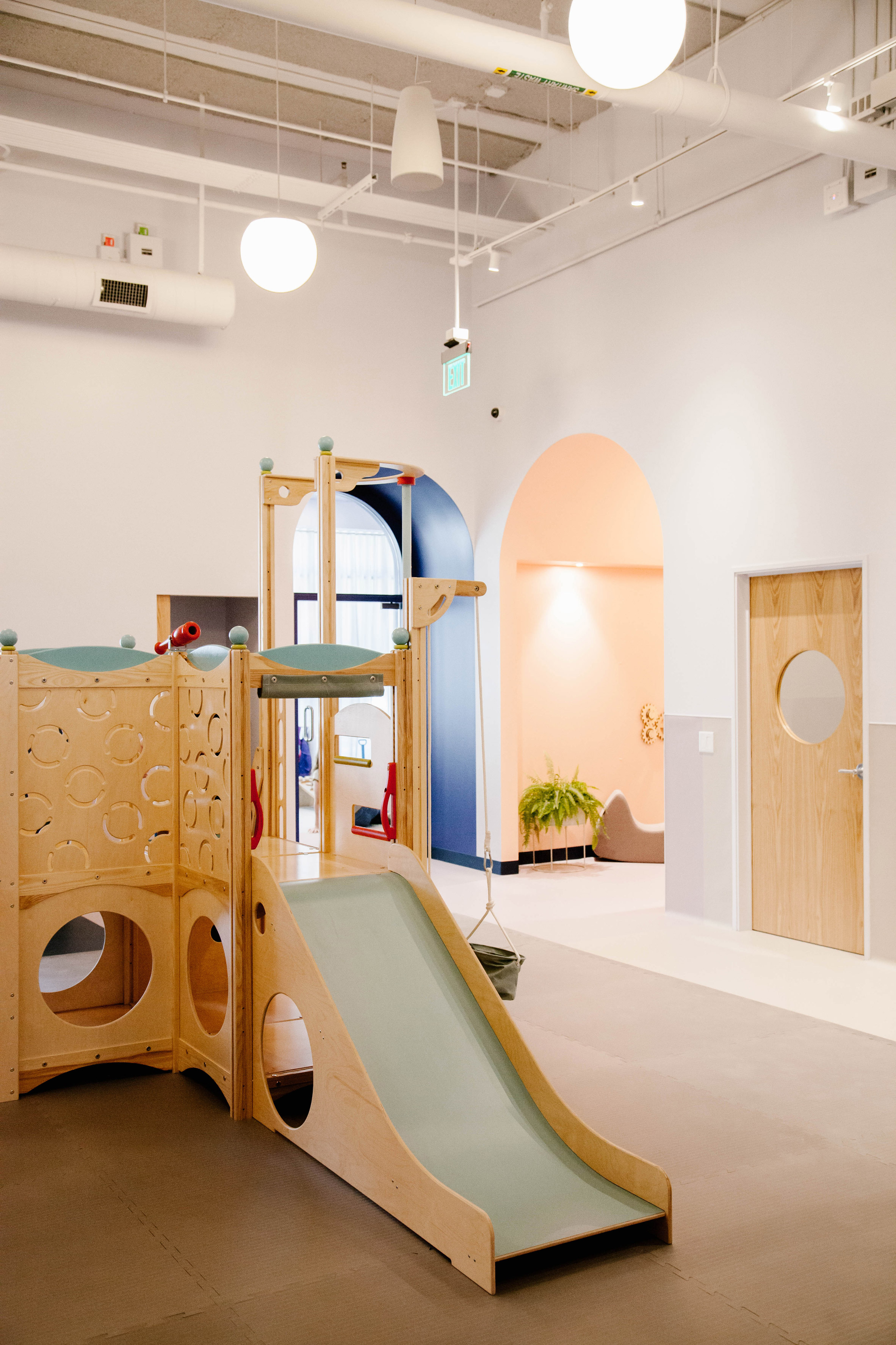
Brella childcare space, US, by Darien Williams, Yasmeen Khan and Project M Plus
Childcare subscription app Brella opened a multifunctional space in Los Angeles that functions as a play centre, co-working space and yoga studio.
In order to unite the different spaces, the designers used a bold colour palette throughout. Arched doorways painted in a blue hue that resembles Pantone's Colour of 2020 frame the pathways from one room to another, while other areas are painted in a contrasting bright coral.
Find out more about Brella's childcare space ›
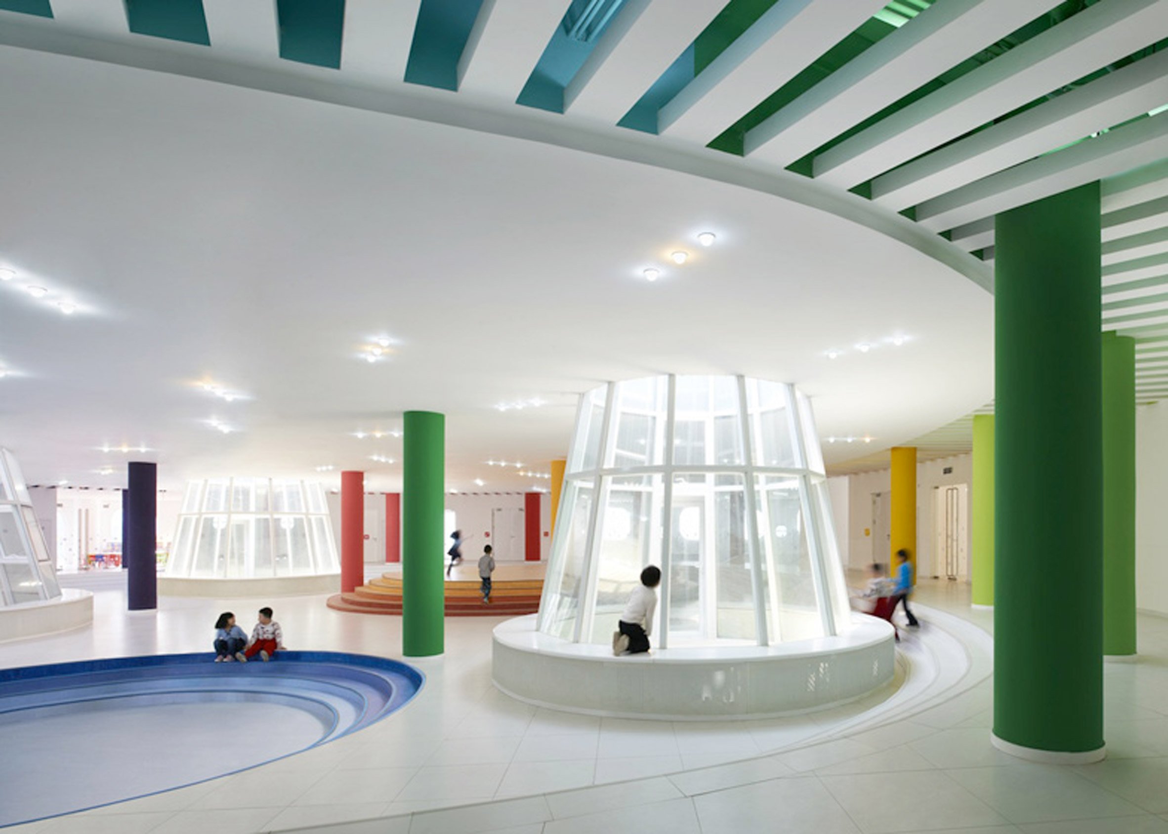
Loop Kindergarten, China by SAKO Architects
On the ground floor of this split-level play area, Beijing studio SAKO Architects has painted columns and tiered platforms in an array of dynamic colours.
A total of 18 shades make up the rainbow colour palette that is threaded around the building, including across the ceilings and around the windows.
Find out more about Loop Kindergarten ›
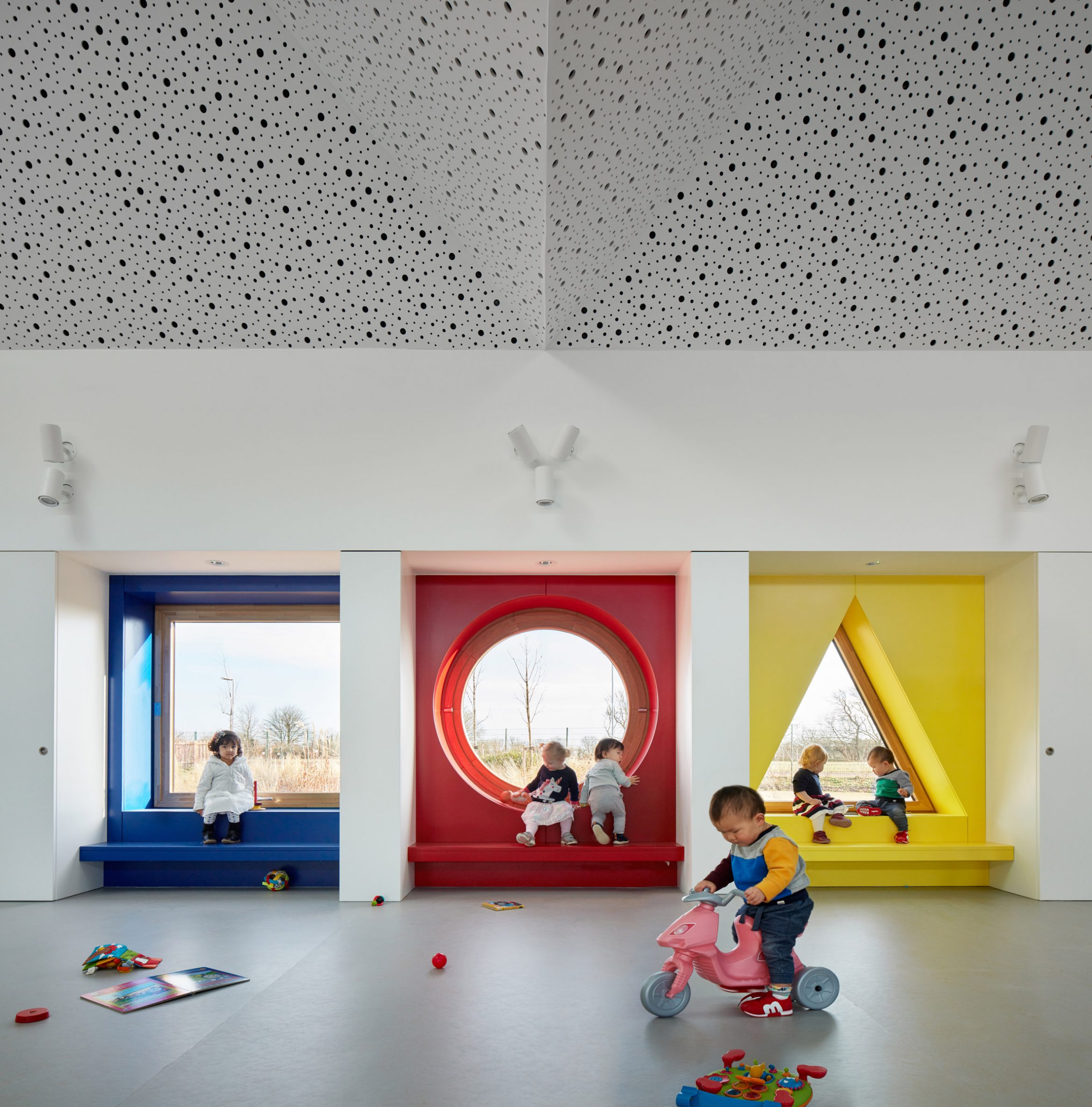
Storey's Field, England, by MUMA Architects
Porthole windows with brightly coloured alcoves, a staggering spiral staircase and waterfall gutters are among the playful details in this community centre in Cambridge, England.
Up to 100 children can climb, play and peak through little porthole windows that frame the low-lying nursery buildings by MUMA Architects.
Find out more about Storey's Field ›
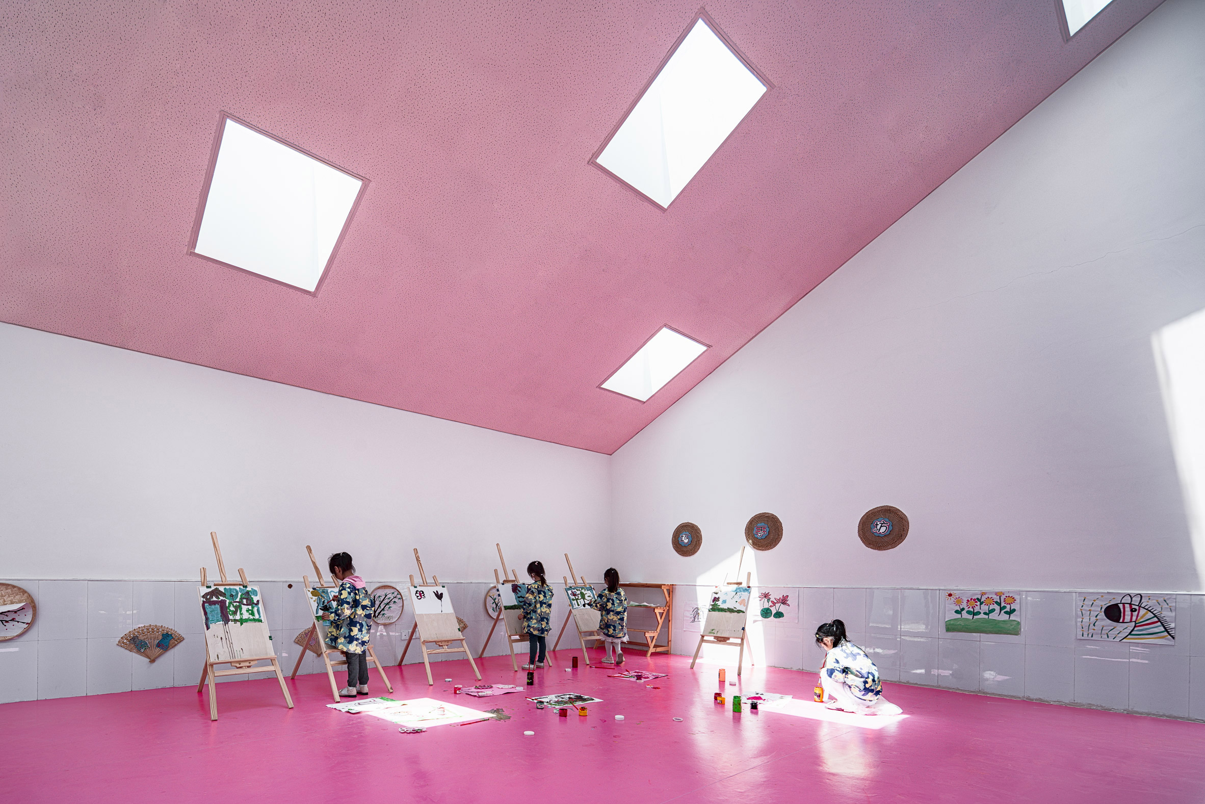
Soyoo Joyful Growth Center, China, by Crossboundaries
Magenta pink paint was used to cover the walls and ceilings of this art classroom in a Chinese kindergarten by Crossboundaries.
Set within a formerly derelict building, a series of slides and climbing frames alongside the bright colours were used to bring the space to life.
Find out more about Soyoo Joyful Growth Center ›
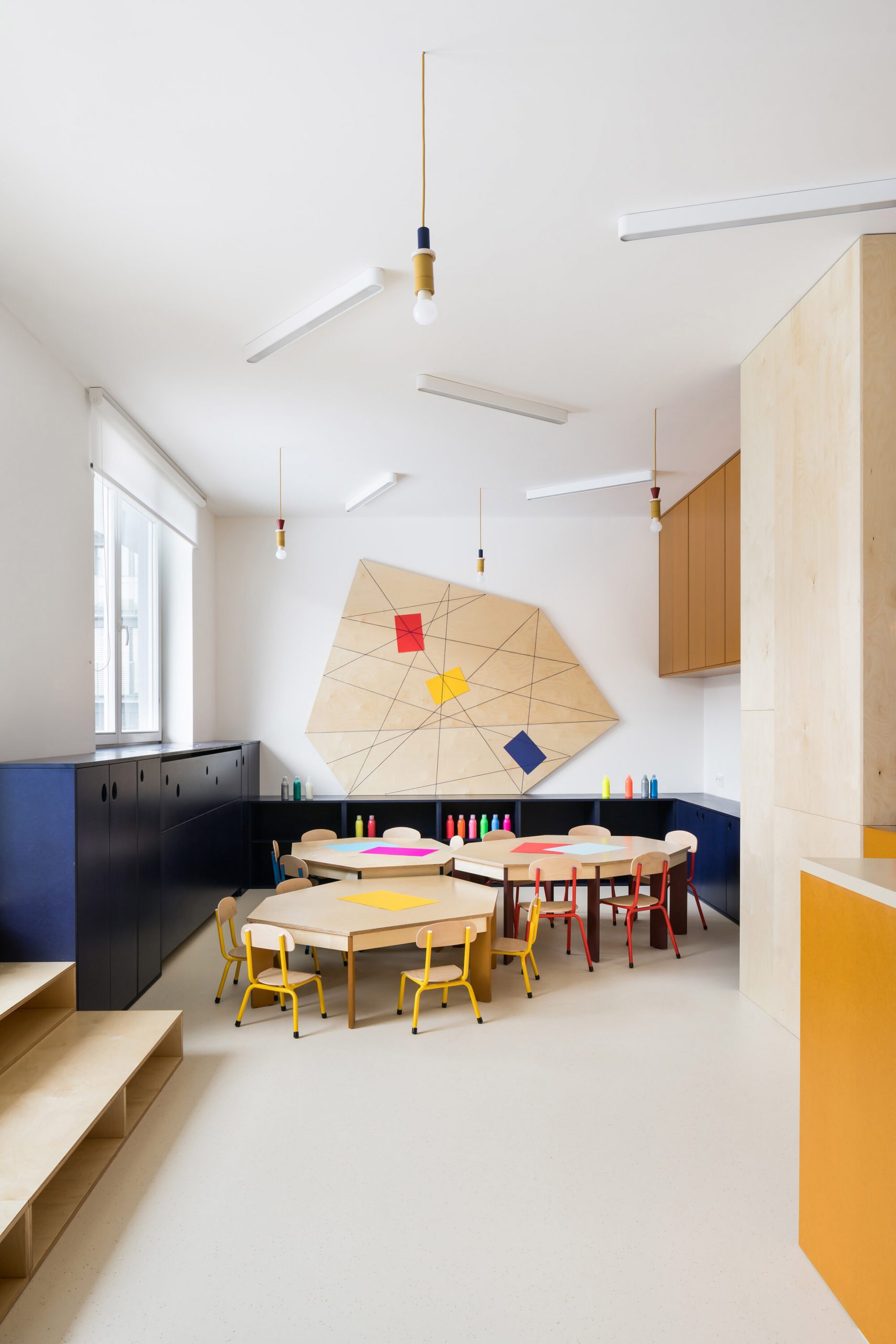
Malvína Day Nursery, Czech Republic, by No Architects
Bright blocks of primary colours were used to highlight important areas such as the kitchen counter, lockers and play areas in this kindergarten interior.
The architects also played with the space by adding lots of windows, places for kids to hide and different floor levels.
"The space itself was quite dark – it's deep and there wasn't too much daylight," said No Architects co-founder Jakub Filip Novák.
"So we chose a lot of white and light finishes, natural oiled plywood and warm colours that correspond with the nursery's branding," he added.
Find out more about Malvína Day Nursery ›
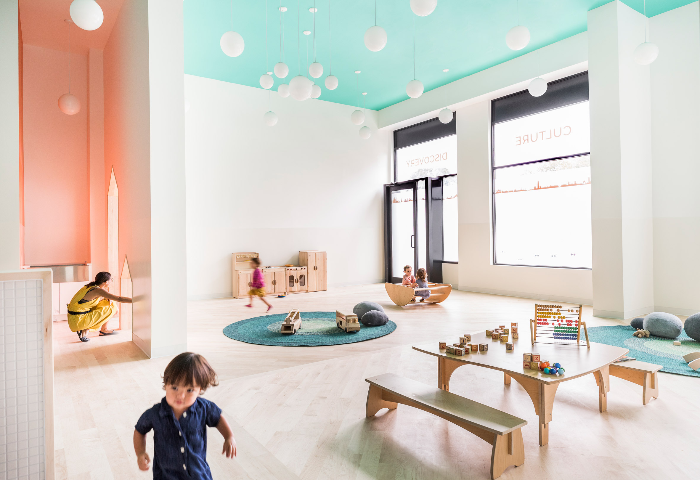
Mi Casita Preschool and Cultural Center, US, by BAAO and 4|MATIV
This cheerfully coloured daycare centre in New York uses pops of colour throughout to create a "dramatic" look for children.
The Mi Casita Preschool and Cultural Center, which is located in a mixed-use development, has coral orange walls in the main area, while sea blue is found on furnishings and in bathrooms.
"Colour is used for dramatic effect throughout the space," the team said. "Turquoise on the ceiling and light globes give the sense of being under a bright blue sky."
Find out more about Mi Casita Preschool and Cultural Center ›
This is the latest in our series of lookbooks providing curated visual inspiration from Dezeen's image archive. For more inspiration see previous lookbooks showcasing homely offices, interiors with cross-laminated timber and green bathrooms.
The post Ten kindergarten interiors that use colour to create a playful environment appeared first on Dezeen.
from Dezeen https://ift.tt/32OXOFC
No comments:
Post a Comment